Product Tours Guide for SaaS Companies: Types, Best Practices, and Tools
Product tours are very common in SaaS products. However, not all product tours are created equal: many companies fail to realize their full potential.
Worry not, though, as our in-depth guide explores the best practices for designing this popular type of onboarding experience. We also show you a few good product tour software tools.
Ready to dive in?
What’s the main goal for your product tours?
Get The Insights!
The fastest way to learn about Product Growth, Management & Trends.
Product tour guide summary
- Product tours are in-app experiences that guide users through the main product features, usually when they start using it for the first time.
- The main role of product tours is to lead users to the Aha! Moment and help them adopt the key functionality. As such, they are essential for customers to realize product value and their overall satisfaction. They also can reduce the support team workload.
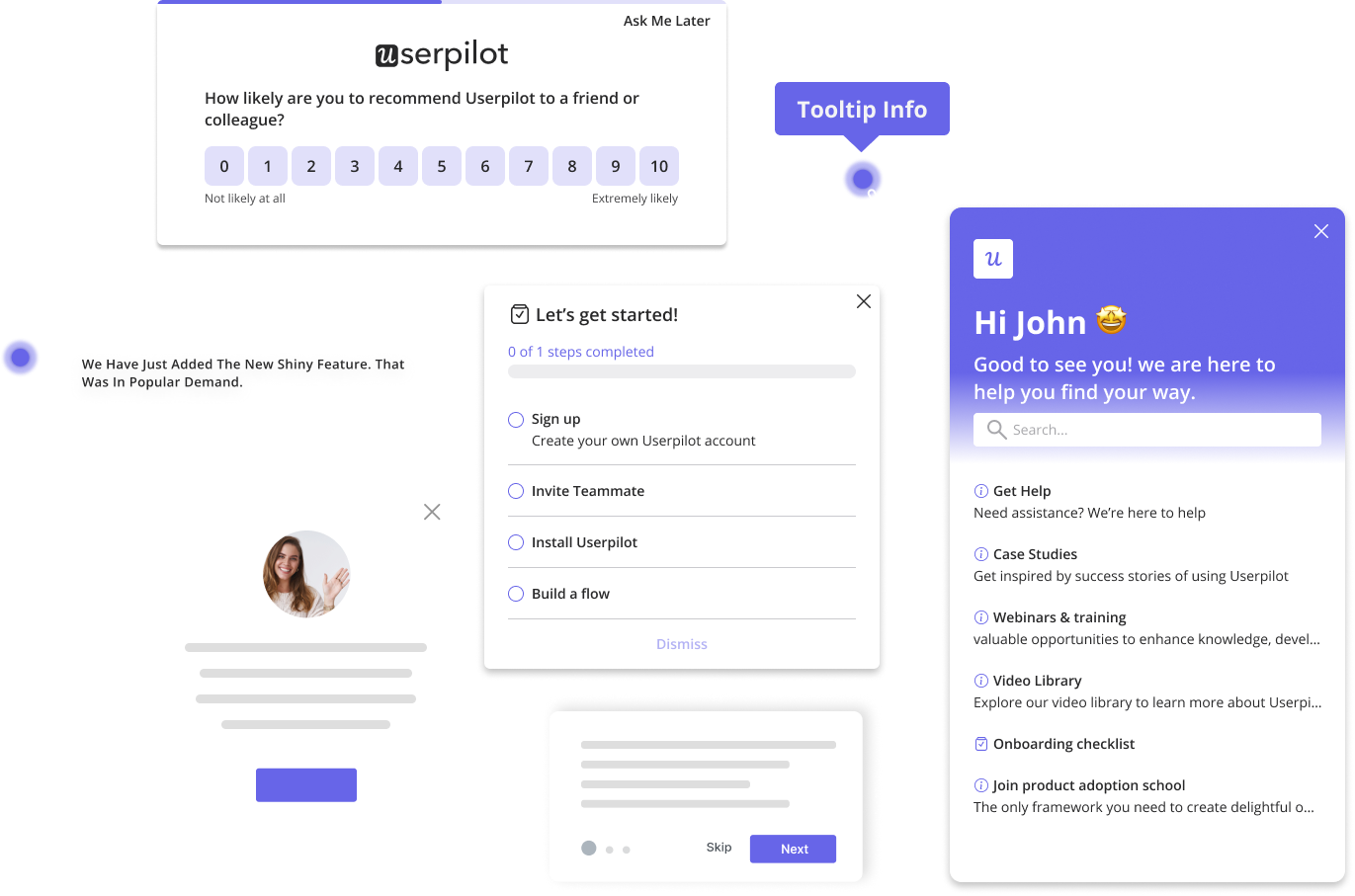
- Modals, tooltips, and hotspots are individual UI experiences often used in product tours.
- Interactive walkthroughs are sequences of tooltips highlighting the key aspects of a feature or product.
- Explainer videos are less interactive but great for step-by-step demonstrations of complex processes.
- Checklists are usually used at the beginning of the onboarding process to activate the essential features.
- The best product tours are personalized for different user segments. This reduces the time to value and is less overwhelming than generic ones.
- For best results, keep your tours short and guide users to value along the most direct route. You can discover it through path analysis.
- To avoid annoying users, always allow them to dismiss product tours.
- AI writing assistants are invaluable for creating powerful product tour microcopy.
- To increase completion rates, consider gamifying your product tours, for example, by celebrating milestones or adding progress bars.
- In the product tour, add links to relevant resource center modules for more in-depth guidance.
- To evaluate your product tours, track onboarding metrics, and collect user feedback via in-app surveys. When making changes, A/B test different versions to choose the best-performing one.
- Use product tours to remove friction in the user journey discovered through product analytics.
- SaaS companies that successfully use product tours for user onboarding include Groupize, Userpilot, Attention Insight, Google Analytics, and Loom.
- Userpilot is a product growth platform with analytics, feedback, and user engagement features, which make it a perfect tool for creating product tours. Book the demo to find out more!
What are product tours?
Product tours are interactive guides that help users understand and navigate a SaaS product.
They normally consist of a sequence of in-app UI patterns, like modals or tooltips, which appear on the screen and offer users guidance on how to use product features.
Product tours can be used for primary onboarding, when users first log into the product, or secondary onboarding when they explore new or more advanced functionality.
Why is creating product tours important?
Product tours play an important role in the user onboarding process.
How exactly? Let’s have a look at a few main ways.
Drive users toward the Aha! Moment
One of the main goals of product tours is to lead users to the Aha! Moment. That’s when they experience the product value.
This is essential for the product-led growth model where monetization can happen only when users see the product value. If you can’t show them what the product can do for them, they won’t subscribe to the paid plan.
Encourage users to adopt a product’s key features
The role of product tours doesn’t end at the Aha! Moment. They are also critical for product and feature adoption.
Adoption is the stage when users start using the product as the go-to solution to their problems.
To adopt a feature or a product, the user needs to use it repeatedly until it becomes a habit. A product tour can accelerate it by prompting regular user interactions with the feature.
Increase customer engagement and satisfaction
By prompting users to interact with the app, product tours don’t let users forget about features. Keeping them constantly engaged is essential for their retention.
More importantly, the guidance they provide enables customers to fully use the product’s capabilities and achieve their personal and professional objectives, which translates into greater user satisfaction.
Reduce the load on the customer support team
Talking of guidance, product tours are essential for sustainable customer support.
They won’t make your customer support team redundant, but they can massively reduce their workload.
This means you need fewer support agents to support the growing user base, and they can focus on the most difficult cases or the most valuable customers.
Types of product tours for user onboarding
‘Product tour’ is an umbrella term for a few different in-app experiences.
Here’s an overview of a few of the main ones.
Modals
Modals are UI patterns that pop up in the center of the screen, either on their own or as a part of the sequences.
You can use them to:
- Create welcome screens that users see when they first log into the product and where they can start the onboarding process.
- Introduce new features, inform users about their benefits, and teach them how to use them.
- Recruit beta testers.
- Make important announcements.

Interactive walkthroughs
Interactive walkthroughs are step-by-step guides, usually made up of tooltips, which help users reach the activation stage or master new features.
Why are they called interactive?
Because they normally prompt users to take action.
Moreover, users can skip different stages of the walkthrough, for example, if they seem irrelevant at a particular moment, and come back to them when the time is right. This distinguishes them from traditional linear product tours.

Tooltips
Tooltips are small square UI patterns that appear when you hover over or click on a feature.
Teams can use them individually, for example, to provide contextual guidance or prompt engagement with a feature, or as a part of a walkthrough.
Tooltips often include CTA buttons that trigger interactive tours or lead users to additional resources.

Hotspots
Hotspots are visual cues, like highlights, pulsing dots, or arrows, that draw user attention to a specific feature inside the product.
Their main strength? They are unobtrusive and yet difficult to miss.
Better yet, hotspots can be interactive and provide additional information about the feature when you click on them or hover over them. As such, they are a valuable onboarding tool.

Explainer videos
Explainer videos can be embedded in a modal and triggered to provide users with step-by-step instructions on how to use a feature or complete a task.
They are particularly effective for dealing with complex features or processes that are difficult to figure out from text or screenshots. They also take less time – both to create and digest – and appeal to users who prefer learning by watching and listening.

Checklists
Checklists are a very structured type of interactive product tour.
As the name suggests, they consist of a list of tasks that users have to complete to achieve a goal. For example, they are commonly used to activate users.
Checklists are very effective at driving the desired behaviors because they rely on a powerful psychological process called the Zeigarnik effect. Basically, humans tend to feel very anxious until they complete a planned task.
This is often reinforced by elements of gamification like the progress bar which shows users how far in the process they are and how many more steps they need to complete.

Best practices for creating interactive product tours
As we’ve covered the main types of product tours and UI patterns used to create them, we can now look at how to create interactive product tours that promote required user behaviors.
Personalize the product tour for different user segments
Obvious as it might sound, different user personas use the product differently. After all, they have different use cases and different goals.
This means that a one-size-fits-all product tour will not necessarily be relevant. Worse, it can confuse and overwhelm users with unnecessary details to the point when they start wondering if the product is what they need.
The solution?
Instead of one generic product tour, design a few, one for each of the main user segments. Next, use a welcome survey to segment users when they sign up for the product, and use the data to trigger a relevant tour.

Keep the product tour short and straight-forward
The Kiss! principle applies to product tours like nothing else.
By keeping your product tour simple and focusing only on the actions and features that directly lead to your objective, you increase the chances that users complete the tour and achieve the goal.
How do you find the shortest and most direct route to value?
Run path analysis to identify the actions of the most successful users who reach the destination. Some analytics tools, like Userpilot, allow you to filter the most common path that users take, which simplifies the analysis dramatically.

Allow users to skip your own product tour
A product tour is like a meal. It may be absolutely delicious, but your guests may not feel hungry, so it’s poor form to shove it down your users’ throats.
Many companies don’t recognize that users might prefer to explore the product on their own or are already competent enough to use the product without the tour and don’t let them skip the product tour.
Don’t be like them; include the ‘skip’ button.

Improve the product tour’s microcopy with AI
Writing microcopy for product tours is challenging because the real estate available is limited and you have a lot of information to communicate.
It isn’t a problem for a decent copywriter but they might be busy doing other stuff, like writing ads for a new marketing campaign or the landing page copy.
If that’s the case, consider using an AI-writing assistant. Many tools, including Userpilot, support such functionality to empower product and customer success teams to create quality microcopy independently and in no time.
AI is particularly useful for tweaking existing copy that you know doesn’t sound right but aren’t exactly sure how to improve it.

Gamify the experience for new users
I’ve already mentioned gamification in the context of progress bars and checklists but that’s not the only way to include it in product tours.
Have a look at the modal below: it congratulates users on reaching a milestone and rewards them with access to premium features.
Such a message sends a dopamine shot up their bloodstream and reinforces the desired behavior.
How else can you gamify product tours?
Consider:
- Setting up challenges and quests.
- Introducing a point system that rewards users for completing tasks.
- Adding quizzes to review what they’ve learned.
- Incorporating a narrative or storyline that unfolds as users progress through the product tour.

Offer additional support after the product tour ends
No matter how good your microcopy is, your product tours can contain only limited information or guidance. This may not be sufficient for users to fully discover the functionality or learn how to use it.
To help them overcome potential obstacles to feature or product adoption, create product tours with links to relevant resource center modules.
This serves another purpose.
It not only helps users master a particular feature but also shows them when they can find additional resources. Thanks to that, they will be able to troubleshoot their future issues independently without contacting the customer support team.

Collect user feedback regarding the onboarding process
So you’ve put a massive effort into creating the product tour. Does it work, though?
There are two ways to find out.
One is by tracking the key metrics, like activation or adoption, to see if they have the intended impact.
The other is by collecting qualitative user feedback. Such feedback can give you actionable ideas on how to improve the product tour. How can you collect such feedback?
Use in-app surveys triggered contextually when the user reaches a certain stage in the product tour.
For example, the survey could appear at the moment when they close the final UI pattern.

Identify and remove friction points from the user journey
Sometimes your users may not know they’re experiencing an issue with user onboarding or cannot put their finger down on it. And yet the metrics show that the user journey isn’t as smooth as it should be.
If that’s the case, drill down on the data to find the exact cause of the problem.
Start by conducting funnel analysis to identify the stage in the journey where users face friction. Next, do a path analysis to gain insights into how exactly they behave at the stage. If you need more granular data, conduct a session replay analysis.
Once you find the root cause, tweak the product tour to remove the roadblocks.

Use A/B testing to create successful product tours
Before you roll out the reviewed version of the product tour, run experiments to test its effectiveness.
In A/B tests, you enable 2 versions of the same tour to half of the selected user sample and watch which of them performs better.
If there are lots of tweaks to make, this can take a lot of time.
Fortunately, you can speed up the experimentation process with multivariate tests. They work in a similar way to the A/B test, but you can manipulate more variables at the same time.

Examples of companies with a successful product tour
Want to see how companies implement the best practices in their product tours? Here are a few examples.
Groupize
Groupize is a meetings management platform you can use to coordinate group and corporate business travel and events.
When designing their onboarding, the company decided to gamify the experience and created an interactive assistant called Groupsize Guide, or G.G. for friends.
G.G. uses a range of tools to guide users, including the resource center, checklists, and live chat. And of course, product tours that guide users through individual pages.
How did they manage to achieve such a comprehensive and yet fun onboarding experience?
They used Userpilot.

Userpilot
Userpilot is a product growth platform that helps companies build in-app experiences to onboard users and provide guidance.
The company eats its own dog food. If the solution is good enough to sell to customers, it must be good for their own goals.
Its onboarding flow is based on a checklist. The checklist includes 4 different tasks needed for user activation.
If you look carefully you will see that the first of them is ‘Create Your Account’. Including a task that the user has already completed gives users an extra motivational boost: they haven’t started yet and they’ve already completed 25% of the checklist. Winning!
Userpilot also provides an estimate of the time needed to complete each task so that users know what to expect, and a progress bar to track progress.
At the bottom, there’s an option to dismiss the checklist.

Attention Insight
Attention Insight is another Userpilot customer.
What does Attention Insight do?
The clue is in the name. The platform uses AI to create attention heatmaps of websites, ads, and other designs without running usability tests with real users.
Sounds complicated, but the process is simple. To activate, users need to complete just two actions.
And yet, when the company first launched, it struggled with low activation rates.
To solve the issue, they used an onboarding checklist covering all actions users need to activate and interactive walkthroughs that helped users complete individual actions.
To make the interactive walkthroughs more engaging, the team gamified them by including congratulatory messages triggered when the user creates the first heatmap successfully.
Users also have access to the resource center with product documentation, guides, and tutorials.
How effective are the onboarding flows?
User activation increased by 47% within 6 months of their implementation.
Not too shabby at all.

Google Analytics 4
Google Analytics needs no introductions: it’s probably the most popular analytics platform out there, enabling companies to track and analyze user behavior on websites and inside apps.
GA4 is a fairly complex tool and new users may struggle to understand what’s where and how to start.
To help them overcome the block, GA has created a user-friendly product tour.
It consists of 8 modals and tooltips, which introduce the main reports and showcase their key features. The UI patterns are minimalistic and clear, and the microcopy is easy to understand.
More advanced or adventurous users have the option to dismiss the product tour and get down to work right away.

Loom
Loom is a video messaging application that has revolutionized how teams communicate. As it allows you to record your screen, voice, and video at the same time, it’s perfect for creating tutorials and demonstrations. Instead of trying to explain something to a colleague, you can send them a link to a Loom video and job done.
Loom is a very intuitive and user-friendly solution. However, some of its features may not be obvious right away.
To improve their adoption and flatten the learning curve, Loom uses a short 4-step product tour. Each of the tooltips briefly explains what each feature does and its benefits.
Should the information be irrelevant, users have the option to skip the tour.

The best product tour software in the market
The days when you had to code every UI pattern for your product tours are long gone. Product, marketing, and customer success teams now have access to brilliant tools for creating stunning interactive in-app experiences without any coding whatsoever.
The best part is that many of them offer analytics and feedback functionalities for a comprehensive growth solution.
If you aren’t using one yet, here are 3 solid options.
Userpilot – best product tour tool for SaaS
As mentioned, Userpilot is a digital adoption platform (DAP) you can use to onboard and support users at all stages of the user journey.
Its engagement layer allows you to create:
- UI patterns – tooltips, modals, banners, hotspots, slideouts, and driven actions.
- Interactive walkthroughs.
- Onboarding checklists.
There’s also a resource center functionality for self-service support, an AI writing assistant, and automatic localization.
For onboarding personalization, you can target different user segments with different flows.
The in-app experiences can be triggered contextually, exactly when the user needs them.
For example?
Say you’ve just added the scheduling feature to your social media management app. You could trigger an interactive tour introducing the functionality when the user is about to publish a post because that’s when it’s most relevant.

Targetted and contextual triggering is possible thanks to Userpilot analytics, which are second to none.
You can use them to analyze user behavior at different touchpoints and track key product metrics, which is essential if you’re serious about creating a frictionless user experience.
The analytics features include:
- Feature and event tracking.
- Funnel analysis.
- Path analysis.
- Trend analysis.
- A/B and multivariate testing.
- Flow analytics.
You can visualize the data in individual reports or one of the 4 ready-made analytics dashboards.

Finally, Userpilot supports in-app surveys so that you can collect user feedback. Again, they can be triggered contextually and sent to specific user segments.
Appcues – recommend product tour tool for mobile apps
Appcues is another product growth platform that is similarly priced to Userpilot (at the bottom tier).
It offers all the features that you may need to create product tours:
- UI patterns – tooltips, modals, slideouts, pins, and banners.
- Checklists.
There’s no resource center, though, its UI isn’t as intuitive and the analytics features are limited to event tracking and flow analytics.
However, Appcues has one advantage over Userpilot: it supports mobile apps.

UserGuiding – affordable product tour software
UserGuiding is the most affordable of the 3 solutions, targeting smaller SaaS companies.
The tool allows you to create:
- Product tours.
- Onboarding checklists.
- UI patterns – tooltips, modals, and hotspots.
It also offers a resource center and its analytics are good enough to support personalized flows.
If you don’t need advanced analytics and are satisfied with branded in-app experiences, this might be the tool for you.

Conclusion
Product tours are a staple of user onboarding. However, there are different ways to serve the dish, some more effective than others.
Successful product tours are interactive and personalized, leading users to value in the simplest and most direct way. Most importantly, they’re based on data from product analytics, experiments, and customer feedback.
If you’d like to see how Userpilot can help you analyze user behavior, collect feedback, and use the insights to design product tours, book the demo!

