7 Must-Know Customer Experience Trends for 2026
Customer experience (CX) refers to a customer’s overall perceptions of a company, product, or service. It is the sum of how satisfied customers are with every interaction with your brand.
And to keep customers satisfied requires meeting their evolving expectations. This you can only do by keeping an eye on changing market trends so you always know what customers want, like how 52% of them are willing to churn after one bad brand experience.
To clarify though, CX isn’t to be confused with customer support or customer service. While CX encompasses all customer touchpoints throughout the customer journey, the latter two are just one part of the journey, solely related to post-purchase support.
To help you decode what customers expect in 2026, this article will explore the 7 key customer experience trends of the year and why they matter.
What are the current CX trends in SaaS?
73% of customers want more personalized experiences as technology advances. But why should this expectation concern CX leaders? Churn is the obvious answer. But it’s worse than that.
Ignoring these customer experience trends means falling behind competitors who are already investing in technology. 74% of companies have already increased their CX spend, and 65% are investing in AI solely to improve their CX initiatives.
So, if you want to stay competitive, here are the CX trends to look out for this year.
CX trend #1: The rise of agentics for AI-powered support
Gartner predicts that by 2028, 33% of software applications will include agentic AI, a huge jump from 1% in 2024.
Agentics is an advanced AI system that can autonomously solve multi-step problems. Its ability to adapt its responses in real-time based on the context makes it ideal for providing instant customer support.
But agentics AI isn’t a replacement for human support teams. If anything, it can help support teams provide more personalized recommendations by analyzing customer interactions, predicting needs, and providing an up-to-date context of the customer’s situation.
So the agent is prepared much quicker than usual to provide greater support experiences.
For example, within SaaS products, agentics AI can help analyze in-app user behavior, such as feature usage, engagement levels, and support ticket history.
Based on this data, it can suggest tailored tutorials and tooltips, and notify the support team if the user is struggling with a specific feature. This enables proactive engagement, helping reduce churn and improve customer engagement.

CX trend #2: Personalized global experiences
75% of customers will switch to a competitor if they can’t find information in their preferred language. Because consumers across the globe want to feel understood and valued by companies, regardless of their location or language.
But providing personalization to a diverse audience goes beyond simply translating content. Instead, it requires true localization, adapting several facets to make space for different cultures, such as:
- In-app experience and design elements.
- Support materials.
- Communication style.
- Payment methods and pricing.
These changes enable more personalized interactions with your product, boosting customer loyalty. And revenue too, with 84% of businesses seeing greater revenue growth after localization.
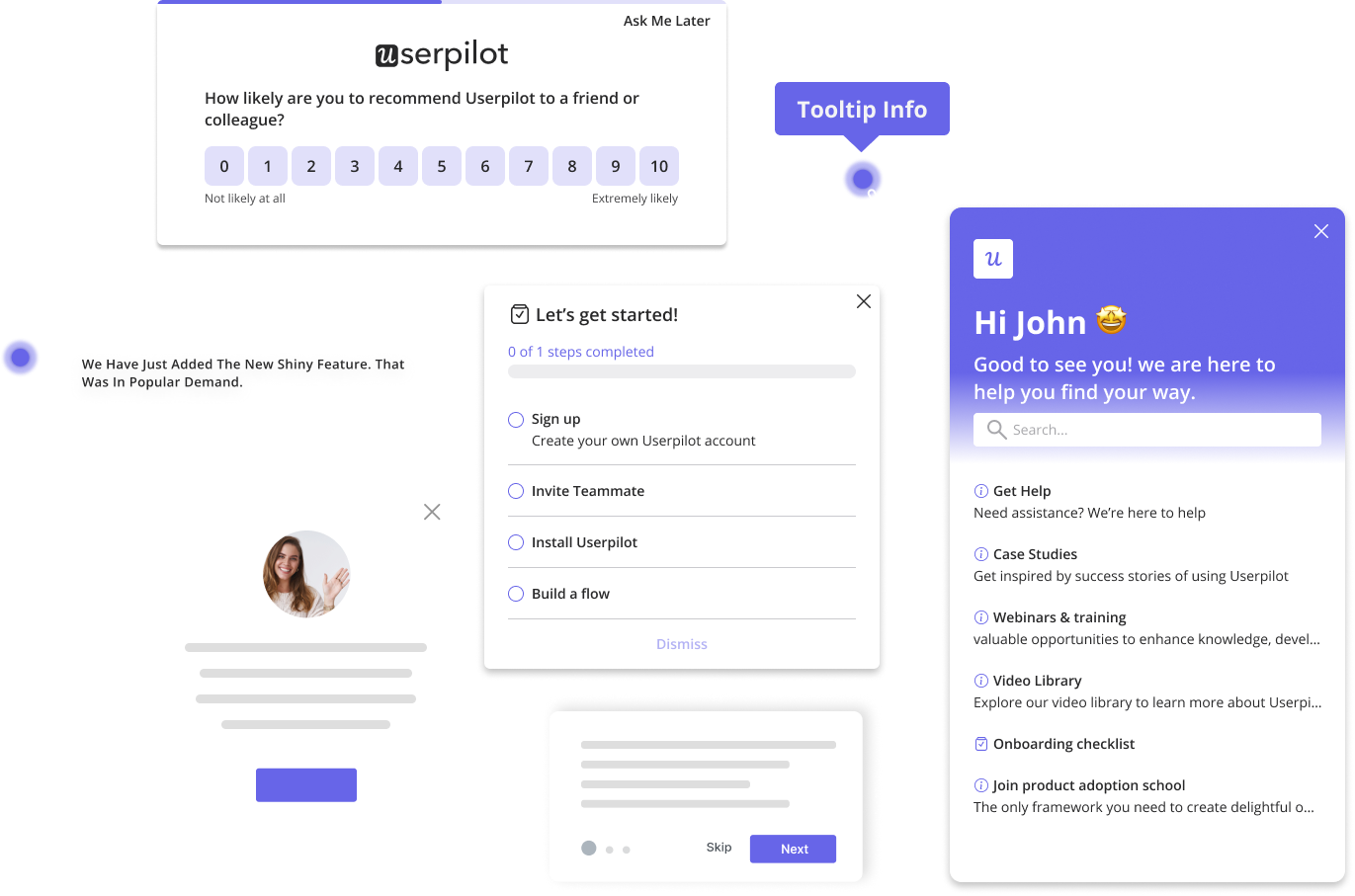
In action, localizing in-app experiences could look something like automatically translating tooltips and checklists for the relevant users, which is possible using tools like Userpilot:

CX trend #3: Human-centered design takes center stage
74% of customers admit that customer loyalty depends on how understood a brand makes them feel. And human-centered design (HCD) is all about understanding consumer behavior and their pain points.
With users at its core, HCD creates easy-to-use, intuitive products that lead to happier customers and increased adoption. This, in turn, reduces the need for extensive user training and support, empowering customers to self-service instead.
Plus, by virtue of being human-centered, HCD also prioritizes accessibility, providing positive customer experiences for all. For instance, in SaaS, a customer-centric approach can help make more accessible designs by:
- Using high color contrast to improve readability.
- Providing resizable text options for users with different vision needs.
- Ensuring screen reader compatibility for visually impaired users.
Such inclusive, user-centric designs foster trust in your brand and build loyal customers.
A great example of this is a little experiment we ran in our State of SaaS Onboarding report, where we reviewed over 100 onboarding flows. We found that frictionless signup flows, built based on human-centered design thinking, performed far better than friction-based ones.

CX trend #4: Proactive customer success
Customer success drives up to 50% of total revenue growth.
Now imagine how much growth proactive customer success could generate by preventing problems instead of fixing them later. Not to mention the reduction in support ticket volume.
In practice, proactive customer success could be as simple as reaching out to a user before their trial ends and offering personalized tips for reducing time to value.
Taking such a proactive approach shows a real dedication to the customer’s success, helping them feel supported every step of their journey. Plus, it creates a seamless customer experience too by minimizing downtime, leading to reduced churn and increased customer lifetime value.
Userpilot allows you to build a comprehensive resource center
One way to offer proactive customer success is by providing self-service options via an in-app resource center. This enables customers to troubleshoot independently without waiting for help.
But remember to integrate various types of support materials into your resource center. Userpilot allows you to do so, adding blogs, video tutorials, walkthroughs, FAQs, etc. to cater to the different learning styles of all your customer segments.

CX trend #5: The growing popularity of the “customer community”
Community building remains a key customer experience trend in 2026, with 73.6% of customers admitting they’re more likely to become repeat buyers because of a brand’s online community.
Creating these communities helps customers interact with peers facing similar issues and learn from their experiences. They also foster a sense of belonging by creating spaces for customers to connect with like-minded individuals.
The Adobe customer community “connects and inspires” users
With over 41 million members, Adobe’s community is a great example of bringing customers together. It provides users an avenue to ask questions and share tips for making the most out of the software.

CX trend #6: Seamless omnichannel experiences
In 2026, customers expect to interact with your brand on their preferred channels, without repeating themselves. Such experiences make it easy for customers to get the information and support they need, regardless of how they contact you.
So, by maintaining consistency across all your platforms, you can boost customer satisfaction and drive revenue too. In fact, research shows that well-executed omnichannel customer experiences increase revenue by 9% on average.
Shopify provides multiple, integrated touchpoints for support
Shopify’s entire design is centered around empowering customers to choose their preferred support method. Customers can try self-service first, leverage the chatbot for quick answers, or directly contact human support when needed—all from the same interface.

CX trend #7: Visual communication is growing in demand
The last of the customer experience trends for 2026 is the booming visual communication market. It is expected to grow at a CAGR of 5.88% to reach $58 billion by 2034, compared to $35 billion in 2026.
For SaaS companies, this means users want more engaging graphics in their product interfaces, dashboards, and even support materials, like video tutorials and interactive demos.
Such visual communication makes content more digestible and engaging compared to just text or voice-based content. Especially when explaining complex issues or demonstrating product features.
HubSpot Academy encourages self-service through visual learning resources
HubSpot capitalizes on the growing demand for visual content well by incorporating video lessons in their free courses. This strategy makes customer education more immersive and improves the overall learning customer experience too.

Shaping the future of CX in SaaS
What’s one thing all these 7 customer experience trends have in common?
Each prioritizes the customer’s voice and point of view instead of solely relying on the data or assumptions.
So, here’s one last unsaid trend to look out for—regularly hear what your customers have to say. Start by focusing on collecting and analyzing feedback. Then build on it, picking what to change and improve. Lastly, always close the feedback loop, so customers know you value their opinions.
Looking to make feedback collection and analysis easier? Book a free Userpilot demo and see how you can customize and launch any type of survey in your product, like NPS, CSAT, and CES.

