How to Create Mobile Slideouts to Deliver Contextual Messages


Mobile slideouts are small, non-intrusive messages that slide into view on your app screen.
Slideouts are great for effectively using the limited space available on smaller mobile screens compared to desktops. Plus, since they slide in and out as needed, they’re useful for delivering contextual information without interrupting the user experience.
And finally, slideouts help improve feature adoption and engagement by directly communicating timely information in-app, helping mobile users discover new features and engage more.
When and where to use mobile slideouts
Mobile slideouts are incredible communication tools as long as you time them right. Let’s go over some key moments throughout the user experience where slideouts are a must.
- User onboarding: Guide new customers through key features and menus without overwhelming them with content. For example, a slideout can be used to introduce the main dashboard with a brief walkthrough of essential tools they can access.
- Feature announcements: Highlight new or underused features to boost engagement. For instance, product managers can use slideouts to showcase a new feature and its intended benefits, encouraging users to try it with a direct link to get started.
- Proactive support: Provide feature suggestions and in-app help before customers seek it. For example, trigger a slide out when a customer encounters a common error, like their analytics dashboard not loading. The slideout can display step-by-step guidance on how to fix the issue, so customers won’t have to reach out to support.
- Promotional messages: Deliver targeted offers or discounts at appropriate moments when customers are most likely to engage and purchase. For instance, display slideouts to offer a limited-time discount to customers with expiring free trials, prompting them to upgrade before the offer ends.
7 Best practices for effective slideouts
Is getting the timing right all you need to make engaging slideouts? Sure, that’s one part of it. But beyond the timing, here are some factors you should consider to make your slideouts more relevant, engaging, and accessible.
1. Context is key
Don’t interrupt users unnecessarily. Only display mobile slideouts when they naturally fit in to improve the experience. For SaaS companies, this is best seen during onboarding or when users are actively engaged with key features.
For example, a customer just finished creating a form in your app. This is the right moment for a slideout to appear, suggesting ways to share the form with their team. The slideout is timed perfectly, related to the customer’s context, and likely to get a positive response.
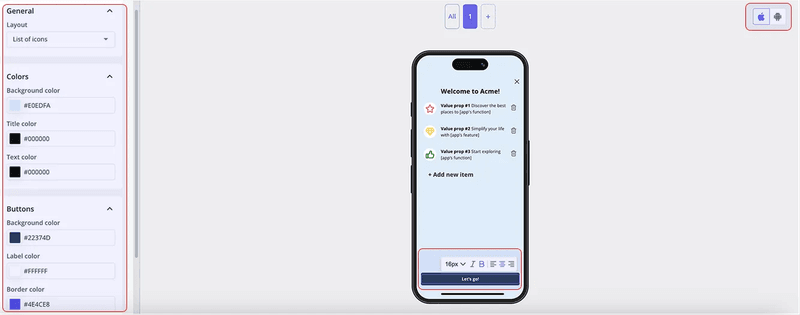
To help build similar timely slideouts, Userpilot can come in handy. It offers quick setup with pre-built templates that you can adjust to customize slideouts and trigger them to deliver contextual messages.
2. Keep them short and actionable
Mobile screens are small. So use concise messaging in your slideouts, along with a clear call to action (CTA).
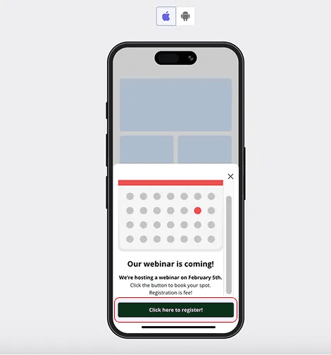
Aim for something like the image below. It has a short yet straightforward heading introducing a specific feature, helping customers grasp the topic at a glance. Similarly, the rest of the slideout, including the CTA button, avoids unnecessary text, making it easy for customers to understand the value quickly and drive action without any confusion.

3. Integrate with app logic for personalized content
Show users targeted content that’s related to their behavior. For example, if a customer has already completed your onboarding checklist, they don’t need another slideout reminding them to do it again. Instead, suggest the next logical action.
How?
Connect slideouts to application logic to dynamically update content based on user behavior.
So, let’s consider the same users who finished your onboarding checklist. This time, rather than a reminder, a slideout could appear asking if they’re ready to explore more advanced features, nudging them towards deeper engagement.
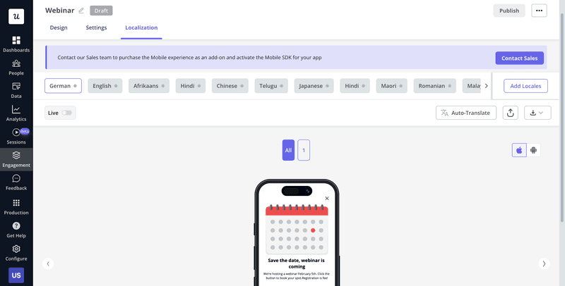
To personalize content even further, try tools like Userpilot. It helps deliver personalized in-app experiences based on several segmentation criteria, such as user attributes, behavior, and language preferences, with auto-translate options for quick localizations.
4. Design for mobile usability
Slideouts should be an unobstructive experience. This means slideouts should appear without interrupting the user’s current interaction or blocking any important details.
Here’s how to make that happen:
- Don’t cover critical UI elements: Avoid blocking menu icons or navigation buttons. This way, customers can still access key features and navigate without disruption.
- Use nonintrusive animations: Choose a smooth slide-in rather than a sudden pop-up. These feel like a more natural transition instead of a jarring shock.
- Add easy dismissal options: Something like a visible close button or swipe-to-dismiss motion. This gives customers control, allowing them to exit the slideout if they are not interested, instead of feeling trapped.
- Follow a logical order: Viewers are used to seeing content follow a certain flow. There’s always a title, sometimes an image, some content, a button to click, and padding between all these items. Maintain this order to avoid overwhelming those with cognitive impairments.
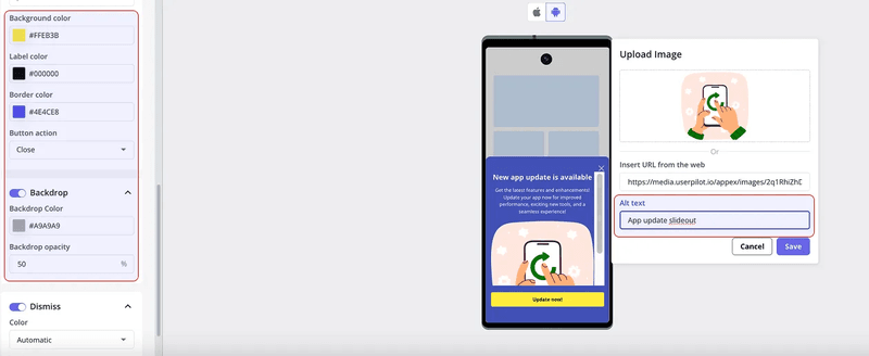
Now, to implement these mobile usability tips, you’ll need a tool like Userpilot that lets you create mobile-first content separately to optimize the customer experience on mobile devices. Plus, it’s a no-code platform, so your product team can deploy slideouts without requiring any technical help.
5. Use behavior-based triggers
Set up triggers to display slideouts based on user actions, not random timing. Such triggers make the most sense when users abandon a task or display signs of lower engagement.
For example, if a user abandons onboarding, show a slideout nudging them to complete the setup. Targeting such behavior makes the slideout content more personal and relevant and also engages the user better, delivering value when it matters most.
6. Include a strong CTA (call to action)
Your slideout CTA needs to be short and clear. Adding to that, it should also be compelling. Let’s look at two examples of CTAs to better understand what I mean.
“Learn more.”
vs.
“Need help? View our quick guide!”
The first CTA is vague and doesn’t encourage action. In contrast, the second, far better CTA grabs user attention, offers value (quick guide), and motivates users to take action, everything your CTA should aspire to do.
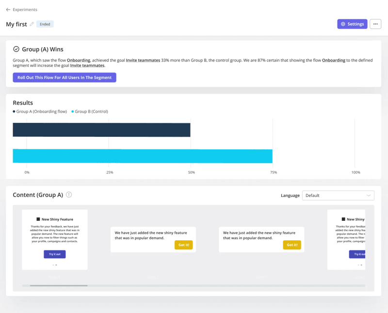
7. Test, optimize, and iterate
Test variations of slideouts to measure which leads to higher engagement.
Start with small changes, running A/B tests on different messaging, designs, CTAs, and triggers. At the same time, track metrics like engagement, conversion, and dismiss rates for each variation to see what works best. And then make changes accordingly.
For example, you could test two slideout designs: one with just text and another with an image above the message. After A/B testing, you see that the version with the image drives greater conversion, making it the obvious, data-driven choice for improving the app experience.
And lastly, make it a habit to regularly test and iterate so your slideouts stay optimized over time.
Use slideouts to drive meaningful engagement
Mobile slideouts are a powerful way to engage customers with contextual information without disrupting their experience. But only when done right.
Slideouts need to be concise, well-timed, and personalized to make an impact. And if your slideouts aren’t getting the engagement they deserve, then experiment and iterate to see how you can improve based on user behavior.
Looking to create mobile-optimized slideouts that drive engagement? Book a Userpilot demo and see how you can create personalized, behavior-driven slideouts with custom templates, auto-localization, and A/B testing capabilities.
About the author