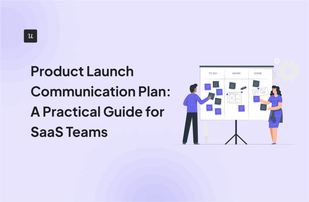
Modal vs Popup vs Overlay: What’s the Difference?

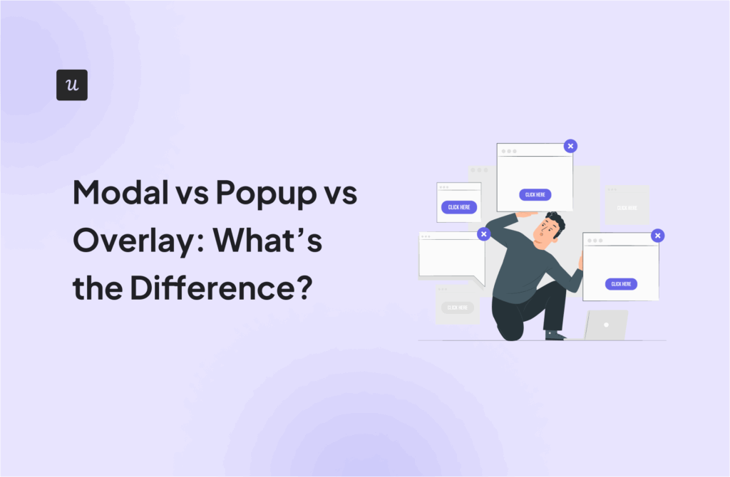
Many product managers use modal, pop-up, and overlay interchangeably to describe UI elements that sit on top of the interface. But each pattern serves a distinct purpose, so blurring the lines can confuse designers and lead to misaligned UX implementations.
In this guide, I’ll clarify the differences between modal vs popup vs overlay, outline when each pattern works best, and help you choose the right one for your marketing campaign.
What is a modal?
A modal is a UI component that appears on top of the main interface and blocks interaction with the rest of the page until the user takes an action, such as confirming or dismissing an item.
I deploy modals for high-intent actions and critical flows such as onboarding steps, confirmations, or legally required acknowledgements. The tradeoff is disruption: overusing modals can frustrate users and slow task completion.
What is a popup?
In the early days of the web, a popup was a literal new browser window that opened via JavaScript. Today, “popup” is a catch-all term used by marketers and users to describe any window that appears suddenly.
Pop-ups are effective for announcements, limited-time offers, or lead capture when the goal is awareness or conversion rather than task completion. Pop-ups allow users to dismiss and continue without consequence, which makes them less risky than modals but also easier to ignore.
What is an overlay?
“Overlay” is the broadest term of all. Technically, anything that sits on top of your main interface is an overlay. However, in practical product design, when I say “overlay,” I am usually referring to the background layer that sits behind a modal window. You might know it as the “backdrop” or the “dimmer.” It is the semi-transparent black or grey film that covers your main content.
I typically use overlays when I want to supplement the main content rather than stop the user’s flow. For example, they’re common for tooltips and loading states.
Build Better Modal vs Popup vs Overlay Flows Without Coding using Userpilot
Modal vs. pop-up vs. overlay: Key differences
Overlays, modals, and pop-ups mainly differ in how disruptive they are and the campaign goals they support.
Overlays are best for guidance and adoption with minimal interruption, modals are suited for required actions or confirmations, and pop-ups work best for promotional campaigns and conversion-focused goals like lead capture.
Here’s a quick comparison table I made to help you make a distinction:
| Dimension | Overlay | Modal | Pop-up |
|---|---|---|---|
| Blocks background interaction | ❌ No | ✅ Yes | ⚠️ Sometimes |
| Visual prominence | Low–Medium | High | High |
| User control | High | Medium | Low–Medium |
| Best for | Guidance | Required actions, confirmations | Promotions, campaigns, lead capture |
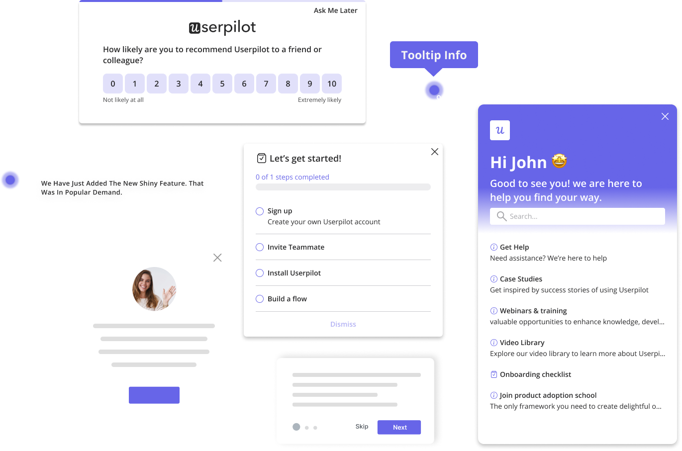
| Typical use cases | Tooltips, onboarding hints, contextual help, and feature highlights | Delete confirmations, form submissions, critical alerts, gated flows, event invitations | Email signups, promotional discounts |
As you can see, modals and popups have tons of use cases, but in this article, I’m zooming in on my favorite one: event promotion, an underrated but highly effective way to use in-app messaging.
Common mistakes to avoid when promoting events with in-app messages
From timing your messages to writing impactful copy, here are the most common mistakes I’ve noticed people make throughout my career, along with ways to overcome them.
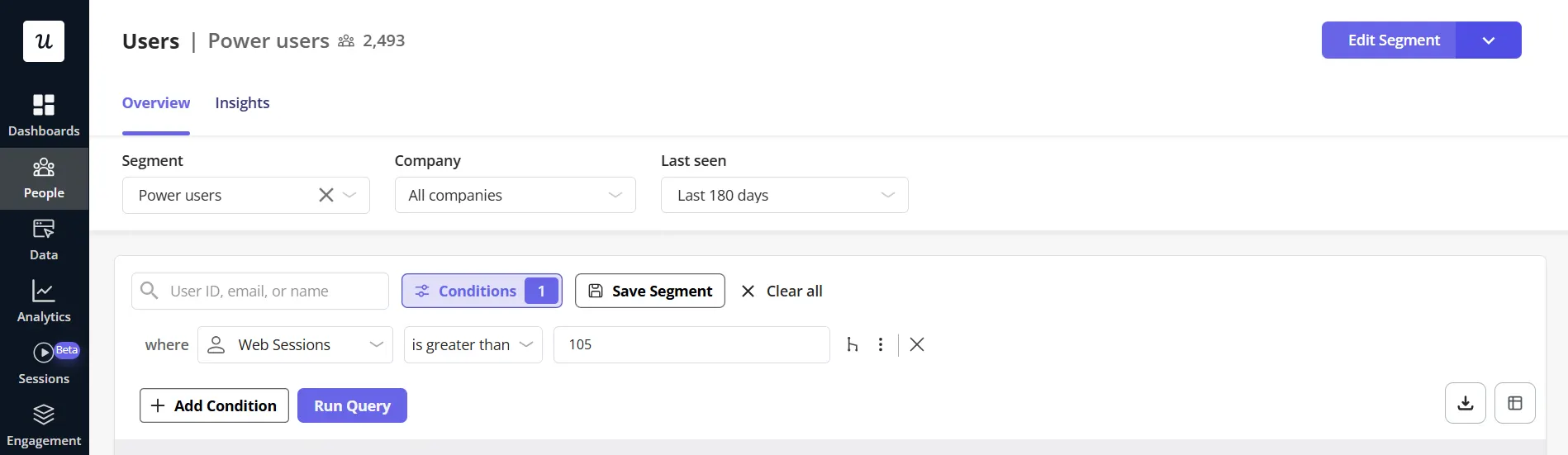
Promoting the event to everyone
It’s tempting to invite your entire user base to an event in the hope of hitting attendance targets faster. While this approach may deliver short-term results, it often damages engagement in the long run. When users repeatedly receive generic, irrelevant in-app messages, they become desensitized and start ignoring them, sometimes even tuning out your brand across other channels like email and social media.
To avoid this, I always segment users and only send event invitations that match their role, maturity level, and goals. For example, I send power users in-app messages linking to advanced masterclasses, and for new users, I trigger invitations to onboarding sessions.
Showing the message at the wrong moment
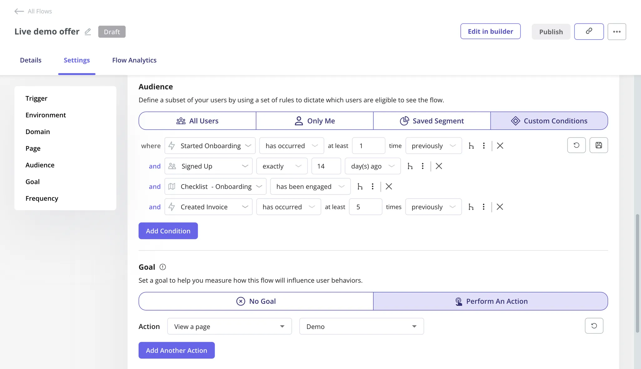
Context is everything. When users are deep in a task, like filling out a form or troubleshooting an issue, an unrelated event promotion appearing mid-flow feels disruptive and out of place. No matter how compelling the event is, poor timing alone can create friction and frustration.
Strong in-app messaging responds to user behavior, not just user presence. Messages that appear after a completed action, during a natural pause, or that directly support what the user is doing feel helpful rather than intrusive. For event promotions that aren’t tied to a specific in-app action, I usually trigger them at the start of a user’s daily session, when their mind is still fresh and not preoccupied with any workflow.
Ignoring accessibility controls
Not all users browse apps in the same way that you do.
For this reason, you should ensure that users who depend on screen readers or keyboards can access your modals just as easily as any other user.
One of my favorite ways to do this is to enable tab navigation through modal elements, then use the Enter key to select the CTA, the X button, or anything else.
Promoting once and disappearing
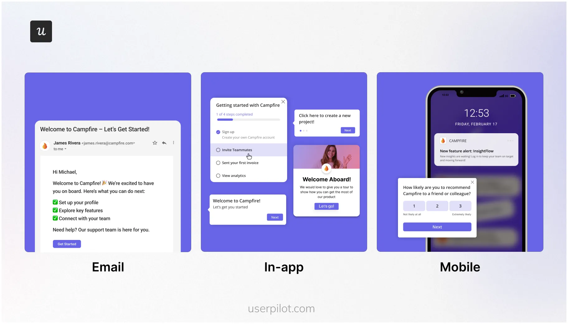
A single message, no matter how well designed, is easy to overlook or forget. Even interested users miss messages. They get distracted, pulled into another task, or tell themselves they’ll “check it later”, and later never comes.
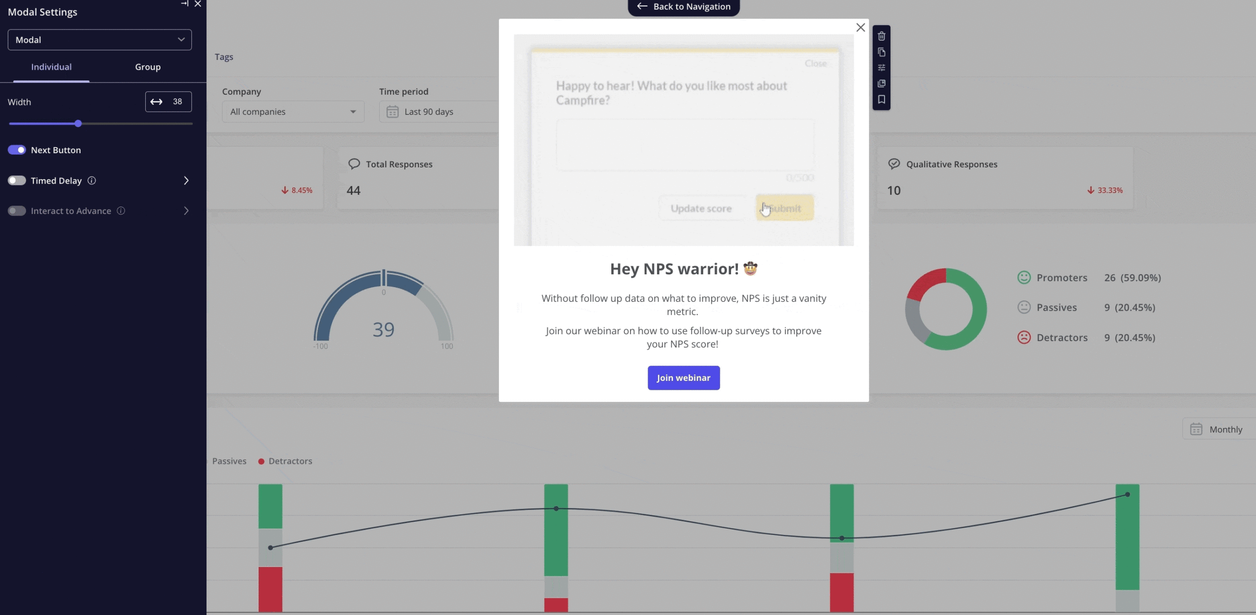
That’s why event marketing shouldn’t be a one-and-done moment. You should apply lifecycle communication principles to it, meaning reinforce the message over time, surfacing it at different touchpoints. For example, once the engages with your event invitation modal, send them an email reminder 2 days before the event and a push notification one hour before.
Overloading the message with too much information
In-app messages aren’t landing pages. Yet I often see teams trying to cram the agenda, speaker bios, dates, times, and FAQs into a single modal. The result is cognitive overload: users skim, feel overwhelmed, and close the message without taking action.
The goal of an in-app event promotion is to spark interest, not answer every question. I keep the message focused on one core benefit and one primary CTA.
And if users want more details, there’s a link directing them to the dedicated page for the event.
How do growth and GTM teams implement these UI patterns?
Traditionally, modals and popups had to be hard-coded into the product, which meant only developers could implement them. This made experimentation slow and limited non-technical teams, such as marketing, growth, and GTM, from iterating quickly.
But nowadays, thanks to no-code product growth platforms like Userpilot, you can design and launch in-app experiences without writing a single line of code, just using a drag-and-drop visual editor.
Let’s go over a detailed overview of Userpilot’s features for in-app messaging:
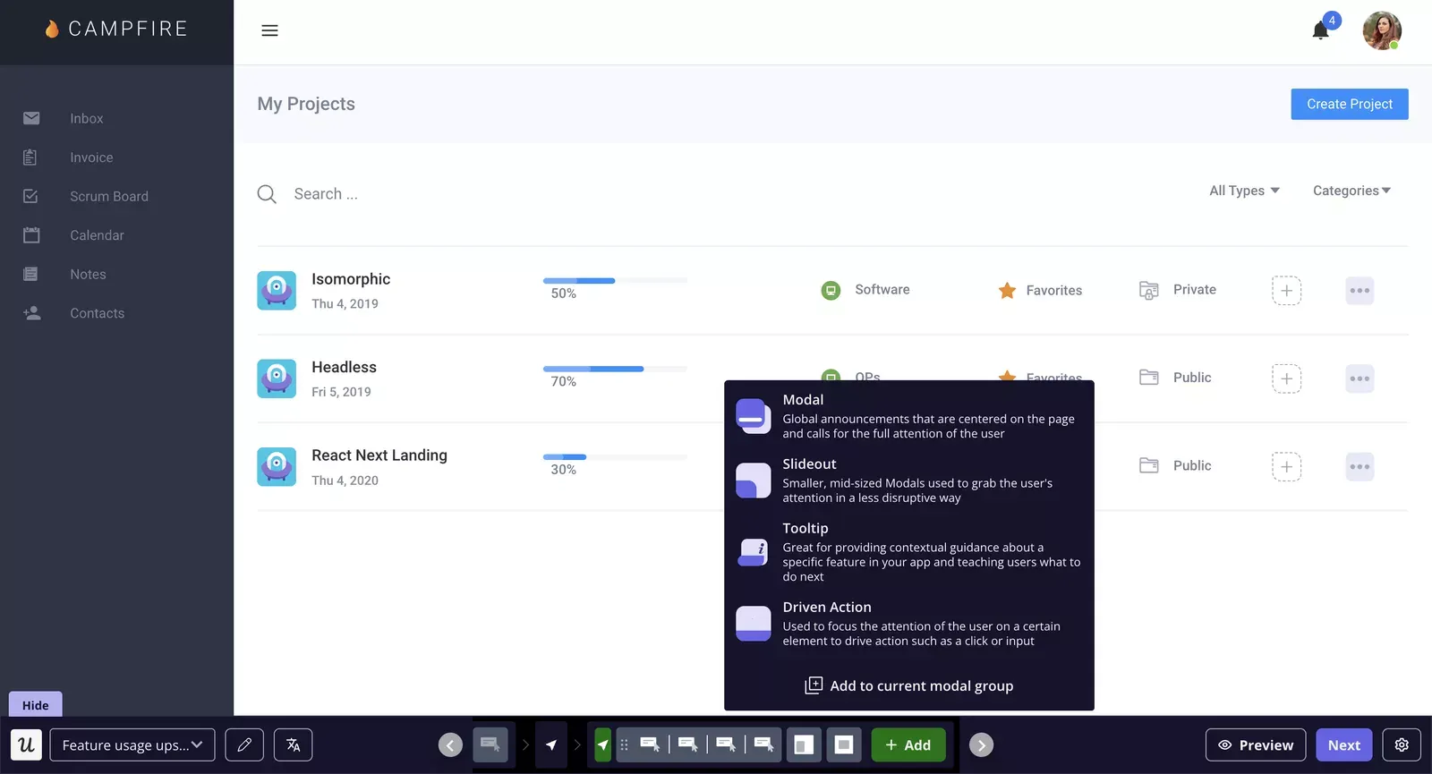
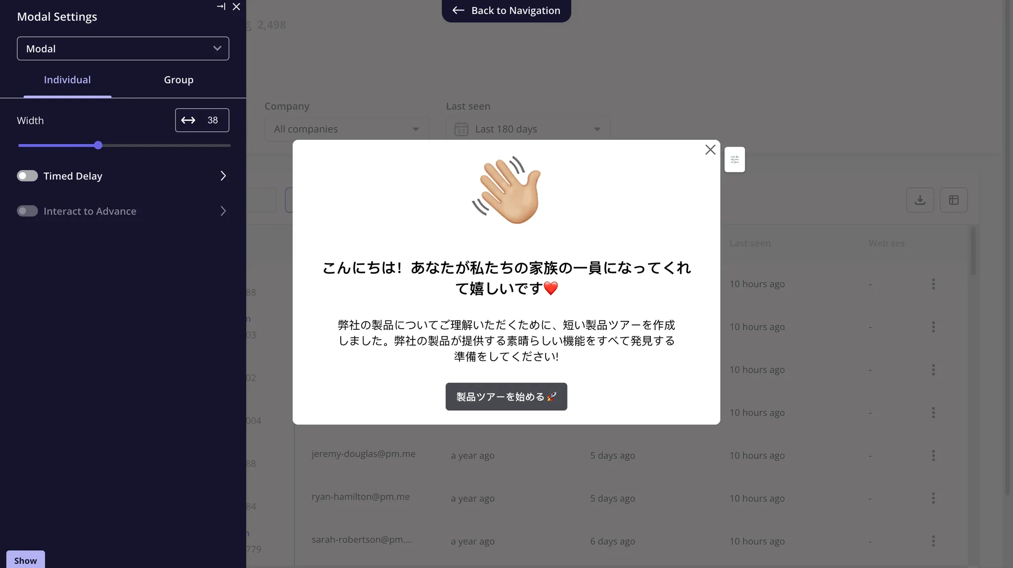
- Rich suite of UI patterns: You can deliver in-app messages in different formats, including modals, tooltips, slideouts, checklists, banners, and hotspots. You can fully customize every part of your message to match your brand, from fonts to colours. Moreover, you can even embed rich media, images, and videos to make your pop-ups more interactive.
- Contextual triggers: You can set up different types of in-app events (clicks, hovers, or even a combination of those into one) and trigger engagement flows when those events occur. You can even segment users based on their behavior and send highly relevant messages, ensuring a contextual product experience.
- AI writing assistant: With Userpilot’s AI writing assistant, teams can enhance and personalize the in-app messages to boost engagement. With artificial intelligence, you can strengthen the copy of your message and even shorten it to improve overall readability.
- Automatic content localization: Userpilot enables you to translate your pop-up content into more than 30 languages with just a click. This way, you reach and connect with global audiences and literally speak their language, increasing the chances of your message resonating with them.
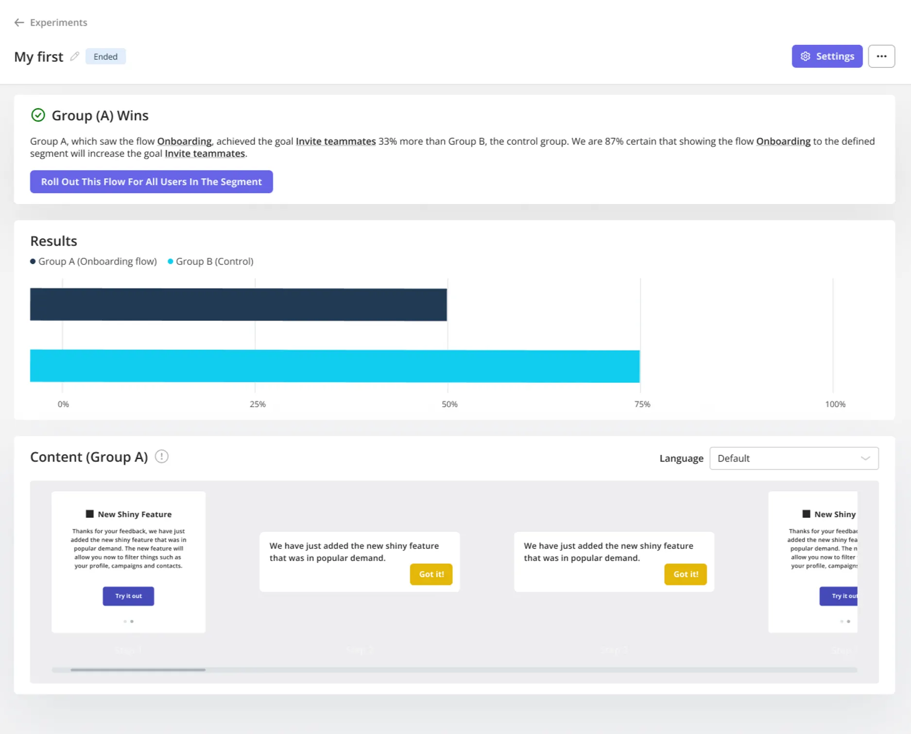
- A/B and multivariate testing: You can run experiments using different versions of an in-app message to identify the most effective combinations (copy, timing, and format) that yield the best conversion rates.
Want to get started with your in-app messaging strategy? Book a demo, and we’ll show you how.
Launch High Converting Modal vs Popup vs Overlay Campaigns Faster with Userpilot
FAQ
Are pop-ups bad for user experience?
Pop-ups aren’t inherently bad, but poor timing or overuse can be disruptive. When used thoughtfully and shown at the right moment, they can be effective without harming UX.
Can I use modals, pop-ups, and overlays together?
Yes. Many products use all three UI patterns at different stages of the user journey, depending on the goal: guidance, activation, or conversion.
About the author