UX KPIs In SaaS: 10 Key UX KPIs That Product Managers Should Keep an Eye On


What is user experience (UX) in SaaS?
The term “user experience” refers to all aspects of how customers interact with a business, its services, and its products.
What are user experience (UX) KPIs?
UX KPIs (Key Performance Indicators) are metrics that are gathered and analyzed to determine the effectiveness of your product’s UX initiatives.
These indicators show how near your product has gotten to meeting its UX objectives and help generate a quantitative report on all types of user interactions. They can also spot user errors and help you address multiple error opportunities.
UX KPIs vs UX metrics: What’s the difference?
It is important to understand how UX KPIs and metrics are different. Although they are closely related, they have different uses.
UX metrics help measure user experience and assess how well users are connecting with your products using UX metrics. These include user satisfaction, loyalty levels (through Net Promoter Score), and satisfaction levels.
These metrics are typically tracked during a campaign because they allow you to quantify qualitative data.
A KPI is any metric used to measure the success of your product’s objectives. It indicates whether or not your strategy is working.
KPIs must be measurable in numeric terms, as they can be used to track development over time and let you change your strategy as needed.
Why should you track UX KPIs?
Here are three reasons why you should measure UX KPIs.
Measure the success of the product and understand if it meets customers’ needs
Firstly, UX KPIs help you understand if users find value in your product and enjoy interacting with it. It answers questions such as:
- Does your product meet the user requirements?
- Are users able to complete the task they want to by using your product?
- How much time do users spend on your app?
Find friction points that block the customer journey
The customer journey has become a multi-channel, multi-stage event. As a SaaS product manager, getting a complete picture of the customer journey and understanding what’s blocking users from advancing further can improve the user experience.
When you monitor real user metrics, you can discover customer pain points, frustrations, and friction points that can be fixed to improve user engagement and generate more revenue for your SaaS.
Optimize and improve user experience
Once you’ve discovered customer issues, your next step should be to solve them to improve user experience. This will result in a greater number of satisfied customers, ultimately leading to higher retention.
Top UX KPIs to track and measure user experience success
When it comes to UX metrics, there are two categories: behavioral (what users do) and attitudinal (what users say).
Behavioral UX metrics
Behavioral metrics include what users do and their activities within your product/website. In other words, they reflect human behavior with your product. Such metrics usually involve:
- Average Time on Task
- Task Success Rate
- Error Occurrence Rate
- Navigation vs. Search
- Conversion Rate
Average time on task
This KPI reveals how long a user takes to complete a certain task successfully. In general, the faster users can successfully finish a task, the greater the user experience.
If you want more detailed information regarding how customers use your product, consider segmenting this measure into “the average task completion time on the first attempt” and “the average task completion time on multiple attempts”.
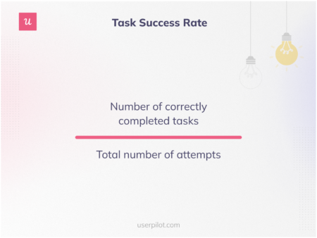
Task success rate
In SaaS, the task success rate is the extent to which your users can complete tasks using the product successfully.
To calculate the task success rate, divide the number of correctly completed tasks by the total number of attempts.
For example, if a user attempts to complete a task 25 times and achieves task success only 15 times, the rate is 15/25 = 0.6.
Task success rate
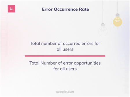
Error occurrence rate
The error occurrence rate, or simply user error rate, tracks how frequently users make mistakes during a specific task.
Measuring this can help you identify where users face difficulties with your product. This information can be used to develop future product updates and UX designs.
Error occurrence rate
Tracking the user error rate helps you answer questions such as:
- Should you focus more on educating and training your users?
- Is the user interface simple or too complicated?
- How can you minimize or eliminate common user mistakes while using your product?
This metric enables you to identify how the platform or product could be modified to reduce errors by highlighting users’ most frequent errors.
For instance, if users consistently make errors when filling out a form, it may be that the fields lack formatting instructions for collecting data. Another possibility is that potential customers would skip through some fields because the form is too long.
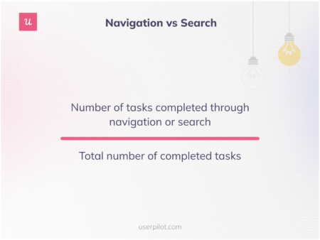
Navigation vs search
A new project design should consider the target audience’s preferred usability. Some users might need enhanced searchability, while others prefer seamless navigation across your product’s app or website.
When it comes to your UX design, measuring the preferences for navigation vs. search can help you make changes that matter to your consumers. Instead of preferring one over the other, your best option would be to create a balance between clever navigation and intuitive search features.
Navigation vs search
This will make the design more enduring over time and ensure that your product offers a smoother user experience to a wider client base.
Conversion rate
The conversion rate measures how many people or new visitors complete tasks such as signing up, completing the free trial and converting to a paid account, etc.
For example, your website gets 100 new visitors every day, but only 20 of them complete the signup process successfully. So, your conversion rate is 20%.
Naturally, you should focus on increasing your conversion rate. Using interactive walkthroughs to guide new users, and then sending microsurveys to collect feedback are just a few ways to increase your conversion rates.
Attitudinal UX metrics
Attitudinal KPIs and metrics involve how users feel and what they say regarding your product. These can be:
- Feature Adoption Rate
- Customer Satisfaction Score (CSAT)
- Net Promoter Score (NPS)
- System Usability Scale (SUS)
- Customer Retention Rate
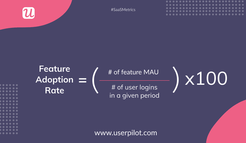
Feature Adoption Rate
As an alternative to monitoring general product usage, you can zoom in and concentrate on the time your users spend with particular features. This allows you to determine how useful a given feature is for an individual customer or your entire client database. This is known as the feature adoption rate.
To calculate this, divide the number of monthly active users for a feature by the number of users who log in within a given period.
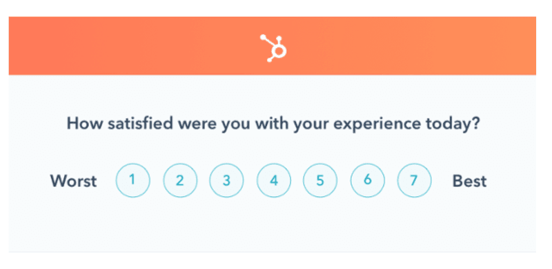
Customer Satisfaction Score (CSAT)
The Customer Satisfaction Score allows you to understand a user’s perceived satisfaction. Similar to NPS, it offers a fast way to quantify the user experience.
You can simply ask users how they feel towards your product and have them rate their satisfaction on a five-point scale, which ranges from extremely unsatisfied to very satisfied.
There are several ways to collect data for your CSAT score, such as online surveys and user interviews. If you’d prefer to communicate with users while they are actively using the product, you can schedule a popup that asks, “How satisfied are you with your experience today?” when users have completed two or three successful tasks or interactions.
Here’s how Hubspot does it.
For best results, you should measure CSAT several times throughout the user journey to get more detailed findings and get a better sense of how customers are feeling as they use the product.
When signing up or completing onboarding, for instance, new users could respond in a different way than users who have been using the product for a while.
Net Promoter Score (NPS)
The Net Promoter Score (NPS) measures UX using one simple but essential question “How likely are you to suggest this product to your friends?”. Then, users choose an answer on a scale from 1 to 10, with 1 being the least likely and 10 being the most likely.
You can calculate the score by subtracting the percentage of detractors (those who choose between 0 and 6) from promoters (those who choose 9 or 10).
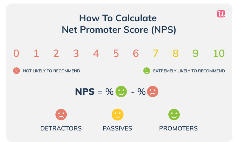
This metric is very useful. It helps you gauge user loyalty and gives you valuable insight into how much they like the product.
It also indicates whether a consumer intends to keep using your product or service. Additionally, whether they would suggest it or not also highlights whether they are content with it enough to promote it actively.
System Usability Scale (SUS)
John Brooke and his colleagues first created the System Usability Scale (SUS) in 1991 at the University of Maryland’s Department of Human-Computer Interaction. It is an online survey that asks respondents how usable a website or product is, i.e., they enable usability testing.
Since then, it has evolved into a widely accepted industry standard, and many product managers now utilize it to gauge how well users are responding to their technologies (also known as perceived usability).
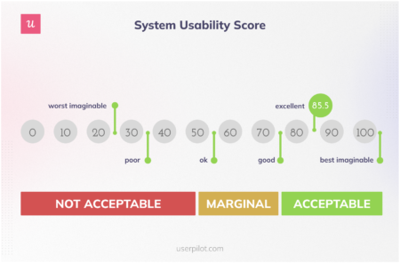
System Usability Scale
However, SUS is not a substitute for hiring a user research team. You’ll still require data-driven insights that explain why users give you a low or high rating. For example, you can gain some insights when you ask your users how easy a certain feature was to use.
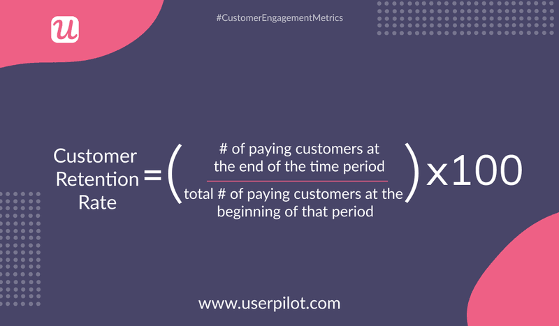
Customer Retention Rate
The customer retention rate measures the percentage of users who keep using your product for a long time.
You can calculate this metric by dividing the number of paying customers at the end of a period by the number of paying customers at the beginning of that period. You can use different periods, such as a week, month, or three months, to track how many users are retained over longer periods.
Utilizing retention rates can help you decide which features to focus on and your product’s best next steps.
For example, a user might use a new feature for a few days but not continue with it in the long term as it might not be useful or fun to them.
Conclusion
Choosing the right UX metrics and KPIs depends on your product’s goals you want to achieve.
To ensure you’re meeting your goals and providing a valuable user experience to all of your customers, you can start by tracking conversion rates, the amount of time spent on tasks, and measuring the general usability of your UX design.
Want to track your UX KPIs and collect invaluable insights? Get a Userpilot Demo and see how you can measure multiple errors, track user performance, and stop losing users due to poor UX designs.
About the author