First-Time User Experience (FTUE): Best Practices, Examples, and How to Improve It with AI


The first-time user experience is where the most impactful user onboarding happens. 88% of online consumers are less likely to return after a bad experience and first impressions are 94% design-related, which together means that the first impression a product gives users will have an outsized impact on retention rates.
Kevin Henrikson, co-founder of Pretty Good AI, has the perfect analogy for why first impressions are so important:
“Users judge your product in 50 milliseconds. At Microsoft and Instacart, I learned 60% never return. I call it the ‘Kleenex User principle’. Just like you can’t un-use a tissue, users can’t un-experience your product. That first interaction permanently shapes their perception.”
For most SaaS teams, FTUE used to be treated as a one-time design problem where you ship an onboarding flow and revisit it at the next UX review. That framing has now been replaced by AI-powered personalization, real-time behavioral analytics, and continuous A/B testing that make it possible to treat the first-time user experience as a system that should improve with every new cohort (rather than a deliverable you finalize then move on from).
This guide will equip you with eight strategies for improving your product’s first-time user experience, real examples of strong FTUE design, and a section for mobile-specific FTUE that too many articles neglect.

What is FTUE and why does it matter in 2026?
FTUE (first-time user experience) is the sum of everything a new user perceives, decides, and concludes during their first interaction with your product. It covers how easy it is to get started, what they discover along the way, and whether the product’s core value lands before they close the tab.
Three years ago, a well-designed SaaS signup flow and a clear “Aha!” moment were enough to be competitive.
Two forces have since raised the bar:
- Mobile has set a baseline expectation for frictionless first sessions.
- AI-native products have redefined what “personalized” actually means.
Users who sign up nowadays have been through dozens of onboarding experiences, and the best ones have trained them to expect near-instant value.
The data supports this shift. According to the 2025 edition of our SaaS Product Metrics benchmark, the average SaaS activation rate sits at 37.5%. This means only a third of users who sign up ever reach the moment where the product actually delivers what it promised. For mid-market companies in the $10–$50M revenue range, that number drops even lower to 17.6%. The gap between median and top-quartile performers has grown every single year since 2022, which means having average onboarding now carries a much higher cost than it did three years ago.
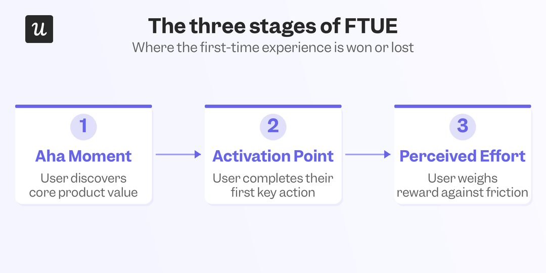
The three core stages of first-time user experience include:
- The “Aha!” moment: When a new user first realizes the product could actually solve their problem. It happens during the first few real interactions, not during a welcome tour or setup checklist, and it’s the hook that makes users want to keep going. AI-powered behavioral analysis can identify when users in a cohort are statistically likely to reach it, so you can trigger a contextual nudge at that exact point rather than on a fixed schedule.
- The activation point: When a user has used the core features and confirmed through direct experience that the product works for them. This is the metric that actually predicts retention, not first-session engagement alone. Benchmarks vary widely by category: AI/ML tools sit at a median 54.8% activation while FinTech sits at just 5%, largely due to compliance-driven setup complexity.
- Perceived effort and experience: How much work a user thinks they have to do before the product becomes useful. A product that delivers value on step two feels easier than one requiring five setup steps, even if the time spent is identical. CES surveys measure this on a 1-to-7 scale, and AI-assisted targeting makes it easy to send them immediately after a key interaction rather than at a fixed post-signup interval, which is when the data is actually clean.
How to create a great first-time user experience for SaaS (and how to improve it with AI)
The strategies below aren’t a checklist of set-and-forget tasks. Each strategy is continuously improvable because the real goal isn’t just to get the onboarding flow right once but to build infrastructure that improves with each new cohort of users.
1. Understand user expectations with a welcome survey
The single most effective thing you can do for FTUE is to collect basic segmentation data at signup. A short in-app survey or a quick question on the welcome screen lets you ask users about their role, primary use case, and what brought them to your product. That takes 90 seconds for the user and gives you the inputs you need to personalize everything that follows. Users don’t hire your product for its features; they hire it to make progress on something they already care about and complete their jobs to be done. The segmentation data from your welcome survey is how you find out what that something actually is for each type of user.
AI-powered classification can route new users into differentiated onboarding tracks based on a small set of signup signals, without requiring users to answer a long questionnaire that adds friction before they’ve experienced any value. Fewer questions asked mean higher completion rates, which in turn yields more usable segmentation data across the board.
2. Personalize onboarding by user JTBD
Once you have segmentation data, the next step is actually using it. A user who says they’re new to email marketing needs a different path through your product than someone migrating from a competitor. Treating them identically means optimizing for neither.
ConvertKit exemplifies this by routing new users and experienced users into fundamentally different flows based on their welcome survey answers, reducing the time to value for both.
Userpilot’s personalized onboarding takes this further by triggering different flows based on user attributes and real-time behavioral signals, rather than requiring teams to build and maintain rulesets for each cohort. As user behavior patterns shift, the logic updates accordingly to ensure the personalization stays accurate over time without manual intervention from the product team.
3. Replace product tours with contextual interactive guides
Long product tours that fire once at signup are designed for user swho wants a full walkthrough of every feature on day one. The thing is, most users don’t want that as they’re just trying to accomplish one specific job or task. Interactive walkthroughs are more effective because they appear at the most contextual moment of the user journey rather than serving a generic sequence every new user receives regardless of what they’ve already done.
These interactive guides can be triggered based on where a user is in the product, what they’ve already completed, and what behavioral signals suggest they need next. The result is an experience that adapts to the individual user’s pace and path rather than following a boilerplate script. That distinction becomes increasingly significant as your product grows more complex and the types of user journeys expand.
4. Use UI design patterns to shorten time to value
UI design patterns like tooltips, onboarding checklists, and contextual modals reduce cognitive load when users are trying to accomplish something with your product. A tooltip that explains a field right as the user is about to type into it removes a question before it becomes a friction point.
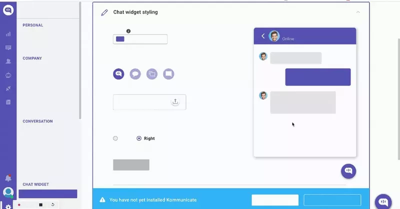
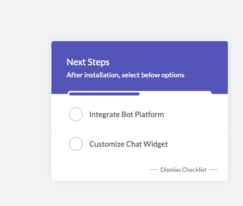
The Kommunicate example below shows how pairing a checklist with inline walkthroughs gives users a clear sense of what to do next, then offers contextual guidance as they do it.
5. Write conversational microcopy
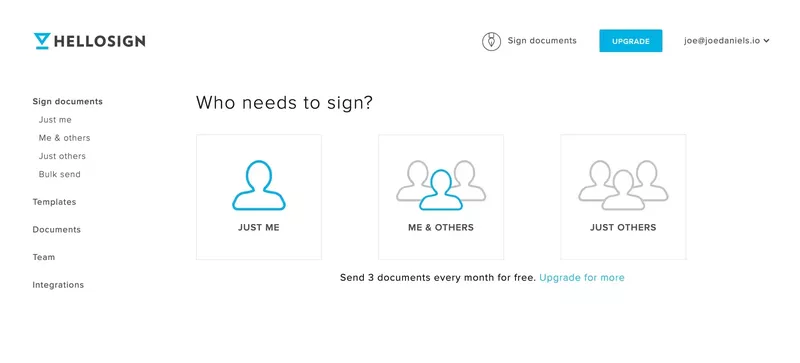
The copy inside your onboarding flow matters more than most teams give it credit for. Corporate or robotic onboarding UX copy creates emotional distance instead of making users feel welcomed. On the other hand, conversational microcopy makes the experience feel personal and makes the product feel less daunting. HelloSign’s opening question, “Who needs to sign?” is a classic example of how a casual three-word question can make segmentation feel like a natural step instead of an intimidating survey.
AI-assisted copywriting can help you generate and test variations of tooltips, empty states, or checklist labels against your activation metrics without as much overhead as manual QA cycles. The copy that makes users feel confident and in control often wins, with behavioral data telling you which version is empirically superior rather than relying on assumptions or preferences.
6. Add gamification to sustain momentum
Gamification works on the basic principle that the closer someone is to completing a task, the more motivated they are to finish it. Progress bars, gamified checklists, and milestone unlocks tap into this instinct directly. When a user can see they’re five out of six steps through an onboarding checklist, the pull to complete the sixth step is stronger than any in-app message you could send them. ProdPad takes this a step further by offering rewards for each task you complete in the onboarding checklist so that more engaged users get longer trial lengths.
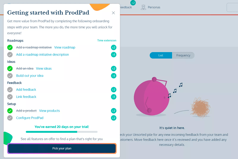
Gamification triggers can be dynamically calibrated based on behavioral data from the current session. Dynamic triggers ensure that a user moving quickly through setup gets different onboarding pacing than one who has already paused twice. This creates a motivation system that adjusts based on how each user actually behaves rather than optimizing for a hypothetical average.
7. A/B test onboarding flows against activation metrics
A/B testing is the best way to convert hunches about what makes a better FTUE into actual evidence. Testing a revised onboarding flow, a different welcome survey question, or an updated empty state against your current activation rates will give you an objective answer rather than a preferred assumption. The challenge has always been running enough tests to generate meaningful data without slowing down the product team. Userpilot’s experimentation tools automate winner selection based on activation rate and time to value so that teams aren’t waiting on someone to run a significance test manually.
Lia, Userpilot’s AI analytics assistant, surfaces which flow variant is driving the strongest downstream retention (not just first-session engagement) without requiring manual statistical analysis.
This lets smaller product teams run continuous onboarding experiments at a tempo that simply wasn’t practical (or even possible) just a few years ago.
8. Offer self-serve support for users who get stuck
When a user gets stuck during their first session, they are faced with the choice between figuring it out on their own or waiting for a support agent to get back to them. Support tickets can take hours to resolve which is long enough for new users to decide that the product isn’t worth the friction. Self-serve support in the form of an in-app resource center or searchable help content can remove that delay entirely and keep users in the product, instead of sending them off to external channels that they may never return from.
The completion rate for users who get help in-context versus those who leave the product to find it is significant and compounds across the entire first-week retention window. For a deeper look at what well-designed help experiences look like in practice, our guide on the 15 Best Help Center Designs for SaaS in the AI Era covers the best practices of designing self-serve infrastructure within your product.
How to improve FTUE: Successful examples from SaaS companies
The examples below aren’t selected for visual appeal. Each one makes a deliberate design decision that lowers the customer effort required to reach the aha moment and something specific that’s worth adapting for your own product.
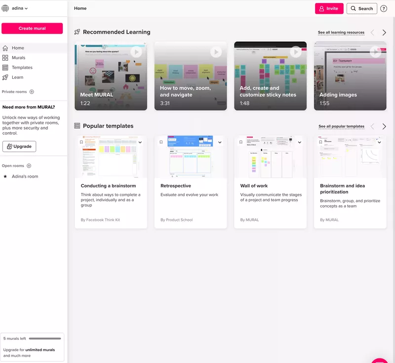
Mural and Todoist: Personalized empty states
Mural solves the blank-canvas problem by ensuring new users never actually face one. The dashboard that appears after signup categorizes learning videos by skill level, recommends templates organized by use case, and places a prominent “Create mural” button for users who’ve already oriented themselves and want to start immediately.
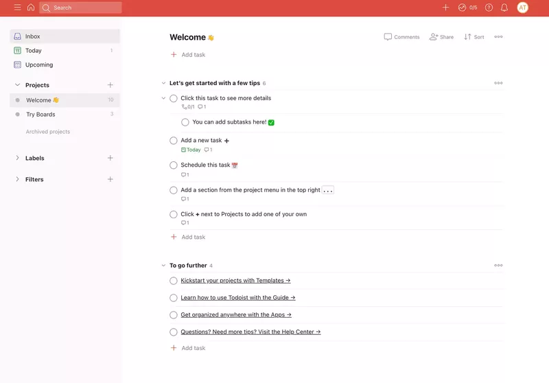
Todoist takes a different approach to the same problem by prompting new users to add their first tasks as part of getting started, which means they’re building their own workflow while being guided through the product’s value. Using a product to teach itself is one of the cleanest FTUE patterns available, though it works best when the core feature is simple enough to start without prior instruction.
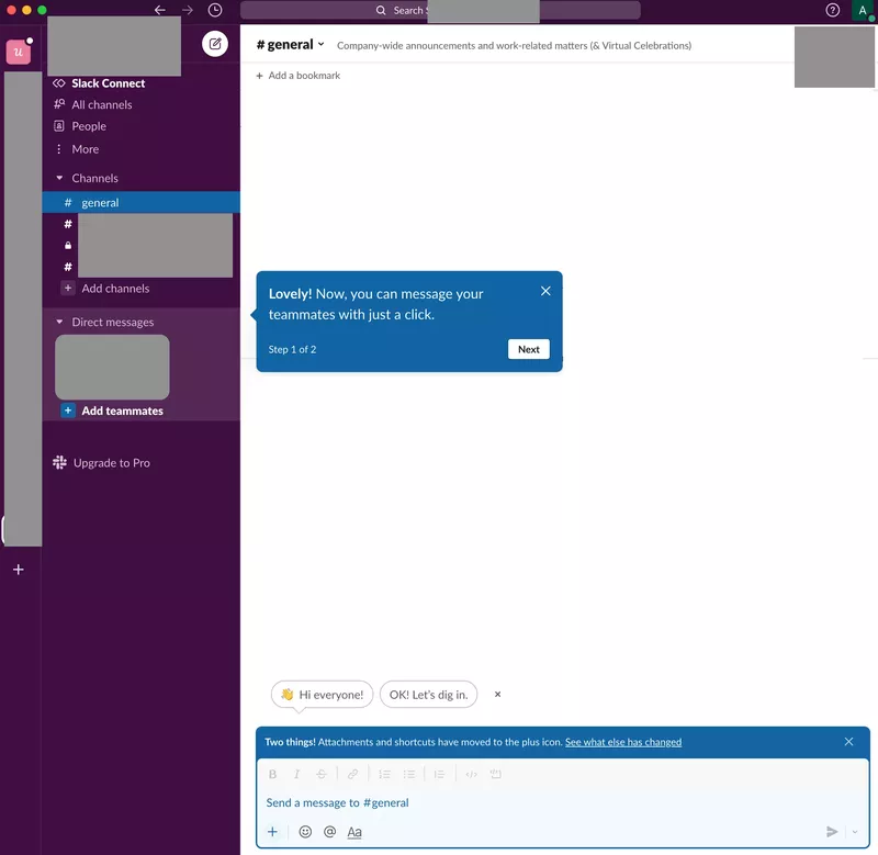
Slack: Tooltips with progress-aware microcopy
Slack’s onboarding breaks setup into explicitly labeled steps with “step 1 of 2” progress indicators so users always know how far they are from done. The tooltips use conversational language that matches the product’s overall tone. This combination of visible progress and friendly copy keeps users organically moving through a setup process that could otherwise feel like an obligation.
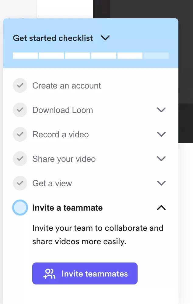
Loom: Gamified checklists with virality
Loom’s onboarding checklist is a near-perfect execution of using completionism to drive activation. New users land on a checklist with a visible progress bar (with “create an account” already pre-checked), giving users immediate momentum before they’ve even done anything. The closer users get to finishing, the harder the checklist is to abandon, so why not start them off with a pre-completed task?
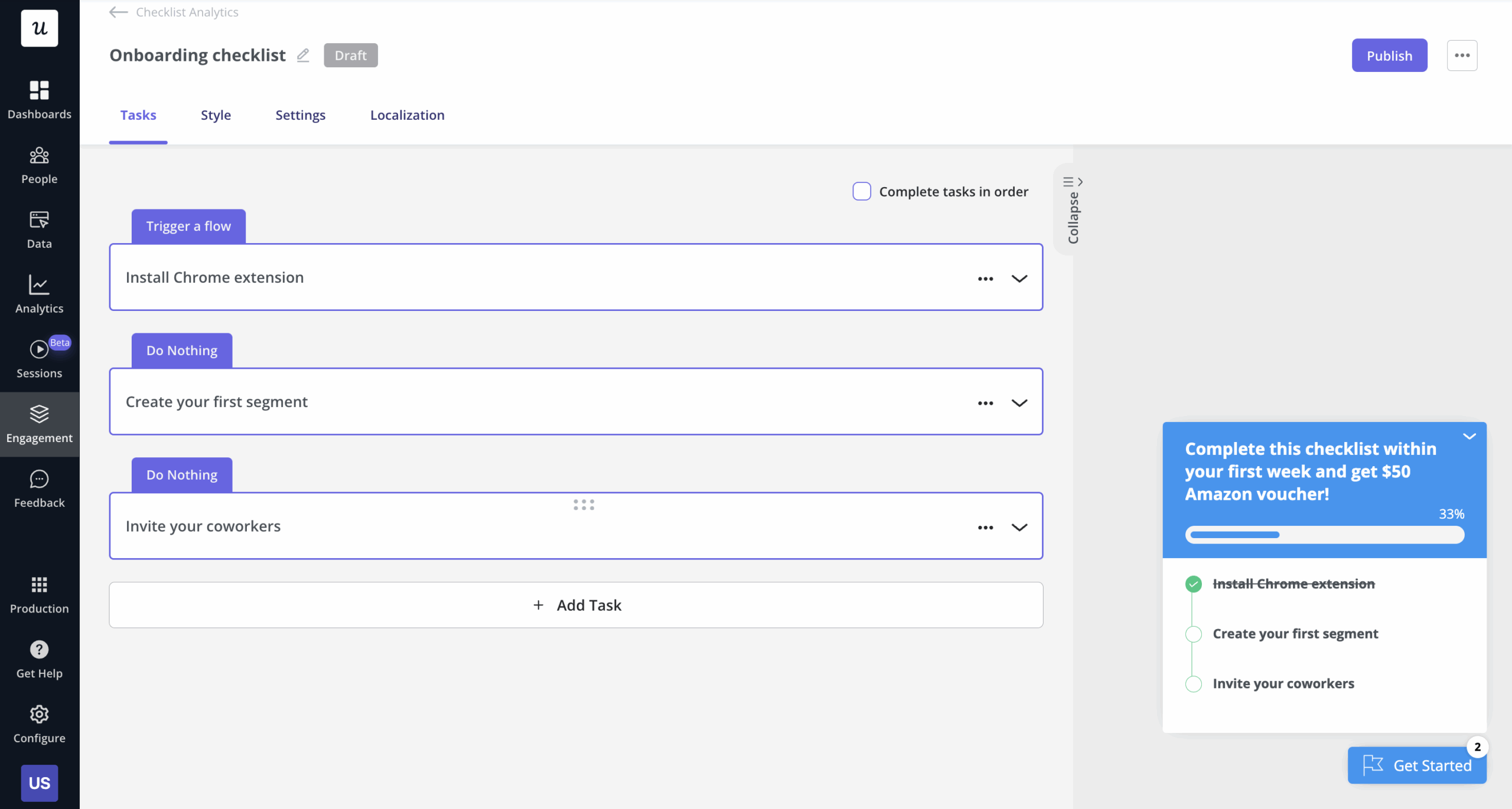
Building onboarding checklists in Userpilot lets you pre-complete tasks like account creation, so that users are already one task deep when they first see their checklist. You can also pair each item with an in-app guide that fires when the user clicks into the task, so the checklist and interactive guide work together rather than splitting the user’s attention.
Notion: Intent-based personalization
Before showing anything else, Notion asks users a single question: “How are you planning to use Notion?” That one answer (whether work, personal, or school) shapes which templates surface, which starter workflows appear, and what the default workspace looks like on first login. By the time the user reaches their dashboard, it already reflects what they said they need, which provides a significantly shorter path to the aha moment than landing on a generic blank workspace.
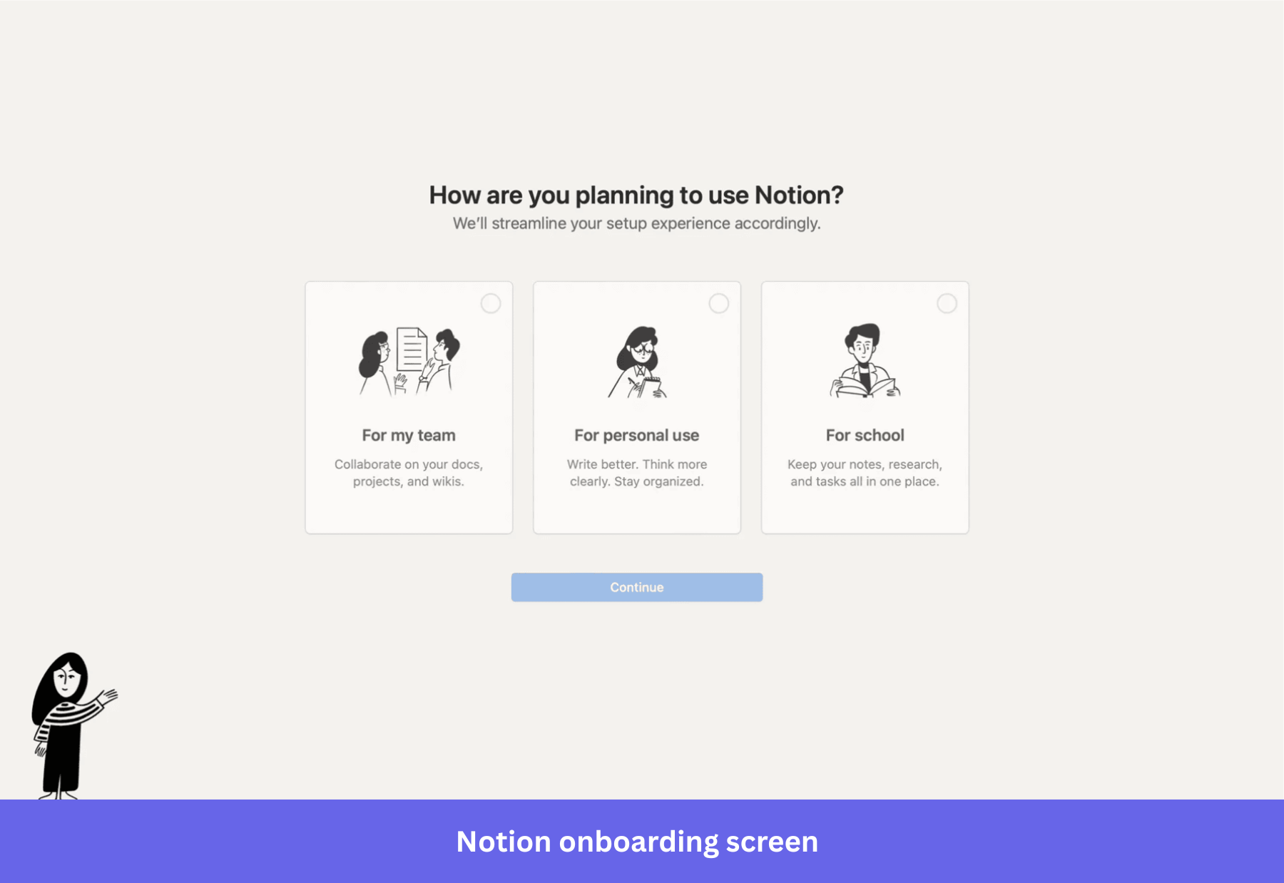
The implication for your own product is about the question you ask at the top of the funnel. A one-question welcome survey with three or four well-chosen segments can have more impact on first-week retention than other UX improvements made further down the onboarding path. In general, personalization signals collected at signup produce stronger downstream retention than personalization applied retroactively based on behavior alone.
Canva: Template-first activation
Canva doesn’t make new users start from a blank canvas. The onboarding drops them directly into a pre-built design that doubles as a tutorial, and the walkthrough consists of choosing a template and then making real edits (such as adding text, swapping an image, or changing colors) to it. By the time users finish, they’ve already created something they could share. That’s Canva’s aha moment arriving before the user even decides what to make.
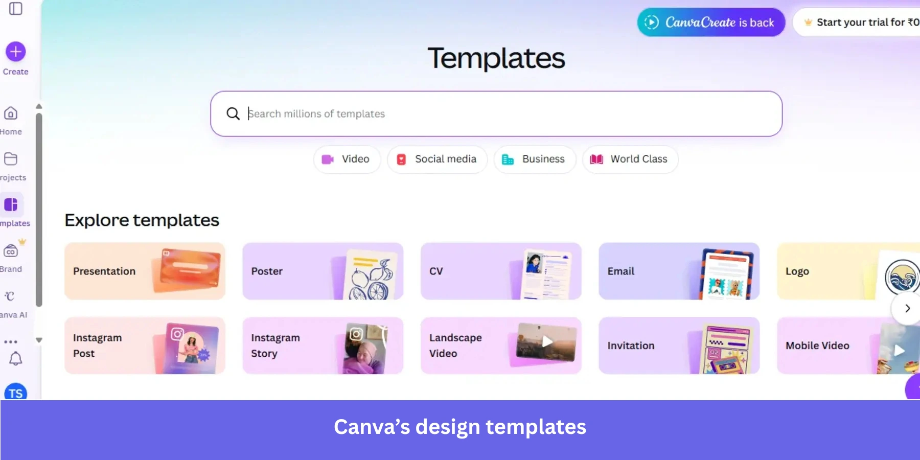
The lesson here is that an empty state is a missed activation opportunity. If your product’s core value can be demonstrated through pre-populated examples or starting templates, you can deliver the aha moment before the user has had to build anything from scratch. This removes one of the most common barriers to activation for users who don’t know where to start.
Figma: Interactive canvas learning
Figma doesn’t explain the design tool to new users. It simply puts them on a canvas and prompts them to draw a shape, apply a color, or create a frame. Each action produces real output, and by the end of the onboarding sequence, users have created an actual prototype. This means the activation event and the aha moment happen almost simultaneously.
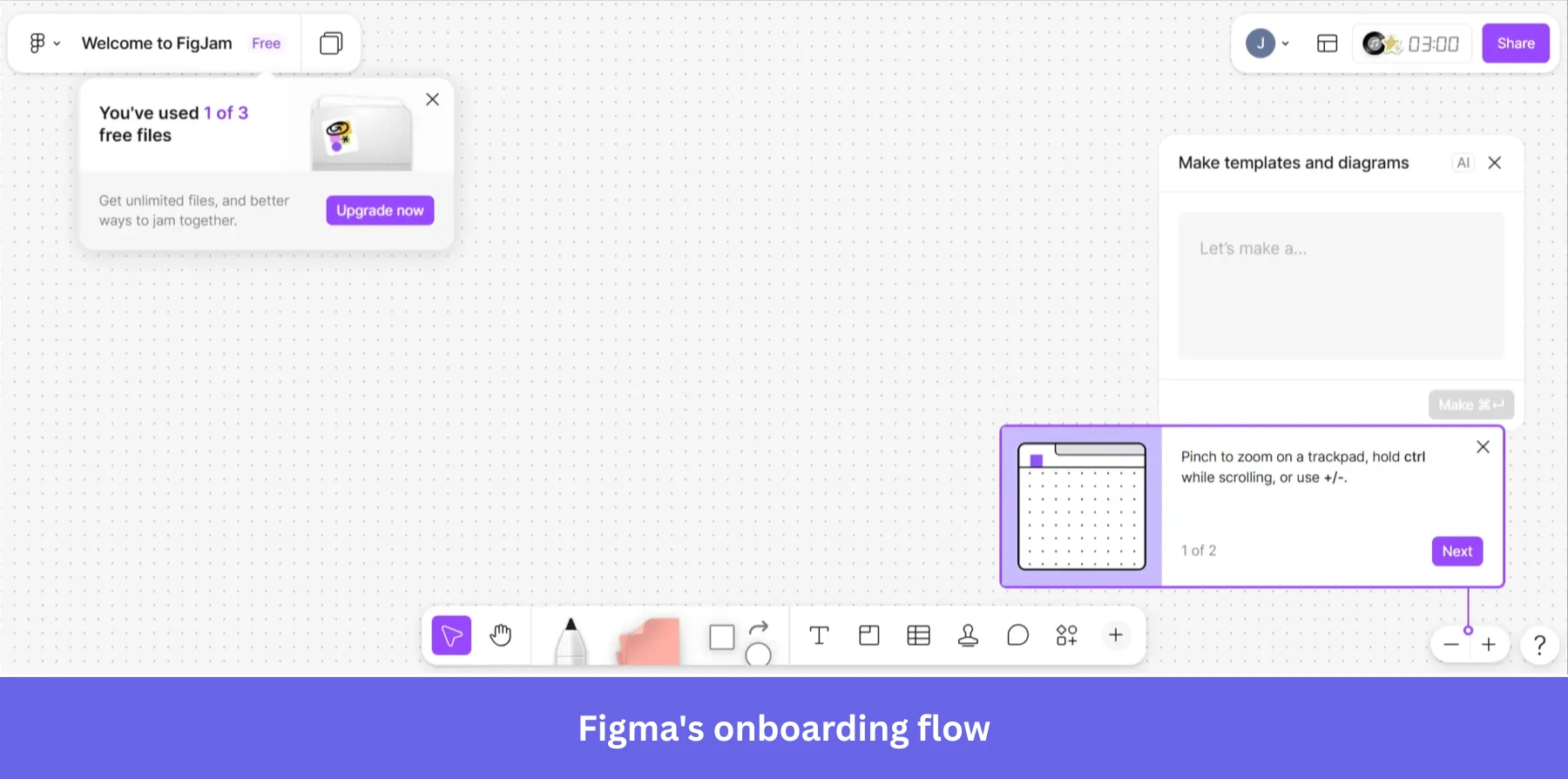
This approach works because Figma’s core value is the canvas itself. For products where the primary interface is the main value driver, interactive onboarding that teaches by doing consistently outperforms walkthroughs that explain features before letting users try them. The trade-off is that the first interactive task must be simple enough to complete without getting stuck because users who fail on step one will have a much higher abandonment rate than those who fail on step five.
FTUE best practices and examples for mobile apps
Adrian Kuleszo, founder of DesignMe, explained the importance of mobile FTUE clear as day:
“Most apps lose 80% of users in the first 3 days. Users decide to stay or delete faster than you think. One of the main reasons is your onboarding. The best onboarding should feel invisible. Users accomplish something meaningful without realizing they’re being ‘onboarded.’ When first-time experience creates immediate value, retention follows naturally.”
Mobile FTUE differs from web SaaS onboarding in ways that most guides don’t address. Permission requests for push notifications/camera access/location ask for user trust before establishing value, touchscreen keyboards make multi-field questionnaires actively hostile, and gesture-based interaction patterns are harder to learn from. The app store context also means users arrive with lower intent than a signed-up SaaS user because they haven’t paid yet, and deleting the app during their evaluation process costs them nothing.
The result is a much shorter window to demonstrate value on mobile than on any other platform. The delete decision happens within 72 hours for most apps, making first-session design far more consequential on mobile than web (which is why you can’t simply port your web-based onboarding patterns directly to mobile without hurting retention).
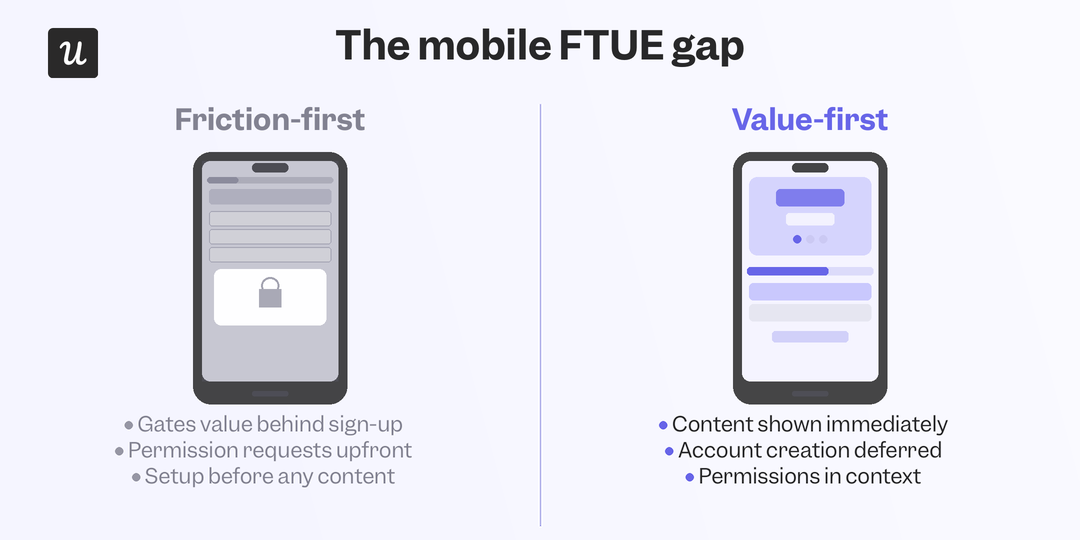
Duolingo: Value before account creation
Duolingo lets users start their first lesson before creating an account. There’s no registration wall, permission request, or setup sequence between landing on the app and experiencing what the product actually does. Account creation is requested after the first lesson when a user has already invested time, experienced value, and made progress that they want to save.
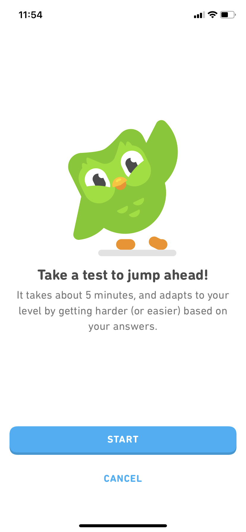
The principle worth taking from this is about ordering. Most apps ask for everything (account, email verification, notification permissions, and preference settings) upfront before showing any value. Duolingo inverts that sequence entirely because the retention impact of demonstrating value before asking for commitment has been consistently documented across mobile product research.
Spotify: Taste profiling at setup
Spotify’s mobile onboarding asks new users to select artists they already like using a visual grid of thumbnails that can be tapped quickly without typing. This gamified setup step feels like play rather than a boring survey or form. The result is a home screen personalized to the user’s actual taste from the very first session, with the aha moment arriving right after setup (rather than after several listening sessions while the algorithm learns).
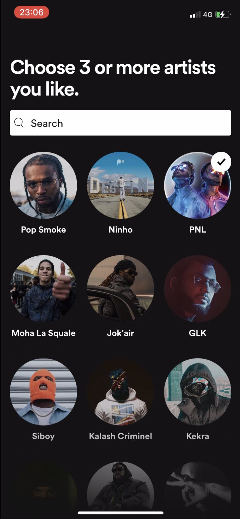
The framing matters as much as the mechanic because “select artists you like” feels very different from “answer these questions so we can personalize your experience,” even though the intent and outcome are identical. Spotify’s version works on mobile because it looks and feels like the product itself rather than a form added as an afterthought, which makes all the difference when users are one thumb-swipe away from closing the app.
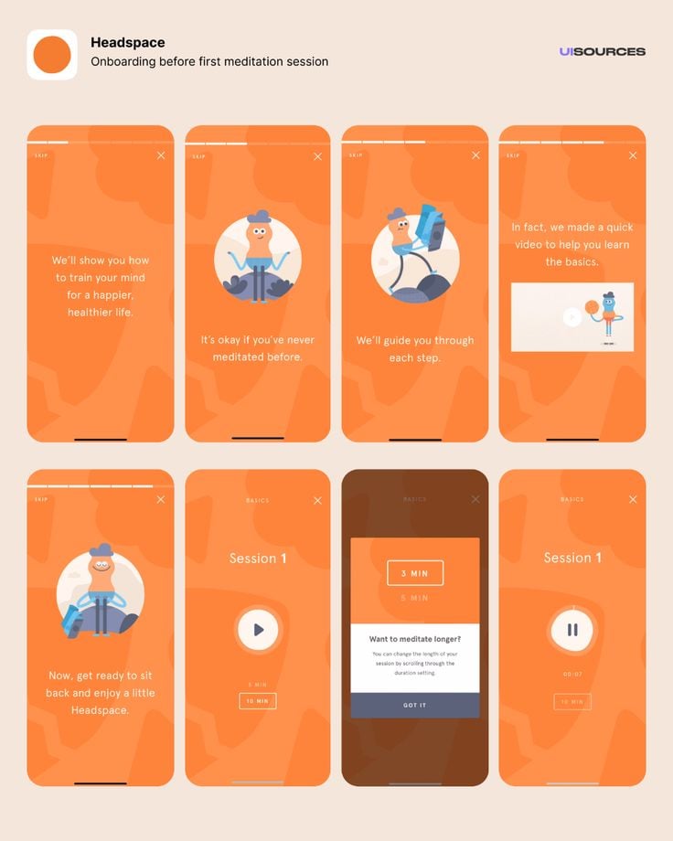
Headspace: Guided first session before paywall
Headspace delivers a complete introductory meditation session to every new user before presenting a subscription option. The product’s core value (guided meditation that actually works) is fully experienced before anything is asked in return. The paywall then appears immediately after the user has just experienced exactly what they’re being asked to pay for and are most motivated to do so.
Session replay analysis of first-72-hour behavior (specifically focusing on users who deleted the app) can identify the precise moment in the first session where the delete decision usually occurs. That data pinpoints exactly where a targeted intervention (like a contextual prompt, push notification, or feature spotlight) would be most impactful.
FTUE as a system, not a project
The first-time user experience isn’t a design deliverable that ships once and gets revisited annually. The teams with the strongest activation metrics treat it as it is: infrastructure. A connected system of segmentation, contextual guidance, behavioral triggers, and continuous experimentation that can improve with more data or better tooling. As a UX researcher, the shift I’ve noticed most directly is what AI-powered behavioral data now makes possible.
Rather than auditing an onboarding flow manually and hoping users respond to surveys, I can watch where users actually drop off, identify who is worth talking to based on session behavior, and target interventions at the exact friction point the data surfaces rather than the one I assume is the problem. Userpilot’s segmentation, personalized onboarding flows, A/B testing, and AI agent Lia give teams the infrastructure to run FTUE as a continuously improving system rather than a periodic redesign project.
If you want to see what that looks like in practice for your product, book a demo so we can walk you through it!
About the author