10 Key UX KPIs in SaaS to Keep an Eye on in the Agentic Era


UX KPIs are the quantitative measurements that tell you how well your product closes that gap between analytics data and action items that move the needle. They translate subjective experience into numbers you can track over time, defend in planning sessions, and use to plan (and justify) design changes.
But in 2026, the standard list of UX KPIs has a problem: it was built for human users.
A meaningful share of product traffic is now AI agents completing tasks on behalf of users, without clicking, scrolling, or filling out forms the way a human would. Several classic UX KPIs are effectively blind to that traffic. Understanding which metrics still apply across your full user base, and which need an agent-specific equivalent, is one of the most consequential measurement gaps most teams haven’t closed yet.
In this guide I walk through top 10 UX KPIs, explain how to calculate each one, and flag which are genuinely decision-triggering versus the ones that are useful to monitor but rarely trigger immediate action. I also cover how the right KPI set changes depending on your product stage, and what breaks when AI agents become a real share of your traffic.

Why should you track UX KPIs?
Tracking the right UX KPIs can help you see how UX decisions impact your revenues:
- They reveal whether your product is actually working: UX KPIs answer the questions that qualitative feedback can’t answer at scale: are users completing the tasks they came to complete, and are they doing it efficiently?
- They surface friction before churn becomes the signal: The customer journey has become a multi-channel, multi-stage event. Users move between mobile, web, and API integrations, and friction points don’t always announce themselves through support tickets. UX KPIs surface where drop-off is happening weeks before it shows up in churn data. It enables you to intervene to reduce churn.
- They connect UX decisions to business outcomes stakeholders care about: A decline in task success rate has a direct line to conversion and retention. A falling NPS predicts churn 60-90 days before it appears in revenue metrics. When you can show that a specific UX change moved a KPI that moved a revenue metric, UX work stops being justified by intuition and starts being justified by numbers.
Types of UX KPIs: Behavioral vs. attitudinal
You can broadly divide UX KPIs into two categories:
- Behavioral UX KPIs track what users actually do inside your product. They come from event data, session recordings, and funnel analytics. Essentially, they are observable actions rather than stated opinions. Task success rate, error occurrence rate, and conversion rate are all behavioral. The data is generated by how users interact with the product, not by asking them anything.
- Attitudinal UX KPIs track what users say about their experience. Unlike behavioral KPIs, they require users to respond actively to a survey, rating scale, or structured feedback mechanism. NPS, CSAT, and the System Usability Scale are all attitudinal. Timing the ask correctly matters enormously, as a user who just failed at a task will respond very differently than one who just succeeded.
This distinction also matters for AI agent traffic. Agents generate behavioral data: they complete tasks, trigger events, and produce error logs. But they can’t answer a survey. Any attitudinal KPI in your stack measures only the human portion of your user base.
The 10 UX KPIs every SaaS team should track
I’ve divided these into two groups: KPIs that are genuinely decision-triggering, meaning a significant move in either direction should prompt a specific next action, and KPIs worth monitoring that provide useful context but rarely trigger immediate intervention on their own.
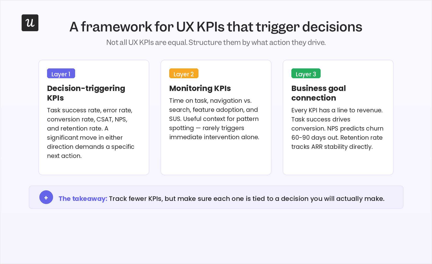
Decision-triggering UX KPIs
These six metrics should each have a defined threshold. When the number crosses it, something specific happens: an investigation begins, a fix goes out, or a redesign is scoped.
1. Task success rate
It defines the percentage of users who complete a target task without error or assistance and is the most direct measure of whether your product does what it promises. Ideally, this rate should be well above 75% to be considered good. Below that threshold on core flows, you might have a usability problem worth fixing.
To calculate it, divide the number of successfully completed task attempts by the total number of attempts.
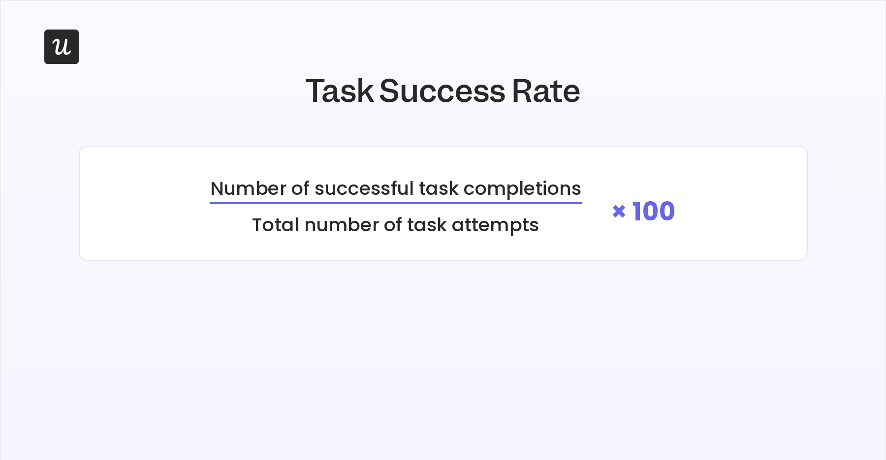
Segment this further into “first attempt” vs. “repeat attempt” rates to distinguish between users who can’t figure out the flow at all and users who are learning the interface over time.
2. Error occurrence rate
The error occurrence rate, or user error rate, tracks how frequently users make mistakes while doing a specific task. A high user error rate could point to a design problem. Confusing UI, missing instructions, or a workflow that doesn’t match users’ mental model can all be reasons behind it. Tracking this metric helps you identify which parts of the interface to fix, rather than redesigning based on guesses.
You can calculate it by dividing the number of errors by the total number of task attempts.
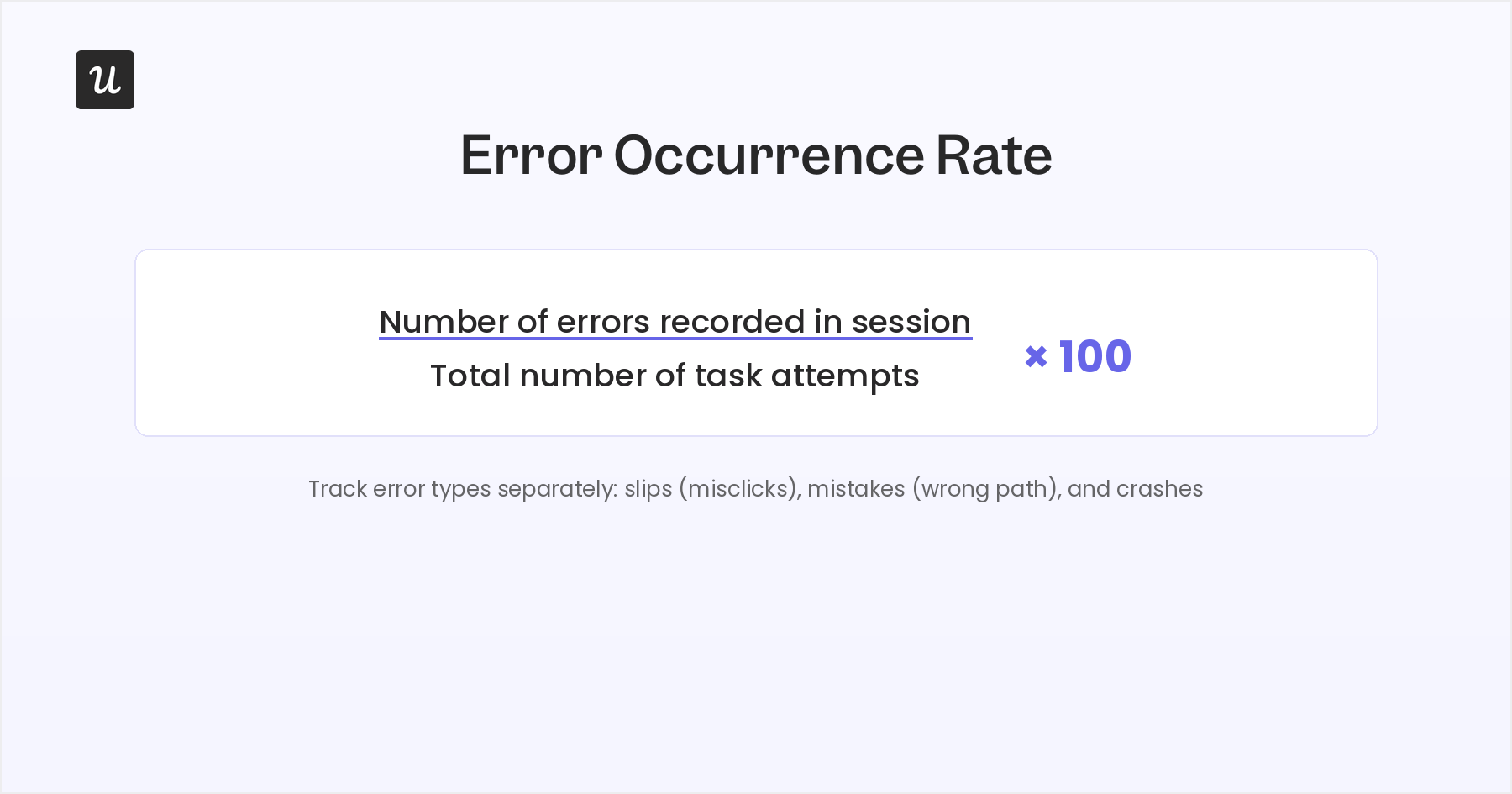
The metric answers practical questions: is a form field failing because the instructions are missing? Is a step failing because the flow is too long? Is a feature being abandoned at a specific point because the UI is unclear? On its own, the error rate tells you what the problem is. And then, you can dig deeper to find the cause.
Session replay is that perfect tool. It’s a blend of a qualitative method watching sessions through at a quantitative scale of sessions for every single user that’s ever interacted with the feature.
The UX KPI tells you the error is happening. Session replay tells you exactly what users are doing when it happens. That’s the combination that turns an error rate into a brief for a specific fix.
3. Conversion rate
The conversion rate measures the percentage of users who complete a defined action, such as signing up, completing a free trial, or upgrading to a paid plan. It’s as much a UX KPI as a growth metric, because the most common driver of conversion failure is friction in the user journey, not the absence of intent. You can calculate it by dividing the number of conversions by the number of total visitors.
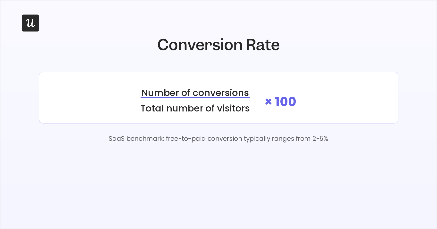
For instance, if 100 users land on your onboarding flow and only 20 complete it, your conversion rate is 20%. A sudden drop of 5+ percentage points in a week typically signals a UX change broke something in the flow. Guided walkthroughs and contextual in-app messaging can directly increase conversion rates by reducing the friction at each step rather than leaving users to navigate alone.
When Userpilot’s email feature launched, funnel data showed a steep drop at the domain verification step. Abrar Abutouq, one of Userpilot’s product managers, describes the fix she deployed without raising an engineering ticket:
“Within a few hours, I just created a targeting tooltip and showed it to users and highlighted the correct steps for them to make it clear what to do next. That helped a lot on reducing friction and supporting users in real time without involving our dev team. The drop-off closed within days.”
4. Customer Satisfaction Score (CSAT)
The Customer Satisfaction Score (CSAT) measures how satisfied users are with a specific interaction, feature, or moment in the product. Unlike NPS, which asks about overall loyalty, CSAT is scoped to a single event.
You ask “How satisfied are you with your experience today?” after a specific trigger. Users rate on a 1-to-5 scale. CSAT is calculated by dividing the number of satisfied responses (4 or 5) by the total responses and multiplying by 100.
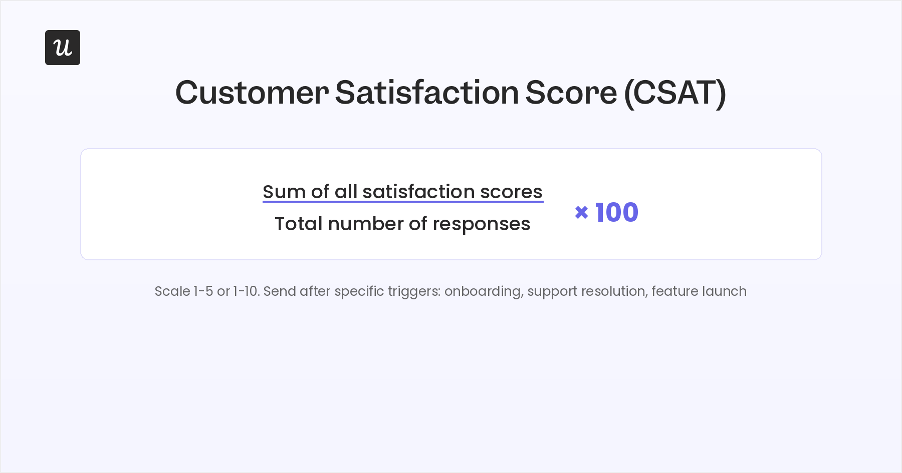
Timing the CSAT ask correctly is the most important variable in getting useful data.
That’s because a user who just completed onboarding for the first time is in a very different state from one who spent 15 minutes failing to connect an integration. You can measure CSAT at multiple points in the user journey to understand where satisfaction peaks and where it drops.
5. Net Promoter Score (NPS)
The Net Promoter Score (NPS) measures customer loyalty through one question: “How likely are you to recommend this product to a friend or colleague?” Users respond on a 0-to-10 scale. Promoters score 9-10, passives score 7-8, detractors score 0-6. NPS is calculated by subtracting the percentage of detractors from the percentage of promoters, producing a score between -100 and +100.
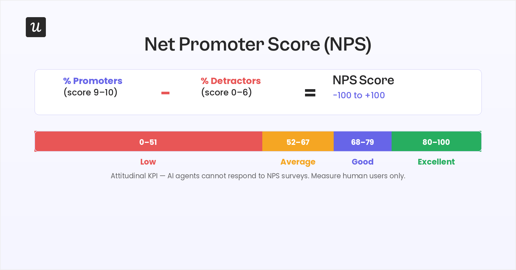
NPS is most valuable as a trend metric. A sudden drop of 15+ points after a product release strongly signals that something broke. A sharp drop here can help you predict churn before it shows up. That window is the time to run follow-up research, identify the specific friction driving the detractor responses, and intervene before accounts actually leave.
6. Customer Retention Rate
The customer retention rate measures the percentage of users who continue using your product over a defined period. Subtract the number of new customers in a period from the number of paying customers at the end of a period. Then, divide this number by the number of paying customers at the beginning of the period, then multiply by 100.
You can apply this across weekly, monthly, or quarterly periods depending on your product’s natural usage cadence.
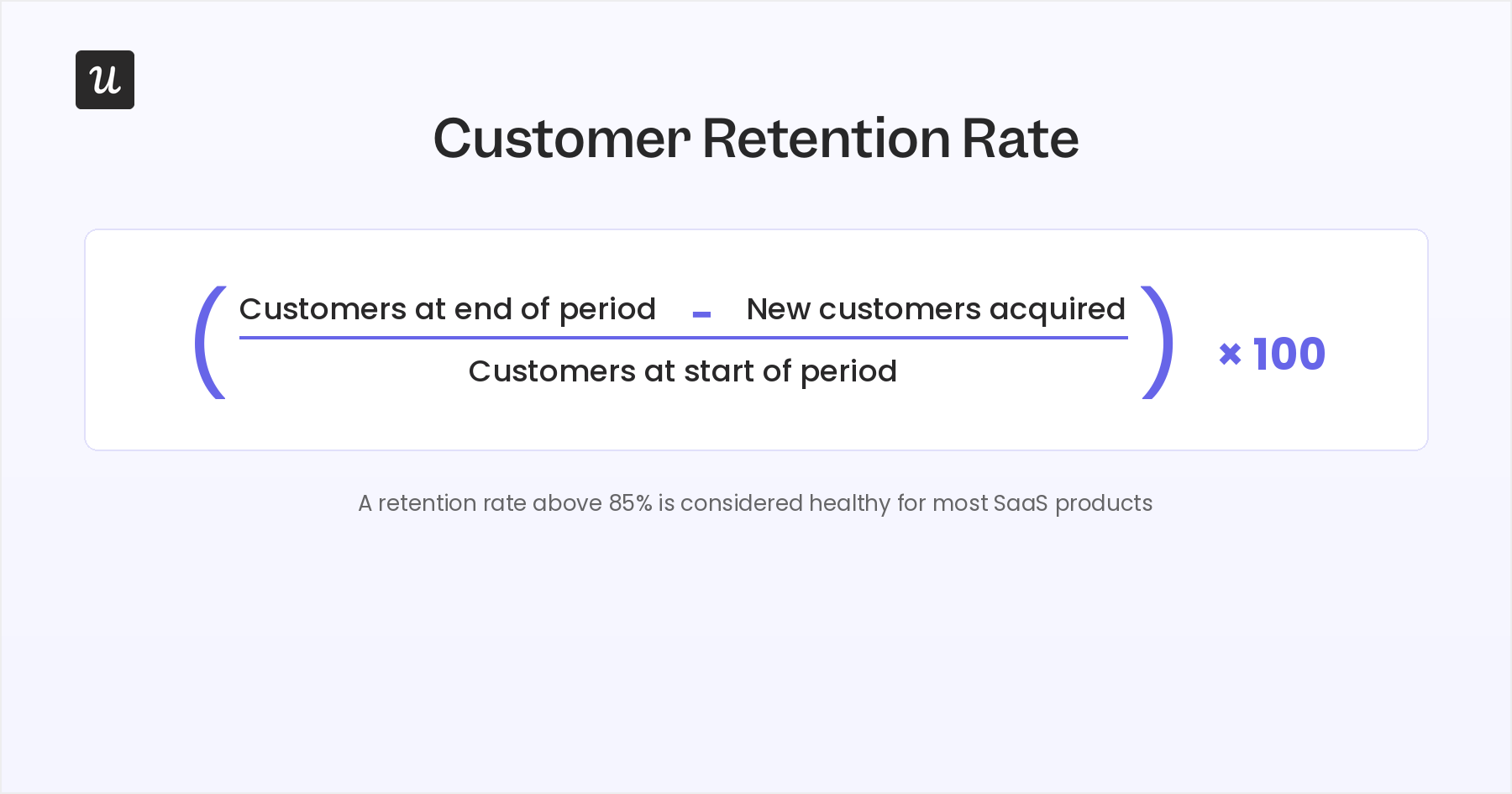
Retention is the downstream output of every other UX KPI doing its job. When customer retention drops, the right diagnostic is usually to go upstream. Which of the behavioral or attitudinal KPIs moved in the weeks before the retention dip? Task success rate, error rate, NPS, and CSAT are all leading indicators for retention.
UX KPIs worth monitoring (but not always decision-triggering)
These four metrics provide useful context and inform design direction, but they rarely produce a clear next action on their own. They’re better reviewed on a monthly or quarterly cadence than tracked as weekly decision triggers.
7. Average time on task
Average time on task measures how long users take to complete a specific task from start to finish. Shorter time on task generally indicates higher usability. It shows that users aren’t hunting, second-guessing, or backtracking through the interface. A longer time on task is a signal that your design is creating friction. But that’s not always true. Context matters, because a legitimately complex multi-step task takes longer by design.
Segment this into “first attempt” and “repeat attempt” averages for meaningful insight. If first-attempt time is significantly longer than repeat-attempt time, users are learning the interface over multiple sessions. The learning curve is still friction worth reducing for new users, even if experienced users are eventually efficient.
8. Navigation vs. search
This metric tracks how users find what they’re looking for. How frequently do they use the navigation and search functions? The ratio can be calculated by dividing the number of tasks completed by navigation or search by the total number of completed tasks. It reveals user preferences and informs design priorities.
If the majority of users default to search, your navigation architecture isn’t surfacing information effectively enough to be useful. If search usage is very low, the function may be poorly positioned or underbuilt.
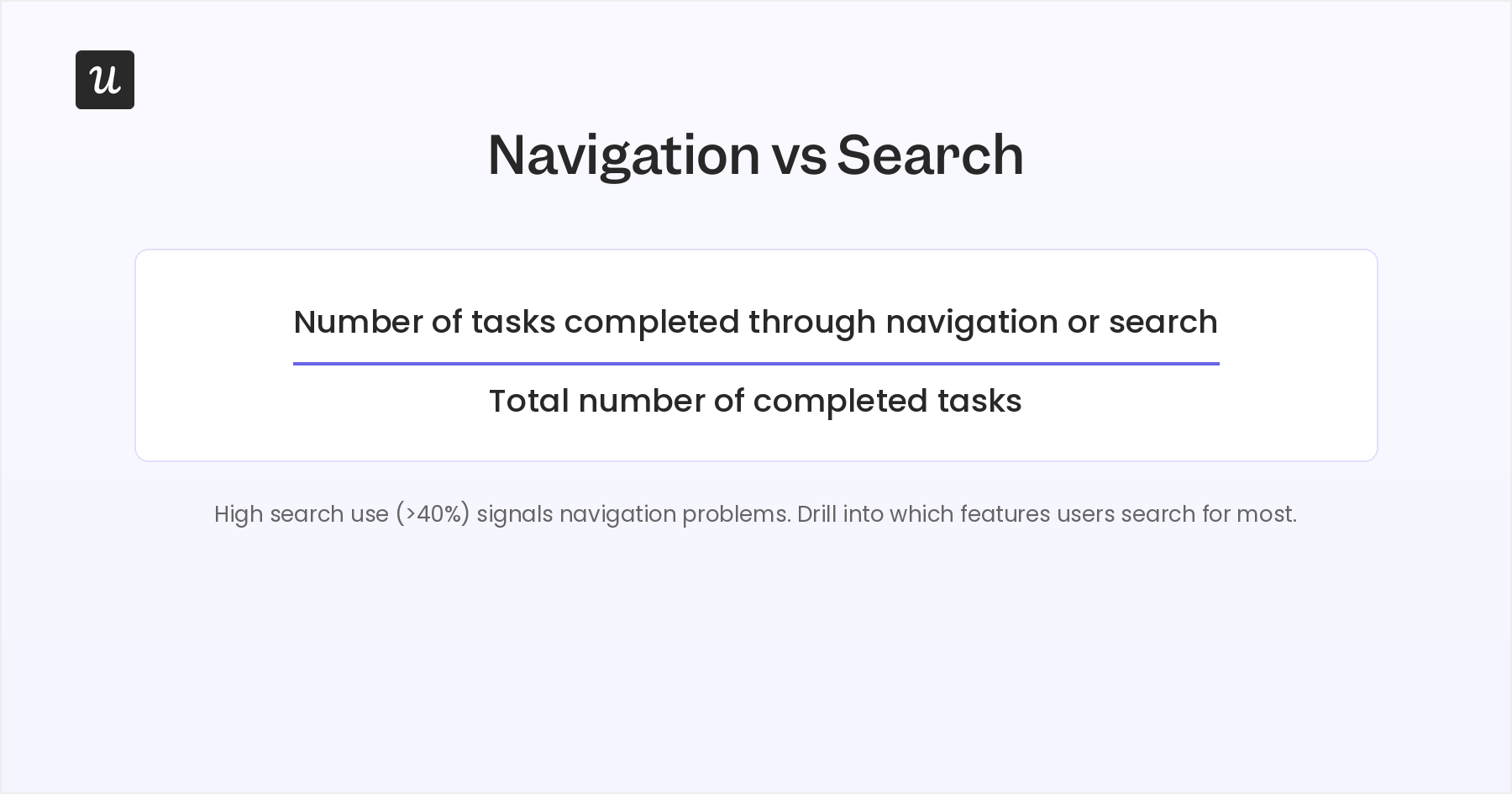
The practical goal is a product that works well for both preference types: clear navigation for users who browse, and an intuitive search function for users who scan.
This metric is most useful as a quarterly design-direction input. A shift in the ratio over time can signal that your navigation is becoming harder to use as the product grows.
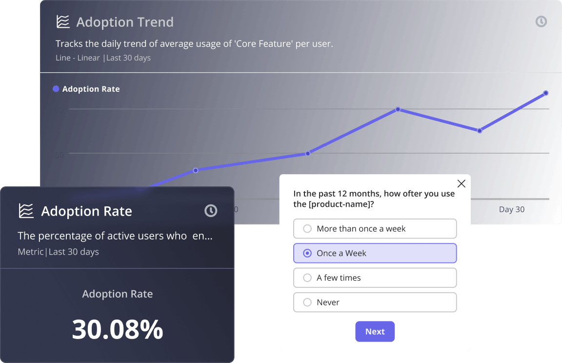
9. Feature adoption rate
The feature adoption rate measures how many active users are actually using a specific feature. Calculate it by dividing the number of monthly active users of the feature by the total number of monthly active users, then multiplying by 100. Low adoption after a launch is worth flagging, but it needs context before it triggers a redesign.
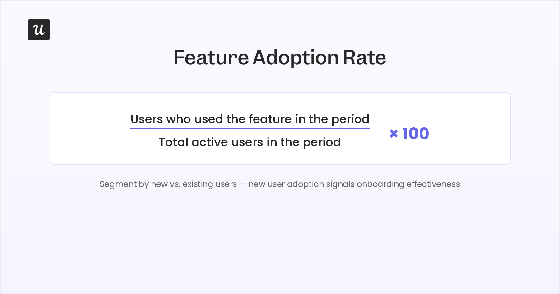
Is low adoption a discoverability problem, a value problem, or a complexity problem?
Those three root causes require different responses, and the feature adoption rate alone can’t distinguish between them.
Abrar Abutouq describes the standard process for diagnosing adoption gaps
“Once we release a feature, we need to create a report and track meaningful events to see the usage and the feature health. From there, I look for where the drop-off is happening, in which step users are getting stuck. Sometimes it’s not engineering. Sometimes it’s just the in-app messaging.”
10. System Usability Scale (SUS)
The System Usability Scale is a 10-question standardized survey for measuring perceived usability. SUS scores run from 0 to 100.
A score of 68 represents average usability, the threshold below which your product could have usability problems that will affect satisfaction and retention. A score above 80 generally correlates with users describing the product as “excellent.”
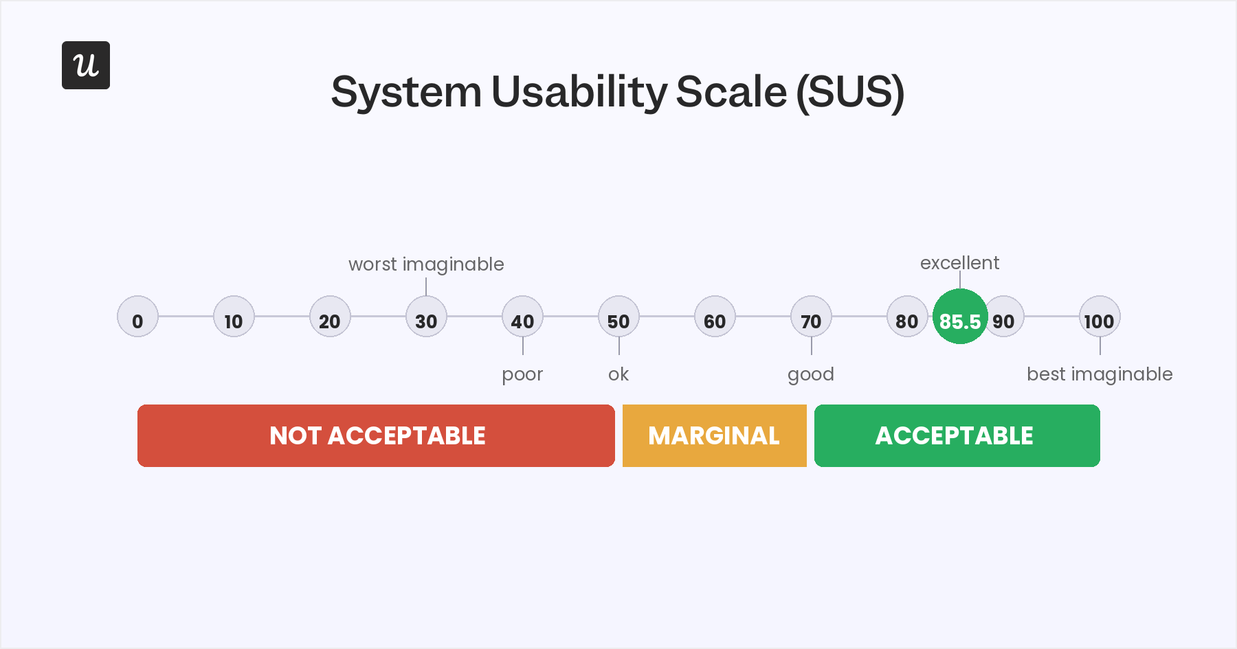
SUS is most useful as a periodic benchmark. Measure it quarterly or after a major redesign, not as a weekly metric. Its 10-question format takes under two minutes to complete, which keeps survey fatigue low. That said, SUS tells you the overall usability score but doesn’t tell which specific flows are dragging the number down. Session replay and task success data are what you use to answer that.
UX KPIs by product stage: Startup vs. enterprise SaaS
The right UX KPI stack isn’t the same at every point in the product lifecycle. Tracking all 10 with equal priority wastes attention and produces false signals. Here’s what you should track based on your product stage.
- Early-stage / pre-product-market-fit: Focus on task success rate and error occurrence rate. You need to know whether users can complete the core workflow at all before worrying about loyalty or retention. CSAT at key onboarding moments signals whether the experience is creating the right first impression. Finally, track the conversion rate to see if you’re driving trial signups, but only after the core task flow works consistently.
- Growth-stage / scaling users: NPS becomes important here because you have enough users to see meaningful detractor patterns. Also, use feature adoption rate to find whether the product surface you’re building is actually being used. Retention rate is the headline metric at this stage: task success, error rates, and NPS all eventually feed into it, so treat retention as the output and the other KPIs as the inputs to manage.
- Mature SaaS / enterprise accounts: At this scale, SUS benchmarking becomes relevant because you’re managing an experience across a diverse user base with varying technical comfort levels. Also, you should check CSAT at specific touchpoints (onboarding, support interactions, new feature launches) to get fine-grained signals that aggregate NPS can’t. Time on task matters more at this stage because enterprise users are in the product daily, and friction compounds.
One additional note for enterprise products: if your enterprise accounts are starting to integrate AI agents through APIs or MCP connections, your human UX KPIs increasingly reflect only the users who still log in manually. The power users and admins who built the automations are often the least likely to appear in your UX KPI data, and often the most likely to drive renewal decisions. Tracking agent task completion alongside your human UX KPI stack is how you keep visibility into the full account health picture.
Mapping UX KPIs to business goals
A UX KPI only earns stakeholder attention if it’s connected to a business outcome they already care about. The connection exists, but you have to make it explicit rather than assume people will draw it themselves.
Here’s how each of the 10 UX KPIs maps to a business objective:
- Task success rate → Activation rate, conversion: Users who complete core tasks convert and retain at higher rates. A sustained lift in task success rate typically moves activation in the same direction.
- Error occurrence rate → Support volume, onboarding completion: High error rates generate support tickets and abandoned signups. Reducing them decreases cost and improves first-week retention.
- Conversion rate → Revenue, ARR growth: The most direct line from UX to revenue. Friction in the signup or upgrade flow is a revenue leak that needs fixing.
- CSAT → Retention, expansion revenue: Satisfied users expand into more seats and higher plans. Dissatisfied users churn, usually without explaining why.
- NPS → Churn prediction, product-led growth: Promoters drive referrals and reduce customer acquisition cost (CAC). Detractors predict churn long before it shows up in revenue metrics.
- Customer retention rate → MRR, LTV: A 5% improvement in monthly retention has a larger lifetime value (LTV) impact over 12 months than almost any top-of-funnel change.
- Average time on task → Efficiency, adoption depth: Faster task completion correlates with higher feature adoption and more sessions per user per week.
- Navigation vs. search → Product discoverability, feature adoption: A poorly navigable product hides features from users who don’t know to search for them.
- Feature adoption rate → Expansion, stickiness: Users who adopt more features retain longer and are more likely to upgrade. Low adoption is an early predictor of churn.
- SUS → Enterprise sales, renewal confidence: Enterprise buyers increasingly run usability benchmarks before committing to multi-year contracts. A SUS score above 80 is a defensible data point in sales conversations.
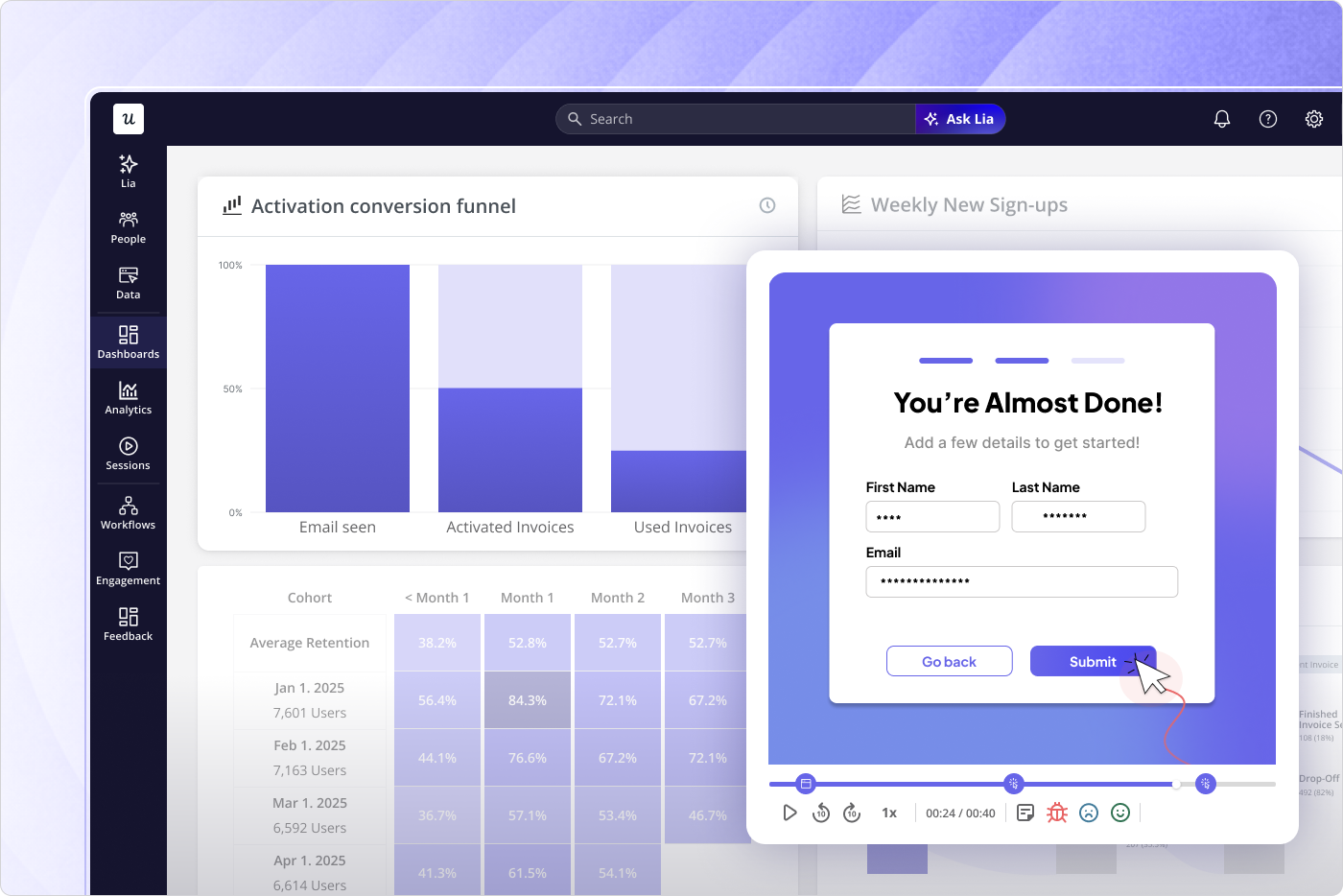
Presenting UX KPI data alongside the business metric it predicts is what turns a UX review into a strategic conversation. Product analytics platforms like Userpilot let you track behavioral UX KPIs (task completion funnels, feature adoption trends, conversion data) alongside retention and engagement metrics in the same view, so the correlation is easily visible.
Start with the metrics that trigger decisions
Tracking all 10 UX KPIs without a decision framework is collecting data for its own sake. The most useful shift you can make is identifying which 3-5 metrics are genuinely decision-triggering for your current product stage and reviewing those on a cadence short enough to actually act on them when they move.
Doing that strategically and making changes can help improve product adoption and increase retention.
Userpilot lets you track behavioral UX KPIs through funnel analytics, feature adoption reports, and session replay, and collect attitudinal KPIs through in-app surveys triggered at the right moment in the user journey. You also get Lia, our AI agent, that provides on-demand access to metrics through conversations. Try Userpilot for free to see how your team can connect UX KPI data to product decisions using a single platform.
UX KPIs vs UX metrics: What’s the difference?
UX metrics measure how users interact with your product across dimensions like task completion, satisfaction, and loyalty. They’re the raw data your team collects during a release cycle or research sprint to understand what’s happening. They’re always useful, but they don’t tell you what to do next.
A UX KPI, on the contrary, is a metric with a target and a decision attached to it. You commit to a specific threshold (say, task success rate above 78% for your core onboarding flow), and when the number crosses that threshold, something specific changes in your roadmap or process. KPIs must be measurable numerically so you can track movement over time and adjust when the number moves in the wrong direction.
For example, session duration is a metric. But “First-session duration under 4 minutes for new signups” is a KPI. The difference is whether you’ve committed to a goal and tied the number to a decision. Most teams collect dozens of metrics but have committed to very few actual KPIs, which is exactly why measurement rarely produces action.
FAQ
What's the difference between UX KPIs and UX metrics?
UX metrics are measurements of user behavior and experience. They are numbers that tell you what’s happening in your product. UX KPIs are metrics with a specific business objective and threshold attached. You commit to a target, track movement toward it, and change your approach based on the result. Every UX KPI is a metric, but a metric only becomes a KPI when it’s tied to a decision you’ll make if it moves.
How many UX KPIs should a SaaS team actually track?
Most teams track too many. A useful working set is 3-5 KPIs that are actively connected to current product goals, with the remaining metrics monitored in the background. If you’re optimizing onboarding, task success rate and error occurrence rate are your primary KPIs. If you’re focused on retention, NPS and CSAT move to the front. The goal is a set small enough that a dropped metric gets noticed and investigated immediately.
What is a good task success rate for a SaaS product?
Typically, a good task success rate should be over 75%. If your core flows are consistently below that benchmark, it’s worth prioritizing. That said, what counts as “good” depends on task complexity. A complex multi-step technical configuration has different expectations than a single-click action, so segment by task type before drawing broad conclusions.
How do AI agents affect UX KPIs in SaaS?
Agents are creating a measurement gap in most SaaS products. They complete tasks without generating the behavioral signals human users do: no scroll events, form hesitation, or rage clicks. Attitudinal KPIs (NPS, CSAT, SUS) are entirely blind to agent activity. Behavioral KPIs (task success rate, error rate, time on task) can capture agent behavior but need to be segmented from human data to be meaningful for UX purposes. If your product is seeing growing API usage or MCP-connected integrations, track agent task completion rate and agent error rate as separate metrics alongside your standard AI product analytics stack.
About the author