Interactive Onboarding 101: How to Create Better User Onboarding Experiences in SaaS
What is an onboarding process?
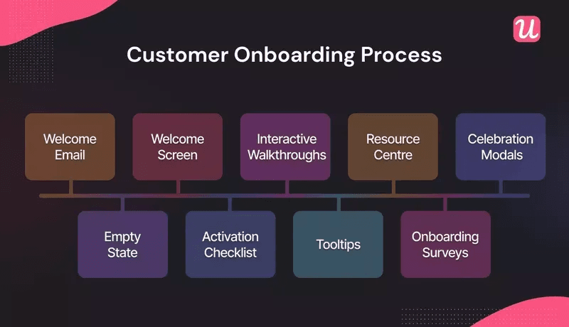
An onboarding process is a broad term in SaaS, which describes a series of activities designed to help both existing and new users get value from your product. Many people think onboarding is purely about new users, but that’s not the case: an onboarding strategy should extend beyond that (i.e. to feature adoption).
What is an interactive onboarding experience?
Interactive onboarding experiences are user-driven and the actions they take directly influence the onboarding flows they’ll go through.
It can be described as a “choose your own adventure” model. A popular example of this is the experimental film Black Mirror: Bandersnatch, in which the viewer is given the illusion of choice.
Product tours: the opposite of an interactive onboarding experience
Many SaaS companies offer product tours as part of their onboarding process. But they have several key drawbacks:
- The “one size fits all” approach is simply not relevant to most users who only want to see the features that matter to them.
- A lack of personalized content makes users feel disengaged and disheartened.
- Being told how to do something isn’t the same as trying it yourself: it’s frustrating to watch a boring product tour when you want to start using it!
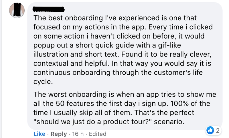
How is an interactive onboarding strategy different? It’s laser-focused on helping users to experience value as quickly as humanly possible. Interactive onboarding achieves this by showing the right parts of the product at the right time to the right groups of users. That is the key to successful product adoption.
How to make the user onboarding experience interactive?
We’ve covered what interactive onboarding is, and why it’s the best way to craft a successful onboarding experience. In this section of the article, we’re going to break down how you can make your onboarding more interactive.
Ready to dive in?
Make onboarding relevant for specific user personas
First things first, you need to recognize that different users have different needs and expectations from your SaaS. Your primary mission should be to understand those key user groups or personas and craft an onboarding experience relevant to them.
Put simply, if you show users irrelevant features during onboarding you will struggle to get them to adopt your product.
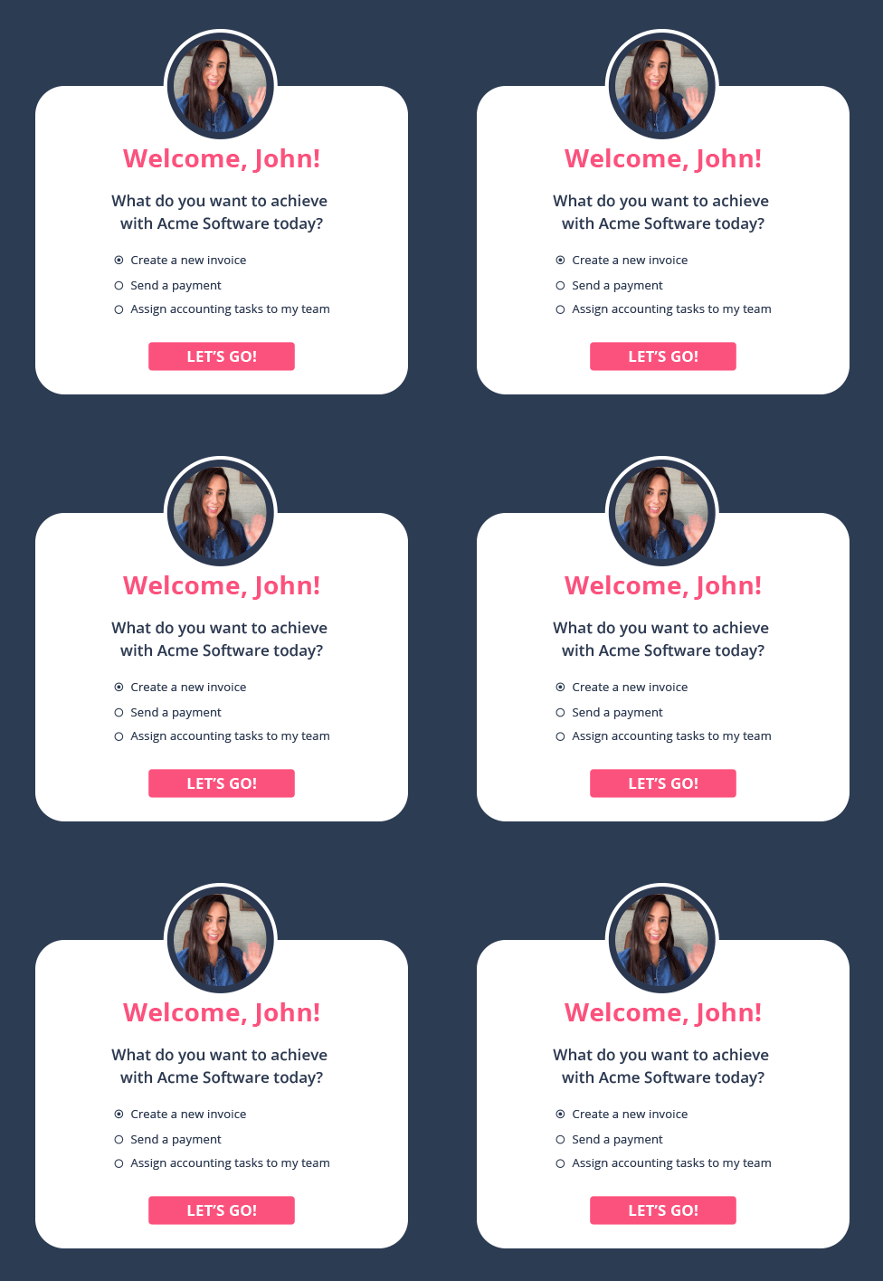
Key tactic: Use welcome screens to greet customers and segment them from the beginning. Then use the data to guide them down the right onboarding process for them.
Start with a minimum viable onboarding process
What’s the fastest way to set user expectations and start delivering value? Ask that question to effectively and quickly drive users through from the “Aha” moment, to activation, to adoption.
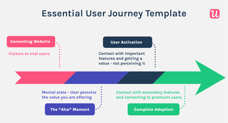
The minimum viable onboarding process is about answering that question and tailoring onboarding around that. Users should finish an onboarding flow and be able to use the key product features they need. That’s how they become “sticky customers”.
Key tactic: Don’t overcomplicate things at first. Relentlessly focus on delivering value quickly with a personalized interactive onboarding flow, and expand on that with other in-app experiences later.
Make the onboarding process look simple
Simplicity is sublime. A bad onboarding process bombards users with every feature possible with too many unnecessary prompts.
Nobody wants to be greeted by an enormous, 30-point checklist if only 3 of them can be considered key tasks. Make it as simple as possible for users to glide through your onboarding flow, from one milestone to the next.
Key tactic: One way to simplify things is to break down tasks into distinct stages, and use multiple checklists to drive users forward.
Apply gamification principles
An excellent way to drive engagement, interaction, and eventual activation is through gamification. For example, you can add progress bars, or leverage the Zeigarnik effect with dummy tasks in checklists (tasks already marked complete) to drive users to take action.
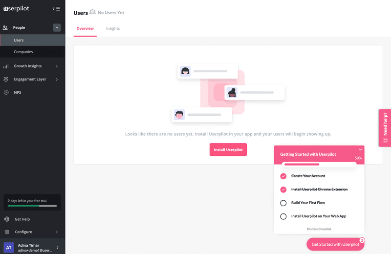
Key tactic: Look for opportunities to make the onboarding process more interactive and fun. Add visually engaging progress bars which give users a sense of completion, or build momentum with completed dummy tasks in checklists (the Zeigernik effect). All of this encourages users to move forward with onboarding.
Best interactive onboarding experience examples
We’ve looked at some actionable tactics for making your own onboarding process more interactive. But how do other SaaS products do it, and what can we learn from them? In this section of the article, we’ll explore a range of examples from across the industry.
Slack interactive onboarding experience
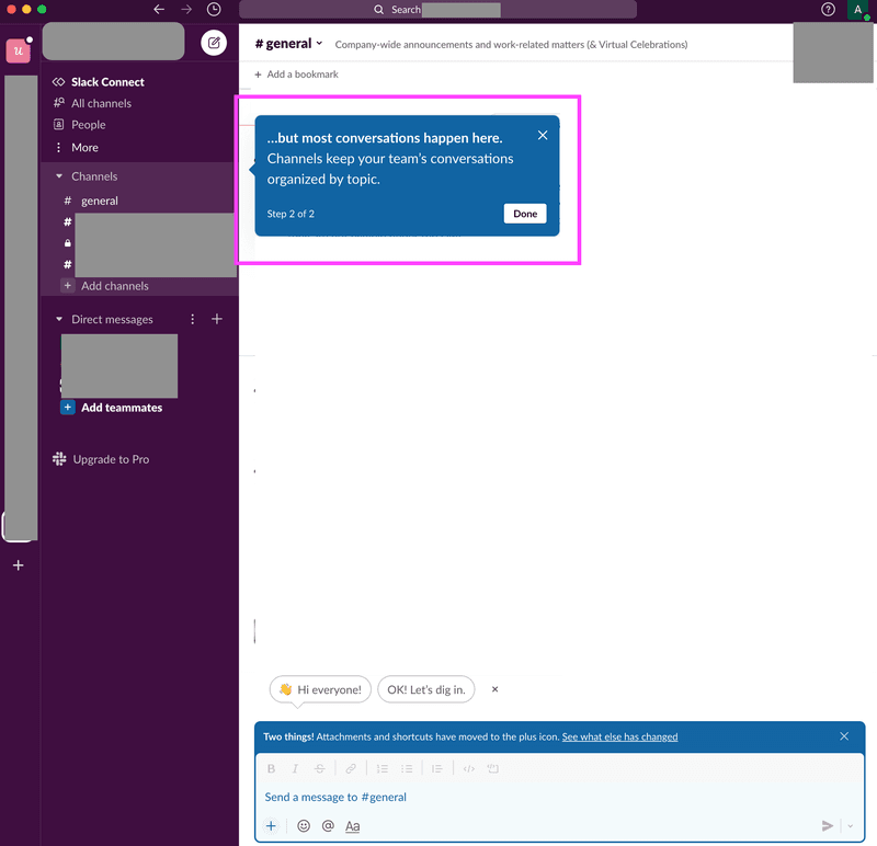
The Slack onboarding experience has several fantastic elements that you can also implement. Here are the highlights of their onboarding.
- Length. It’s short, to the point, and entirely focused on getting users to understand the core functionality rather than trying to cram a lengthy virtual tour in.
- Engaging. Relevant, context-driven tips help encourage users to take the necessary action (in this case, write a message).
- Progress. Utilizing gamification to tell users what stage in the process they’re at (i.e. “step 2 of 2”).
- Visual. They don’t leave users in the dark: there are clear examples and placeholders to help get users off to a fast start.
Airtable interactive onboarding experience
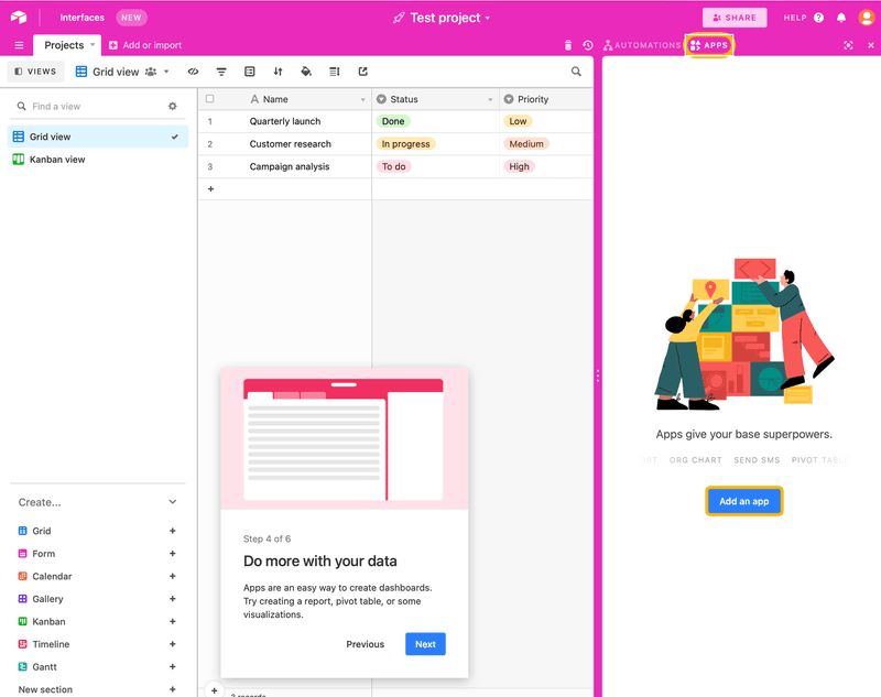
Airtable has internalized the key principles of minimum viable onboarding (minimizing time to value). Here are some of the key aspects of their onboarding flow:
- Short signup. The signup flow is simple, brief, and offers several options to reduce user friction.
- Personalized. Airtable uses a welcome message modal to greet users and get them off to a smooth start.
- Engaging. Airtable uses a range of methods to drive engagement, including helpful tooltips, hotspots to drive attention, and slideouts.
- Support. Providing in-app self-service is an excellent way of automating support and driving customer success during onboarding: Airtable draws attention to a help center using a handy widget.
Tolstoy video interactive onboarding experience
Tolstoy is an interesting example to explore, as it’s a slightly different onboarding program that we haven’t witnessed so far. Here are some key takeaways:
- Extremely interactive onboarding. Not only does Tolstoy use features like branched journeys, tooltips, and other UI patterns, but they take it a step further with the use of interactive videos.
- Choose your own journey. Importantly, they remember the key principle of successful onboarding: don’t force users with different needs down the same path.
Kommunicate interactive onboarding experience
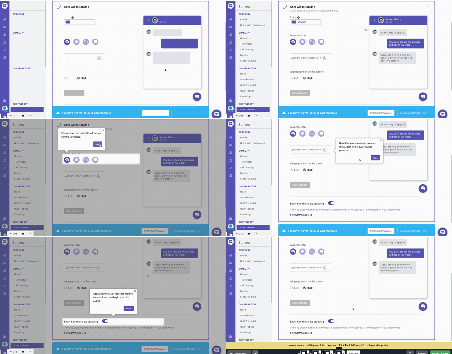
Kommunicate is a great example of a SaaS company getting most of the complex aspects of interactive guides right. Some key parts are worth mentioning.
- Gradual engagement. Kommunicate does a great job by providing progressive onboarding to help users establish background knowledge of the product and build their experience as they go.
- Driven actions. Rather than a boring tour, Kommunicate hand holds users through feature adoption one step at a time. The animation below shows how user actions trigger relevant tooltips, and that helps drive a user forward (teaching them how to get value out of the product quickly).
- Engaging. A mixture of UI patterns, a clear logical sequence, and a focus on letting users drive their own journey, mean Kommunicate has created a successful onboarding flow.
Demio interactive onboarding experience
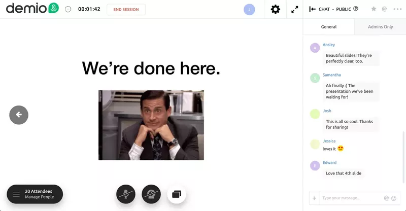
Demio is an excellent case study to explore – their interactive onboarding is fun, fast, and frictionless! Apart from that, their onboarding has the following characteristics:
- Simple. They remove barriers to onboarding, such as complex sign-up flows, so users can directly experience value from their products. Their onboarding experience would be even better if they eliminated the product tour.
- Minimum viable onboarding. Focusing on the core value proposition of the product (running their webinar), Demio’s onboarding essentially mirrors how you would use the product for real (complete with a live chat mockup). It’s a great way to focus on activation.
- Self-driven. By putting users in the driver’s seat, they avoid a common mistake: assuming everyone needs the same exact onboarding experience to understand how to use their product.
How Userpilot can help you build interactive onboarding experiences without having to code
After learning what interactive walkthroughs are, you might be wondering how to create one without spending so much time on it. We have good news for you.
Userpilot is a powerful onboarding tool for crafting onboarding experiences.
It’s easy to use with a drag and drop builder, meaning even non-technical team members can get involved. Importantly, it offers huge amounts of customization so you can design bespoke onboarding experiences that fit the needs of your SaaS users.
Here is what you can do with Userpilot.
Build interactive onboarding flows using different UI patterns
As we saw from the real-world examples above, different products will have different onboarding needs: you don’t want to be forced to use a modal every time. To create a truly successful onboarding flow, you should carefully consider the UI pattern that is most appropriate for the context.
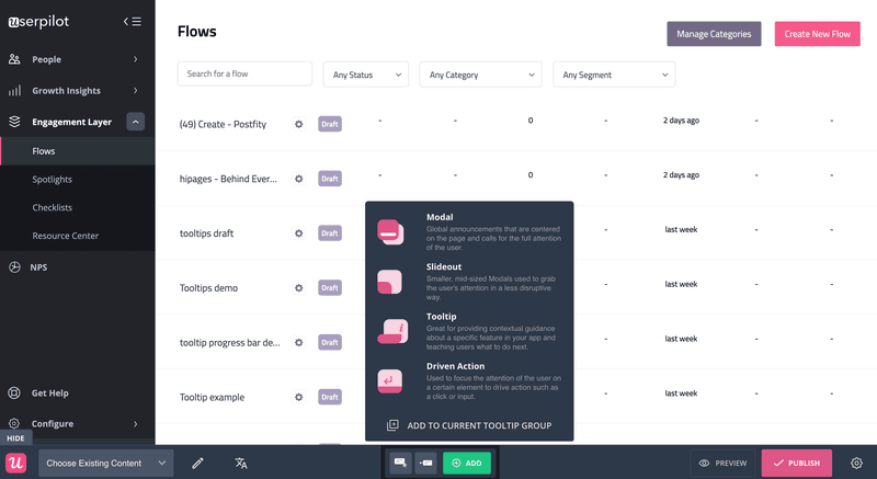
Userpilot offers an extensive range of patterns to choose from:
- Tooltips can help you provide pertinent, targeted information
- Slideouts capture attention without overwhelming the UI and help guide users
- Modals are a useful tool for global messages
- Driven actions are a perfect addition to any interactive onboarding experience
Trigger flows using event triggering and advanced segmentation
This is a new feature in Userpilot. Event triggering enables you to construct flows that launch automatically when a specific event occurs. The critical thing here is that you can define the event, so it’s completely tailored to your needs.
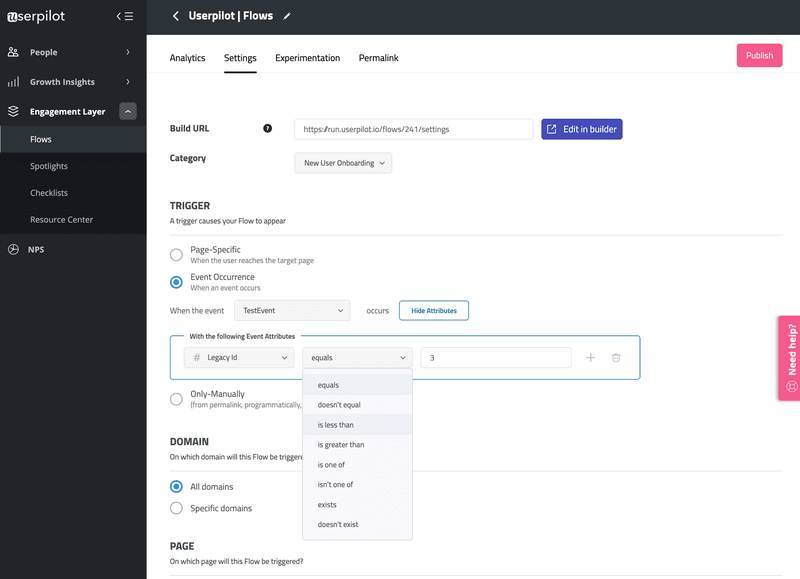
You can take the customization a step further by digging into custom attributes, and specifying other aspects of the sequence (i.e. do you want to launch a flow after just one event, or more)? That means you can create bespoke triggers tackling a range of scenarios for more users – and that can only serve to improve your onboarding.
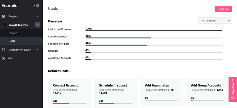
Keep track of where users are in their journey with goals
Without a goal, you can’t score. With that in mind, any savvy product manager should set clear goals to help them understand when users reach specific milestones and objectives.
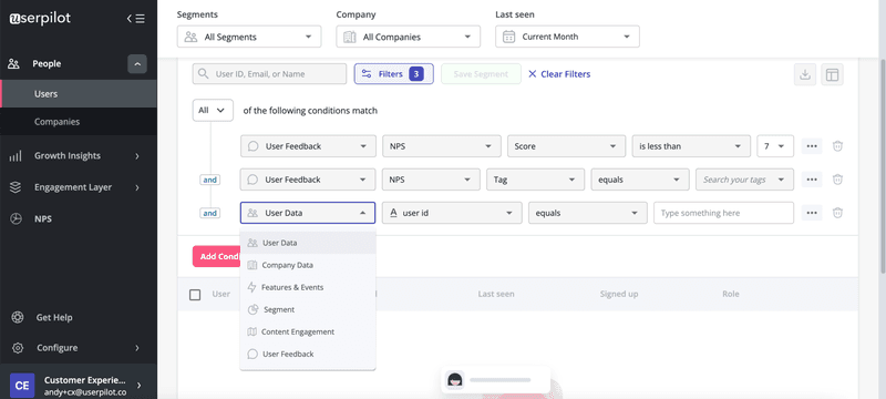
To ensure you’re focused on crafting the relevant onboarding experience for the right user groups, you need to understand which “segments” they fit into. Luckily, Userpilot has one of the most advanced segmentation options when it comes to user onboarding tools.
It’s simple to construct user segments and make sure you always send the right message at the right time in an onboarding flow.
Conclusion
Interactive onboarding has a key role in user activation and engagement.
Hopefully, this article has given you a framework which:
- Helps you understand the importance of an interactive onboarding process
- Provides practical examples to draw inspiration from
- Tactics to apply to your own product
- How to get the most out of a powerful onboarding tool
Want to create interactive onboarding experiences for your SaaS code-free? Get a Userpilot Demo and see how you can craft impactful interactive onboarding experiences effortlessly.

![Best User Onboarding Tools for SaaS [Categorized by Use Case]](https://blog-static.userpilot.com/blog/wp-content/uploads/2025/06/Best-User-Onboarding-Tools-for-SaaS-1024x670.png)


