
Understanding data visualization UX best practices is key to creating compelling visuals that produce digestible insights, empowering users to make informed product management decisions.
By optimizing the user experience of your visualizations, you unlock their potential to drive engagement, improve product understanding, and ultimately, lead to business success.
In this article, we examine the six-step process to creating effective visuals and best practices that can elevate the quality and impact of your visuals.
Data visualization UX best practices summary
- Data visualization is the visual and graphic representation of data using charts and graphs.
- Good data visualization enhances the user experience, makes data easier to interpret, improves decision-making, and drives user engagement.
- The first step to creating an effective visualization is deciding on the purpose and goals of your visuals. Next, you need to determine who your audience is and how best to reach them.
- Then, it’s time to decide on the best type of visualization for your data and choose the most engaging color palette to match the data.
- Finally, you need to test and refine your data visualization to ensure it is coherent, intuitive, clear, and inclusive.
- To ensure your visualization is effective, you need to select the best graph or chart for your data type. For example, time series data are best represented with line charts.
- You also need to make your visualization adjustable so that users can zoom in for more insights. This will make your data more actionable.
- Good color usage is also an important data visualization best practice. Use colors to differentiate data points and keep your color selection inclusive.
- Other best practices include providing carefully written UX content to enhance understanding, using progressive disclosure to ease users into core insights, and avoiding misleading visualizations.
What is data visualization?
Data visualization is the visual and graphical representation of quantitative data. It involves presenting data using charts, graphs, and maps in an accessible, easy-to-understand manner.
Why is data visualization important in SaaS?
Data visualization plays a crucial role in the world of SaaS, providing companies with powerful tools that aid product development, customer acquisition, and more. Its advantages can be summarised as follows:
- Enhanced User Experience: Interactive dashboards and reports make complex data more accessible to users, improving the user experience.
- Data Interpretation: Visualization helps to simply communicate complex data. It, thus, makes it easier to interpret and analyze.
- Decision-Making: Data visualization equips users to make more informed decisions and choices based on data rather than intuition.
- Monitoring and Alerts: It empowers users to quickly identify issues, track progress, and optimize workflows by visually monitoring key performance indicators (KPIs).
- User Engagement: Interactive charts and reports keep users engaged and invested in understanding their data.
- Data Storytelling: Well-structured visualizations tell a story. They help users see how they’re utilizing your software and identify areas for improvement.
How to create effective data visualizations
Creating visualizations in SaaS requires careful consideration of your data, audience, and design.
Here are some key steps to follow:
1. Decide on the purpose of data visualization
What insights do you want to communicate with your visualization? Good data visualizations answer vital strategic questions, provide value, and help solve problems.
Defining a clear purpose for your visualization helps you to create easy-to-understand visuals. Having a purpose lets you set your priorities and create more useful visuals.
For example, when creating a user retention graphic, your purpose may be to communicate trends and changes in retention over time. With this in mind, you’ll need a chart with a trend line that illustrates patterns in your retention rate over a period.
On the other hand, if your purpose is to compare the retention rate among different user segments, then you’ll need a different type of chart.
2. Know your audience
To communicate your intended message with your target audience, you must first understand them. This means you must answer the following questions about your audience before you proceed:
- Who are they?
- What do they already know about the topic?
- What kind of visualization will help them achieve their goals?
Your goal here is to determine how familiar the audience is with your theme and which charts/graphs will be most useful to them.
For example, after running a marketing campaign, developers will benefit more from a heatmap showing which parts of your landing page visitors interacted with the most. Marketers, however, will benefit more from a chart illustrating web traffic trends over time.
3. Choose the right types of visualizations
There are several different types of data visualization techniques with varying strengths and weaknesses. Some of the most popular include:
- Pie charts: A pie chart is a circular graph used to illustrate a part-to-whole relationship. It is ideal for showing how data is shared among distinct categories.
- Line graphs: Line charts or graphs are excellent tools for illustrating the evolution of data over time. They are used to monitor trends, patterns, and changes in a dataset over time.
- Bar charts: A bar chart is ideal for comparing values from different categories or groups. Similar to line graphs, they can also be used to track changes in data over time.
4. Choose the color palette for your data visualization project
The human brain intuitively understands colors differently, assigning them meanings and emotions. It is, thus, important that you stick with familiar patterns when selecting colors.
For example, the color green is always associated with positivity and red with negativity. When used together, it’s important to follow the same pattern to avoid confusion.
Your chosen colors should also reflect your data’s type, context, and purpose. It should match your audience and reflect their expectations and preferences.
5. Test and refine your data visualization
Testing and refining your data visualization can help you identify any gaps, errors, or flaws in your design. When testing your design, you want to watch out for the following:
- Coherence: Does the design draw attention to the data in the best possible way?
- Inclusivity: Are your selected colors easy enough for visually impaired users to read?
- Clarity: Does your design lead users to make biased or inaccurate conclusions?
- Legibility: Are your labels easy to read?
- Omission: Have you omitted any relevant data points, perhaps because they are outliers or don’t fit a narrative?
6. Use data visualization tools
Finally, it’s important to note that your data visualization is only as good as the tools you use. Good data visualization tools simplify the design process, even when handling very large data sets.
When selecting a visualization tool, you need to watch out for the following:
- Ease of use: Your chosen tool should have a clear and intuitive interface. A tool with a drag-and-drop interface and a library of pre-built templates will make your life a lot easier.
- Connectivity: The tool should connect seamlessly to your existing databases. Depending on your needs, you may also need a tool that reflects real-time data in its visualizations.
- Customization: An extensive array of customizable charts and graphs. It should enable you to customize everything from the layouts to the colors, labels, and other design elements.
10 Best practices for creating effective data visualizations
Now that you know the exact steps to follow when creating compelling data visualizations, let’s identify some data visualization UX best practices to guide you to success.
1. Represent data in different formats
The best format for your visualization depends on the purpose of your presentation and the type of data you’re visualizing.
Choosing the right format ensures the data is presented effectively for its intended use.
For example, line graphs are excellent for visualizing trends but not for visualizing part-to-whole relationships. Likewise, bar charts and scatter plots are great tools for numerical comparison.
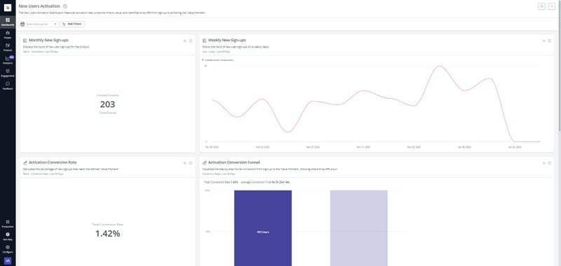
Select the appropriate graph for each data type.
2. Use predictable patterns for layouts
Using intuitive design in your visualization makes information more understandable at a glance. It leverages common visual elements and patterns to make the visualization easier to understand.
For example, we generally expect dates and other numeric values to rise from left to right. Maintaining that pattern, thus, makes your visualization easier to interpret.

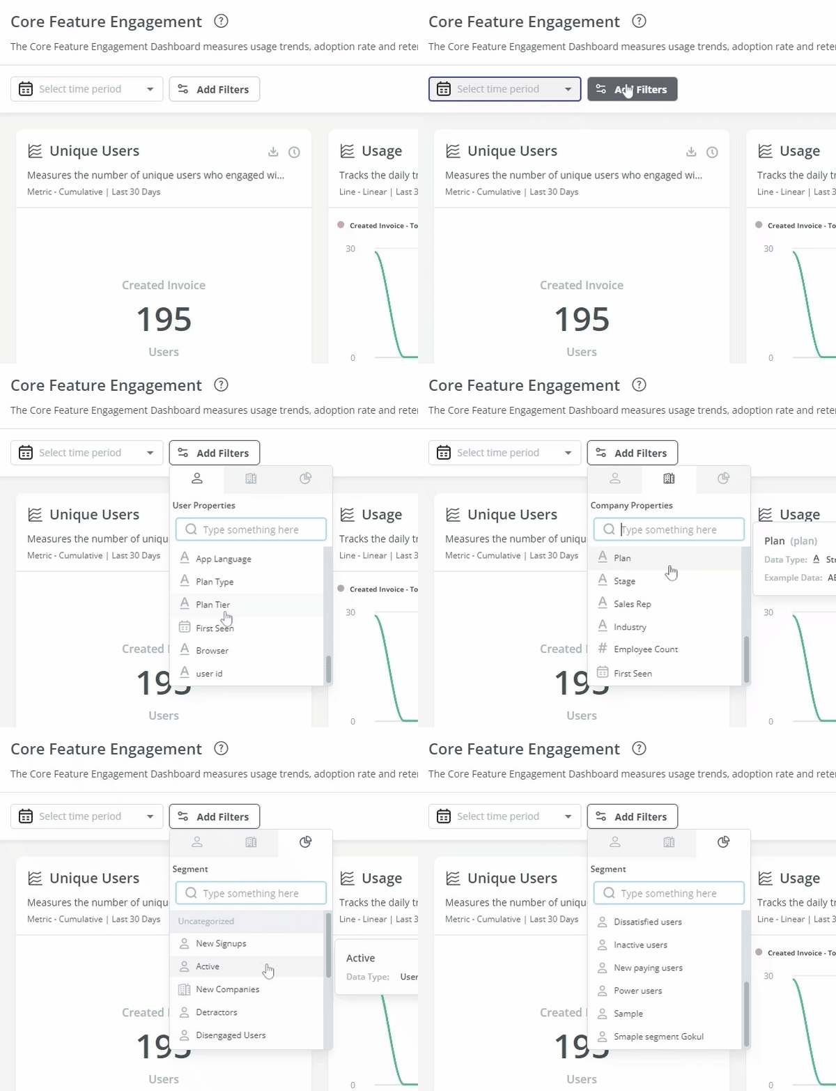
3. Display data in an adjustable format
Make your data visualization more engaging by making it adjustable. Adjustable visualizations encourage user interactivity while empowering them to uncover hidden insights and gain a deeper understanding of your data.
Include interactive filters that allow users to filter data on time periods, demographics, product categories, etc. They should be able to zoom in on specific data points, switch data views, and control the range of data.
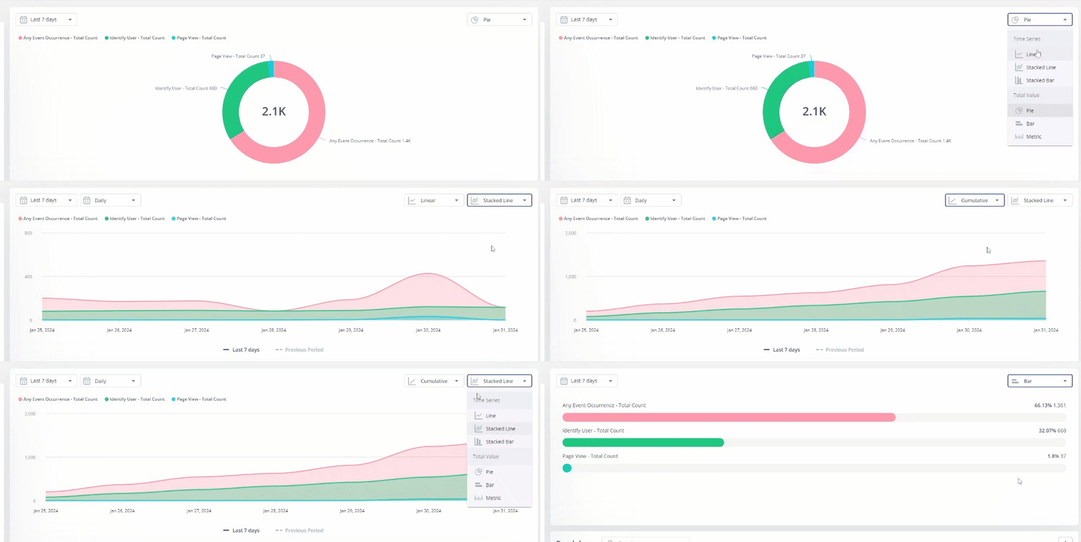
Sometimes, too, it may be possible to represent the same data in different ways. Offering users the chance to see data in these different formats will expose them to even more insights.
4. Use colors to differentiate between data points
There are several ways you can use colors to differentiate data points. The easiest way is by selecting different colors to highlight different categories.
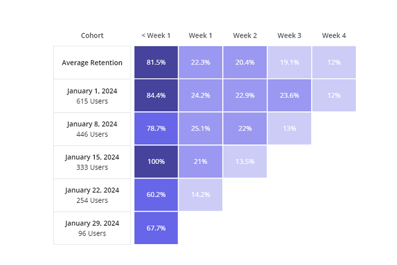
But you can also vary a color’s intensity to illustrate different levels in a category or adjust the lightness or darkness of a color to show smaller or larger quantities.
For example, darker colors in a retention table indicate higher retention levels, while lighter colors indicate lower retention levels.
5. Provide content for a good data visualization
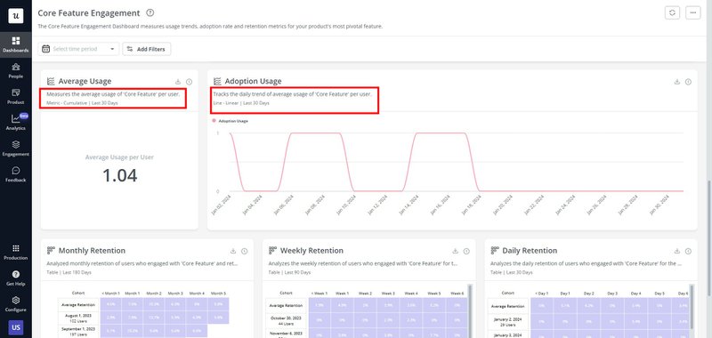
UX content writing is crucial in elevating visualizations from mere visuals to impactful communication tools. It provides context and helps viewers understand what the data represents.
There are different types of content you can add to improve your visualization, including:
- Microcopies explaining the purpose of the visualization.
- Clear and concise labels for every axis, data point, and element.
- Annotations to highlight important features or provide context.
- A title to grab attention and reflect the visualization’s main message.
6. Enhance data storytelling with AI
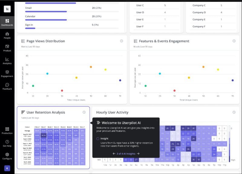
Use AI to create compelling narratives around your data. AI can create personalized data stories, generate interactive visualizations, and provide deeper insights into your data.
As a result, it becomes a lot easier to create engaging data stories that help users to better understand the data.
7. Make your data presentation actionable
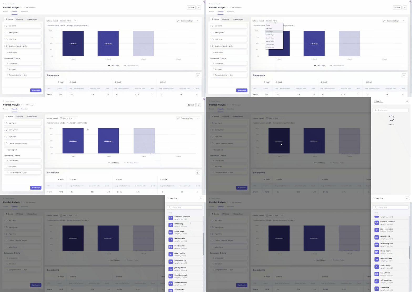
Make your data presentation actionable by enabling viewers to dig deeper into the data and glean even more insights.
For example, users who are viewing product-wide statistics should also be able to zoom in on a single location, organization, or individual. They should be able to adjust timelines and make other changes.
This will transform your data from arbitrary numbers into an empowering presentation that guides your viewer’s thoughts and actions. As they ask follow-up questions, they should be able to adjust the data for even more answers.
8. Use progressive disclosure to display data
Progressive disclosure is a design technique that involves revealing information gradually. It prevents users from being overwhelmed by complex data dumps and ensures they focus on relevant data first.
For data visualization, this means starting with basic data summaries first and gradually revealing more intricate details as users explore further.
For example, financial reports can begin with a summary of the overall financial performance. As it progresses, it can then drill down into specific income or expense categories.
9. Avoid misleading visualizations
Steer clear of misleading visualizations that distort data and lead to wrong conclusions. Avoid cherry-picking data to show a desired outcome or manipulating scales to exaggerate differences.
You also need to avoid any form of bias in your data storytelling. This means providing the right context and background information for your data and allowing the data to tell its own story.
Remember, data integrity is more important than your desired outcomes. Thus, the data should always guide your narrative, not the other way around. Misleading use of data can lead to poor decisions with terrible consequences.
10. Try to make visualization inclusive
Making your visualization inclusive means ensuring it is accessible and understandable to a diverse audience, regardless of their backgrounds, preferences, or abilities.
You make your design inclusive by:
- Using colors and textures that are suitable for those with color blindness.
- Employing high contrasts between backgrounds and data elements for more visibility.
- Using clear, concise, and legible fonts.
- Providing alternative text descriptions for images and visualizations.
- Avoiding flashing elements that can trigger seizures or migraines.
- Creating a well-organized and logical layout for users with different cognitive abilities.
By accounting for users with diverse visual processing abilities, you increase the accuracy of how your data is interpreted.
Conclusion
Remember, effective data visualization is impactful and insightful. Good visualization takes complex information and presents it in an easy-to-understand manner, making it easy to comprehend data at a glance.



![What are Release Notes? Definition, Best Practices & Examples [+ Release Note Template] cover](https://blog-static.userpilot.com/blog/wp-content/uploads/2026/02/what-are-release-notes-definition-best-practices-examples-release-note-template_1b727da8d60969c39acdb09f617eb616_2000-1024x670.png)

