Feature discovery is an important aspect of any SaaS product. It has the power to drastically improve the adoption of your SaaS product. For some reason, however, a lot of SaaS companies overlook it, or fail to utilize it effectively.
In this article, we’re going to take a look at how you can use feature discovery inside your own product!
Let’s start by talking about what feature discovery actually is…
Try Userpilot Now
See Why 1,000+ Teams Choose Userpilot
What is Feature Discovery?
In a nutshell, feature discovery is a way of alerting your users to a specific feature of your product. This could be a brand new release, or simply an underused feature that you want more engagement for.
Feature discovery can be broken down into two aspects.
Firstly, it informs a user that the feature exists. That way they become aware of the feature, and potentially interested in using it.
Secondly, it sells the benefits of the feature. Simply raising awareness isn’t enough. You need to compel your user to actually use the feature.
Feature discovery can take many different forms. Common examples include a change log and contextual pop-ups. Other forms include UX copy, prominent CTAs, and even changes to your product’s design.
We’ll cover some of the best examples of feature discovery later on.
For now, let’s talk about why you need to care.
The Importance of Feature Discovery
It goes without saying that building and shipping new features is pointless if your users don’t realize they exist.
Spending months of resources on your brand new feature only to have nobody use it is a real kick in the teeth. You don’t want that.
That’s why feature discovery is so important.
It enables you to educate your users and drive engagement from within your product. This is far more effective than the traditional forms of product marketing, such as blog posts and social media. Your users are more likely to see a notice inside the product than a tweet you send out.
It also makes it easier for them to act. By providing a contextual notice inside the product, you’re removing any barriers for adoption. If a user reads a blog post, they then have to log in and navigate to the feature in order to try it out. If they’re presented with a button in your app, then that new feature is a simple click away.
This all comes down to Product-Led Growth. You create the best possible product experience, and your product markets and sells itself.
Here are some examples…
Examples of Feature Discovery
Drift — Giving The User Control
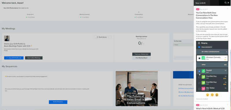
Drift are well versed in Product-Led Growth, and often espouse the importance of your product driving user engagement.
They provide a great example of feature discovery. In their case, they’ve opted for a change log.
You can simply open up the “Now In Drift” sidebar and you’ll see a list of new features as and when they’re released.
The reason this works well is because you can convey a lot of information. Notice how they include a description of what the feature does, how it benefits you, and provide a screenshot. That’s a lot of information to help inform the user.
It’s also non-invasive. If you don’t want to see the sidebar, then you don’t need to open it. It won’t have any impact on users who want to simply carry on using the product as they always have done.
However, there are some areas for improvement. The non-invasive nature of the change log is good in one sense, but bad in another. If users never open the change log, then they’ll never see the new feature, and they might miss out. Sometimes you need something more noticeable, like a pop-up, for example.
Also, they don’t provide a clear CTA. They explain how to find the new feature but that’s it. The user then has to navigate to it themselves. This adds an extra barrier to adoption. A better alternative would be to provide a link that takes the user to the feature in question.
Airtable — A Subtle Approach
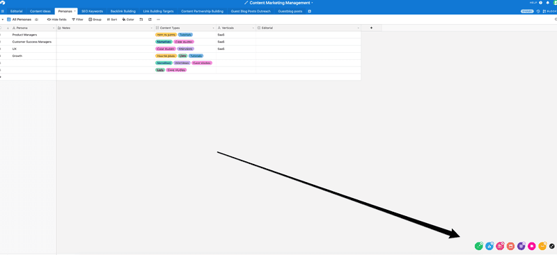
Airtable have opted for a subtle approach to feature discovery, aimed at onboarding users. While Drift’s example focuses on new features as they are released, Airtable uses feature discovery to ensure their users try out different aspects of their product.
Each of the icons represents a different feature. Hovering over the icons displays the feature on the page so you can try it out. If Drift’s approach was non-invasive, this is practically invisible. That’s not a bad thing, it means that users can try out the core features of Airtable when it’s convenient for them.
The other nice thing about this example is that once you’ve tried out a feature, you get a little tick next to the icon. This is a neat example of gamification, enticing users to try out each feature and earn their ticks.
In terms of improvement, perhaps the icons could be made more prominent, as they’re fairly easy to miss.
Heap — Be Direct
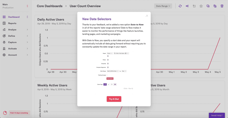
In this example, Heap have opted for a much more “in your face” approach.
This pop-up informs users of a new addition to Heap. It appears in a relevant part of the app, at a relevant time to the user. This means they’re more likely to actually pay attention and not simply dismiss it.
The best part, however, about this pop-up is the content it includes. It starts with a brief description of what the new feature does. Then it explains why that’s useful, and entices the user to try it out. It also informs the user how the new feature works, including a screenshot for extra clarity. Finally, it contains a clear CTA that takes the user directly to the new feature.
This is a really fantastic example of how feature discovery can be used to drive product adoption. If there’s one criticism of this method, it’s that invasive pop-ups like this can sometimes be an unwelcome distraction for users. Used sparingly, however, that shouldn’t present too much of a problem.
How to Use Feature Discovery In Your Own Product
Now that we’ve explained how important feature discovery is, and shown you some examples, it’s time to get to the heart of the issue.
When it comes to using feature discovery in your own product, the most important thing to remember is you need to put your user first. This is something that will become apparent as you read through this section, but it’s so critical to your success that we figured we’d give you a heads up.
Some aspects of feature discovery have the potential to annoy your users. That’s the exact opposite of what you’re trying to achieve here. The key to NOT annoying your users is to consider the context of what your user is trying to achieve.
If you can help them do that by highlighting a particular feature, then you’re doing it right.
It’s also useful to emphasize the benefits of the feature you’re highlighting. Why should your users try that feature out? What will they get out of it? What pain point does it address? You need to answer those questions if you want to compel your users to act.
Remember that, and you’ll be fine.
The other thing to remember is that there isn’t a one-size-fits-all approach to feature discovery. In some cases, a change log is the best idea. In others, you need a pop-up. The key is to use a combination of the different methods at your disposal.
Keep Users Updated With a Change Log
Your changelog should be your go-to source for updating users about new features you release.
Most of the time, users grow accustomed to a product, and fall into specific patterns of usage. New features threaten to disrupt those patterns, and so older users will often prefer to ignore them.
Now, the reason for adding these features is to improve your product. You know that if those older users adopted the new features they would get even more value from your product. But they don’t necessarily know that.
That’s why you can’t simply bombard them with a pop-up or banner every time you release a new feature. Chances are you’re releasing new features all the time. All those pop-ups would be exhausting.
Your changelog works because it’s voluntarily opened by your users. Ideally, you’ll have a standalone icon that users can click to open your changelog. If that’s not possible, then including it as an item on your menu will also work.
Any new features can then be added to the changelog. To alert users to the fact that a new feature has been added, you should alter the icon slightly.
Slack’s little gift icon (see below) is a great example.
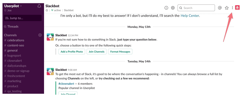
In terms of what to include in your changelog, you should include enough information to convey what the new feature does, the benefits it provides to your users, and a CTA so users can jump in right away.
But don’t overdo it. You don’t want to overwhelm your users with too much information.
Finally, and this is fairly obvious, make sure you keep your changelog updated so that your users keep coming back.
Send the Right Message With Contextual Onboarding
Onboarding is a fine art. At Userpilot, we’ve seen some brilliant onboarding examples and some truly awful ones. One of the key factors that takes your onboarding to the next level is context.
The whole point of onboarding is to improve adoption and to educate your users on how to use the core functionality of your product. But simply providing a checklist or product tour isn’t good enough. If your user has a specific goal in mind with your product, then telling them how to use a completely irrelevant feature isn’t going to help.
That’s what we mean by context: Showing the right message to the right user at the right time.
The key to pulling this off is understanding how your users think. You need to know what motivates them, what they usually want to achieve by using your product. Then you can tailor your onboarding to those goals.
This is particularly important if you have different user personas, each with their own use cases. You might, for example, have one group of CEOs who want a high-level overview of product analytics, and another group of PMs who want to dive deeper into the reporting. It would be useful to have different onboarding funnels for each of those groups.
It’s also useful to have your onboarding messages trigger based on user activity. If, for example, a user lands on a reporting page for the first time, it makes sense for a message to appear that guides them through using it.
Contextual onboarding is an incredibly effective way to aid feature discovery and product adoption.
Incidentally, it’s what Userpilot excels at, so it’s safe to say we know what we’re talking about.
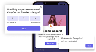
And now with our native mobile app SDK, you can create targeted onboarding flows using slideouts, carousels, and push notifications without writing extra code.
Introduce New Features with Product Design
Of course, as useful as elements like a change log or contextual onboarding pop-ups are, perhaps the best way to aid feature discovery is through the design of your product itself.
Consider a product feedback tool, that enables you to add a form to your app and collect feedback. You can then browse through the answers, analyze your data, etc.
Now, imagine that you’ve just built a new feature for that tool, adding the ability to create NPS surveys.
How would you alert your users to your shiny new feature?
You could add a pop-up, and you could update your changelog. In fact, you should probably do both of those. But there’s something else you could do.
You could simply add “the new feature” to the main navigation menu.
Your users would log in, and the first thing they would see is your new menu, complete with “the new feature”. Chances are, their curiosity will be piqued, and they’ll click to see what it’s all about.
Once they’re looking at “the new feature”, some simple contextual onboarding will seal the deal and have them creating their surveys.
Simply altering the product slightly can drastically improve your feature discovery and product adoption.
Of course, this is something you should use carefully. With great power comes great responsibility.
You shouldn’t make massive changes to your product as you risk confusing, and alienating, your users. Equally, you don’t want to increase adoption of a new feature at the cost of the old ones.
But, if you can make subtle changes to your product, without hindering other features, then it’s an extremely effective way of improving feature discovery.
Here’s a Recap of Our Feature Discovery Article
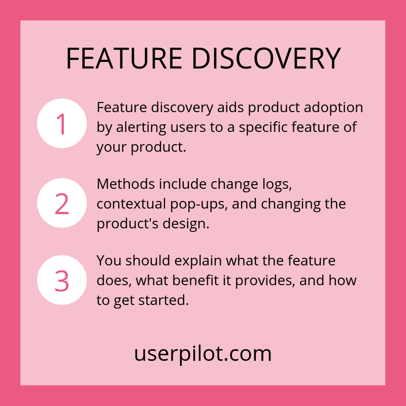
Feature discovery is key when it comes to product adoption. If your users don’t even know a feature exists, then how can you possibly expect them to use it?
Whether it’s a new feature, or an existing one that needs more love, there are plenty of ways you can increase feature discovery.
One way is to create a change log that your users can access whenever they want, or when you prompt them. This includes all the relevant details of new features.
Another way is to use contextual onboarding to present users with relevant messaging about features you want to highlight.
A final way is to change the product itself, for example, adding items to navigation menus, in an attempt to nudge users towards a specific feature.
The best option is to use a mixture of different methods to encourage feature discovery and improve product adoption.
Did we miss any examples of feature discovery? Share them with us in the comments below!
If you want to improve feature discovery in your own product, then Userpilot’s contextual onboarding tools can help. Book a demo to get started.
About the Author
Joe is a UX and content writer, with several years of experience working with SaaS startups. He’s been working with SaaS startups that are focused towards product management and customer success for the past couple of years.


