What 15+ Years in Product Has Taught Me About Improving Customer Retention

Retention is the ultimate measure of product-market fit.
In today’s guide, we’re going to cover my hard-won lessons from 15+ years of working on and improving retention. Along the way, I helped:
- Fortnite increase 30D retention by over 10%.
- thredUP increase CLV by over 40%.
- Affirm increase TPU by over 50%.
How to measure retention correctly
Measuring retention seems simple, but anyone who’s done it knows that there are lots of intricacies in reality.
I have boiled it down to 3 main steps:
- Isolate cohorts.
- Determine what counts as an active user.
- Decide which time period to measure.
Step 1: Isolate cohorts
Every retention measurement starts with isolating cohorts. You need to figure out the bucket of people’s retention you care about.
The most common way is to group new users you acquire each week or month. But you will more often look at things like region, acquisition channel, or device rather than “new users” as a whole.
The key here is to choose cohorts that make sense for your business. If you’re a global company, regional cohorts might reveal important differences. If you’re heavily invested in multiple marketing channels, segmenting by acquisition source could be eye-opening.
Step 2: Determine what counts as an active user
The next step is to ask who your active users are. These days, most sophisticated companies identify active users as users who have used and adopted a specific feature.
For instance:
- At Fortnite, it would be loading into a game.
- At Affirm, viewing a merchant or loan.
- At Apollo, having any relevant event in any of our products in addition to a view.
This approach gives you a much more accurate picture of who’s truly engaging with your product. But it’s not one-size-fits-all. You need to think critically about what actions truly represent value for your users.
My general guidance here is: the best action touches your most common source of user value.
For instance:
- Instagram used “viewed 3 or more posts”.
- Uber chose “completed a ride”.
These choices are deliberate. They’re looking for actions that signify real engagement, not just casual or accidental use.
Now, here’s something that might surprise you: someone who is a paid user isn’t a strong enough signal to indicate them as an active user. It’s much more useful when someone is paying and actively using the product.
That’s because a company could be paying for your B2B software, but if no one’s using it, that’s not true retention. You’re at risk of churn. What you really want is paid accounts where people are actively engaging with your product.
In the B2B world, you might have multiple users under one account. Do you care if the account is retained (i.e., keeps paying), or do you care about individual user retention within that account?
Often, it’s both – you want the account to stay, and you want users within that account to remain active.
Step 3: Which time period to measure?
Now that you’ve nailed down who you’re measuring and what counts as an active user, you need to decide on your time frame, which isn’t as straightforward as it might seem.
Different products have different natural usage cycles:
- Social media apps might look at daily active users (DAU).
- B2B SaaS products might focus on weekly or monthly active users (WAU or MAU).
- Seasonal products (like tax software) might look at annual retention.
The key is to choose a period that aligns with your product’s expected usage patterns.
It’s also worth considering multiple time frames.
For example:
- Short-term retention (7-day or 30-day) can give you quick feedback on new features or onboarding changes.
- Long-term retention (90-day or annual) can provide insights into overall product stickiness and lifetime value.
By looking at both, you can get a complete picture of your retention dynamics.
How to work with charts once you have the data
Alright, you’ve worked hard to collect and organize your retention data. But let’s face it, staring at a data table isn’t going to win you any friends in the boardroom.
When it comes to retention, you want to visualize the data in a way that tells a story.
Let’s dive into the charts that will make your retention data sing.
1. New user retention analysis table
This is your ground zero, the foundation of all retention analysis.
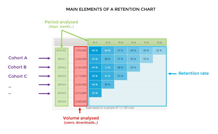
What’s happening here?
Left Side – Month they came from
- January
- February
- March (and so on, marching down the left side of your table)
Right Side – Which month they came from, so each column is a ‘+’
- Month 0 (always 100%, your starting point)
- Month 1 (cue the suspense)
- Month 2 (the plot thickens) (continuing across to the right)
This table is your retention story in its rawest form. It’s not glamorous, but it’s powerful. You can see at a glance how each cohort performs over time.
2. Cohort retention curves
Now we’re talking! This is where your data starts to look sexy. Imagine a line graph where:
- Each line represents a cohort (maybe January is blue, February is red, and so on).
- The x-axis shows time (usually in months).
- The y-axis shows the retention rate.
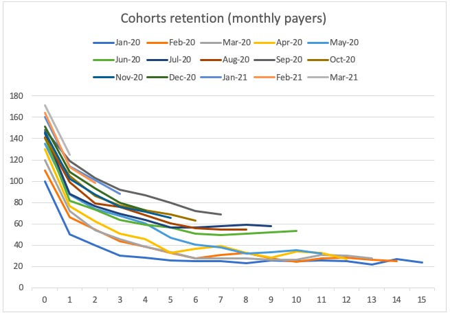
What you’re looking for here is the shape of those lines.
Are they:
- Dropping off a cliff in the first month? (Yikes, you might want to look at your onboarding). Learn how to improve your onboarding.
- Gradually flattening out? (That’s more like it)
- Crossing each other? (Ooh, intrigue! Later cohorts performing better or worse?)
This is where you start to see the patterns emerge.
3. Layer cake graphs
Finally, take your cohort retention curves, but instead of just lines, fill in the area under each line. Voila! You’ve got a layer cake graph.
Why “layer cake”? Because each cohort forms a layer, and together they build up like a delicious, data-driven cake.
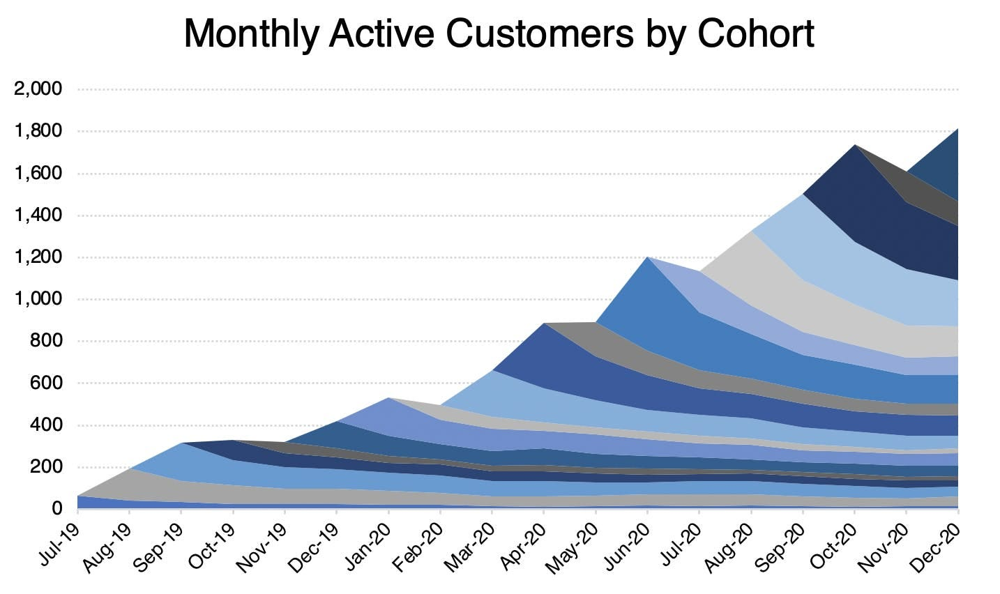
This graph is a feast for the eyes, showing you:
- The total volume of retained users (the height of your cake).
- How much each cohort contributes to your current user base (the thickness of each layer).
- Whether newer cohorts are forming thicker layers. (Is your cake getting taller over time? Yum!)
![]()
Analyze Retention Cohorts Code-Free with Userpilot

What is good retention?
So what does “good” retention look like?
Generally, you want your retention curve to flatten out. Think of it like a roller coaster – a steep drop at the beginning is normal (and maybe even fun), but you don’t want it to keep plummeting forever. You’re aiming for that nice, gentle glide at the end.
What’s even better?
- The flat (or rising!) retention: The cohort retentions that are flat and then actually start increasing.
- The improving cohorts: You want to see subsequent cohorts getting better over time, with each new batch of users retaining better than the last.
Of course, the whole point of this data feast isn’t just to make pretty charts (though that is a nice side benefit). It’s to improve your product. So how do you go from “Ooh, pretty graphs” to “Aha! I know what to do”?
The key is to cut your data into different cohorts. Don’t just look at time-based cohorts. Get creative:
- Acquisition channel (Did those Facebook ads really pay off?)
- User demographics (Are millennials sticking around longer than Gen Z?)
- Product version (Did that big redesign help or hurt?)
- Feature usage (Are power users who use Feature X retaining better?)
So with those basics covered, let’s move on to my main mental model of moving retention.
6 Case studies in success
‘You can’t actually move retention. If you have low retention, you’re screwed.’
This might be the worst advice I have ever heard. Yet so many people repeat it.
Let’s walk through 3 of my own case studies of moving retention, and 3 case studies that companies have generously shared.
Case Study 1: Fortnite
Let’s start with case studies that were my own.
At Fortnite, we faced a unique challenge: keeping players engaged in a highly competitive gaming environment.
Our approach went beyond just creating fun gameplay. We kicked off with a focus on daily engagement. Challenges and events gave players reasons to log in regularly. This simple addition created a powerful loop, bringing users back day after day.
Habit formation was our next target. We refined our notification strategy, ensuring players knew when friends were online or when special events were happening. These timely nudges became the triggers for regular gameplay sessions.
One of our most effective moves was counterintuitive: we made dying more fun. In a battle royale, most players lose most of the time. By adding entertaining death animations and quick re-queue options, we turned potential frustration into part of the fun. It’s a reminder that every aspect of user experience, even the seemingly negative ones, can be optimized for retention.
Our retention strategy extended beyond the game itself. We built out the creator and competitive ecosystem, creating a YouTube-powered flywheel that kept players engaged even when they weren’t in the game. This taught us to look beyond our core product for retention opportunities.
Finally, we tackled mobile retention. By improving usability and gameplay on lower-end devices, we ensured a great experience for all players. It was a crucial lesson in not neglecting any segment of your user base.
The result? A 10% increase in 30-day retention. In the hyper-competitive world of gaming, that’s a massive win.
Case Study 2: Spotify
When Spotify launched in 2008, the music industry was still reeling from piracy issues. Their challenge wasn’t just getting users to sign up, but keeping them engaged month after month.
Spotify’s journey to retention mastery is a tale of personalization and social connection:
- In 2015 Spotify introduced Discover Weekly, a personalized playlist updated every Monday which was a game-changer. Within the first year, 40 million users streamed over 5 billion tracks from Discover Weekly playlists.
- In 2017 Spotify launched its social features, including Friend Activity and Collaborative Playlists that tapped into the fundamental human need for connection. By 2018, 40% of all Spotify listening time came from user-generated playlists.
- In 2019 Spotify made a bold move by acquiring Gimlet Media and Anchor for $340 million. By 2021, Spotify had become the most popular podcast platform in the U.S., surpassing Apple Podcasts. Spotify achieved a 73% retention rate after the first month, significantly outperforming the industry average of 45-55% for music streaming apps.
Case Study 3: thredUP
At thredUP, we faced the challenge of not just acquiring customers, but keeping them. Our focus was on increasing customer lifetime value (CLV).
We started by lowering the barrier to entry. Strategic price reductions on key items made it easier for new customers to make their first purchase.
Next, we implemented comprehensive lifecycle marketing. We crafted growth marketing email sequences that nurtured customers throughout their journey. This was complemented by strategic promotions and remarketing ads to re-engage customers.
User experience improvements played a crucial role. We enhanced our filtering system and introduced saved preferences, reducing friction for return visits. We also introduced an outfits tool, adding value beyond our core offering.
Throughout our efforts, we doubled down on personalization. Improved merchandising algorithms showed customers more of what they were likely to love.
The results were significant. Between 2014 and 2017, we saw a 40% increase in CLV. This wasn’t just a vanity metric – it unlocked a whole new phase of growth. It led to higher customer acquisition costs (CAC) balanced by higher LTV, enabling more aggressive marketing and a faster growth rate. Ultimately, this success helped secure our Series D investment.
Case Study 4: Duolingo
Duolingo entered the market in 2012 with a mission to make language learning free and accessible. Their challenge was keeping users engaged in something as challenging as learning a new language.
Duolingo’s retention strategy revolves around gamification and habit formation:
- In 2013, Duolingo introduced the streak feature, encouraging daily usage. By 2020, over 1.5 million users had a streak of 365 days or more.
- In 2019, Duolingo introduced competitive learning via Leagues that grouped users based on their weekly XP. In the first year after launch, users who joined Leagues completed 72% more lessons on average.
- In 2020, Duolingo launched its podcast (#1 on the US iTunes podcast) and virtual events, creating a more comprehensive language learning environment.
Duolingo’s retention strategy resulted in a retention rate of 55-60%, far exceeding the EdTech industry average of 30-40%.
Case Study 5: Affirm
At Affirm, our goal was to increase transactions per user (TPU). We needed to make Affirm an integral part of shopping habits.
We started by expanding our merchant network by partnering with Shopify and Amazon to increase usage opportunities.
Next, we developed a mobile app that served as a hub for Affirm activity and a discovery tool for enabled merchants.
We also introduced the “Pay in 4” option with zero interest to lower the barrier for frequent, smaller transactions.
Throughout, we maintained a focus on showing value and forming habits after the first use.
The result was impressive: a 50% increase in TPU.
Case Study 6: Strava
Strava, launched in 2009, entered a crowded fitness app market. Their challenge was making people stick to their fitness goals and choose Strava over countless alternatives.
Strava’s retention strategy focused on community building and competitive elements:
- In 2010 Strava introduced Segments, allowing users to compete on specific routes. By 2020, users had created over 180 million Segments worldwide.
- In 2016 a safety feature allowing real-time location sharing added a new dimension to the app. Beacon usage increased by 30% in 2020, highlighting its importance to users.
- In 2020 Strava launched Routes, using AI to suggest personalized routes based on user preferences and community data. Within the first year, over 20 million Routes were created by users.
The result of these efforts was remarkable: Strava achieved an 80% annual retention rate, far outperforming the fitness app industry average of 25-35%.
These case studies demonstrate that while the specifics may vary, successful retention strategies often share common themes.
Let’s concretize all the learnings from these case studies into a framework.
The retention hierarchy of needs
Too often, teams jump to advanced retention tactics before nailing the basics. If your core product isn’t delivering value, no amount of clever notifications or gamification will save you.
One of my go-to concepts for solving a retention problem is starting with a retention hierarchy of needs.
This means thinking of retention as a pyramid, where you have to satisfy the lower layers first before tackling the ones above them:
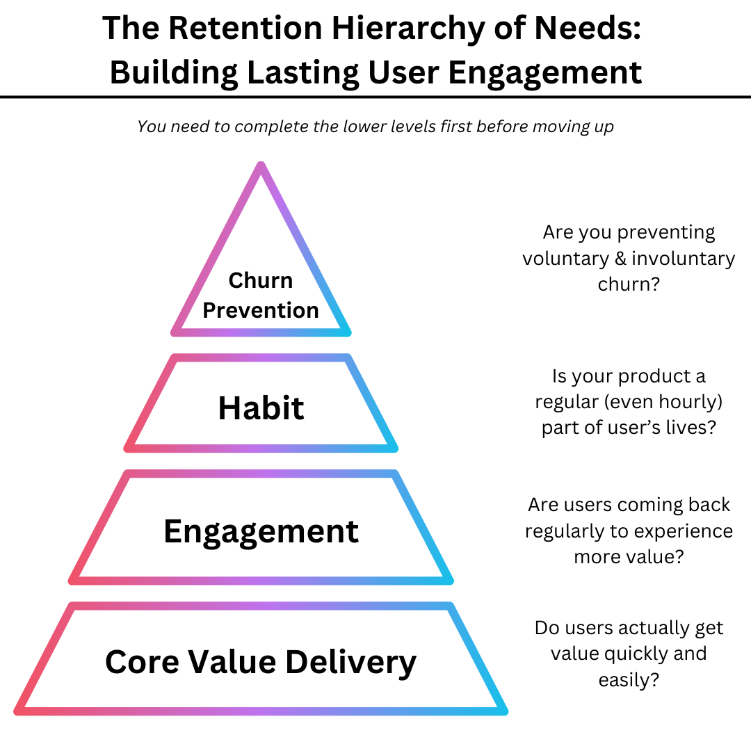
Layer 1: Core Value Delivery (The Foundation)
If you can’t build a great product and an excellent onboarding to it, you are toasted.
This is the bedrock of your product. If you’re not nailing this, nothing else matters.
You’ll be surprised. But as companies expand, this area is often a problem.
The solutions lie in your core product teams, but you can also deploy a growth activation team. These teams often rely on tactics like:
- Improve your UX and information architecture.
- The activation playbook.
- Not making users think.
The metrics that go alongside this are:
- Time to Value (TTV).
- First Value Experience (FVE) completion rate.
- Core action completion rate.
This is the first layer of the hierarchy of needs – and going to a later layer is usually not worth your time until it’s nailed.
Layer 2: Engagement (The Building Blocks)
Once users get your core value, it’s time to keep them coming back for more.
Engagement turns one-time users into regulars. It’s the difference between a fling and a long-term relationship.
And it’s measured by tried-and-true metrics like:
- Daily Active Users / Monthly Active Users (DAU/MAU).
- Session frequency.
- Time spent in-app.
If you’re working to move this, you’ll want to do things like:
- Gamify key actions.
- Create more regular use cases.
- Create reasons to keep coming back.
Layer 3: Habit Formation (The Keystone)
This is where your product becomes part of users’ daily lives. It’s not just useful; it’s necessary.
Habits are hard to break. When your product becomes habitual, you’ve achieved a new level of stickiness.
Working in this layer entails doing things like:
- Integration with Daily Routines: Becoming part of existing behaviors.
- Creation of New Rituals: Establishing new behaviors centered around your product.
- Leveraging Existing Habits: Piggybacking on habits users already have.
The metrics that are relevant here are things like:
- Retention curve flattening.
- Usage frequency patterns.
- Feature adoption rates over time.
When the core product itself doesn’t deliver, adding growth tactics can be very useful:
- Implement daily streaks or challenges.
- Create time-based triggers (e.g., “Your daily summary is ready”).
- Offer cross-platform consistency for seamless integration into users’ lives.
Layer 4: Churn Prevention (The Fortification)
Once you’ve got users hooked, many people stop there. But it’s a mistake. Keeping paying users long-term usually requires active defense against churn.
There’s two types of churn prevention:
- Voluntary Churn Reduction: Addressing active decisions to leave.
Supported by tactics like:- Implement exit surveys.
- Design thoughtful cancel flows.
- Offer timely retention offers.
- Involuntary Churn Prevention: Tackling passive user loss (e.g., payment issues).
Supported by tactics like:- Develop smart payment retry logic.
- Create effective dunning campaigns.
- Implement in-app payment recovery.
Churn prevention isn’t just about stopping users from leaving; it’s about continuously demonstrating your product’s value.
The metrics that matter here are things like:
- Overall churn rate.
- Voluntary vs. involuntary churn rates.
- Winback rate.
5 Best practices to improve retention
The overall approach is the product process – talk to customers, discover problems and obstacles to getting habitual value, and then solve them.
However, it can be useful to refer to best practices.
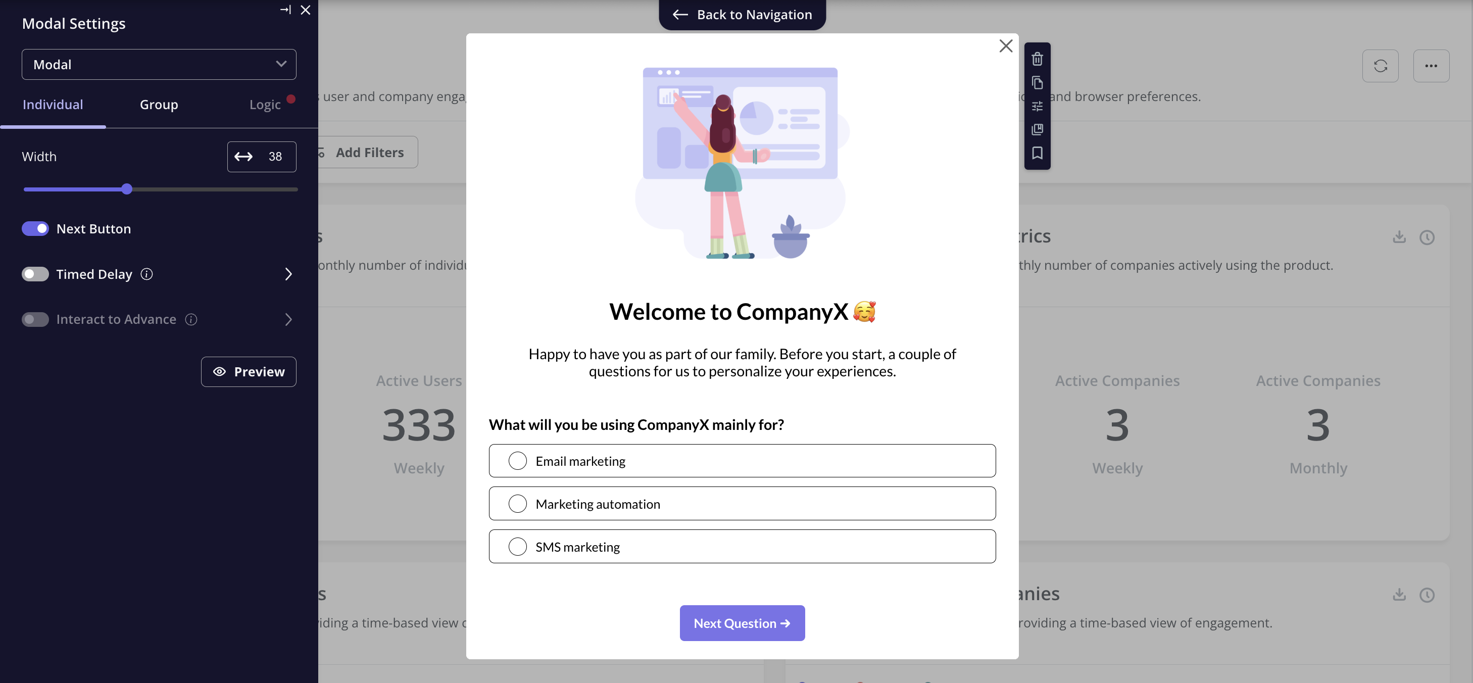
1. Use personalized welcome flows
Tailor the onboarding experience based on user characteristics or stated goals. This isn’t just about showing different screens – it’s about fast-tracking users to their “Aha” moment.
Implement by segmenting users during sign-up. Ask for key information like job role, main goals, or experience level. Use this data to customize the initial product tour, feature recommendations, and even default settings.
2. Use interactive tutorials
Design tutorials that require users to complete mini-tasks within your product. Ensure each task teaches a key feature while moving the user toward their goal.
3. Implement progress bars
Tap into the Zeigarnik effect. Show users how close they are to unlocking full product value. It’s not just a visual – it’s a psychological trigger for completion.
Implement a clear, visually appealing progress bar during onboarding. Break down the process into 5-7 clear steps. Ensure each step provides value, not just busy work.
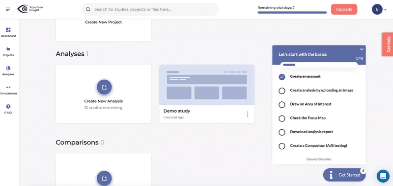
4. Provide a clear roadmap for new users with an onboarding checklist
It’s not about hand-holding – it’s about empowering users to explore your product purposefully.
Create a checklist of 2-5 key actions new users should take. Make it easily accessible, perhaps pinned to the dashboard. Allow users to dismiss it, but make it easy to retrieve.
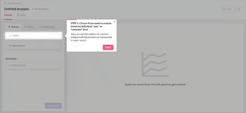
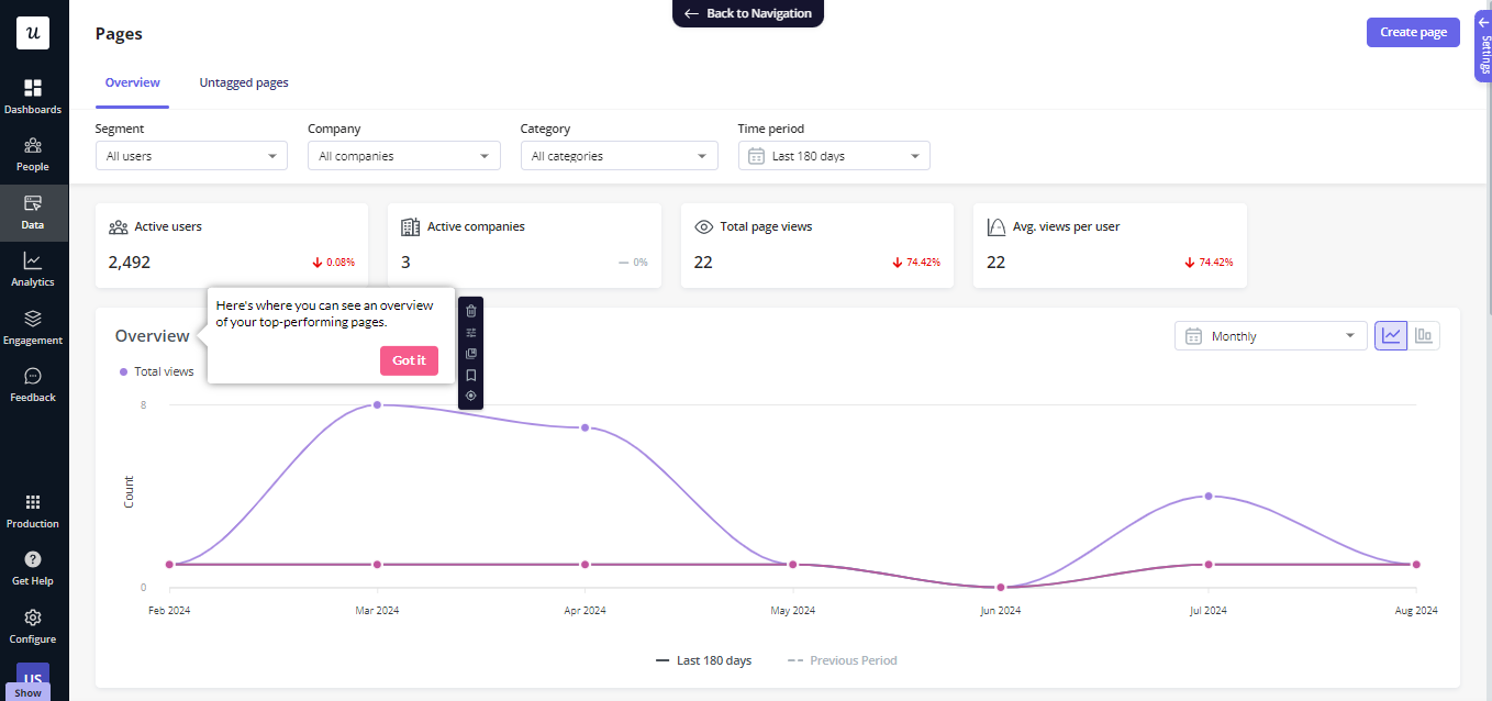
5. Implement contextual help bubbles with tooltips
Don’t force users to dig through help docs. Bring the information to them when and where they need it.
Implement smart, context-aware help bubbles that appear when users hover over or interact with new features. Keep the content concise and actionable.
Final Words
We’ve covered a lot of ground in this retention masterclass. From the foundations of measuring retention correctly to the advanced tactics of preventing churn, we’ve explored the entire spectrum of keeping users engaged and coming back for more.
Remember, retention isn’t just a metric – it’s the lifeblood of your product.