Contextual Onboarding: What is it, and Why Should I Care?
What is contextual onboarding and why is it important if you want to achieve product growth and user retention?
Today we’re going to tell you everything you need to know about contextual onboarding, why you need it, and how you can use it to grow your SaaS product.
We’ll also share some of the best user onboarding examples along the way.
Let’s get started!
TL;DR
- Contextual onboarding is the process of introducing new users to the product features and showing the right things at the right time.
- Unlike contextual onboarding, generic onboarding isn’t as effective as it doesn’t cater to different users and their needs.
- Contextual onboarding relies on two things: Triggers that are based on user behavior and custom events.
- Contextual onboarding reduces the time to value as well as allows you to create personalized flows and provide a great user onboarding experience.
- To create a good contextual onboarding experience, you should scrap the introductory walkthroughs, maximize the value of the empty states, use onboarding checklists, segment customers to apply personalization later, and add interactivity to your entire onboarding process.
What is contextual onboarding?
Contextual onboarding is making sure you show the right message to the right user at the right time.
In other words, contextual onboarding adapts to each individual user. Everyone will have their own onboarding experience with your product.
That might sound a little daunting. After all, you don’t want to hand-craft an onboarding flow for every single user.
Fortunately, you can use triggers to customize the onboarding flow based on your user’s in-app behavior.
If, for example, a user starts using Feature B before Feature A, then they’ll go through Feature B’s onboarding flow first.
The idea behind contextual onboarding is that the flow changes and reacts to each individual user. This makes it far more effective than a one-size-fits-all approach.
Why you should avoid generic onboarding at all costs?
The trouble with generic onboarding flows is that they don’t cater to each user’s needs.
Consider an email marketing product, something like Mailchimp or Drip. Imagine if you signed up and were then presented with each major feature in turn.
How to generate a sign-up form > how to manage your list > how to send emails.
That might seem like a good onboarding flow, right? But imagine if you already had a sign-up form and a mailing list. You’d want to skip to the emailing section.
Generic onboarding would mean sitting through tutorials and product tours that you don’t need to sit through.
Contextual onboarding, on the other hand, would mean you could skip straight to the features you needed to use.
What are the elements of contextual onboarding?
Contextual onboarding relies on two things: Triggers and custom events.
Triggers are based on a user’s in-app behavior. Some examples include:
- Scrolling to a certain point on the page.
- Clicking a button.
- Activating a specific feature of your product.
Triggers enable you to adapt your onboarding to what the user is actually trying to achieve.
Custom events are what happens when a trigger is fired. Examples include:
- A tooltip that draws attention to a button.
- A modal that drives you to a new feature.
- Redirecting you to a different page.
As you can see, contextual onboarding is completely customizable. It enables you to create an interactive onboarding experience.
Why contextual onboarding will take your product to the next level?
The biggest problem that most companies face when it comes to onboarding is making sure that their users see it through to the end.
It’s far too easy for users to fall off halfway through your carefully crafted onboarding flow. Short attention spans, and other priorities — these are your enemies.
With contextual onboarding, there’s no danger of a user leaving before the end of the onboarding flow.
In fact, there isn’t really an end. Or a start. You onboard your users as they start using your product. This is really important.
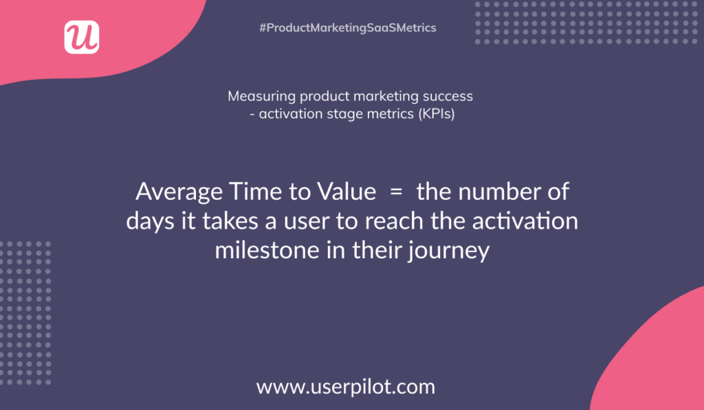
Reduce the Time-to-value
The ideal product would have a time-to-value of zero. A user would sign up and instantly start seeing value from your product.
They’d be hooked. They’d shout from the rooftops. They’d probably even cry tears of joy.
But, as you probably already know, there’s no way you can ever achieve a time-to-value of zero.
That means you need to aim for the shortest time possible. The quicker your users see value in your product, the more likely they are to stick around long-term. The longer it takes to see the value, the more chance a user has of leaving.
Making your user sit through product tours and walkthroughs that don’t apply to them? Well, that’s adding more time to value. That’s adding more friction.
Contextual onboarding, however, enables your users to start using the product right away. Maybe they need a short introduction, sure, but otherwise, they’re free to go and use your product.
This means they’ll start seeing value far sooner. It means they’ll experience your product’s Aha! Moment quicker. Essentially, it means they’ll have a better time using your product.
Provide personalized experiences
Personalization has quickly become the default. We expect marketing to be personalized to us. We expect a personal touch from customer support.
For some reason, the product is yet to keep up.
We’re slowly starting to see personalization creep into the products we use.
Some products now ask you some questions when you sign up. Your answers are then used to personalize your experience.
This is a step in the right direction, but it still places users into “silos” and forces them down a certain onboarding flow.
Contextual onboarding enables you to provide actual personalization to your product.
The onboarding flow adapts and changes in response to your users’ actual in-app behavior.
This gives your users the feeling that the product is genuinely helping them.
Contextual onboarding is incredibly effective when it comes to providing value to your users. So how do you go about adding it to your product?
How to get started with contextual onboarding?
There are several steps you can take to embrace contextual onboarding in your product.
Scrap the introductory walkthrough
Unless your product is about as complicated as a New York Times crossword, there’s really no reason for having a long drawn-out tutorial when a user signs up.
Most users are savvy enough to click around and try things out. If your product looks scary and unusable, then that’s probably an issue with your product, rather than your onboarding.
As we’ve already mentioned, a tutorial at the start adds more friction and means a longer time-to-value.
The best step you can take, therefore, is to remove it altogether.
Ultimately, most users aren’t going to pay much attention to it anyway. And even those who do won’t remember everything you’ve told them.
Instead, let your users start exploring the product from the moment they sign in.
This works really well for Airtable. You’re able to sign up and start using the product in whichever way you choose.
Airtable includes a very subtle onboarding flow:
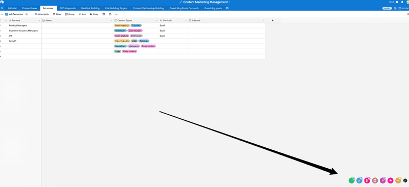
It’s so subtle we needed an arrow to point you in the right direction!
Each of those icons relates to a different Airtable feature. Clicking on them opens the onboarding flow for each one.
This means new users can access the onboarding whenever they need a helping hand.
Make the most of empty states
Empty states are often the first thing your users will see when they sign up for your product.
Generally, these are dashboards that would usually show certain data. Of course, this is the first time a user has logged in so that data will be non-existent.
A lot of empty states are often, well, empty. But you can actually use them to onboard your users.
Instead of leaving them empty, include a message that briefly explains: a) what the user will normally see here, and b) how they can start filling this page with data.
The message will often include a CTA, directing the user to the relevant feature.
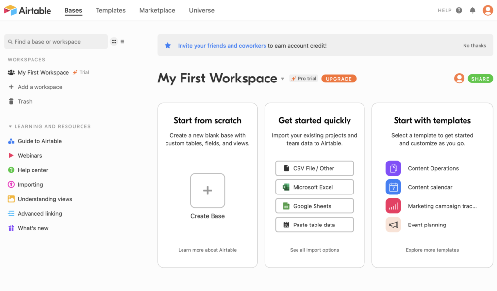
Here’s a perfect example from Airtable:
This is what you see when you first log in to the product.
A quick explanation of what you can do with the product and then a CTA encouraging you to create your base.
It’s not complicated, but it’s so much better than having an empty screen with no explanation.
Use onboarding checklists
That introductory walkthrough we asked you to scrap earlier on? It’s time to repurpose it.
The information in that walkthrough is great. The problem was with the timing.
Instead of having all the guidance at the start, you need to spread it out and have it appear at the right time.
So, when is the right time?
To figure that out you need to think about the different areas of your product, and what your users need to know to get started with each one.
This ensures that the user receives the messaging right as they need it.
You essentially have to predict how your users will interact with your product, and then make sure you’re delivering the message at the right time.
Another good way to encourage users to do things in the right order is to use checklists.
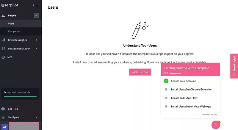
Here’s a good one from Userpilot:
This checklist focuses on the key actions a user needs to take to start seeing value in the product. It ensures new users go ahead and get set up before worrying about the rest of the features.
As you can see, there is also a progress bar that indicates that you’re showing progress and the end is near.
With Userpilot, you can create checklists without having to code.
You can also create mobile-first onboarding flows with Userpilot, customizing welcome screens, carousels, and slideouts to deliver personalized messaging.
Segment your users
If you think right back to the start you’ll remember we explained that contextual onboarding was sending the right message at the right time to the right user.
We’ve covered how to send the right message, and you know how to find the right time. So how do you make sure you’re sending it to the right user?
There are two approaches you can take to this. One is a behavioral approach.
For this, you simply trigger your onboarding based on the in-app behavior of the user.
If a user reaches a particular page, it triggers a modal. If a user clicks a specific button, it triggers a tooltip.
This approach is the most effective, as it essentially personalizes the onboarding for each and every individual user.
Having said that, it requires a bit more work.
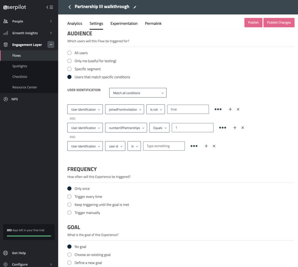
A quick win is to opt for segmentation. This involves splitting your users into different groups (usually based on persona). You can then give each group a different onboarding flow.
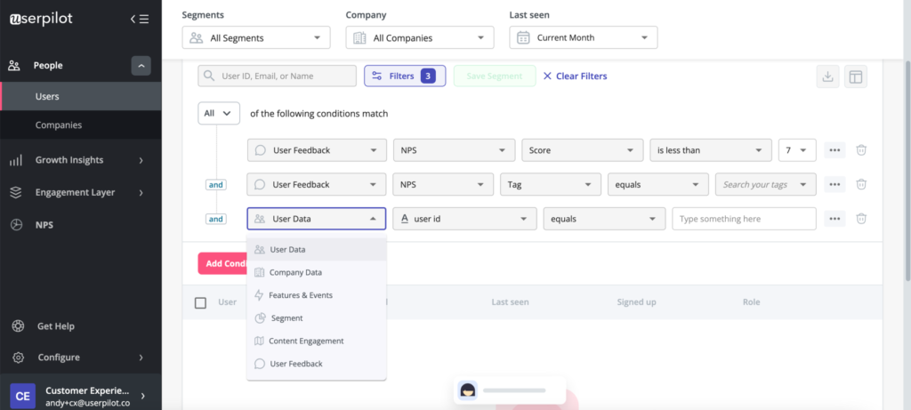
With Userpilot, you can segment customers based on user, company data, feedback, features, events, etc.
Make your onboarding interactive
The best way to learn a new piece of software is by using it. It beats reading help docs, it beats scrolling through walkthroughs, and it beats demo calls.
There’s nothing as effective as having your users play around with your product as part of the onboarding process.
Adding a layer of interactivity to your onboarding flow will drastically improve your adoption and activation rates.
The best way to do this is with an interactive walkthrough. This serves as an introduction to your product. However, unlike a simple product tour, this walkthrough lets your users do the work.
Perhaps one of the best examples of this we’ve seen comes from Trello.
For those new to Trello, the way a board is structured can be a little confusing. It’s such a versatile tool that it’s easy to be overwhelmed.
That’s where the interactive walkthrough comes into play:
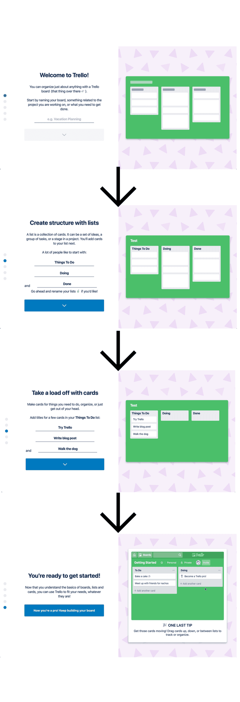
As you progress through this walkthrough, you enter the details as you go along.
This teaches you how the different elements of a Trello board work.
The best part, however, is that you end up with a Trello board based on what you entered.
In other words, you’ve been guided into building your first board, without even realizing it.
In just a couple of minutes, this interactive walkthrough teaches new users everything they need to know, and instantly provides value.
Key takeaways about contextual onboarding
It’s safe to say that contextual onboarding is only going to become more and more popular as time goes on.
Eventually, your users are going to demand that they be onboarded in this way. Why not get ahead of the curve?
Let’s recap:
- Contextual onboarding is sending the right message to the right user at the right time.
- It utilizes triggers (eg. clicking a button) and custom events (eg. a modal popup).
- Contextual onboarding is far more effective when it comes to driving activation and adoption of your product.
If you need a helping hand with contextual onboarding, then why not give Userpilot a try? Book a demo to get started!

