Demo Content 101: How to Use It Correctly in SaaS

If you’ve ever signed up for a complex SaaS product, there’s a good chance you’ve seen demo content without realizing it.
SaaS businesses use demo content because they know that it’s incredibly demoralizing for customers to get excited about using a new product, only to find that there’s no existing data on the site that would lead them to understand the value of the product faster.
The value of demo content is perhaps most apparent for early-stage SaaS products with few users, or for products where the value is directly correlated with the presence of other users, such as a social network.
But where do you get demo data from? How do you use it transparently and ethically? And why does it matter?
Read on to find out.
Contents
- What is demo content?
- The problem with empty states
- How to use demo content correctly
- Demo content pitfalls to avoid
- How to generate demo content
- Conclusion
What is demo content?
Let’s start with some basic definitions.
Demonstration content, or “demo content” for short, is made-up, placeholder customer data that businesses show to users in order to demonstrate a product use case that is relevant to them.
For example:
- Made up project data for a project management tool
- Made up sales call data for a sales CRM tool
- Made up browsing data for an analytics tool
Demo content is valuable for SaaS products for two main reasons:
1. To see if your product works
For example, if you were testing an online course platform that you built, you’d need to put in some dummy users before being able to show it to real customers.
It would be foolish indeed to expose your online course site to customers if they were unable to register on it due to a technical issue — one that you could have easily discovered through testing it.
2.To sell your product
Buyers want to see how something works before they buy it, and this is especially true online. A demo can be sales-led or self-service.
Most often, demo content is shown to users when they first sign up for a particular SaaS product, or during sales calls.
In both instances, the thinking is that it would be harder for a new user to really experience the “Aha Moment” without seeing how the product works in a practical sense — complete with real data.
On sales calls, the salesperson is able to harness the demo content to illustrate to the customer what they can expect from using the product.
Given that customer education is a journey that never ends, you could also use demo content as a way to illustrate the value of new features during secondary onboarding.
It’s important at this stage to distinguish demo content from content templates. Put simply:
- Demo content is made up of placeholder data/content that shows the customer how the product works.
- Templates are pre-engineered forms that the customer needs to fill out manually with their own data.
Demo data is presented to the customer without them needing to do anything, whereas template data needs to be input manually by the customer.
The problem with empty states
What demo content and templates have in common is that both are used to fill so-called “empty states.”
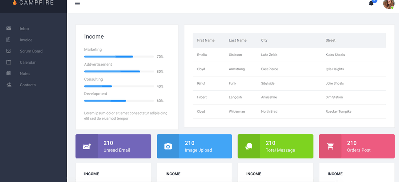
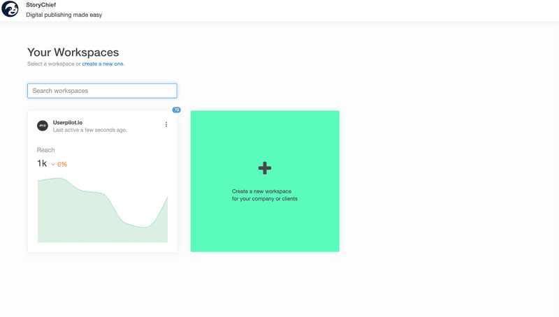
In UX design, an empty state is the blank screen users experience when signing up for a new product. The user has no friends on the platform, and no history of activity, so there’s just nothing there for them to see.
It doesn’t take a genius to realize that this is a depressing state of affairs for a new user.
Imagine that you’ve spent ages looking for a new project management tool to supercharge the team you’re leading. You’ve read all the reviews, talked to industry leaders, and are ready to make your decision.
You get buy-in from the person in charge of the budget, and you sign up for the platform. You’re super excited to get into organizing things.
And then you see this:
Nothing. Blank. Emptiness.
It takes much more energy to start filling this empty state with your data than it would do if there were already data there for you to read.
(This is the same reason that staring at a blank piece of paper before you had to fill it for your art exam in school sucked, by the way.)
Replacing empty states
I’ve seen several businesses deal with the problem of empty states by showing their excited new users messages like “You haven’t set up any projects yet.” Or, worse yet, “You don’t have any friends.”
Although well-intentioned, these messages don’t help the user get started with your product. All they achieve is to highlight the user’s solitude in a rather demeaning way.
Sounds like a recipe for churn.
But in every problem lies an opportunity. And in this case, an empty state is a chance to show customers what life on your product could be like — if they were using it to its full potential.
Showing users templates that they can fill in is one way to solve this problem. This is how the marketing automation tool Autopilot doubled their product activation rate: by replacing empty states with customer journey templates. You can read more about Autopilot’s story here.
Showing users demo content is an equally valid solution. It’s a smart way to capture your users’ imagination and have them think about what their product experience might look like a few months from now.
Ideally, you’ll use their answers to your onboarding survey and welcome screen to sort them into a customer segment, and then show them demo content that is specific to that segment’s individual use case.
If you want specific guidance about how to segment customers, I highly recommend checking out this post for a good overview, since it goes beyond the scope of this article.
For now, let’s look at some best practices for how to use demo content to fill empty spaces— as well as what mistakes you should avoid.
How to use SaaS demo content correctly
Here are a couple of real-life case studies from other SaaS businesses to give you a bit of inspiration.
1. Use demo content to educate customers
It’s great if your demo content is relevant to your user’s individual use case. Many SaaS companies don’t go as far as to personalize their demo content by use case, so you’ll set yourself apart if you do it.
But it’s even better if your demo content actively teaches your user how to get the most out of your product, step by step. This is sometimes referred to as the “content-as-tutorial” approach.
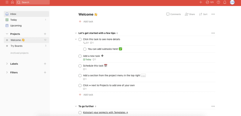
A company that uses the “content-as-tutorial” approach exceptionally well is Todoist.
This is what you see as a new user when you sign up for the platform.
Note how there is dummy data that demonstrates the value of the tool, but how that same data also provides you with step-by-step instructions on how to start using Todoist.
I’d be prepared to bet that Todoist has worked out which product features an average user needs to learn in order to activate, and then listed them right there in the demo content.
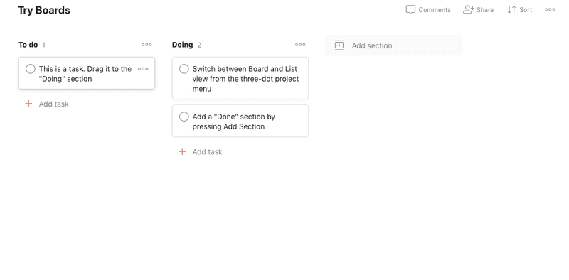
Further down, they also have a “Try Boards” section, which contains demo content that encourages you to, you guessed it, try out the boards feature.
This kind of “learning by doing” approach is both memorable and practical.
It’s also a million miles away from the passive, generic product tours that are sadly commonplace in the SaaS world.
2. Deliver different demo content to different use cases
Regular readers of this blog will know that we are big on personalizing your product to the individual needs of your customers wherever possible.
The reason for this is based on empathy and simple common sense. What’s more appealing?
- Try this project management software.
- Stop drowning amidst a sea of deadlines and make sure that all the projects on your team get done on time, so that your CEO can get an idea of the bigger picture.
You get the picture. People are most interested in content that speaks directly (and emotionally) to their specific needs.
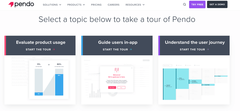
One company that has found a way of speaking to specific needs with demo content is Pendo.
If you sign up for a demo of their product, you’ll be asked to choose between 3 different use cases:
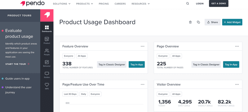
Once you’ve made your choice, you’ll then be served with demo content specifically related to your use case. This is the demo for “Evaluate product usage,” for example:
All the numbers are fake placeholder data, but the point of the demo is achieved: to show the user how someone with their specific use case might use the product.
It’s easy for a user to imagine what their product experience could look like in a few months time, after some real data has been added.
Demo content pitfalls to avoid
Needless to say, it’s possible to really mess up your demo content so that it ends up putting users off, instead of drawing them in. Here are some mistakes to steer clear of:
1. Don’t make dummy data permanent
The dummy data that users see when they sign up should vanish soon after they input their own, real data. Perhaps even immediately, depending on your product.
Bonus points if the user doesn’t have to remove the dummy data manually and the data just auto-deletes, or the space it took up is auto-populated with the customer’s data.
Remember: the more your demo gets in the way of your customers doing what they want to do, the more they’re going to perceive it as a hassle, instead of the inspiration it’s intended as.
2. Don’t forget to tell users that this is demo content
Otherwise, you risk running into some awkward questions such as:
- Where did this data come from?
- Did you hack my business to get this data?
- What am I supposed to do with this data that I don’t recognize?
The last thing you want is to replace the problem of empty states with the problem of confused customers.
You can frame your demo content in your customer communications as “fictitious data,” “sample data,” “placeholder data,” or similar. Here’s how Pendo solved this problem:
If you do that, there’s a good chance your customers will recognize that you’re trying to help them, not confuse them.
3. Don’t base demo content on a data set that is too small to show meaningful trends
Imagine you’re using a tool that measures NPS scores.
That same tool gives you a demo. Yes, you appreciate the fact that there are some demo users to show you how things look, but is it really possible to get a meaningful NPS score from 3 users: 1 detractor and 2 promoters?
Another example. Say you’re using a tool that measures product analytics, because your employer has a complicated product with 300 features, all catering to different audiences who use them at different rates.
You’re interested in viewing a demo about which features were used the most frequently… only to discover that there are only 2 features on the demo.
These examples are somewhat exaggerated, but you get the point. In each case, these demos are going to irritate customers more than inspire them.
4. Don’t show real user data in your demo content
… unless you really want a lawsuit.
The data in your demo content should be entirely fictitious. If you share another company’s private data in your demo content, even if it’s only a tiny amount, you are playing with fire.
You have been warned.
How to generate demo content
If you’re sold on the value of demo content, I want to leave you with some ideas for tools that can help you generate it automatically.
The days of having to make this data up manually yourself are, thankfully, long gone 🙂
1. Use synthetic data
Synthetic data is data that was created by AI. This is valuable from a privacy perspective, as there’s no risk of you showing real user data and running into legal issues.
If you’re thinking “How is this data going to be relevant to my users?” fear not. Synthetic data is based on patterns in your original data. Those patterns are picked up by the AI, aggregated, and then anonymized.
The result is data that is relatable, but also completely fake.
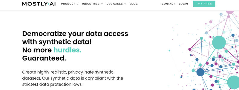
If you’re looking for companies that run this kind of AI as a service, consider checking out Mostly.ai (pictured) or Syntho.ai.
Astonishingly, there are even websites that create synthetic data like this in image form. The most famous one is thispersondoesnotexist.com, which is also completely free. It takes photos from stock image websites and makes entirely synthetic people out of them.
Hence the name of the site 🙂
2. Use an API with fake data
If you’d rather plug an API into the backend of your website to access data that way, this might be the option for you.
There’s a handy little website called dummyapi.io which claims to have 100 users, 800+ posts and pictures, and over 1000 comments — all of them fake, of course.
From the type of data they’ve created, this looks as if it would be especially valuable for SaaS companies needing dummy social media data in order to create their demo, such as social media scheduling apps.
The API is publicly available for free. If you find it valuable, you can tip the creators on Patreon.
3. Use an open-source database
This idea is similar to an API but requires less technical knowledge to integrate.
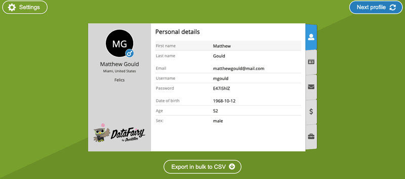
The DataFairy project lists a large number of fake profiles, complete with name, bank account details, ID number, and even password information!
You can scroll through them to find profiles that suit your needs, or alternatively download the entire data with the click of a button.
For a free, minimal-effort solution, this seems pretty valuable.
One potential word of caution, however: a lot of the data is non-English; Chinese, or German in particular. If that’s not your audience, then this might not be the best dummy data for you.
Conclusion
We hope you’ve enjoyed this deep dive into everything demo content! If you’ve made it this far, you should now be able to:
- Understand why demo content is valuable to prevent empty states
- Emulate best practices from other companies’ demo content
- Avoid common pitfalls when using demo content
- Find or create dummy data quickly and easily
Demo content can be seen as just one element of the larger topic of customer education. It just so happens that Userpilot is an extremely potent customer education and engagement tool, with a wide variety of different capabilities.

