Userpilot vs Google Analytics: Which is Better for User Analysis?


Is Userpilot or Google Analytics the best tool for user analytics? And is there a better software that would better fit your needs?
In this post, we’ll discuss exactly that. Let’s dive in!
Userpilot vs Google Analytics – quick summary
- Let’s explore how Userpilot and Google Analytics compare when it comes to performing user analysis.
- Userpilot is a product growth platform that drives user activation, feature adoption, and expansion revenue. It also helps product teams collect user feedback, streamline onboarding, and gather actionable insights from analytics.
- Google Analytics is a web analytics service offered by Google that tracks and reports website traffic and mobile app traffic and events, currently as a platform inside the Google Marketing Platform brand.
- While Google Analytics provides a comprehensive view of website traffic and user behavior, Userpilot’s product analytics offers specialized insights tailored for SaaS businesses that can be pivotal for growth in your SaaS. Here are three advantages of Userpilot over Google Analytics:
- Feature Adoption Analysis: Google Analytics provides general metrics about pageviews and user interactions, but Userpilot takes it a step further. It specifically analyzes the utilization of individual product features. These features give you insights into which functionalities are driving value and which might be overlooked, thereby guiding product enhancements and feature prioritization.
- User-Centric Tracking: Unlike the broad-strokes approach of Google Analytics that prioritizes overall web traffic, Userpilot delves deep into individual user journeys. This means you can get a granular view of each user’s interactions, facilitating a deeper understanding of user needs, pain points, and preferences.
- In-App Experience Enhancements: While Google Analytics provides data, Userpilot offers tools to act on that data within the application. With its suite of in-app tools, you can instantly deploy surveys, tooltips, and guided flows, capitalizing on analytics in real time.
- Get a Userpilot demo and drive your product growth code-free.
What is user analysis?
User analytics is the process of capturing and analyzing user behavior within your product. This helps to understand how different segments act in-app, identify friction and drop-off points, and make data-driven decisions.
Must have features for user analytics tools
Choosing the right user analytics tool is important for understanding your customers’ behavior and optimizing their journey. Here’s what you should look for:
- Event tracking: The chosen tool should come with the ability to set up events for monitoring in-app behavior. It should be capable of tracking both client and server-side events so you can have a better understanding of how users interact with your product.
- Analytics dashboards: These include no-code reports and dashboards that you can easily build to draw meaningful insights from collected data. It’s also highly recommended that these dashboards have advanced segmentation filters so you can filter data for a better understanding of specific user groups.
- Surveys: In addition to behavioral data, it’s also necessary that the chosen tool is capable of collecting and analyzing feedback. Such direct data from customers can help you understand customer expectations and work on improving your product.
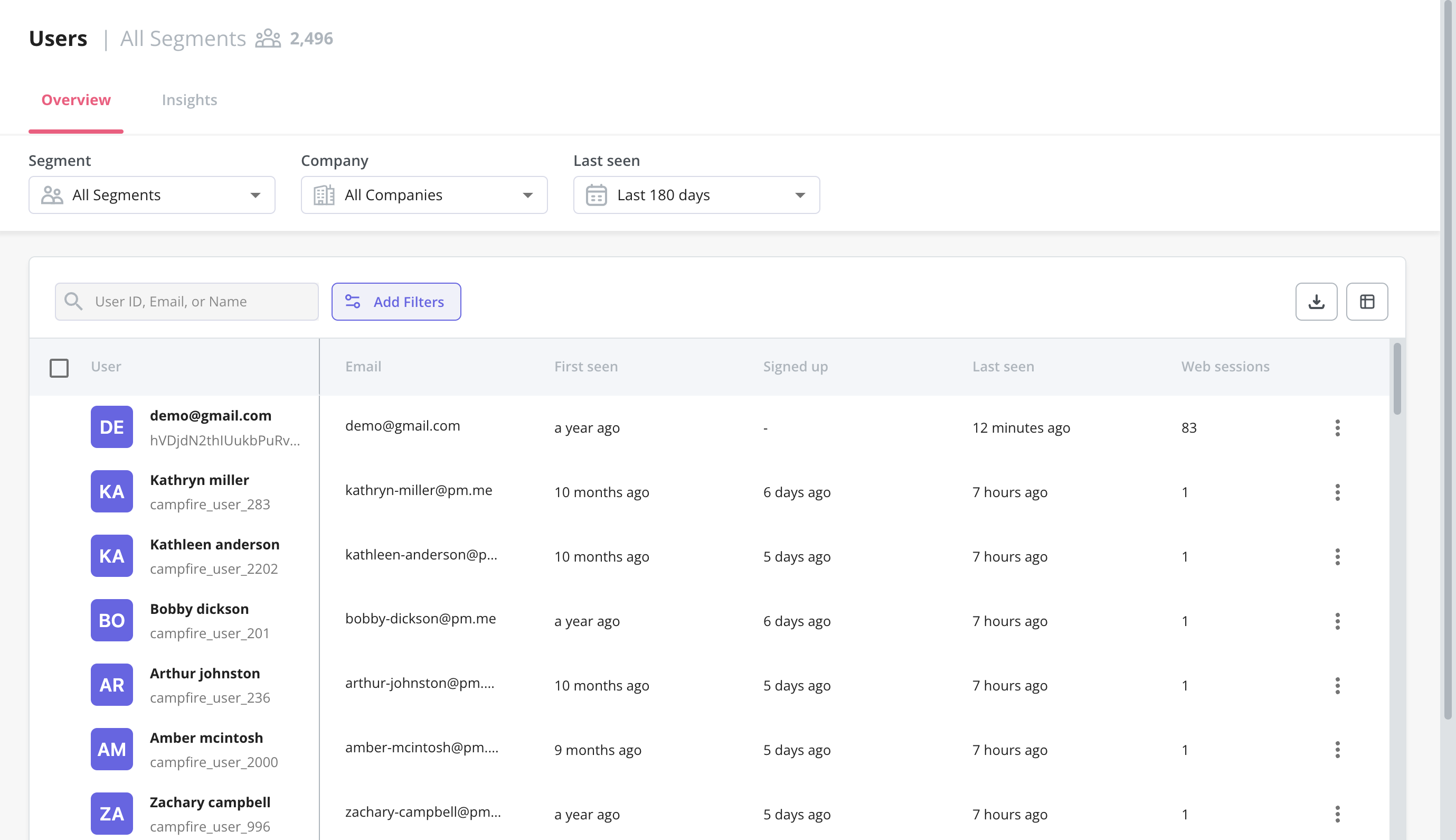
- Users dashboard: Userpilot’s users dashboard gives you an overview of all user data in one place. You’ll be able to filter by segments, which companies users are from, or when they were last seen active. You can also export data in bulk as a CSV or perform actions on individual users.
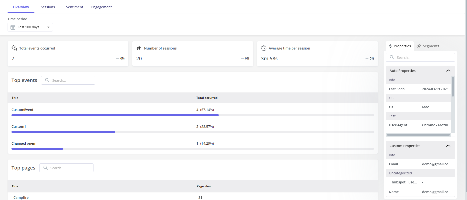
- User and company profiles: Here you can view data related to a certain user/company to gain insights into their behavior i.e. Top events, Top pages, Sessions, Sentiment – user’s feedback (NPS & Survey), etc. With such granular insights, you can go one step further with your personalization efforts.
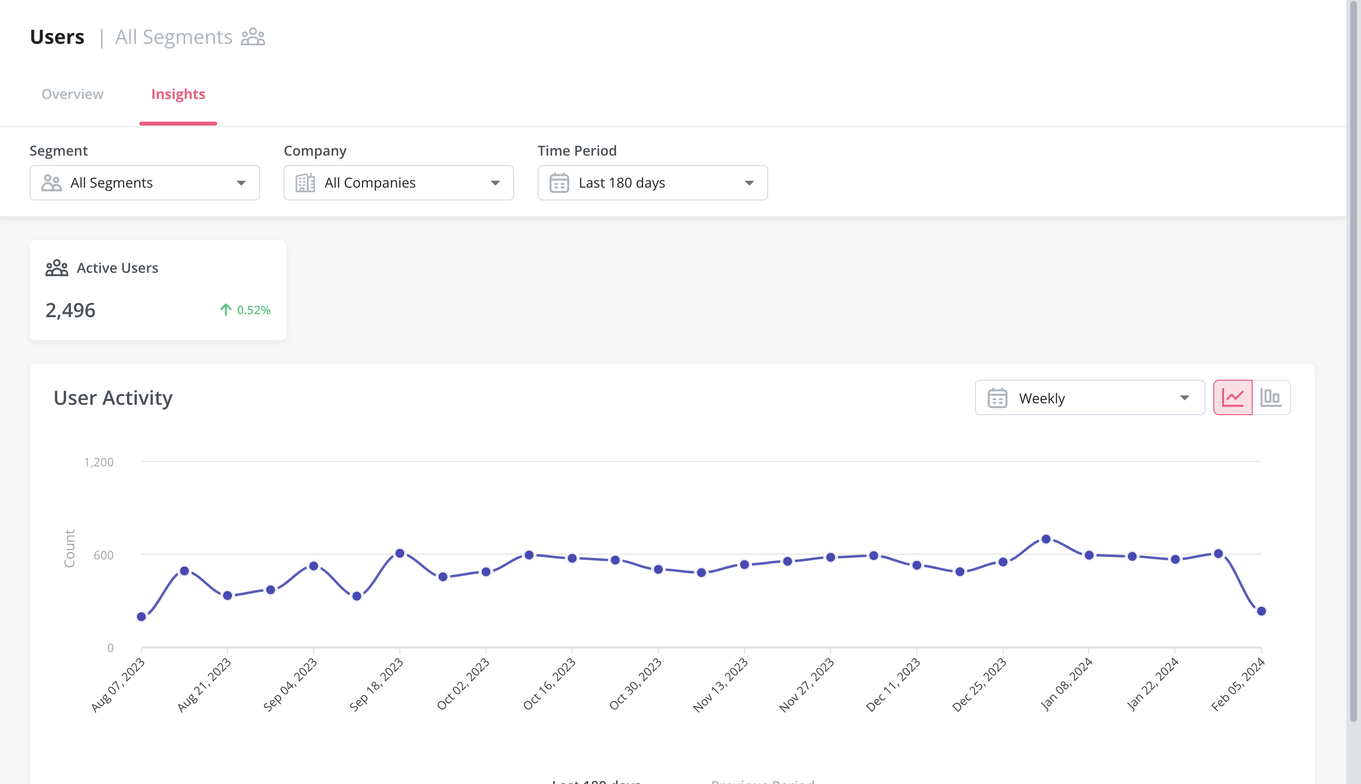
- Audience insights: Much like the overview dashboard, the Insights section lets you filter metrics by segment, company, and time period. You’ll be able to choose between a daily, weekly, or monthly view and then compare data between the current and previous time periods.
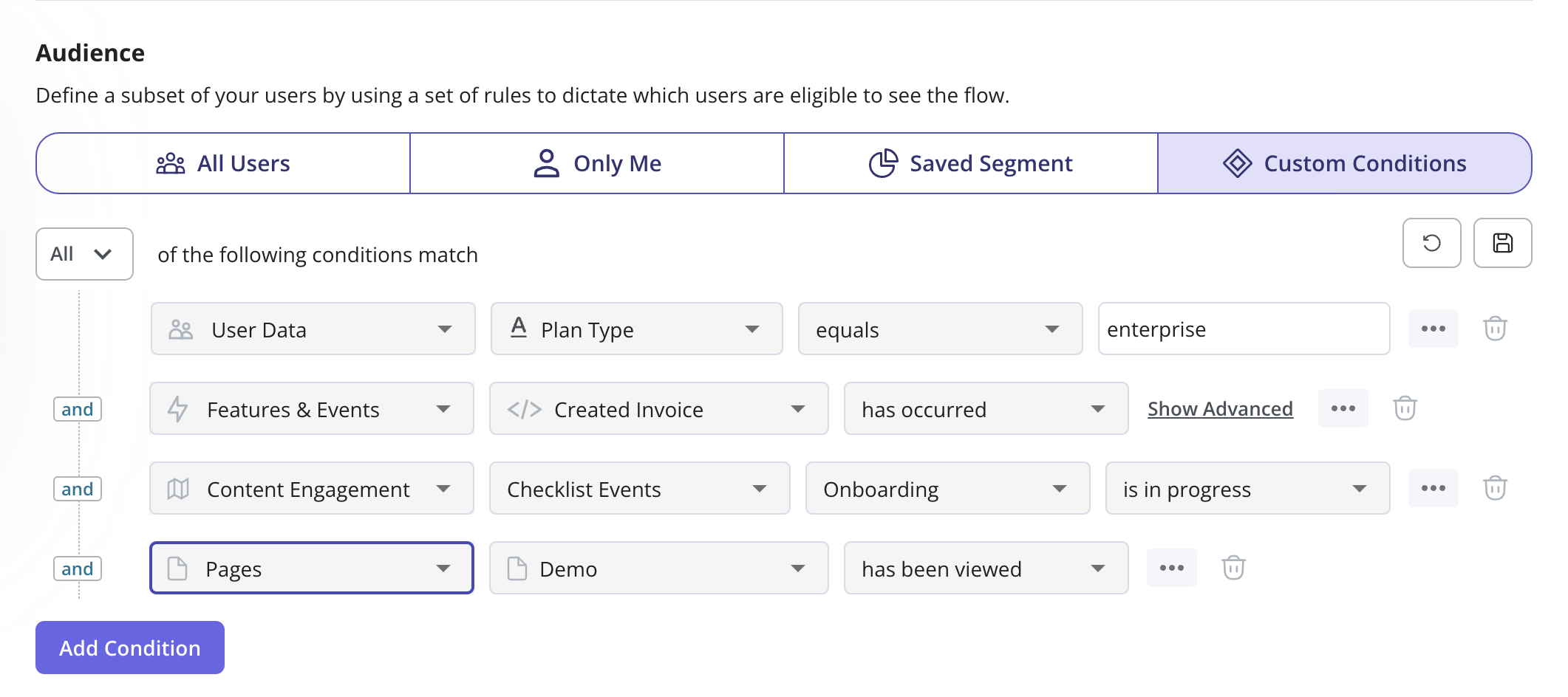
- Conditional segmentation: Practical use cases for user analytics include creating segments for all users that meet certain conditions. For instance, you could reach out to companies in a certain country when creating a new flow or target customers who have tried certain features.
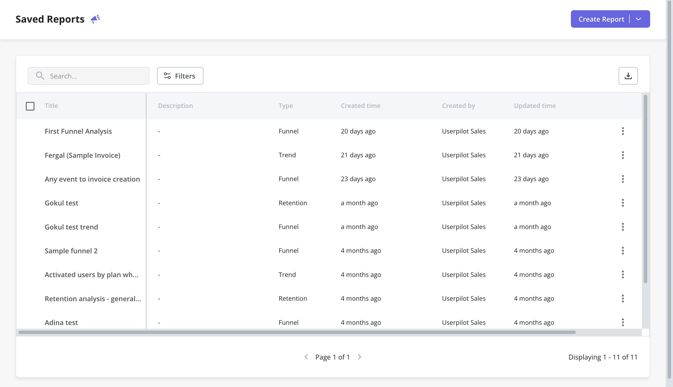
- Saved reports: With Userpilot, you can create funnels, trends, retention tables, and path reports. The saved reports dashboard lets you view, edit, duplicate, or delete any trend and funnel reports you’ve created. You’ll also be able to sort by report type, filter by the teammate who created the report, or export in bulk if you need a CSV of your user analytics.
- Dashboards: Once you log in to Userpilot, you will see a collection of dashboards that collects all your key product metrics, like product usage, user activation, feature engagement, etc. These dashboards are automatically available without you having to set anything up.
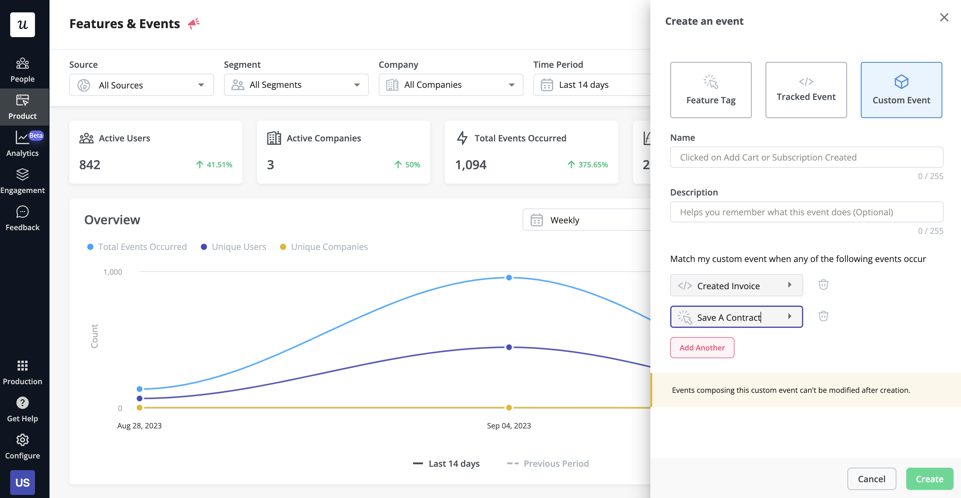
- Event tracking: The Userpilot flow builder lets you track custom events by tagging individual features (Feature Tag), by API (called Tracked Events) or by setting them up using a combination of feature tags and tracked events (Custom Events).
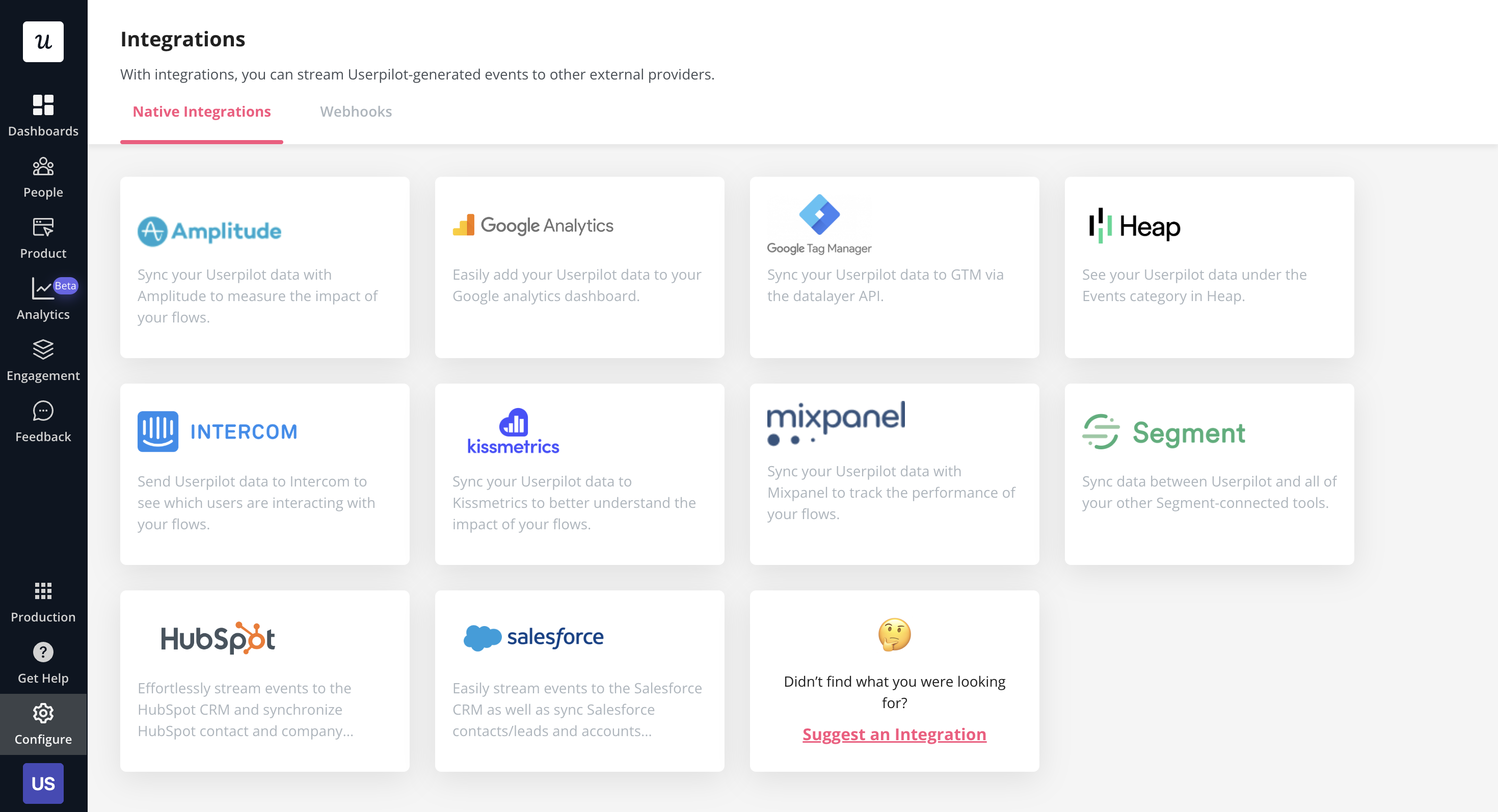
- Data integrations: Userpilot has native integrations with popular analytics tools like Amplitude, Mixpanel, Google Analytics, and more. This makes it possible to sync your event data across multiple tools within your tech stack.
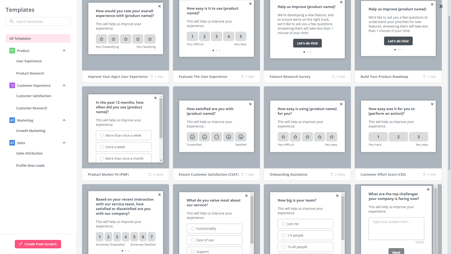
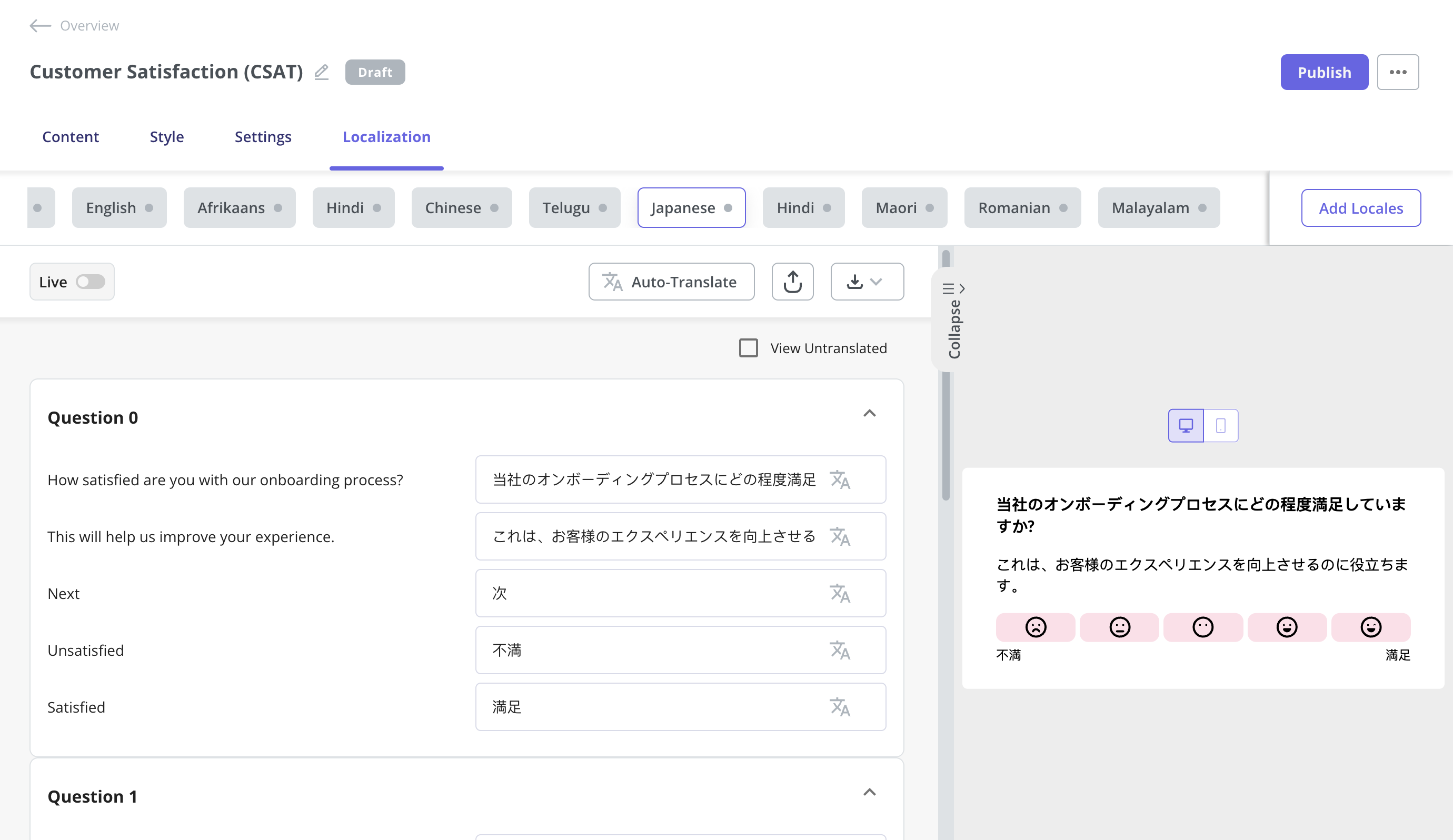
- Survey templates: Userpilot’s no-code survey builder has 14 templates to choose from. These include NPS, CSAT, and CES surveys among others for collecting quantitative and qualitative feedback from users. You can add a series of questions to gather valuable insights.
- Survey translation: Userpilot’s AI localization feature lets you translate surveys in a matter of minutes. All you need to do is add the desired locale and leave the rest to Userpilot. You can also make manual tweaks to translations if needed.
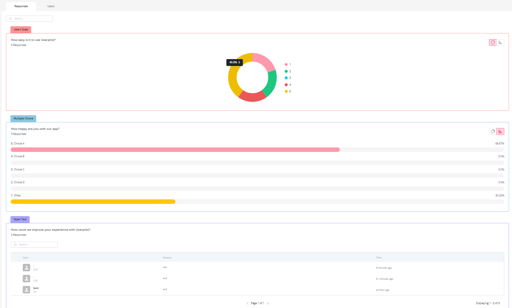
- Advanced analytics: Userpilot has detailed analytics that shows what percentage of users chose a specific option, summarizes the most popular choices, and lets you browse through open-ended responses to extract insights from qualitative feedback.
- Users and Active Users: Google Analytics displays the number of users who viewed or interacted with the site or app. Teams can access the Active Users report to see the number of unique users who started sessions on the site or app within a specific timeframe.
- New vs. Returning User: Cookies allow Google to monitor user activity. Cookies are unique to each browser and device. Google creates a distinct ID for each user’s browser or device and stores it in GA when they visit a website. And distinguish between new users (first-time visitors) and returning users (previous visitors).
- User Exploration: You can use Google Analytics’s User Explorer to get detailed information about specific groups of users. For example, a group of users who interacted with your app and website.
- Robust Event Tracking: Google Analytics offers a seamless event tracking system, allowing you to monitor user interactions effortlessly.
- Custom Event Categories: Tailor event tracking to your specific needs, from button clicks to form submissions, and gain a comprehensive understanding of user engagement.
- Real-time Data: Stay in the loop with real-time event tracking data, enabling immediate response to user behavior changes.
- Tight budgets: Userpilot is the best option for mid-market SaaS companies who want to get the most bang for their buck with plans including unlimited feature usage, fully interactive walkthroughs, advanced analytics, integrations, and a wide array of feedback collection mechanisms — all starting at $299/month. However, early-stage startups with sub-$100 budgets may want to look into options like Intercom, UserGuiding, and Product Fruits.
- Employee onboarding: Userpilot’s Chrome extension and no-code flow builder only works with your product, meaning it can’t be used to onboard employees to third-party apps. For onboarding internal teams, WalkMe is a viable solution that you should consider.
- No-code builder: Userpilot’s Chrome extension lets you build flows, add UI elements, and tag features without writing a single line of code.
- UI patterns: There are plenty of UI patterns to choose from when using Userpilot, such as hotspots, tooltips, banners, slideouts, modals, and more!
- Startup-friendly: Userpilot’s entry-level plan gives you access to all available UI patterns so you can hit the ground running.
- Walkthroughs and flows: Build engaging interactive walkthroughs and personalized onboarding flows that target specific segments of your user base.
- Self-service support: Build an in-app resource center to help users solve problems, customize its appearance to align it with your brand, and insert various types of content (videos, flows, or chatbots) to keep your customers satisfied.
- A/B testing: Userpilot’s built-in A/B testing capabilities will help you split-test flows, iterate on the best-performing variants, and continually optimize based on user behavior.
- Feedback collection: Userpilot has built-in NPS surveys with its own unified analytics dashboard and response tagging to help you retarget users. There are other survey types to choose from and you can even create your own custom survey.
- Survey templates: There are 14 survey templates to choose from so you can gather feedback on specific features or run customer satisfaction benchmarking surveys like CSAT and CES.
- Advanced analytics: Userpilot lets you analyze product usage data, monitor engagement on all in-app flows, and use the data to create user segments that are based on behaviors instead of demographics.
- Event tracking: Userpilot’s no-code event tracking lets you tag UI interactions (hovers, clicks, or form fills) and group them into a custom event that reflects feature usage.
- Mobile: Userpilot’s mobile SDK includes a full suite of engagement tools, carousels, slideouts, push notifications, and in-app surveys (NPS, CSAT, CES) that enable personalized user interactions.
- Third-party integrations: Userpilot has built-in integrations with tools like Amplitude, Mixpanel, Kissmetrics, Segment, Heap, HubSpot, Intercom, Google Analytics, and Google Tag Manager so you can share data between all the solutions in your tech stack.
- Employee onboarding: Currently, Userpilot only supports in-app customer onboarding.
- Mobile apps: Userpilot doesn’t have any mobile compatibility which could make it difficult for developers with cross-platform applications to create a consistent user experience for both versions of their product.
- Freemium plan: There’s no freemium Userpilot plan so those bootstrapping their startup and need sub-$100 solutions should consider more affordable onboarding platforms like UserGuiding or Product Fruits.
- Data Privacy Concerns: Google Analytics collects vast user data, raising privacy concerns for your SaaS and other small businesses with little to zero security systems. Alternative tools can provide a clearer, more transparent approach to user data handling, ensuring compliance with global data protection regulations.
- Customization and Flexibility: You might have unique analytical requirements that Google Analytics doesn’t cater to by default. Alternative platforms can offer more tailored solutions, allowing for greater customization in tracking, reporting, and integrations specific to a SaaS setup.
- Cost Efficiency at Scale: Google Analytics can become expensive with premium versions like GA360 for high-traffic SaaS platforms. Some alternative tools offer competitive pricing models, ensuring a more cost-effective solution as the business scales.
- Comprehensive Insights with Customizable UI Patterns: Google Analytics empowers B2B SaaS companies with the ability to uncover user insights through customizable UI patterns.
- Experimentation and Iteration through A/B Testing: You can directly explore user behavior variations, refining strategies based on real-time results.
- Cost-efficient: The free access to comprehensive data tracking, user behavior analysis, and performance measurement empowers you to make informed decisions without the burden of additional expenses.
- Real-time metrics: Discover which of your pages are most popular. By understanding the pages your visitors visit most, you can begin optimizing and focusing on these pages to drive action.
- Data Visualization and Customization: The platform offers various visualization options, including charts, graphs, and tables, to help you make sense of complex data sets
- Data Privacy and Compliance Concerns: Google Analytics collects user data to provide insights, which can raise concerns about user privacy and data security.
- Limited Historical Data: Google Analytics retains data for a limited time, often up to 26 months by default. This means that historical data beyond that timeframe is unavailable for analysis, potentially limiting long-term trend analysis.
- Steeper learning curve: Google Analytics provides almost too much information, which can be overwhelming to new users. The range of features and customization options might require a learning curve, and users might struggle with setting up more advanced tracking or reporting.
- Limited Cross-Device Tracking: Tracking users across multiple devices can be challenging, and Google Analytics might not always provide a seamless view of a user’s journey across various devices, leading to fragmented data.
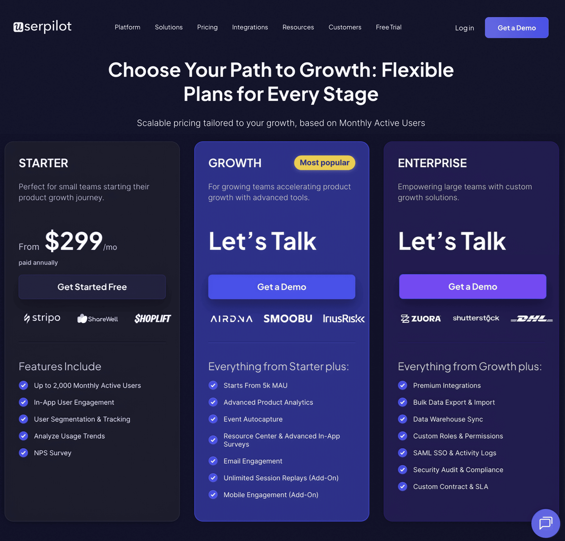
- The Starter plan begins at $299/month (billed annually) for up to 2,000 monthly active users. It includes in-app user engagement, usage trend analysis, NPS surveys, and essential product analytics—ideal for mid-market SaaS teams getting started.
- The Growth plan offers custom pricing and adds advanced analytics, retroactive event auto-capture, in-app surveys, session replay, and more. It’s the most popular choice for growing teams that need deeper insights and scale.
- The Enterprise plan offers custom pricing and includes everything in Growth, plus bulk data handling, custom roles and permissions, SOC 2 Type 2 compliance, and enterprise-level support.
- Google Analytics offers a free version that provides a wide range of features for basic website analytics. It’s suitable for individuals, small businesses, and websites with relatively low traffic.
- GA 360 (now GA4) provides higher data limits, BigQuery integration, service level agreements, custom variables, and a dedicated support team. The cost of Google Analytics 360 starts from $12,500 per month and $150,000 per year. Google suggests that the cost of Google Analytics 4 360 starts at a retail price of USD $50,000/year, which entitles customers to 25 million events per month at no additional cost.
- Feature Adoption Analysis: Google Analytics provides general metrics about pageviews and user interactions, but Userpilot takes it a step further. It specifically analyzes the utilization of individual product features. These features give you insights into which functionalities are driving value and which might be overlooked, thereby guiding product enhancements and feature prioritization.
- User-Centric Tracking: Unlike the broad-strokes approach of Google Analytics that prioritizes overall web traffic, Userpilot delves deep into individual user journeys. This means you can get a granular view of each user’s interactions, facilitating a deeper understanding of user needs, pain points, and preferences.
- In-App Experience Enhancements: While Google Analytics provides data, Userpilot offers tools to act on that data within the application. With its suite of in-app tools, you can instantly deploy surveys, tooltips, and guided flows, capitalizing on analytics in real time.
Userpilot for user analytics
User analytics lets you track and analyze the behavior of users within your product. Userpilot lets you filter through customers from a unified dashboard, extract insights from specific segments or time periods, and create custom segments for all users who meet certain conditions. Here’s an overview of Userpilot’s analytics features:

In-app events in Userpilot
Tracking and analyzing event data gives you a better understanding of user behavior so you can capitalize on opportunities to improve the in-app experience.
Here are the ways you can use Userpilot as an event-tracking tool:
In-app surveys in Userpilot
In-app surveys are an effective way to collect direct feedback from users without being at the whim of their email inboxes. Userpilot’s built-in functionality lets you create surveys, translate them, and track granular survey analytics that offer additional user insights.
Here are the Userpilot features you can use when building in-app surveys:
Google Analytics for user analytics
Users are the lifeblood of every company. Marketers and product managers use Google Analytics to track and measure user data.
Here’s a closer look at some of Google Analytics features for user analytics:
The GA4 reports these activities, including views, events, purchases, and goal achievements.
However, you should note that Google Analytics cannot be used to perform cohort analysis, as the data is not identifiable. However, it is still great for time-based analytics.
In-app events in Google Analytics
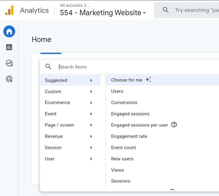
Google Analytics 4 event tracking is an invaluable feature that allows you to record interactions with elements of your website that aren’t tracked by default within GA4.
By adding snippets of code to your site, it’s possible to track event interactions to understand how long users spend watching your videos or even which fields on your forms users drop off at.
![]()
Here are the features of Google Analytics as it relates to event tracking:
In-app surveys in Google Analytics
Google Analytics doesn’t support in-app surveys so you can’t collect direct customer feedback with it.
Pros and cons of Userpilot
While Userpilot’s versatile feature set and relatively affordable entry-level plan make it an attractive option for most SaaS companies, there are bound to be certain scenarios where it simply isn’t the right tool for the job.
Here are a few scenarios where you should look for a different tool other than Userpilot:
Pros of Userpilot
As a full-suite digital adoption platform, Userpilot has all the features you need to onboard users, track analytics, and gather feedback from customers without writing a single line of code. Here are a few pros of using Userpilot as your product growth solution:
Cons of Userpilot
Of course, no tool is perfect and there are a few cons to consider before choosing Userpilot as your user onboarding or product growth solution:
Pros and cons of Google Analytics
While Google Analytics is a popular tool, here are three compelling reasons to consider its alternatives:
Pros of Google Analytics
Google Analytics helps you understand your site and app users to check your marketing performance, content, products, and more.
Analytics works with Google’s advertising and publisher products, so you can use your insights to deliver business results. Let’s look at the pros of using Google Analytics:
Cons of Google Analytics
As powerful as Google Analytics is in providing valuable insights into user behavior and website performance, it’s important to recognize that no tool is without its limitations. In this section, we’ll delve into some of the key cons associated with using Google Analytics.
Userpilot vs Google Analytics: Which one fits your budget?
Understanding the cost implications is paramount when selecting the right solution for user analysis, so here’s a detailed pricing comparison of Userpilot and Google Analytics.
Pricing of Userpilot
Userpilot offers flexible pricing based on your monthly active users (MAUs). Plans start at $299 per month for smaller teams and scale as your user base grows.
Below are the pricing tiers you can choose from:
Pricing of Google Analytics
Google Analytics is a free tool with paid upgrades available for advanced features. It has two price plans: the free and 360 plans respectively:
Userpilot vs Google Analytics – Why Userpilot might be a better choice?
Why is Userpilot’s product analytics better than Google Analytics?
While Google Analytics provides a comprehensive view of website traffic and user behavior, Userpilot’s product analytics offers specialized insights tailored for SaaS businesses that can be pivotal for growth in your SaaS.
Here are three advantages of Userpilot over Google Analytics:
What do users say about Userpilot?
Most users laud Userpilot for its versatile feature set, ease of use, and responsive support team:
I recently had the pleasure of using Userpilot, and I must say it exceeded all my expectations. As a product manager, I’m always on the lookout for tools that can enhance user onboarding and improve overall user experience. Userpilot not only delivered on these fronts but also went above and beyond with its impressive new features, unparalleled ease of use, and truly exceptional customer support.
What truly sets Userpilot apart is its outstanding customer support. Throughout my journey with Userpilot, the support team has been responsive, knowledgeable, and genuinely dedicated to helping me succeed. Whenever I had a question or encountered an issue, their support team was always there to assist promptly, going above and beyond to ensure my concerns were addressed effectively.
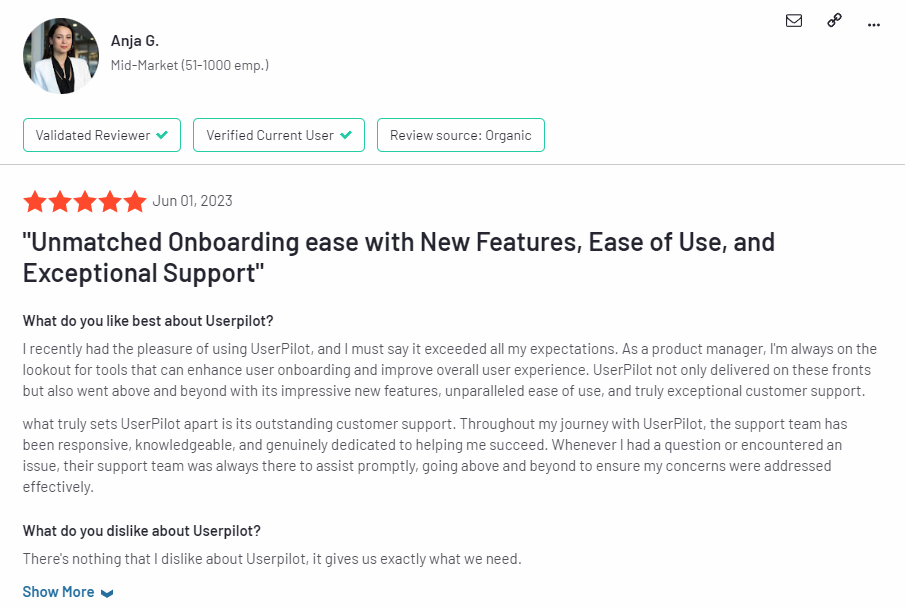
Source: G2.
Of course, other users are also kind enough to share constructive criticism regarding specific features like event tracking filters:
“The filtration while analyzing specific events is a little confusing. Understanding of custom properties and data management configuration could have been more organised.”
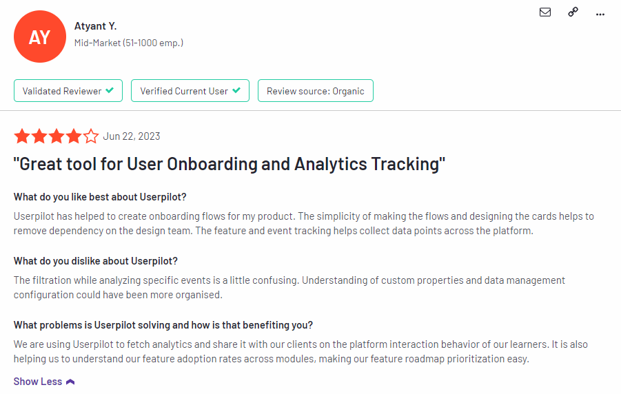
Source: G2.
Conclusion
This is the end of our thorough comparison between Userpilot and Google Analytics. You should be able to make a confident decision by now. If you’re looking for a solid tool for user analytics that promises great value for money, give Userpilot a go. Book a demo today.
About the author