For me, effective mobile app onboarding is the difference between new users looking around our app and disappearing right after, or understanding our app value and becoming engaged users.
This is crucial as data reveals that the average mobile app loses 77% of users within its first 3 days, and about 90% within the first 30. Such is the cruel world of mobile app management.
To succeed, therefore, you need to create a frictionless mobile app onboarding flow that captures users’ attention and shortens their time to value. In this article, I highlight my tried and tested system for doing just that.
How is mobile onboarding different from web app onboarding?
Before we proceed, keep in mind that successful onboarding processes are tailored differently for web apps versus mobile apps. Here are some differences you can expect between them:
- Limited screen real estate: Mobile screens are typically smaller, demanding more concise, focused content and UI than the web.
- Attention span is shorter: With so many apps competing for their attention, mobile app users are often distracted or multitasking, so you need to prove value even faster.
- Touch-based navigation: Mobile app onboarding needs to be optimized for taps and gestures, not a mouse and keyboard.
- Permissions matter more: Mobile users are increasingly sensitive about the permissions they grant. So, requesting access to notifications, location, etc., must be well-timed and justified.
Remember that the goal of any app onboarding process (whether mobile or web app onboarding) is still to introduce new users to your app and improve user retention.
My 6-step process to designing an effective mobile app onboarding experience
1. Understand your mobile users
Before I even begin designing anything, my absolute first step is to conduct extensive user research. I want to know who my users are. And, I don’t mean just knowing their age or location; I need to know what pain points they’re trying to solve with the app.
Understanding their motivations is key to showing them the app’s value proposition right away during onboarding.
I also like to consider deeper contextual information about my audience. For example, will they be using the app while in the office or in a leisurely environment? How comfortable are they with mobile apps (in general and within this niche)?
Armed with this information, I can create detailed user personas that paint an ideal picture of my different user groups.
2. Choose an onboarding strategy
Once I fully understand our users, I need to decide the best way to introduce the app to them. The strategy I adopt will depend on the app’s complexity and what users want to achieve first.
Progressive onboarding
This approach is great for more complex apps. It involves breaking down the onboarding into small parts and revealing them to the user gradually.
So, I’ll introduce new users to the app’s core functionality first. Then, as they interact with the app and find other features, I’ll provide relevant guidance to help them progress. This system feels less like a tutorial and more like the use of targeted helpful nudges.
For example, the collaboration tool InVision correctly implemented a progressive onboarding process that previews a step, allows the user to explore it at their own pace, and only previews the next step when they’re ready.
Function-oriented onboarding
I prefer this system if the app has unique but familiar features. That is, apps of this kind are common, but the user needs guidance to understand how this particular app works.
In this case, function-oriented onboarding showcases how to achieve key actions so that the user is ready to use the app right off the bat.
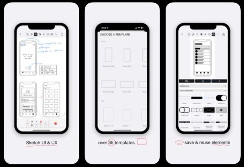
For example, Mockup‘s mobile app onboarding flow comprises three slides that showcase its key features and how they work.
Benefit-oriented onboarding
Sometimes, I find it best to hit users with the “why.” The idea is to show them the product’s key benefits and core value proposition upfront so they immediately understand why they need it.
This approach is ideal for apps that address a clear need, like fitness trackers and mindfulness apps, but may not be familiar to the user. The goal is to create an emotional connection that motivates the user to adopt the app.
For example, the note-taking app Evernote uses the onboarding journey to highlight the product’s value. It provides users with valuable education while also allowing them to choose how to proceed on their journey.
3. Map out the user journey
This is the point where I visualize the user’s entire initial experience (from their perspective) so that I can shape the app onboarding process.
So, I’ll want to consider all the ways a user might start the onboarding. Will they open it right after installation, or do they wait until they want to access a specific feature?
Next, I mark down the critical milestones and notable touchpoints in the app. Think of these as points where the user needs to grasp something important or complete a key action to move forward. I break this down for each screen, tap, and information they encounter.
Finally, I link all of this into a comprehensive journey map and try to anticipate the user’s emotions at each step of the way.
The idea is to determine potential areas of confusion or frustration, as well as the app’s “Aha!” moment, so that I can craft an onboarding flow that efficiently gets them to that point.
4. Design your onboarding screens
When designing the actual screens, my focus is to make them as clear, simple, and engaging as possible. I always start with conceptual wireframes and flowcharts that highlight important information/benefits (depending on my chosen strategy).
Then, I start developing the screen to bring this concept to life. Now, different onboarding platforms may offer different UI pattern selections for this step, but there are two common options you can expect:
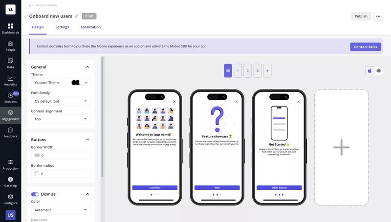
Mobile carousels: A combination of customizable full-screen guides to help shape user expectations, one feature/benefit at a time.
Carousels take up the full screen, so they can feel invasive. But they’re great for big feature announcements, priority notifications, and information-dense primary onboarding.
Ideally, I limit my carousels to between 3 and 5 screens. I also go all in on visuals, using high-quality images to complement compelling text on each slide.
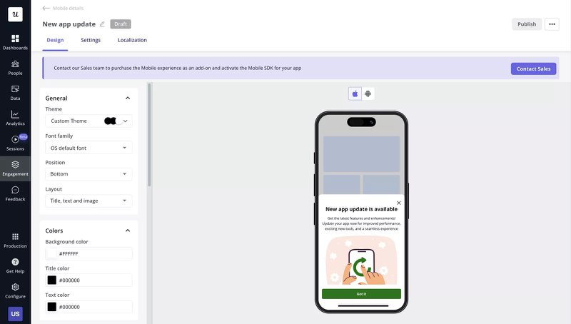
Mobile slideouts: A half-screen intro that lets you share useful tips while giving the user a glimpse of the product interface. Unlike carousels, they’re easier to dismiss and less invasive, making them very flexible.
For example, you can use slideouts to announce feature updates (big or small), request reviews, or even announce new features with links that redirect the user to that part of the app. If necessary, you can even curate multi-page “flows” by triggering a new slideout following a redirect.
Now, slideouts are easy to dismiss, so I try to make my slides striking. As a rule of thumb, it’s also important to limit text by adding rich media and applying triggers like “time on page greater than” to avoid triggering it too early.
5. Use segmentation and targeting to deliver personalized experiences
By this point, I probably have 2 or more onboarding flows for different user segments. So, it’s now time to decide who sees what.
Most modern onboarding tools, like Userpilot, allow you to do this through audience targeting. They typically present two options:
- Select a pre-defined user segment.
- Define custom targeting conditions that can be triggered on the go.
The first option is ideal when targeting existing users who have already been segmented. When targeting new users, however, I like to define custom conditions.
For example, I can create a welcome survey with 2/3 answer options and trigger a different onboarding flow based on the user’s response.
But targeting may not always be that deep. For example, I can target users with different flows based on their devices/operating systems or an event they’ve completed (like a demo).
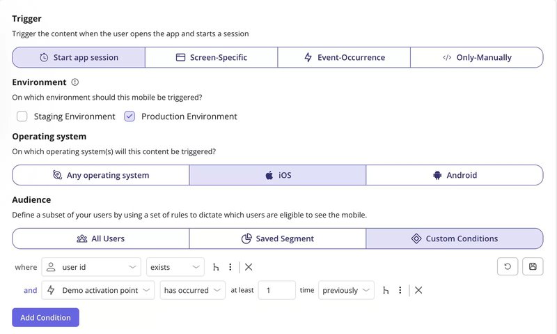
Ultimately, the goal is to create and deliver personalized onboarding experiences relevant to the user’s needs and shorten their time to value.
6. Test and iterate your mobile onboarding flow
Finally, the design is ready, but that’s just a starting point.
Once we’ve released the flow, it’s time to begin monitoring it. Onboarding metrics like flow completion, drop-off, and user activation rates can reveal areas for improvement and help identify friction points.
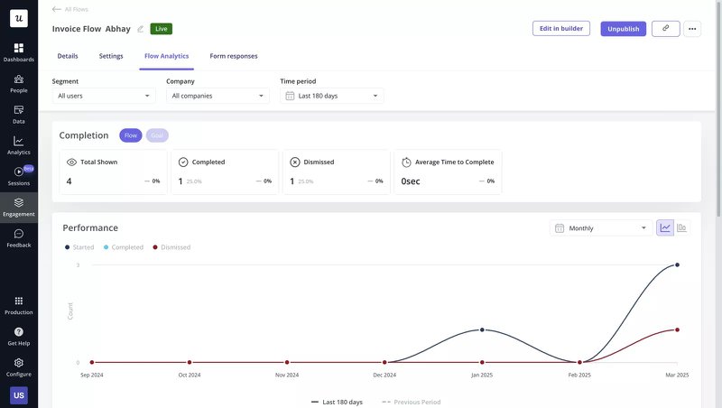
I also like to back up the user behavior data with qualitative research (via surveys and app reviews) to help me fully understand customers’ needs. And, if unsure, a little A/B test of different elements can help us see what works best.
This commitment to testing and iteration is, in my opinion, the difference between good and great onboarding. It keeps the experience effective and timeless for every new user.
5 Successful app onboarding flow examples to inspire you
Feeling ready to start creating but not sure where to begin? Consider the following mobile app onboarding flow examples and the lessons you can learn from them.
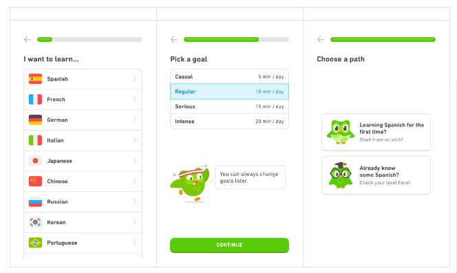
Duolingo
The popular language-learning app Duolingo manages to keep users hooked despite its fairly lengthy in-app onboarding process.
Its adorable mascot is present every step of the way, creating a consistent and friendly experience while guiding users. Meanwhile, the concept of streaks and rewards helps motivate users from the start.
But where Duolingo really nails it is with personalization. Users are asked to choose their goal (casual, regular, serious, or intense learner) and experience level, and the onboarding process is tailored to their needs.
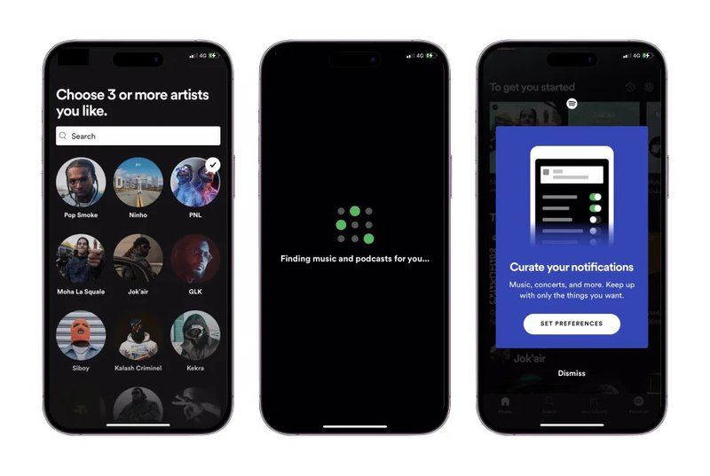
Spotify
The music streaming giant Spotify also approaches onboarding, intending to personalize the user experience from the start.
Knowing they hold a vast library of music content, Spotify immediately asks users to select three favorite artists. Behind the scenes, it uses these artists to curate playlists and suggest songs that match the user’s tastes.
Next, Spotify builds on this by asking users to set their notification preferences to keep them up-to-date with concerts, new song releases, and other activities related to their favorite artists.
Thanks to this double-pronged approach, Spotify can personalize users’ song interests and notifications, keeping them engaged and returning for more.
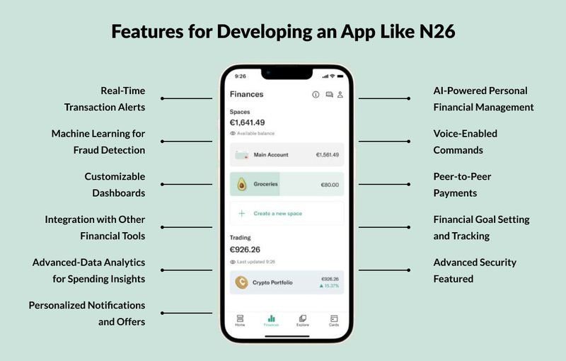
N26
Banking apps are typically known for their terrible UX, but N26 isn’t one of those. Known for its digital-first onboarding experience, N26 emphasizes speed and ease of use.
Everything from its account creation to identity verification processes takes just a few minutes and can be completed on a mobile phone.
Once you get into the app, the ease of use is even further emphasized. N26 anticipates what you need, offering real-time transaction alerts, AI-powered spending recommendations, low-balance alerts, etc.
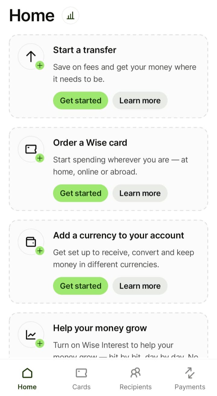
Wise
Wise uses a step-by-step onboarding flow to guide users through account setup without overwhelm. The mobile app walks users through account creation, identity verification, and the first transfer in a clear, logical order. Each step unlocks the next, making progress easy to follow.
To reduce hesitation around pricing, Wise shows exchange rates and fees before sign-up. This transparency addresses a common friction point early and helps users understand the value upfront.
Progress indicators and short celebratory messages keep users motivated, while reassuring copy reduces anxiety when sensitive information is required. For businesses managing cross-border payments, this structured onboarding shortens time to value and supports stronger retention.
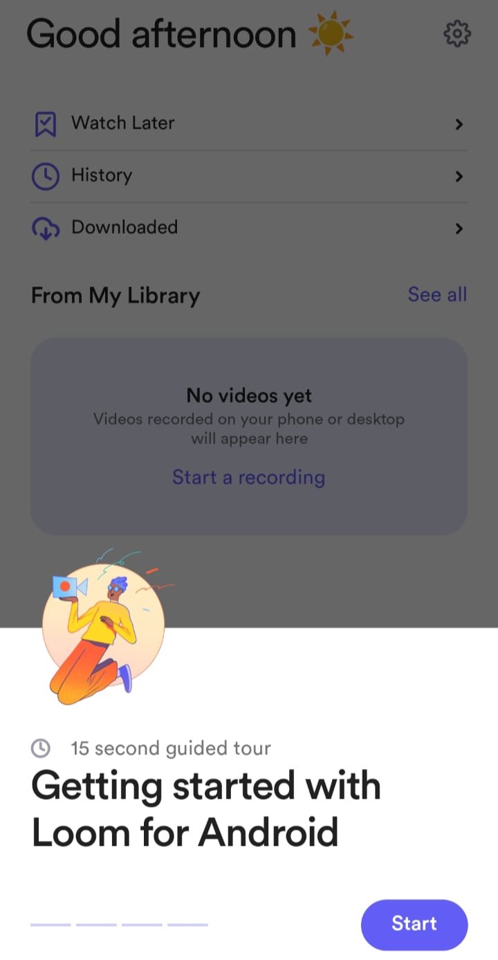
Loom
Loom’s mobile onboarding focuses on speed and simplicity. One-tap login options remove friction, and users are immediately prompted to record a video instead of reading through instructions. The onboarding experience is short, direct, and action-driven.
Clear CTAs, light guidance, and small progress nudges help users complete their first recording quickly. Loom reinforces momentum by acknowledging early success, such as finishing a test video.
By guiding users to create and share a video within minutes, Loom delivers its core value fast. This quick “Aha!” moment builds confidence, improves activation, and encourages continued product use.
Create a stellar user onboarding flow with Userpilot
So far, we’ve explored the critical steps involved in crafting a successful mobile app onboarding flow. But understanding these principles is only the first step, and putting them into practice can be incredibly complex.
This is where a powerful tool like Userpilot comes into play. It provides robust features for flow creation, segmentation and targeting, and even post-launch analysis. This makes it a great tool for building, personalizing, and refining user onboarding journeys.
Want to see how it works? Book a Userpilot demo to explore it firsthand!
FAQ
Which app has the best onboarding process?
There is no single “best.” However, apps like Spotify and Duolingo demonstrate the importance of personalization, clear progression, and gamification (in Duolingo) as part of the onboarding process. You can review the best app onboarding examples above.
What is a mobile onboarding flow?
A mobile onboarding flow is a guided sequence of screens and interactions designed to help new users understand an app’s value and functionality as they navigate their initial experience. A good user onboarding flow can help activate users faster and significantly boost user satisfaction.
Why is designing a seamless mobile onboarding experience essential?
A seamless app user onboarding experience is essential for boosting retention and user engagement. It provides a positive first impression, reduces early churn, and sets the tone for a successful long-term relationship.
Which UX elements to use in the mobile app onboarding flow?
Once you have the strategy down, you need to choose the right UI patterns to deliver it. In the Userpilot mobile builder, we see teams using a few specific patterns that consistently perform well.
1. The welcome screen
Most welcome screens are boring. They say “Welcome to App” and have a “Next” button. Make your welcome screen work harder. Use it to restate the value proposition. Remind the user why they downloaded the app in the first place. “Hi Abrar, ready to improve your users’ onboarding?” is infinitely better than “Welcome.”
On mobile, you can take advantage of carousels to easily show your users all the necessary first steps.
2. Contextual tooltips
Instead of a 10-step tour that forces users to click “Next” repeatedly (which they won’t read), use tooltips that appear only when relevant. This is “progressive disclosure.” You don’t show the user how to use the advanced search filter until they actually tap the search bar. This keeps the interface clean and provides help only when it is needed. In our mobile SDK, we allow you to anchor native tooltips to specific elements. This means the guidance moves with the user’s flow, rather than interrupting it.
3. Checklists for gamification
Humans hate unfinished tasks. It is a psychological phenomenon called the Zeigarnik effect. You can leverage this by using onboarding checklists. Show the user a progress bar that is already partially filled.
Seeing that they are already partway there motivates them to finish the rest. It turns the boring setup process into a game.
4. Push notifications
Have your users dropped off the onboarding flow and haven’t logged in for some time? Luckily, they probably still use their phone. Use push notifications to gently nudge them back into the app. Instead of a simple “long time no see” reminder, your push notification can include useful tips on the next step to take in the app. Remember: the users need to give you their permission to enable notifications.
What are the best practices for creating mobile app onboarding flows?
Here is the playbook I use when designing or critiquing a mobile onboarding experience.
1. Delay the sign-up wall
One of the fastest ways to kill conversion is to force a user to create an account the second they open the app. Use a “gradual engagement” strategy instead.
We handle this technically using anonymous user tracking. This allows you to track behavior and serve content to users who haven’t logged in yet. You generate a unique ID for the session, let users explore and engage, and then ask for the sign-up when they try to save their progress or perform a critical action. They are less likely to leave because they don’t want to lose the work they just did.
2. Personalize the onboarding
I use welcome screens to ask 2-3 critical questions about the users’ role and goals right at the start. In Userpilot, I create user segments based on these responses. Then, I differentiate the onboarding flows to different jobs-to-be-done, showcasing different core features and prompting users to try out workflows most relevant to their use case.
3. Ask for permissions only when necessary
Overwhelming users with a permission dialogue right after they log in looks like a data mining attempt. I recommend “permission priming.
Create a custom mobile slideout or modal that explains why you need the permission. For example, instead of “Allow access to photos,” say: “To upload your profile picture, we need access to your photo library. Tap ‘Continue’ to allow access.”
When the user taps your custom “Continue” button, trigger the system dialog. If they say no to your custom screen, you don’t trigger the system dialog at all. This saves you from the permanent “Don’t Allow” setting in the OS, giving you a chance to ask again later when the user understands the value.
4. Teach through interactions
Nobody reads instruction manuals. If your onboarding relies on a 5-screen carousel of text explaining how to use the app, you’re likely to lose your users’ attention.
I prefer interactive walkthroughs. Instead of telling app users “Tap the + button to add a task,” I highlight the + button and wait for them to tap it. Once the user interacts with the element, the tooltip disappears, and the next step triggers.
About the author