Mobile apps don’t leave much room for guesswork. Every screen, swipe, and tap has to earn its place, and carousels are no exception.
When used well, they onboard users, highlight key features, and save space. Used poorly, they’re ignored or frustrating. So if you’ve ever thought, “Is this the right place for a carousel?” or “Will users even swipe through this?”, this guide is for you.
I’ll walk you through what makes a good mobile carousel, when to use one (and when not to), and how to build carousels that actually improve your app experience.
What is a mobile carousel?
A mobile carousel is a horizontal scroll area that lets users swipe through a set of cards or slides, one at a time, on a mobile screen.
You’ll often see them used in onboarding flows, feature announcements, or app walkthroughs.
There are two main types, depending on where they appear:
- Mobile app carousels: These usually take up the full screen and are used for onboarding or feature tours. They’re designed for tap or swipe gestures.
- Mobile browser carousels: These are smaller and show up in banners, product listings, or article previews. They’re common in e-commerce and content-heavy websites.
Unlike vertical scrolling, carousels let users explore content within the same page without disrupting the experience. However, how users interact with them can vary; thus, design choices should fit the context.
What are the typical components of a mobile carousel?
A mobile carousel might look simple on the surface. But a few key pieces need to work together behind the scenes to make it smooth and user-friendly:
- Content container: The frame that holds your cards or slides. This needs to be responsive and adapt well to different mobile screen sizes.
- Navigation controls: These help users move through the carousel. Think swipe indicators, arrows, or progress dots: clear visual cues that make navigation feel intuitive.
- Background or overlay (optional): This is used to add contrast or visual polish. A subtle background or gradient overlay can help the content pop.
- Looping and auto-scroll settings (optional): Some carousels scroll automatically or loop back to the first slide. I usually avoid auto-scroll in mobile apps. It often causes more user frustration than engagement.
- Embedded video (optional): For advanced use cases, some carousels include short videos to guide users through a process or product feature.
Note: If you include video or interactive elements, make sure they work well across devices and don’t interfere with swipe gestures.
When these components are well-executed, users can focus on the message, not the UI.
How to create mobile carousels on mobile devices?
Mobile carousels can be a great UI pattern, but only when used with purpose. Too often, I’ve seen them get added just because they look good.
If you’re thinking of adding one, it’s worth taking a step back. What are you trying to achieve? Where will customers see this: on a small tablet, a large screen, or within a tiny product card? And is a carousel really the best choice?
Let me walk you through a few key decisions that have helped me design carousels that serve users instead of just taking up page space.
Define the goal of your mobile carousels
Start with the goal. What’s the carousel supposed to do?
Carousels are best when the content is optional, that is, things users notice and swipe through without needing to act. Think about new feature announcements, sharing product highlights, or adding a bit of personality to onboarding.
They’re also useful for short onboarding flows. You can guide users through a few quick steps without overwhelming them.
But if your content is essential or task-focused, carousels might not be the right fit. I usually turn to simpler UI patterns like static sections, grid layouts, tabbed navigation, or list views instead, especially on mobile, where space is limited and attention is short.
Understand the nature of the mobile environment
Where you use a carousel matters just as much as why.
Are you designing for a mobile app or a mobile browser? The environment shapes how users interact with your carousel and what kind of content makes sense.
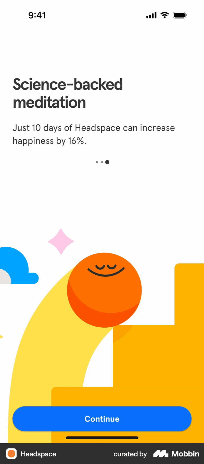
In mobile apps, carousels often take up the full screen and guide new users through a simple, linear flow. Like Headspace does here:


In mobile browsers or websites, you’ll see them in hero sections, product card sliders, or as part of promotional banners. This is common in online stores where space is tight, but there’s a need to show multiple options fast.

I find that understanding the environment can really help you decide the size, style, and purpose of the carousel. What works in a mobile app might feel clunky on a website and vice versa. So, always design with context in mind, especially how your carousel will display across different screen sizes, screen ratios, and device orientations.
Decide the type of mobile carousels
Not all carousels are created equal. Before you start designing, figure out what type of content you’re working with and match it to the right format.
Here are the three most common types:
- Image carousels: Great for product galleries or visual content. These are often used in e-commerce apps and listings where quick visual scanning matters.
- Text carousels: Ideal for short bursts of information, like quotes, tips, or announcements. These are less common but can be useful when visuals aren’t the focus.
- Mixed content carousels: A blend of images, headings, text, and sometimes video. These are perfect for onboarding or in-app walkthroughs.
Each type serves a different purpose. Choosing the right one upfront helps keep your UI clean and focused.
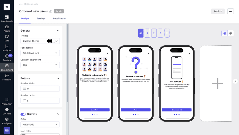
Consider your developing and implementing options
Once you’ve nailed down the purpose and type of carousel, it’s time to think about how you’ll actually build it.
You’ve got two main options: code it from scratch or use a no-code tool.
If you go the custom route, be prepared for a few trade-offs. Coding carousels for mobile can be time-consuming. You’ll need to handle responsiveness, gesture controls, screen sizes, and accessibility, and test it all across devices (including phones, tablets, and even desktop browsers if your product supports responsive design). Iterating is slower, too. Any changes are likely to mean you’ll have to loop in devs again.
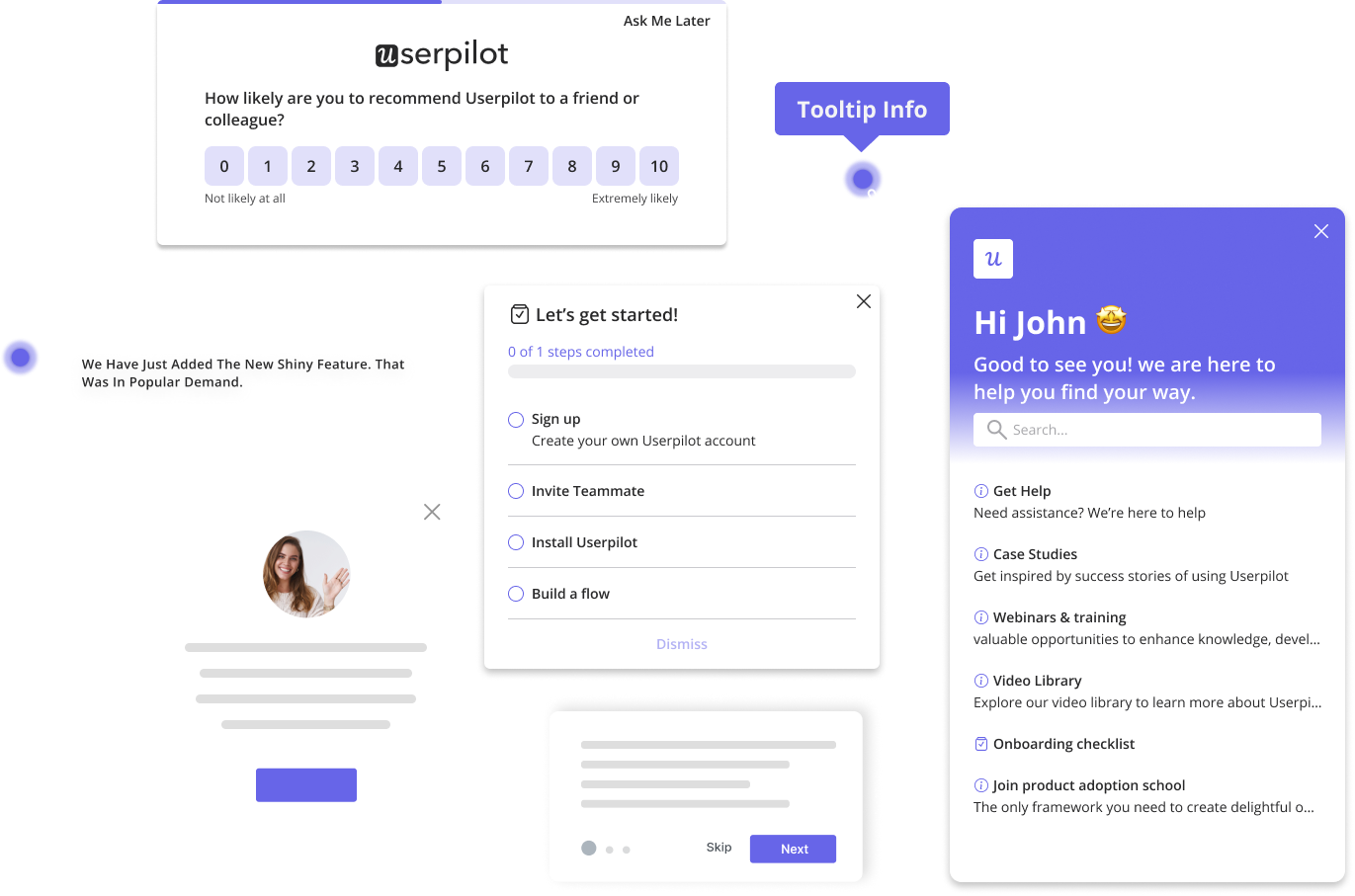
If speed and flexibility are priorities for you, no-code tools might be a better fit. With Userpilot, for example, my team can create and launch mobile carousels without writing any code. That means faster experimentation, easier updates, and less back-and-forth with your engineering team.
So, before diving into dev work, think about what you really need. If it’s fast iteration and less overhead, no-code wins.
Unlock the Power of Mobile Carousels to Enhance Your App Engagement
What are the best practices for designing mobile carousels?
Once you’ve decided that a carousel is the right fit, the next step is getting the experience right. A good mobile carousel shouldn’t just sit there. It should guide users, feel intuitive, and fit naturally into the rest of the UI.
Here are a few design principles I always come back to when building carousels that actually get swiped through.
Ensure your mobile carousel’s visual consistency
Consistency makes or breaks the experience. This is especially true on small screens, where users rely heavily on visual cues to navigate.
I like to keep things simple and familiar. That means using the same color scheme, text styles, layout, and navigation elements across the pages. You want the spacing to feel predictable, the icons to be the same size and style, and the content to line up so nothing feels out of place as users swipe through.
Take MyFitnessPal, for example. Their mobile UI is clean, and their carousels have a consistent design: same colors, font sizes, icon styles, and spacing. This makes it easier for customers to focus on the content rather than adjusting to new layouts on every swipe.
So:
✅ DO keep your carousel cards visually uniform so users know what to expect.
❌ DON’T mix styles or layouts slide-to-slide. It creates friction and reduces trust.

Learn how to prioritize content
The front page sets the tone for the entire carousel, and a vast majority of users won’t even make it past that.
Research shows that only 1% of users actively interact with carousel content, and engagement drops off sharply after the first item. That means your opening slide needs to carry the weight. It should instantly communicate value to mobile users and give them a reason to swipe.
I usually treat it like a mini landing page. One strong hook, one clear benefit.
It’s also important to keep things brief. I recommend limiting carousels to 3–5 slides max. It’s just enough to communicate your message without overwhelming users or making the page feel too long.
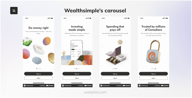
A great example of this is Wealthsimple’s onboarding carousel. It opens with a strong, benefit-focused slide, and the rest then build on it with clear, concise follow-ups with absolutely no filler.
So,
✅ DO lead with your strongest value prop to hook attention right away.
❌ DON’T overload your carousel with too many slides. Most users won’t stick around.
Clear interactive elements with manual controls
If users don’t know how to navigate your carousel, they won’t use it.
Mobile screens don’t leave much room for guessing. That’s why I always use clear, tappable elements like dots, arrows, or swipe indicators. These help users understand how to navigate from slide to slide without confusion.
You also want to give users control. Let them swipe through manually or tap next/previous buttons if needed. Avoid auto-rotating pages unless you have a really good reason.
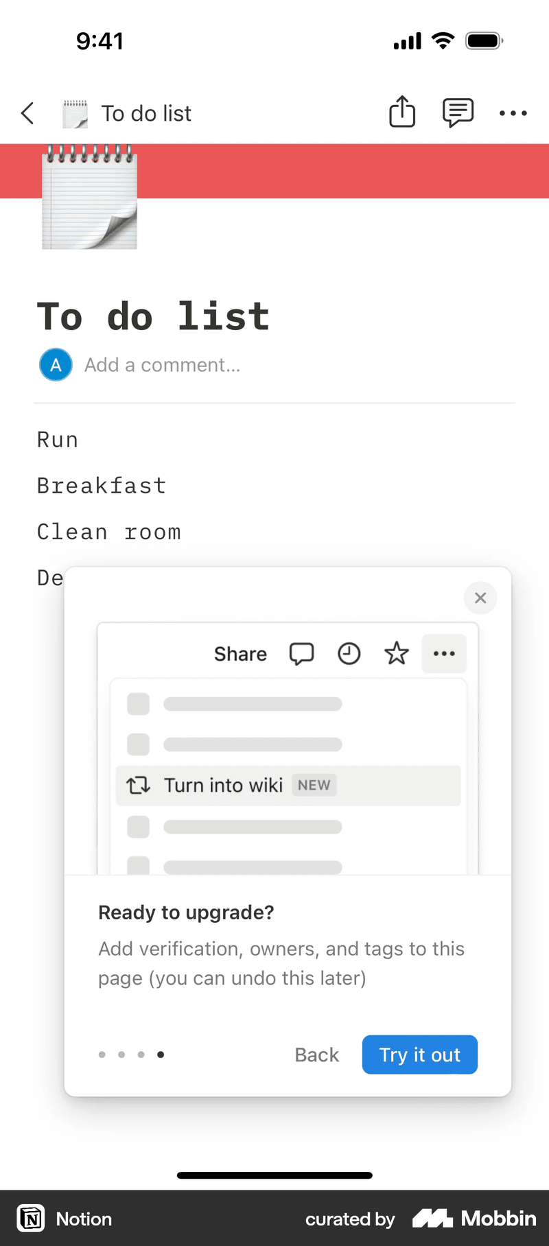
Take Notion’s feature guidance carousel, for example. It uses clear visual indicators, swipe gestures, and consistent manual controls. You always know where you are and how to move forward.
So:
✅ DO use visible, swipe-friendly navigation controls that work well with thumbs.
❌ DON’T rely on hidden gestures or auto-play.
Ensure mobile optimization
Even the best-designed carousel will fail if it doesn’t perform well on mobile devices.
Mobile users expect fast, smooth experiences. So, your carousel needs to load quickly, scroll cleanly, and feel lightweight. That means compressing images, optimizing mobile images and icons, and minimizing any layout shifts or animation lags.
This is especially important if your carousel includes rich visuals. Apps like Airbnb handle this well. Their image carousels load fast, look sharp, and feel snappy, even on lower-end devices. That kind of performance creates a positive first impression.
So:
✅ DO optimize images and interactions for speed and responsiveness.
❌ DON’T load large assets or untested animations that slow the experience down.

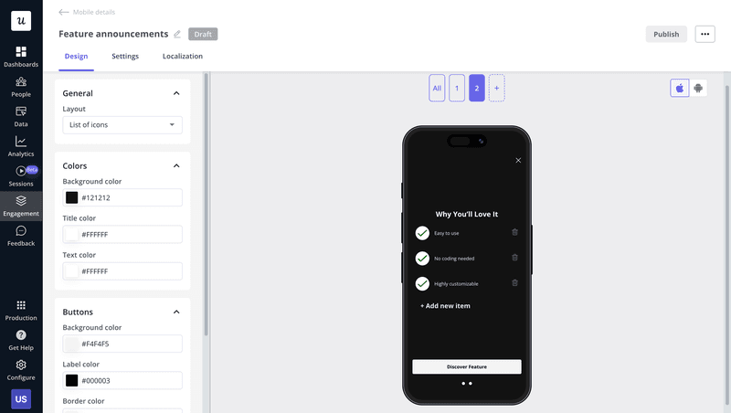
Create mobile carousels without coding!
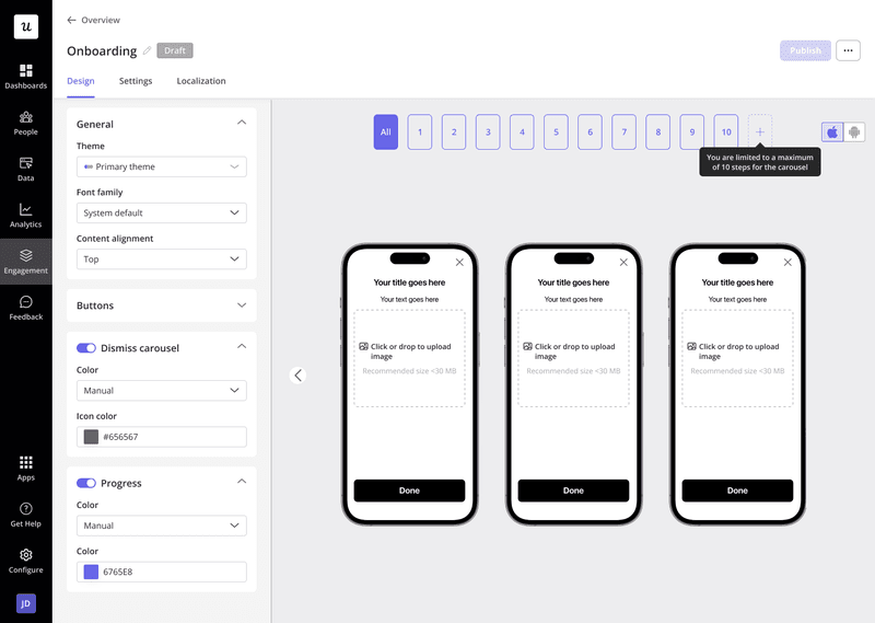
Building carousels shouldn’t slow your team down. With Userpilot, you can create and launch mobile carousels right inside your app, without writing a single line of code.

You can build up to 10 pages, choose from ready-to-use templates, and customize the layout to match your brand. Whether you’re onboarding new users, announcing features, or driving key actions, you can do it all without leaving our editor.
It’s fast, flexible, and designed for product teams who want to move quickly without looping in engineering every time. If that sounds like what your team needs, book a Userpilot demo to see it in action.
Unlock the Power of Mobile Carousels to Enhance Your User Engagement
FAQ
What's the difference between a carousel and a slider?
The terms are often used interchangeably, but there’s a slight difference. A carousel usually refers to a looping, swipeable set of items that users can scroll through. A slider is more linear and often includes navigation buttons like “next” or “previous.” On mobile apps, carousels are more common because they feel more natural to swipe, unlike on desktop, where sliders are often paired with a left sidebar or fixed navigation elements.
What is a carousel on the app?
A mobile app carousel is a UI pattern made up of horizontally scrollable cards or slides. It’s used to onboard users, highlight features, or prompt actions without crowding the screen. Most apps use carousels during onboarding, in product tours, or to promote updates in a lightweight, swipeable format.
How to make a carousel in Android?
If you’re coding from scratch, tools like ViewPager or RecyclerView can help, but that takes time. With Userpilot’s mobile SDK, you can build and ship carousels with zero code. Just choose your trigger, pick a layout, add your content, and go live, no app update needed.
About the author