Mobile Usability Testing in 2026: How Top Product Teams Uncover Why Users Struggle


Mobile usability testing’s purpose is to catch anything that will make real users quit before they ever open your app again.
Mobile usability testing isn’t a one-time validation exercise; it’s the layer that explains what your analytics can’t. Product analytics, session replay, and crash reports have gotten very good at showing you what happened; none of them reliably tell you why, and that’s the job usability testing still does better than any dashboard.
I wanted to write something that treats usability testing the way we actually run it, not the way a checklist post from 2019 still describes it. So here’s what this guide covers:
- What actually separates usability testing from analytics, QA, and crash reporting.
- Why the practice matters more now than five years ago, and who owns it today.
- When to run tests (it’s not just before launch).
- How to pick a method, run a test that changes a real decision, and avoid the mistakes that waste one.
- Where AI genuinely helps, and where it still falls short.
- How to turn findings into an actual product roadmap instead of a report nobody reads.

Mobile usability testing is about explaining user behavior
Mobile usability testing is a research method for watching real people try to use your app or mobile website on an actual phone, then figuring out where they get stuck. That’s different from QA, which checks whether the app is broken, and different from crash reporting, which tells you after it already has. It’s also different from product analytics, which most PMs reach for first.
Analytics can tell you that 40% of users drop off on a specific screen, and session replays can show you the exact tap that went wrong. Neither one, by itself, tells you the icon looked like a settings gear when it was actually the share button.
Testing on real devices matters more than most teams assume because an emulator can’t replicate a thumb reaching across a 6.7-inch screen one-handed on a moving train, and that’s exactly the kind of friction mobile usability testing is built to catch. Interactive elements need a minimum touch target of roughly 44×44 pixels, or about 10x10mm in physical size per NN/g’s touch-target research, and going smaller doesn’t just cause mis-taps, it adds cognitive load every time someone has to look before they tap instead of relying on muscle memory.
Testing on one platform and assuming the results transfer to the other is a common trap. iOS and Android have genuinely different navigation UX patterns, so what confuses users on one can be invisible on the other.
Mobile also resets user expectations in ways desktop testing won’t surface; that is, people expect to control everything with one thumb, and they have little patience for a flow that assumes a keyboard and a mouse. I’d add one more distinction here, because it comes up constantly on our team – usability testing and user testing aren’t quite the same thing. User testing asks whether anyone wants this at all; usability testing assumes that’s answered and asks whether people can actually use what you built.
Why mobile usability testing matters more now than it did five years ago
Three things have changed since the “test before launch” playbook was written, and none of them are hypothetical:
- Research stopped being one team’s job.
- Release cycles compressed from quarterly to weekly.
- AI walked into the research process, whether anyone asked it to or not.
39% of product managers now conduct user research themselves, according to Maze’s 2026 Future of User Research report, a shift from a practice that used to sit almost entirely with dedicated UX researchers. That’s not a demotion for UX teams; it’s a sign that research demand outgrew the headcount assigned to it.
AI adoption among research teams climbed from 44% in 2024 to 58% in 2025 to 69% in 2026, and organizations calling research a core part of business strategy nearly tripled in a single year.
Teams still running research the old way, one big study before launch, aren’t just slower. They’re giving up a real competitive advantage to teams treating research as a continuous process.
Mobile users still abandon apps that frustrate them, still behave differently with one thumb on a bus than they would with a mouse at a desk, and still won’t tell you what’s wrong unless you watch them try. What changed is the cost of waiting for the next scheduled round to find out.
When should you actually run mobile usability tests?
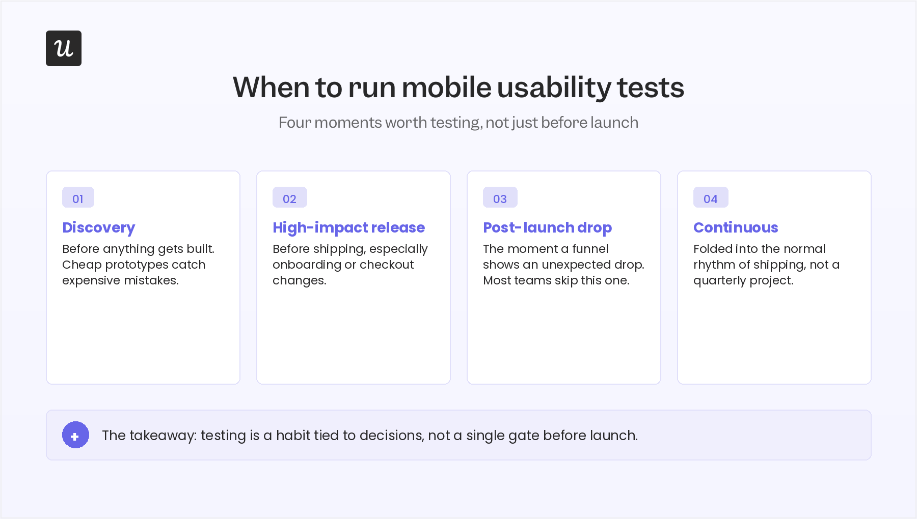
The old advice was to test before launch, but the better version is to test whenever a decision is about to become expensive to reverse. On our own team, that happens in four recurring moments:
- During product discovery, before anything gets built: Cheap prototypes catch expensive mistakes.
- Before shipping a high-impact feature: Especially anything touching customer onboarding or checkout.
- After launch, the moment a funnel analysis shows an unexpected drop: This is the one most teams skip.
- Continuously, folded into the normal rhythm of shipping: Not scheduled as a separate project every quarter.
That third moment is where testing pays for itself fastest. One of our product managers, Abrar Abutouq, noticed a sharp drop-off rate in our email feature’s funnel right at the domain verification step. Instead of filing an engineering ticket and waiting, she built a targeting tooltip and checklist directly inside the product in a few hours.
“Within a few hours, I just created a targeting tooltip and showed it to users and highlighted the correct steps for them to make it clear what to do next. That helped a lot on reducing friction and supporting users in real time without involving our dev team.”
That’s not a formal study with a recruiting script and a consent form. It’s the same underlying discipline to watch where people get stuck, fix it, and check whether the fix worked, compressed into hours instead of weeks. The feature adoption metrics told her where to look; a usability mindset is what she did with it.
How to choose the right mobile usability testing method
There’s no single correct way to run a test, only a correct way for what you’re trying to learn. Moderated testing puts a facilitator in the room or on the call, guiding participants through tasks and collecting customer feedback in real time. Unmoderated testing lets people complete tasks on their own schedule, trading that real-time depth for speed and a larger sample.
There’s a third category worth knowing: automated usability testing, where software simulates user interactions to flag potential issues across many devices and screen sizes at once. It’s a useful broad screen, not a substitute for watching a real person get confused.
Remote and in-person work present a similar trade-off. In-person sessions catch things remote sessions miss, like hesitation, body language, the moment someone’s thumb hovers over the wrong button before they commit. Remote testing trades that away, but it lets you recruit participants from anywhere instead of just people who can get to your office.
In-person mobile sessions need their own setup, too. An external monitor or document camera mirroring the phone screen lets the whole room watch without crowding around one device, and a video camera on the participant’s hands helps with gesture-heavy tasks like swiping or pinching. UserTesting’s own mobile session templates are built around exactly this kind of setup for retail and travel apps.
Our product designer, Amal Al-Khatib, ran exactly this kind of test on a proposed approval workflow, mocked up in Figma and tested with three participants before a single engineer touched it. The prototype looked reasonable in every design review. Here’s what she said about her experiment.
“When we had those usability testing with 3 of the users, we discovered that this would complicate our product, and it will add friction. It wasn’t the solution. So we deprioritized that feature and worked on another one, and you can see it now in the product: it’s notifications, signals, and the alert system.”
That test wasn’t on a phone screen, but the discipline transfers directly to mobile app prototype testing. A clickable mobile mockup tested with five real users costs a fraction of finding the same problem after your app is already live in the App Store or Google Play.
How to run a usability test that actually changes a product decision
Most usability tests fail before the first participant logs in, because nobody defined what decision the test is supposed to inform. Start with one specific user research question, not a general “let’s see how people use the app.” A test built around “can users complete checkout without abandoning” produces a decision; a test built around “let’s get some feedback” produces a checklist nobody acts on.
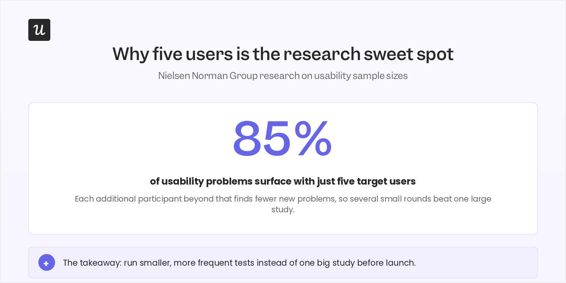
Recruiting the right participants matters as much as the question. Nielsen Norman Group’s research found that five users from your actual target audience surface roughly 85% of usability problems, and running several small rounds beats one large study almost every time. The catch is “actual target audience”: testers who’ve used your product, or a comparable one, for at least three months, who give user feedback that reflects real habits, not a first-time user’s confusion.
We recruit for this largely through in-app surveys, segmenting for people who’ve already touched the feature we want to test. It’s faster than cold outreach and reaches people while the feature is still fresh in memory.
Run a pilot first, with someone who wasn’t involved in writing the test script. It catches unclear task wording and broken prototype links before you burn five real participants on your own setup mistakes.
Once you’re in the session, watch behavior instead of asking what people would do. Someone will tell you they’d definitely use a feature, then never open it once the session ends. Predefined tasks phrased as goals rather than instructions, “find last month’s invoice” instead of “click the invoice tab“, show you the gap between stated preference and actual behavior patterns.
Track metrics that actually inform you what’s happening, instead of you having to assume based on the mobile analytics dashboard. Focus on task completion rate, time on task, abandonment rate, and tap accuracy tells if people will stick around. Then look for patterns across sessions, not standout moments from one. Three participants missing the same button in the same order is what turns a pile of observations into actionable insights instead of a report nobody acts on.
The mistakes that make usability testing a waste of time
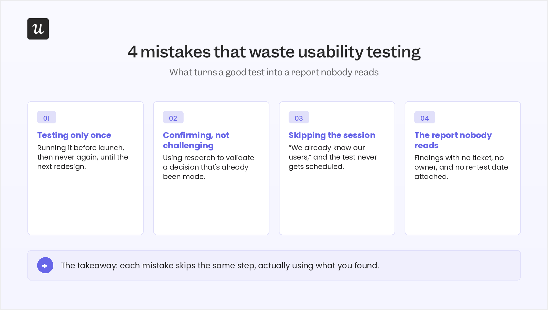
The first mistake is treating testing as something that happens once, before launch, and then never again. Second, using research to confirm a decision that’s already been made instead of challenging it. Researcher Nikki Anderson, who writes the User Research Strategist newsletter, has described teams that wanted to “do user testing to validate designs” when what they actually needed was to test a concept.
A close cousin of that mistake is recruiting whoever’s convenient instead of whoever’s relevant. Five real target users beat twenty coworkers or friends of the design team, every time, because the coworkers already know where the buttons are.
Then there’s the leader who insists “we already know our users” and skips the session entirely. One documented case describes a CEO who ignored every user test because he was certain he already knew what customers wanted. I’ve sat across from that same instinct more than once, and it’s rarely malicious: it’s usually a team that’s confused familiarity with the product for familiarity with how a stranger experiences it the first time.
The last mistake is the quietest: writing a thorough report that never reaches the roadmap. If a finding doesn’t get tied to a specific ticket, a specific owner, and a specific re-test date, it becomes a document nobody opens again.
Where AI helps in mobile usability testing (and where it still falls short)
None of the AI shift has replaced the two most-used research methods. User interviews and usability testing remain the top two methods UX teams rely on, used by 86% and 84% of teams, respectively, even as AI adoption climbs. AI is accelerating the surrounding work, not replacing the core practice.
What AI is genuinely good at is transcription, clustering feedback into themes, and summarizing long interviews into something a product lead will actually read. Lija Hogan and Amrit Bhachu, research leaders at UserTesting, discussed the split in a recent conversation on 2026 research trends: “There are folks who are very intentional leaders in AI adoption—and others who are equally intentional laggards.” The real difference shows up in whether a team treats AI output as a first draft that still needs a human to check, rather than as the finished answer.
Melissa Garber of Consumer Reports gets at the same limit from a different angle:
“AI doesn’t reason; it recognizes patterns. It can pull sentiment, but it doesn’t truly understand emotion or context.”
A synthetic user can produce a convincing transcript, but it’s still just predicting likely words, not a real person with an actual reaction.
Some vendors claim their AI testers catch 97 to 98% of usability issues. That number comes from applying Nielsen Norman Group’s math about human testers to AI testers instead, not from actually comparing the two side by side. Treat it like any vendor stat you can’t check yourself; it’s worth noting, not worth building a decision on.
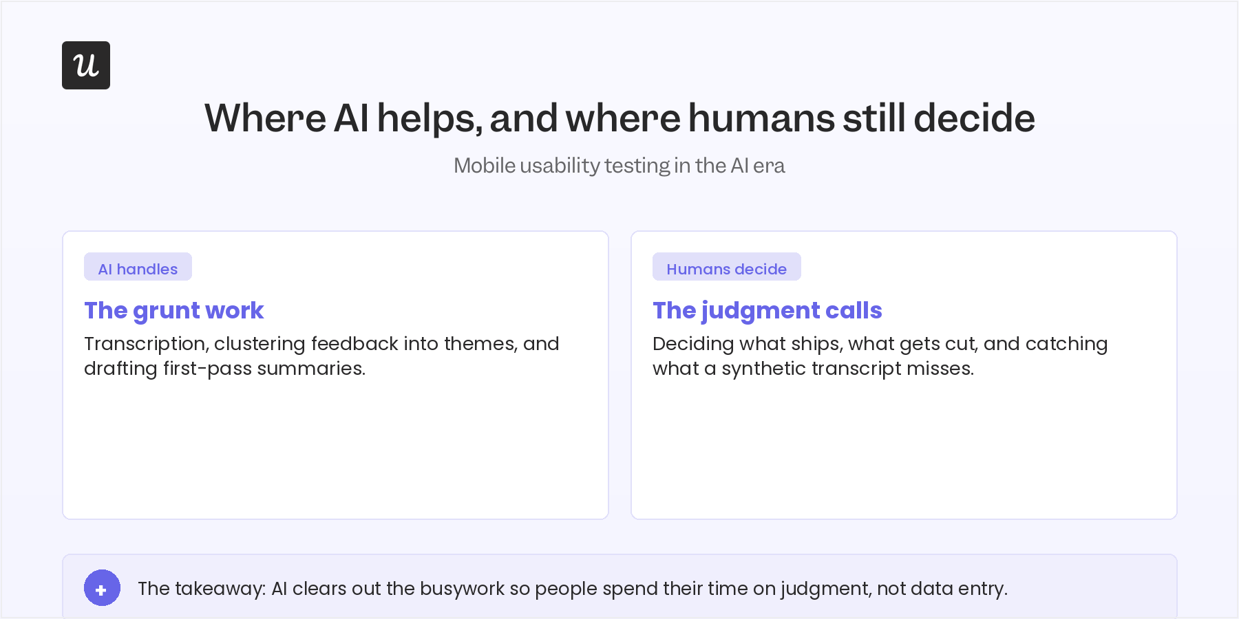
The honest split, based on what I’ve seen on our own team, is that AI handles the grunt work of transcribing, clustering, and drafting a first-pass summary, so the humans doing research spend their time on judgment instead of data entry. Decisions that ship a feature, kill a feature, or reroute an entire flow still go through a person. That’s not a temporary limitation to route around; it’s the actual point of doing research with humans in the first place.
Turning usability findings into product decisions, not just a report
A usability finding is only useful once it’s paired with what your analytics and session replay already know. I learned this directly from our own analytics feature: our team had an internal assumption that one particular chart wasn’t adding value, and we nearly redesigned it away entirely based on that hunch.
Before making that call, we pulled session replay on the feature instead of trusting the assumption. Roughly 10% of users were hovering on the exact chart we were ready to cut, a meaningful share once you scale it across the full user base. We kept the chart, made it collapsible for people who skim past it, and avoided taking real value away from one in ten users.
That’s the pattern worth copying: let session replay and product analytics tell you where to look, then use usability testing or direct observation to confirm what you think you’re seeing before you act on it. Skipping that confirmation step is how confident teams ship confidently wrong redesigns.
Prioritize what you find by actual business impact, not by how interesting the observation was. For example, a confusing tooltip that three people mentioned in passing matters less than a checkout step that’s costing you conversions. Baymard Institute’s research, drawn from over 200,000 hours studying e-commerce and mobile checkout flows, found that checkout usability improvements alone can lift conversion by 35.26%.
Then validate the fix after release instead of assuming a redesign worked because it tested well in the lab. UserTesting’s Forrester-verified study found organizations using structured usability research saw a 415% return on investment over three years, with payback in under six months. Numbers like that only hold up if someone checks whether the fix actually moved activation, user retention, or feature adoption, not just whether it looked better.
Building a continuous feedback loop instead of one-off studies
The teams that get the most out of mobile usability testing don’t treat it as a standalone project. They pair it with:
- In-app surveys to catch the why behind a metric.
- Analytics to spot where users are struggling in the first place.
- Targeted follow-up sessions once a pattern shows up more than once.
Our product designer Amal Al-Khatib described what changes once a team has one shared source of truth instead of scattered opinions: design sessions are now backed by research and user data instead of whoever has the loudest opinion in the room, which removes the friction of different people making different assumptions about the same feature.
Closing the loop means acting on what you find with the same tools you used to spot it. If a usability session surfaces confusion around a specific step, an in-app checklist or tooltip at that exact step, the same kind of fix Abrar shipped for the domain verification drop-off tends to outperform a redesign that waits for the next sprint.
None of this requires a bigger research team; it requires treating usability testing, surveys, session replay tools, and analytics as one connected system instead of four separate projects that happen to study the same users.
The mobile usability testing habit that actually works
Mobile usability testing was never meant to be a single gate before launch. It’s the practice that explains what your funnel, your session replay, and your crash reports can show you, but it can’t explain why a real person, holding a real phone, gave up at that exact moment on their own.
The teams doing this well in 2026 aren’t running more studies than everyone else. They’re running smaller, more frequent ones, tied directly to what the data already flagged, with AI clearing out the transcription and clustering work so people can spend their time on judgment.
If you’re starting from nothing, don’t try to build the full continuous system on day one. Pick the one moment your team keeps skipping, usually the post-launch check nobody schedules, and fix that first. The rest of the loop gets easier to build once that habit exists. Want to see where users actually get stuck on mobile? Userpilot’s session replay shows you the exact tap, scroll, or rage-click before you ever schedule a test.
FAQ
How many users do you need for a mobile usability test?
Five participants from your actual target audience typically surface about 85% of usability problems, according to Nielsen Norman Group’s research. Running that size test multiple times, across different features or releases, beats spending the same budget on one large study, and it lets you combine quantitative data from a broader unmoderated round with qualitative depth from a handful of moderated sessions.
How often should you run usability testing?
Continuously, not on a fixed calendar. Test during discovery, before high-impact releases, and immediately when analytics show an unexpected drop-off, rather than waiting for a scheduled quarterly round.
Can AI replace mobile usability testing?
Not reliably, though it’s genuinely useful for transcription, clustering feedback, and drafting first-pass summaries. It still can’t judge emotion, context, or what a finding means for your roadmap, and synthetic user tools claiming to replace real participants haven’t been independently validated at the accuracy vendors advertise.
What's the difference between usability testing and user testing?
User testing is the broader question of whether people want a product at all. Usability testing assumes that the question is answered and asks whether real users can actually complete tasks in it without getting stuck.
About the author