Usability vs. User Experience: Understanding the Difference Changes How You Build Products


Most articles treat usability and user experience as different words for the same idea, and readers walk away no better equipped to know which one actually broke. Usability refers to whether someone can get through a task. User experience encompasses everything around that task, before it, after it, and everywhere the product touches a person’s expectations.
That distinction used to be a nice-to-know. Now that AI can generate a usability score in an afternoon and half the product org runs its own research, mixing the two up doesn’t just create confusion; it wastes a research budget and ships the wrong fix.

Usability is an engineering metric
Usability refers to whether someone can actually get a task done inside your product. It’s one of the few product qualities you can put an honest number on. Task completion rate is the clearest example: across nearly 1,200 usability testing tasks, Jeff Sauro at MeasuringU found the average completion rate sits at 78%, with the top quartile above 92% and the bottom quartile below 49%. A proper user testing session recruits real users, not the product team, and watches them attempt the task. That’s the only way the number means anything.
The System Usability Scale (SUS) works the same way. Sauro’s analysis across 500 datasets puts the average SUS score at 68, and that number functions as a percentile rank rather than a percentage, so a 70 means above average, not “70% good.” Error rate follows the same logic: across 719 tasks, roughly two out of three users hit at least one error, and only about 10% of tasks come back completely clean.
How many errors someone hits matters, but so does what happens next. Confusing error messages turn a small mistake into a dead end, and a fast backend with unclear error messages still reads as poor system performance to the person staring at the screen.
Sauro named task completion the fundamental usability metric for a reason:
“If users cannot accomplish their goals, not much else matters.”
Time on task doesn’t have a universal benchmark the way completion rate and SUS do. MeasuringU explicitly said that task time depends entirely on what the task is, so the right comparison is against an expert baseline or your own product’s history, not an industry number. Anyone who quotes you a “good” time-on-task figure without that context is guessing.
Nielsen Norman Group breaks usability into five components:
- Learnability
- Task efficiency
- Memorability
- Error frequency
- Satisfaction
ISO 9241-11 compresses the same idea into three dimensions, effectiveness, efficiency, and satisfaction, and that triad is what most usability metrics are quietly measuring. Usability involves the mechanics of a single interaction, not the whole product, which is exactly why it’s measurable in the first place.
Usability isn’t the same thing as utility, which is whether a product’s functionality actually matches user needs and its anticipated use. A product can be effortless to use and still fail here if nobody needed that function in the first place. Usability plus utility together is what NN/g calls usefulness.
The biggest UX problem usually isn’t the interface
In most digital experiences, a usable interface can still sit on top of a broken experience. Picture a movie database site with a flawless interface for finding movies. If the underlying catalog only includes major-studio releases, someone hunting for a small independent film gets a perfect interface yet a useless result.
That’s the gap between the two terms. Usability refers to a single interaction; user experience encompasses everything around it, before someone opens the product, during the task, and after they’ve closed the tab and formed an opinion about your brand. Usability is one turn in the road, and the user experience is the whole twisting mountain road, every customer journey touchpoint– the pricing page, the onboarding emails, the support ticket, the renewal conversation.
Don Norman, who coined the term user experience, and Jakob Nielsen, co-founder of NN/g, put it directly in their own definition:
“User experience encompasses all aspects of the end-user’s interaction with the company, its services, and its products.”
Usability, in their framing, is only one quality attribute inside that much broader experience. UX includes trust, users’ expectations, user onboarding, support, pricing, and the emotions someone carries into and out of every one of those moments, none of which shows up in a SUS score. A product can score an 85 on usability and still lose a customer over a support ticket that took four days to answer.
Jesse James Garrett’s five-element framework maps this same gap in more detail. His model breaks user experience into strategy, scope, structure, skeleton, and surface. Usability lives mostly in the skeleton and surface layers, which is proof that UX encompasses far more ground than any single usability metric can cover, and strategy and scope get decided before UX designers or UI designers ever open a design tool.
Surface is where visual design, visual elements, and branding live, and it’s the layer most usability tests never even measure. Garrett’s own framing is that the surface layer is where a product creates emotional resonance, the sensory, interactive details that give people an emotional impact and a felt sense of the brand, not just a working button. A screen can pass every usability check and still feel cold if nobody designed it for that layer with a purpose.
That’s why UX designers exist as a role distinct from usability specialists, and why good UX design principles run through all five layers, not just the surface one. Teams that create products people actually stick with treat the entire process, strategy through surface, as one connected design process. A good user experience is what happens when all five layers hold together, not just the one you can screenshot.
The key differences between usability and user experience
Once you stop treating usability and user experience as synonyms, the differences sort into four categories: scope, metrics, research methods, and who owns the outcome. I’d rather show this than define it twice.
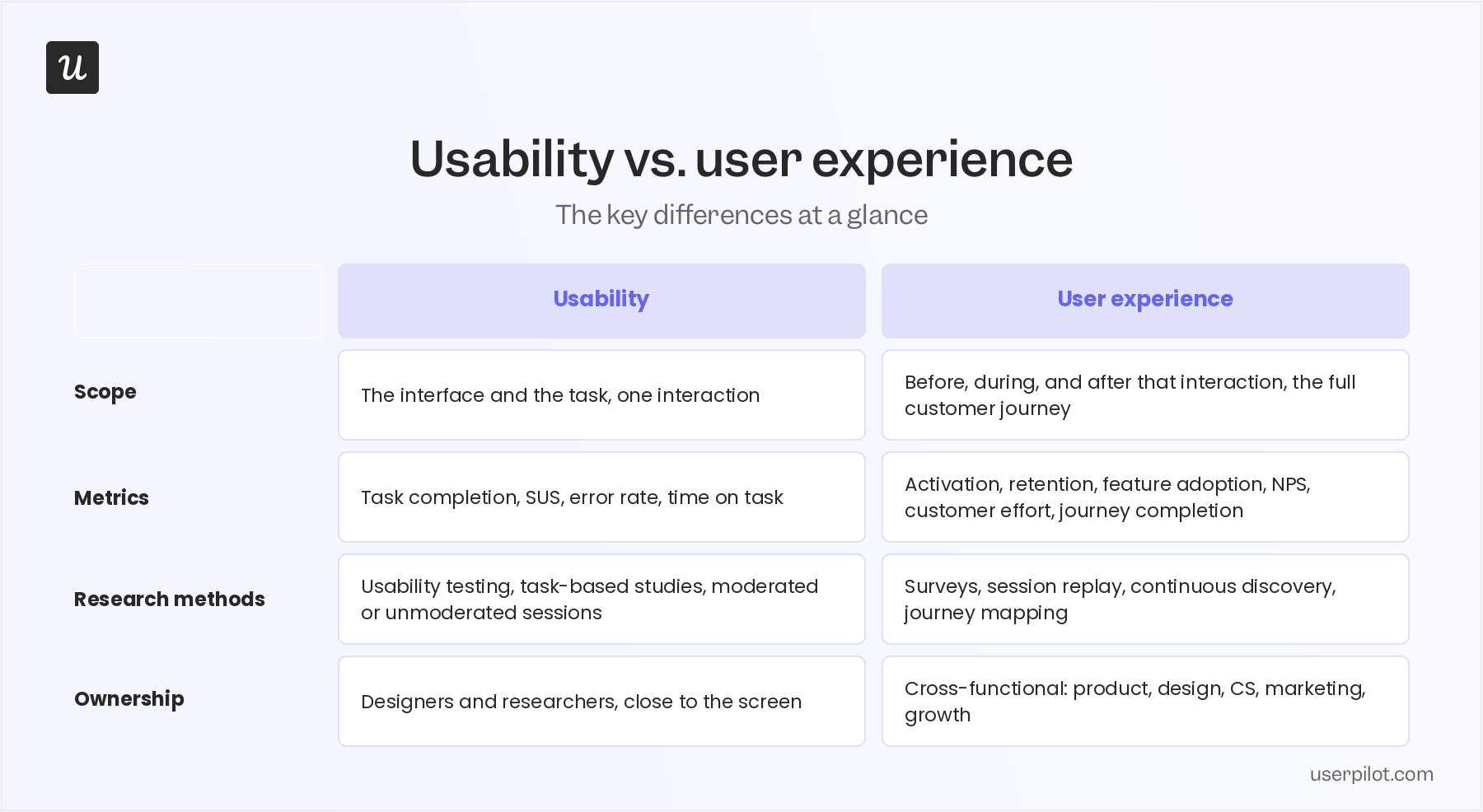
A team can nail every cell in the usability column and still miss the UX column entirely, which is exactly the trap the next section walks through.
Why confusing usability with UX leads to poor product decisions
Teams optimize what they can see, and usability is easy to see. Reduce clicks, sharpen the microcopy UX, fix the error states, watch the SUS score climb. None of that guarantees the metric leadership actually cares about moves with it.
I’ve watched teams ship a usability win, present the before-and-after screenshots, and go back to flat activation metrics the following month. The interface got better, but the reason someone opened the product in the first place never really changed. The users were still not motivated to use that feature despite it looking cleaner and more useful.
NN/g’s own data backs this up at the aggregate level: the average business-metric improvement after a usability redesign is 83%, down from 135% a decade earlier, because most of the easy interface wins have already been made. The remaining gains increasingly come from fixing things that were never interface problems to begin with.
Beautiful interfaces don’t fix poor onboarding or a product that never explains its own value. Left unresolved, that gap becomes a product strategy problem, not a design one, and it stays invisible because the interface metric already looks good, but just on paper.
The upside of getting this right is just as real. McKinsey studied 300 public companies over five years and found that firms in the top quartile for design maturity grew revenue 32 percentage points faster and delivered 56 percentage points higher shareholder returns than their industry peers. That gap came from design tied to strategy across the whole company, not from a cleaner interface in isolation.
How product teams should measure usability and UX differently
Once the categories are separated, measuring them is mostly a matter of picking the right instrument for the right question. Usability metrics are tactical and task-level:
- Task completion rate
- System Usability Scale (SUS)
- Error rate
- Time on task
- Single Ease Question (SEQ)
UX metrics are strategic and journey-level:
- Activation
- User Retention
- Feature adoption
- Net Promoter Score (NPS)
- Customer effort
- Customer satisfaction
- Journey completion
You need both, not just because it’s thorough to collect more numbers. Usability metrics tell you whether the task itself works. UX metrics tell you whether working tasks add up to a product people actually want to keep using, which is what measuring user experience is really asking.
Customer effort specifically checks whether people got what they needed with minimal effort, not just whether they technically could. None of these numbers alone describes the overall user experience; you need the full set across both columns, or a team that only tracks the first list will ship a technically excellent product nobody activates.
Related read: How product adoption actually connects to the UX metrics above, since feature adoption and activation are the same conversation from two different angles.
Modern UX research requires both usability testing and experience research
AI has changed how fast research happens, not what research is for. Maze surveyed 800 product professionals for its 2025 Future of User Research report and found 58% now use AI tools, a 32% jump from the year before, mostly for analyzing research data (74%) and transcription (58%).
Jakob Nielsen, founder of UX Tigers and co-founder of NN/g, has been blunt about what this does and doesn’t replace. On his own Substack, he argues the discipline isn’t dying; it’s changing shape:
“So no, UX doesn’t die; it metamorphoses. We’ll still craft humane experiences, but increasingly through policies, protocols, and orchestrations rather than panels and palettes.”
AI speeds up the parts of research that were always mechanical, like transcription, clustering, and first-pass summaries. It doesn’t replace the judgment call about which finding actually matters, and treating AI output as a finding instead of a first draft is where teams get burned.
Democratized research is the other half of this shift, and it’s where I have a more specific opinion than most of what I’ve read on it. It’s become common for product managers and designers to run their own user analysis without a researcher in the loop, and the instinct is to treat that as a quality problem. I don’t think it’s inherently bad. It scales research coverage, and designers use a product differently than I do, so their questions surface things I wouldn’t have thought to ask.
My actual concern isn’t who runs the study. It’s that everyone, researchers included, tends to mistake confidence for accuracy. I’ve caught myself assuming I understood why a metric moved before I’d actually watched the interaction patterns in the session replay, and that’s a very human habit of filling gaps with a story that feels true.
Accessibility has moved in the same direction research has, that is, from optional to expected. Designing for people with diverse abilities isn’t a compliance checkbox anymore; it’s a product-quality and business issue, because a product that only works for “ordinary” users is quietly excluding a real share of the market.
A quick task-based usability test tells you whether a new flow works before you ship it. It won’t tell you whether people trust the product enough to come back, which needs the kind of longer-horizon UX research covered above.
Examples where usability wasn’t the real problem
Baymard Institute’s checkout research is one of the clearest cases. Across 50 studies, the average documented cart abandonment rate is 70.22%, and Baymard has found that fixing checkout usability specifically can lift conversion by 35.26% at large ecommerce sites. Many of those checkout forms were never confusing. Users just didn’t trust the process enough to finish it, or the flow asked for more than they were willing to give.
Baileigh Industrial’s information architecture overhaul, documented by NN/g, tells a similar story from the other direction. Tree testing showed the original navigation scored 4.0 out of 10 on findability; after restructuring the categories, the same tasks scored 7.4 out of 10, an 85% improvement. The fix wasn’t a prettier interface. It was rethinking how the whole catalog was organized.
Arc Browser shows this clearly. People loved using it, but the company still had to pivot its whole strategy when market pressures caught up with it. Good usability earned goodwill. It didn’t guarantee a sustainable business.
One engineering team’s fake-latency experiment makes the same point from a stranger angle. They deliberately added a small delay to an API response that was already fast, because instant responses made users distrust the result. A technically better experience wasn’t perceived as a better one, one of the stranger bad UX examples you’ll find, a usability win and a UX failure happening in the same feature at the same time.
Our own usability testing case study covers the same pattern: Amal Al-Khatib, Product Designer at Userpilot, ran into it building an approval system for the platform where a contributor publishes a flow or survey and a manager approves it before it goes live. Her team built the idea, then usability tested it with three users on a Figma prototype before it ever reached engineering.
The testing showed the approval step would complicate the product and add friction. Rather than ship it, the team scrapped the idea and built something different, including the notifications and alert system that’s live in Userpilot today. In Amal’s words:
“We discovered that solution wasn’t right, and we completely changed the solution. It wasn’t the solution. So we deprioritized that feature and worked on another one.”
The usability test worked exactly as intended. It caught a UX problem and added complexity that would have hurt the whole product before a single line of production code got written.
How to know whether your problem is usability or UX
Every time a product problem shows up, someone looks for a usability fix first, tightening a form or cutting a step from a flow. Sometimes that’s right, but often it just means the real problem never gets named, because usability and UX get diagnosed with the same instinct instead of different questions.
I use what I’ve started calling the Usability Ceiling Check, four questions that show whether you’re still inside usability’s reach, or whether you’ve hit the point where interface work stops moving the metric you actually care about. Usability asks whether people can complete tasks and accomplish tasks without getting stuck. UX asks whether the user actually got what they came for (what a researcher would otherwise call “did the user accomplish their goal“), would do it again, and felt right the whole way through, and those last three are the ones teams skip.
- Can the user complete the task? If the answer is no, that’s a usability problem, worth fixing regardless of what else is going on.
- Did they get what they actually came for? Completing the task and getting the outcome they wanted aren’t the same thing. Someone can finish an onboarding flow and still have no idea what the product does for them.
- Would they do this again? A completion that never repeats usually means the task was usable but not worth repeating, a retention problem, not an interface one.
- Did the process feel right while it happened? This is the one that gets missed most. A flow can work perfectly and still not match users’ expectations, because users feel friction long before they can explain it, and they act on that feeling before they act on the logic.
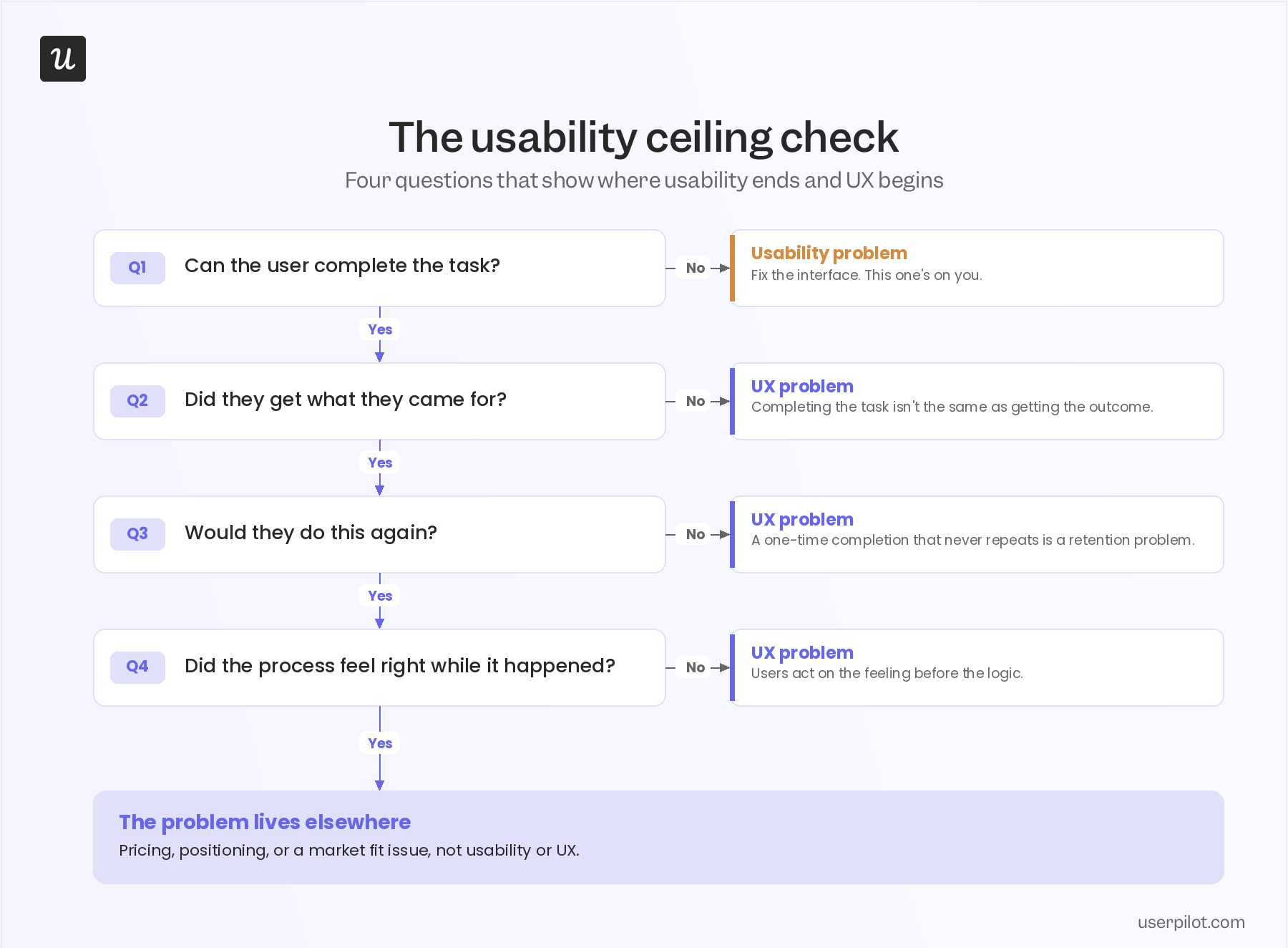
Answering these four questions honestly takes more than a survey. Question one needs user behavior analytics, and question four needs you to watch the session, not just count the clicks, which is what session replay is actually for in this context.
What usability metrics can’t tell you?
Task completion, SUS, and error rate tell you what happened. They can’t tell you why, and they can’t answer “did they get what they came for” or “would they come back,” the two questions from the usability ceiling check that actually predict whether someone sticks around.
That gap is exactly what feedback and user survey tools are built to close. A well-timed NPS survey or an in-app survey question gets you the “why” that behavioral data alone can’t.
Usability and user experience aren’t competing frameworks; they’re different instruments for different jobs. Mixing them up is what produces a product that scores well and still loses customers, because a task that’s technically easy doesn’t automatically leave a user happy. If you want to see how Userpilot’s survey and feedback tools close that gap and get you closer to an actually positive user experience, that’s worth trying firsthand.
About the author