15 SaaS UX Design Examples That Cut User Effort, Not Just Friction


Usually, SaaS UX design roundup posts curate and celebrate beautiful interfaces with gradients, micro-animations, and precisely kerned typography. These things matter, but they don’t explain what separates products people try from products people pay for month after month. The design decisions that actually retain users for a SaaS are mostly invisible. They’re the steps users didn’t have to take, the decisions they didn’t have to make, the configurations they never saw.
I’ve been running funnels, watching session replays, and reading behavioral data at Userpilot for the past year. The pattern that keeps showing up is that users aren’t leaving because a product looks bad. They leave because the product demanded too much of them before it gave anything useful first.
This guide covers 15 SaaS UX design examples, answering one simple question: “How much user work did the product remove?” For each one, I’ll explain what users had to do before the design decision, what changed, why it works, and what your team can take from it.
Great SaaS UX removes effort. Here’s how to spot it.
The traditional checklist for UX quality covers usability, accessibility, and visual hierarchy. Visual hierarchy, in particular, has a huge impact on whether users can identify the most important action on a page without consciously working it out, and a well-structured hierarchy reduces cognitive load by presenting information in a clear and organized manner. The more useful question to ask in 2026, though, is: “How much effort did this UX design remove from the user’s workflow before asking them to invest anything?”
Products that score well on this question tend to have something in common:
- They adapt to how much the user already knows, rather than treating every session like the first one.
- They eliminate decisions the user would otherwise have to make before getting started.
- They anticipate the next step instead of waiting for the user to figure it out.
- They reduce the time between signing up and the first completed task.
UX research and design thinking are what reveal these patterns, where teams that run user research before making design decisions are far more likely to catch friction before it shows up in churn data.
15 SaaS UX design examples worth following for 2026
Here’s the evaluation criteria I use when studying UX design examples:
- Did it reduce the steps between signup and first value?
- Did it remove a decision the user had to make before?
- Did it adapt to the user’s level of familiarity over time?
- Did it eliminate something repetitive from a common workflow?
- Did it fit into how the user already works, rather than requiring a new habit?
- Did it use visual hierarchy to guide attention to the most important action rather than presenting every feature with equal weight?
All the examples below follow these principles. Let’s see what we can learn from them.
1. Notion: Templates replace the blank state
Before Notion added templates to new-user empty states, users opened the app to a blank page. For a general-purpose tool with no obvious starting point, that blank page caused a significant drop-off, because users had no clear answer to the first question a blank canvas creates: “What am I supposed to put here?”
Notion now presents a gallery of ready-to-use templates the moment a new user creates a page, covering meeting notes, project trackers, personal dashboards, and more. The user imports a template, the structure appears, and they can start adding their own content within seconds. Setup work that used to require knowing what you needed becomes something the product has already figured out for you.
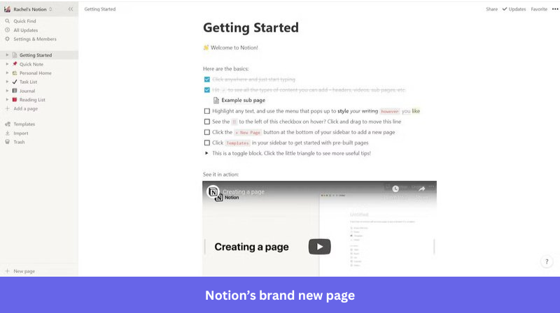
Pro tip: Never let a new user face a genuinely empty state. Pre-populate with the most common starting configuration for users at their stage, even if it’s just placeholder content. Blank states communicate that the product’s job is done; templates communicate that the product is still working for the user.
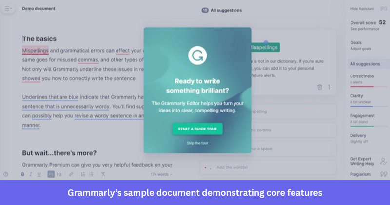
2. Grammarly: Teach by doing, not by announcing
Most writing tools onboard new users with a product tour covering the toolbar, here’s how suggestions appear, and here’s your writing score. Grammarly skipped the tour and built a sample document instead. When a new user opens the app for the first time, they see a pre-written sample document with real errors already highlighted, and they fix those errors themselves before they touch their own work.
Practice leads to habit-forming faster than passive observation. A user who spends three minutes correcting a sample document will remember how to handle Grammarly’s suggestions when they open their own writing. A user who watched a two-minute walkthrough likely won’t.
Understanding user motivation matters here because users are more likely to complete an onboarding flow when they feel they’re building something real rather than watching a demonstration. The difference in retention between these two approaches shows up in activation rates and feature adoption rates within the first session.
Pro tip: If your product requires users to learn a skill before they can get value, give them a safe place to practice on pre-loaded practice material before touching their own data. The sample environment teaches the behavior, and the user’s own data cements it.
3. Calendly: Making decisions on the user’s behalf
Before scheduling tools existed, setting up a meeting meant sending time options, waiting for a response, going back and forth, and manually blocking a calendar. Calendly removed most of that sequence. Users set their availability once, share a link, and the system handles timezone conversion, buffer times, confirmation emails, and calendar blocking automatically.
What makes Calendly worth studying is how many default decisions it makes on behalf of the user right from the start.
- The default meeting duration is 30 minutes.
- The default confirmation email is already written.
- The default buffer between meetings is 10 minutes.
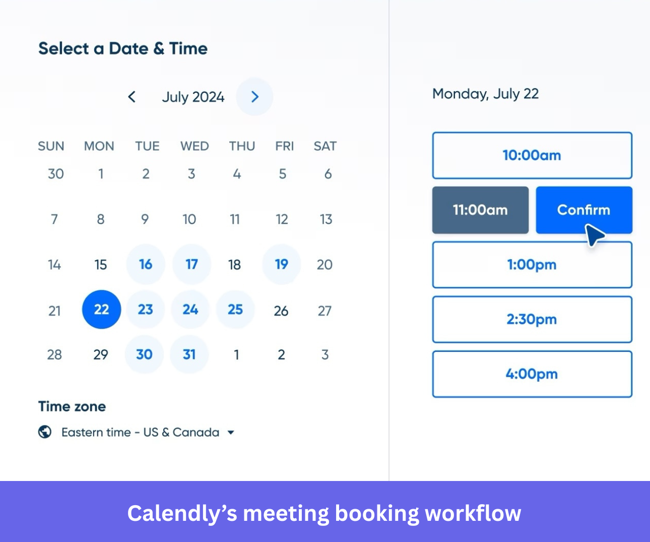
The result is a user-friendly interface that gets out of the way, where a new user can go from signup to sharing a working scheduling link in under two minutes because the product has already made the obvious choices for them.
Pro tip: Map every decision your product asks a new user to make before they can do anything useful. For each one, ask whether there’s a sensible default you could set instead. Most defaults are right for the majority of users; the rest can customize later.
4. Stripe: Show value before setup is complete
SaaS products usually gate their core functionality behind a complete user account activation. A developer can integrate the Stripe API and see test transactions live in the dashboard within minutes of creating an account, without completing email verification, business details, or bank account connection.
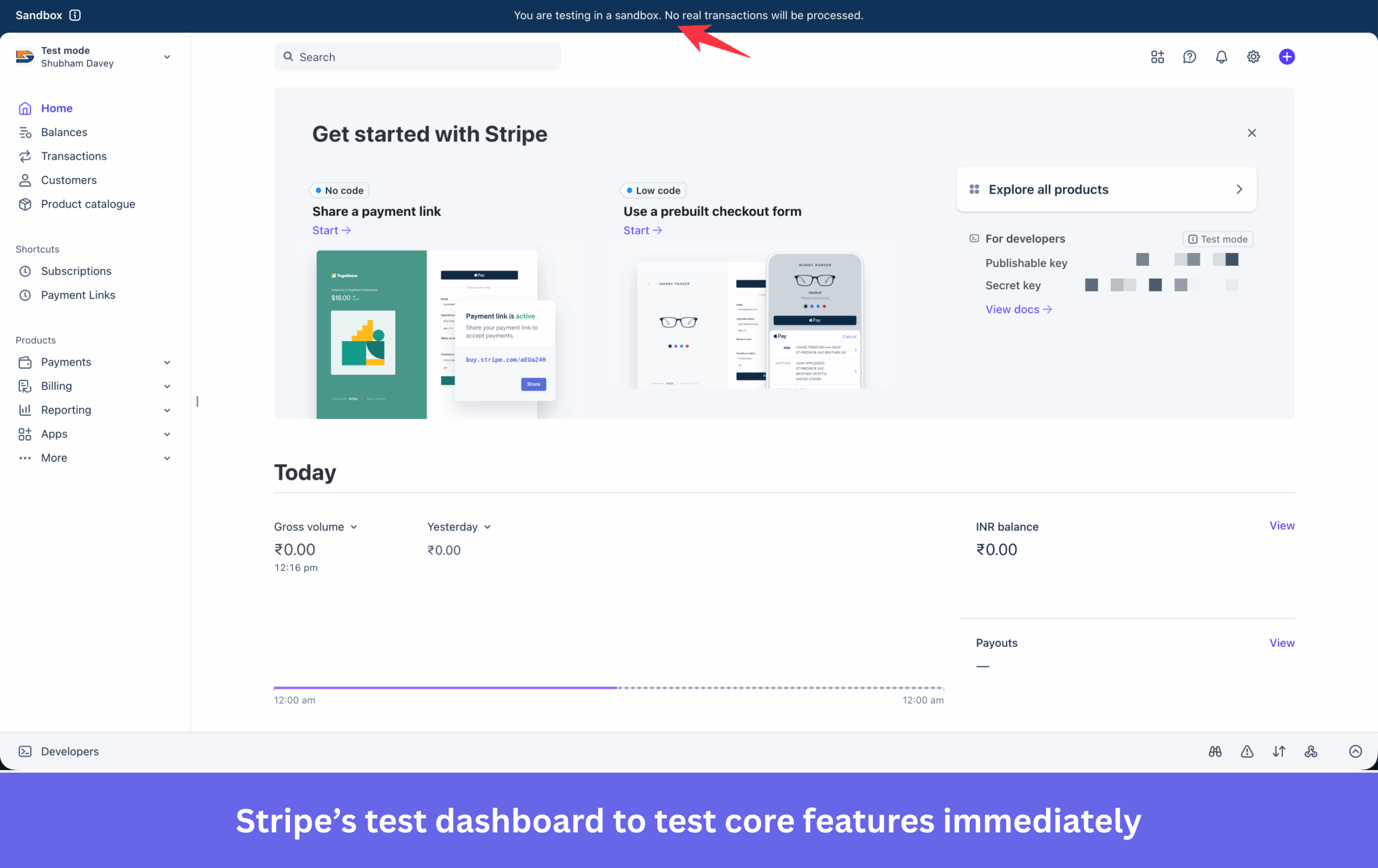
This matters because it shifts the moment when a user decides whether the product is worth their time. A developer who sees a working test transaction in their dashboard before entering a single piece of business information has already experienced the product’s core value. The remaining setup steps feel like administration, not prerequisites, and users are far more likely to complete administration after they’ve seen the payoff. In fact, once they see the value, they can’t wait to finish the required steps to fully utilize the product, in this case, Stripe’s live features.
Pro tip: Separate setup steps that are required for the product to work from steps required for billing or compliance. Move everything non-essential out of the activation path and into a secondary “complete your account” flow that users can return to after they’ve experienced value.
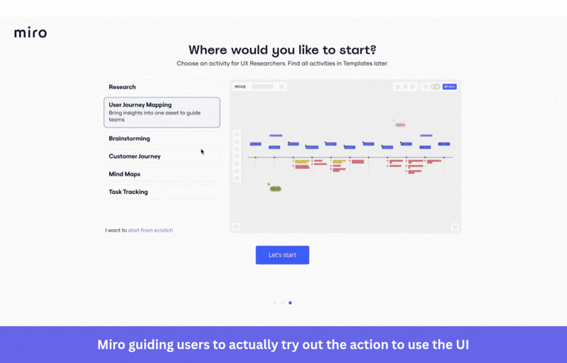
5. Miro: Onboard through practice, not instruction
Miro is a collaborative whiteboard tool with a moderately high skill ceiling. Keyboard shortcuts, gestures, and mouse operations all affect how quickly a user can work, and on a mobile device, gestures like pinch-to-zoom require practice before they feel natural. Teaching these through a list or a walkthrough produces poor retention, because instructions that haven’t been applied won’t stick with users.
Miro’s onboarding flow prompts users to complete each action rather than observe it. When the flow introduces sticky notes, it asks the user to create one. When it covers connections, it asks the user to draw one. Each step produces something the user built themselves, which builds familiarity faster than any amount of demonstration. IKEA effect, if you will.
Pro tip: For features that require procedural knowledge or muscle memory, replace explanation with practice. Build a sandbox or sample environment where users complete the real action on controlled content before touching their own data.
6. Linear: Strong defaults that skip configuration
Project management tools typically begin with a configuration step, including setting up your team, creating your first project, defining workflow stages, and choosing notification preferences. Instead of asking teams to design a workflow from scratch, Linear starts with a predefined system. Teams get built-in workflow stages, predefined priority levels, and a structure that works for most software organizations on day one. The result is fewer setup decisions and a much shorter path to shipping work.
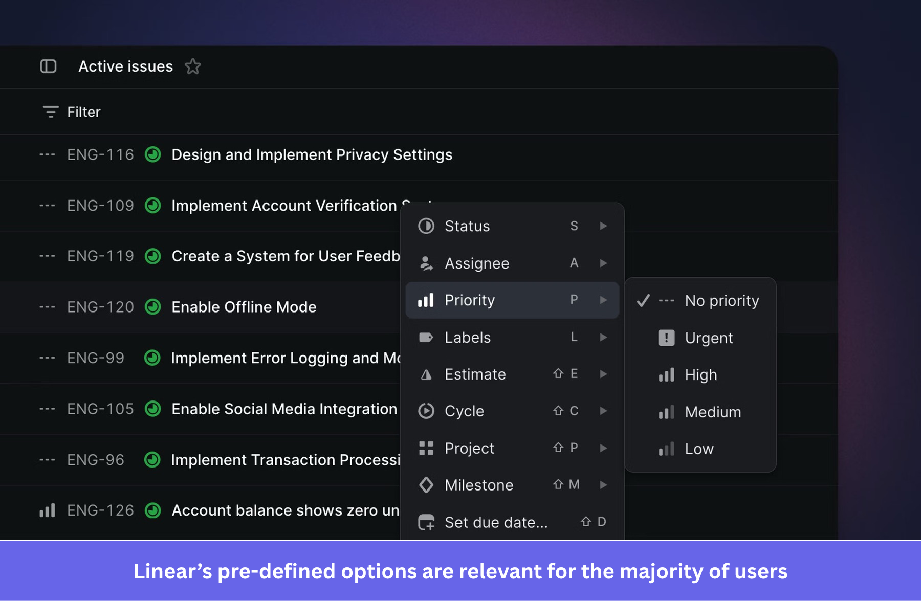
The philosophy behind this is straightforward. The team that built Linear is a software team that has thought harder about sensible project management defaults than most new users often use. Offering those decisions as pre-configured starting points rather than open questions removes hours of configuration without taking away control for teams that want to customize.
Pro tip: Ship with default settings that hold true for most users. Default settings that reflect real-world best practice are faster to arrive at than asking every new user to independently rebuild the same configuration from scratch.
7. Figma: Auto-layout removes the correction loop
Before auto-layout, making a button that adjusts to its text label required manually updating padding after every content change. Add a word, resize the button, recheck alignment, then repeat across every instance in the file. Figma’s auto-layout changed this by letting designers define rules for how a component should respond to content changes, so the component maintains those rules automatically without any manual adjustment.
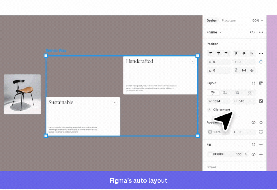
Across a full design file with dozens of reused components, this removes hours of manual work per project. The broader UX lesson is about reducing the correction loop, that is, anytime a user has to make the same manual adjustment after each input, the product is creating work that the system could be absorbing.
Pro tip: Look for places in your product where users have to make the same correction after each input. If there’s a rule that could be defined once and applied automatically, the product should enforce it instead of the user.
8. Slack: Slash commands cut navigation out of common actions
Before Slack shortcuts existed, taking a common action like setting a status, creating a poll, or scheduling a reminder required navigating to the right place in the interface, usually through the navigation bar or a settings menu several clicks deep. Slash commands let users trigger those actions without leaving the message input. Type “/status” and the status panel opens; type “/remind,” and the reminder gets created immediately.
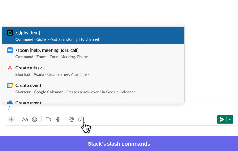
Slack’s Workflow Builder extends this to team-level repetitive work. A recurring process, like a weekly standup or a new hire introduction, can be automated entirely through a visual builder, removing the manual trigger that someone on the team was doing repeatedly. The design goal in both cases is the same, to make the most frequent actions require the fewest steps.
Pro tip: Find your users’ most frequently performed actions and count the navigation steps each one currently requires. A command palette, keyboard shortcut, or automation that eliminates two or three steps from something done dozens of times per week creates a measurable reduction in daily work.
9. HubSpot: Sequences that respond to what the user actually did
HubSpot enrollment sequences do more than send automated emails at scheduled intervals. They branch based on real behavior, that is, if a contact opens an email but doesn’t click, the next step adjusts. If a contact books a meeting, they exit the sequence automatically. No manual intervention required.
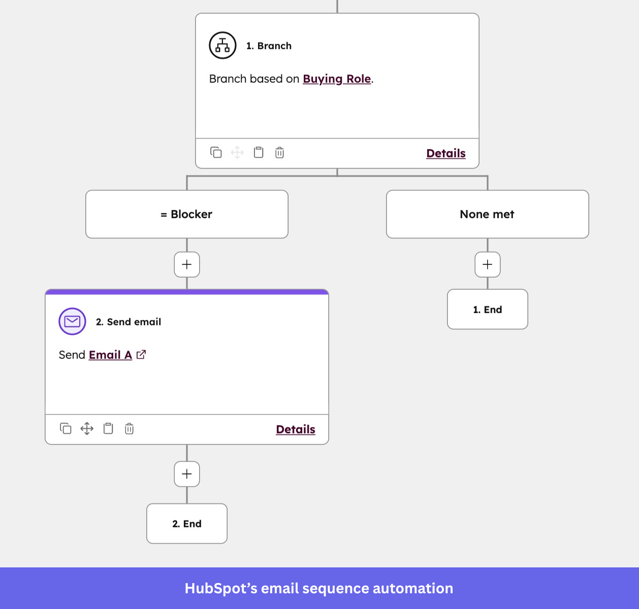
For sales and marketing users, this removes the work of monitoring each contact’s status and manually updating their outreach plan accordingly. The alternative, tracking who did what and adjusting each sequence by hand, is exactly the kind of repetitive work that creates errors and burns time in smaller teams. HubSpot’s design makes the right response happen without the user needing to remember to trigger it.
Pro tip: Wherever users are currently making manual adjustments based on what another user or system did, look for ways to automate those adjustments. The user defines the rule once; the product applies it every time conditions are met.
10. Loom: Record, share, done
Before async video tools, explaining something visual to a remote colleague required a scheduled call, a detailed written explanation with screenshots, or both. Loom collapsed that workflow. You click record, show or say what you mean, and click stop. The shareable link is generated automatically, and the viewer can watch at their own pace, add timestamped comments, and respond without scheduling anything.
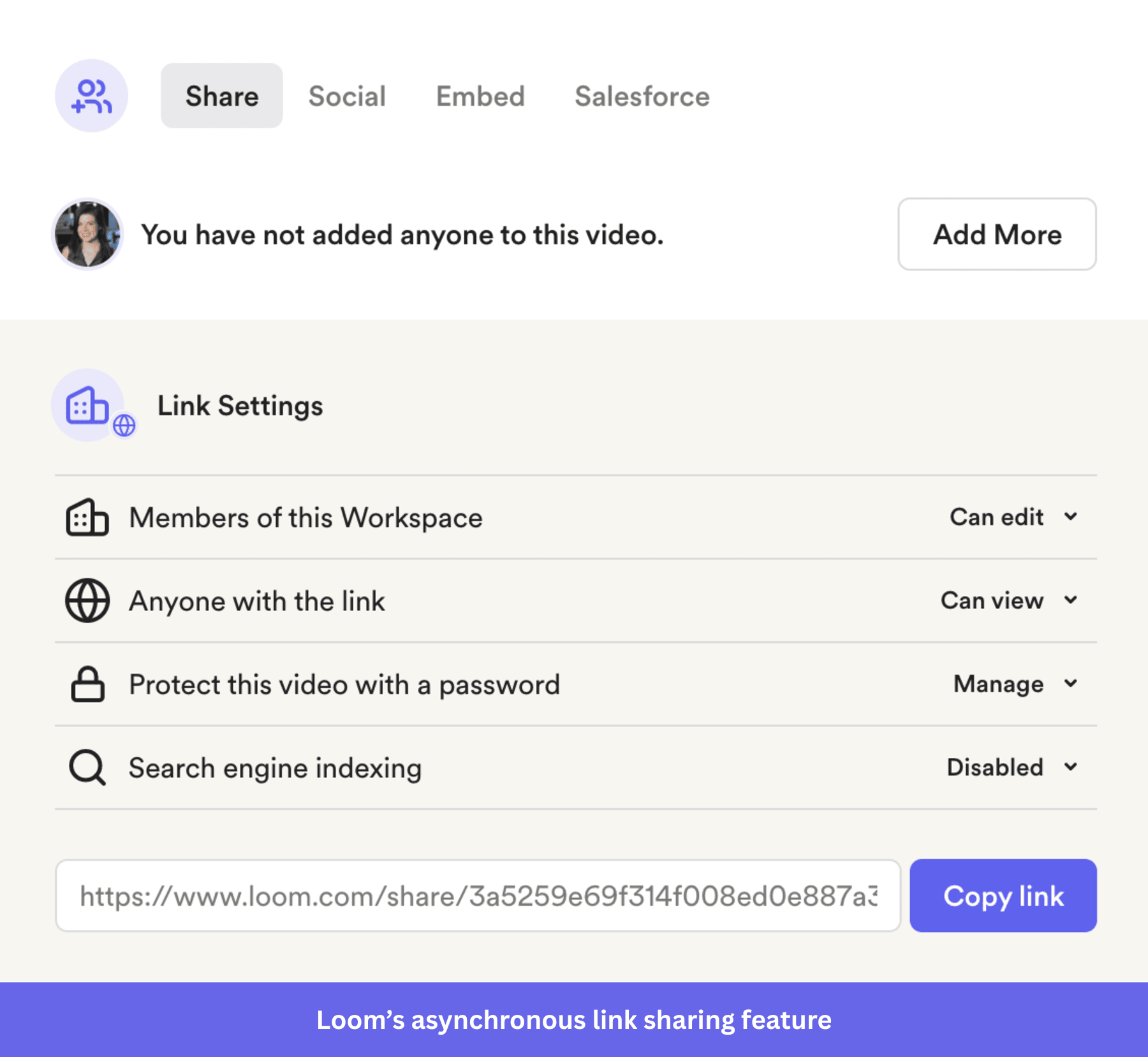
The product usability principle here is about removing coordination overhead. A meeting that could be a Loom recording is a block of scheduled time reclaimed by two people. Loom’s design makes the lower-effort path feel equally professional, which is what changes team behavior rather than just offering the option.
Pro tip: Look for places where users currently coordinate synchronously to accomplish something that could be done asynchronously. If the async version can be made to feel as complete and credible as the synchronous one, users will choose the asynchronous option by default.
11. Evernote: Announce features without stopping the user
Most SaaS products announce new features with either an email that the majority of users ignore or an in-app modal that interrupts whatever the user was trying to do. Evernote’s “What’s New” sidebar takes a different approach. It appears as an optional panel with numbered notification icon marking each new feature, and a checklist that tracks which ones the user has explored. Users can investigate at their own pace without losing their current context.
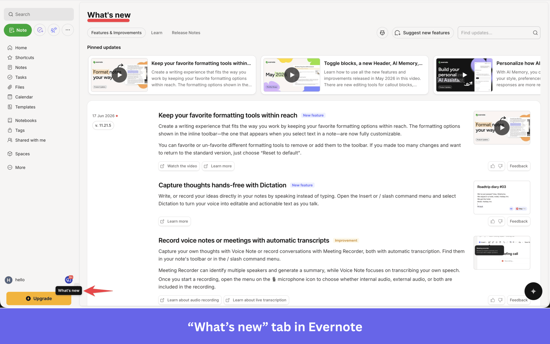
New feature announcements should strike a balance between being visible and being respectful of what the user is doing. The sidebar gives new features enough presence to be noticed while keeping them explorable on the user’s terms. Users who are curious go in; users who aren’t continue their work without interruption.
Pro tip: Use persistent but non-blocking entry points for new features. A sidebar, a notification dot, or a subtle spotlight gives users the choice of when to engage, which tends to produce higher feature adoption than a modal that creates a forced decision at the wrong moment.
12. Airbnb: Search filters that match how users think
Standard property search filters ask practical questions like price range, number of bedrooms, and check-in date. Airbnb added filters organized around emotional outcomes: “amazing views,” “unique stays,” “beachfront.” A user who doesn’t know exactly what they want can browse by feeling rather than specification, which matches how many people actually plan travel.
While Airbnb ran these emotional categories from 2022 to 2025 before removing them, the lesson still stands – organizing by user intent rather than property specs cuts down the trial-and-error required to find a match.
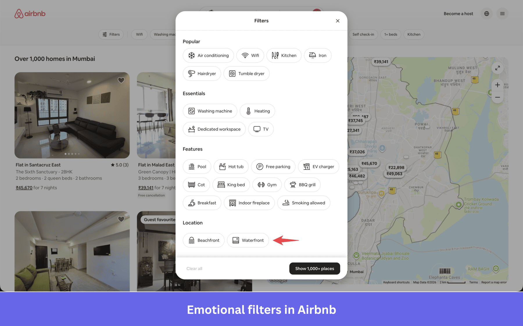
Airbnb pushed this further with their Winter 2021 update, announcing more than 50 new features through a narrative video built around personal connection rather than a feature list. The new feature announcement worked because it organized the experience around user motivation, not a product changelog.
The SaaS equivalent of this problem is more common than it looks. Users in analytics tools, CRMs, and project management software often know the outcome they want but not the right query or filter combination to find it. A navigation structure built around technical jargon or product architecture creates a gap between what users look for and what they see. Organizing navigation around user intent closes that gap, reducing the trial-and-error required to arrive at the right result.
Pro tip: If your product has a search or filtering system, audit how users describe what they’re looking for in their own language. Building filters around outcomes and use cases rather than technical categories can significantly reduce the time users spend getting to the right place.
13. Etsy: Spotlighting a new feature in context
When Etsy launched an AR experience for mobile that lets buyers preview products in their own space, they needed users to notice the feature without forcing a decision before seeing it. They added a spotlight overlay on the AR button within the product view, accompanied by a single-sentence tooltip explaining what it does.
This approach works especially well on a mobile device, where mobile patterns favor small, tappable elements over expanded panels. The spotlight gives the feature enough visual weight to be noticed without blocking the surrounding interface, and on a small screen, that balance matters more than on a web app with more available space. It’s a good example of how placement and timing of a feature announcement matter as much as the announcement itself.
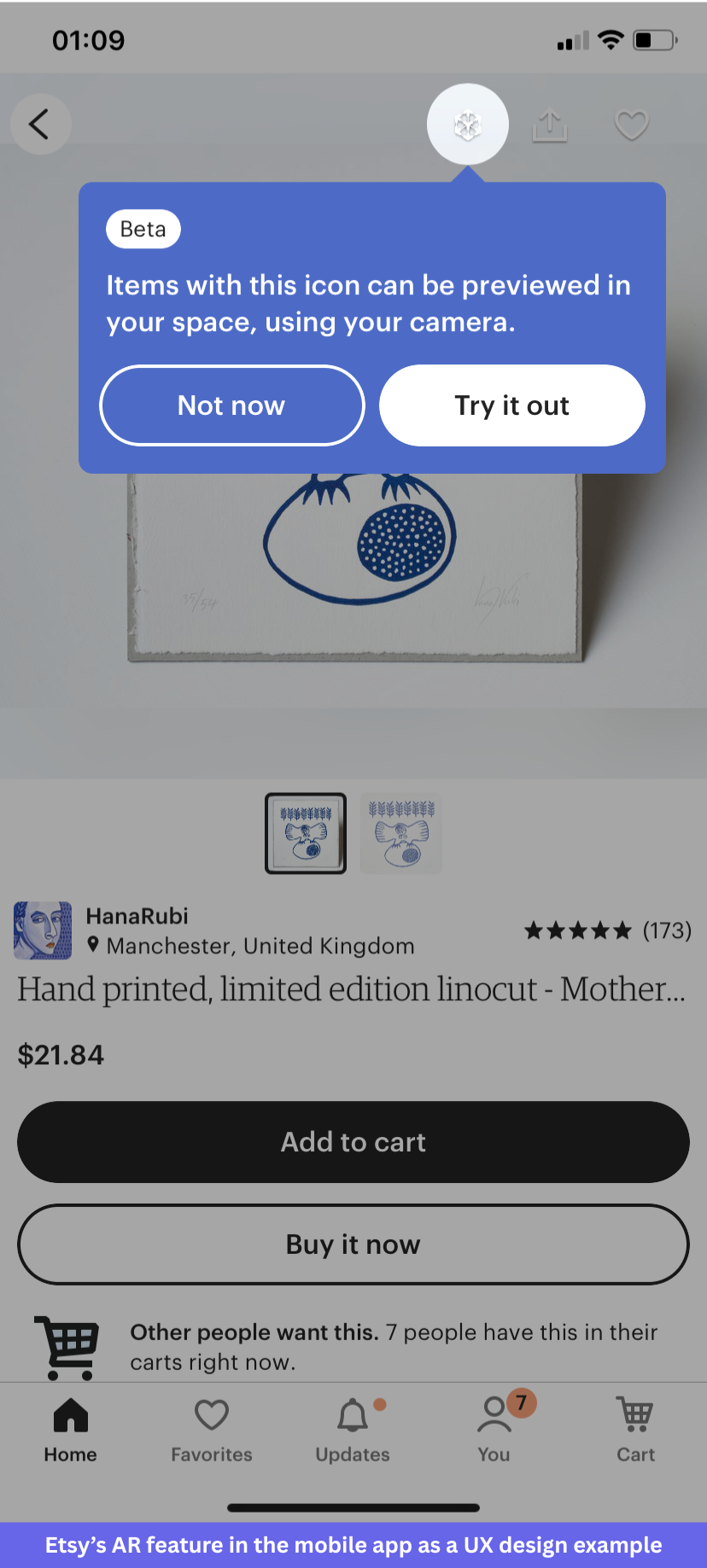
Pro tip: use contextual spotlights to introduce features at the moment they’re relevant to what the user is already doing. A tooltip on a feature the user is adjacent to lands differently than a banner on the loading screen on the home page announcing the same thing.
14. Netflix: Making the path of least resistance the right path
Every episode ending is a decision point: continue watching, search for something else, or stop. Auto-play removes the first decision and makes the other two require active effort. For a product whose value depends on continued engagement, this is a deliberate design choice about which action should be the easiest one to take. Netflix made binge-watching a cool thing people can boast about.
The “skip intro” and “skip recap” buttons follow the same logic. Netflix identified the actions most users want to take at specific moments and made them the default rather than requiring users to opt in each time. This feature is so useful that Netflix went on record and said the skip button is clicked/tapped 136 million times a day, saving 195 years.
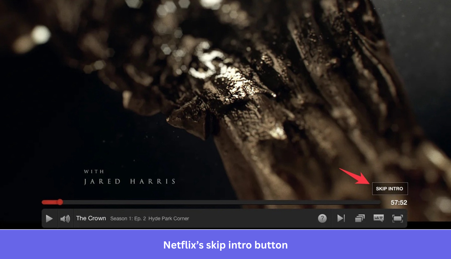
It keeps users engaged by removing every small obstacle between episodes rather than rewarding continued viewing externally. Users who want a different experience can take it; users who don’t get a frictionless path without asking for it.
Pro tip: Map your most common user paths and identify the transitions where users have to make a choice. For each one, ask what the majority of users do next. If the answer is consistent, make it the default and let the exceptions opt out, rather than requiring the majority to opt in every time.
15. Userpilot: One survey question that reframed mobile adoption data
When we launched support for mobile app experiences, engagement with the feature looked poor. Raw funnel data showed roughly 10% of customers using Userpilot’s mobile content tool. That figure, taken at face value, suggested the feature had an adoption problem.
Abrar Abutouq, Product Manager at Userpilot, ran a single in-app survey with one question: Does your company support a mobile application? The answer changed how the team read the entire dataset. Around 25% of customers who actually had a mobile app were using the feature. The 10% figure was low because it included all customers, the majority of whom had no mobile product to instrument. Once the data was correctly framed, the team segmented users. Customers without a mobile app were excluded from mobile-related messaging, and customers who had a mobile app but hadn’t connected it received a targeted checklist walking them through setup.
The one-question survey added a single step to the workflow and removed a significant amount of guesswork. Contextual guidance only works when it reaches the right users. A single targeted in-app question gets that answer faster than a follow-up email most users won’t open.
Common patterns in the best UX design examples
Looking at these 15 examples together, five consistent principles emerge.
#1 Templates beat blank states: Notion, Miro, and Linear all demonstrate this. A user who opens a new project and sees a blank canvas faces a question the product hasn’t answered yet. A sensible default, a pre-built template, or an opinionated starting configuration answers that question before it creates hesitation. The design work here isn’t glamorous, but the impact on activation rates consistently is.
#2 Guidance beats tours: Grammarly, Miro, and Userpilot all use guidance that appears at the moment of need rather than at signup. An interactive walkthrough triggered by actual user behavior lands differently from a tour triggered by a first login. The user is already in a relevant state, which makes the guidance feel useful rather than interruptive. Timing is a design decision as much as content is.
#3 Defaults beat decisions: Calendly, Linear, and Stripe all reduce the number of choices a new user has to make before reaching value. Every configuration step moved from “required before use” to “optional after setup” is friction removed from the activation path. The key constraint on this principle is that the defaults need to be genuinely defensible. A default that works for 80% of users is worth setting; a default that works for 50% creates as many problems as it solves.
#4 Automation beats repetition: HubSpot’s branching sequences and Slack’s Workflow Builder both automate decisions that were previously made manually on each cycle. The pattern is consistent: find a recurring judgment call, let the user define the rule once, and let the product apply it thereafter.
#5 Context beats documentation: Evernote, Etsy, and Userpilot all demonstrate that users don’t look up documentation before they need it in the moment. Help that appears at the actual point of friction, in the context of what the user is doing, works consistently better than a knowledge base article the user would have to search for. The practical implication is that support and guidance belong inside the product flow, not linked from a sidebar.
#6 Visual hierarchy guides attention without requiring effort: Across these 15 examples, the products that onboard well share one visual trait: they make the most important action on the screen obvious without requiring the user to scan the entire interface. Not only does a well-structured visual hierarchy reduce cognitive load, but it also contributes to the overall aesthetic appeal of a design, making the product feel more polished without additional elements. Clear spacing, adequate white space, and large enough type for the primary action are design team decisions that UX and UI designers make early in the design process, and they have a disproportionately large impact on whether new users feel oriented or overwhelmed.
The product should do the work, not the user
The products worth studying for UX in 2026 aren’t making software easier to learn. They’re making software require less learning in the first place. The examples in this guide all point in the same direction: the product does more, and the user does less, before arriving at the outcome they came for.
That shift requires looking at your funnel differently. Where are users dropping off? What decision or step comes just before that point? Could a default, a template, a contextual tooltip, or a triggered automation remove that step entirely? Userpilot’s session replay and funnel analytics make those questions answerable without guesswork, and in-app guidance can be deployed without engineering support once you’ve identified the friction point. Book a demo to see for yourself.
FAQ
What is UX design?
UX design is the process of deciding how users interact with a product. The UX design process covers user research, information architecture, prototyping, and testing, with the goal of building a user-friendly interface that requires the least effort to accomplish any given task. Good UX design reduces the effort required for users to accomplish their goals, whether they’re using a web app, a mobile website, or a desktop platform.
What is the difference between UX and UI design?
UX (user experience) design focuses on the overall flow and functionality of a product, including how decisions are structured and what the user has to do to complete a task. UI (user interface) design focuses on the visual layer: layout, color, typography, and components. UX designers and UI designers often work closely together, but the disciplines are distinct: UX determines the path the user takes; UI determines what that path looks like.
What makes a good UX design?
Great UX design reduces the effort required for users to accomplish their goals. It removes unnecessary steps from common workflows, provides sensible defaults rather than open-ended configuration, and delivers guidance at the
What do many teams still get wrong about UX design?
#1 Feature-first onboarding: A common mistake is building onboarding around the product’s features rather than the user’s first goal. When a new user signs up, they have one specific outcome in mind. Showing them a tour of every other thing the product can do before they’ve achieved that first outcome adds cognitive load without adding value. The onboarding structure should follow the user’s goal, not the product’s feature inventory.
#2 Dashboard bloat: The default dashboard in many SaaS products shows everything. Every metric, every module, every shortcut, presented with equal visual weight. This creates unnecessary friction for experienced users who know what they need and for new users who don’t know what to focus on. Overwhelming users with too many options at once is one of the most common mistakes design teams make when they optimize for feature completeness rather than task completion. Dashboards that surface the most important action or metric first, use white space to separate priority from secondary content, and progressively reveal additional detail consistently produce faster task completion than dashboards that present everything simultaneously.
#3 Configuration before value: Many SaaS products require users to complete account setup before accessing core functionality. Some of that setup is genuinely necessary. Most of it is administrative work that could happen after the user has seen the product’s value and decided to stay. Every setup step placed before the first value is a point where the user can decide the product isn’t worth the effort it’s asking for right now.
#4 Measuring engagement instead of outcomes: A user who visits the product five times a week without completing a meaningful action is a user at risk of churning, not a retained user. Teams that optimize for logins and time-on-page often miss this signal. The UX metric worth tracking is whether users are completing the outcome they came for, and at what point in the flow they’re stopping when they don’t.
About the author