Product-Led Growth Playbook: 11 Tactics for SaaS Companies


Product-led growth is predicted to become even more prominent in 2024. For those who would like to implement the growth model, here’s our product-led growth playbook.
In this article, we share 11 tried and tested tactics for product managers who want to up their PLG game.
Let’s dive in!
Product-led growth playbook summary
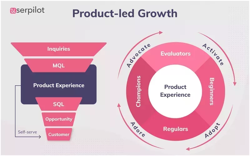
- Product-led growth (PLG) is a go-to-market strategy where the product is the main driver of customer acquisition, adoption, and account expansion.
- PLG differs from sales-led and marketing-led growth by focusing on the product as the key growth driver, as opposed to sales or marketing efforts, with monetization happening only after users have experienced the product value.
- For SaaS businesses, PLG offers benefits like lower user acquisition costs, reduced burden on customer success and support teams, sustainable and scalable business growth, and higher customer satisfaction, retention, and lifetime value.
- To become a product-led company, essentials include a high-quality, user-friendly product with a good market fit and an intuitive design that allows users to experience its value in little time.
- Our product-led growth playbook includes 11 strategies:
- Leverage product virality and network effects to drive organic growth.
- Offer a free plan or trial to ensure a constant flow of customers and allow them to experience the product value.
- Create a frictionless sign-up flow to smoothly let users inside the product.
- Provide onboarding experiences personalized to unique user needs to reduce time-to-value.
- Use contextual in-app messages to introduce new features.
- Gather customer insights on how to improve the CX via surveys and direct interactions with users.
- Lean into product analytics to enable data-driven decision-making.
- Just like new feature announcements, it’s best to trigger upsell messages contextually to maximize their impact.
- Both free and paid users need on-demand access to support.
- Referral schemes are an alternative method for driving customer acquisition.
- Cultivate an organizational culture that fosters customer-centricity, innovation, and cross-functional collaboration.
- To learn how to use Userpilot to implement the PLG playbook, book the demo!
What’s your biggest challenge with your current product-led growth playbook?
How are you currently guiding new users through your product?
How do you typically announce new features to your users?
You’re ready to build a powerful product-led growth playbook.
Based on your answers, Userpilot can provide the tools you need to accelerate user activation, improve adoption, and drive growth directly within your product. See how to execute your strategy.
What is the product-led growth strategy?
Product-led growth is a go-to-market strategy that prioritizes the product as the main driver of growth.
The main idea behind PLG is to create a product that attracts potential customers. The users get free access to the product so that they can experience its value and convert into paying accounts with minimal intervention from the marketing or sales team.
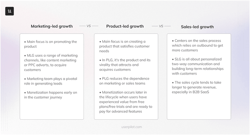
Marketing-led growth vs. sales-led growth vs. product-led growth
Product-led growth is often mentioned along with marketing- and sales-led growth.
How do these growth models differ?
As mentioned, in PLG, the product is the main vehicle that drives customer acquisition, adoption, account expansion, and customer advocacy. This means that monetization happens later in the product lifecycle after the users have experienced the product value through free usage.
In contrast, in sales-led growth, it’s the sales teams that drive sales. They rely on outbound techniques and personalized communication to identify leads and build relationships that gradually lead to deals.
This often takes more time than customer acquisition in PLG and yet monetization happens before users get a chance to experience the product value firsthand.
Early monetization characterizes also the marketing-led growth model. This approach prioritizes promoting the product via multiple marketing channels like content marketing or paid advertising to acquire promising leads that they later pass on to sales.
In practice, most organizations use a combination of marketing, product, and sales-led tactics in what we call product-led sales.
Benefits of product-led growth for SaaS businesses
Product-led growth comes with a bunch of advantages over the traditional marketing- and sales-led approaches.
Here are the main ones.
Lower user acquisition costs
PLG relies on product virality and word-of-mouth marketing to drive customer acquisition.
Compared to traditional marketing methods, these are considerably cheaper.
It gets even better.
This model puts less pressure on the sales team because customers use self-service methods to buy the product. This isn’t limited to small purchases: more and more companies are happy to pay by credit card for products costing over $500k.
Lower overheads allow companies to sell the product at more competitive prices, which drives further acquisition.
Less burden on customer success and support teams
It’s not only the sales but also the customer success and support teams that benefit from self-service solutions.
For example, self-service onboarding and resources can dramatically reduce the number of support tickets. In the case of GrowthMentor, there was an 83% drop, from 25-30 down to 1-2 a day.
Sustainable and scalable business growth
The low acquisition and support costs as well as minimal reliance on customer-facing teams, make the PLG model more sustainable and scalable.
Once you develop the onboarding and support resources and set up processes that enable users to sign up for the product and upgrade to higher plans, it makes no difference how many customers you have. The more customers you have, the lower the cost per customer.
Of course, your infrastructure costs might increase. For example, your AWS bill will most likely go up, but this is the case regardless of the growth model.
Higher customer satisfaction, retention, and lifetime value
To stand a chance in the market, product-led companies prioritize building valuable products that enable customers to successfully achieve their objectives.
This alone translates into higher customer satisfaction, retention, and lifetime value.
But it’s not just about the product but also the overall customer experience that drives customer satisfaction.
PLG companies offer features and solutions that many users expect these days, like self-service on-demand support.
Prerequisites of becoming a product-led company
What does it take to become a PLG company?
For starters, you need a high-quality and user-friendly product whose value is easy to experience through free trials or freemium.
Apart from intuitive design and high usability, your product needs a product-market fit. If there aren’t enough customers who are ready to pay for it, there isn’t much scope for organic growth.
Product-led growth playbook: 11 tactics for driving exponential growth?
With the basics and theory out of the way, let’s see how we can implement the PLG model in practice.
Our product-led growth playbook includes 11 battle-tested tactics for driving sustainable growth.
1. Develop products with virality and network effects in mind
Many successful SaaS products leverage virality and network effects to drive growth.
Whenever you send a Calendly invite or a Loom video, you promote the products by demonstrating their value to your mates. Even if they are not users themselves yet, they soon want to be because they see how well the tools solve their problems.
Or take Slack as an example. It’s a brilliant business tool that can help you streamline team communication and collaboration, but it’s useless if you’re the only user in your organization.
However, its value increases dramatically with every new user. As a result, existing users do a lot of the promotion themselves because they have a vested interest in expanding the user base.
2. Offer a free trial or freemium plan to attract new users
For users to experience the product value, they first need to use it for a while – for free.
Think about it: it would be pointless asking potential customers to part with their hard-earned cash if they don’t know if it suits their needs.
PLG companies enable free access to the product via free trials or freemium. The former gives them free access to full functionality for a limited time, while the latter has no time limit but gives access to the core features only.
You can also offer a combination of these.
For example, consider a reverse trial, during which users have a chance to experience the premium features for free for a limited period, say 7 or 14 days. Once that time is up, their plan reverts to the free one unless they upgrade.
3. Create a frictionless sign-up page
A frictionless sign-up flow allows users to get inside the product without unnecessary delays. This reduces the time they need to experience the product value – and the risk of them vanishing into thin air.
When designing your sign-up page, keep it simple. Avoid unnecessary elements and steps.
If possible, enable single sign-on (SSO), so that users can log in with their existing accounts and don’t ask for immediate email confirmation.
4. Provide personalized onboarding to guide users
Another way to reduce the time to value is through personalized user onboarding.
Instead of overloading users with unnecessary information, such onboarding focuses only on the functionality that’s relevant to their use cases.
For example, an interactive walkthrough can guide users through a specific task that they have to complete to achieve their goals or a checklist to help them set up the product for their needs.
Before you can create such personalized onboarding flows, you first need to identify their needs and how to best satisfy them. You can do this by collecting customer feedback and analyzing their in-app behavior.
5. Contextually announce new features with in-app messaging
To fully realize the full product potential, the core product features introduced at the early stages of the onboarding process won’t be enough.
As users get increasingly more competent, use in-app messages to gradually introduce more advanced features.
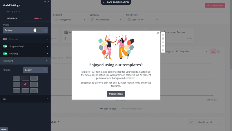
Modals, slideouts, and banners are also great for announcing the new shiny features that you’re developing to better satisfy user needs and stay ahead of the competition.
6. Collect customer feedback to improve experiences
Talking of new features… How do you know that they’re successful?
Simple. Create an in-app survey and trigger it contextually just as the customer engages with the feature. In this way, you can collect users’ insights on how to improve it while the experience is still fresh in their minds.
Collecting feedback is not limited to new feature releases.
Successful PLG companies run surveys regularly. This allows them to track trends in user sentiment (NPS, PMF, CSAT) and identify opportunities to add value to the product and make the product experience even more positive.
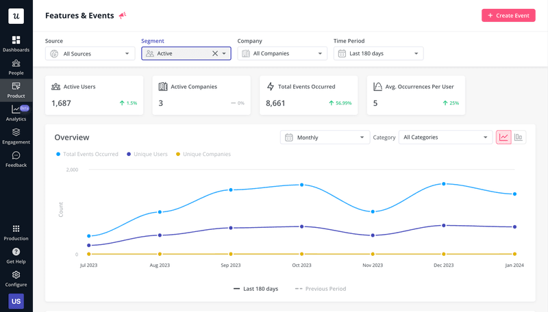
7. Track product usage analytics to make data-driven decisions
Surveys can reveal a lot but not everything. Users are not always able to clearly express their thoughts or don’t understand why they behave or feel in a particular way. Worse yet, sometimes they don’t even know that they behave like that.
Fortunately, you can fill the gap with product analytics.
By analyzing customer behavior inside the app, you can objectively assess where the product may be lacking.
For example, your users might give very positive feedback on the new feature but its low usage rate might indicate that it doesn’t quite meet their expectations. Or if a lot of users drop off at a particular stage of the user journey, it’s safe to assume that they experience some friction over there.
8. Trigger upsell messages to increase expansion revenue
In addition to onboarding and feature announcement, there’s another use case for in-app messages: driving product expansion.
For example, you can use them to prompt users to upgrade to a higher plan or buy an additional product or service.
For best results, trigger the messages contextually, for example, when the user tries to use a premium feature or when they’re near their usage limit. That’s when they can appreciate the value of the potential upgrade the most.
9. Provide proactive customer support to free and paid customers
The fact that a user is on a free plan doesn’t mean they shouldn’t have access to support.
As a matter of fact, free users may need your support even more because they may have only signed up and won’t be able to reach the activation stage without help. And if they drop off too soon, there’s a risk they might not have too many good things to say about your product in the future.
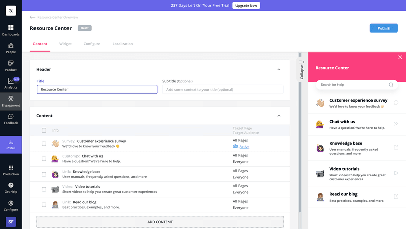
Sure, you won’t be able to offer high-touch one-to-one CS assistance but they need access to resources that will help them deal with their issues.
This could be in the form of a resource center with product documentation, video tutorials, webinars, or blog posts.
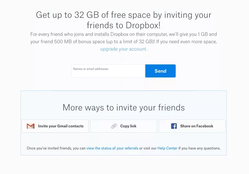
10. Share a referral business strategy
Referrals are another way to help your product spread like wildfire.
How does it work?
In a nutshell, you provide your users with an incentive to invite their friends or colleagues. This could be access to premium features, or even cash if it translates into more paid business.
11. Foster a product-led culture within your company
To build a product that delivers value by solving genuine user problems, and to make all the other elements of the PLG jigsaw puzzle work, your organization needs the right culture.
What are its characteristics?
The key ones include:
- Customer-centricity – so that you always prioritize their success.
- Flexibility and adaptability – to stay on top of the shifts in customer needs, competitive landscape, and technological developments.
- Creativity and problem-solving – to develop solutions that address user pain points and needs in innovative ways.
- Cross-functional collaboration and knowledge sharing – to ensure a unified approach to product development and GTM strategies.
How Userpilot can help in implementing product-led growth?
There’s one more thing that product-led teams need: solid software tools.
Userpilot is one of them.
As a product growth platform, it offers a range of engagement, analytics, and feedback features that will enable you to execute your PLG motions.
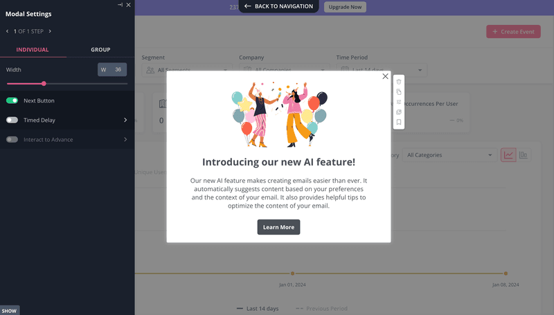
Create personalized in-app experiences
With Userpilot, you can build personalized onboarding experiences that drive activation, adoption, and account expansion.
Userpilot allows you to create and trigger:
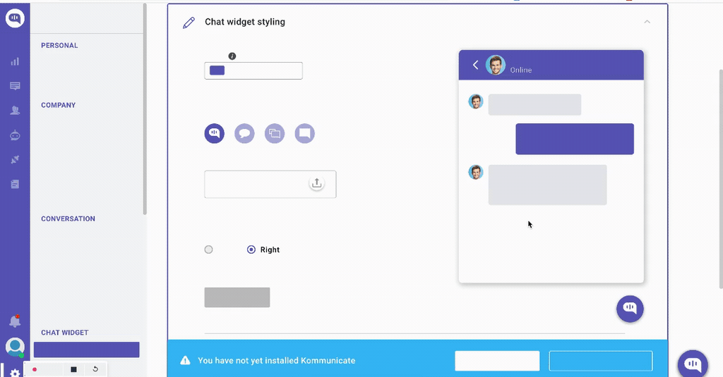
- In-app messages – based on 6 UI patterns (tooltips, modals, slideouts, banners, driven actions, and hotspots)
- Interactive walkthroughs
- Onboarding checklists
These are easy to customize thanks to the WYSIWYG editor and AI-writing assistant.
Once they’re ready, you can first A/B test them, trigger them for specific user segments, and analyze their performance with product analytics.
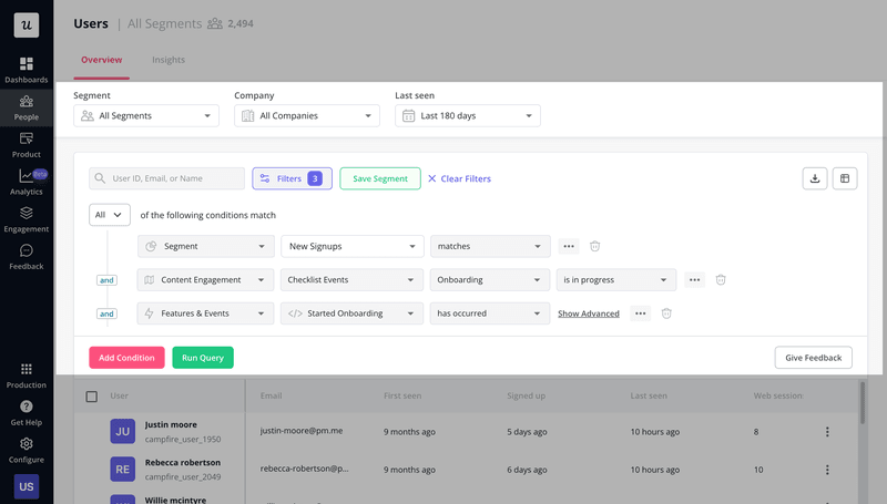
Track user behavior of different customer segments
Userpilot’s analytics aren’t limited to flow analytics. The platform offers multiple features for various use cases:
- Feature usage analysis
- (Custom) event tracking
- Retention analysis
- Trends analysis
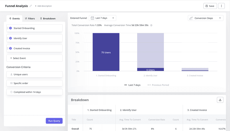
- Funnel analysis
- Path analysis
Want to know the best part?
You can use them to analyze the behavior of specific user segments. For example, you could conduct the Path analysis of your power users‘ interactions to identify the happy path for other users and optimize the onboarding experiences.
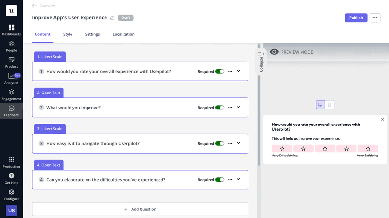
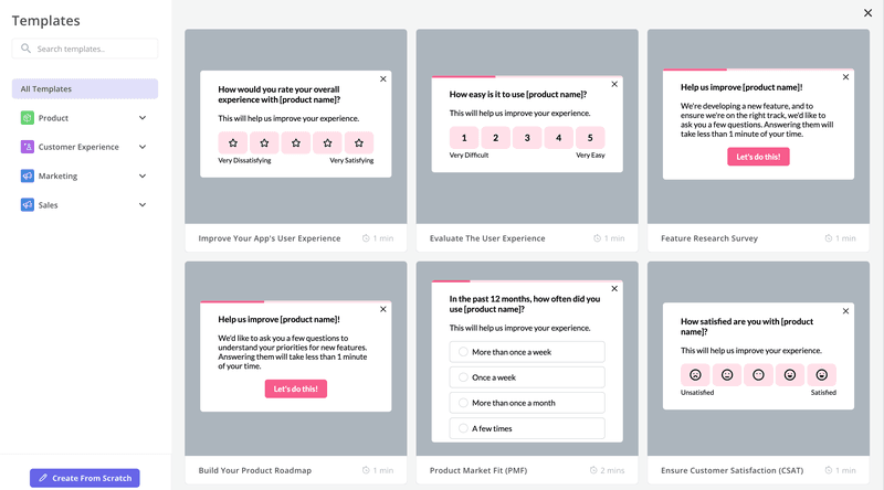
Build and trigger contextual surveys
For a comprehensive understanding of user needs, Userpilot offers advanced feedback features.
Creating the in-app surveys takes no time thanks to the template library and visual editor.
You can then send them a particular user segment at a specific time or trigger contextually when they complete an event.
There’s also a feedback widget for collecting passive feedback and customer requests.
Conclusion
Our product-led growth playbook, with 11 reliable tactics, provides a good foundation for product teams that are just starting their PLG journey and those that want to optimize their processes to fully realize the benefits of this product strategy.
If you want to learn more about Userpilot and how it can help you implement our PLG playbook, book the demo!
About the author