Product Engagement Score in 2026: You’re Probably Reading It Wrong


Product engagement score is the number most product teams check quarterly and trust at face value. I’ve seen product engagement scores sit at a seemingly healthy 75 for companies that have already had a dozen accounts go quiet, without anyone noticing until renewal rates start dropping or churn starts rising.
In my experience, teams get product engagement score wrong in one of three specific ways:
- They pick core events that inflate the adoption pillar without proving anyone found value.
- They choose a stickiness ratio that punishes perfectly normal usage patterns or workflows.
- They read a declining composite score without identifying which pillar is actually dragging it down.
PES was built as a diagnostic tool, not a reporting metric. The topline score only tells you something shifted, but it’s the three pillars underneath (adoption, stickiness, and growth) that tell you where to intervene. This guide will show you how to measure product engagement scores properly, what counts as a healthy score, and how to improve your product engagement score with proven strategies!

What product engagement score actually measures
The product engagement score is the average of three components, each on a scale from 0 to 100 to ensure no single metric dominates the result:
- Adoption tracks how broadly users touch your core features.
- Stickiness tracks how consistently they come back to the product.
- Growth tracks whether your user base is expanding faster than it’s shrinking.
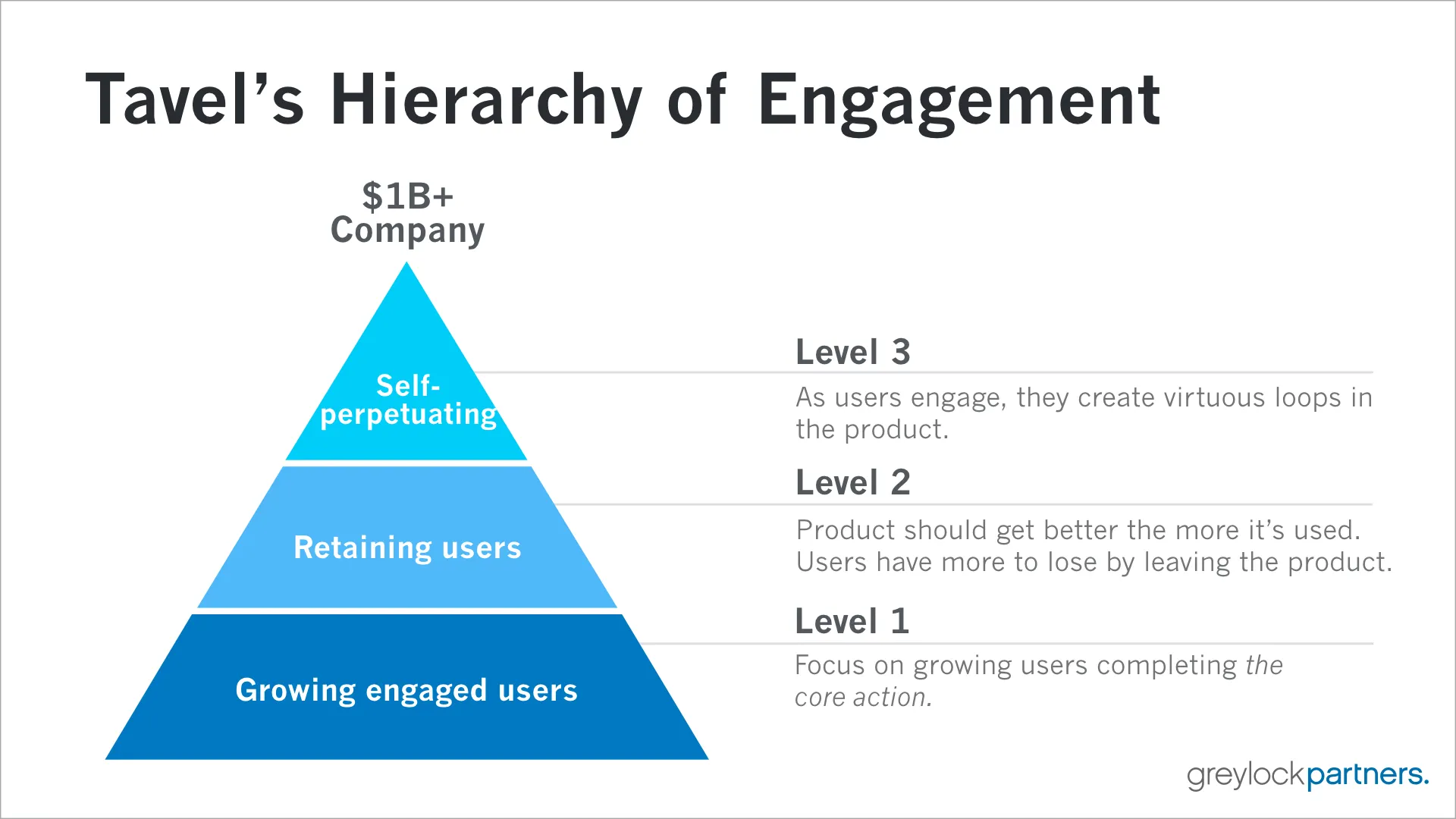
The normalization is what makes the score genuinely useful for trend tracking. A PES of 68 at the start of the year will mean the same thing as a 68 in the final quarter (even after you’ve shipped new features or doubled your user base) because every component was rescaled before it hit the average. Sarah Tavel, former product manager at Pinterest, built a framework coined the Hierarchy of Engagement to visualize how core actions can turn into virtuous loops.
How to calculate product engagement score
Calculating the product engagement score is as simple as measuring its three components and averaging them out into a compound metric.
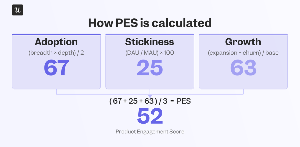
The three components of the product engagement score are:
- Adoption: Calculated as (avg core events used per active user / total core events) × 100. Pick 10–20 “core” events that signal real work (e.g., “published report,” “invited teammate”) instead of administrative actions, navigation clicks, or one-time setups that can skew the score. Choosing the wrong core events is the most common way teams sabotage this metric.
- Stickiness: Uses DAU/MAU for most B2B products, or WAU/MAU for weekly-rhythm tools (e.g., planning software). Avoid DAU/WAU as it can turn a healthy 80% WAU/MAU into a misleadingly alarming 11%.
- Growth: Uses the Quick Ratio: (new + recovered users) / dropped users, scaled 0–100 (0.5→0, 1.5→50, 5.0→100). Below 1.0 means your user base is actually shrinking rather than growing.
Here’s an example calculation:
12 core events, avg user hits 8 → 67% adoption. 200 MAU, 50 DAU → 25% stickiness. 40 new + 10 recovered vs. 25 dropped → Quick Ratio 2.0 → ~63 growth
You’d simply calculate (67 + 25 + 63) / 3 and get 52 as the product engagement score.
What counts as a healthy score (and why the average lies)
For most B2B SaaS products, a score in the 70 to 80 range signals healthy engagement. 80 and above points to strong product-market fit, while anything below 60 is a cue to investigate further. Those broad ranges are useful, but they’re not numbers I’d take at face value. Your own trendline matters far more than any benchmark. A move from 68 in Q1 to 72 in Q2 tells you things are moving in the right direction (even if another competitor is sitting at 75) because it’s measuring the same product against itself.
However, even a company-wide PES of 75 can suppress a handful of unhealthy accounts that are at risk of churning while simultaneously failing to highlight power users ripe for an upsell. The average score often looks calm even when the underlying accounts are polarized in either direction. In practice, PES dropping below 60 is a reasonable line for triggering CSM outreach because it could signal that at-risk accounts need outreach to prevent them from churning.
Why a single number can’t tell you what’s broken
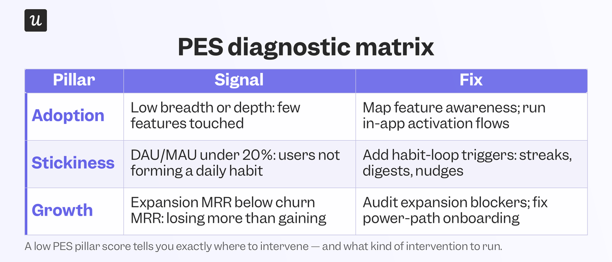
This is the part most PES explainers skip entirely, and it’s where the metric earns its keep. Each pillar failure points to a specific root cause, and each root cause has a specific fix. Low adoption with healthy stickiness and growth means users come back regularly but only touch a narrow slice of the product. That’s a discovery and onboarding problem, not a churn problem, and it’s usually the easiest of the three to fix quickly.
I saw this pattern directly when we shipped Userpilot’s own email feature. The funnel showed a sharp drop-off right at domain verification. Users were reaching the feature just fine, but abandoning setup before they completed that key step. I pulled the funnel analysis, found the exact step where people were getting stuck, and built a targeted tooltip within Userpilot that same afternoon.
No engineering ticket or sprint planning, just an in-app help at the one point where people needed it. The drop-off closed within days, which is the kind of result you can only get once you’ve traced the failure to the right pillar first. Low stickiness with healthy adoption and growth means people are finding value but haven’t built a habit around the product yet. In B2B products, stickiness under 20% usually means the product is seen as occasionally useful rather than consistently valuable.
Low growth (a Quick Ratio below 1.0) means churn is outpacing acquisition. This shows up in your product engagement score months before it hits your revenue reports. That early warning sign is one of the most valuable insights you can get by regularly measuring your product engagement metrics. Of course, it’s more of an alarm bell than a diagnosis since you’ll still need to figure out why growth is slowing (or why churn is accelerating).
How to actually move your product engagement score
Calculating PES is the easy part, but increasing it requires surgically matching the right fix to whichever component is dragging the score down.
Fix adoption with onboarding that targets the gap, not the whole user base
The first session decides whether users come back for a second one. I rely on contextual onboarding here to make a good first impression. Instead of sending new users towards a generic product tour, I trigger a walkthrough based on what the user is actually doing inside the product at that moment. Secondary onboarding matters just as much for this pillar. Primary onboarding gets a user to their first activation moment, but secondary flows introduce advanced features that deepen adoption once users are ready for them.
Build stickiness through nudges that show up at the right moment
Habit formation happens when the product shows up inside a user’s existing workflow, not when a scheduled email reminds them you exist. Tooltips and progress indicators that appear right after someone completes a core action work best since that’s the exact moment they’re most open to going one step further. A bit of onboarding gamification with checklists and streak counters also helps, albeit as a supporting tactic rather than the whole strategy. The goal is to expand the number of features that users actively rely on (rather than blindly increasing login volume).
Treat growth as a data problem before an acquisition problem
When the Quick Ratio drops below 1.0, spending more on acquisition just fills a leaking bucket faster. The intervention starts by predicting churn and identifying users whose core-event completion and return frequency have dropped over the last 30 days. When users cancel their subscription, a well-timed churn survey tests whether a pause plan or discount could change their mind. On the acquisition side, focus on product-qualified leads (free users already showing strong engagement) since converting them raises revenue growth without increasing user acquisition costs.
Using product engagement scores as a diagnostic tool
Product engagement score is most useful as a diagnostic tool, not a north star metric. The topline number tells you something’s off, while its three pillars tell you where. Teams that move their score fastest are those that can trace a drop in PES back to the root issue and deploy a fix where users already are. Userpilot helps you track the metrics that feed your product engagement score, analyze the signals that tell you which pillar is dragging it down, and ship the in-app interventions that close the gap once you’ve pinpointed its location.
Book a demo to see how Userpilot’s funnel analysis, event tracking, and in-app messaging work together to proactively address declining KPIs!
FAQ
What is a good PES score?
A good PES score depends on your product and growth stage. Scores below 60 often signal engagement gaps. Scores between 70 and 80 suggest healthy usage patterns. Scores above 80 are typically associated with strong retention, expansion signals, and a healthy, active user base.
What is a good engagement score?
A good engagement score reflects consistent usage of product features and shows that users consistently return. Rather than focusing on a single metric, engagement is best evaluated in context by considering adoption, retention, and growth.
How do you measure product engagement?
Product engagement is measured by tracking product adoption across key features, monitoring daily active users, and analyzing growth metrics to see whether usage expands or contracts over time. PES combines these signals into a single score to provide actionable insights into engagement health.
About the author