Task Analysis 101: What Is It and How To Improve Your UX Using Task Analysis?

What is a task analysis in UX?
Task analysis is the process of analyzing the number of steps (tasks) a user has to complete to get their jobs to be done (JTBD) when using your product. To put it simply, task analysis breaks down complex tasks into small steps to find overloaded UX areas.
This helps take a deep dive into understanding user behavior and eliminate unnecessary steps toward completing the goals (JTBD).
The more advanced UX, the fewer friction points users encounter, and the better customer satisfaction.
Why is task analysis important in UX?
A task analysis is a process of putting yourself in the shoes of your customers and experiencing their user journey. How easy it is for them to complete the steps, what steps make them confused or upset, etc.
The end goal is to address all the downsides and deliver a best-in-class product experience.
But there’s more to it than that.
Have a deep understanding of users and their end goals
Task analysis helps UX designers and product managers to understand the whole picture of the user journey toward particular goals. You will uncover:
- What triggers lead to the task, and what steps do they take to reach the end goal?
- What does their learning process look like?
- How does their competence in performing tasks affect the speed at which they complete tasks and the overall completion rate?
- What does their everyday flow look like?
- What hinders their journey?
The sweet point is that you can conduct task analysis for any user’s goal within the product and make well-informed decisions toward product updates.
Identify how customers behave in the app
While running task analysis, you will map out all the steps users execute to achieve their goals. This gives you a clear understanding of their in-app behavior and enables you to spot roadblocks on both the product and UX layers.
See how users are influenced by their environment
Task analysis also shows how users are influenced by their in-app environment. For example, you can compare the differences in the user experience of users employing the mobile app and web version of your product.
Detect flaws and friction points
The prime goal of task analysis is to detect UX design flaws that compromise customer engagement and satisfaction.
Do you have an easy-to-use navigation menu, intuitive design prompting users to perform the next task, and workflow efficiency?
You can put everything under the test and see whether you’ve logically built your app.
Types of task analysis
There are two types of task analysis — cognitive and hierarchical analysis.
Let’s learn the pros and cons of each.
Cognitive task analysis
Cognitive task analysis (CTA) studies users’ cognitive activity when performing specific tasks. In other words, CTA aims to gauge how much mental effort is required to reach the desired outcome when using your product (aka how hard it’s for customers to use your product for a given task).
With CTA, you will understand:
- Performance differences between basic users and pro or advocates
- The extent of mental workloads
- The motivation to use your product
- The emotional side of your users engaging with your product (angry, happy, upset, confused, etc.)
The cognitive analysis consists of several steps:
- Defining the task (goal) to analyze
- Determining the critical decision points
- Grouping by user’s behavior
- Acting on findings
Advantages
We can highlight two main benefits of CT analysis:
- Provides insight into user motivations
- Helps establish the participants’ end goals
Disadvantages
The main disadvantage of cognitive analysis is its qualitative nature. You may not get accurate results or relatively clear results.
Hierarchical task analysis
Hierarchical task analysis lays out every step a user performs to accomplish their goal. It involves a linear diagram like signing up → creating an account → connecting to a Facebook account. And it also breaks down every major step into smaller subtasks (tasks’ decomposition).
Thus the signing up task implies the following steps — signing up with Google → reading through a welcome screen → completing a 4-step welcome survey, etc.
The hierarchy of tasks enables UX researchers to examine the nooks and crannies of interface design and understand how each contributes to the users’ goals.
This way, you may spot that multiple tasks in the signing-up process can overwhelm users and lead to a low completion rate.
The hierarchical analysis is essential for designing new features or reverse-engineering existing ones. With this, you can explore different approaches to achieving the same goal and find the most efficient path.
Advantages
At an earlier stage, hierarchical task analysis enables you to build efficient product usability. When applied later, it helps identify hidden UX flaws and address them accordingly.
Disadvantages
There are no obvious disadvantages as such. You’re good to go as long as you do task decomposition correctly and get detailed results.
When should you perform a task analysis?
Task analysis is an essential step in the product design process. It should be done in the early stages because it helps teams frame the problem and gather user requirements.
Basically, task analysis is the foundation of the product.
In the realm, we cannot expect that once we complete task analysis, we will build the most authentic product UX ever and never return to this task again.
With the company’s growth, we build various features, incorporate new flows, etc. Hence, we must ensure that updates are aligned with existing flows and in no way hinder user experience.
Bottom line: Task analysis is an ongoing process that helps product teams design a user-friendly and appealing interface.
What data do you need for a task analysis process?
There are five pillars for task analysis. You should find answers to all of them while conducting task analysis. This will help you decompose user goals efficiently and create the fastest path to value.
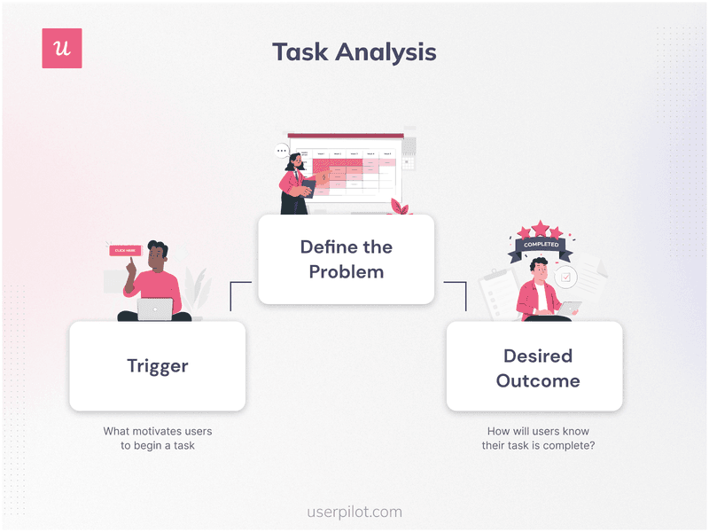
- Trigger: Determine what triggers users to begin their journey. What caused the goal to occur?
- Desired Outcome: What is the desired outcome that users aim for?
- Base Knowledge: What base knowledge do users have before getting started?
- Required Knowledge: What knowledge do users lack in order to complete the task?
- Artifacts: What additional tools or information do the users rely on when performing the tasks?
Now let’s find out what a task analysis process consists of.
How to conduct a task analysis and improve UX?
In this chapter, we’ve laid out the entire task analysis process and how to act on findings.
Let’s begin.
Define the task that should be analyzed
Any analysis begins with a goal and questions behind it. Why do we need to conduct the research? What do we aim for? What is a starting point for analysis?
In our case, we must define the high-level task (the user goal) to analyze. The specific step in the user journey that users should perform (e.g., account creation).
Segment customers in the welcome flow and understand their goals
Customer segmentation refers to categorizing customers based on common characteristics for further analyses (e.g., behavior analysis, task analysis, customer journey analysis, etc.).
When it comes to task analysis, segmenting your customers from the onset gives you a deeper understanding of them. What niche they come from, how they heard about your company, what is their job to be done, etc.
To gather such data, you need to implement the welcome flow (a welcome screen). This is a pop-up with a microsurvey that appears at the last step (or at the beginning) of the sign-up process.
Welcome screens usually serve two purposes: greeting customers and collecting data.
For example, Kontentino utilizes a welcome screen by Userpilot to define customers’ goals, workflows, and the type of company they represent.

Create mobile-first onboarding flows with Userpilot, customizing welcome screens, carousels, and slideouts to deliver personalized messaging.
Use feature tagging to identify what customers are doing in the app
Feature tagging is another solution to understanding what your users are doing in the app and what their path toward the goal looks like. In short, feature tagging allows you to analyze product usage behavior.
Thus, you will learn and document every click users make. What features do they use more or less frequently, etc?
With Userpilot, you can select any UI pattern of your app to track its usage.
Use this data to understand when users reach certain milestones in their journey.
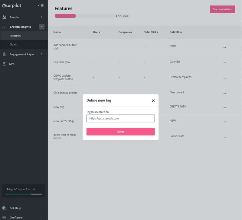
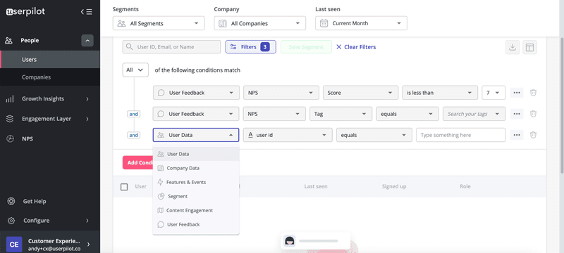
Once you set up feature tracking and data starts flowing, you can segment customers by their in-app experiences (e.g., their interactions with the features).
This will help you identify segments that are having trouble with a specific feature, etc.
Set up custom goals and monitor how users are progressing toward goals
Whenever you want to know how customers feel about recent changes to a product or design, this step is crucial.
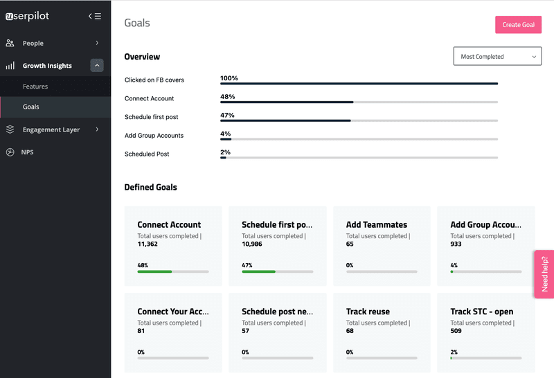
For this, you can digitize all the steps of hierarchical task analysis and track how many users complete pre-defined milestones. You can also monitor the completion rate of intermediate steps (tasks) toward goals.
This will help you measure how successful product updates were or you can identify the best performing features of your app. Additionally, you can understand what step (task) causes trouble. Essentially, these are tasks with a low completion rate of concrete action.
With Userpilot, you can create goals and track their completion. It’s code-free and can be set up in just a few clicks away.
Create a task analysis diagram based on the gathered data
Lastly, collect the new data (from the steps above) and make a graphical representation called a task-analysis diagram.
This will help understand the overall number of tasks, subtasks, sequence, and hierarchy.
The diagram will also help you analyze the complexity of the process users are going through to achieve their goals.
Ultimately, you will uncover tasks that users find insufficient.

Discover friction points and fix them to improve the user experience
Once you finish the analysis, you will locate the friction points that hurt the user experience and might lead to churn.
Regardless of what task damages the user experience, your next step is fixing the problem.
Most drawbacks arise either in the onboarding flow or in a specific part of the user journey. No matter what part of the product has flaws, it usually comes down to overcomplicated navigation and unnecessary steps to get to value.
The next time you’re working on a new design, do UX research first. Interview customers, analyze competitors’ UX, and run task analysis. Make your UX flawless by using as many methods as you can.
Task analysis example
Here we will show you how bad UX can drastically impair the overall user experience.
Let’s look at two tools for keyword research (SEO) Semrush and Serpstat.
Our goal is to run a quick analysis of the most important components of SEO. Keywords our site ranks for and the number of backlinks.
We will be testing both tools and running a small task analysis to compare their UX.
Semrush
Type the query → Click on “Search” → Done! The tool shows me the needed metrics from the first screen.
But let’s make the task more difficult. Now, I want to analyze my Anchor text list.
Click on “Backlinks” from the Domain Overview → View Details → Anchors. Three clicks and you’re on the destination page.
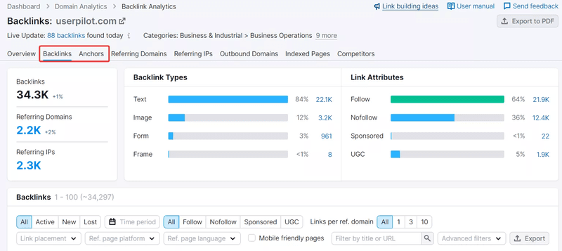
Takeaways: Super intuitive design. Flawless path to get to value. It took less than 10 seconds to open the needed report.
Serpstat
Type the query → Click on “Search” → scroll six screens down to reach the Backlinks overview → click on “Backlinks” → scroll two screens down → fail!
No jump link will get you to the Anchor report.
The workaround is to click “Anchor” from the navigation menu.
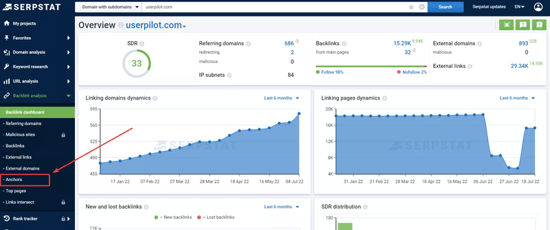
Takeaways: Not friendly and not intuitive design. It took up to 40 seconds to realize the next step to reach the objective and some cognitive and emotional effort (irritation).
As you can see, task analysis is crucial if your goal is to build an outstanding product on the market.
Conclusion
Conducting a task analysis is important if you don’t want a bad UX to impair the user experience and lead to high churn.
Ideally, you should analyze customer behavior and understand your users’ needs and goals before creating a product or updating an existing feature.
Want to collect customer insights and understand their goals code-free? Book a demo call with our team and get started!


