Most SaaS brands think their onboarding works, yet only 36% of all users reach activation. If your activation rate is less than 36%, your product most likely has learnability issues, which can be addressed by applying the cognitive walkthrough (CW) methodology.
The CW method is a cost-effective way to evaluate human-computer interaction and allows your team to assess the interface’s usability from a new user’s perspective.
With concrete data, this assessment can get even better. In this article, you’ll learn how to improve the quality of cognitive walkthrough with insightful data from Userpilot.
Is your product’s learnability holding you back?
Only 36% of users reach activation on average. How does your product stack up?
How do you currently evaluate new features?
Cognitive walkthroughs focus on “learnability” for first-time users.
When users drop off, do you know why?
Identifying the friction point is half the battle.
Back Your Next Cognitive Walkthrough with Data
Don’t just guess where users struggle. Userpilot gives you precise behavioral data to pinpoint friction, automate path analysis, and fix learnability issues instantly.
See how Userpilot improves activation in real-time.
What is a cognitive walkthrough?
A cognitive walkthrough is a task-based usability inspection method where a team of participants steps through a product’s interface as if they were new users.
You’ll gather a small, cross-functional team including designers, product managers, and even engineers who haven’t been too deeply involved in the specific feature. One person acts as a facilitator, guiding the session, and another as a note-taker.
This entire session focuses solely on assessing “learnability” – how easily a first-time user can accomplish key tasks.
To make the process neutral and effective, you can establish rules like “no design discussion” or “no defending design decisions” during the walkthrough.
Unlike usability testing, it doesn’t involve real users, making it relatively quick and cheap to carry out.
Why use the cognitive walkthrough method?
For me, the appeal of a cognitive walkthrough boils down to its practical nature and early impact. It’s a focused way to tackle product usability, especially for complex features where existing user behaviors might not apply.
Think about introducing a completely new workflow or a major redesign. Users won’t have established behavior patterns or mental models for interacting with it.
Also, because it is task-specific, a cognitive walkthrough zeroes in on whether users can figure out how to perform important actions (e.g., “add item to cart” or “find the settings”) in a new design.
It is complementary to other methods like heuristic review or user testing, focusing especially on first-time-user issues that might not be obvious from general usability guidelines.
When should you use cognitive walkthroughs?
Ideally, you should use the CW method when dealing with interfaces that require immediate success without prior training of computing systems, especially for non-tech-savvy users.
It’s also helpful for assessing tasks that are complex, high-risk, or rely on unfamiliar patterns that force the user to abandon their established mental models. Think of CAD software.
Let me give you some examples of such scenarios:
- Prototyping new flows: We use it with wireframes or mock-ups, long before any code gets written. This is how we ensure first-time users can complete critical tasks without feeling lost.
- Testing major releases: When we’re introducing significant features or revamping key parts of the product, like an onboarding flow. It helps us catch learnability issues that could otherwise lead to high customer churn.
- Addressing knowledge gaps: If our product introduces unfamiliar tasks, a walkthrough helps us spot where our internal understanding differs from a new user’s perspective. This process can help highlight areas that need clearer in-app guidance.
However, the CW method might be an overkill if you’re designing a standard web interface that uses universally accepted design patterns (e.g., basic checkout process on an established e-commerce site).
![]()
Back Your Next Cognitive Walkthrough with Precise Behavioral Data from Userpilot

How to conduct a cognitive walkthrough?
In short, a cognitive walkthrough session is often carried out in a highly structured workshop setting involving cross-functional teams (UX, design, product, engineering).
Reviewers will define specific user tasks and then examine the interface step by step from a novice’s perspective. At each step, they ask a set of standard questions to uncover anything that might confuse or trip up a new user.
Over the years, I have developed and refined a process for running the CW method that works well for our team. Below, I’ve shared my playbook with detailed steps.
Step 1: Define user goals and tasks
We start by defining who we’re designing for based on our user personas. Also, we get specific with defining our goals. We give them a name, a role, a goal, and a level of technical comfort. We also consider their goals, what they already know, and any potential pain points.
Here’s a relatable example:
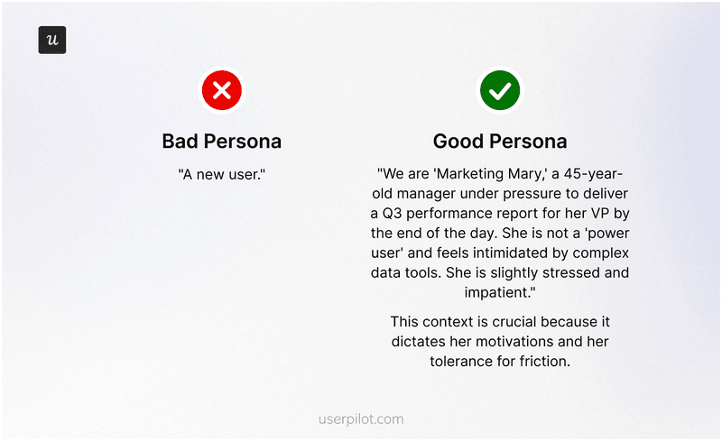
We also set the behavioral context for our personas:
- What device are they using?
- What’s their mental state?
- Are they under pressure?
Asking these questions gives us clarity for carrying out the procedure.
Step 2: Select key tasks
We choose critical tasks that a new user must complete to experience value. For instance, signing up, creating a first project, or completing a key integration.
These are the moments where early drop-off has the biggest impact on growth. We break down each task into its smallest steps. For example, “Enter email,” “Click verification link,” “Set up profile,” “Create first item.” This granular detail is crucial for a thorough evaluation.
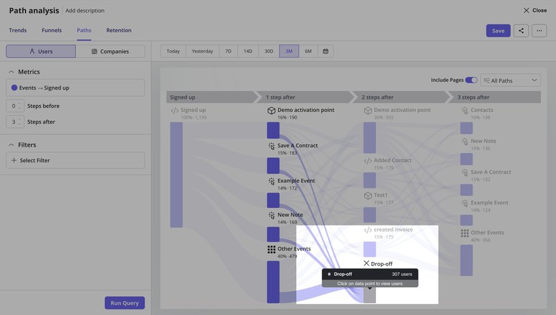
You can use paths within Userpilot to identify such actions by:
- Discovering activation drivers: See which actions lead users to complete critical milestones or “value moments”.
- Observing common patterns: Understand the most frequent steps users take to reach activation when looking at multiple paths from an initial step.
- Spotting drop-offs: Find where users abandon the journey before completing key tasks, and get the full list of dropping off users for designing re-engagement experiences.
And this is about to get a lot easier.
We’re building an AI agent that automates the heavy lifting of path analysis. It analyzes your product data, detects drop-offs and anomalies, and explains the why behind user friction.
This means you can run cognitive walkthroughs more frequently, catch issues earlier, and spend your time fixing problems instead of hunting for them.
If you want to see how AI can speed up your usability evaluation process, join the beta waitlist.

Step 3: Prepare the interface
We use the most current representation of our design.
The prototype doesn’t need to be fully polished, but it should be functional enough to demonstrate the end-to-end flow. This allows us to observe how participants interact with it and understand their decision-making process.
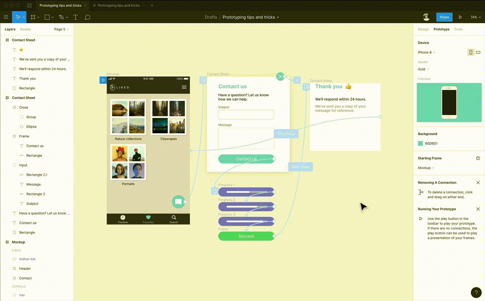
Figma prototype works for this because you can link pages, create hotspots, and set basic logic without writing a single line of code. Doing this helps your team for later UT since early issues never reach real users.
Step 4: Walk through each task step
For each step in the predefined task flow, we ask four critical questions. These questions force us to think deeply about the user’s mental model and how the interface supports or hinders it.
1. Will the user know what to do next? This is to know if the user understands what they need to do to move closer to their overall goal. This question opens up a few more questions that improve the clarity of this step.
-
- Does the interface clearly show the purpose of this step?
- Are we making assumptions about their prior knowledge that aren’t true?
- If we’re building an in-app tutorial, for instance, is the text so clear that a user immediately knows its purpose?
- If they’re using interactive user guides, does the guide clearly state the desired outcome of the current step?
2. Will the user see the control to do it? The idea is to evaluate if the users can see the element needed to perform the task. Check whether the element is buried in a menu or if there’s too much visual clutter around it.
3. Will the user connect the control to their goal? Check if the button is visible, and if its label, icon, or button placement clearly communicates what it does. The user should understand if the button is connected to the outcome of their intended goal.
4. Will the user understand that it worked? This is to check if the user clicks a button, and the system gives clear feedback.
As we go through each step, the note-taker marks whether the user is likely to “Pass” or “Fail” based on the answers to these four questions.
If any question gets a “No,” the step is a “Fail,” and we document the reason. We then assume the correct action was taken and proceed to the next step to keep the evaluation moving forward.
Step 5: Record findings and analyze them for insights
Once the walkthrough is complete, we document all the issues. We prioritize them by severity and how much they impact a new user’s ability to achieve the core value from the product.
You can use a friction log – a simple spreadsheet for that documenting process with columns as follows:
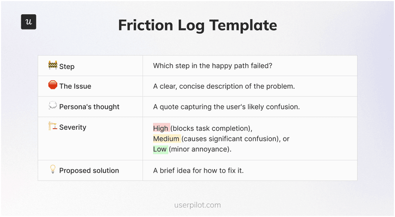
This process helps us identify the product’s most critical learnability gaps that need immediate attention.
For instance, a common issue found is often related to the time to value – how quickly users experience the main benefit of our product.
By spotting these early, we can adjust our product redesign efforts or optimize our user onboarding flow.
A practical cognitive walkthrough example
To help you understand the process practically, we’ve created a hypothetical persona, and we will walk you through it.
Our persona is “Sam,” a non-technical project manager. His task is to add a “Tasks Completed This Week” widget to his new project dashboard. The interface is a Figma prototype.
Happy path step 1
From the empty dashboard, Sam clicks the “Add Widget” button.
- Does the user know what they need to do next? Yes. The screen has a large heading: “Your dashboard is empty. Add a widget to get started!” The goal is clear.
- Does the user notice the clickable element? Yes. There’s a single, primary-styled button labeled “Add Widget.” It’s impossible to miss.
- Does the user associate the element with their goal? Yes. The button label “Add Widget” perfectly matches the goal described in the heading.
- Does the user understand if their action worked? Yes. Clicking the button immediately opens a large “Widget Library” modal view. Success.
Verdict: PASS.
Happy path step 2
From the widget library, Sam selects the “Tasks” widget.
- Does the user know what they need to do next? Yes. He knows he needs to find and choose his widget from this library.
- Does the user notice the clickable element? FAIL. The library lists 20 widgets with their internal engineering names: prod-task-stream-v3, analytics-rollup-q4, user-metric-snapshot. Sam, being non-technical, has no idea what these mean or which one relates to his tasks. This is a critical failure.
- Does the user associate the element with their goal? FAIL. Because he can’t find the control, he can’t associate any of them with his goal. He’s completely stuck.
Verdict: CRITICAL FAILURE. The task is blocked.
Happy path step 3
After we update the widget names in the library that are self-explanatory, we assume Sam would understand them. Sam now sees “Tasks Completed This Week” and clicks it. He then clicks the “Add to Dashboard” button in the modal.
- Q1-Q3: Pass. The goal is clear, the button is visible, and the label is perfect.
- Q4 (Feedback?): FAIL. When he clicks “Add to Dashboard,” the modal simply closes, returning him to the dashboard screen he started on. It looks like nothing happened. The widget was actually added, but it was placed at the bottom of the page, below the browser fold. Sam thinks his action failed and will either give up or try again, getting increasingly frustrated. Another critical failure.
Verdict: CRITICAL FAILURE. The user believes the task failed.
In just a few minutes, the CW used structured questioning to uncover two show-stopping usability flaws that would have completely blocked our persona. These insights go directly into our friction log as high-severity issues to fix before a single line of backend code is written for it.
My tips for conducting a successful cognitive walkthrough
As a senior product designer, the execution of the CW method is just as important as planning. I’ve compiled a few actionable tips that focus on crucial moments during the CW walkthrough to ensure the output is actionable and the team stays on track.
- Emphasize real-user perspective: Remind evaluators to stay in the persona’s mindset so that every step is judged with fresh eyes. Overuse the persona wherever needed, because people slip into expert thinking fast.
- Follow the known flow: Don’t let participants simply click around randomly. The facilitator (who knows the correct sequence) should guide the process so the group evaluates the intended workflow only.
- Enforce session rules: Avoid lengthy design debates or defensiveness. A thumb rule to follow is “no defending the interface” to keep focus on usability. Use a slightly larger group only when you need varied views, like for external reviewers.
- Manage group size: Keep the internal sessions small so discussions stay clear and quick because too many evaluators can stall the discussion.
- Don’t skip complementary methods: A walkthrough easily finds learnability issues, but deeper behavior still needs other checks from your team.
- Thorough documentation: Record each pause with context so that the team knows where the flow broke. Even small issues matter because they often cause early drop-offs.
Cognitive walkthrough vs. other methods
It’s useful to understand how cognitive walkthroughs fit into the broader landscape of usability evaluation. There are basically two alternatives to the cognitive walkthrough method.
- Heuristic evaluation: This method involves experts judging an interface against a set of predefined usability principles (heuristics). It’s broad and can quickly find general usability issues. However, it often doesn’t dive into the specifics of a user’s journey or thought process as deeply as a cognitive walkthrough does.
- Usability testing (UT): This involves observing or learning from real users as they perform tasks. It gives direct, empirical evidence of user behavior. While invaluable, it can be resource-intensive and often comes later in the design cycle.
A common objection I often hear is, “Isn’t this just guessing? Why not do real usability testing?” This is a fair question, but it misunderstands the goal. A cognitive walkthrough isn’t a replacement for usability testing; it’s a prerequisite. It’s a cost-effective filter that catches show-stopping issues.
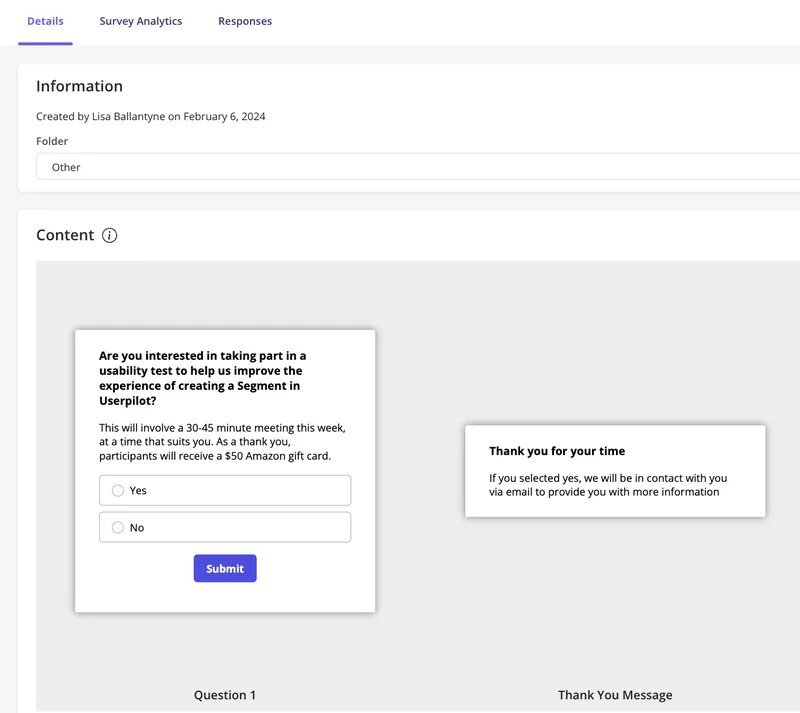
This is what my fellow researcher Lisa experienced firsthand when she had to recruit B2B users for our usability testing. Even with Userpilot helping to identify ideal participants through recorded in-app activity and trigger targeted in-app surveys, this is still a resource and time-consuming task.
Monitor usability beyond the walkthrough with Userpilot!
Coginitive walkthrough helps you fix early friction, but you still need real behavioral data to choose what to do next. Userpilot gives you that data by showing how new users move, pause, and drop off in their journey.
Once the walkthrough flags weak steps, Userpilot helps you validate the fix with live paths and funnels, rather than waiting for late-stage tests. You can also find and recruit users who match the exact flow you want to study next.
This creates a tight loop: spot issues early, fix them fast, then confirm real impact with data and users on a single platform. Teams that work this way ship cleaner flows, with fewer cycles because every decision starts with evidence, not guesses.
Book a demo today to see that in action!
![]()
Supercharge User Activation Rates by Optimizing Your Cognitive Walkthrough with Userpilot
About the author