9 Growth Hacky Ways to Use Psychology in Your App Onboarding

Ever wondered why your users don’t continue using your product after their app onboarding or post sign-up?
There are various reasons why that might happen. Perhaps they aren’t reaching your product’s Aha! Moment quickly enough. Maybe you’re using boring product tours instead of interactive walkthroughs.
A lot of app onboarding is about psychology. Psychology doesn’t just help us create better marketing campaigns or user interfaces. For SaaS businesses especially, implementing different psychological concepts will help your product to acquire and retain more users.
Understanding user behaviour and how they think is crucial in order to create more effective user onboarding processes. If you want to understand user behaviour and decide which psychological concepts to implement, you first need to understand what motivates and guides them to take action.
As Plato once said:
“Human behaviour flows from three main sources: desire, emotion, and knowledge.”
In order for behaviour to occur, the user needs those three things in place.
Let’s see an example of how this can be implemented in app onboarding:
Your users’ biggest pain point is having to publish different posts for their clients on time, so you’re developing a scheduling tool for social media.
The desire for your users would be to publish and maintain every post for their clients without losing the quality of the copy and image.
The emotion which will then occur is a feeling of relief and satisfaction now that they have more time for other tasks.
The knowledge (trigger) is actually an “Aha! Moment”. When a user sees and understands the value you’re providing, they will start developing behaviour (in our case – they will start using the product).
Marketing and Sales are here to provide users with desire and emotion. The knowledge part, however, comes from your user onboarding.
In this article, we’ll take a look at different psychological concepts, along with successful examples, that will provide more value when it comes to onboarding, nudge users towards the Aha! Moment, and convert trial users to paying customers.
Unleash the “aha moment” with incomplete tasks in your app onboarding
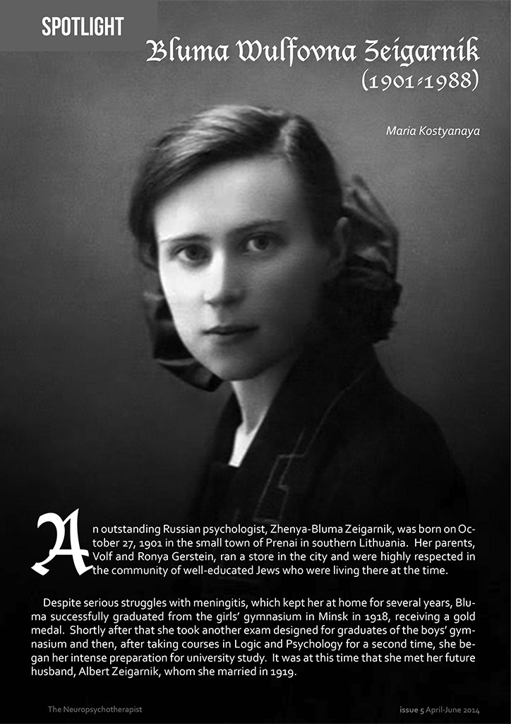
Bluma Wulfovna Zeigarnik was sitting in a bustling restaurant in the 1920s. She noticed that the waiting staff were able to remember tables’ orders perfectly if they hadn’t yet paid their bill. As soon as the bill was paid, it was like the order simply vanished from their minds.
Zeigarnik was intrigued, and ran a series of experiments to better understand what was happening. The results indicated that people could remember incomplete tasks far better than ones they had finished. This was then named the Zeigarnik effect.
You’re actually reading an article which uses the Zeigarnik effect.
Notice how we explained what this article was going to be about at the start. Only, we didn’t give everything away. This way the task of reading this article is incomplete, and now you want to read on. That’s the Zeigarnik effect in action.
So how can you use it in your product’s onboarding?
One way is to try adding different missions, steps, or a progress bar for your users.
This is a widely used tactic not only for SaaS tools and products, but also for video games!
For example, a popular online browser game called Travian developed different missions and steps for any new players:

You can see the different missions on the right side of the interface. These incomplete tasks make the Zeigarnik effect take hold. You can’t help but try to complete them.
Uncompleted tasks and progress bars force users to move forward and move ever closer to the Aha! Moment.
Storychief, a content management tool, uses a checklist containing various tasks. It also includes a progress bar. This progress bar is begging to be moved to 100%. Users will see the progress bar and immediately want to complete more tasks. As they do, they move closer to Storychief’s Aha! Moment.

Another great example of the Zeigarnik effect comes from Ghost, the online blogging platform.
The team at Ghost realized users who executed one particular task were 10x more likely to subscribe to the paid version. That task was simple: changing the blog’s theme.

After discovering this, they created a Getting Started checklist. It included adding a custom theme and provided a video tutorial on how to do it. Those who hadn’t added a theme yet were sent an e-mail with the video tutorial.
While only 7% of new users added a custom theme, 26% of them watched the video tutorial. That meant a lot of users now had an incomplete task on their minds. That’s right, it’s the Zeigarnik effect. By reminding users to add a theme, a greater number of trial users converted to paying ones.
Entice the user with peer pressure in your app onboarding
Peer pressure or social pressure is the direct influence on people by their peers. In other words, social pressure encourages people to follow their peers and change their own attitudes, behaviours, or values.
Have you ever wondered what the secret behind the growth of every social media platform is?
Facebook, Instagram, Twitter, LinkedIn and many other social media channels are a fine example of using peer pressure in user onboarding. None of them would exist without achieving a critical mass for growing their products.
If your circle of close friends consists of ten people, and six of them are using a new tool for achieving their goals, it’s very likely that you’ll start using it too.
Let’s take a look at some examples of peer pressure in action:
One of the famous growth hacks of all time is Dropbox’s referral program. Dropbox encourages people to use its product and grow space by inviting their peers to use Dropbox too.

Here’s how this works… Users want to increase the amount of storage they have on Dropbox. Rather than simply asking them to pay more, Dropbox will give them more storage in exchange for them getting their friends or colleagues to sign up. In other words, they’re causing existing users to use peer pressure to sign new users up.
Dropbox used this psychological concept to create an outstanding 3900% growth in just a few months.
Giving their users more space by inviting their peers didn’t just grow their user base. It also forced people to continue using product because their peers are now using it too.
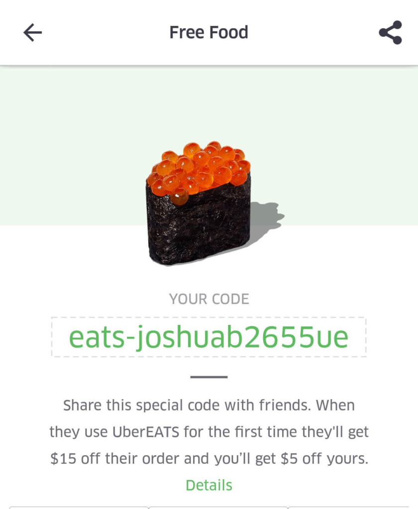
Another great example of using peer pressure to sign up new users is from Uber Eats.
Everyone loves free food, and Uber Eats used that to sign new people up to the app. Every existing users was provided with a unique code. If one of their friends signed up using their code, they would get some credit towards food. The new user would also get some bonus credit. This was a great way of quickly building a large user base, by making old users peer pressure new users into signing up. The reward of extra food probably didn’t hurt either.
Focus on success oriented achievement for users
Joseph Nunes and Xavier Dreze conducted an experiment in which they gave people a loyalty card while at a car wash. One group of participants were given a card with 10 slots on, two of which were already filled. The other group received cards that had 8 blank slots on. So both groups needed 8 stamps to get a free car wash, but it seemed like the group with two stamps already filled in had a head start.
The researchers found that the group with two stamps already filled in were twice as likely to end up collecting their free car wash. Not only that, but they completed their loyalty cards much faster than people from the other group.
This is known as the endowed progress effect. People are more likely to accomplish their goals if you provide them with a symbolic reward.
Let’s look at the endowed progress effect in action.
Kickstarter is a great example of endowed progress effect. Under every project, there’s a progress bar showing the percentage of money which has been pledged and funded at that moment in time.
When people see a project that has nearly reached its target, they are far more likely to donate money.

PayPal provides another way of encouraging users to achieve goals by combining checklists with the endowed progress effect.

When you sign up to Paypal, the first task (Account created) will already be checked off for you. As far as you’re concerned, you’re already making good progress with PayPal, and so you’re more likely to carry on completing the other tasks.
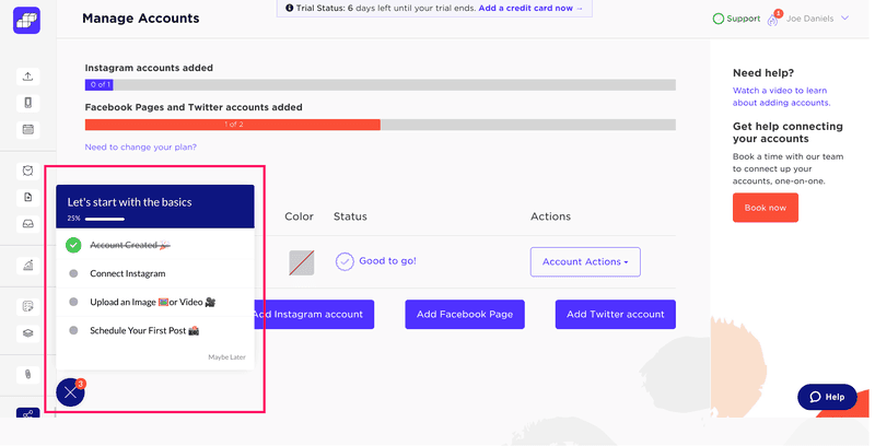
Sked Social added a checklist to their product. This checklist also ticks off the first task, giving users a head start.
This checklist proved to be really important for Sked Social. They found that users who completed it were 3x more likely to convert to being paying customers. By easily adding a checklist with Userpilot, Sked Social improved onboarding and conversions.
Gamify your app onboarding
Everyone likes games. That’s why gamification has become such a big part of the products we use.
Gamification will not only make your onboarding more engaging, but it will also help you improve your conversion rate. Gamifying processes will encourage your users to take action and compete with themselves and others.
One product that uses gamification perfectly is Duolingo.

Duolingo offers its users XP points and achievement badges for completing different tasks. The more XP points and achievements you gain, the higher your level.
Users who have friends that are also learning languages on Duolingo now have a way of comparing progress. It’s natural that they’ll want to compete to see who can unlock the most achievements and gain the most XP points. As a result, they’ll use Duolingo more.
Foursquare is another platform that uses gamification in their app onboarding processes to drive growth, achieve critical mass and earn more money.

By using gamification and a reward system, Foursquare managed to reach more than 10 million users. This enabled them to raise $50M in 2011, with an evaluation of $600M.
Foursquare gamified check-ins, which allowed the users to gain points for particular activities (like checking in to a new venue). This turned what could have been a boring app into a fun game, allowing users to compete with their friends. This encouraged further use of the app.
Another example of using rewards to encourage product adoption comes from Seamless AI.

As you can see from the screenshot above, Seamless offers users credits in exchange for completing the different tasks on the onboarding checklist. In this way, users are rewarded for completing the onboarding flow. And, of course, users who complete this onboarding flow are more likely to stick around.
After testing this method, the team at Seamless said that they were able to see better results and bigger traction.
Give your customers fewer choices
American psychologist Barry Schwartz discovered that people who have fewer options and choices are more likely to buy something than people who have more.
According to Schwartz, people usually choose what items or products they should buy in 6 steps:
- Figuring out what their goals are
- Evaluating the importance of each goal
- Arraying the options
- Evaluating how likely it is that each of the options will meet their goals
- Picking the winning option
- Modifying the goals
Step number 3, arraying the options, is the most important step. The more choices we have to pick from, the more indecisive we become and the more time it takes to reach a decision.
If we have fewer options, we’ll be more confident and make decisions faster.
If you have a lot of options available to your users, then you might be causing them to deliberate for too long. They may eventually give up and find another product entirely. While restricting your users’ options might seem like a backwards move, it’s a very effective way of improving product usage.
Ryan Engley from Unbounce tested this technique by reducing the number of options for his webinar sessions.

After he A/B tested two landing pages – the first with four options and the second with three options – he realized that the second landing page’s number of conversions increased by 16,93%. Simply by reducing the number of choices available to people, he encouraged them to make an actual decision.
The Paradox of Choice is used very effectively by HelloBar, a WordPress plugin for improving your conversions and converting visitors into customers.

HelloBar has a lot of functions. You can choose to drive traffic, collect emails, point your visitors to your social media channels. It has other functionalities like bar customization – changing themes, the text, etc.
This can be overwhelming for new users. These users generally have one use case in mind when they install HelloBar. All of these other options will put them off, and they’ll go and find a simpler solution.
Realizing this, the team at HelloBar presented new users with a introductory modal. This modal contained three simple choices, each based around a specific use case. Upon making a decision, the new user would be funnelled down a specific onboarding flow.
By enabling their customers to select their goals and reducing the number of choices, HelloBar’s conversions significantly increased.
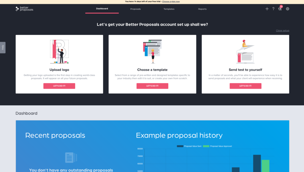
Another good latest example is from a proposal management software called Betterproposals.io. They also limit their customers with fewer choices.
Familiarization as a psychological concept in your app onboarding
Imagine you have the opportunity to invest money in one of two companies or funds. The first one is familiar to you (you have already heard or read about it), and you know absolutely nothing about the second one. The first one looks like it’ll give an average ROI, while the second could give you much higher returns.
Where would you invest the money?
It turns out lots of people would choose the first option, simply because of its familiarity. Rather than risking their money on an unknown company, even if that company might be a better choice, people prefer to choose the option they recognize.
This is called familiarity bias. People have a tendency to prefer more familiar products than unfamiliar ones.
Let’s see how this works when it comes to products…
When signing up to LinkedIn for the first time, or when adding new connections, you’re offered the option to connect with your e-mail contacts. These people are familiar to you, and so you’re more likely to add them as connections than you are new people.

This significantly decreased the time users needed to set up their LinkedIn accounts. Plus, since growing your network is a key part of LinkedIn, it also meant users were more likely to stick around.
Another company that uses many psychological concepts to improve its onboarding (with familiarity bias among them) is Pinterest.

When you create your account, Pinterest provides you with various subjects to choose from based on your interests. By showing you things that you’re familiar with, Pinterest helps you to get set up with your account. It also means your Pinterest feed will be tailored to you, making you more likely to return to it.
This significantly reduced the time users need to set up their account and also triggered the Aha! Moment.
Give your customers feel-good app onboarding experiences
Nobel-prize winning psychologist Daniel Kahneman and his colleagues discovered that what we remember from our experiences is mostly determined by two things:
- How the experiences felt when they were at their emotional peak (best or worst)
- How they felt in the very end
This became known as the Peak-End rule.
Let’s illustrate this through an example:
Your family is preparing dinner for your new neighbours. If the neighbours left your home smiling, they will probably remember that dinner as a pleasant experience and they will have joyful memories of that evening. But if they left your home angry or bored, chances are they will avoid you next time.
The Peak-End rule is certainly most widely used in games.

League of Legends is one of the most popular games in the world (I’m a fan too).
It uses different events in the game to indicate various peaks while playing, such as:
- First blood, Double Kill, Triple Kill, Quadra kill, Penta kill
- Killing spree, Rampage, Unstoppable, Godlike, Legendary
- An enemy has been slained, You have slain an enemy
These events reflect the stages of the gameplay, and they motivate you to move towards self-improvment and victory. Who wouldn’t want to keep playing if “Godlike!” appeared on the screen to describe your prowess?
Within the SaaS industry, MailChimp did a great job with their famous “High five” illustration.

This little illustration of a high five motivates you to push forward and continue with your next e-mail campaigns. Essentially, it makes you feel good, it puts a smile on your face.
This surge of good feeling comes right at the end of the task, meaning you’re more likely to remember sending an email campaign as a positive task. You’re bound to want to do it again.
Proposify, an online tool for creating Sales Proposals, also uses the peak-end rule in their user onboarding.
In their demo tour, Proposify’s users are able to create demo versions of proposals. After various step-by-step guides, the user finishes creating the proposal. When it’s signed, the user is asked to check their e-mail.
When they do, they are greeted with Proposify’s “accepted” e-mail.

This e-mail is a massive part of their user onboarding process. Once the customer opens this email, they have finished their user onboarding and they are considered to be an active user. By making users feel good at the end of the onboarding flow, Proposify encourages its users to keep coming back for more.
There are various examples of using the Peak-End rule in user onboarding. For example, you have probably seen different pop-ups like: “Congratulations on your first email campaign!” or “Congratulations on your first 100 subscribers!” numerous times.
Those are all examples of using the Peak-End rule in user onboarding.
Improve your customer’s performance with social facilitation
Social Facilitation, or the Audience Effect, is a psychological concept which is based on the assumption that people who collaborate with other team members have a tendency to perform better.
In 1897, a psychologist called Norman Triplett tested the performance of cyclists when riding a bike alone and when riding a bike against another cyclist. Cyclists who rode the bike against the clock had a tendency to be slower than cyclists who rode against each other.
When working with other people, we want to prove ourselves by accomplishing our tasks better. That’s social facilitation.
Social media networks generally use social facilitation as their core psychological concept. Networking forces people to chat, work and accomplish tasks together while simultaneously improving their progress and performance.
Slack, another team collaboration and chatting platform, also uses social facilitation in their user onboarding processes with their famous Slack bot!

Although Slackbot isn’t actually a real person, it helps people to set up their accounts and channels faster. It’s like having a person show yo around the product in a funny and interactive way. Slack uses social facilitation to easily and effectively onboard its users.
The ambiguity effect found its purpose in product onboarding
The Ambiguity effect is a cognitive bias that explains how decision making is affected by a lack of information. It means that people have a tendency to select options with a more probable favorable outcome.
The Ambiguity effect was present even back in the prehistoric era. If our ancestors needed to choose between black and red berries (even if the probability that both of them are poisoned is high), we would pick the option we knew the most about.
The Ambiguity effect has a significant influence on the decisions we make every day.
If you want to include the ambiguity bias in your app onboarding, here are some tips for you:
- Be as clear as you can about every step of your app onboarding process
- Try reducing navigation outside the app as much as possible
Use mobile in-app messaging to offer guidance or support users through unfamiliar features with Userpilot.
ProdPad, an online tool for Project Management, perfectly implemented the Ambiguity effect in its app onboarding flow.

Short, catchy and informative descriptions beneath each step helped them to acquire more users and teach them more about the product itself.
By explaining why they need more information about their users, and why should they complete each step, ProdPad built trust with their users from the very beginning.
After completing those steps, ProdPad users will receive an extension to their trial. They know what’s waiting for them on the other side, so they’re more likely to complete the onboarding process.
The App Onboarding Summary
The main thing you should focus on when it comes to your user onboarding process is driving users to the Aha! Moment. You can then work on converting those users into paying customers.
The Aha! Moment can occur for various reasons. The psychological hacks I’ve covered in this article can help your users to find it.
The different psychological principles we covered were:
- Zeigarnik effect – Users are more likely to remember incomplete tasks.
- Peer pressure – Encourage your existing users to invite new ones.
- Endowed Progress Effect – Give your users a head start by completing the first task for them.
- Gamification and offering rewards – Add an element of competition into your product.
- Paradox of Choice – Avoid choice paralysis by restricting the number of options.
- Familiarity bias – Users are attracted to things that are familiar to them.
- Peak-End rule – Make your users feel good at the end of a task, and they’re more likely to repeat it.
- Social Facilitation – Users will perform better if they can collaborate with others.
- Ambiguity effect – Provide your users with all the information they need to make decisions.
Whichever psychological concept you implement in your user onboarding flow, one thing is certain – your customer journey will be easier, more efficient, and most importantly – it will bring you more conversions!
About the Author
Aazar Ali Shad is the VP of Growth at Userpilot, and has more than 5 years of SaaS Experience. He is currently helping 200+ SaaS companies improve user onboarding and increase product adoption.

