Interactive Walkthrough vs. Product Tour: Is There A Difference?
When should you use an interactive walkthrough vs. a product tour?
If you’re in the process of designing your product’s onboarding process, you’ve likely had to spend some time considering this question. You may have also wondered:
Is there a difference between an interactive walkthrough vs. a product tour? How can you tell the difference? And… which is better suited to your product?
The truth is that both are excellent onboarding tools with different approaches. So, this article will explore their ideal use cases and some best practices to help you implement them correctly.
What is an interactive walkthrough?
An interactive walkthrough is essentially a series of driven actions designed to educate users. Each Driven Action is a tooltip prompting the user to take a certain action before moving to the next step.
In this walkthrough below, for example, Attention Insight – an AI-powered heatmap analysis tool – guides the user to the heatmap comparison page and prompts them to create a new comparison.
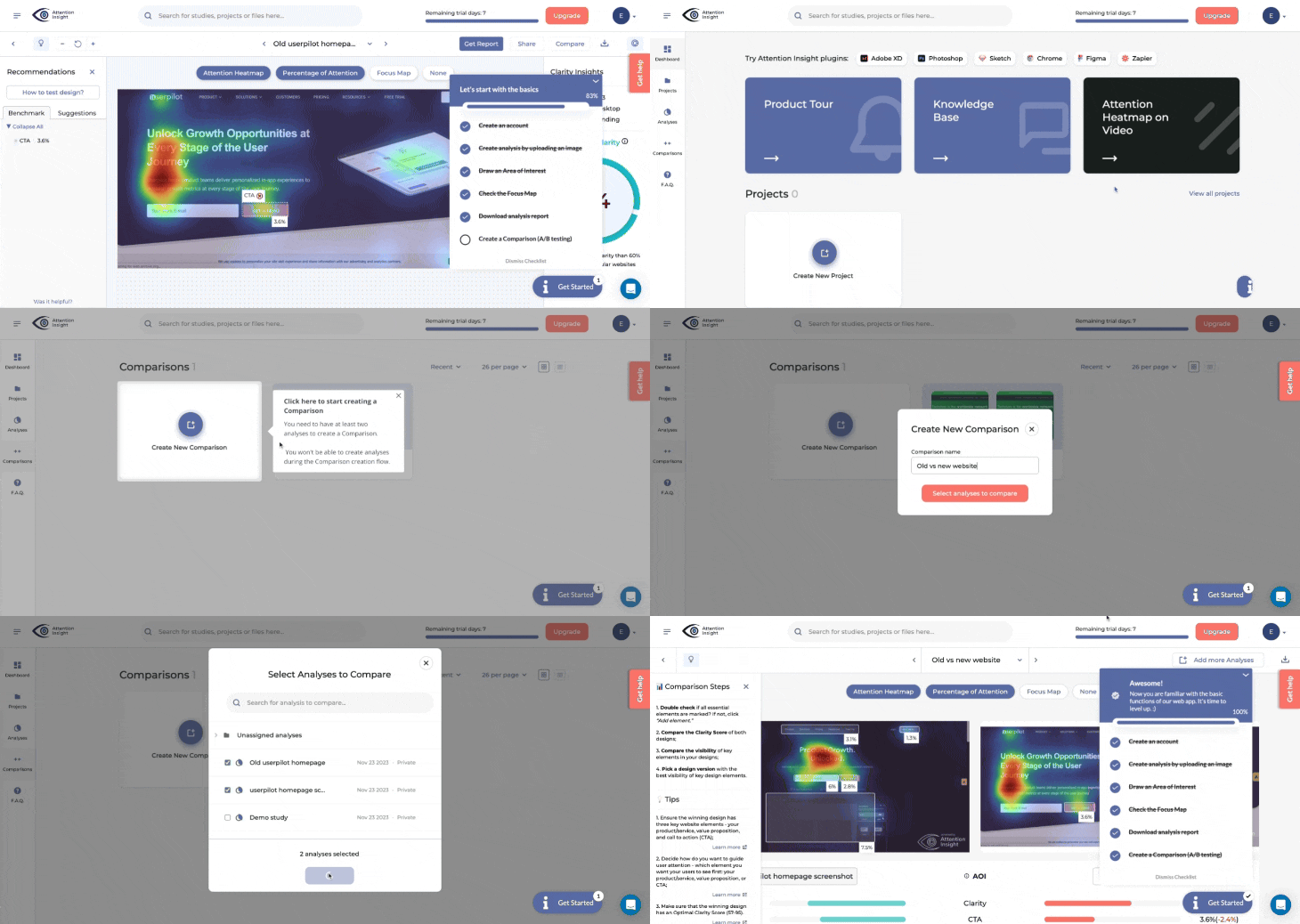
Notice how there’s no ‘Next’ button? Instead of simply informing the user and skipping to the next, the user is compelled to take action. This improves user engagement, ensuring they understand the described flow.
What is a product tour?
As the name implies, a product tour is a tour of your product. They are designed to showcase the product’s key features, highlighting each feature/button/section and its use.
Product tours use a combination of non-action-driven tooltips, spotlights, and/or modals with embedded tutorial videos.
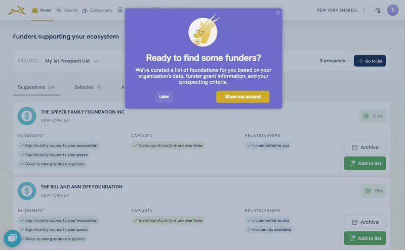
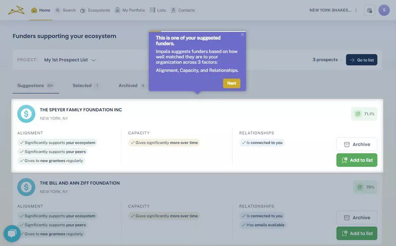
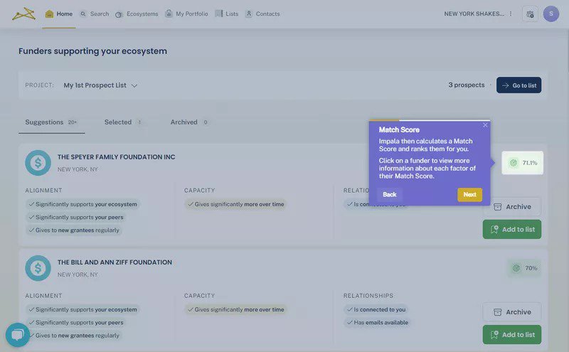
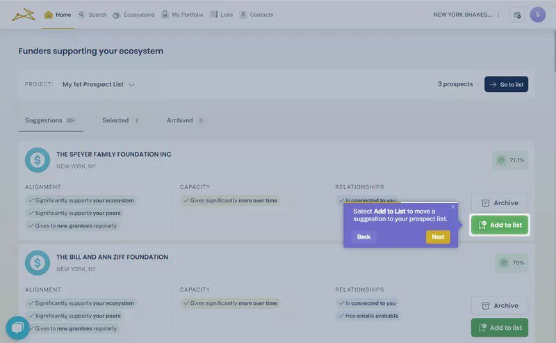
For example, Impala, a virtual assistant for nonprofits, grantmakers, and networks, uses a product tour to guide users around a new feature.
All you have to do is click the “Next” button to move across the tour’s different steps and explore the feature. As a result, product tours are typically linear and non-interactive.
Is there a difference between a product tour and an interactive walkthrough?
To answer simply, Yes.
By virtue of how they both work, they’re not the same.
Interactive walkthroughs are typically focused on specific workflows or actions. Essentially, a walkthrough is a form of interactive product tour that requires the user to take an action.
It requires user input and action during the flow, making it more dynamic and personalized: Completing the required action triggers the next sequence in the walkthrough. This is different from a standard product tour, which only requires user action in the form of “Next” and “Back” or “Previous” buttons.
Product tours, however, are less interactive and often passive. As a result, they can provide a broader overview of a product’s key features and functionalities. They are also more structured and linear.
But, they also share some similarities.
For example, they’re both user onboarding tools designed to improve the user experience, increase product or feature adoption, and boost user retention.
They can also both be triggered at any point in the user journey – during onboarding, after the launch of new features, etc. Whenever they’re triggered, the goal is always the same: educate users about the product’s features.
Is the interactive walkthrough a better choice than a product tour?
The short answer is, No.
You see, a good user onboarding process is one that helps new users progress to the activation point. And, although interactive product walkthroughs are sometimes ideal, that is also true for product tours.
Think of it this way…
To guide users to success with your product, you must first create a good product that’s as easy to use as possible. Naturally, some products are more complex than others, but they should still be fairly intuitive.
You also need to have a good understanding of your product and its users (particularly their technical level). This understanding will inform all of your onboarding decisions.
For example, if your product’s features are…
- ‘Obvious’: You may not need to provide onboarding guidance, as most users will intuitively understand how to use it.
- Very complex: Interactive walkthroughs can help users understand how to use advanced features that may not otherwise be intuitive.
- Neither obvious nor complex: A product tour can highlight different features and encourage users to try them out.
Similarly, if your product has different activation goals, an interactive product walkthrough can help your different user segments reach their desired goal.
Note, however, that you’re not limited to “one or other” when onboarding new users. You can use a simple tour to guide users around fairly simple features and trigger an interactive product walkthrough for more advanced features.
Whether you choose to create a product tour or a walkthrough, Userpilot can help you with both. Book a demo now to learn more.
What’s the best practice when implementing interactive walkthroughs and product tours?
Before we get into any best practices, it’s important to note that the best onboarding is an intuitive product. The reason is simple: you can’t put lipstick on a pig.
Just as your lipstick won’t make the pig pretty, product tours and interactive walkthroughs can’t make a clunky product with a nasty user experience good.
Assuming your product is already well-designed, though, the following best practices should help you get the most out of your onboarding:
1. Onboarding should drive action
The goal of onboarding is user activation and product adoption. So, identify the action(s) that signal activation in your product and design your onboarding flow to lead users toward that action.
2. User guidance is everything
Even the best-designed products can sometimes be complex. If that’s your case, think of how best to guide users. That said, different onboarding elements and processes serve different purposes:
- Walkthroughs provide a learn-by-doing approach, which is great for complex stuff.
- Product tours excel for not-so-complex features.
- Checklists tell the user exactly what to do to reach activation, and can be used with both tours and walkthroughs.
- Docs and resource centers are excellent sources of on-demand support.
3. Segment users to tailor your product walkthrough
Not all users have the same needs. In fact, most large SaaS products have multiple JTBDs for different user groups.
An effective way of approaching your walkthroughs is to group your customers based on different personas with different jobs to be done. Then for each user persona, create a personalized walkthrough or tour that highlights exactly what value they want to get from your product.
4. Give users control
The typical user doesn’t want to spend too much time learning to use your product.
One way to reduce the learning time is by breaking up the tour. Instead of a long tour up front, for example, you can create bite-sized tours and walkthroughs for different features.
Known as progressive onboarding, this system triggers tours and walkthroughs contextually when the user completes certain events.
5. Do it… or don’t
Part of giving users control involves allowing them to skip a product tour if they don’t need it. But, you must avoid half-measures.
If you choose to put a skip button, make sure it’s visible and clickable. Making it hard to reach or giving the impression that it’s useless, defeats its purpose.
Even worse, this deceptive pattern leaves a negative impression in the minds of users who notice it.
So, pick a side. If you think a walkthrough must not be skipped, leave out the button altogether. But, if completing it is optional, include a usable skip button.
6. You know what you test
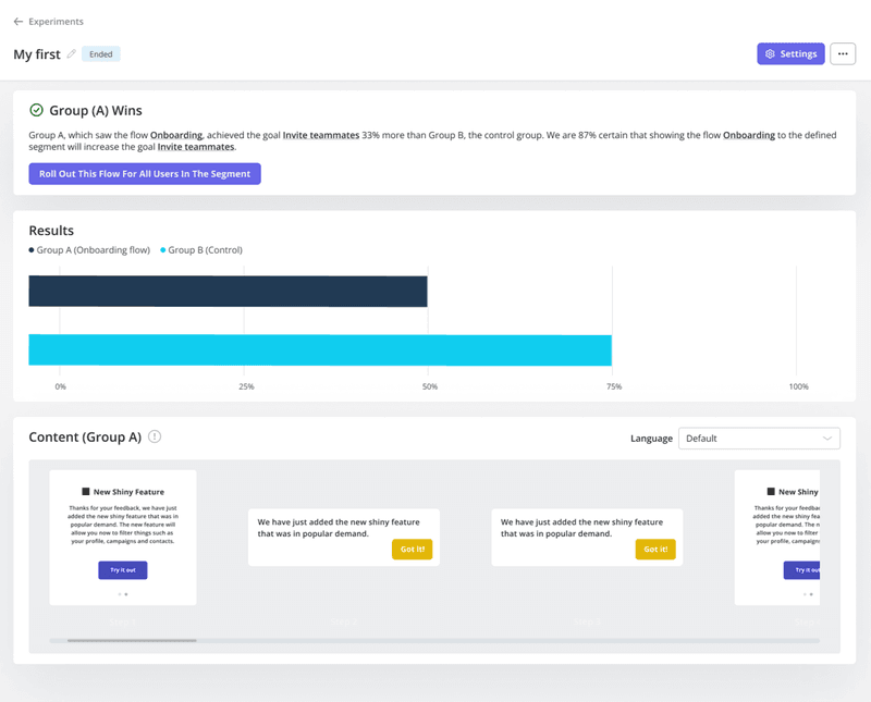
The best way to learn which (interactive walkthrough vs. product tour) will be most effective for your users is to try them both. Conduct A/B tests to confirm your hypothesis and stick with what works best for your product.
7. If in doubt, let users choose
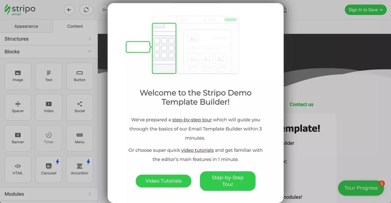
Think your users could benefit from either a tour or a walkthrough? Then, allow them to choose. The image below demonstrates how Stripo empowers its users to select the approach that suits them best.
Users are allowed to select their preferred learning pattern – watch video tutorials or complete a product tour.
8. Collect user feedback
The easiest way to know what works and what doesn’t in your onboarding process is to ask users. Trigger an onboarding survey for activated users, such as those who have completed every onboarding checklist task.
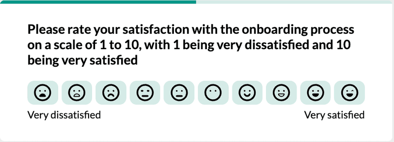
Be sure to include a follow-up question so users can state what they liked/disliked about the process.
The insights you receive will help your product and customer success teams to optimize the onboarding experience.
9. Make good use of checklists
There are a few ways to do this:
- Open the checklist as the user arrives so it feels like part of the flow.
- Enable users to close the checklist without losing it.
- Enable users to trigger a product tour or walkthrough from each checklist item.
- Make the first list item a task the user has already completed, giving users the feeling they’re already off the mark.
You can find more onboarding checklist tips here.
10. Fight the problem, not the symptom
If your onboarding completion rate is low, it may be a symptom of some other problems:
- Poor segmentation.
- Misaligned value proposition (no focus on core JTBD).
- Excessive setup actions (no available defaults).
- Information overload (no progressive feature disclosure).
- Numerous onboarding questions, etc.
So, before dismissing your onboarding elements as problematic, first analyze your onboarding experience to identify lapses in the process.
How are SaaS companies leveraging interactive product tours?
Thankfully, you don’t have to look too far to find excellent examples of properly utilized interactive product tours and walkthroughs in SaaS.
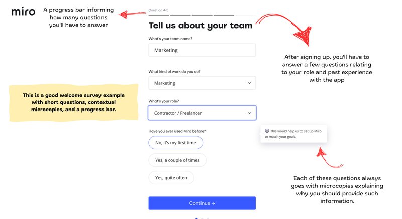
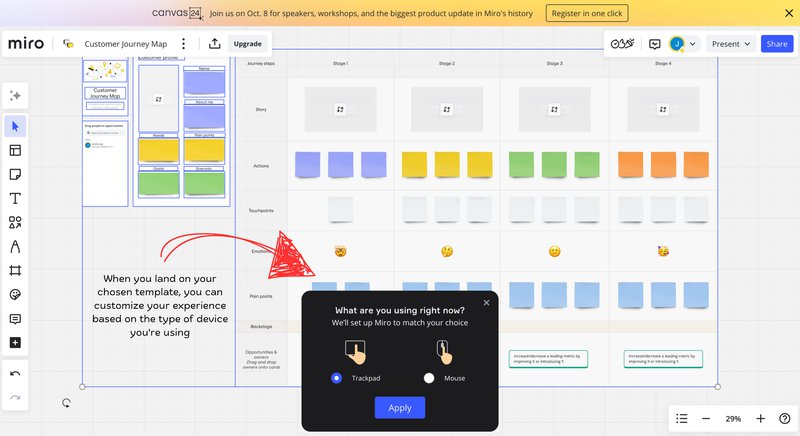
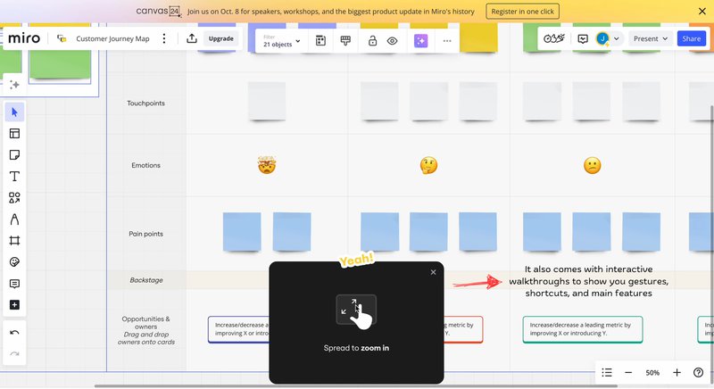
One such excellent example is that of Miro, a collaborative virtual design workspace. As seen below, Miro provides a truly interactive walkthrough that shows new users exactly how to use the product.
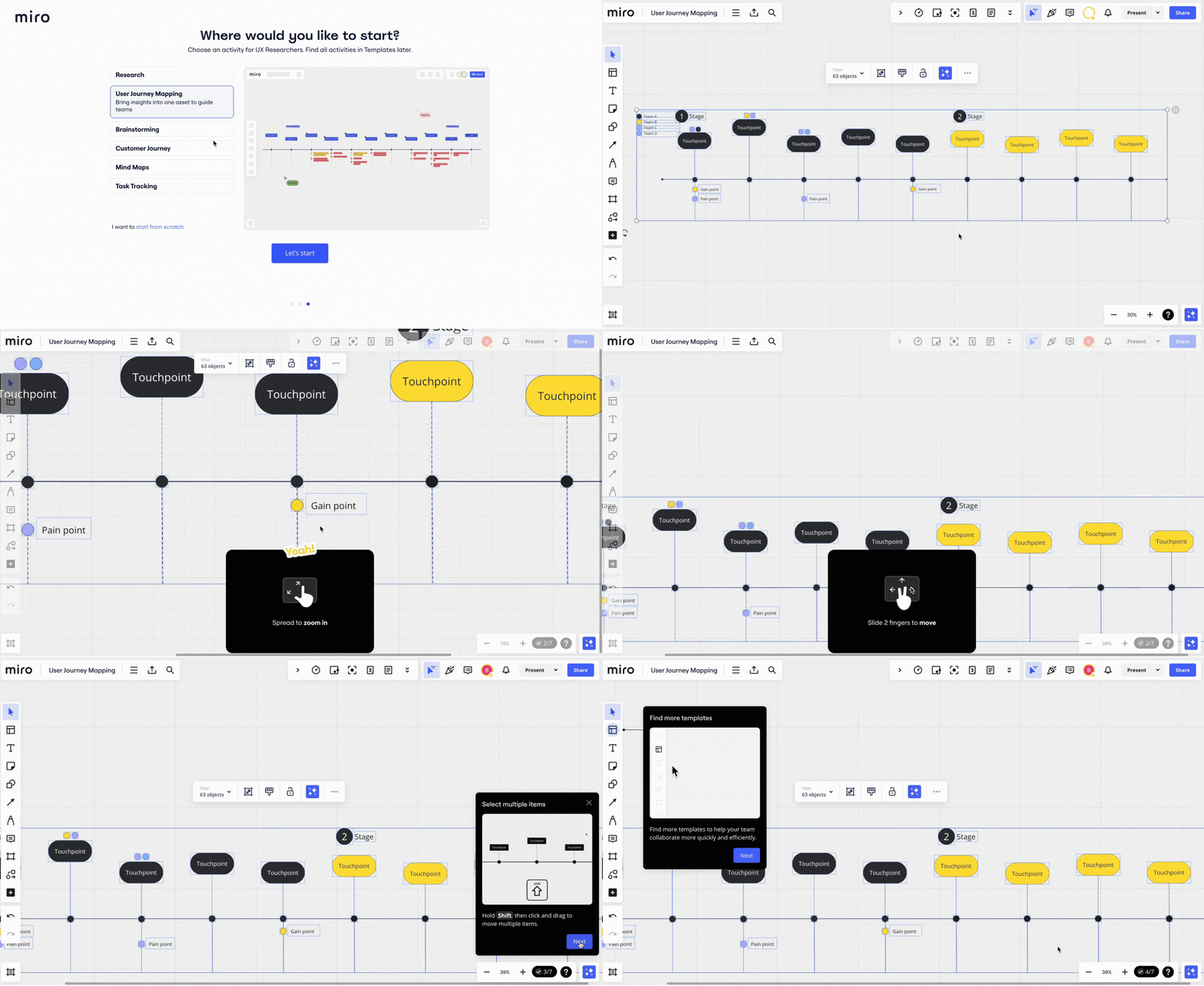
But the flow doesn’t start there.
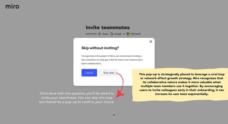
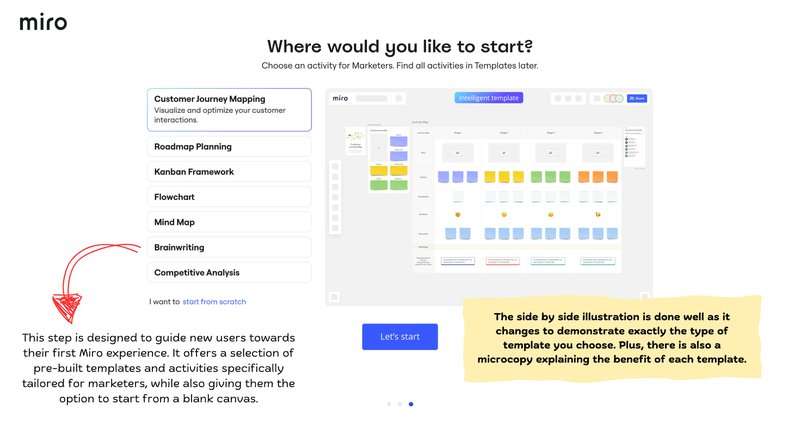
First, Miro shows a good understanding of their product’s use cases and target users. So, they employ an onboarding survey to identify this use case and provide relevant templates to help users get started.
Next, demonstrating a good understanding of their product’s complexity, Miro includes an interactive walkthrough highlighting features like zooming, panning, etc., for different device types.
All of this comes together nicely to form the powerful onboarding flow below:
In contrast, Figma, despite being a similar tool with identical use cases, opts for a linea, un-interactive product tour.
Of course, an argument can be made that Figma is a more popular tool, and may be more intuitive as a result. Still, Figma’s generic onboarding flow lacks any action-driven elements.
This leaves it feeling incomplete. It also feels un-optimized for new users’ differing needs and abilities.
For example, after signing up for the first time, Figma triggers an onboarding survey to determine how well you know the product. The survey has three options, but I tried the last two:
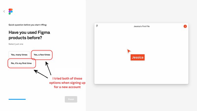
Whatever your answer, though, the result is the same…
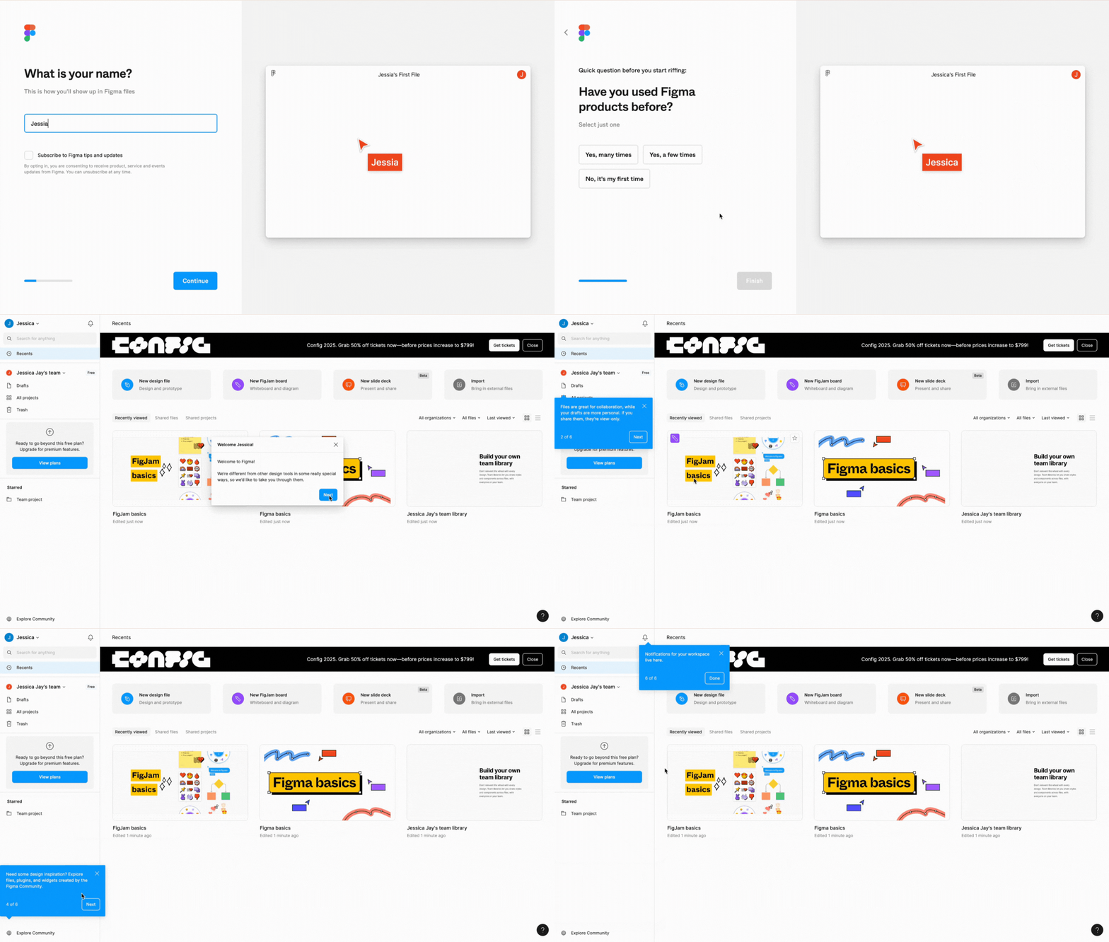
A bland, generic product tour that just goes through the motions. Unlike the Miro walkthrough, this tour highlights a few features but fails to set up new users for success with the product.
The question shouldn’t be interactive walkthrough vs. product tour…
It’s clear, then, that whether you use an interactive walkthrough or a product tour matters little to the success of your onboarding experience.
The real question should be, “Does my product need onboarding guidance?” If your answer is yes, then you need to ask yourself what sort of (and how much!) guidance will best serve your users.
Once you’ve answered those questions, Userpilot can help you create the ideal onboarding experience for your users – interactive or not. Book a demo today to see just how easy it is to use.
Interactive Walkthrough vs. Product Tour FAQs
How to create an interactive guide?
Creating interactive product tours and walkthroughs is easy with a no-code tool like Userpilot. In fact, there are four key steps to follow with Userpilot:
- Define your target audience (the segment of users that’ll see the guide).
- Create and combine a series of Driven Actions (tooltips that wait for users to interact with an element) to form a multi-step guidance.
- Customize the onboarding elements (like buttons, logos, colors, layouts, etc.) for native design.
- Finally, set display/trigger conditions so it only appears to relevant users.
How to create a walkthrough?
Creating a walkthrough with Userpilot follows a similar pattern as above (with a few tweaks):
- Define your target audience (the segment of users that’ll see the walkthrough).
- Determine what features need guidance and which ones don’t.
- Combine a series of tooltips, modals, and driven actions for the walkthrough, so you can prompt user action only when necessary.
- Customize your onboarding elements (like buttons, logos, colors, layouts, etc.).
- Finally, set display/trigger conditions so it only appears to relevant users at the right time.

