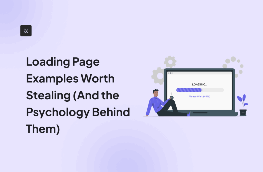
Loading Page Examples Worth Stealing (And the Psychology Behind Them)


Loading screens started as fake progress bars with little to do with actual load progress. Just something moving on screen to say, “This is working, keep waiting.” That accidental fix turned into a discipline.
Today, the best loading screens do far more than buy time. They reinforce brand identity, reduce perceived wait time, surface upsell opportunities, and in some cases, make users genuinely smile.
So for each example here, I looked at the specific design decision being made, the psychological principle driving it, and what type of product it maps to. The goal was to find examples where every design decision has a clear reason behind it.
Some of the most engaging loading page examples I’ve found are:
- Slack incorporates a loading spinner, team quotes, and helpful tips into its loading page.
- TurboTax delays its loading for a few seconds, with a loading animation showing the “complex” process happening in the background.
- Letterboxd displays a movie scene with a humorous quote to keep film lovers entertained during load times.
- Productboard uses a skeleton screen for small loading areas and a logo animation with marketing messages for a full page load.
- WeTransfer utilizes its loading screen to advertise its paid Pro service.
- Duolingo uses its cute owl mascot, Duo, to engage users on the loading page. It also shares inspiring messages to drive retention.
- Expedia uses a floating airplane animation on its loading screen as users search for flights.
- Medium uses a skeleton screen to reassure users that the content is loading.
- Webflow keeps it simple with a centered logo and a clean progress bar on a dark screen, proving you do not always need to reinvent the wheel.
Loading page vs. loading spinner vs. skeleton screens
Before we get into the examples, it’s worth clearing up the difference between a loading page, a loading spinner, and a skeleton screen. I see people using the terms interchangeably.
- A loading page is a full-page display that typically includes a message, loading animation, or progress bar. It works best when the entire website is loading, or there is a significant delay in content delivery.
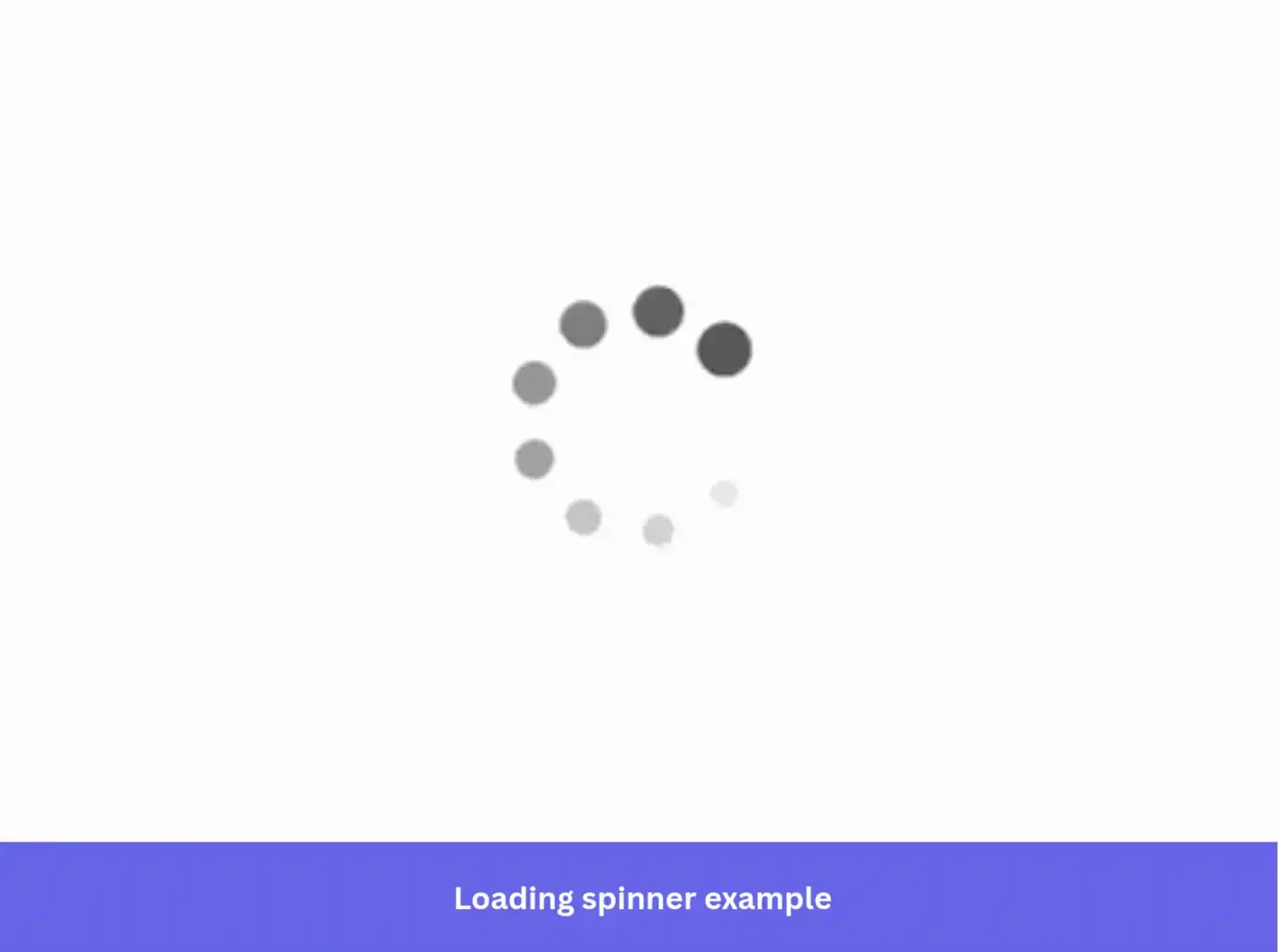
- A loading spinner is a small CSS animation that rotates to indicate loading activity. Unlike a full loading page, it can sit anywhere on the screen to show progress on a specific element or section rather than the whole page.
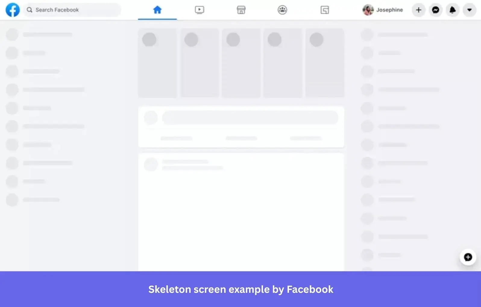
- Skeleton screens are full-page displays that mimic the structure and layout of the incoming content, appearing as gray or white outlines before the real content arrives. Because users can see the page taking shape, they perceive the wait as shorter than they would with a spinner. That makes skeleton screens the stronger choice for complex, content-heavy layouts.
Loading page examples worth learning from
The loading page examples below span different industries and design approaches. They might distract, reassure, or sell you something. What they share is a clear understanding of what users need in that waiting moment.
1. Slack incorporates quotes in its loading page design
Slack provides one of the best loading page examples for products looking to reinforce their brand identity with the loading page.
A skeleton screen and a loading spinner prepare users as the app loads. Seeing the screen pre-populate with placeholders also gives the impression that the page is loading faster than it actually is. Google’s Luke Wroblewski proved this in 2013. Spinners make users focus on waiting; skeleton screens make them focus on content arriving. Facebook, LinkedIn, and YouTube all switched for the same reason.
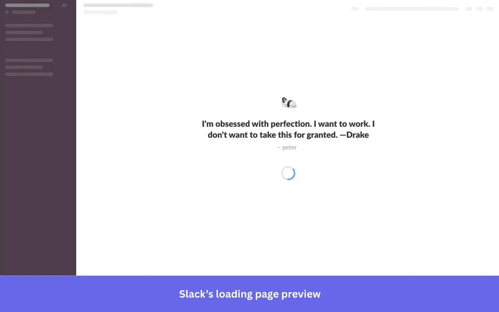
Slack also reinforces their collaborative features by enabling users to add quotes that team members can view during wait times. These quotes become small cultural touchpoints that spark thoughts or bring smiles during routine moments.
Finally, if there are no quotes from the team, Slack shares helpful tips on the loading screen, providing users with valuable information to help them get the most out of the app. Every loading moment becomes a learning opportunity.
2. TurboTax uses a deliberate delay to build user trust
TurboTax helps users calculate and file their taxes. To do that, it has to load and process the user’s data. This process takes about 5-10 seconds, with a loading animation showing the processing happening.
TurboTax provides a perfect example of how the loading page can improve the user experience. They really do not need 10 seconds to load and process user data. TurboTax can actually perform this task much faster, but the slower experience is intentional.
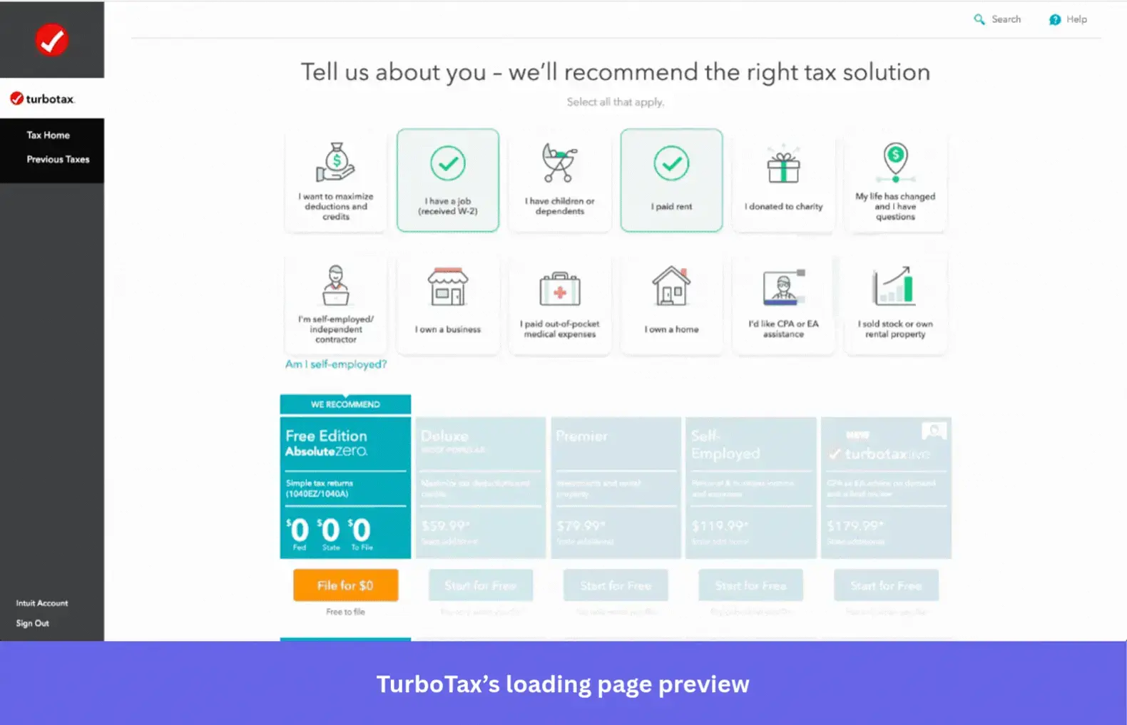
By taking that long, though, they reassure users that their accounts are actually checked and accurately analyzed. This ties back to letting users know their actions have meaning. If a user knows they’re importing a large amount of data, they expect it to take time. A near-instant result would feel suspicious.
Harvard researchers actually gave this a name. The Labor Illusion. Users rated a travel site higher when it showed a slow animation of searching 100 databases than one that returned instant results. TurboTax is doing exactly this.
3. Letterboxd uses film stills to entertain users during load times
Letterboxd is a social platform built around film reviews and recommendations, and its loading screen knows exactly who it is talking to. While the app loads, users are shown a movie scene alongside a humorous quote from the film.
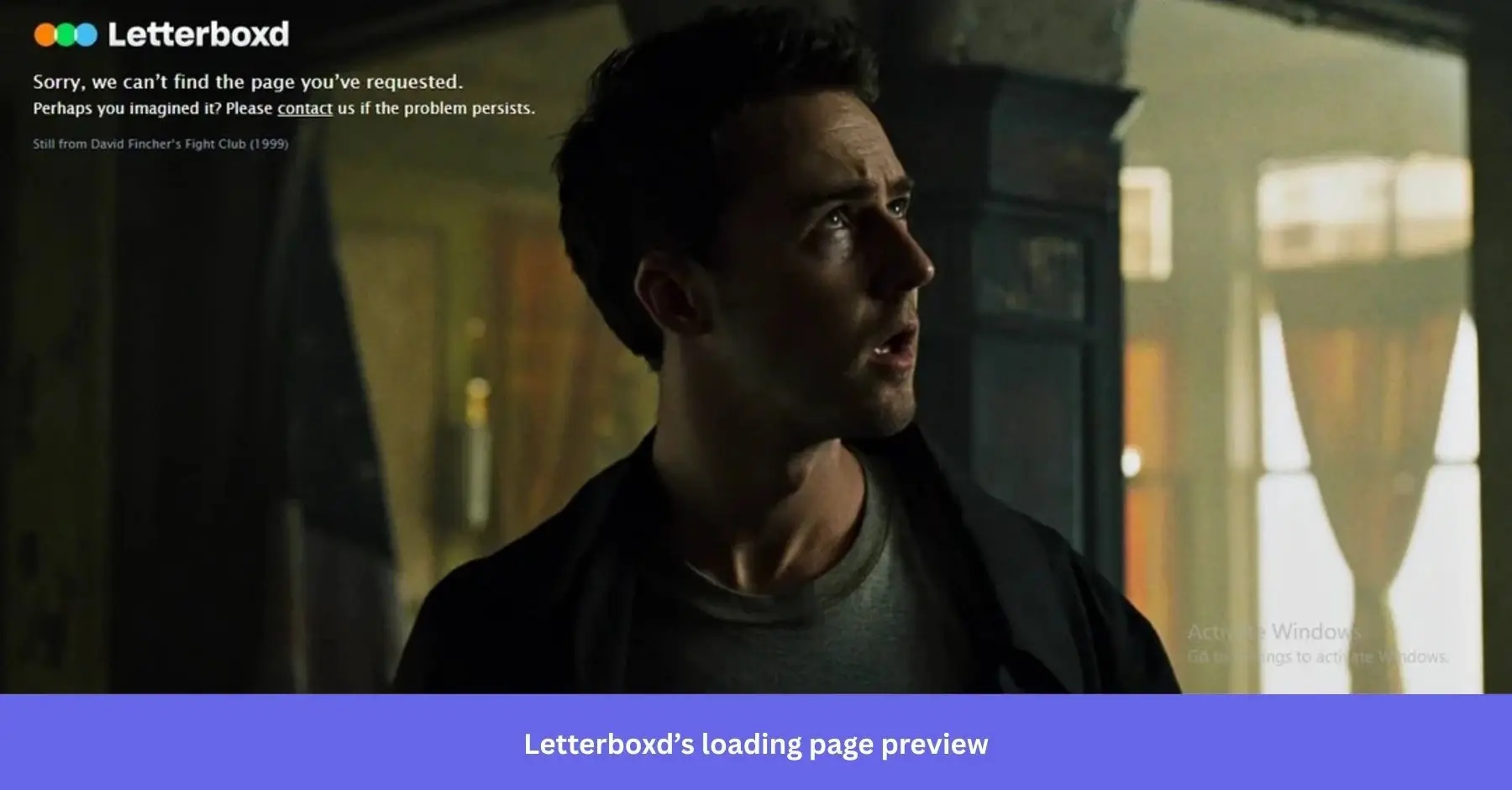
It is a small detail, but it lands perfectly. The loading screen feels like an extension of the product rather than an interruption from it.
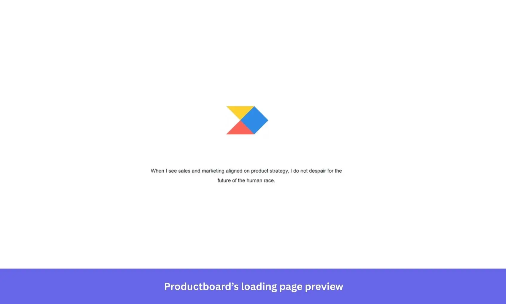
4. Productboard combines skeleton screens with logo animation on load
Productboard uses a skeleton screen when small sections of the website are loading. This limited loading screen drives attention to the specific loading area while also setting expectations for what’s coming.
For a fuller app launch, Productboard animates its logo to let users know things are moving forward. They also include marketing messages and other quotes beneath the logo animation to keep users engaged.
5. WeTransfer uses its loading screen to upsell while users wait
WeTransfer enables you to share files of up to 2 GB for free, without even registering an account. However, they also offer an Ultimate plan for larger file transfers.
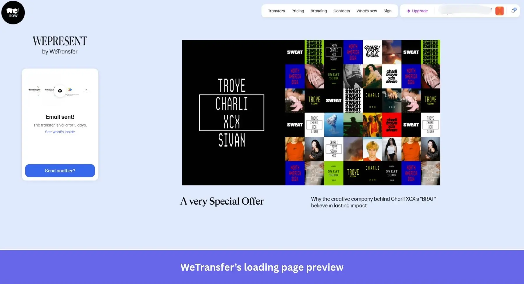
While users wait, WeTransfer now shows a few things alongside the transfer confirmation. An upgrade prompt for their Ultimate plan and WePresent, their editorial platform showcasing creative work from artists and brands. The upsell is still there, but it is wrapped in content their audience actually wants to see. That is a more sophisticated approach than a straight promotional pitch.
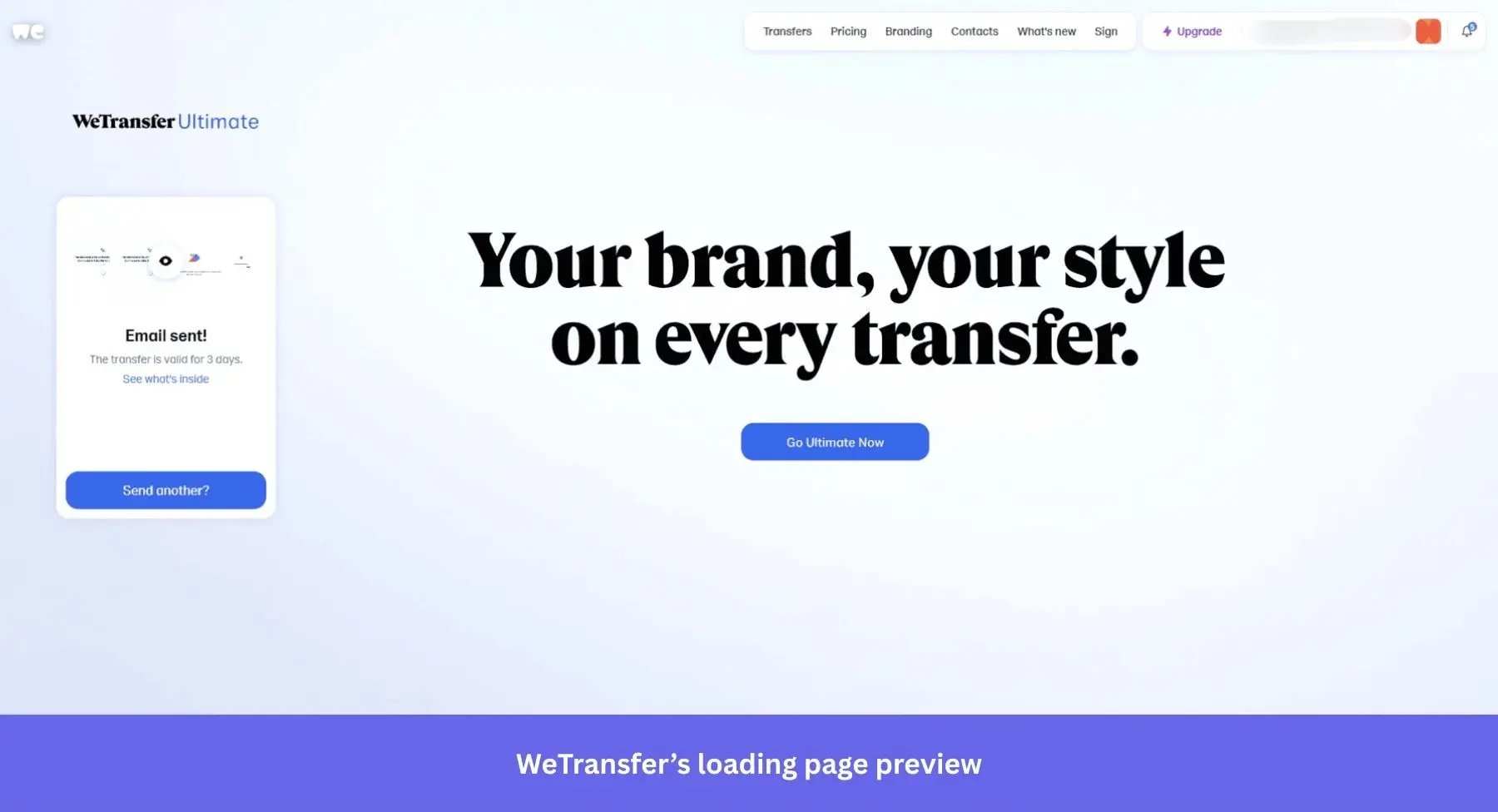
What makes it work is the design restraint. The upload progress remains the main focus while the Ultimate promotion sits alongside it without overwhelming the screen. Promotional content stays subtle, the messaging is direct, and there is enough white space that nothing feels pushy.
6. Duolingo brings its owl mascot to the loading screen to drive retention
The language learning app Duolingo adopts a fun approach to its user interface, and its loading process is no different. Their adorable owl mascot, Duo, occupies the screen as the app loads.
Duo appears with encouraging messages or interesting language facts, turning a potentially frustrating moment into a chance to build brand identity and keep users engaged.
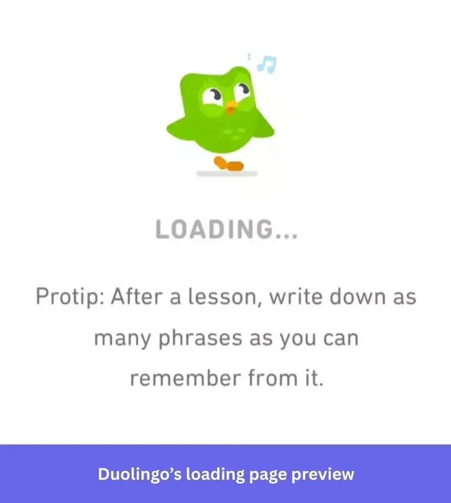
These brief moments of encouragement strengthen users’ dedication to their goals before a lesson even starts. A little progress bar also helps users track the loading progress. Carnegie Mellon researchers found that a progress bar accelerating toward the end feels faster than a steady one. A small animation detail, but it makes a measurable difference to how long the wait feels.
7. Expedia mirrors the user’s search with a contextual flight animation
Expedia’s loading animation is equally captivating. A plane floating past fluffy clouds. This animation fits perfectly as it pops up while users search for a flight on the platform.
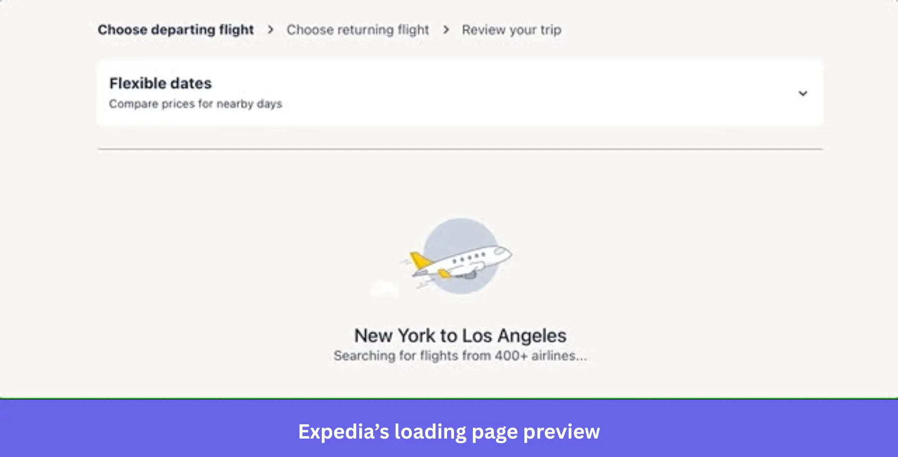
It, thus, reinforces the site’s purpose while providing some entertainment to engage users until the flight results are available.
8. Medium relies on skeleton screens to keep content delivery feeling fast
The online publishing platform, Medium, uses a skeleton loading screen to engage and delight users. Designed to facilitate quick content delivery, this loading page design is an essential part of a better user experience.
It reassures users that the content is loading, making the waiting experience more bearable. They also load low-res image previews to further reduce loading time.
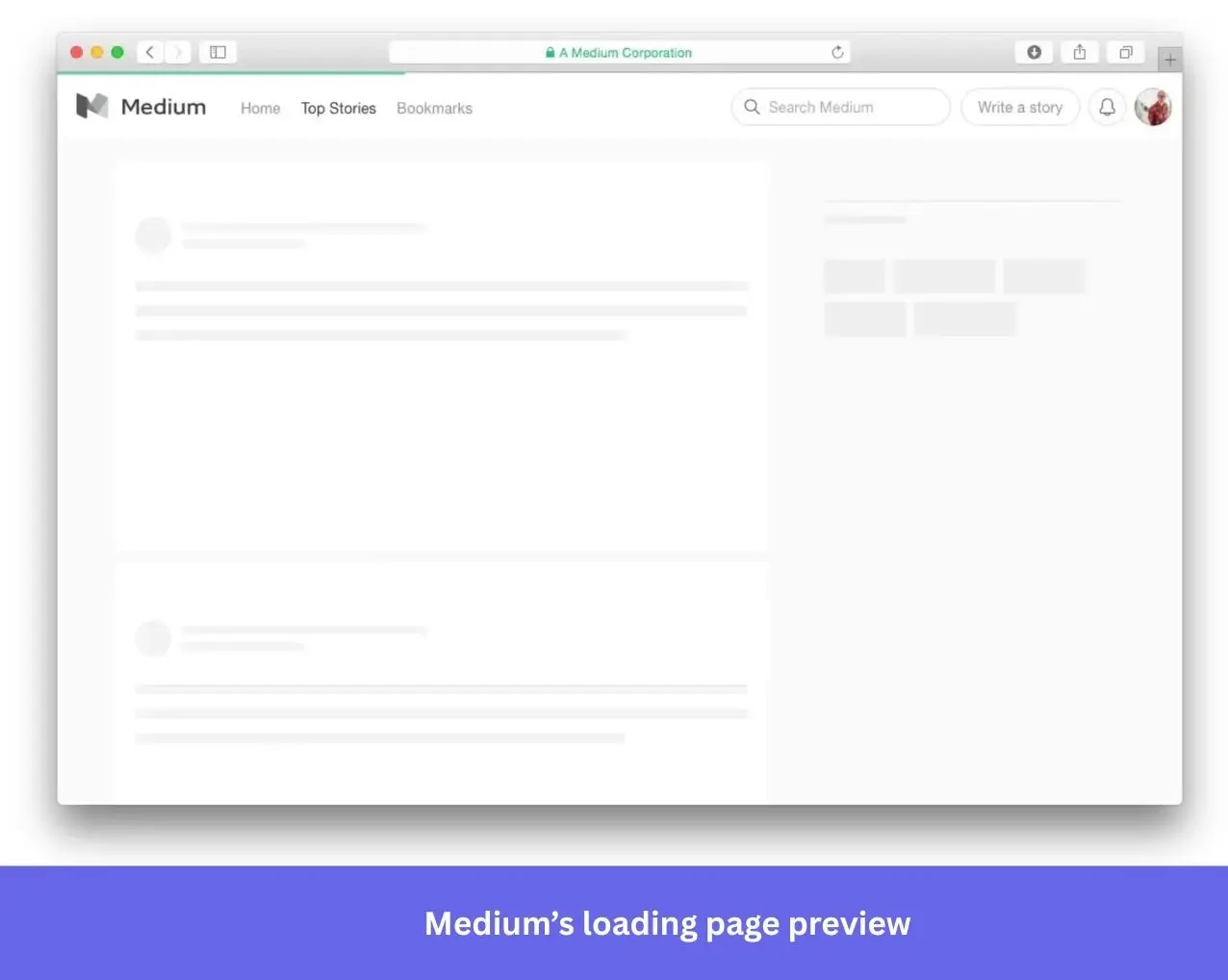
Medium is not alone in this approach. Slack, LinkedIn, and Facebook all use skeleton screens for the same reason. For a content-heavy platform like Medium, where users come specifically to read, getting content on screen fast is important. These tweaks might seem small, but they are what turn a content-heavy site into a smooth reading experience.
9. Webflow proves a simple progress bar is sometimes all you need
Webflow is a website builder that gives users control over the underlying code of their sites. When the editor loads, it takes a few seconds to pull in all the required assets.
What fills that time is about as simple as it gets. The Webflow logo sits centered on a dark screen with a clean progress bar beneath it.

And honestly? It does not need any of that. Users launching a technical editor are not looking to be entertained. They want to know things are loading and roughly when they will be done. The progress bar handles both.
How to build engaging loading pages with these UX principles
Jakob Nielsen established that users abandon an app after 10 seconds of silence. Loading screens exist because of that single finding. Here’s how to make yours work harder.
- Add a progress bar: A progress bar reduces anxiety even when the estimate isn’t accurate. The bar doesn’t need to be precise. It just needs to exist. Animate it to accelerate toward the end and pair it with copy that explains what’s happening or previews what’s coming.
- Use animation to create engagement, not distraction: Subtle animations draw attention to the loading process and make the wait feel active rather than passive. Small interactive elements (hover effects, click animations) can extend this further without adding complexity.
- Use empty states to communicate, not just fill space: When there’s nothing to display, skeleton screens and placeholder text show users what’s coming rather than leaving them in the dark. Tailored messages that reference the user’s specific context: what they’re loading, why it’s taking time, are more effective than generic “loading…” copy.
- Tell users why it’s taking time: If a loading screen runs long, explain it. Estimated load times, reasons for delay, or a note about a connectivity issue all reduce frustration and shift the attribution of the wait away from the product. Users who understand why they’re waiting are measurably more patient than users who aren’t told anything.
- Test before you ship: No loading screen design is self-evidently correct. A/B test multiple approaches with real users, collect feedback on what reduces frustration versus what compounds it, and iterate. What works for a content platform like Medium won’t work for a tax tool like TurboTax.
The case for intentional loading screens
While developers and designers debate whether loading screens are worth the effort, the examples above make a strong case. Done right and with intention, a loading screen is not dead time. It is a design decision that can build trust, reinforce your brand, and keep users coming back.
But if those extra seconds are not intentional and have not been tested, they are probably doing more harm than good.
Want to test which approach works best for your users? Userpilot’s A/B testing helps you find out without guesswork. Book a demo today to learn more.
About the author