Loading Page Examples That Actually Reduce User Frustration


Loading screens are a crucial element of UX design, but they often get neglected, with aesthetics being prioritized over usability. Research from Cornell University suggests that a loading screen with an interactive animation will be perceived as faster and liked more than a loading screen with a progress bar or passive animation. That means the few seconds your product spends loading are more important than most teams assume. Users form opinions about your product during loading screens that affect whether they come back. A subpar loading page that quietly frustrates users builds up in the background until they finally churn.
The worst part is that loading screens never show up on exit survey responses because they’re a seemingly minor inconvenience that accumulates over time rather than a memorable catalyst that users readily recall. Interactive loading screens can reduce frustration and improve customer sentiment among SaaS users, resulting in higher satisfaction scores and retention rates. This guide will cover the different types of loading screens, show you nine curated examples to take inspiration from, and outline the best practices to follow when building your own.

Loading page vs. loading spinner vs. skeleton screen: What’s actually different
Luke Wroblewski, former Chief Design Architect at Yahoo and Product Director at Google, spoke to the transparency benefits of adding loading elements to indicate progress:
“Conventional wisdom tells us that when things are going to take a while, we should let people know. In most mobile applications that translates to adding progress bars or spinners when something is happening or loading.”
Many teams erroneously use loading terminology interchangeably, which makes it hard to get everyone on the same page. This may seem like trivial semantics, but getting it wrong can create dangerous mismatches.
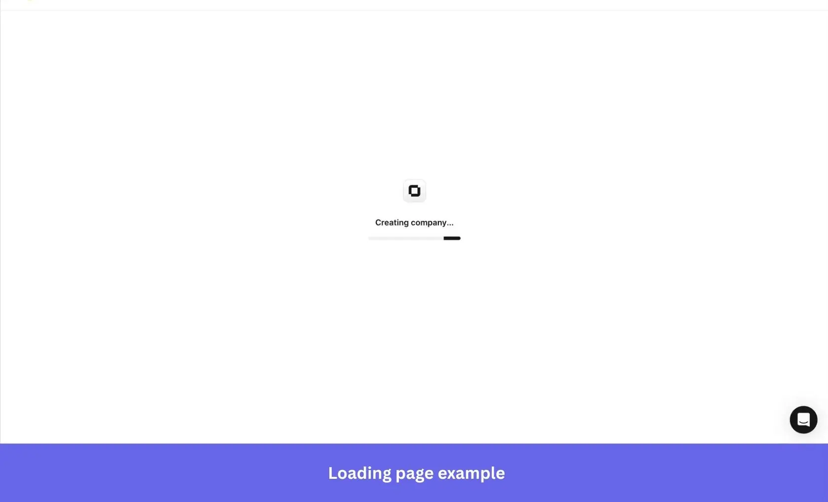
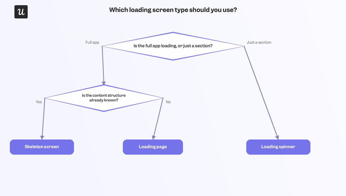
- Loading page: Full-page display (usually a message, animation, or progress bar) that takes over the whole screen. It should be used when the entire product is loading, or when the delay is long enough that displaying incomplete content would be misleading.
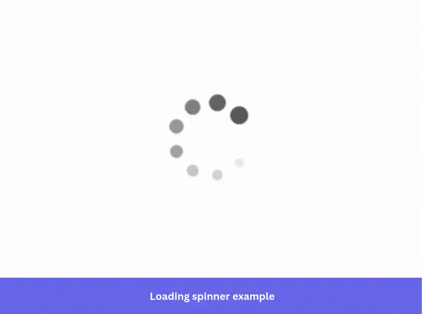
- Loading spinner: Spinners are small CSS animations that rotate in place. They can sit anywhere on the screen to signal that a specific element is working without covering the whole page.
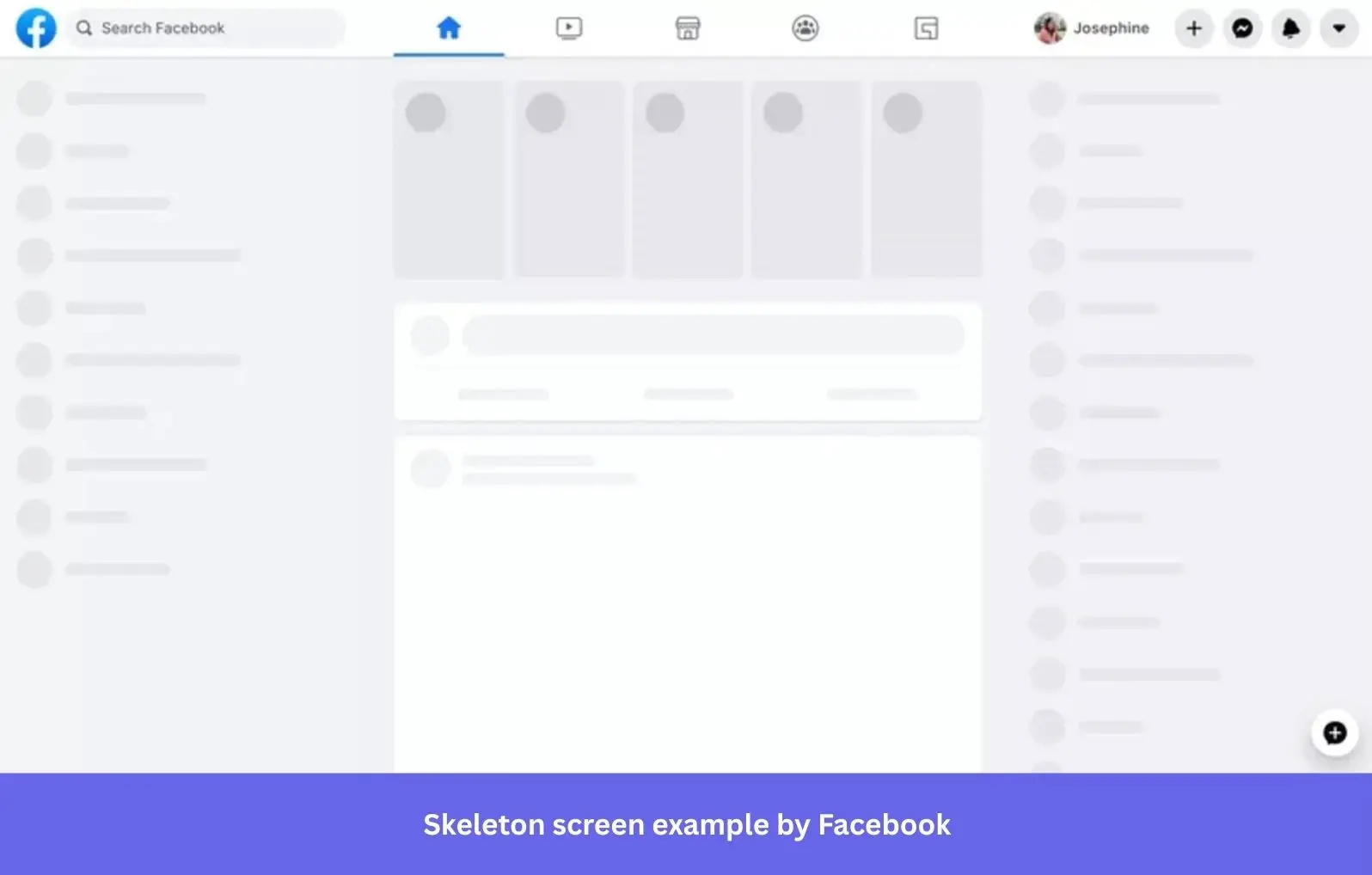
- Skeleton screen: Skeleton screens mimic the structure of the content about to arrive, using gray outlines in place of real text and images. Because the page’s silhouette is already visible, people perceive the wait time as shorter, making it a strong pick for content-heavy layouts.
Picking between the three isn’t about stylistic preference. It’s a question around what portion of the page is still waiting and whether showing incomplete information and page silhouettes would serve as a calming preview of what’s to come or as visual noise that doesn’t represent the incoming content.
9 Loading page examples that reduce frustration and improve retention
The loading page examples comprise a curated collection from different industries and design approaches, offering enough variety to spot the universal patterns that hold true.
1. Slack turns loading time into a brand moment, not just a wait
Slack is one of the clearest examples of a product using wait times to reinforce its brand identity. A skeleton screen and small spinner prepare the interface as the workspace loads, while the pre-populated layout makes the app feel faster than it is.
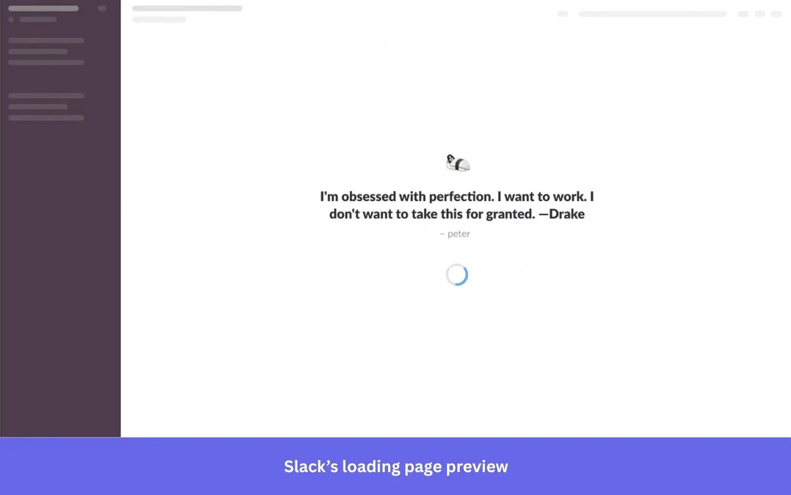
Slack also lets teams add their own quotes for people to see while the product is loading, adding personalization and social elements. When there’s no quote queued up, Slack shares a product tip to make every wait a chance to learn something. A few seconds of downtime converted into a learning moment can increase the odds that someone discovers a feature they’d otherwise never find.
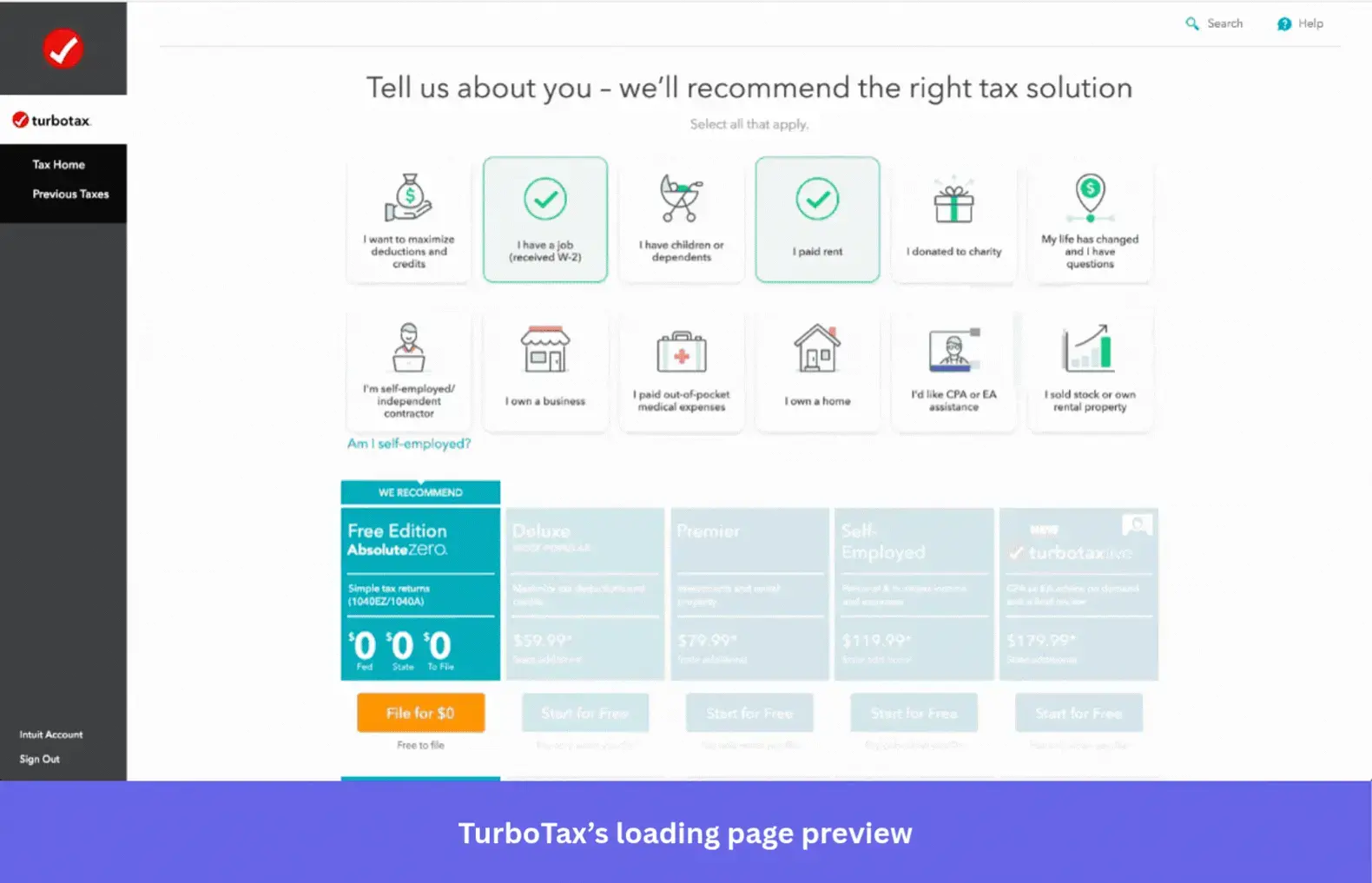
2. TurboTax uses a deliberate delay to make the result feel earned
TurboTax processes a user’s tax data before showing results, showing an animation of the work happening for five to ten seconds. TurboTax could return the result almost instantly, but letting users wait makes the process feel more sophisticated and complex.
Researchers at Harvard Business School call this effect the Labor Illusion:
“When websites engage in operational transparency by signaling that they are exerting effort, people can actually prefer websites with longer waits to those that return instantaneous results.”
3. Letterboxd entertains its specific audience instead of generically distracting them
Letterboxd is a social platform for film reviews with a loading screen tailored to its target audience. While the app loads, it shows a movie scene alongside a humorous quote from the film.

It’s a small detail that lands perfectly because it’s specific to film lovers rather than a generic loading screen. Loading pages that are relevant to the end user and feel like a native part of the product will be more forgivable than one that feels like a placeholder bolted onto it.
4. Productboard scales its pattern to the size of the wait
Productboard uses a skeleton screen for small sections loading in place, drawing attention to exactly where content is arriving. For a full app launch, it switches to an animated logo with a marketing message underneath to keep people engaged during the extended wait.
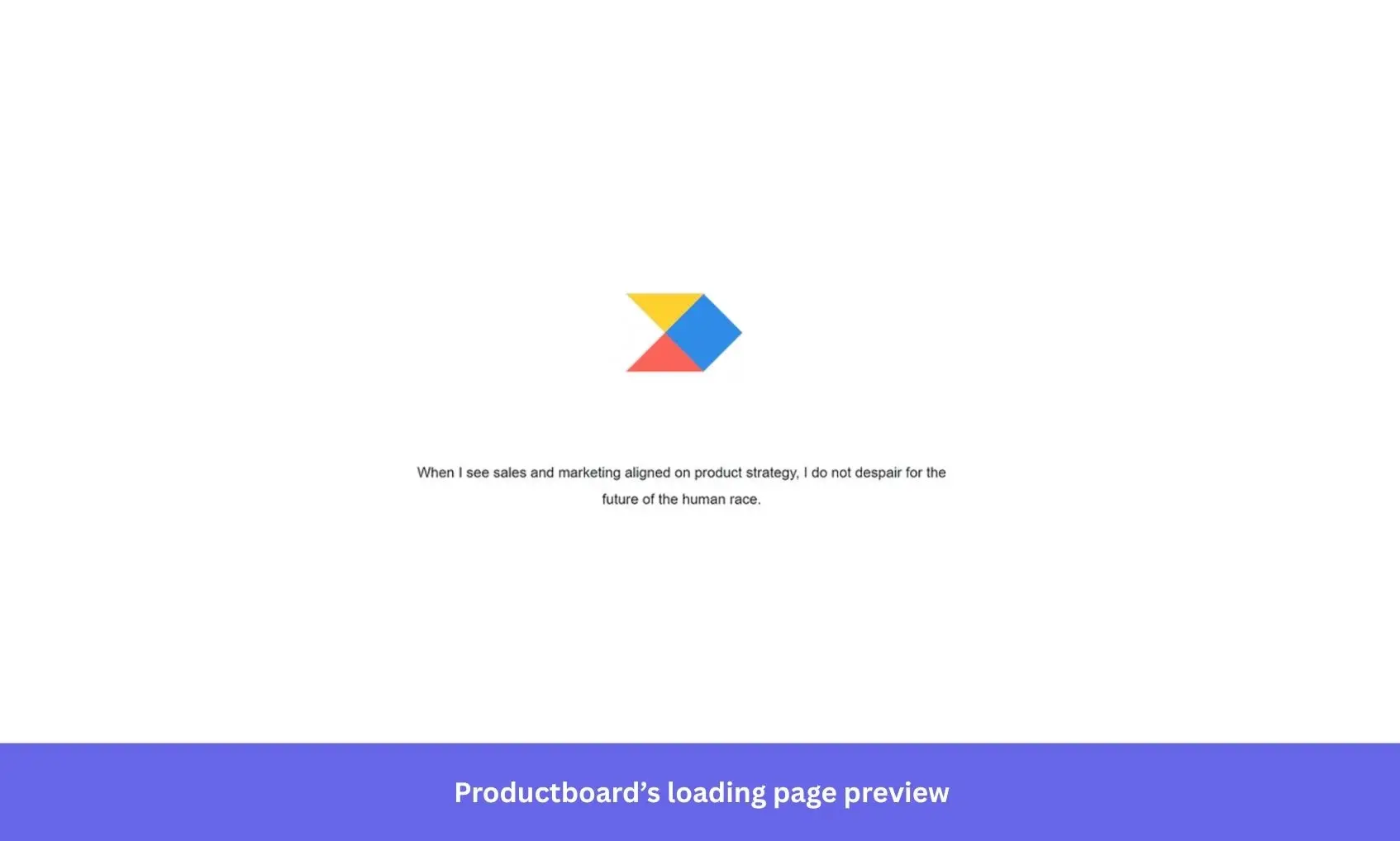
Matching the pattern to the length of the wait time is the part most teams skip. Placing a skeleton screen everywhere, regardless of what’s actually loading, teaches people to ignore it altogether. Productboard only uses the bigger pattern when the wait is longer, making that pattern feel significant rather than overused.
5. WeTransfer wraps its upsell in content people actually want
WeTransfer lets people send files up to 2 GB for free without an account, with a paid plan for larger transfers. While a transfer completes, it shows an upgrade prompt while plugging WePresent (its editorial platform) with creative work from artists and brands.
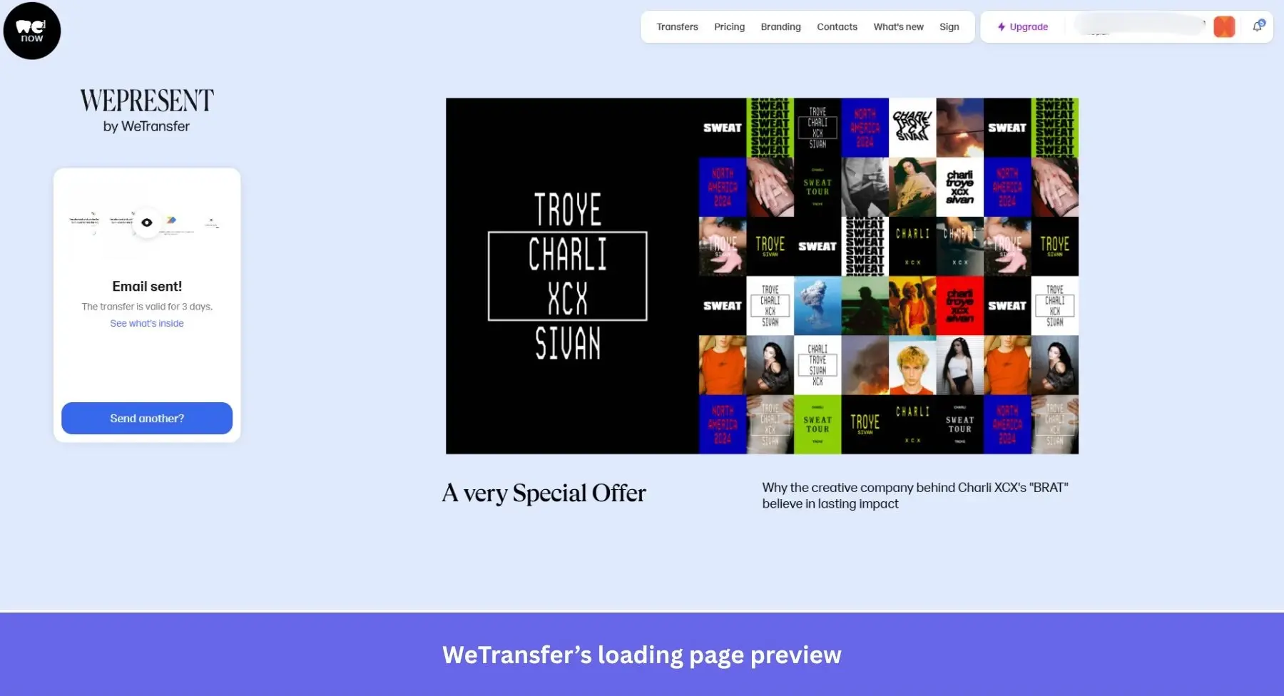
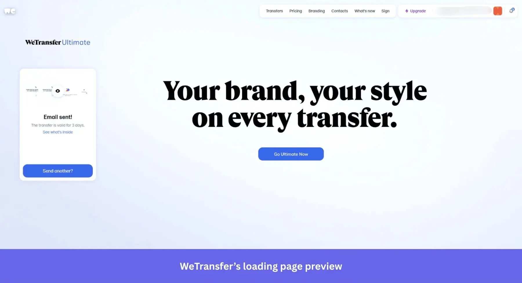
The design restraint keeps the upload progress as the visual anchor while the promotion sits beside it without crowding the screen. That leaves enough white space that nothing feels like a pitch. Balancing useful content with light-touch upsells is a much easier pill to swallow than a banner ad blatantly asking for your money.
6. Duolingo’s mascot turns a routine wait into daily reinforcement
Duolingo’s owl mascot, Duo, occupies the screen while the app loads. Duo is typically accompanied by encouraging messages or language facts that learners using the app would find interesting. What could easily be a frustrating pause instead becomes another dose of the brand’s personality, making the app more memorable before the lesson has even started.
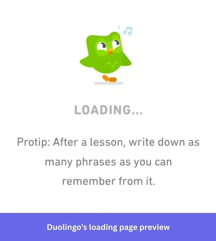
The progress bar underneath also makes the load feel faster. Chris Harrison at Carnegie Mellon University found that a progress bar accelerating toward the end feels faster to the person watching it than if it moved at a constant pace, even if the total duration is the same. It’s a small animation detail that can measurably shorten how long the wait feels.
7. Expedia mirrors the exact task the user is waiting on
Expedia’s loading animation shows a plane floating past clouds while it searches for flights, which resonates with the user who’s currently waiting on flight results. The animation isn’t just decorative but an illustrated representation of the data being fetched.
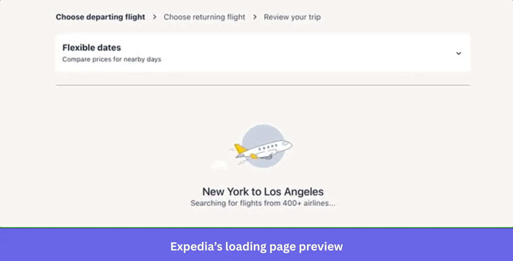
Expedia’s loading page reinforces what the product is actually doing while giving people something relevant to watch instead of a generic spinner. The specificity of showing the plane instead of a blank bar is what keeps the wait from feeling like dead air (no pun intended).
8. Medium keeps content-heavy pages feeling fast, not just looking busy
Medium uses a skeleton screen to make its publishing platform feel faster. Readers arrive specifically to read, so any delay in getting text on screen works against that intent. Low-resolution image previews load first to shave more time off the perceived wait by partially revealing the content that’s nearly available.
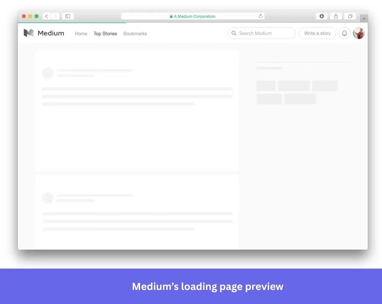
Slack, LinkedIn, and Facebook use similar approaches for the same reason. On content-heavy platforms, getting something on screen fast matters more than making the wait look elaborate. These are small tweaks that can make the difference between whether a page feels sluggish or snappy.
9. Webflow proves restraint can be the strongest choice
Webflow’s editor takes a few seconds to pull in the assets it needs. What fills that time is the simplest loading screen we’ve seen with a centered logo, dark screen, and progress bar underneath.

It doesn’t need anything more elaborate than that because users launching a technical website builder aren’t looking to be entertained. All they need is confirmation that the loading process hasn’t stalled and a rough estimate of when it’ll be done. A plain progress bar answers both questions without adding any bells or whistles.
How to design loading screens that reduce frustration and keep users coming back
Jakob Nielsen, Principal of Nielsen Norman Group, established the baseline that nearly every loading page is built on:
“Anything slower than 10 seconds needs a percent-done indicator as well as a clearly signposted way for the user to interrupt the operation. Assume that users will need to reorient themselves when they return to the UI after a delay of more than 10 seconds. Delays of longer than 10 seconds are only acceptable during natural breaks in the user’s work, for example when switching tasks.”
That said, wait times aren’t the only thing worth optimizing. Progress indicators, animation speeds, and transparent messaging also prevent frustration during loading screens.
Give people a progress indicator, even an imprecise one
A progress bar reduces anxiety even when its estimate isn’t accurate. It doesn’t need to be precise; it just needs to exist because the alternative is silence, and silence during a wait reads as a possible crash. Animate the bar to accelerate toward the end rather than move at a constant pace, and pair it with copy that says what’s happening or previews what’s coming. A bar that just sits there says nothing. A bar that visibly speeds up near completion, the same effect Carnegie Mellon’s research found in the Duolingo example above, does real psychological work with zero added complexity.
Use animation to signal real activity, not to decorate the screen
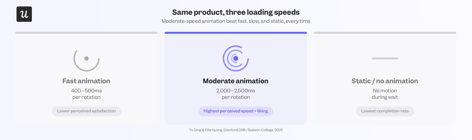
Stanford’s Yu Ding and Babson College’s Ellie Kyung ran three experiments with more than 1,400 participants across animation speeds from 400 milliseconds to 10 seconds per rotation. They found that moderate-speed animation beat fast, slow, and static loading in every version of the test.
Yu Ding, Associate Professor of Marketing at Stanford Graduate School of Business, had this to say about their findings:
“If something is moving too slowly, people just don’t pay attention. There’s nothing to attract their attention. But when it’s moving too fast, like some of the animation in our experiments, it will become a blur, and they just zoom out and look at the general picture. The middle point is the sweet spot.”
To test this, the researchers created real Facebook ads about the benefits of sunscreen. Users who clicked on them were subjected to a 20-second wait for the associated site to load. Animation speeds varied during the wait. Moderate speed outperformed fast animation and a static image, with 45% of participants waiting until landing. In one experiment, users faced a 20-second landing page loading time after clicking a Facebook ad. 45% of people watching a moderate-speed animation stayed until the landing page loaded, beating both fast animations and static images.
A follow-up study with 30-second wait times was conducted, with more than two-thirds of people watching moderate-speed animation finishing the task (compared to just half of the group seeing the fast animation).
Match the loading pattern to what’s actually being loaded
Use empty states to communicate, not just fill space. Skeleton screens and placeholder text should show people what’s coming. Microcopy needs to reference the thing being loaded, what it is, and why it’s taking time. This beats generic “loading…” text every time. That’s why we recommended using a skeleton screen for content-heavy pages, spinners for partial updates, and loading pages for whole-screen refreshes. Slapping the wrong pattern on can confuse users further, such as by previewing a skeleton screen that looks nothing like the final layout once the page loads.
Tell people why it’s taking time
If a loading screen runs long, explain why it’s taking longer than expected. An estimated time, reason for the delay, or note about a slow connection all reduce frustration while subtly shifting the blame away from the product. Users who understand why they’re waiting are going to be more patient than those who are left wondering. It’s the same mechanism behind TurboTax’s deliberate delay that uses context to turn wait times into evidence of work rather than making users wonder if the product is broken.
Test before you ship
Not all loading screens are created equal, nor are the users staring at them. What works for a content platform like Medium won’t work for a tax tool like TurboTax because the two are solving different problems during the wait. A/B test multiple approaches on real users and watch what they do while waiting. Are they rage-clicking, switching tabs, or abandoning the flow entirely? Watching session replays is the fastest way to see that behavior for yourself instead of guessing why drop-off rates are higher than expected.
Loading page examples are worth referencing but only if you know why it worked for the product you took inspiration from. Interactive loading screens with well-paced animations reduce frustration and improve how people feel about the product they’re waiting for, with the benefits appearing downstream in satisfaction scores and retention rates. Want to see whether your own loading screen is boosting satisfaction or causing churn? Book a Userpilot demo and our real-time analytics dashboards will take the guesswork out of loading screen design!
About the author