Mobile UX Design in 2026: The Interruption Problem Every Design Team is Ignoring


Pick up any mobile UX resource published recently, and you’ll find the same checklist: tap targets at least 44×44 points on iOS and 48dp on Android smartphones, primary actions placed in the thumb zone, OS-native mobile patterns for intuitive navigation, and screens kept free of clutter. All of it is correct. Teams shipping serious mobile software in 2026 have largely internalized these UX design principles.
Buttons smaller than the recommended tap target size still appear in production apps, leading users to hit neighboring targets and trigger rage-tap patterns. Text below 14pt forces users to zoom or squint to read critical content on a mobile screen’s limited space, and inconsistent gesture behavior across screens, like a swipe that dismisses in one view but opens in another, adds confusion that compounds across a session. These are real problems worth fixing, but they’re implementation gaps rather than the systemic failure driving mobile abandonment.
Nielsen Norman Group’s State of UX 2026 noted that users open mobile apps for seconds at a time, often interrupted, and that designers should save state generously so users can resume. That research shows that when users abandon a mobile product, the reason is almost always the work they have to repeat.
Consider what happens in three common scenarios:
- A traveler who gets a phone call mid-booking and comes back to a timed-out session.
- A field technician who fills out a five-step inspection form loses the signal before submitting and has to start over.
- An enterprise SaaS user who starts onboarding at lunch, gets pulled into a meeting, and returns to find progress gone.
These are not edge cases; instead, these are those normal scenarios of mobile device use, and designing for them is what mobile-first actually means in practice. The mobile UX conversation that matters most right now is about continuity, and the industry’s published advice hasn’t caught up with it.

Five mobile UX interruption failures that dominate SaaS mobile app reviews
I’ve read through hundreds of App Store and Google Play reviews for SaaS mobile apps across different product categories. The complaints that generate the most frustrated language are consistently about losing work. Five specific patterns appear across entirely different products and user bases.
#1 Forms that reset
Forms that reset when the app is moved to the background, mobile survey responses are lost when a notification interrupts mid-answer, and onboarding flows return to step one after a session expires. Users in these situations describe the same feeling- “the effort was real, but the app discarded it”.
Form abandonment data from Gnosari puts mobile form abandonment at 81%. A significant share of those forms were started by users, interrupted for a few minutes, and returned to a blank form.
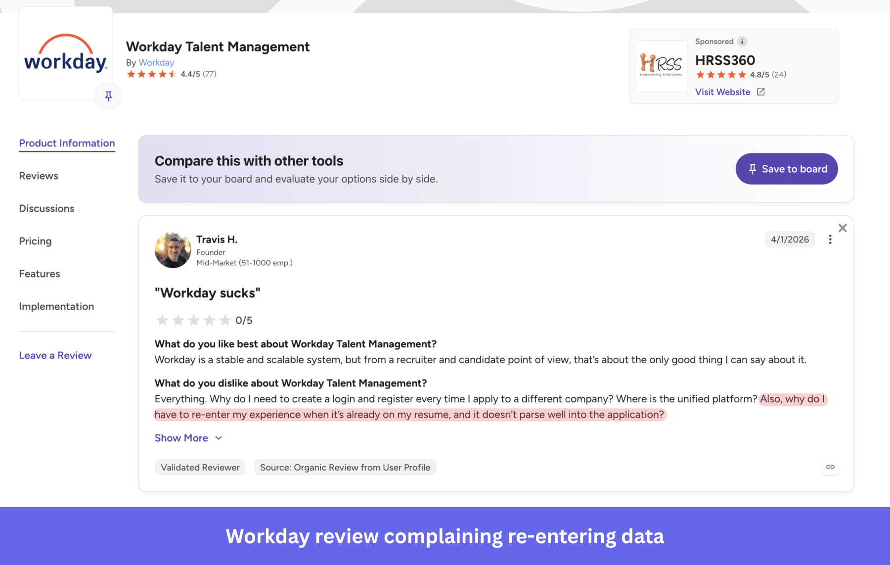
The fix is technically straightforward, where you can save form state locally, parse data correctly from documents, auto-save drafts, and restore field and scroll position on return. Minimizing user input also helps; that is, appropriate keyboards for each field, autofill where available, and social login or passkey defaults reduce the number of steps where an interruption can cost progress. The reason these fixes don’t get prioritized is that no standard product analytics dashboard makes the cost visible.
#2 Onboarding that restarts
Onboarding flows that restart from the beginning when a session times out are a recurring complaint in enterprise mobile apps. Progressive onboarding flows should highlight the core benefits of the app first, before asking users to complete technical configurations like domain verification or workspace integration setup.
Users who haven’t seen value yet are far more likely to abandon when interrupted. Repeating work feels worse than doing it for the first time, and the probability of external interruption on a smartphone is far higher than on a desktop.
The products that handle this well start with upfront intent alignment. They answer app users’ main question (what will I be able to do?), set expectations for what the setup involves, and explain why each step matters before asking for any input. They then split the setup into individually completable steps with clear save points. Users can leave and return to exactly where they stopped, without any anxiety about losing what they’ve finished so far.
#3 Context that disappears
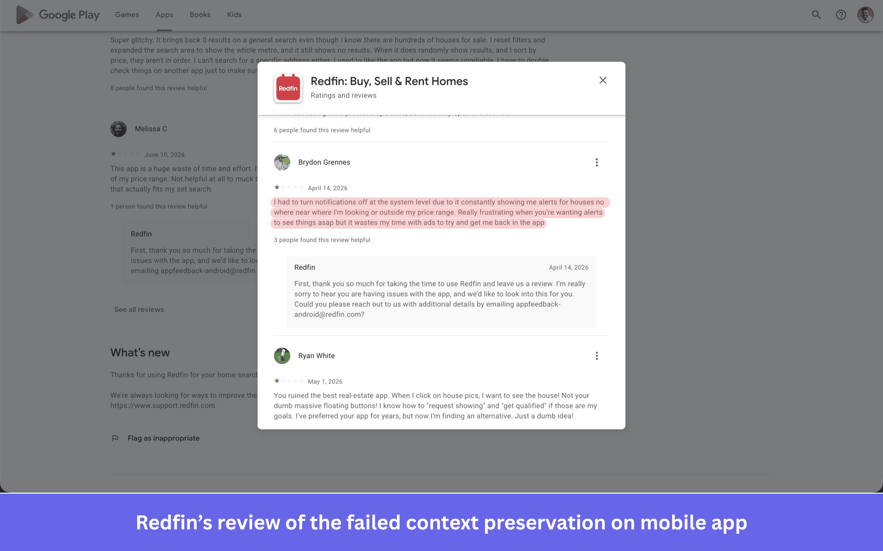
Search filters that disappear when a user navigates away, reading position is lost on a long document, and product comparison selections are cleared after a session expires. In every case, users expect to continue where they stopped, but instead have to reintroduce themselves to the app and rebuild the context they already established.
Context preservation is especially visible as a failure in B2B SaaS mobile apps. A real estate investor or a buyer looking for a house in a nearby locality cannot find relevant properties because the app notifies them about properties far away from the desired location. Context preservation has been table stakes for mobile users for years, yet it still gets missed in mobile products built as lightweight companions rather than primary workflow surfaces.
#4 Repeated re-authentication
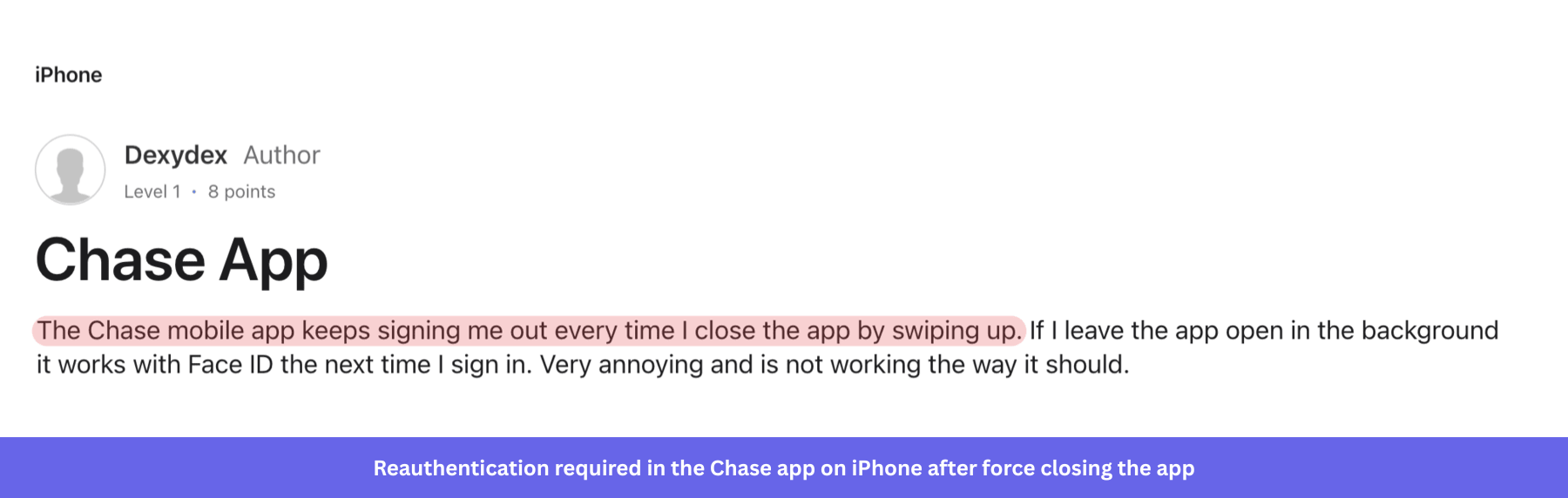
Aggressive session timeouts, repeated MFA prompts, and authentication flows that don’t remember the device appear constantly in reviews for banking apps, healthcare platforms, and enterprise SaaS products. The intent is security, but the implementation trains users to expect friction every time they open the app, and many of them stop opening it.
Good security and good continuity are achievable together. Session tokens can be refreshed in the background, and biometric authentication on modern mobile phones provides strong security with zero re-entry effort for users who’ve already verified their identity. The secondary cost of over-aggressive timeouts is less obvious, as support teams receive tickets from users who assumed their account was locked or the app was broken.
But the product engagement metrics shows artificially low session lengths that obscure actual product usage, making the continuity problem look like a retention problem. Personalized, timely notifications enhance user engagement by bringing users back to in-progress work, but only when the app has the session state to resume from exactly where they left off.
#5 Connectivity failures
Mobile networks are intermittent, and users move between strong WiFi, LTE, and dead zones throughout their day without always realizing it. An app that handles this gracefully queues writes for retry, caches data aggressively, and communicates clearly what’s available offline. Project management, CRM, field service tools, and travel products, as mobile apps, generate the most vocal user feedback when they get this wrong. Adding an offline mode for such scenarios can help end users save their data within the app until they get connectivity back. Notion added offline mode, but users are complaining about how inefficient it gets sometimes.
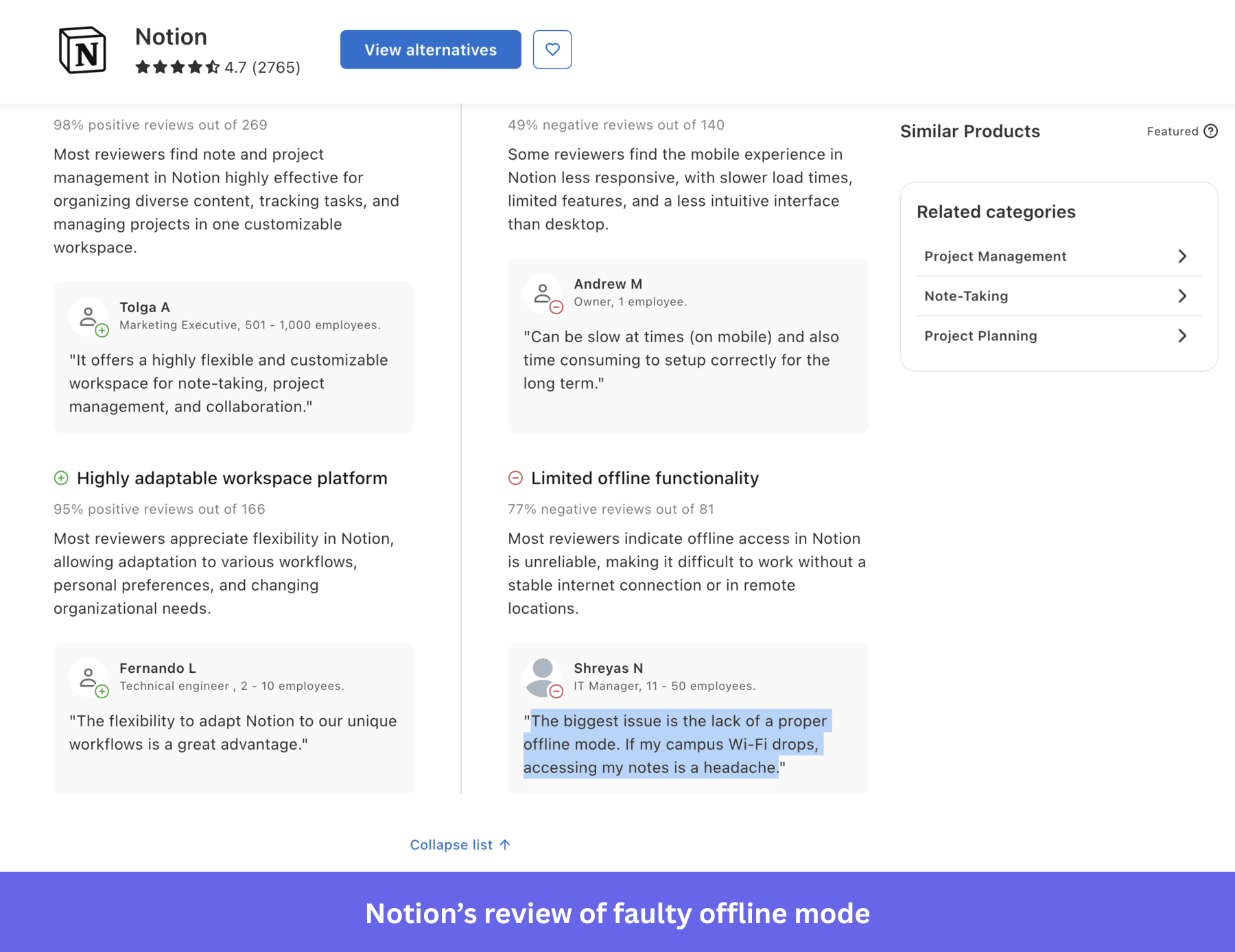
The failures happen when the app has a partial signal, can’t complete a transaction reliably, and shows an error message that gives no specific information about what went wrong or how to resolve it. Users who aren’t aware whether their data was saved will often submit the form again, creating duplicates, or abandon and not return.
The mobile UX failures that screenshots and design reviews don’t reveal
When designers focus on UX teardowns and design critiques, they tend to surface design elements visible in a screenshot in the form of cluttered screens, hamburger menus that hide primary navigation and frustrate users looking for essential features, and interactive elements too close together. Sure, these are worth fixing, but they’re also not the failure mode that drives the most damage in SaaS mobile UX.
The bad UX examples that cause the highest abandonment rates don’t appear on a single screen. For example, a fragile checkout breaks when a push notification, consent modal, or in-app upsell pulls the user out at step four. An onboarding flow that requires domain verification times out when the user switches to check their DNS settings, then returns them to step one.
None of these failures appear in a heuristic evaluation of individual screens. The forgetful search experience is another common case where a user builds a complex filter state, navigates to a detail view, hits back, and finds the filters cleared. Each individual screen passes a heuristic review, but the failure happens between screens, where no state was captured and preserved.
Finding these failures in your own product requires watching actual user sessions in production, not reviewing screens in isolation. The session recordings that shows a user rebuilding the same filter state three times in a row, or resubmitting a form that appeared to succeed, is what bad mobile UX looks like in 2026. A design review process focused only on individual screens will miss most of what’s going wrong.
The interruption resilience framework: Five questions to audit mobile UX continuity before you ship
Design reviews that focus on visual inspection, tap target compliance, and navigation logic will not catch continuity failures. Identifying usability issues early in the mobile UX design process costs significantly less than diagnosing them from production complaints, which is the practical case for running these questions before a flow launches. They surface the continuity failures that standard usability testing misses because testing happens in controlled, uninterrupted conditions that don’t reflect how people actually use their phones.
- Can users stop at any moment? If a user is interrupted at any point in a flow and the app is moved to the background or closed, what happens to their work? Any step where progress is lost on interruption is a failure state, even if the interruption was user-initiated.
- Can users resume instantly? When a user returns to an in-progress task, does the app place them at the exact step they left? If they need to navigate back to their position, that navigational cost will reduce completions over time.
- Can users recover from mistakes? For destructive or irreversible actions, is there a clear undo or confirmation mechanism? Designing for confident action means supporting recovery with micro-interactions, like haptic feedback or a brief animation confirming receipt, which reduces cognitive load and helps users act confidently in the product.
- Can users survive poor connectivity? What happens to a form submission, a draft save, or a data request when the connection drops mid-action? Does the app queue the request and retry without the user having to do anything, or does it fail without feedback?
- Can users remember where they were? When a user returns to a product after hours or days away, does the app preserve their context, including filters, scroll position, and partially completed work? Returning to a product should feel like picking up a conversation, not starting from scratch.
These questions work best applied to the flows that address your users’ core needs, that is, the ones where interruption would cost the most work. Different users will hit these failures at different points depending on their network conditions, device capabilities, and how they typically use the app, so walking through all five questions for your core activation flow will almost always surface failure modes you hadn’t explicitly designed for.
Why does the task completion rate miss the interruption failures, hurting your mobile UX
The standard metrics for mobile UX quality record outcomes rather than experiences. Task completion rate captures whether users eventually finish a flow, conversion rate captures whether they complete a purchase, and user onboarding metrics captures whether users reach the end of setup. None of these tracks tells what it costs users to get there.
- A user who had to restart a form three times after interruptions still counts as a completed task if they eventually submitted.
- A user who abandoned onboarding on Monday, lost all progress, and restarted from scratch on Friday still counts as an onboarding completion.
The metric is technically correct, but the friction in user experience was high, and the product team has no signal that anything went wrong.
Kevin O’Sullivan, Head of Product Design at Userpilot, describes what session replay surfaces that aggregate metrics miss:
“Session replay is that perfect tool… It’s a blend of a qualitative method, watching sessions through at a quantitative scale of sessions for every single user that’s ever interacted with the analytics feature.“
Watching sessions at scale is how interruption failures become visible, not as a failed task in aggregate data, but as a pattern of users retracing steps they already completed.
The metrics that reveal failures caused by interruptions are less commonly tracked. Four metrics reveal the friction despite typical successful metrics:
- Interrupted journey completion: The percentage of users who complete a flow despite at least one session interruption. A low rate here, relative to single-session completion, is one of the clearest signals that a product has a continuity problem.
- Resume rate: What percentage of users who start a multi-step flow and abandon it mid-way return to complete it, and at which step do they pick up?
- Return-to-task success rate: What percentage of users return to an incomplete task, and how many complete it versus abandoning it entirely?
- Draft recovery rate: In content creation flows, how often is unsaved content recovered versus lost when users return?
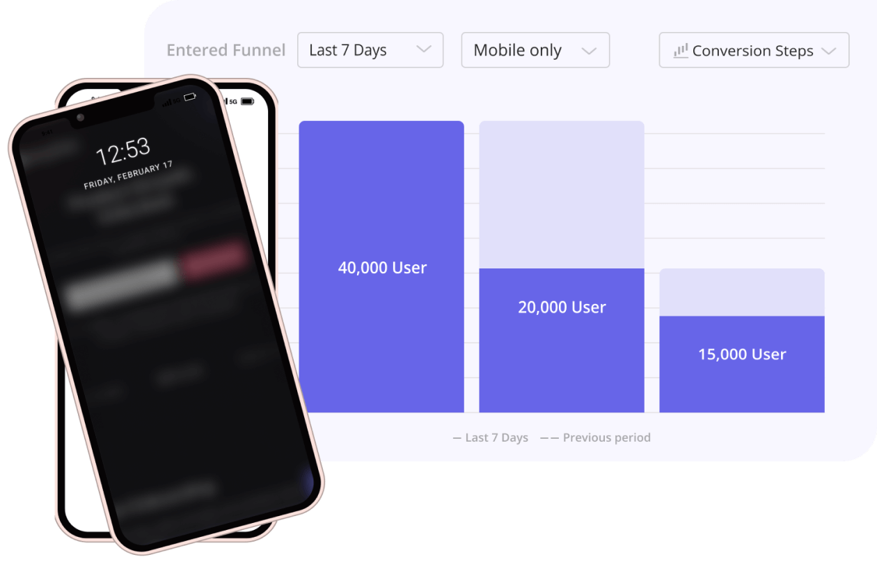
Watching production sessions in session replay tools alongside these numbers is how design teams move from knowing a problem exists to understanding exactly where it happens. As Katie Kelly, UX Researcher at Userpilot, observed when reflecting on working without user behavioral analytics: “We were always kind of working with an incomplete picture in that regard.” Session replay fills in what task completion rates and conversion numbers can’t.
Why design leaders should audit mobile flows for interruption resilience, not just screen quality
When a mobile UX problem surfaces in a product review, the natural response is to look at the affected screen for visual issues. The root cause is almost always somewhere else, maybe in what the app did when the user came back after leaving, or in what happened to their progress when connectivity dropped, or in whether their session survived a two-hour gap between opens. The shift that matters is in the questions design leaders ask their teams.
- Asking “Can users complete the task?” produces positive answers from mobile usability testing because testing happens in controlled, uninterrupted conditions.
- Asking “What happens when users get interrupted halfway through?” requires designing for the conditions that are actually normal on mobile devices, and it reveals failure modes that ideal-session testing will never expose.
Interruption failures create compound problems that look like unrelated issues in your mobile analytics. For example, a low day-7 user retention rate attributed to poor feature adoption may actually reflect interrupted onboarding that users never resumed. A support ticket about “data disappearing” may be a form that resets on backgrounding, and a low activation rate for a setup-dependent feature may reflect users hitting a connectivity failure mid-setup with no guidance on what to do next.
Design teams that audit specifically for interruption resilience and track metrics that capture resumption behavior rather than just completion close a gap that widens as mobile interfaces become the primary surface for SaaS products. The mobile user experience in 2026 depends less on individual screen quality and more on whether the app helps users pick up exactly where they left off, regardless of how many times real life interrupted them.
Effective mobile UX design today centers on reducing friction, increasing personalization, and ensuring accessibility for all users, including those with disabilities, and that focus shows up directly in mobile app retention, engagement, and brand metrics.
Find the interruption failures your mobile analytics aren’t showing you
The interruption resilience framework is something any design team can apply starting today. The harder part is seeing what actually happens in production, where real users are getting interrupted constantly, and standard success metrics are recording outcomes without the context of how many attempts it took to get there.
Userpilot’s mobile analytics and session replay let you observe interrupted journeys, track where users drop off and whether they return, and watch exactly how users navigate around continuity failures in your flows. If your product has a context preservation problem, the evidence is already in your session data. Book a demo to see how Userpilot helps your team find and fix the interruption failures that your current metrics aren’t surfacing.
FAQ
What is mobile UX design?
Mobile UX design is the process of designing the user interface and mobile user experience for apps and mobile web, accounting for how people actually use their devices while having interrupted sessions, variable network connections, and multiple return visits to the same task. Mobile UI design handles how the interface looks and behaves on screen, but mobile usability goes beyond that. A well-built mobile app preserves user context, handles connectivity changes gracefully, and helps users resume where they left off.
What are the most common mobile UX failures in SaaS apps?
The failures that drive the highest frustration and abandonment in mobile applications are almost always about context loss and broken continuity. Visual design problems like cluttered screens cause friction, but they rarely trigger the complete abandonment that continuity failures do. A mobile app that handles interruptions well improves user retention, satisfaction, and brand loyalty because every successful resumption signals to users that the product respects their time.
How do you measure mobile UX quality beyond task completion rate?
- Track resume rate (users who return to incomplete flows), return-to-task success rate (users who complete a task after at least one interruption), draft recovery rate in content creation flows, and interrupted journey completion rate. Pair these quantitative metrics with session replay to understand the behavioral patterns behind the numbers and identify exactly where continuity is breaking down in your product.
What is interruption resilience in mobile UX?
Interruption resilience is the degree to which a mobile app preserves user state, context, and progress when users are interrupted between actions or sessions. An interruption-resilient app allows users to stop at any point, resume exactly where they left off, survive connectivity loss without losing data, and recover from accidental actions. On mobile devices, where interruptions are the norm, interruption resilience is one of the strongest predictors of user engagement and long-term retention.
How does mobile app UI design differ for native apps versus mobile websites?
Native apps run directly on device hardware and have access to varied device capabilities like biometric authentication, local storage, and haptic feedback, which makes them faster and more capable than mobile websites for tasks that depend on device processing power. Mobile websites are easier to maintain since changes reflect immediately for all users without requiring an app store release, but they have more limited access to device-level features for managing interrupted sessions. For products where users switch contexts frequently or work offline, native app architecture gives design teams more control over the continuity behaviors that mobile usability depends on.
About the author