Why Your Loading Screen Matters: How to Improve UX During Loading Time

The seconds a user spends on the loading screen are far more critical in UX design than most people realize. Even a minimal delay in page-load time can affect the overall product experience and, in turn, adoption and retention rates. Session replays full of rage-clicks are never a good sign.
However, sometimes the longer waiting times are inevitable. That’s why it’s key to design loading screens that reassure users about progress, make the wait bearable, or even engage and delight.
In this article, I’ll explore why the loading screens shouldn’t be overlooked and how to optimize them for the best user experience.
Why does your loading screen matter?
A loading screen is an interface that appears when a user needs to load an app or perform a data-heavy task. Think of running a report, opening a heavy dashboard, or activating a Chrome extension.

The biggest mistake I see product teams make is treating the loading screen as an afterthought.
However, any moment when a user starts thinking “should I refresh?” or “does this work?” instantly creates user friction and leads to frustration. Even a brief delay can impact a user’s perception of your product’s speed and reliability.
On the other hand, a loading screen with a strategic design turns a potential negative experience into a positive or at least neutral part of the user journey. It can show loading progress to reassure the users, entertain them to keep their attention, or educate them about your product.
What should a loading screen include? Ideas and examples
I’ve categorized the most essential elements you can add to a loading screen into two sections:
- Progress signals.
- Engagement tools.
I’ll walk you through which ones are the most suitable for your product and how to combine them.
Managing expectations with progress signals
The most basic elements of a loading screen signal the progress. Think of a simple loading bar or a text that reassures users they aren’t stuck.
While sometimes these progress bars don’t perfectly reflect real-time data transfers, they can help manage expectations. For instance, as the psychology behind progress bars shows, a loading indicator can enhance perceived speed.
Here are the progress signals I use the most often:
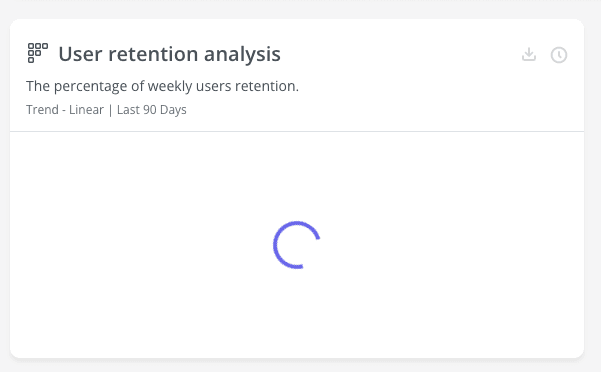
- Progress indicators: This includes spinners, loading bars, or percentage counters. They communicate to the user that progress is happening and may give them an idea of how long they need to wait.
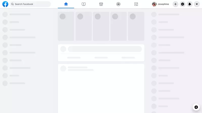
- Skeleton screens: These are preloaded assets that make the user feel like the page is getting prepared. It’s particularly helpful for pages where the loading time isn’t too long.
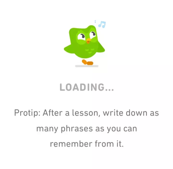
- Microcopy: These are short messages to reassure users that the progress is going well and to set the right expectations. They often inform users of the purpose of loading, which makes it easier for users to tolerate longer waiting times.

You can combine all these elements depending on how they fit your product’s UI. For example, many companies use a skeleton screen combined with a loading spinner or microcopy. The more uncertainty you can remove from loading times, the better.
Turning waiting into engagement with other loading elements
Apart from progress signals, consider adding engagement elements. They come in handy when the expected loading times are long, keeping users’ attention on the product.
Here are some of the engagement elements I use:
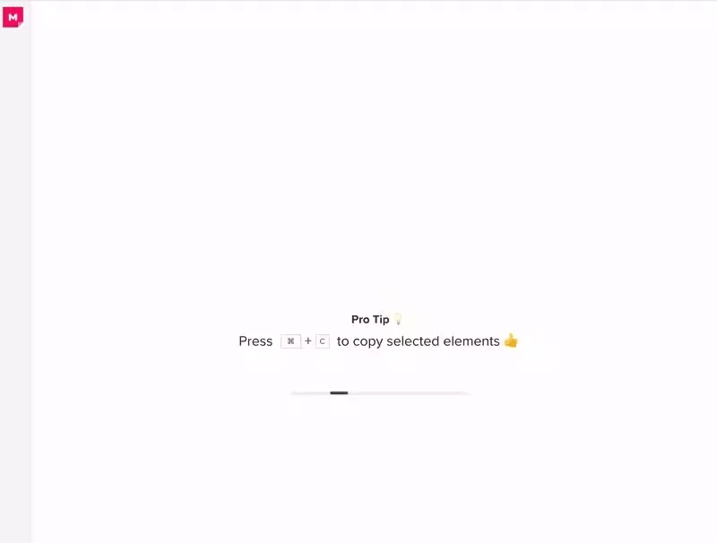
- Contextual tips: Instead of a generic message, a relevant tip about the loading feature or app usage makes the user more prepared to take full advantage of the product. It’s a great opportunity for contextual in-app guidance, since you’re educating the users in the right place and right time.
- Brief explanations: If the loading feature is particularly complex, a short animation or text explaining what the users can expect next reduces friction. I’d consider turning the loading screen into an in-app tutorial to drive product adoption.
- Storytelling: Depending on your branding, a mini-narrative or interesting fact related to your product can delight the users and turn waiting times into a positive product experience.


- Micro-interactions: Micro-interactions mostly involve animations, mouse-over effects, or other dynamic elements. They improve the user experience by drawing attention, supporting the branding, and introducing an element of interactivity.
How to measure and improve your loading screen?
Like with any other aspect of product design, you can’t just set up a loading screen and forget about it.
That’s why I rely on product analytics to track user behavior and ensure the loading screens don’t create friction. Here’s what I measure:
Track actual loading times
The first performance metric you should measure is loading times.
Growing loading times can reveal issues with the product design. Additionally, knowing the average waiting time can inform the design of a loading screen that fits your product.
If the waiting is short, simple progress signals are sufficient. But if the users need to wait more than a few seconds, I’d get more creative with engaging elements.
Check session replays to see how users interact with loading screens
My favorite tool for improving loading screens is session replays. They help me see exactly how users engage with interactive elements, or monitor if they start rage clicking after a specific amount of time.
When watching replays, I learn what users are doing when the loading screen is on. This way, I can determine if the screen is doing its job and what parts of it could be improved.
Also, I can spot “thrashed cursor” scenes, where users hover the mouse wildly out of impatience or confusion. This often occurs as a result of dead clicks, but can also happen when loading times are too long and users click around out of frustration.
Discover user sentiment with in-app surveys
Another way to measure the effectiveness of loading screens is through in-app surveys.
To do this, trigger a microsurvey right after a loading screen finishes or after the user completes the related task. I’d then ask them how they feel about the waiting experience.
This way, you’ll be able to read how users feel about your product and validate that your loading screen is fulfilling its purpose.
Make the best out of your loading screen to boost the product experience
An effective loading screen is far from being a placeholder. It’s an often overlooked opportunity for providing a more engaging user experience.
If you apply the best design principles and monitor the performance of your loading screens, you can reduce drop-offs, improve user sentiment, and even avoid churn.
About the author