12 Micro-Interaction Examples That Reshape User Behavior in 2026


When micro-interactions break, nothing tells the user what went wrong. A missing loading state, an unconfirmed click, or an incomplete form that stays silent until they click submit. None of these give users an explicit error, yet the user quietly stops trusting the product a little more each time without being able to pin down the reason why. That silent erosion can compound into a significant driver of churn. The user who never came back didn’t file a ticket or leave a review explaining what happened, and neither you nor your analytics dashboard ever found out why.
Micro-interactions are moments meant to connect a user action to the corresponding system response. That moment could come in the form of a button that ripples, a bar that fills, or a dot that pulses.
Every micro-interaction does one of four jobs:
- Giving instant feedback.
- Showing system status.
- Reducing errors.
- Humanizing products.
The 12 micro-interaction examples below are organized around those four jobs so you can learn from them and apply those lessons to your own product moments.

Instant feedback micro-interaction examples
The job of feedback micro-interactions is to close the loop between a user’s action and the resulting confirmation before they start wondering if anything happened. This has a larger impact on user engagement than most teams realize, because uncertainty about whether a click landed is one of the fastest ways to make a product feel unreliable or clunky. Every example below answers the same question of “Did that work?” in under half a second.
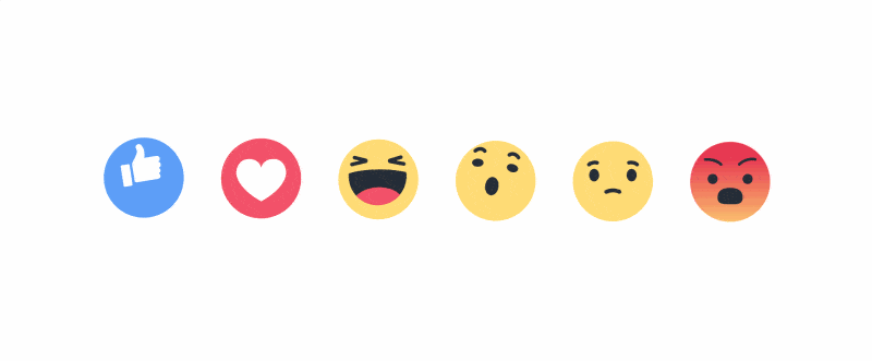
1. Facebook’s tap-and-hold emoji spectrum
Holding Facebook’s like button reveals a variety of animated emojis to choose from. A single tap or click still likes the post, so user experience isn’t needlessly complicated by the micro-interaction. The interaction extends a trivial action into a personalized choice that rewards engagement.
2. Hootsuite’s magnetic hover cards
When a user hovers over a card, it jumps slightly towards the cursor as if a magnet were pulling it forward. The sole job of this interaction is to confirm that the element is clickable without requiring a label or color change, just motion. In a dense dashboard, non-obvious interactive elements can cause hesitation and rage clicks. One hover animation removes both by hinting at which elements are clickable without having to say it outright.
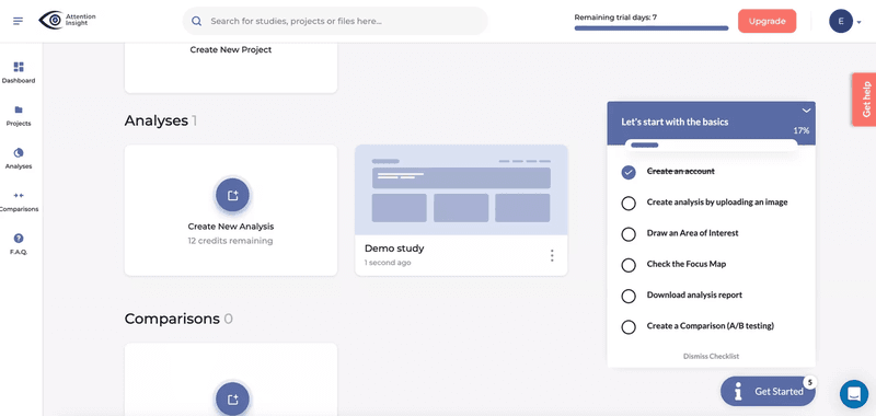
3. Attention Insight’s real-time checklist progress bar
Attention Insight used Userpilot to build an onboarding checklist with a progress bar that updates in real time as users complete each step, with new-user activation climbing by 47% as a result. The bar communicates progress towards completion without forcing the user to count steps. The closer someone gets to 100%, the stronger the urge to finish becomes. It’s the Zeigarnik effect implemented as a micro-interaction, with feedback that not only confirms what happened but also motivates users to complete the next task.
System status micro-interaction examples
The job of system status micro-interactions is to prevent users from interpreting silence as failure. The Nielsen Norman Group lists visibility of system status as one of the most commonly violated usability heuristics, with most products failing it due to an outright lack of implementation rather than bad design. Every example in this section tells users whether anything is happening, reassuring them that neither the product nor their browser has frozen.
4. Google Assistant’s listening dots
Floating dots appear the moment a user says “Hey Google!” and then transform into a sound wave as soon as they start speaking. The system hears the trigger and then begins processing what comes after. Two states with distinct visuals. That transformation communicates more efficiently than text can without breaking the voice-first flow.

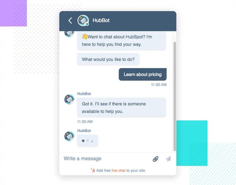
5. HubSpot’s typing indicator
Three bouncing dots appear as soon as HubSpot’s chatbot starts composing a reply. Most users won’t consciously register this detail, but its absence would make the gap between sending a message and getting a response feel like the product had stalled for an extended period of time.
6. Userpilot’s Chrome extension preloader
Userpilot’s Chrome extension does complex processing under the hood, meaning loading can take a moment. Instead of making users stare at a blank screen, it shows an animated banner at the bottom confirming that the selected activity is still in progress. An acknowledged wait feels shorter and eases stress by confirming that the product isn’t stuck in an infinite loop.
Error reduction micro-interaction examples
The job of error-reduction micro-interactions is to catch a mistake before the user commits to it. These are the micro-interactions most teams skip because designing for failure states takes more effort than designing for the happy path. They’re also the ones users feel most viscerally when they’re missing, with forms that won’t tell them what’s missing or deleted file confirmations that don’t offer to revert the deletion.
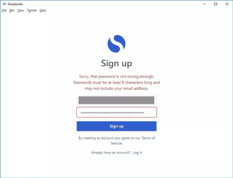
7. Simplenote’s inline password validation
Password requirements in Simplenote update dynamically as the user types, with each rule resolving in real time before the form is submitted. That eliminates the frustration of filling out a form, clicking submit, getting a generic error, and then having to guess which rule was broken. The feedback runs in parallel with the typing to keep the user from reaching the error state.
8. RememBear’s color-coded mascot
RememBear turns its bear mascot red when a password is wrong and green when it’s right. The color change provides both instant feedback and error prevention since the user can see whether their input is correct before hitting enter. While most password managers put that same information in a red border, RememBear encodes it into something the user is already looking at so the error signal doesn’t have to compete for their attention.
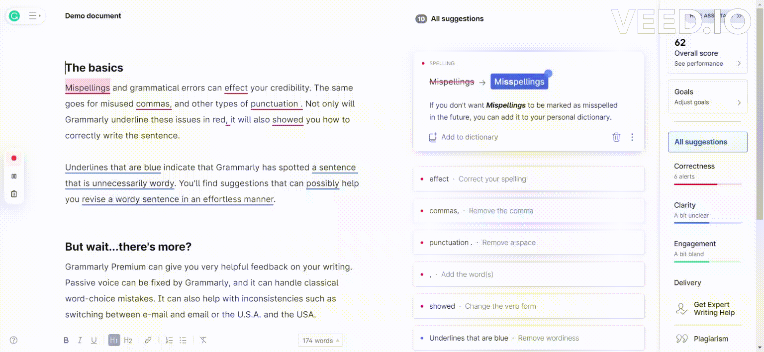
9. Grammarly’s onboarding hotspots
Grammarly uses small pulsing hotspots during onboarding to draw attention to specific features. Clicking a hotspot reveals what the feature does and what to try next. Users who don’t know where to brute force their guesses with rage clicks or give up entirely. The hotspots prevent both types of failure by making the correct next action visually obvious first. The pulsing pattern isn’t an aesthetic choice either, as motion is harder to miss or ignore than a static dot.
Product humanizing micro-interaction examples
These humanizing micro-interactions add product texture that makes it feel like it was crafted by people rather than churned out of a factory. Dan Saffer, author of Microinteractions: Designing with Details, explained why restraint matters more than delight when creating these micro-interactions:
“Microinteractions are an exercise in restraint, in doing as much as possible with as little as possible. Embrace the constraints and focus your attention on doing one thing well. Mies van der Rohe’s mantra of ‘less is more’ should be the microinteraction designer’s mantra as well.”
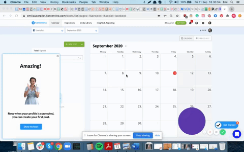
10. Kontentino’s celebratory milestone modal
Kontentino displays an animated celebratory modal when users hit a major onboarding milestone. The delight is functional because it reinforces user behavior and motivates them to continue. It also gets the sequencing right because the animation only appears at genuine milestone moments rather than after every completed step. Overuse would erode the signal fast while annoying users in the process. When used sparingly, it makes the user feel recognized and creates motivation to keep going.
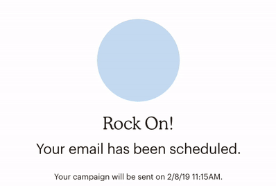
11. Mailchimp’s “Rock on!” confirmation
Mailchimp confirms every scheduled newsletter with the “Rock On!” message, alongside an animated GIF. Writing a newsletter is real work, so finishing the draft and scheduling it is a milestone worth celebrating. A plain “Your email has been scheduled” confirmation would be technically accurate but emotionally flat by comparison. Mailchimp’s version accomplishes the same functional goal while also creating the small, meaningful moments that users screenshot and share.
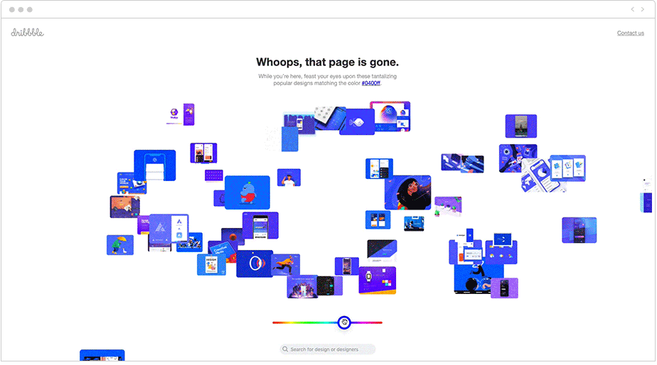
12. Dribbble’s portfolio 404 page
Whenever a user lands on a page that doesn’t exist, Dribbble plays an animation with the 404 error code built from tiny cutouts of the platform’s best design work. In doing so, the micro-interaction turns the failure state into a portfolio plug. The execution also fits the audience, since most of Dribbble’s users are designers and creatives who genuinely enjoy seeing great design work on display. This allows Dribbble to express its brand personality at a moment when most products default to generic apologies.
Five principles to design micro-interactions that work
Across all twelve examples above, there are five decisions that separate the ones that earn their place from those that add motion for motion’s sake. None of these require an entire UX redesign, just asking the right questions to find the best answers.
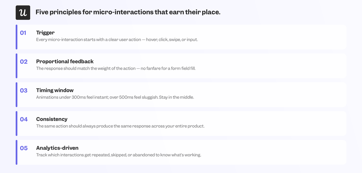
The five principles are:
- Start with the trigger: Name the uncertainty this moment creates for the user, then find the fastest way to resolve it. If you can’t name the uncertainty, the interaction probably isn’t worth adding.
- Make feedback proportional: A destructive action needs more confirmation than a reversible one. Matching a subtle animation to a high-stakes action or an intrusive one to a trivial click will both erode trust, just in different directions.
- Nail the timing window: Google’s open-source Material Design guidelines put comfortable transition durations around 150 to 300 milliseconds (depending on the size of the element/device), as faster would be invisible while slower would feel laggy.
- Build consistent patterns: A pattern the user learns in one part of the product should behave identically everywhere else. Case-by-case motion design asks users to learn a new mental model on every screen, which adds friction that could’ve been easily avoided.
- Use product analytics: The friction points uncovered in product analytics serve as your guide for which micro-interactions to design next, catching problems before users ever file a single support ticket.
Micro-interaction mistakes that cause silent churn
The compounding effect of micro-interactions goes both ways. A justified micro-interaction builds trust one moment at a time, while a misplaced one silently erodes trust with each appearance.
Three micro-interaction mistakes are responsible for most of the damage:
- Animating for its own sake: Motion with no trigger or function trains users to tune out feedback entirely, including later feedback that actually matters.
- Mistiming the response: Venturing outside the 150-millisecond to 300-millisecond window in either direction makes the interaction invisible or laggy.
- Breaking consistency: The same action producing different feedback in different parts of the product undermines the mental model users are building.
Context failures fall into a category of their own and occur when you put the right micro-interactions in the wrong product areas, turning an effective moment into a confusing one.
Turn micro-interactions into trust, not decoration
Users who describe a product as intuitive are usually subconsciously responding to dozens of micro-interactions that removed uncertainty at every step of the way. They never explicitly noticed a single interaction, which is the point of building them subtly but effectively. There’s no neutral option because every micro-interaction either reinforces confidence or introduces doubt. In SaaS, the highest-stakes micro-interactions live inside onboarding flows, where a new user’s confidence either builds or erodes across the first few sessions.
Getting them right is the difference between having a user who activates and one who churns without fully understanding why. If you want to see how Userpilot’s tooltips, checklists, and progress indicators come together, get a demo to see how micro-interactions are built in real time!
About the author