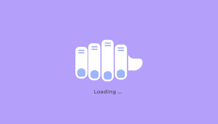
What is a Preloader and How to Use it Right in Your SaaS – Examples and Best Practices


We all know that feeling of impatience when a webpage takes too long to load, or a transaction seems to hang in limbo. Your users experience the same frustration. While delays are sometimes unavoidable, a well-crafted preloader can transform those moments of waiting from frustrating to engaging.
In this article, we’ll delve into the art of preloader design specifically for SaaS products, showcasing best practices and inspiring examples that keep users informed and entertained. Get ready to level up your UX design and make the user experience more enjoyable!
What is a preloader?
A preloader is an animated element that indicates the content is being processed in the background.
It’s your way of telling users, “Hey, our platform hasn’t crashed. The page is loading and will be ready in a few seconds.”
Preloader vs. loading screen vs skeleton screens
Preloaders, loading screens, and skeleton screens all serve a similar purpose in UX design. However, they slightly differ in their implementation and visual presentation.
Understanding these subtle differences helps you make informed decisions about which loading element best suits your UI at any given time.
- Preloaders are typically smaller, often animated, visual elements placed within the main content area of a web page or app. They don’t obstruct the entire screen.
- Loading screens are full-screen overlays that cover the entire content area while the page is loading.
- Skeleton screens are a type of loading screen that shows the page’s structure without its actual content until the server operations finish processing and the data is available to display.
You can combine a skeleton screen with a loading screen if it complements your product design aesthetic. For example, Slack’s loading page consists of an animated feature in the center and a skeleton screen in the background.
What are the benefits of using a preloader?
So why should UI designers bother creating preloaders? There are tons of benefits, but here are some of the major ones.
A preloader gives your product a more professional look
To begin with, a well-designed and creative preloader animation makes a good initial impression on the user.
It shows the user your commitment to delivering high-quality product experiences and that you don’t leave any stone unturned.
If the preloader is designed with adequate attention to detail, your users will be more inclined to believe that the rest of the product is of similar quality and wait for the product page to load.
This is particularly important if it’s a first-time user experience.
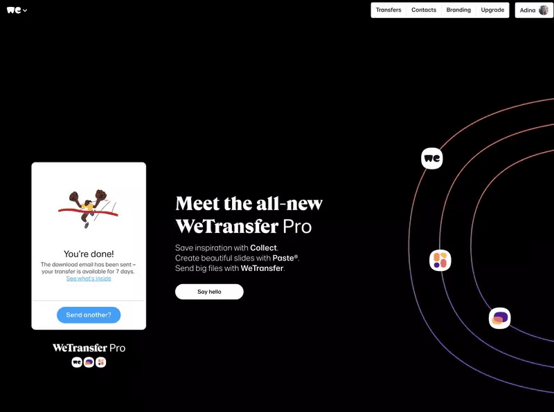
A preloader reinforces branding
Another reason to put effort into designing a brilliant preloading animation is that it can help reinforce your branding and product positioning.
Rather than just keep customers waiting, use that short window to reference your product’s core features, characteristics, or benefits through an effective microcopy on the loading page screen.
For example, WeTransfer uses its loading page to promote the Pro plan and increase free-to-paid conversion.
A preloader can reduce the bounce rate
Research shows that human attention spans are decreasing. The current attention span is around 8 seconds, and that has tremendous implications for digital products.
Preloaders give users a reason to hang around and not leave the app until the page opens, and they can go on with their workflow.
No matter if you use simple or complex animations as your preloader, these will have a good impact on decreasing the bounce rate by reassuring users that your app is still working and that there may be an end to their wait.
Of course, if your product is poorly designed and the loading times are horrendous, even the most creative loading screen or preloader isn’t going to make much difference.

5 Best practices for creating good preloaders
Now that you’re convinced of the importance of designing preloaders, let’s go over a few best practices to help you get the best results.
1. Go beyond the basics and design an appealing custom animation
Most companies have been choosing to stick with the basic spinning wheel—a simple CSS animation that confirms to the user that the app is being loaded.
This is a safe option when your end-users might have slow internet connections or your app has limited processing power.

However, with more and more users getting powerful devices and faster internet speeds, it’s worth considering using complex animations, such as those that incorporate your brand’s colors or tell a mini-story related to your app’s purpose.
A well-designed loading animation creates a more enjoyable waiting experience for your users. Don’t underestimate its power—it can make all the difference in user perception and engagement.

2. Incorporate progress indicators into your preloader
Uncertainty breeds impatience. Showing progress helps manage user expectations and reduces perceived wait times.
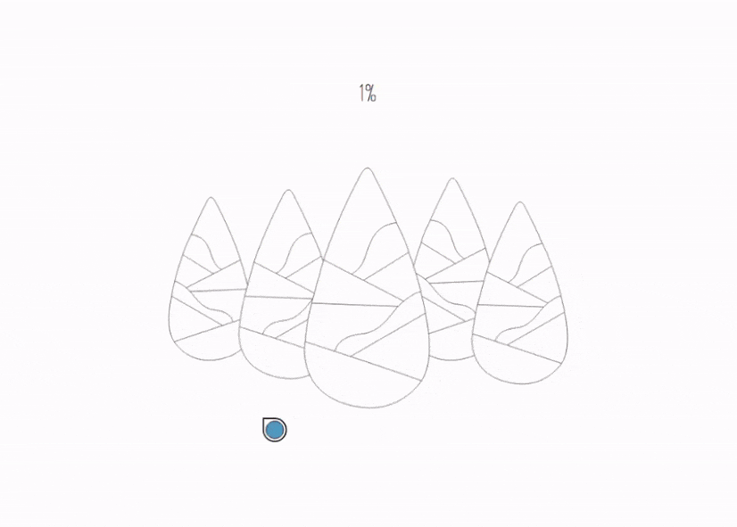
The most common tool here is a basic progress bar. It’s classic, and it works. You can also go for something more creative and engaging, like percentage indicators or step-by-step visuals.

3. Clearly communicate the reasons for the waiting via microcopy
Waiting is easier to bear if you know what you’re waiting for.
That is why including information about what is going on in your app or website preloader may help your case.
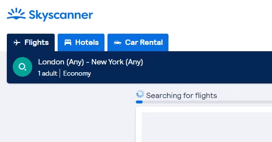
For example, Skyscanner displays “Searching for flights” to communicate that the platform is processing data. This eliminates confusion and helps the user to be patient.
4. Use the preloader to educate your audience about the product
Loading pages present an opportunity to educate your users. You could share interesting trivia related to your industry, remind of your value proposition or provide useful tips and tricks for using your tool.
By offering valuable information during the loading process, you can help users get more out of your product, potentially leading to increased adoption and retention.
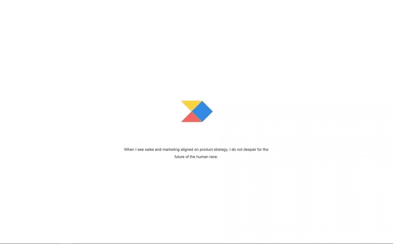
5. Use your preloader to inspire and motivate users
Including a motivational quote may not necessarily be enough to change users’ lives, but it will definitely take their minds off waiting for a few seconds and put them in a good mood.
You could even tailor these to your user persona as Productboard does:
14 Great preloader examples to inspire you
Ready to see more real-life examples from thriving brands? Here are 14 more:
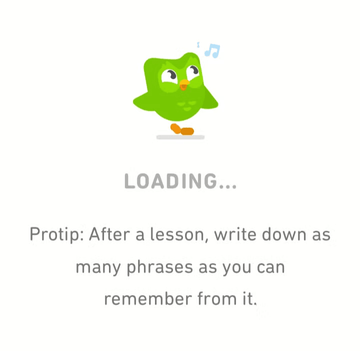
Duolingo loading animation
Duolingo, the language learning app, has built a preloader that serves a few functions.
The preloader’s animation may not be the most complex one (it’s still better than a spinner), but it does a good job of reinforcing the branding and product positioning through simple messages.
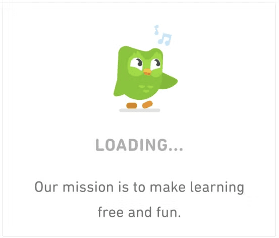
The slogans also inspire and motivate their learners to keep learning, driving repeated usage of the app.
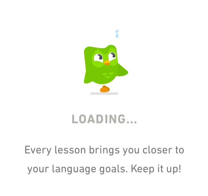
They make the time pass faster by entertaining them with interesting facts about how their app helps.
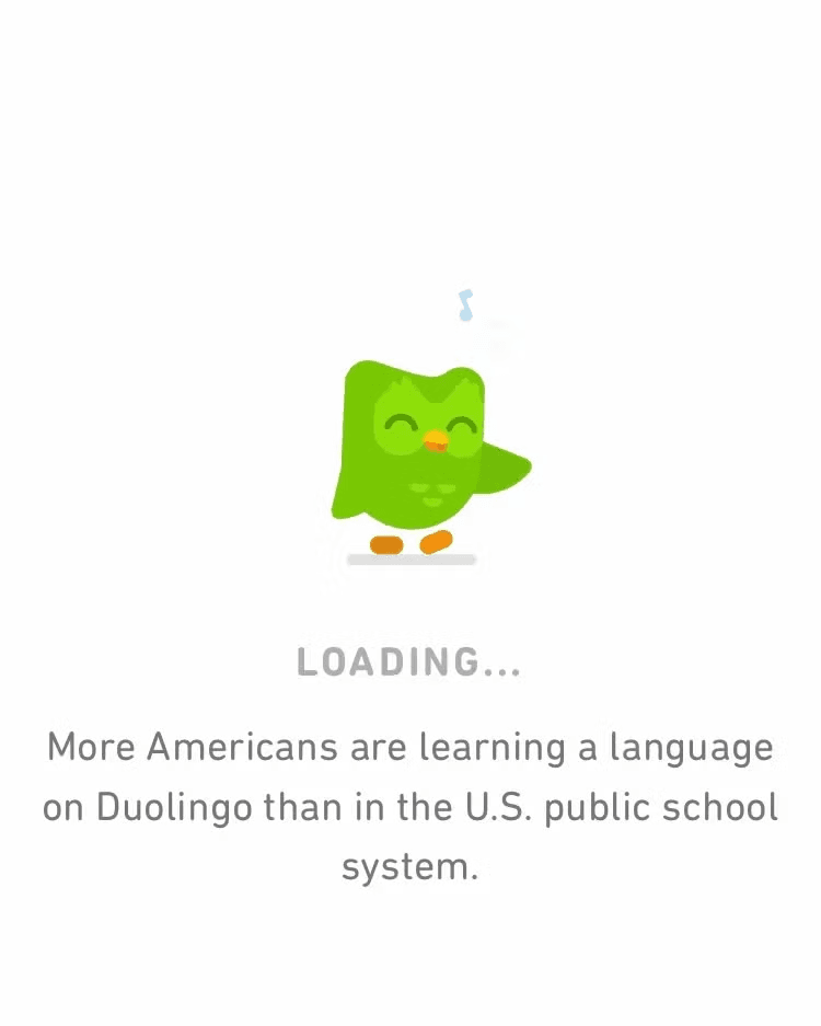
Finally, they educate users on how to develop good learning habits and progress their learning. If learners are successful, their loyalty will grow, and so will the app’s user retention.
Hinge
The dating app opted for simplicity with its preloader. It created a clean, minimalist design with the Hinge logo subtly incorporated into a smoothly rotating wheel. This straightforward approach helps confirm that the app is working while also reinforcing brand recognition during the loading process.
The subtle animation creates a sense of anticipation, hinting at the exciting possibilities that await users once the app is fully loaded.
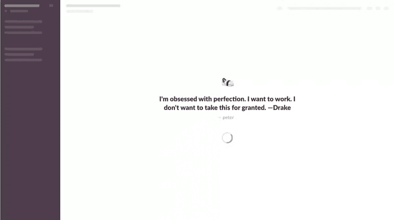
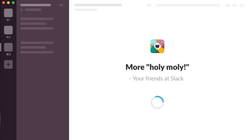
Slack
Slack’s custom preloader cleverly integrates Slack’s brand colors as well as the logo of the organization using it.
The platform uses tongue-in-cheek status updates, like the one in the image below, to entertain users during the wait.
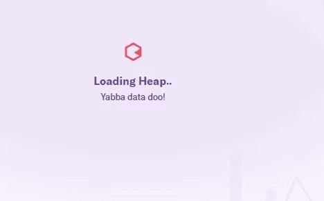
Heap
Heap’s preloader leverages a pun on the classic Flintstones line, “Yabba Dabba Doo,” to playfully highlight their focus on data—”Yabba Data Doo!” This tactic entertains users and also serves to remind them of the product value.
In addition to the humorous pun, the preloader includes a loading message that keeps users informed about the progress, manages expectations, and reduces any potential frustration during the wait.
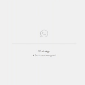
There’s nothing fancy about WhatsApp’s web app preloader, and yet it ticks a couple of boxes:
- The prominently displayed app icon reinforces brand recognition.
- The preloader uses a progress bar to set clear expectations.
- WhatsApp leverages the loading screen to highlight its key positioning factor: end-to-end encryption.
Figma
Figma’s preloader has a dynamic progress bar that changes color as loading advances—a smart way to help users estimate the remaining wait time.
The preloader is used in conjunction with the skeleton screen, which gradually reveals the page structure as elements become available. This combination helps users visualize the upcoming content and reduces the perception of waiting.

Kokopako
Who said that a preloader needs to be a standalone animation that goes away once the product page or website has loaded?
Kokopako’s website loading animation preloader is a great example of counter-trend ingenuity.
What looks like a preloader (and it serves the purpose of one) is actually part of the website:

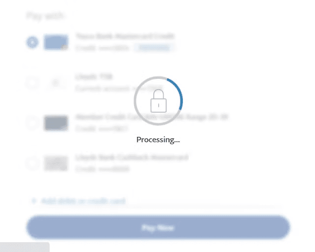
Paypal
Paypal’s preloader combines the classic spinner wheel with a padlock icon, visually communicating their commitment to security during transactions. The accompanying “Processing…” message helps keep users informed and engaged.
The blurred background serves as a skeleton page, letting the user know what’s being loaded while they wait.
Stained Glass
The preloader on the Stained Glass site is a captivating masterpiece that blends functionality and artistry.
As it loads, site visitors are treated to an interactive stained glass window that gradually fills with vibrant colors, visually representing the loading progress. But this preloader goes beyond mere aesthetics; it actively engages users by inviting them to participate in the coloring process, transforming the wait into a delightful and creative user experience.
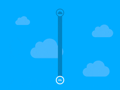
Vertical progress bar by Ben Mettler
Ben Mettler’s vertical progress bar is a visually striking example of how preloaders can remind users of a product’s core value. The bar’s upward movement, coupled with the cloud imagery, symbolizes the uploading process commonly associated with cloud storage apps.
The vertical orientation also allows for efficient use of screen space, especially on mobile devices where horizontal space is limited.
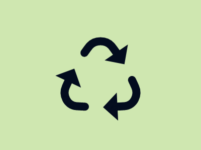
Recycle Spinner by SVGator
This recycle spinner preloader by SVGator is an engaging and symbolic design that perfectly embodies the concept of sustainability. As the page loads, three rotating arrows, forming the iconic recycling symbol, create a dynamic and mesmerizing animation.
The design is particularly suited for eco-friendly or sustainability-focused applications.
MemeChat messenger
MemeChat is an app for creating viral memes, and the platform’s preloader captures its lighthearted and humorous spirit.
A playful animation featuring popular memes or quirky characters keeps users entertained while they wait for the app to load:

Сreative Сruise
Creative Cruise is one of the biggest events in Amsterdam’s creative industry. Its website loader uses whimsical and imaginative animations to give visitors a taste of the event’s creative atmosphere.
In the example below, a 3D character playfully floats amidst a calming blue backdrop accompanied by a percentage indicator.
Waiting and finger-tapping
This site loader takes acknowledging the user’s wait to a new level.
It captures the universal experience of impatient waiting through a simple yet relatable animation of finger-tapping. The animation creates a sense of shared experience that encourages users to wait a little longer.
Conclusion
A preloader is more than just a waiting screen; it’s an opportunity to engage users, reinforce your brand, and enhance their overall experience.
Ready to go beyond the preloader and create a truly exceptional user experience? Userpilot makes it easy to build interactive in-app guidance like tooltips and walkthroughs, ensuring your users get the most out of your product.
Book a demo today and discover how Userpilot can elevate your user experience.
About the author


![What are Release Notes? Definition, Best Practices & Examples [+ Release Note Template] cover](https://blog-static.userpilot.com/blog/wp-content/uploads/2026/02/what-are-release-notes-definition-best-practices-examples-release-note-template_1b727da8d60969c39acdb09f617eb616_2000-1024x670.png)
