New Product Announcement Examples That Drive Adoption in 2026


If you are searching for new product announcement examples, you almost certainly already have a feature ready to launch. That is the easy part. The hard part, and the reason you are here, is getting users to adopt it.
The data confirms the struggle is real. Most SaaS teams roll out a new feature and see only 20 to 30% of users adopt it within the first 30 days. Userpilot’s own benchmark across 547+ SaaS products puts the average core feature adoption rate even lower, at just 24.5%.
A product announcement is the bridge between shipping a feature and getting it used, so a good one closes that adoption gap and a weak one widens it. This is not a press release roundup, and it skips social media buzz, because the channels that move feature adoption are email, in-app, and mobile.
I wanted to write something more useful than a gallery of pretty screenshots. So this guide walks through real product announcement examples across all three channels, and breaks down what specifically makes each one drive adoption.
Product launch email announcement examples
Email is still the workhorse for reaching users who are not logged in right now. Here are four product launch emails that earn the click and, more usefully, the adoption that should follow it.
Typeform: email announcement for a product relaunch
Typeform announced its relaunch with an email that reintroduces the platform as a next-generation form builder. Instead of listing individual updates, the email shows how the product helps users generate leads, gather market insights, and collect customer feedback.
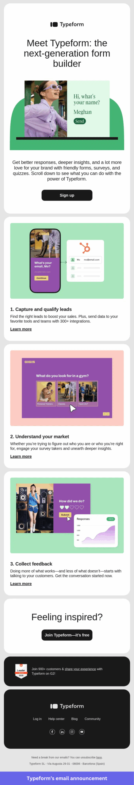
- Outcomes before features: The messaging leads with what readers can achieve, so they grasp the payoff before any specific capability shows up.
- Built around jobs: Each section maps to a real use case, framing the announcement around the work customers actually want done.
- Visuals tied to every benefit: Each use case is paired with a product preview, which connects the benefit to the experience inside the platform.
- Multiple ways in: Readers can explore the use case most relevant to them without wading through the rest of the announcement.
Takeaway: Reach for this approach when relaunching a product that serves several use cases or audiences. Organizing the announcement around customer goals makes it easier for readers to see how the update applies to them.
Fellow: Email announcement for an AI assistant release
Fellow introduced its Ask Fellow AI assistant with an email built around tasks: preparing for meetings, tracking action items, and handling follow-ups. Rather than explaining the technology behind it, the announcement shows what users can get done.
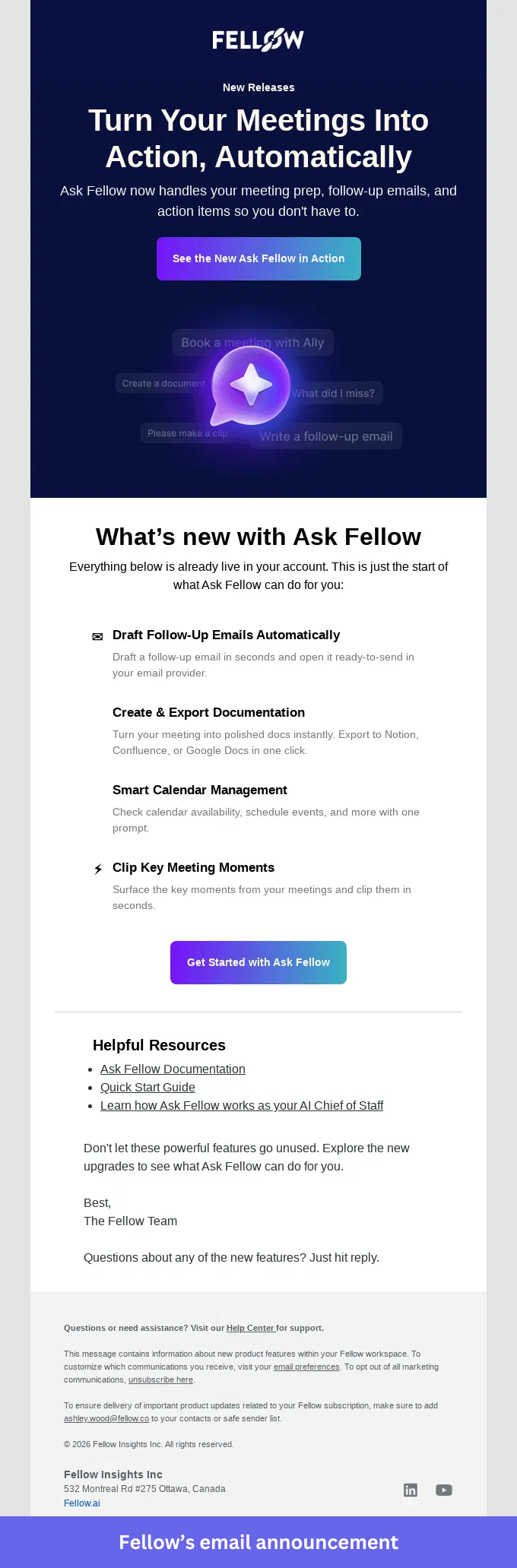
- Real prompts: Examples like “Write a follow-up email” and “What did I miss?” let readers picture exactly how they would use the assistant.
- No ambiguity about next steps: The email states the feature is already live in the user’s account, which makes the next action obvious.
- More than one path forward: Readers can watch a demo to learn more or jump straight into using the feature.
- Value over terminology: Instead of leading with AI jargon, Fellow shows how the assistant handles common meeting tasks.
Takeaway: When announcing an AI feature, lead with real use cases instead of technical capabilities. Showing what users can do usually explains the value more clearly than describing how the technology works.
Browserbase: Email announcement for a platform expansion
Browserbase announced its shift from browser infrastructure to a broader platform for building, deploying, and scaling browser agents. The email introduces the expanded offering and spells out what the change means for existing customers.
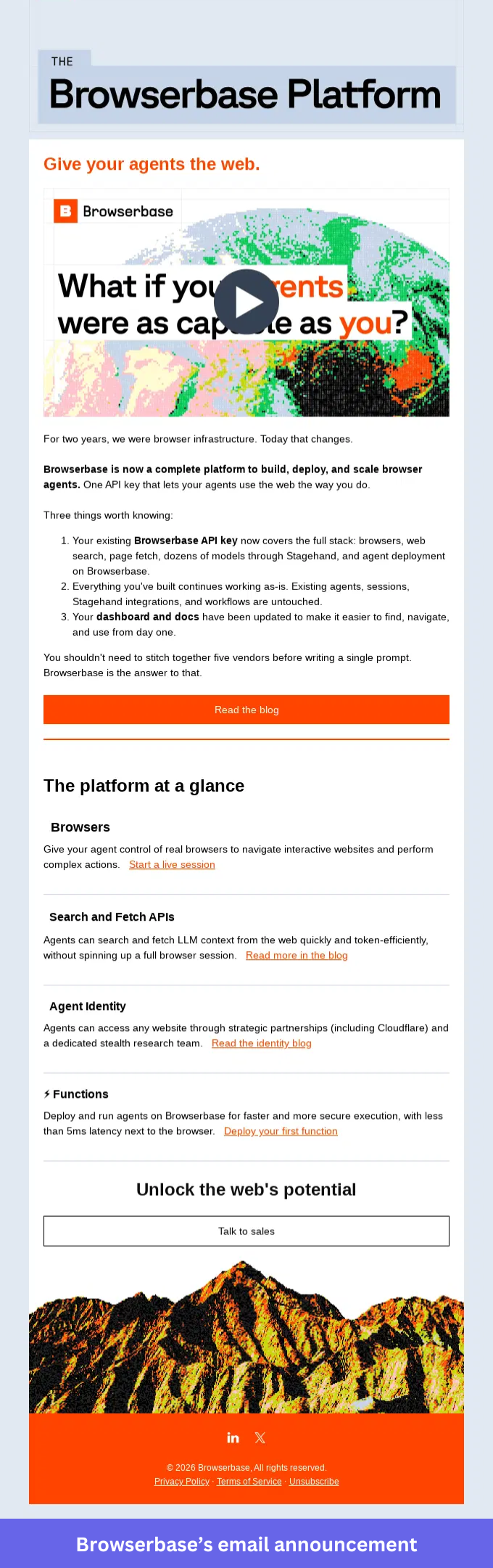
- A clear statement of what is changing: Browserbase opens with its move from infrastructure provider to platform, so readers see this is more than a routine update.
- Early reassurance for current users: The email confirms that existing integrations, workflows, and API access stay the same, so customers know nothing breaks.
- Distinct, scannable sections: Each part of the platform gets its own description, which lets readers focus on the capabilities relevant to them.
- Resources where you need them: Dedicated links sit beside each section, so users can dig into a specific area without hunting through the whole email.
Takeaway: Use this approach for a platform expansion or major product evolution. Explain what is new, but also clarify how the change affects current customers and what they should do next.
Loom: Email announcement for a batched feature release
Loom announced four new PRO features in a single email: Video Inline Comments, Custom Access, Video Duplication, and Do Not Disturb. Instead of four separate sends, Loom grouped them into one release and gave each feature its own section.
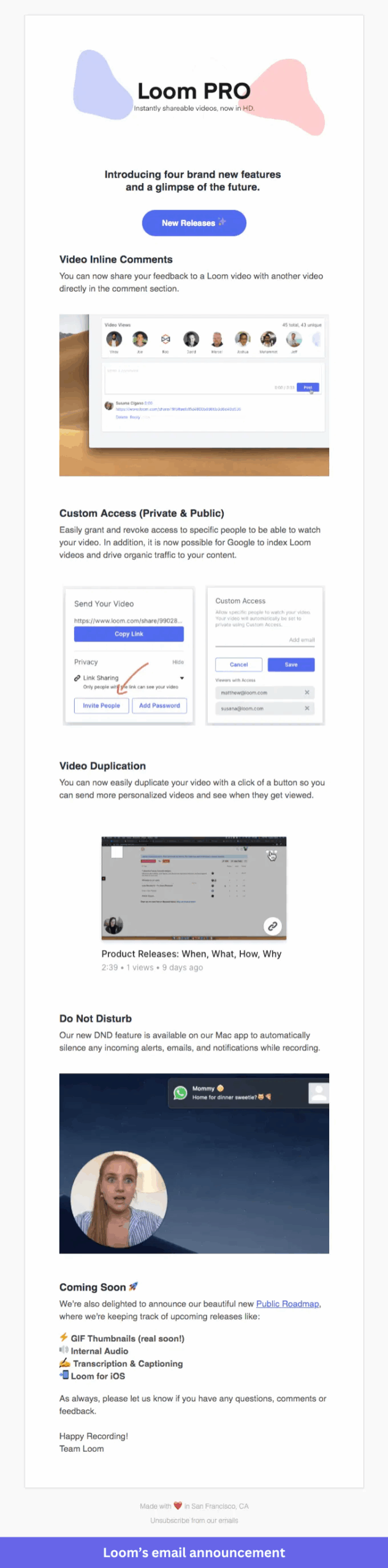
- Expectations set up front: Readers know they are about to see several updates before they start scrolling.
- Room for each feature: Separate sections keep the announcement from reading like one long list.
- Visuals for every release: Screenshots and demo images show what each feature does and where it appears in the product.
- A roadmap teaser: A short “Coming Soon” section gives users visibility into what the team is shipping next.
Takeaway: Use this when you are releasing several related features in the same cycle. Grouping them keeps users informed without filling their inbox with separate update emails.
In-app feature announcement examples
When adoption is the goal, in-app announcements are hard to beat. They appear while users are in the product, right where the new feature lives. These four examples put the message next to the thing it describes.
Zapier: In-app announcement for an AI generation feature
Zapier introduced a feature that generates canvases and notes from assets stored in a folder. The announcement appears inside the product and explains where users can find the new functionality and what it produces.
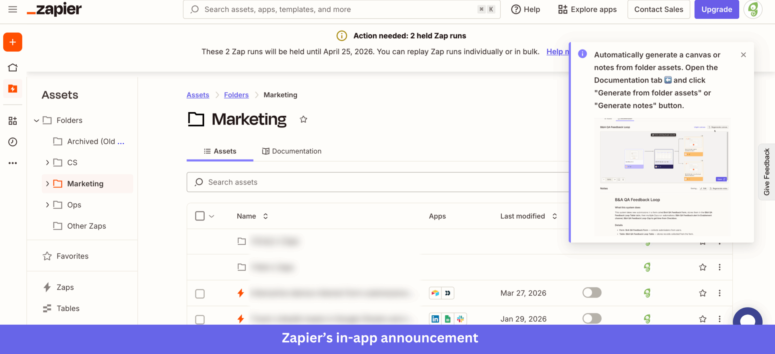
- A clear location: The announcement points to the Documentation tab, so users find the feature without searching the interface.
- Outcome over button: Rather than highlighting a menu item, Zapier previews the generated canvas and notes that users will receive.
- Shown in context: Because it sits beside the workspace instead of covering it, users can explore the update while staying on task.
- Easy to dismiss: Readers close it when they are ready, which keeps the message informative without feeling intrusive.
Takeaway: Discovery gets much easier when users can see both where a feature lives and what it produces. For updates tucked inside tabs or secondary screens, an in-app announcement bridges the gap between release and adoption.
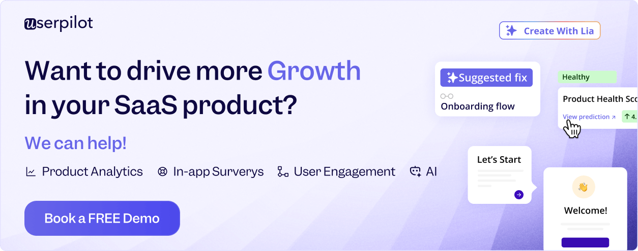
Userpilot: In-app announcement for a new question type
At Userpilot, we introduced Single Input, a survey question type that accepts text, numbers, dates, and email addresses. The announcement appears inside the survey builder and explains how teams can turn responses into user properties.
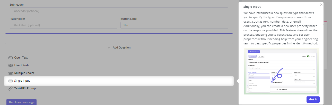
- The feature is visible while you read about it: The slideout appears alongside the survey builder, with Single Input highlighted in the question-type menu.
- Capability and use case together: Users learn what the new question type does and how it supports data collection inside their workflows.
- An annotated screenshot: A visual callout points to the Create Property setting, so users quickly spot the configuration that unlocks the value.
- Tied to the workflow: Because the announcement appears inside the survey builder, users explore the feature without switching screens or digging through documentation.
Takeaway: Announcements for features hidden inside menus, dropdowns, or settings should sit as close to the feature as possible. When users can see the update and its location at the same time, discovery becomes far simpler.
Figma: In-app announcement for a major product redesign
Figma introduced UI3 with a modal that appears when users open the product. It frames the redesign as a new Figma experience and invites users to explore the updated interface through a guided tour.
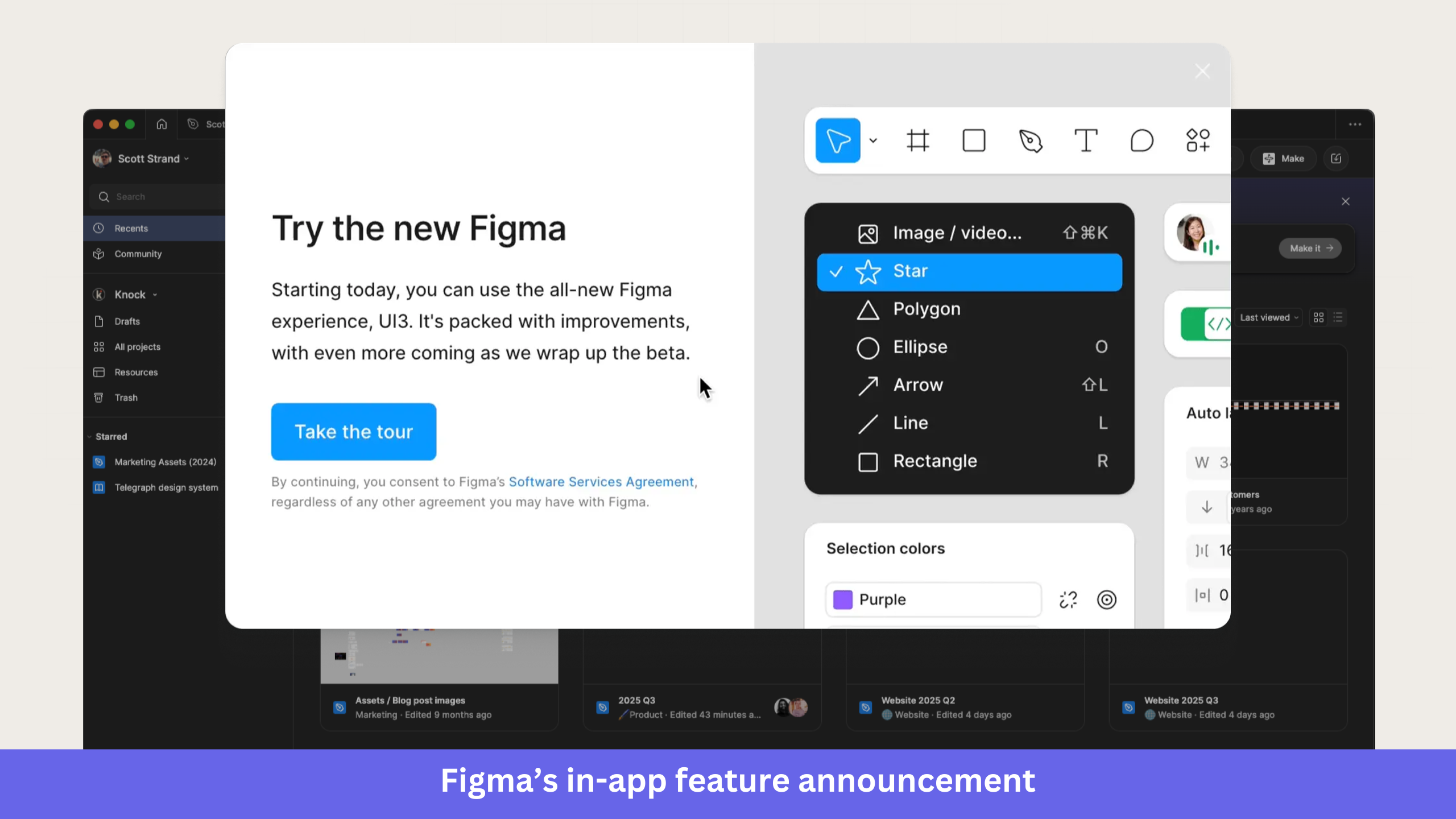
- Scale set immediately: Terms like “new Figma” and “UI3” signal a redesigned experience rather than a small update.
- One clear next step: The modal directs users to the tour instead of offering competing actions or destinations.
- A guided tour for discovery: Users learn where key tools and workflows now live inside the updated interface.
- Details kept in view: Information about the updated agreement appears inside the modal, so users can review it without opening another screen.
Takeaway: Major redesigns deserve a different playbook than routine feature releases. When an update changes how users navigate the product, a guided introduction provides context and helps them get comfortable fast.
Segment: In-app announcement for two beta features
Segment announced Profiles Sync and Reverse ETL via an in-app modal, introducing both as part of a beta release. It pairs a visual overview with a short explanation of how data moves between Segment and downstream tools.
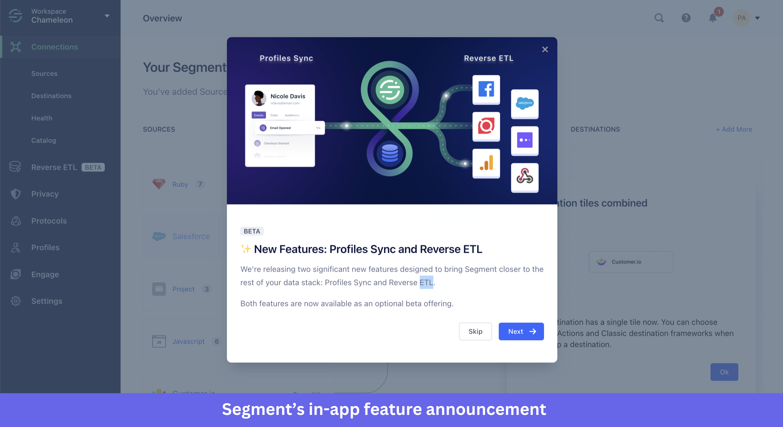
- An illustration that shows the relationship: Users can see how data flows from Profiles Sync into Reverse ETL and on to connected destinations before they read the supporting copy.
- Honest about maturity: A BETA label and supporting text set expectations that the features are still early and require opting in.
- Focused on the workflow: Rather than describing each capability in isolation, Segment shows how the two work together as part of a broader data process.
- User in control: The modal lets users keep exploring or dismiss the announcement, so they decide how to engage with the release.
Takeaway: Beta releases work best with clear expectations. Alongside what the feature does, communicate its availability, maturity, and any action users need to take before they can start.
New product announcement examples via mobile app
Mobile screens leave little room for explanation, so the strongest mobile announcements lean on visuals, pacing, and tight copy. These three examples show different ways to handle that constraint.
Duolingo: Mobile in-app announcement for a new subscription tier
Duolingo introduced Duolingo Max, a premium plan that adds AI-powered features such as Explain My Answer and Roleplay. The announcement combines a pricing screen with feature previews, giving users a clear view of what the new tier includes.
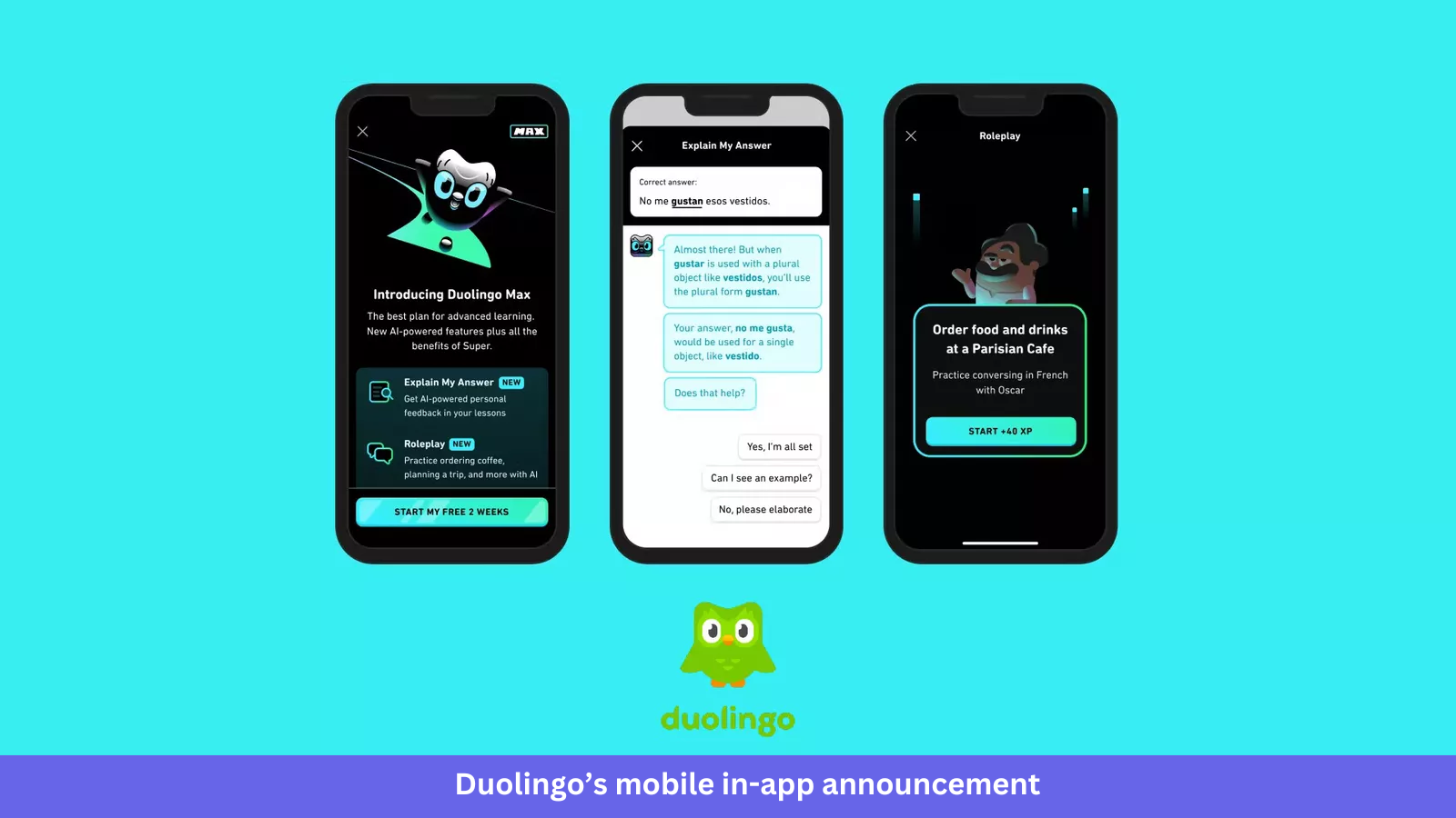
- Positioned within the lineup: The announcement explains that Duolingo Max includes all Super benefits plus extra AI-powered features, so users see where the tier fits.
- Exclusive features flagged: NEW labels mark Explain My Answer and Roleplay, making it easy to spot what is unique to the Max subscription.
- Outcomes, not specs: The copy describes what users can do, such as getting personalised feedback or practising conversations in realistic scenarios.
- Screens that show it working: Dedicated previews show both features in action, so users see the experience before deciding whether to upgrade.
Takeaway: Subscription-tier launches usually need more explanation than a standard feature release. Showing the new capabilities next to the upgrade screen helps users understand what is included and why the higher tier exists.
Headway: Mobile in-app announcement using a carousel
Headway introduced its Spaced Repetition feature via a five-step in-app carousel, featuring the app’s Brainy mascot to explain how it works and where users can find it.
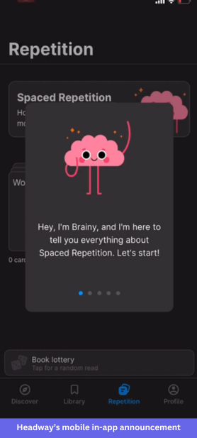
- A consistent voice: Brainy introduces the feature and guides users through each step, which fits Headway’s learning-focused brand.
- Information in small doses: The carousel splits the explanation into sections, so users absorb the concept one step at a time instead of reading a wall of text.
- Progress made visible: Five dots at the bottom of the screen show users how many steps remain in the walkthrough.
- An obvious destination: The Repetition tab stays visible throughout, and the feature card sits behind the carousel, showing users exactly where to go once the walkthrough ends.
Takeaway: Mobile screens cannot hold a long explanation. When a feature needs more context than a single message allows, a short carousel introduces the concept in manageable steps while keeping users oriented inside the app.
The groundwork behind a successful product announcement
Good examples only help if you can turn them into your own product launch plan. Here is how I would prepare for a launch.
One shift worth flagging first: more launches now are AI features, where agentic AI acts on the user’s behalf, so your announcement often has to sell an outcome an agent produces rather than a button to click.
- Define the audience and the job: Start with who you are targeting and the workflow they care about, then map the pain point your feature removes. Your messaging should answer one question for them: what is in it for me?
- Write for outcomes, and show rather than tell: Lead with what users can achieve, and pair every claim with a visual, since images and short demos communicate value faster than text alone.
- Lead with the subject line for email: For email announcements, the subject line carries disproportionate weight, because 47% of recipients decide whether to open based on the subject line alone. Teaser emails and one clear CTA do the rest.
- Default to in-app when adoption is the goal: In-app messaging outperforms other channels for feature adoption because it reaches users in context, at the moment they are most likely to try something new. Use ProductLed’s bowling alley framework as the authoritative reference: hyper-relevant communication delivered at the right moment drives adoption far better than broadcast messaging.
- Orchestrate across channels from one place: For a high-stakes launch, sequence in-app, email, and mobile together. Managing all three in a single tool keeps the message and timing consistent, which is what Userpilot’s platform is built for.
Supercharge your product launch
The best product announcements do not just get opened, they get features adopted, and that comes down to the right message on the right channel at the right moment. Book a Userpilot demo to see how to plan, ship, and measure announcements across in-app, email, and mobile from one platform.
About the author