Rage Clicks: How to Identify and Avoid Them?

Picture this: you’re navigating through an app to complete an urgent task. You click one of the buttons. And nothing happens. You click again. And again. And again. Faster and faster. Click, click, click. And still nothing.
Sounds familiar? If so, you already know what rage clicks are!
In this article, you will learn why they happen, how to use product analytics to find them, and how to optimize the product experience to avoid them.
Let’s dive right in.
What are rage clicks?
Rage clicking happens when a user repeatedly clicks on a web page or app screen element, for example, because it isn’t responding as they expect it.
It’s like frantically pushing an elevator button when the doors don’t open immediately, or whacking the side of a vending machine time after time because it doesn’t dispense your snack.
This kind of user behavior is a clear sign of their frustration with a suboptimal digital experience.
The user can’t complete their job, and it brings negative feelings. If this happens too often, it negatively affects customer satisfaction and may eventually lead to churn.
Why do rage clicks happen?
Rage clicks are caused by technical and usability issues in your digital product.
Common culprits include:
- Broken links: If the user clicks on them, expecting to be taken to another page, be it internal or external, and nothing happens, they will keep clicking.
- Slow loading times: Users expect the page to respond instantaneously. If your web page takes too long to load, users might resort to repeated clicking, hoping to speed things up.
- Non-responsive interactive elements: Buttons that don’t “click,” sliders that don’t slide, or dropdown menus that don’t drop down are all rage-click magnets.
- Confusing navigation: A clear, intuitive navigation structure is vital. If users feel lost or can’t find what they’re looking for, rage clicks might follow.
3 ways to identify rage clicks
How can you detect rage clicks? Let’s unpack three main methods.
1. Autocapture
To pick up rage clicks, use an analytics tool that captures all user actions on the webpage or inside the product automatically – manual event tagging won’t fly.
That’s because users often rage-click on unclickable pages or screen elements. You never know where it’s going to happen, so how would you know what events to track?
So, autocapture is a must.

2. Session replay
Another way to detect and analyze rage clicks is by watching user behavior in session replays.
Session replays are recordings of everything the user does on a page or screen – all the cursor moves, hovers, text inputs, taps, and clicks (including rage clicks).
Some tools, like Hotjar, have even rage click filters, so you can quickly find where in the session they happen.
Such recordings give you detailed insights into user interactions with the product UI. You don’t only learn where they rage-click but also often why.

3. Customer feedback surveys
Sometimes, the best way to understand user frustration is to ask users directly. Customer feedback surveys can help you gather qualitative data about user experiences, including instances of rage-clicking.
Consider implementing short, targeted surveys that appear after a user exhibits signs of frustration.
For example, ask, “On a scale of 1-10, how user-friendly do you find the page?” and follow up with an open-ended question for more in-depth insights.

How to avoid customer frustration from rage clicks?
Let’s wrap up by looking at how you can optimize the product experience to avoid issues resulting in rage clicks.
Optimize the UI/UX design of your website or app
A well-designed interface can significantly reduce rage clicks.
Consider these best practices:
- Ensure all interactive elements are clearly distinguishable and they work as intended.
- Maintain consistency in design across your product so that users can quickly learn how to navigate it or where to find information.
- Use familiar patterns that users intuitively understand, like icons, symbols, or emojis.
- Implement a clear visual hierarchy to guide users.
While aesthetics are important, your priority is creating an intuitive and frictionless user experience.
Provide instant feedback when users click on elements
Users often rage-click because they don’t know if their actions have been registered.
To prevent it, provide immediate visual feedback when a user clicks an element. For example, through animated buttons or a link color change.
And I get it: sometimes things take time, and there isn’t much you can do to speed them up. If that’s the case consider adding a loading spinner or progress bar to show the action is happening.
Showing the user that their action was successful can prevent frustration and repeated clicking.

Conduct usability testing to track rage clicks
Regular usability testing can help you identify potential rage-click hotspots before they become a problem for your users.
During the sessions, you normally watch users interact with the product. Depending on your goals, you could give them a specific task to complete or let them explore it on their own. And then interview them about their experience.
Such tests used to be a real pain because they required complex arrangements. Fortunately, these days, you can lean on UX tools to schedule and conduct user sessions.
Many tools, like Hotjar or Fullstory, give you access to a pool of testers who match the characteristics of your target users, so you can even run them before you launch the product.

Conclusion
Rage clicks are valuable signals from your users. By identifying and addressing their root causes, you can significantly improve the product’s UX. This will lead to improved customer satisfaction and, ultimately, better retention.
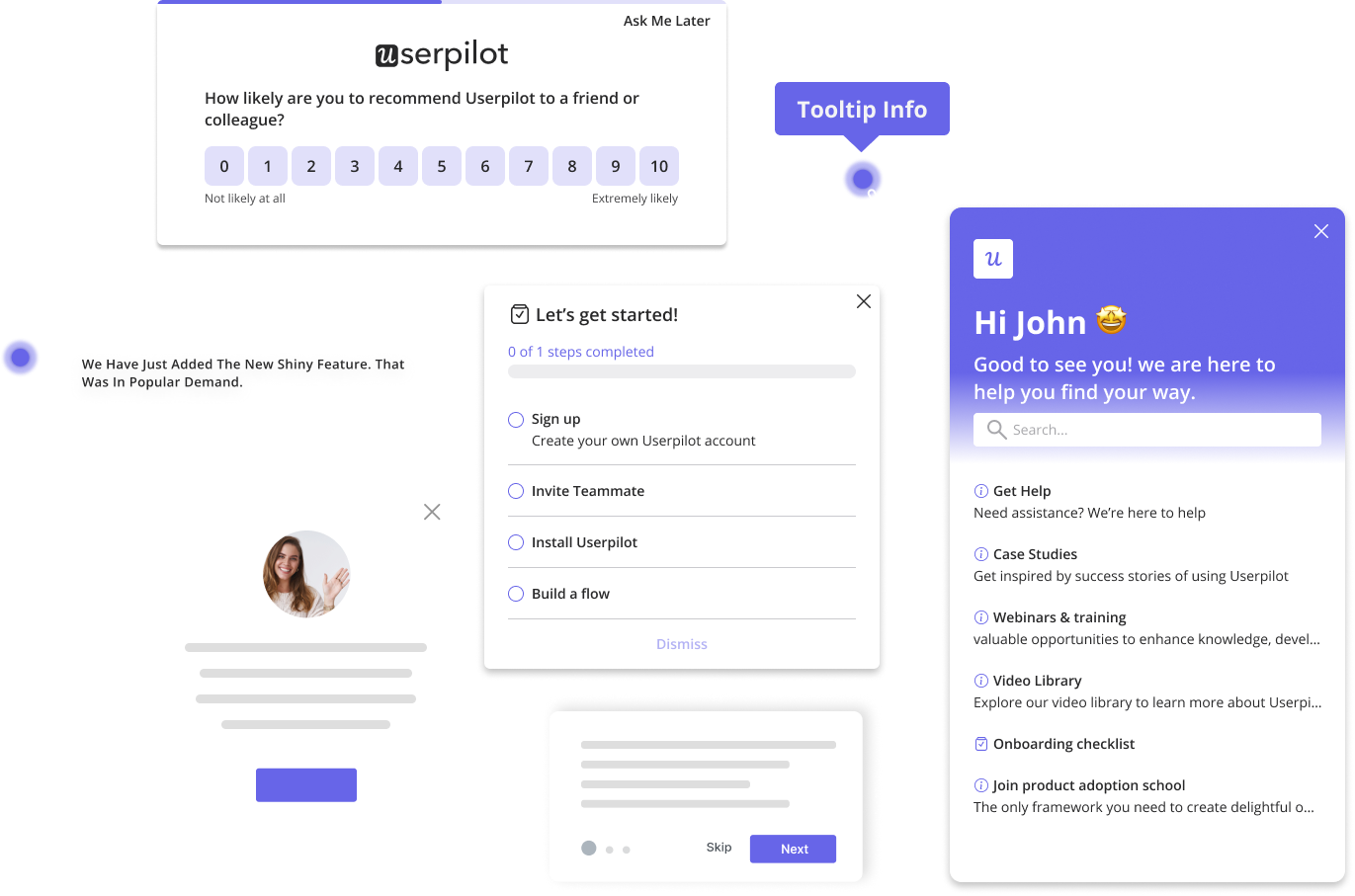
Userpilot is a product growth platform. It allows you to collect customer feedback through in-app surveys and monitor events through autocapture.. You will soon be able to analyze user behavior in session replays, too.
To learn how Userpilot can help you prevent issues leading to rage clicks, book a demo!


