How to Improve Mobile User Experience: 7 Tips from a UX Researcher


Imagine you’re on your mobile phone, trying to find something on a site, and it’s taking forever to load. What do you do? You get annoyed after a few seconds and hit the back button.
I’ve seen how mobile users have zero patience. If your design doesn’t make it ridiculously easy to navigate and get what they need, you’ll lose them in seconds. Users are 5x more likely to abandon a task if your site isn’t mobile-optimized. The difference between web and mobile UX goes beyond just screen size. If your UX designers don’t grasp this, you’ll inevitably end up losing users.
Here are my tips for creating a killer mobile experience that keeps users engaged and encourages them to browse your app.
Mobile app vs. mobile web design vs. desktop version
Each platform demands a unique approach to navigation, interaction, and usability:
- Mobile App: Native mobile apps offer deep integration with the device’s features and provide smooth performance, making them ideal for engaging user-centric designs.
- Mobile Web: Mobile web design is about creating an experience optimized for small screens without compromising a website’s functionality. However, browser limitations constrain it, so interactions might not feel as smooth or responsive as with a native app.
- Desktop Version: The desktop experience usually focuses on more complex interactions and larger displays. There’s more room for content, often resulting in a different design approach to accommodate a more involved, multi-tasking desktop user.
| Native Mobile App | Mobile Web Design | Desktop/Web Version | |
| Performance | Optimized for speed and smooth interaction | Slower compared to native apps due to browser limitations | Fast, with more resources for complex tasks |
| Integration | Seamless with device features (camera, GPS, etc.) | Limited integration with device features | Fully integrated with system capabilities |
| User Experience | Highly intuitive, with native gestures and features | More rigid design, limited by browser functionality | Can handle complex interfaces and multitasking |
| Design Flexibility | Customizable for the device’s specific needs | Must adapt to various browser environments | Flexible design but constrained by screen size |
In this article, we’ll focus on mobile user experience design, discussing optimizing your app design to keep users engaged and ensure smooth, intuitive interactions.
Key components of mobile UX design process
Mobile design demands intensive user research and attention to unique challenges such as smaller screens, limited interaction time, and the need for quick, intuitive navigation.
Here’s what you should keep in mind when creating your mobile app UX design:
- Mobile-Friendly User Interface: Touchscreen devices don’t have the same precision as desktops, so create larger touch targets, finger-friendly navigation, and gestures like swiping and tapping. Mobile interfaces should be simple, with only essential UI elements on each screen, ensuring that mobile users don’t have to search or zoom to find what they need.
- User-Centric Design: Accessibility plays a key role here. Ensure your app or site is usable for people with disabilities (e.g., color contrast and screen reader compatibility). Prioritize easy-to-use interfaces and fast-loading pages and minimize unnecessary steps in the user journey. Ultimately, responsive design ensures higher user satisfaction.
- User Testing: User testing is not just about testing your design’s appearance on one screen size. It’s about understanding how different devices affect usability. Conduct market research and test with focus groups to identify areas where mobile-specific issues might arise, such as load times, navigation difficulties, or touch-related issues.
- Optimization for Mobile Devices: Your mobile app must perform well regardless of the device used. This includes monitoring load speed, touch responsiveness, and minimizing unnecessary bandwidth consumption. Optimizing mobile content helps ensure users don’t wait too long for the page to load, keeping them engaged. Proper optimization provides a smooth experience and higher customer satisfaction.
- A Clean Layout: Ensure buttons and text are legible without zooming and interactive elements are easy to find. This clean layout helps users stay focused and minimizes distractions, allowing them to navigate your app or site without confusion.
How to optimize mobile user experience: 7 best practices
The key to optimizing mobile UX is understanding mobile-first design, eliminating unnecessary clutter, and providing intuitive navigation, personalized experiences, and feedback systems. Here are some mobile UX best practices to follow:
1. Use clear and consistent navigation
A user who struggles to find what they need or feels lost within the app will quickly abandon it. Navigation should be intuitive, simple, and easy to follow, especially considering the smaller screens and varying user behaviors on mobile. A well-designed navigation system reduces friction, allowing users to complete tasks in fewer steps.
Here are some methods for a good mobile navigation system:
- Keep it simple: Limit the number of options on the main menu to avoid overwhelming users.
- Use clear labels: Use straightforward terms to help users understand what each menu item leads to.
- Utilize familiar patterns: Leverage universally understood patterns like the hamburger menu, tab bars, and swipe gestures for navigation.
- Prioritize the most important features: Ensure key actions (e.g., search, home, profile) are easy to access and prominently placed.
2. Use mobile-specific UI patterns for driving engagement
Many web-based UI patterns do not translate well to mobile. On smaller screens, elements that work on a desktop might be cumbersome or difficult to interact with.
To ensure smooth, engaging experiences, you need to use UI patterns tailored for mobile. These patterns are designed for touch interfaces and can boost user engagement by simplifying actions and encouraging exploration.
| UI Pattern | Use Case |
| Mobile Carousels | Great for displaying multiple images or pieces of content in a limited space, engaging users through swipe actions. |
| Slideouts | Allow users to access menus or information by swiping or clicking, saving space and improving accessibility. |
| Push Notifications | Keep users informed or remind them about updates, driving engagement with timely alerts. |
| Surveys | Collect user feedback directly within the app, enhancing engagement and gaining valuable insights. |
3. Deliver personalized experiences with segmentation and localization
Personalization is crucial for creating meaningful interactions with users. You ensure your app resonates with each user by personalizing experiences based on behavior, attributes, and language preferences.
Segmentation makes the experience more relevant and boosts engagement by ensuring users receive content, features, and offers tailored to their needs.
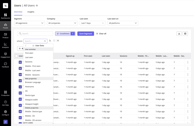
Content localization can help you cater to users from different countries or regions by offering content in their native language and adapting to cultural nuances.
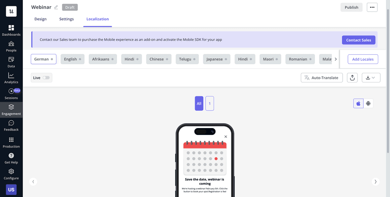
4. Unify web and mobile onboarding for a consistent user experience
Consistency across the web and mobile onboarding creates a smooth transition for users who might engage with your app on different devices.
By unifying onboarding processes, you ensure users encounter the same experience regardless of where they access your app.
Combining onboarding, in-app messaging, push notifications, and feedback can create a seamless experience.
Rather than using multiple tools for different parts of the process, all-in-one platforms allow you to deliver a unified, efficient onboarding experience across all platforms.
5. Understand and optimize user experience by collecting real-time user feedback in-app
To optimize UX, you must first understand your users. Collecting real-time user feedback allows you to gather actionable insights at the right moment: after a user completes a key action or interacts with a feature. This gives you a clear understanding of their experience and where you can improve.
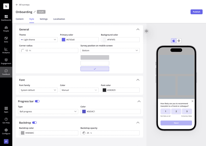
For example, after a user completes a purchase or finishes a task in your app, prompt them with a quick survey asking about their experience.
6. Monitor key metrics for instant insights and optimization
Optimization doesn’t stop at collecting feedback. Tracking key UX metrics that help you understand user behavior and app performance is essential.
Metrics like session duration, bounce rate, conversion rate, and feature adoption can clearly show where your mobile UX may need adjustment.
Having all these metrics in one dashboard makes tracking performance, identifying patterns, and making data-driven decisions for immediate optimization easier.
7. Track mobile app feature adoption and optimize for better results
Low adoption rates for specific features often signal poor user experience. If users aren’t engaging with a feature, it may be due to confusing navigation, poor design, or simply a lack of understanding.
By tracking which parts of your mobile app aren’t adopted, you can use mobile UI patterns, such as slideouts or push notifications, to gently nudge users toward these features and increase engagement.
3 Examples of successful mobile user experiences
Creating a great mobile UX isn’t just about looking good. It’s about keeping users engaged, making them feel understood, and meeting their needs without making them think too hard.
The best mobile apps have figured out how to blend design and functionality to make interactions feel effortless. Let’s dive into three apps that know how to create a user journey that sticks:
1. Headspace: User retention through personalization
Headspace does a brilliant job of making meditation feel like it’s made just for you. From the moment you open the app, it asks a few questions about what you’re looking to achieve, and from there, your journey is tailored.
It shows you personalized meditation sessions, tracks your progress, and even sends reminders to keep you engaged.
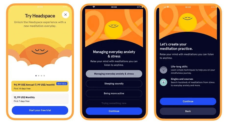
Why We Liked It: The magic of Headspace is in how it keeps everything relevant to the user. It’s not just throwing generic content at you. The app remembers your preferences, adjusts to your use, and pushes content that fits where you’re at. That sense of personalization doesn’t just improve the experience; it keeps users coming back for more, and that’s the key to user retention.
2. N26: Anticipating user needs
Banking apps typically have the worst UX I’ve seen, but not N26.
N26, the digital bank, doesn’t wait for you to check your balance. It anticipates what you need. From real-time transaction alerts to spending recommendations powered by AI, it’s clear that N26 is built with a mobile-first mindset. It makes banking easy and stress-free.
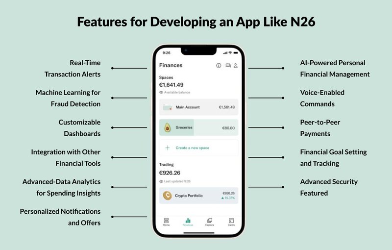
Why We Liked It: N26 stands out because it’s proactive. By anticipating user needs and providing smart suggestions, N26 creates an intuitive banking experience. The app alerts you when your account balance is low or when a transaction happens. It even offers insights into your spending habits.
3. GoodCourse: Centered user experience
GoodCourse is all about making corporate learning easy and effective. It puts the user at the center of everything, with an interface that’s clean, simple, and easy to navigate.
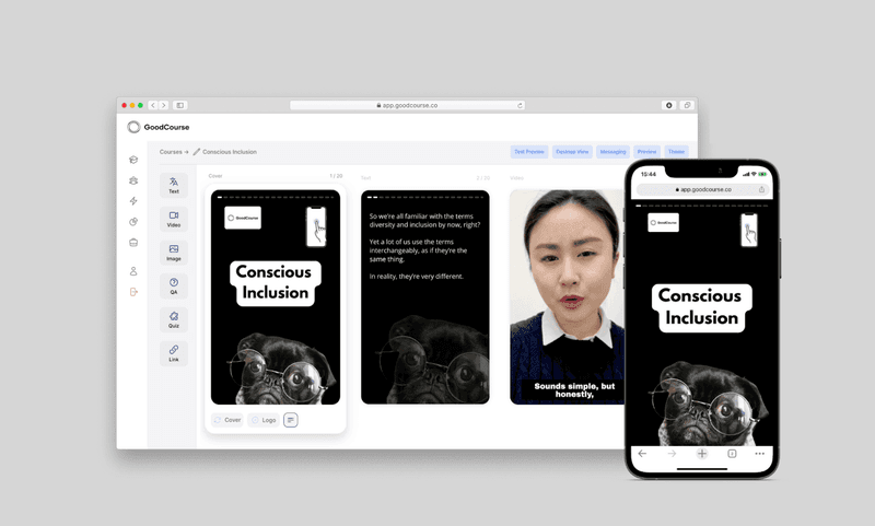
Why We Liked It: GoodCourse gets straight to the point. The app’s flow is clean, and the content is easy to follow, making it simple for users to dive right into their courses. By focusing on the user’s goal, the app removes anything that would slow or confuse them.
Mobile user experience trends to watch
One key trend to watch is the rise of voice user interfaces (VUI).
With voice assistants like Siri, Google Assistant, and Alexa becoming a part of everyday life, it’s no surprise that mobile applications are integrating voice commands as a core part of their functionality. This shift is expected to significantly enhance the mobile UX by providing users with a more hands-free, convenient way to interact with apps.
Along with voice, AI-driven personalization will also become more prevalent. Apps will use AI to better understand user behavior and provide even more tailored experiences; whether offering personalized recommendations, automating tasks, or creating smarter, context-aware interfaces.
FAQ
What is mobile user experience?
Mobile (UX) refers to how users interact with mobile apps or websites, focusing on usability, accessibility, and satisfaction.
Why is mobile UX design important?
Mobile UX design is crucial because it directly impacts user retention, engagement, and overall satisfaction by ensuring smooth, intuitive interactions on mobile devices.
What are the three main pillars of mobile user experience?
The three main pillars of mobile UX are usability, accessibility, and interaction design, ensuring an app is easy to navigate, inclusive, and responsive to user actions.
What are the 5 elements of user experience?
The five elements of user experience are strategy, scope, structure, skeleton, and surface, which together define how a product delivers value to users.
Book recommendations on mobile UX design
“Don’t Make Me Think” by Steve Krug, “Mobile First” by Luke Wroblewski, and “The Mobile Frontier” by Rachel Hinman are great reads for mobile UX design.
About the author