7 Mobile App Onboarding Strategies to Improve User Engagement


In the early 2000s, going online meant sitting at a desk, when apps were websites, and people had more time. However, by 2020, we began spending 2x more time on mobile apps than on desktops because it’s faster and easier.
Today, users expect to get value in seconds, not minutes. They open your app in a grocery line, during a commute, between meetings, and if it doesn’t provide value right away, they’re gone. That’s why one in four users drops off after just one session, often before they even get to experience the core product.
This guide breaks down 7 mobile onboarding strategies that work, complete with real mobile app onboarding examples and tips on how to build a solid app onboarding process.
What makes mobile app onboarding different?
Mobile app onboarding isn’t just a smaller version of web onboarding. Screen space, attention span, and platform-specific expectations shape the way app users engage with your product.
If you’re applying the same web-first playbook, you’re already a step behind. Here’s how you can avoid that:
- Reduce your copy: Long copy on tiny screens clutters the UI and gets skipped before users see your value. To ensure good app design, introduce new features through a simple three-step carousel with one-sentence hooks and swipe-based navigation.
- Optimize for interruptions: Users get multiple notifications every day, and multitasking pulls users away mid-flow. This kills their momentum and discourages re-engagement. I recommend splitting the app experience into modular, skippable steps that auto-save progress.
- Tailor apps based on platforms: Treating iOS and Android the same forces users into unfamiliar gestures and misplaced tooltips. You should align swipe actions, tooltip positions, and navigation flows with each OS’s conventions.
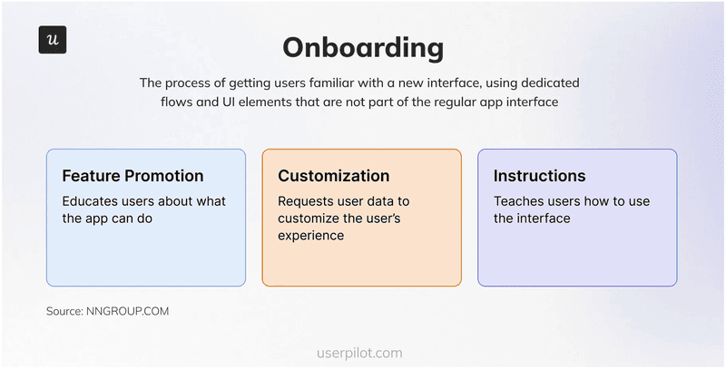
The 3 building blocks of a great mobile app onboarding flow
Creating a user onboarding flow is not just about explaining how your app works. It is about helping mobile app users experience value as quickly and smoothly as possible
Let’s look at how you can put these points into action:
1. Promote key features
A brief visual introduction reminds users why they downloaded your app by showcasing core value props through two or three onboarding screens or a welcome carousel
Why it matters: It reinforces their download decision, sets clear expectations early in onboarding, and highlights what’s in it for them.
How to do it well:
- Emphasise benefits over features (for example, “Stay consistent with your fitness goals” instead of “Daily activity tracker”).
- Limit to two or three slides with bold images and outcome-focused copy.
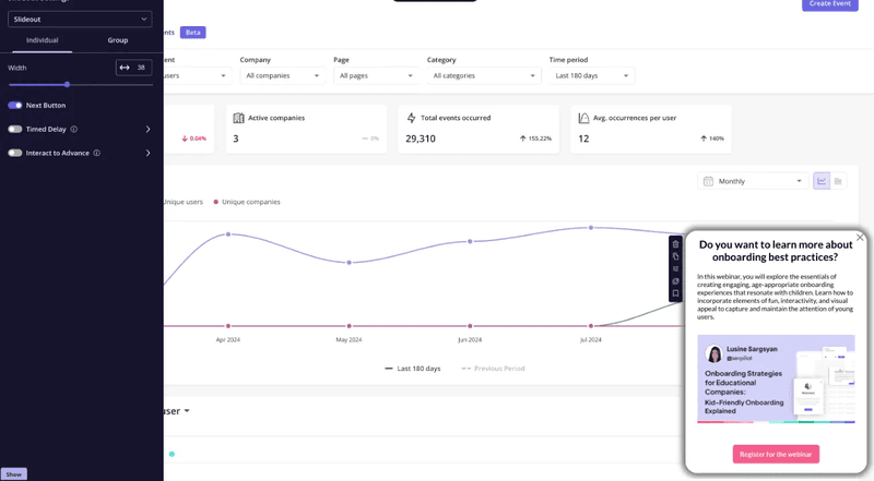
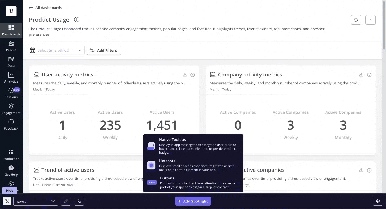
- Surface feature highlights contextually by triggering modals or slideouts via Userpilot when users land on key screens for the first time, leading users toward immediate value.
2. Customize the experience
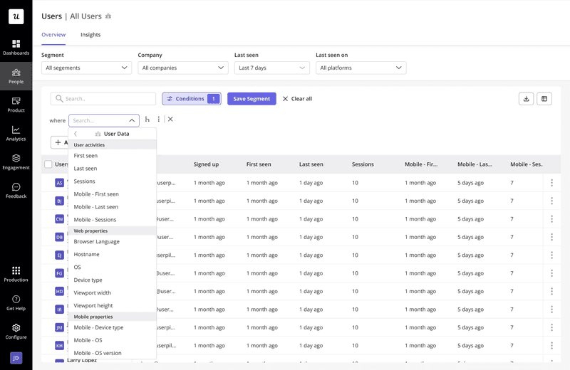
Tailor the onboarding journey to each user based on role, goals, device type, or behavior so users feel like the app is built for them.
Why it matters: Personal experiences boost retention. Users stay when they see relevant paths and features that match their needs.
How to do it well:
- Ask a couple of targeted questions upfront to segment users by role or intent.
- Guide each segment down a flow that highlights the features they care about most (for example, project managers see task dashboards first, developers see API integrations).
- Use progressive disclosure to avoid infodumping on your users.
3. Provide contextual guidance
Contextual tooltips and micro-prompts deliver timely, relevant guidance as users interact with your app.
Why it matters: Avoids overwhelming new users with everything at once and helps them focus on the next meaningful step toward their “Aha!” moment.
How to do it well:
- Trigger tooltips only when users first engage with a feature, so prompts answer one question at a time.
- Keep each message concise and action-oriented to avoid information overload.
- Guide users toward the single action that unlocks core value without making the app feel complex.
7 Mobile onboarding strategies that actually work (+ real-life examples)
Let’s look at the top mobile onboarding strategies used by most apps today:
1. Reduce drop-offs with a frictionless sign-up flow
Improving the signup flow helps new users dive straight into your app’s core features. By swapping lengthy forms for one-tap logins and minimal input fields, you shave off unnecessary friction and get people to that first “Aha!” moment faster, which is crucial for freemium or trial-based products where early hands-on time drives conversions.
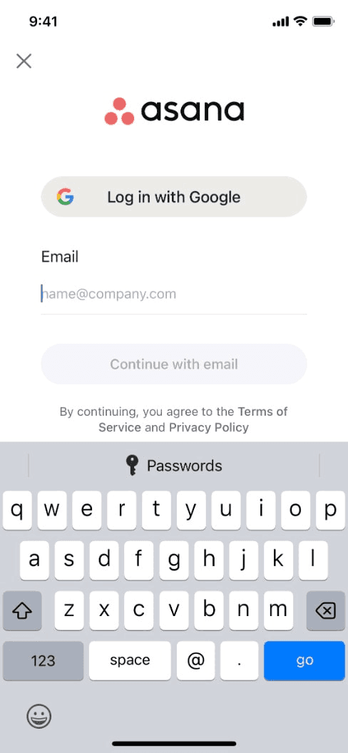
Take Asana as an example. Users can tap “Login with Google,” skip email confirmations, and land immediately in a ready-to-use workspace. There is no overexplaining or waiting around: just instant access to the app’s value.
For example, if a user joins via Google login, you skip redundant steps and trigger a role-based walkthrough that feels personal and concise. Every extra tap you remove boosts user engagement and drives retention.
2. Accelerate activation by driving users to the ‘Aha!’ moment
Sign-ups don’t guarantee engagement. What turns a curious visitor into an active user is how quickly they find success, aka when they have their “Aha!” moment. The sooner someone experiences real value, the more likely they are to return.
This strategy is ideal for apps with a strong core action, like sending a message, completing a task, uploading a file, or creating content. Instead of overwhelming users with every feature at once, the goal is to guide them toward that first meaningful outcome.
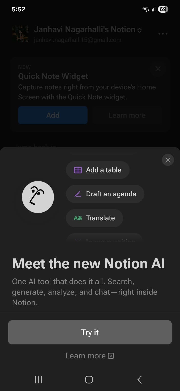
Notion doesn’t do the lengthy onboarding schtick. Instead, they simply empower users to take the next step, whether it’s to create a new document, a checklist, etc. The app lets users take action immediately, which makes the value of the feature obvious from the start.
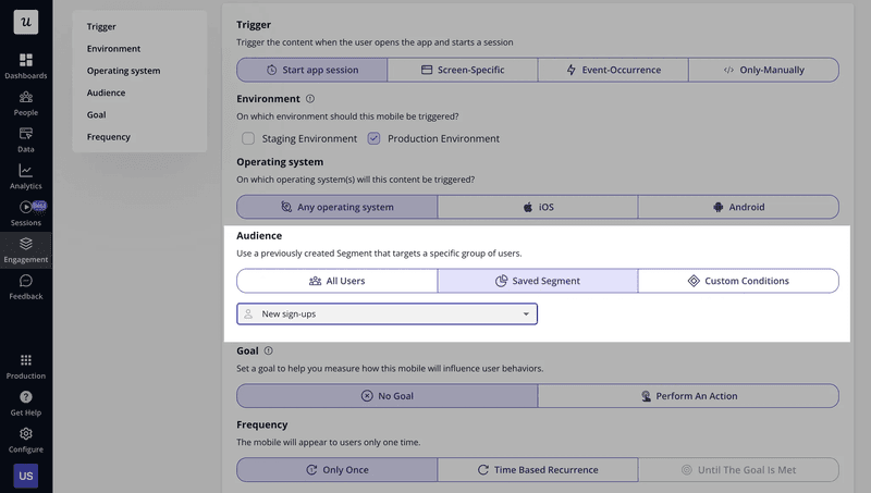
With Userpilot, you can go a step further. Track completion of your activation event in real time. Then use that data to trigger nudges, checklists, or tooltips for users who haven’t taken action yet. Instead of guessing, you’re guiding each user based on what they actually do.
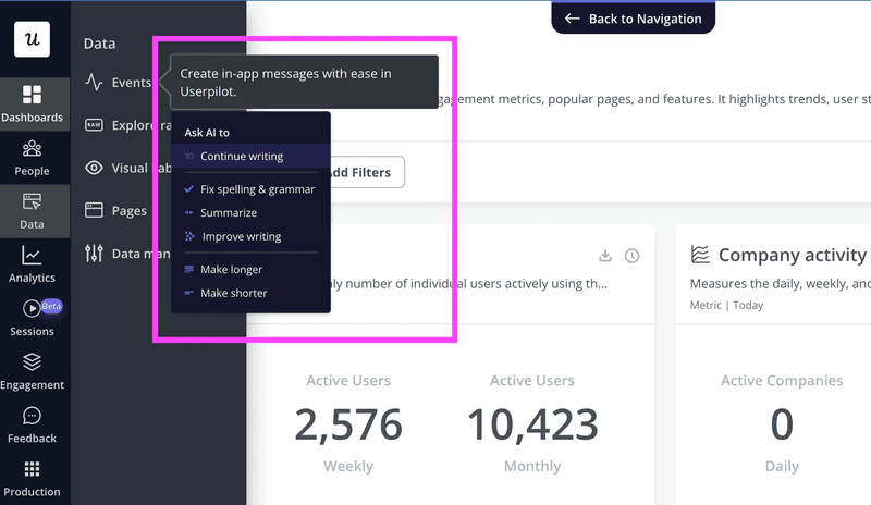
3. Reinforce learning with in-app messages and nudges
Users rarely remember everything they’re shown during onboarding. What sticks is the help they get when they actually need it. Teaching users with static tours that front-load information often falls flat because they don’t match how people learn.
Reinforcement works best in apps with layered app functionalities, features users won’t need on day one, but will benefit from as they grow. By guiding users based on what they’re doing, not what you think they might do, you keep engagement high and feature discovery natural.
Example: ClickUp introduces advanced features gradually, not immediately after users download the app. Instead of overwhelming new users with every view and automation option upfront, the app waits until users interact with related tools. Then it surfaces a short prompt or tip to explain what’s possible. It feels helpful, not disruptive.
With Userpilot, you can automate this approach. Use event-based targeting to trigger messages when users take certain actions. Create helpful microcopy using Userpilot’s AI writing assistant and layer these elements into your product without code. The result is a learning experience that feels invisible but impactful.
4. Personalize onboarding from the start
Not every user signs up for the same reason. Some want a quick win, while others prefer to see advanced features immediately. Customize the onboarding experience based on a user’s role, goal, or behavior so each person gets a flow that feels relevant from the beginning.
This approach is especially effective for apps that serve multiple personas or use cases. Whether it’s admins vs. contributors or freelancers vs. teams, the more tailored the journey, the better the engagement.
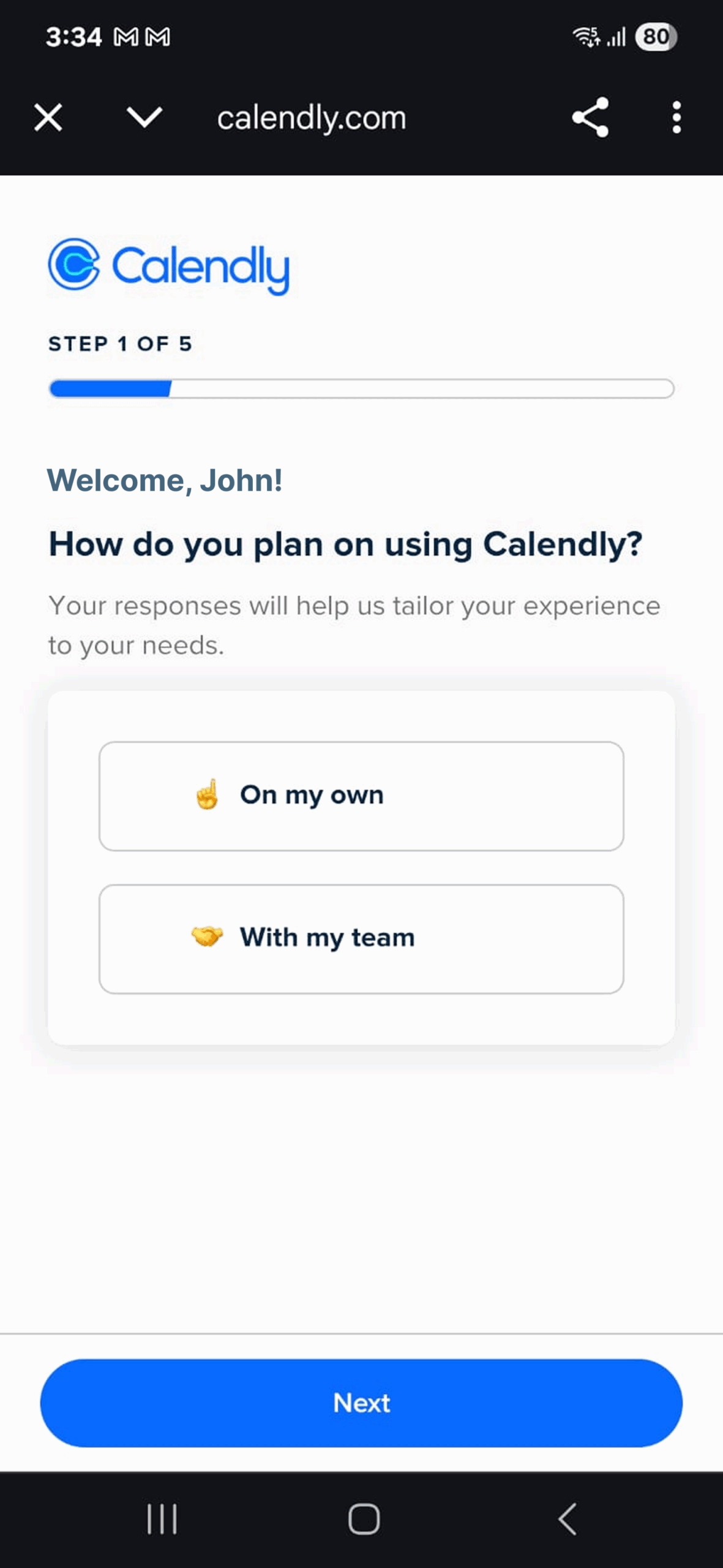
Calendly gives new users a simple question upfront: How are you using the app?
Options include personal meetings, client bookings, or team scheduling. Based on the selection, the setup experience changes. Users only see what’s relevant, which helps them move forward with less friction.
Segment users by behavior, role, or sign-up source, then show them the right screens, messages, and tooltips. You’re not just improving the first impression. You’re improving the odds they’ll succeed.
5. Encourage task completion with gamified checklists
A feature-filled screen can be intimidating. If users feel lost or unsure where to start, they tend to quit. Gamified checklists break onboarding into smaller steps using visual checklists that show progress and motivate users to complete essential tasks.
It gives users direction and a sense of accomplishment. This method is especially helpful for apps with multi-step onboarding or technical setup requirements. It turns a to-do list into a mini-win experience that feels productive rather than overwhelming.
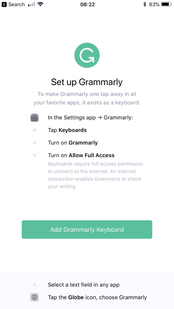
Grammarly does this from the first session. New users see a simple checklist with actions like installing the keyboard, enabling permissions, and completing a test sentence. As each item gets checked off, the app starts to feel more useful, without needing a heavy walkthrough.
With Userpilot, you can build and customize these checklists. Connect each step to real product actions and trigger tooltips or messages as users complete them. This turns onboarding into a guided experience that users actually enjoy finishing.
6. Localize onboarding content
Language influences more than comprehension. It shapes tone, builds credibility, and impacts how users feel about your product. Adapt your onboarding content to match the user’s language, culture, and region so that every step feels familiar and trustworthy.
Localization is one of the easiest mobile onboarding strategies to implement and is especially valuable for global apps with strong download numbers across different countries. By speaking the user’s language, you remove a key barrier to adoption.
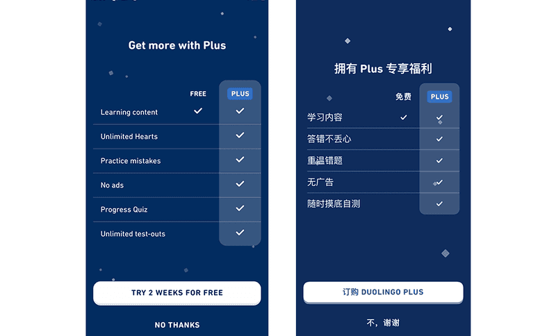
Duolingo sets the standard here. The app doesn’t just translate its onboarding flow. It adapts based on the learner’s goals. A casual user looking to pick up a few words for travel will see a different experience than a student preparing for an exam. The result feels personal, relevant, and accessible.
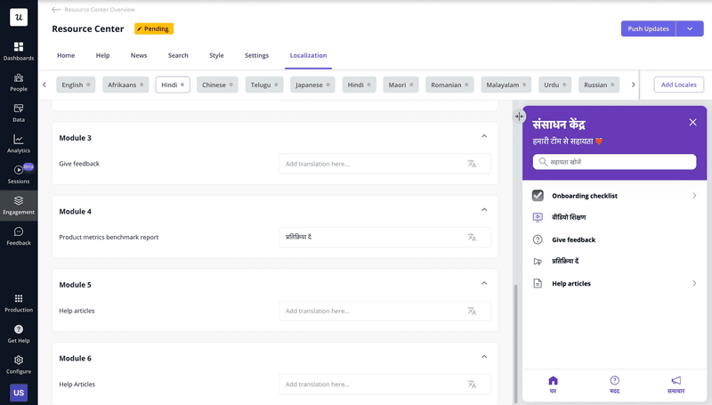
Localize onboarding elements like welcome messages, tooltips, checklists, and resource centers. You can also segment flows by country or device language, so every user sees a version of the product that feels built just for them.
7. Re-engage users with out-of-app nudges
Sometimes, even the most intuitive onboarding flow can’t help if the user gets distracted and disappears halfway through. When that happens, a well-timed message outside the app can bring users back to finish what they started.
Use timely push notifications, emails, or SMS to re-engage users who drop off during onboarding and guide them back to complete key actions.
This strategy is especially effective when you notice consistent drop-offs between steps, such as users who sign up but never complete their profile, or start a tutorial but leave before hitting the activation point.
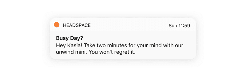
Headspace, a popular meditation app, sends a nudge for users to try new features. The message is short, acknowledges the user’s schedule, and most importantly, it’s not pushy. It simply shows up at the right time and reminds the user why they started.
Monitor user behavior across sessions and platforms, spot where people drop off, and send targeted re-engagement nudges. Whether it’s a push notification inviting them to resume setup or a helpful email tailored to their last action, you stay connected without being annoying.

How can I test and improve mobile user onboarding?
Creating a good mobile onboarding flow is just step one. The real work lies in testing it, tracking how users interact with it, and improving it based on real behavior.
Here’s how to make sure your onboarding isn’t just live, but actually working:
- Track key metrics: Monitor time to value, feature adoption, and drop-off points to understand if your users are engaging with the product. For instance, if fewer than 40% of sign-ups hit their “first action” in 24 hours, it means your initial steps feel too heavy.
- Use behavioral tools: Funnel analytics, and session replays can show you where users get stuck or abandon the flow entirely. Let’s say your session recordings show users dropping off at the “Integrate tech stack” step. It means that the step is confusing or hidden. You should surface that button higher on the page and add a brief tooltip explaining why it matters.
- A/B test different flows: See which version drives more activation or faster setup. If your two-question welcome survey delivers 10% more activations than the five-step form, it means a lighter lift drives engagement.
FAQ
How long should a mobile onboarding flow be?
Keep it short; 1 to 3 screens max. Let users explore the app quickly and guide them contextually as they interact, rather than dumping too much upfront.
What’s the difference between onboarding on mobile vs. desktop?
Mobile app onboarding flow must be shorter, cleaner, and optimized for touch. Users have less patience and screen space, so flows should be fast, focused, and interruption-tolerant to improve user retention.
Can onboarding impact app store ratings?
Yes. Confusing or buggy onboarding is a top reason for negative reviews. A smooth user onboarding experience keeps users hooked, increases satisfaction, and ratings.
About the author