How to Drive Feature Adoption in 2026: Strategies for Human Users and AI Agents


Most feature adoption problems don’t start with a bad feature.
They start at the setup screen, the verification step, or the blank state between a user and the value they signed up for. When we shipped Userpilot’s email feature, the funnel data revealed a 60-day lag between domain verification and adding a confirmed email address. Disastrous drop-off caused by setup friction, rather than a problem with the feature itself. What’s sad is that this isn’t just our problem but one that SaaS companies face across the board. Most features in production are used by a fraction of their intended audience, not because they lack value, but because there’s no deliberate strategy to move users from awareness to habitual use.
These long-standing challenges are compounded by the fact that 85% of enterprises and 78% of SMBs are now deploying AI agents who adopt features through an entirely different path and can’t be teased with a countdown timer, won over with testimonials, or guided using product walkthroughs. Agentic adoption depends on the feature being technically accessible for programmatic use, documentation telling the human operator how to configure it, and whether that operator can see evidence that the agent is actually getting results.
This article will cover 10 proven strategies for driving feature adoption for human users across every stage of the funnel, 5 strategies to drive agentic feature adoption, and how to track adoption across both populations.

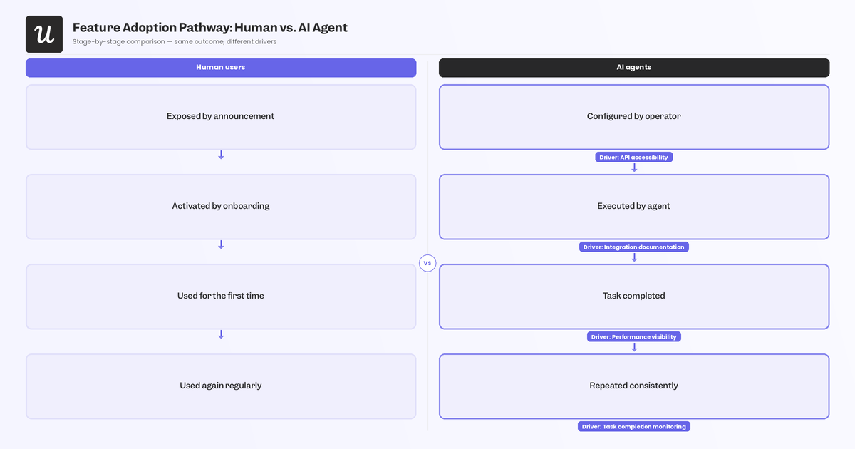
4-Stage feature adoption funnel
The feature adoption funnel has four stages:
- Exposed: Users discover the feature exists.
- Activated: They take an action to try it or enable it.
- Used: They engage with it for the first time and experience the problem it solves.
- Used again: They return to it consistently, signaling genuine value.
The 10 human strategies below are organized around these stages. Strategies 1-4 drive exposure and activation, while strategies 5-8 drive first use and repeated use, and the last couple of strategies provide the measurement layer that makes the others work. Note that AI agents skip the Exposed and Activated stages almost entirely because a human operator configures the agent to use specific features directly (bypassing discovery and activation). Agent behavior appears almost exclusively at the Used and Used again stages, with high-frequency event patterns that will inflate both stages and mask low human engagement if agent events aren’t separated before analysis.
10 Strategies to drive feature adoption for human users
All 10 strategies below are aimed towards humans, but the next section will focus on agentic adoption since AI agents follow an entirely different adoption path.
1. Create in-app teasers to build pre-launch anticipation
Neuroscience research shows the brain releases dopamine in anticipation of rewards just as strongly as when it actually receives them, which means you can create real excitement for a feature before it ships. Handled well, that anticipation converts into higher activation rates on launch day because users arrive already primed to try the feature rather than discovering it cold during a normal session.
Three approaches that work best in-app:
- Sneak peeks that show a blurred screenshot or a short animation of the feature with a “Coming Soon” label.
- Countdown timers placed on the home screen or in a “What’s New” section showing days until launch.
- Benefit-driven teasers that highlight the specific outcome the feature unlocks (“Your reporting workflow is about to get 50% faster, launching next week”) rather than describing the feature itself.
The benefit framing outperforms pure curiosity hooks because it connects the new capability to a job the user already cares about, rather than asking them to speculate about whether it’s relevant to them.
Building the teaser in the same tool you’ll use to run the actual launch announcement keeps the pre-launch and launch experiences visually consistent while saving you from having to set up flows from scratch on launch day.
2. Gamify the onboarding process to move users through activation
Getting a user exposed to a new feature covers the first stage of the funnel. The harder job is designing an onboarding flow that moves them through activation: helping them understand the feature’s value, showing them how to use it, and giving them a reason to start now. Game design elements do this better than passive documentation because they’re built around the same motivators that drive completion behavior generally: visible progress, clear goals, and small wins along the way.
Progress bars work because they make the activation journey visible so users can see exactly how far they’ve come and how close they are to finishing. Badges and virtual rewards add an achievement layer that’s particularly effective in products with team-oriented use cases where completion has social visibility. Interactive tutorials that include a quiz or small challenge after each step reinforce understanding rather than just presenting it, and they give users a concrete action to complete rather than content to scroll past.
Instead of stacking everything at once, have a progress bar during setup, a completion confirmation when the user finishes the core activation action, and a follow-up nudge if they stall halfway through:
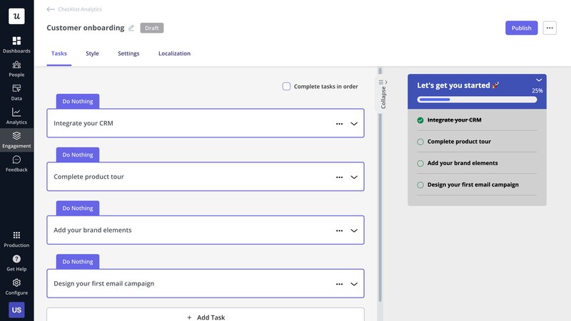
Staggering gamification elements will allow you to cover the full activation path without overwhelming someone who’s still evaluating whether the feature is worth their time.
3. Use social proof to build trust for new features
Users are skeptical of promotional copy from the company itself. 79% of consumers report trusting a stranger’s review as much as a personal recommendation from someone they know, which means the most effective advocate for your new feature isn’t your product team’s launch email. It’s a specific user who adopted the feature and can describe the result it produced in concrete terms, ideally with a number attached.
Three forms of social proof worth using include:
- Customer testimonials naming a specific outcome (“This feature cut our reporting time by 40%”).
- Case studies that show what the user was trying to accomplish and how they used the feature to do it.
- Social media mentions or community posts that product teams can surface and amplify at launch.
Each one lets potential users see themselves in an existing user’s outcomes, which motivates trial far more effectively than any benefit description you can write.
Timing matters though. Social proof placed in a pre-launch teaser builds anticipation while social proof placed directly in the feature’s first-use flow reinforces the decision to activate at the moment of hesitation.
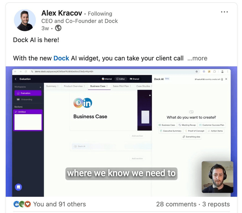
Dock provides a great example when CEO Alex Kracov announced their AI widget on LinkedIn with a 3-minute demo alongside the in-app launch, giving the announcement credibility and reach beyond their active user base.
4. Build a multi-channel announcement strategy for new features
No single channel reaches your entire user base at the moment they’re most likely to act. Your users are distributed across channels (inside your product, in their inbox, in community forums, on LinkedIn), and an in-app feature announcement misses everyone who isn’t active in the product on launch day. A multi-channel strategy multiplies the launch’s surface area without requiring proportionally more effort to execute, because each channel is serving a different segment of your user base rather than all of them seeing the same message through the same medium.
The channels worth considering: in-app messages and notifications for active users; email for users who haven’t logged in recently; blog content and website updates that work as evergreen discovery for new signups; webinars and live demos for features that benefit from explanation; community forums and discussion groups for your most engaged users; and social media for amplified reach. The specific mix depends on your product and audience. A developer-focused tool needs a different channel stack than a no-code product marketed to operations teams.
The practical discipline is sequencing rather than simultaneous broadcast:
- Teaser before launch to build anticipation.
- Full in-app announcement on launch day to reach active users.
- Email follow-up a few days later to catch users who weren’t in the product.
- Community/social posts extend reach over the following week.
Each channel does a different job inside the same campaign.
5. Provide contextual in-app training at the moment users need it
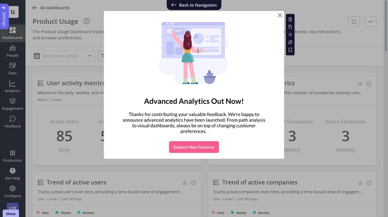
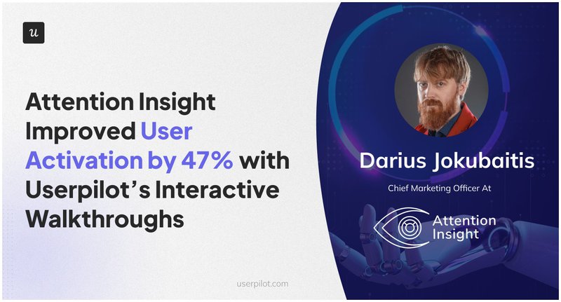
Most users who don’t adopt a feature aren’t confused about its existence: they hit a friction point during their first attempt to use it and abandon rather than investigate. Contextual in-app guidance addresses this by delivering training exactly where and when users need it: inline at the friction point, in the workflow they’re already in, rather than in a help center they have to navigate away to find. The Attention Insights case study is the clearest benchmark for this. They used Userpilot to build a contextual onboarding experience combining interactive walkthroughs, tooltips, and hotspots at the exact moments users were dropping off.
The result was a 47% boost in feature activation within a few months (not from changing the feature itself, but from changing where/when users received guidance about it).
Three elements worth layering for feature-specific guidance are interactive walkthroughs that take users step by step through the feature’s core action, tooltips that surface at relevant UI elements to explain what a control does before the user has to guess, and hotspots that draw attention to features users haven’t noticed yet without blocking the current task. The right combination depends on where your funnel data shows drop-off actually happening.
Not all three are necessary for every feature, and over-guiding users who don’t need it creates unnecessary friction.
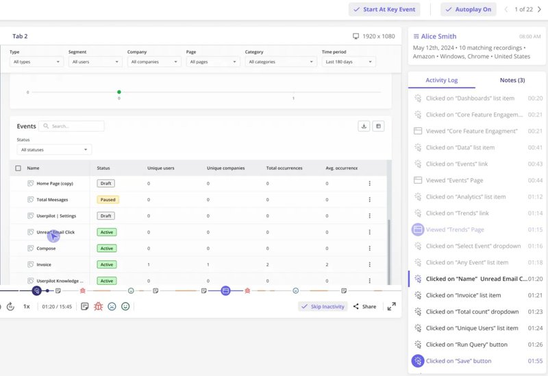
6. Use behavioral data to understand how users actually interact with features
Aggregate feature adoption metrics tell you a feature isn’t being adopted. They won’t tell you where in the funnel users are stopping, which segments are engaging and which aren’t, or whether users who do activate it are taking the path you designed for them. That level of diagnosis requires session replay combined with funnel analysis. The two together give you a quantitative picture of where drop-off happens and a qualitative understanding of why.
In practice, you can start with the funnel report to surface where users are stopping, at what rate (and how that compares to previous periods). When there’s an anomaly (such as a significant drop at one step, a time lag between two events, or a cohort behaving differently), session replays are where you can go to understand what’s actually happening. Watching sessions on users who dropped at a specific step is faster than scheduling interview calls and surfaces behavioral patterns that users can’t always articulate when asked directly.
Last but not least, Userpilot’s user analytics dashboards can show feature usage trends, path analysis showing whether users take the intended route to activation, and cohort views that let you compare how different user segments engage with the same feature over time to paint a causal picture that single-metric analyses often miss.
7. Use Google’s HEART framework to diagnose what’s actually failing
Activation rate and usage frequency answer some questions about feature adoption, but not all of them. A feature can show acceptable adoption numbers while generating steady user frustration; users are using it, but satisfaction scores are sliding, and retention around the feature is quietly degrading.
Google’s HEART framework developed by Kerry Rodden provides a more complete lens across five dimensions:
- Happiness: User satisfaction with the feature.
- Engagement: How actively users interact with it.
- Adoption: The rate at which new users start using it.
- Retention: Whether they keep coming back.
- Task Success: Whether users can accomplish their goals with it.
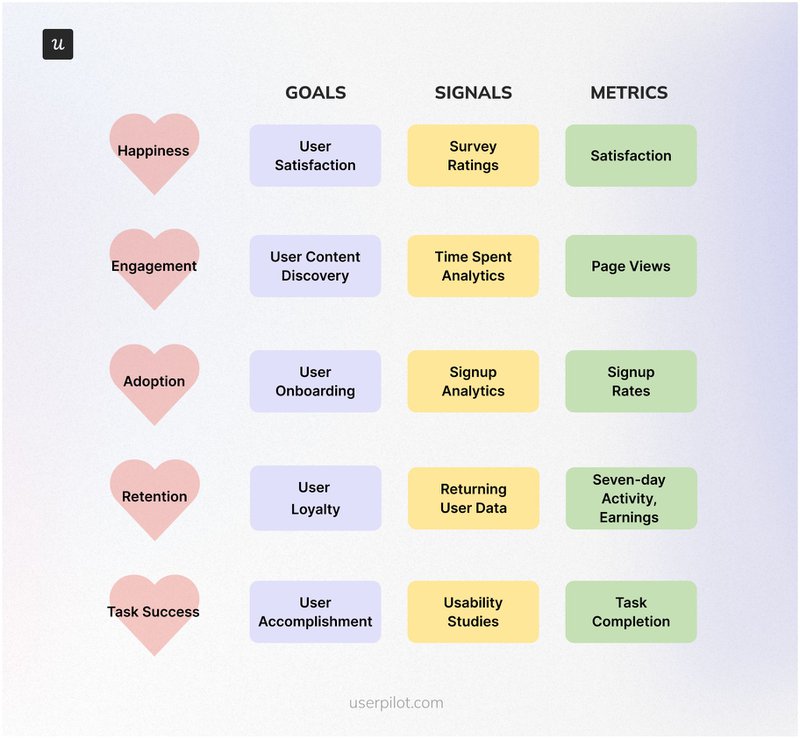
The practical value of HEART is that it separates problems that look identical in simple adoption metrics but require entirely different interventions. Low task success points to a usability problem; low happiness with reasonable engagement points to a value perception problem; low retention after activation points to a workflow embeddedness problem. Each calls for a different fix, and you need all five dimensions to know which one you’re actually looking at.
Track HEART metrics on a consistent cadence rather than just post-launch, because degradation often can develop gradually and go undetected for some time if you’re not actively checking.
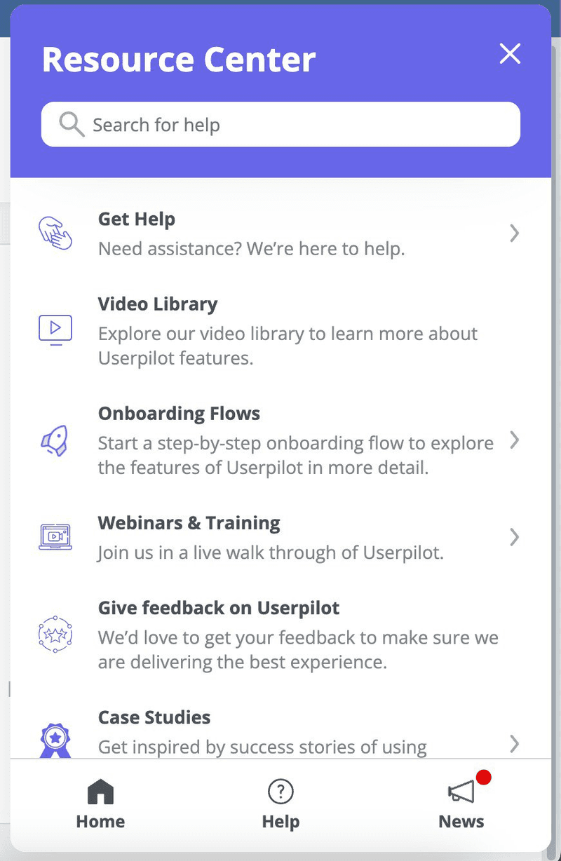
8. Build self-service support that keeps users moving without human intervention
Users who hit an obstacle mid-adoption have two options: find an answer quickly or abandon the feature. A well-built self-service support resource makes the first option fast enough to compete with abandonment, delivering help inside the product flow rather than sending users to a separate help site they have to navigate to and return from.
Four things that make a self-serve portal effective in practice are:
- Search bars that return relevant results immediately (the biggest single factor in whether users actually use it).
- Multiple content formats so users can watch a video, read an article, or follow a step-by-step tutorial depending on how they learn.
- Clear navigation with logical categories so users can browse when they don’t know the exact search term.
- Visible path to human support for the cases where self-service genuinely can’t resolve the issue.
Keeping content current matters more than comprehensiveness since an outdated article describing a UI that no longer exists creates more friction than having no article on it at all.
Userpilot’s resource center builder embed these resources directly in your product’s UI without writing any code so your documentation can rapidly evolve alonsgide features:
9. Run experiments to iterate on what’s not working
No feature adoption strategy survives first contact with real user behavior unchanged. The behavioral data and HEART metrics from strategies 6 and 7 will surface where the current approach is underperforming; the job then is to form a hypothesis about why, test a change, and measure whether the change moved the metric. This means A/B testing at the adoption layer rather than in the feature itself, testing the length of an onboarding flow, the microcopy in an in-app announcement, the timing of a tooltip, or the placement of a progress bar.
Cohort analysis is the most useful tool for this work. Grouping users by sign-up date, subscription plan, or other relevant characteristics and comparing how each cohort adopts a feature over time reveals whether a change you made in week 6 actually improved adoption for users who joined in week 8, or whether the numbers are being carried by a different segment entirely. The best approach is to make isolated changes, one at a time. Running multiple experiments simultaneously makes it impossible to identify which change caused which outcome. Change one variable, measure it with a representative cohort, let the data settle, then move to the next iteration.
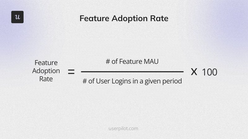
10. Make feature adoption a tracked KPI with clear ownership
Feature adoption strategies fail when they’re treated as launch activities rather than ongoing measurement disciplines. The organizations that consistently improve adoption assign clear ownership to product, marketing, and customer success teams. Each team owns specific funnel stages and tracks performance against a consistent formula (feature’s monthly active users divided by total user logins for the month multiplied by a hundred). That number, tracked weekly for features launched in the last 30 days (or monthly for established features), creates the accountability structure that makes the other nine strategies work.
How to track human feature adoption metrics
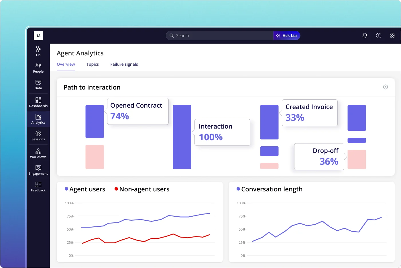
Before analyzing any adoption data, separate agent events from human events. Agent usage is high-frequency, consistent, and volume-heavy, and it dominates every chart it enters when mixed with human data. Every metric in this section is meaningful only when measured on human event data.
Userpilot’s Agent Analytics handles this separation at the event level so you can analyze both populations accurately without manual filtering.
Step 1. Start with clear objectives
Before you tag a single event, decide what you’re trying to learn. How many users do you want to adopt this feature, in what timeframe, and what specific user action demonstrates they’ve experienced its value, specifically the action that signals real adoption rather than a casual first tap? What does the data need to show for you to conclude the strategy is working? These questions take 20 minutes to answer before tracking starts and prevent the more expensive problem of spending weeks collecting data that can’t answer the question you actually care about.
Starting with the objective will shape which events get instrumented, which cohorts get compared, and which metrics get reviewed weekly versus quarterly.
Step 2. Choose the right feature adoption metrics
The core metric set is consistent across most features: activation rate (how many users take the initial action demonstrating engagement), usage frequency (how often active users return), task completion rate (what percentage successfully accomplish the goal the feature was built for), and time spent with the feature. Feature-specific KPIs layer on top of this core set: messages sent for a messaging feature, reports generated for an analytics feature, and integrations connected for a connectivity feature. The diagnostic value comes from combining metrics rather than reading them in isolation.
High activation with low return frequency points to users trying the feature once and not seeing a reason to come back, while low activation with high return frequency indicates a feature discoverability problem.
Step 3. Set up tracking with product analytics
Defining what to measure is half the work; making sure the instrumentation actually captures it is the other half. Custom event tracking lets you define exactly which user actions constitute the meaningful milestones in the feature adoption funnel rather than relying on generic page views or session counts. For a new analytics feature, the most meaningful event is probably “first report created” rather than “navigated to analytics page.” Getting this definition right before launch preserves the early cohort data that’s most informative about how first-time users approach the feature.
Retroactively instrumenting a funnel two months after a feature ships is possible but means the most valuable data (how users behaved in the first weeks before any adoption optimization was in place) is already lost.
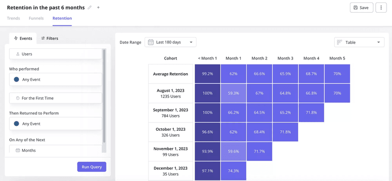
Step 4. Analyze the data by cohort
Aggregate charts tell you whether the number went up or down. Cohort analysis tells you which users drove that change and why, by grouping users by sign-up date, subscription plan, or company size and tracking how each cohort’s adoption evolves over 30, 60, and 90 days. Patterns that aggregate data buries become visible: early cohorts adopting faster than later ones, enterprise users at a different rate than mid-market, users who completed onboarding activating at twice the rate of those who didn’t.
Cohort comparison also makes it possible to measure the impact of changes to the adoption strategy over time.
A feature that added a new contextual tooltip in week 6 should show a cohort break in the adoption curve, and users who signed up after week 6 should activate faster than those who signed up before it. Without that cohort lens, the improvement is invisible in the aggregate trend.
Step 5. Use the insights to drive action
Adoption data has no value until it produces a specific change. The final step is translating what the cohort analysis and funnel data show into a targeted intervention: redesigning a tutorial step where drop-off is highest, triggering a contextual in-app message for users who activated but haven’t returned in 14 days, adding a tooltip to a UI element that session replay shows users consistently skipping. Each action should be targeted at a specific segment based on observed behavior rather than broadcast to the entire user base.
What that might look like in practice is a weekly review of early adoption data for features launched in the last 30 days (where changes in the funnel are still causally connected to recent decisions), monthly review of adoption trends across the broader feature set, and quarterly reviews to decide which features with persistently low adoption need a strategic intervention (and which ones reflect genuine user indifference that no amount of in-app guidance will change).
Agentic feature adoption
Every strategy in the human section above assumes the user has intentions, attention, and the capacity to respond to motivation. AI agents have none of these. An agent doesn’t browse your product to discover features, doesn’t read launch emails, and can’t be guided through a walkthrough. Its feature adoption is determined entirely by the human operator who deployed it, driven by two factors: whether the feature is technically accessible for the agent to execute and whether the evidence shows it’s working.
Driving agentic feature adoption means influencing the operator’s decision and removing the technical barriers to execution, and the 5 strategies below are what’ll actually move the needle.
1. Design features with API accessibility as a first-class requirement
An agent can’t adopt a feature it can’t call programmatically. If a feature requires navigating a multi-step UI, lacks a consistent input/output schema, or returns unpredictable error formats, the agent will fail regardless of how well the feature was announced to human users. Agent-accessible features have clear authentication flows, predictable response formats, well-documented error handling, and reliable performance under high-frequency repeated calls, since agents make many requests at consistent intervals and any structural instability surfaces immediately.
When agents show persistently low task completion rates on a specific feature, the diagnosis is almost always a product design problem rather than a communication problem. Human adoption friction is usually a messaging or onboarding issue and gets fixed with better guidance or copy. Agentic adoption friction almost always resolves to a structural issue in how the feature handles programmatic requests, and you fix it in the product rather than in the launch motion.
2. Treat developer and integration documentation as the primary agentic discovery channel
Human users discover features through in-app announcements, email, and social media; agents don’t browse any of these channels. The human operator who decides to configure an agent to use a particular feature reads your documentation, and if that documentation doesn’t describe the feature accurately and with working examples, the agent won’t be configured to use it. No amount of in-app marketing compensates for absent or inaccurate API docs.
For agentic feature adoption, documentation is the functional equivalent of contextual in-app guidance for human users. It needs to be accurate at the time of a feature’s launch rather than updated six weeks later after operators file tickets, be example-rich enough that a developer can follow along without guessing, and be comprehensive enough to cover authentication flows, rate limits, and error formats that a real-world integration will encounter. The documentation investment that most teams defer until after launch is the primary lever on agentic adoption rates.
3. Surface agentic feature performance to the human operator
The human who deployed the agent is the real customer for agentic feature adoption. If that operator can see their agent is successfully completing tasks with a feature (high task completion rate, consistent usage patterns, low failure rate), they’ll expand it; if they can’t see this data, or the data shows unexplained failures, they’ll reconfigure away from it. This operator-side feedback loop is the agentic equivalent of the ‘Aha!’ moment: the moment the operator sees evidence the feature is working for their agent is the moment they commit to it.
Making this visibility easy requires building it into the product rather than expecting operators to build their own monitoring.
4. Track task completion rate as the primary agentic adoption signal
The agentic equivalent of the human feature adoption rate is task completion rate: the percentage of agentic interactions with a feature that result in a successfully completed task. Low task completion doesn’t mean the feature isn’t being used; it means it’s being used and failing, which burns operator trust faster than low usage ever would. A feature with 80% agent usage and 40% task completion is performing worse in practice than one with 50% usage and 85% completion.
Diagnosing a low task completion rate comes down to where in the interaction sequence agents are failing, identifying frequent error types, and seeing specific features show the worst completion rates.
5. Separate agent events before measuring any adoption metric
This point appears in the tracking section above, but it’s worth restating in the agentic context explicitly. Agent usage inflates every human feature adoption metric it mixes with: high-frequency, consistent agent interactions count as active users and usage events in any raw event count, pushing activation rates, usage frequency, and adoption rate well above what the human population alone would show. The five agentic strategies above require their own metrics to be tracked on agent event data independently, just as the 10 human strategies require their metrics to be tracked on human event data independently.
Blending the two gives you a number that misrepresents both populations and masks the distinct problems each one has.
Drive feature adoption for every user: Human and agent
The 10 human strategies we’ve covered span every stage of the feature adoption funnel, while the 5 agentic strategies address the parallel adoption path that most product teams are still treating as an afterthought. With 85% of enterprises already running agents, ignoring that gap has real consequences for adoption metrics and user retention across both populations. What both playbooks have in common is that they depend on measurement you can trust, which requires separating human and agent event data before you analyze anything (so each population’s numbers reflect what’s actually happening in that population rather than bleeding into each other).
Ready to track feature adoption across both populations without worrying about blended data skewing your insights? Book a demo with our team to see how Userpilot handles both in the same platform!
About the author