What is a Heatmap in 2026 & How Its Use Has Changed with AI


What is a heatmap, and why has it become a fixture in every serious product team’s toolkit?
The answer starts with a problem most product managers know well: your analytics dashboard shows users are dropping off on a specific page, but the numbers alone don’t show where the friction lies.
That’s where heatmaps come in.
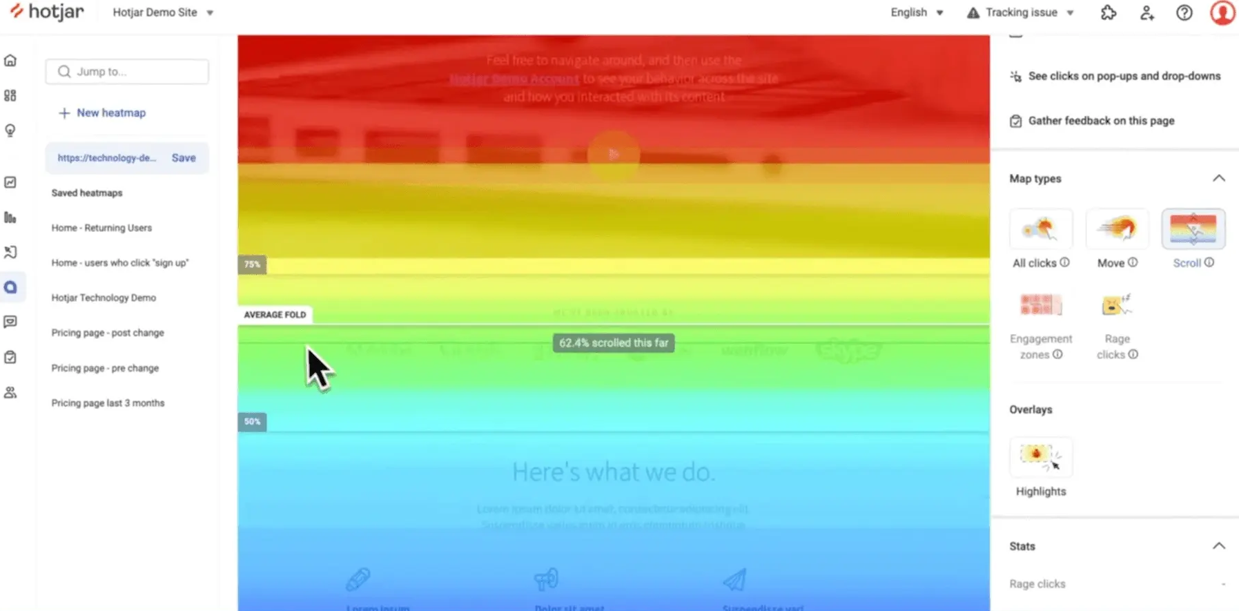
A heatmap is a data visualization tool that uses a color gradient to map user activity directly onto a page, showing where users click, how far they scroll, and where their cursor lingers. It enables you to see the pattern without digging through raw data.
For most of the past decade, heatmaps were the diagnostic tool product teams reached for after something went wrong. A conversion rate dip, a UX complaint, a feature nobody was using: you’d open the heatmap, find the cold zone, adjust the layout, and move on. The workflow was reactive by design.
In 2026, that picture looks different. Predictive eye-tracking has turned heatmaps into a design input tool rather than a diagnostic tool.
At the same time, AI agents now interact with SaaS products in ways a traditional heatmap cannot capture. Built-in AI tools are also reading and summarizing heatmap data automatically, cutting out a significant chunk of manual analysis work. The heatmap as a concept hasn’t disappeared, but how teams create and use heatmap data has shifted considerably.

Main types of a heatmap
The main types of heatmaps in web and product analytics each measure a different dimension of how users engage with a page:
- Click maps: Show where users click, revealing which elements are drawing interaction and which are being ignored. Click maps are the most common starting point for conversion rate analysis.
- Scroll maps: Show how far down a page users scroll before dropping off, making it possible to see which content below the fold is effectively invisible to most visitors.
- Hover maps (mouse tracking maps): Track cursor movement as a proxy for visual attention. Users tend to move their cursor toward what they’re reading, so cursor movement data offers a rough approximation of where attention lands without requiring eye-tracking hardware.
- Attention heatmaps: Aggregate data from both click and hover activity to show where users are concentrating over time. These give a more complete picture of engagement than either click maps or hover maps alone.
- Zoned heatmaps: Group page elements into defined sections and measure engagement at a component level rather than as a raw color gradient. This is useful for structured layouts like product pages or onboarding flows where you want to measure engagement per section.

Beyond web behavior analytics, heatmaps appear across business and scientific contexts: spatial heatmaps for analyzing population density or crime rates, matrix heatmaps for tracking performance trends over time, and correlograms for visualizing relationships between variables in financial data sets. In product work, the application is almost entirely focused on identifying patterns in how users interact with a page, what draws attention, what gets skipped, and where users tend to drop off before completing an action.
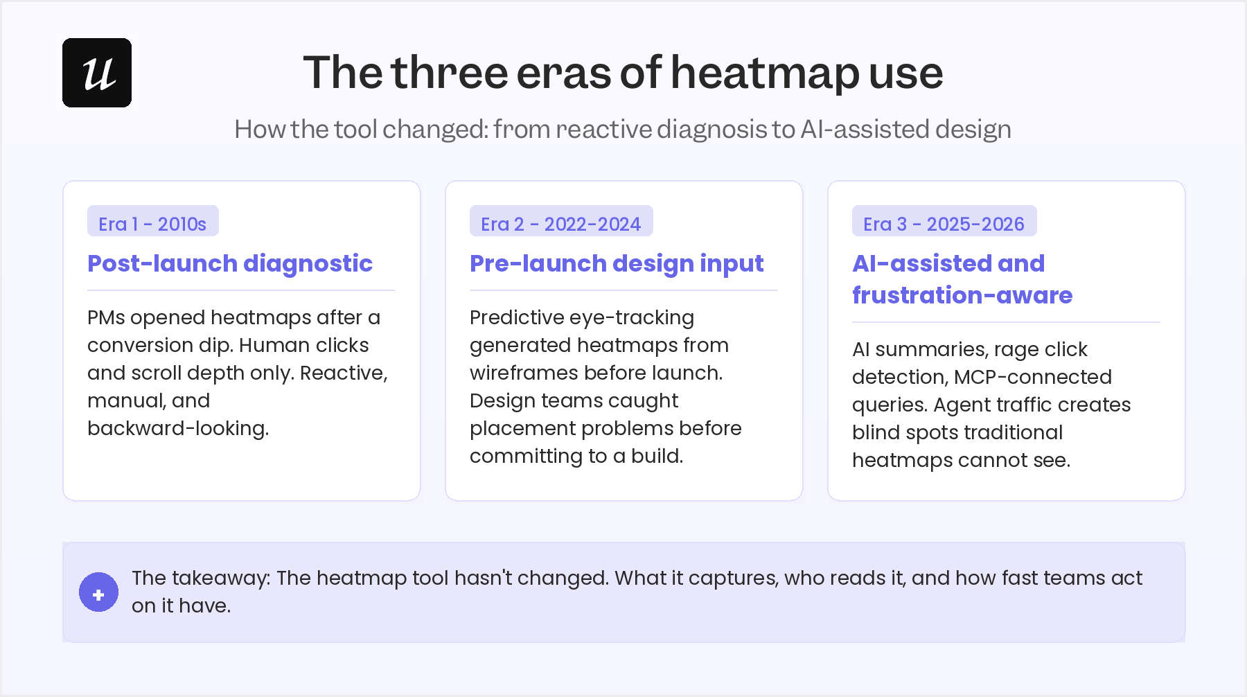
How heatmaps evolved: From post-launch diagnostic to design input
When heatmaps first became popular among product teams, their primary job was to confirm what had already gone wrong. In short, diagnostics. In response, the PM would open a heatmap analysis, identify the cold zone or the unexpected click pattern, and file a fix.
This reactive cycle worked reasonably well. However, it required two things: enough traffic, and enough patience to wait for statistically meaningful data to accumulate. The shift began with predictive eye-tracking technology. Tools like Attention Insight now generate AI-powered heatmaps based on models trained using millions of real-user sessions.
As a result, you can see the prediction where attention will land based on visual salience principles. It enables design teams to validate layout decisions during the design phase rather than after launch, which changes the economics of fixing UX problems significantly.
This fundamentally changed the purpose of heatmaps. They moved from a diagnostic tool into an active design tool.
It’s now possible for product designers to generate an attention heatmap on a wireframe, identify that the primary CTA is landing in a predicted cold zone, adjust the layout, and re-run the prediction before committing to a build. The feedback loop that used to require weeks of post-launch data collection now takes minutes inside the design tool.

The AI disruption: When your users stop clicking
Traditional heatmaps are built around the assumption that users interact with your product by clicking, scrolling, and moving a mouse or trackpad.
For human users, that assumption still holds.
But in 2026, a growing share of SaaS product interactions aren’t coming from humans. AI agents accessing tools through MCP connections execute tasks programmatically and don’t generate the mouse events or scroll depth data that heatmaps are built to capture.
This creates a real blind spot in heatmap data. If a portion of your product’s active sessions are AI agents completing workflows on behalf of users, your heatmap will show those areas as cold, and the reading will be wrong. Features that look underused in a click map might be processing significant agent-driven activity that the color gradient simply cannot see.
Yazan Sehwail, Userpilot’s CEO, put the broader shift plainly:
“You’re no longer operating. The AI is operating. You’re just basically evaluating and monitoring the agent workflow.”
The implication for product analytics teams is direct: heatmaps now need to be read alongside agent activity data, not as a standalone picture of how a product is being used.
Reading heatmaps in 2026: AI summaries, chatbots, and Lia
Even for human-generated data, the traditional heatmap workflow carried its own process friction. You’d have to open the tool, filter for the right user segment, and then interpret the color overlay.
The result?
All of this added up to a real time cost for teams running experiments across multiple pages.
Most product managers I’ve spoken to describe the same pattern: they know they should be checking heatmaps more regularly, but the manual process means it only happens when a specific problem surfaces.
Microsoft Clarity addressed part of this with its AI-generated summaries of heatmap sessions. Instead of having to interpret a color overlay yourself, Clarity’s AI describes what the heatmap shows.
It describes which sections had the most engagement, where users dropped off, and which elements received unexpected clicks. For teams who need a quick read rather than a deep analysis session, this removes a real barrier to regular heatmap use.
Lia, Userpilot’s built-in AI agent, and the Userpilot MCP Server take this further by connecting heatmap data to a conversational query layer. As Yazan explained:
“If you as a marketer wanted to see, using session replay, NPS data, survey data, and product usage data, you’re able to get your answer without having to go to Userpilot, without having to pull data and upload it to someone. So this is why MCP is gonna be a game changer.”
Rather than navigating to a separate view and configuring filters, product managers can ask for a specific segment’s behavioral pattern and get it back in seconds.
Rage clicks, frustration signals, and what traditional heatmaps missed
Standard click heatmaps have a limitation: they only measure the click frequency, but not the intent behind it. A button that shows up as a bright hotspot could be attracting genuine engagement. Alternatively, it could be drawing rage clicks from users who expected a response and got absolutely nothing.
Because traditional heatmap tools didn’t distinguish between these two scenarios, a warm zone gave product managers no real signal about whether users were satisfied or deeply frustrated.
Tools like FullStory, Mouseflow, and Contentsquare have addressed this by building frustration signal detection directly into their behavioral analytics. Instead of blending everything together, they track specific behaviors separately from general click activity:
- Rage clicks: Rapid, repeated clicks on a non-responsive element.
- Dead clicks: Clicks on completely non-interactive elements.
- Error clicks: Clicks that trigger a visible JavaScript or system error state.
This gives product teams immediate visibility into customer friction. Without it, these critical issues would remain entirely obscured behind warm-looking color data.
Contentsquare goes a step further by combining these frustration heatmaps with session replay and journey analysis. Now, an aggregate rage click pattern can be traced directly to specific session recordings.
Product managers can move from spotting a behavioral pattern to watching the exact user experience that caused it in a single workflow. This speeds up things and eliminates the need to switch tools.
Closing the feedback loop: From insight to action
Heatmaps have always been better at diagnosing problems than solving them. For instance, a scroll map showing most users dropping off before a key CTA is useful, but it doesn’t tell you whether the issue is.
This meant that product managers would have to carry that insight into a separate brainstorm, align with design, form a hypothesis, and queue a test. That process took time.
But things are changing with AI. Analytics platforms that integrate heatmap data with AI analysis can now surface suggested interpretations alongside the pattern itself, whether the problem looks like a copy issue, a UI affordance gap, or a load-time problem. This doesn’t replace the judgment call, but it gives product managers a starting point for the fix conversation rather than a blank page.
Abrar Abutouq, one of Userpilot’s product managers, frames the right relationship with AI suggestions well:
“Sometimes [AI] might be right, might be wrong, but I always believe that every single suggestion you gather from feedback, from AI or a teammate, it’s an experiment. You need to try it out.”
The value AI adds to the heatmap-to-action workflow is speed, not certainty.
Teams that treat AI suggestions as experiments to validate will get far more out of the loop. In contrast, teams that treat them as final answers will likely miss the mark.
Heatmaps in 2026: Still valuable, but only if your setup has kept up
Heatmaps still remain valuable. They make behavioral data visible without needing to ask users to explain their experience. What’s changed, though, is how they work. Instead of using them as a diagnostic tool, you can now use them to actively design your products.
If your heatmap setup hasn’t changed since 2022, you’re likely getting reliable data for human sessions on static pages, and missing rage clicks, frustration signals, and any activity from AI agents. Adding frustration signal tracking and connecting your behavioral data to an AI query layer are the two highest-leverage updates most product teams can make right now.
Userpilot’s session recording and heatmap tools, combined with Lia’s AI analysis layer, let product teams move from behavioral pattern to in-app intervention without switching platforms. To see what the workflow looks like for your product, book a demo.
About the author