Why Most In-App Onboarding Fails (And How to Fix It in 2026)


I think most teams overcomplicate in-app onboarding.
The question they tend to ask is what the onboarding flow should look like. Five screens or three? Tour or checklist? Tooltips or chatbot?
That’s the wrong place to start. Onboarding rarely fails at the wireframe stage. It fails earlier, when the team picks the wrong outcome to optimize for, or defaults to whatever onboarding pattern looks normal in their category.
I’m a PM at Userpilot, and I’ve spent the last few years shipping in-app onboarding for both our web and mobile products. This is the playbook I use now. So I’ll cover both web and mobile app onboarding throughout this guide.

Why does most in-app onboarding fail?
I think most onboarding fails because of how we measure it, not how we design it.
We track tour completion. Checklist completion. Time on each step. Those numbers are easy to log, and they all look like progress. But none of them tells you whether the user got value from the product.
Instead, you should go for an outcome metric (the action that signals product value, not the action that finishes the welcome screen), and the design problems become easier to see.
The second thing I’d argue is about you, not the product. When you’ve built something, you can’t see it the way a new user sees it. The dashboard that is familiar to you may feel like a jungle to someone who signed up an hour ago.
I’ve watched founders defend their onboarding by saying “but it’s so simple,” while test users got stuck on the second step. It’s simple to the person who built it, isn’t the same as simple to the person who didn’t.
For those reasons, there are 3 common mistakes that cause in-app onboarding failure:
1. The tour is teaching the interface, not the outcome
A walkthrough that explains where each menu lives is teaching people how to navigate your software. They came to get a result, not to learn the navigation.
Wes Bush at ProductLed has a phrase for this. He calls it the click tax, where every action in your onboarding that doesn’t move the user closer to what they came for. Most flows charge a heavy one without realizing it.
So I suggest picking the one thing your user came to do, and getting them doing it. If a tooltip is going to exist, make it about why the user would want to click the button, not how the click works.
2. One flow for everyone
A first-time user, a power user evaluating a switch, and an admin setting up the team all need very different first sessions. When you ship the same screens to all of them, the first-timer is overwhelmed, the power user is bored, and the admin can’t find the settings panel.
What you can do is to add one question on signup. Not a ten-question survey. One question. Something like “What are you mainly here to do?” with three or four options. Then route the rest of the onboarding to that single answer.
I’ve watched activation rates jump by a quarter to a third on this change alone, with almost no engineering cost. That said, if users have to answer six profile questions before they see anything, you’ve replaced a tour with a survey and called it personalization.
3. The empty state stays empty
A new user lands on a dashboard with no data, no example to react to, and no obvious place to start. So they close the tab.
What I recommend is to drop them into a sample workspace with example data they can poke at. Prefill the first project from their signup answer. Generate the first artifact for them if you have an AI that can.
Reacting to something is much easier than creating from nothing.
How has AI changed user expectations of onboarding?
When people talk about AI changing onboarding, they usually focus on shorter attention spans.
That’s part of the story, but I don’t think it’s the biggest change. The bigger change is that onboarding is no longer just for people.
Human users now increasingly expect the product to do more of the work for them instead of teaching them how to do it themselves. At the same time, AI agents can now interact with products on a user’s behalf without ever seeing the onboarding experience at all.
Patience first
AI products spent the last two years training users to expect output in seconds. Once you’ve watched ChatGPT generate a marketing brief in twelve seconds or Notion’s AI draft a project structure in one prompt, sitting through a five-minute product tour feels like a relic.
People aren’t being unreasonable. It’s just them getting used to the new norm. As Wes Bush put it in a January piece:
“AI onboarding raises the bar to 60-seconds-to-value: users must reach meaningful output fast or they drop off.”
The data agrees with him. Median SaaS activation across 500+ products sits at 36% (per productgrowth.in’s 2026 onboarding benchmark), and the gap between products at the median and products above 50% is mostly the gap between flows designed for “under five minutes” and flows designed for “under sixty seconds.”
Now the second part: users who aren’t human
As of April 2026, every major AI platform supports the Model Context Protocol (Claude, ChatGPT, Perplexity, Grok, Mistral, all of them). That means a user can ask their AI agent, “Do this thing for me,” and the agent walks into your product through an API, executes the task, and leaves.
Your tooltips don’t fire for that user. Your modals don’t appear. Your checklist doesn’t load. For a growing share of your users, your onboarding flow is just invisible.
I asked our CEO, Yazan Sehwail, about this in an internal session last quarter, and his framing has stuck with me:
“People don’t wanna do any of this. That’s the truth. You create a project, you tell it what you want, and it should do the rest. You’re no longer operating. The AI is operating. You’re just basically evaluating and monitoring the agent workflow.”
— Yazan Sehwail, CEO at Userpilot
That reframes the onboarding question entirely. It used to be “how do I teach the user where to click?” Now it’s “how do I get the product to deliver the outcome with minimum input from the user?”
The human users want this because they’ve been trained to expect it but the agent users need it by definition.
How should you build in-app onboarding now?
If users expect value in minutes instead of hours, and increasingly expect the product to do the work for them, then the way most teams approach onboarding now looks a bit backward.
The traditional mindset is to introduce the product first and help users discover value later. You explain the interface, walk through key features, and hope users eventually connect those features to whatever they came to accomplish.
The problem is that users don’t sign up to learn your product. They sign up to solve a problem. That’s why whether you use a checklist, a walkthrough, an AI assistant, or something else entirely matters far less than whether the user reaches the outcome that made them sign up in the first place.
Here’s how I’d approach building onboarding today.
Pick the outcome that signals activation
Not “completed the welcome flow.” Not “watched the tutorial.” One concrete event that correlates with whether the user comes back next week and converts next month.
In a project management tool, it might be creating and assigning a task. In a finance app, linking the first account. In Userpilot’s case, getting a user to build a flow that fires for an end-user.
The principle stays the same. Pick the action that predicts retention, and design the entire first session around getting people there.
Then ruthlessly cut anything in onboarding that doesn’t measurably move users closer to that action. You can always reintroduce features through secondary onboarding once people are coming back.
Use whichever mechanism gets them there
This is where I see teams get stuck. They assume there’s a “right” onboarding pattern (a checklist if you want to look like Asana, a walkthrough like Salesflare, a chatbot like Notion) and they over-invest in that one mechanism.
The answer is mechanism-agnostic. Here are the options I think about:
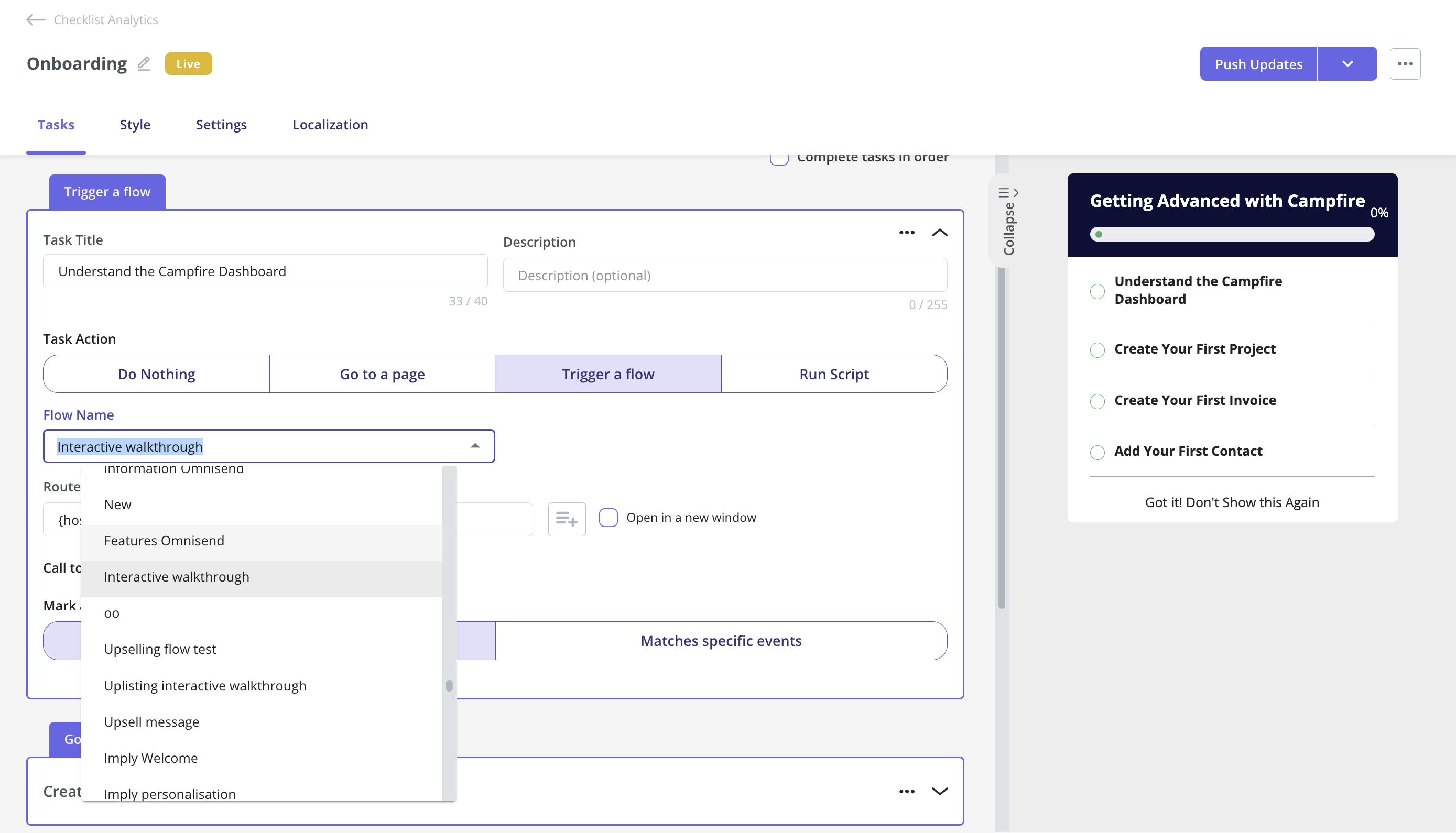
- A checklist works when its items map to outcome events, not a feature tour in disguise.
- An in-product guide works when it appears contextually next to the next action, not as a wall of tooltips on signup.
- A conversational AI agent works when it can do the setup work itself, not just answer questions about the product.
- A prefilled workspace works when it gives the user something to react to.
- Progressive disclosure works when you show one path on day one and reveal the rest only after the user has done something.
Notion’s current onboarding flow is a good example because it runs three of these in parallel. One question on signup routes everything that follows. The dashboard loads with an AI chatbot sidebar. There’s a small checklist for users who’d rather work through tasks than chat.
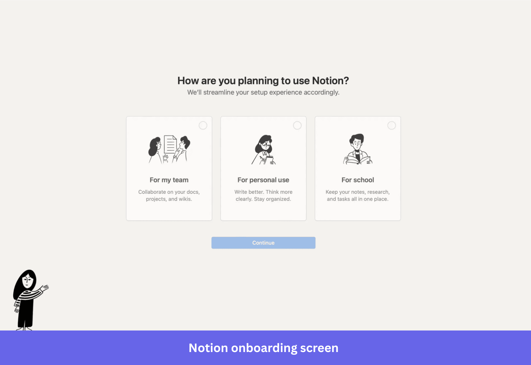
The user picks which surface to engage with. Notion gets activation either way.
No single “right” pattern. Just whatever your user is willing to respond to.
Let AI do the setup work
This is where AI is unambiguously useful. Setup work that used to take engineering tickets and weeks of configuration now collapses to seconds, because the AI does the work the user used to have to do themselves.
I’d give you a few examples that you can sign up and see how they do it yourself:
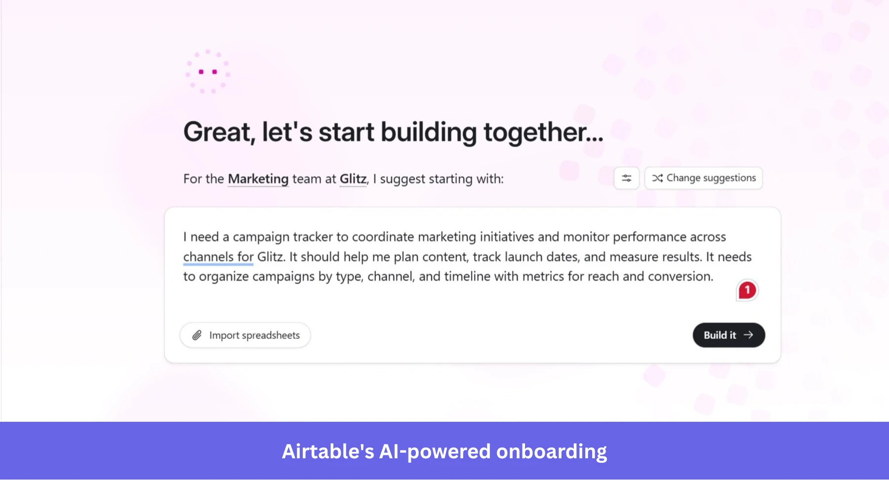
- Airtable’s Omni assistant generates entire apps and dashboards from a single prompt during onboarding. By the time a user would normally be naming their first base, they’re looking at a working setup with their data inside it.
- Amplitude shipped a Wizard CLI that walks developers through SDK setup and event tracking from the command line, removing the engineering wait that used to delay every analytics rollout.
- iOS 26’s on-device Foundation Models let mobile apps read draft text as the user types and personalize the onboarding around what they said, which nobody could have shipped two years ago.
The pattern across all of these is the same. Instead of teaching the user how to use the tool, the tool does the user’s first task for them. The user’s job becomes evaluating whether the output is good, rather than constructing it.
Once they’ve seen one good output, they’re motivated to figure out how to make more.
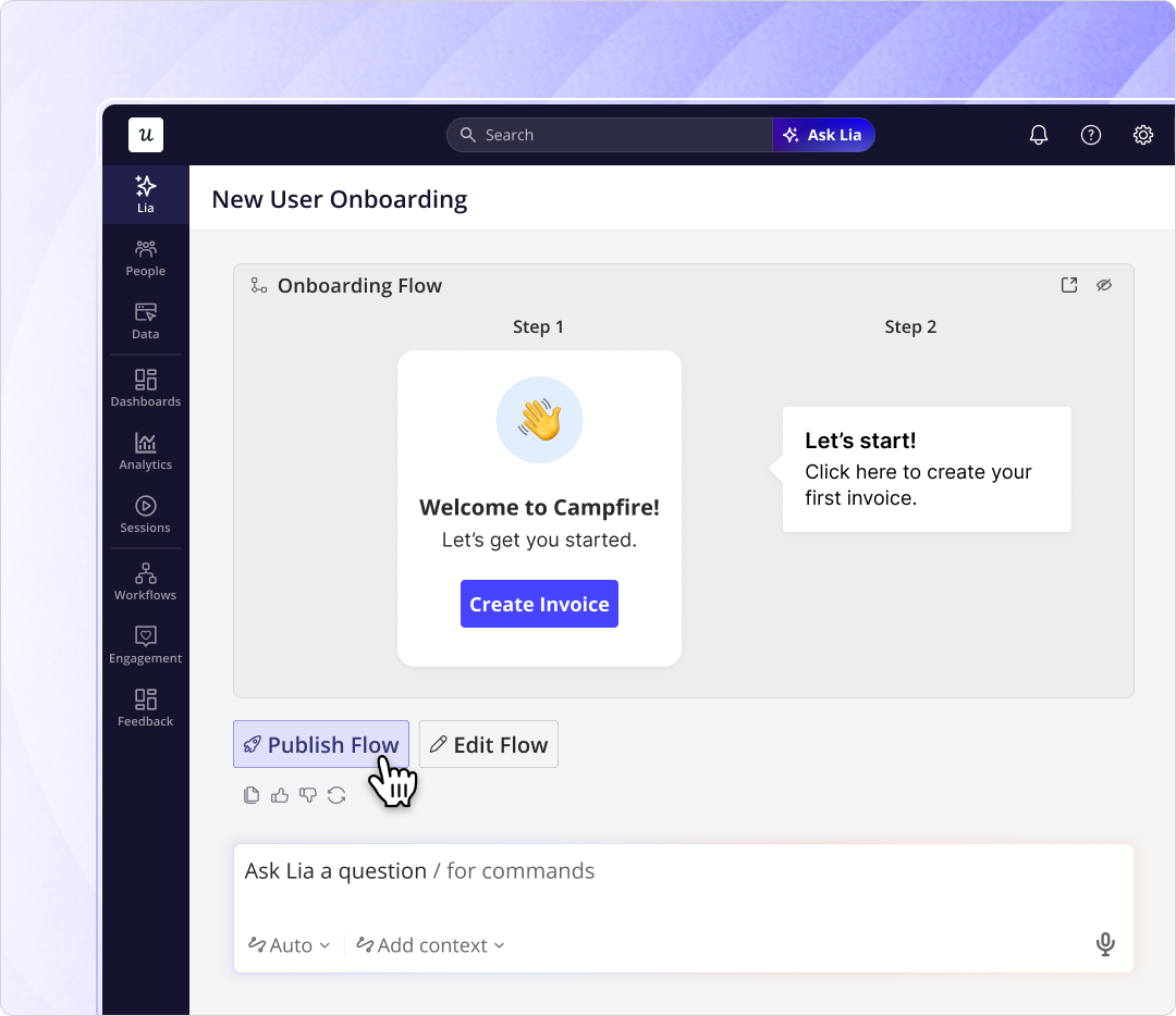
We use the same idea at Userpilot with Lia. You describe the in-app onboarding flow you want in plain language, Lia builds it, and you approve what ships. Lia also monitors how each flow performs once it’s live and flags the parts that aren’t working.
Run it across channels and test it
Onboarding rarely stays inside the product.
Behavior-triggered emails, push notifications, slideouts, in-app modals: they all overlap. When you run them as four separate systems, your users get hit by the same nudge four times. At some point, it can be pretty annoying for your new users if you don’t have a way to orchestrate these onboarding nudges.
Userpilot Workflows is what I use for this now. You build the whole onboarding sequence on one canvas, branched on what the user does rather than on a fixed schedule.
The in-app modal, the email follow-up, the push if they go idle for two days, the survey three days later, all connected. Activation reminders fire only when someone has stalled. The day-two email is about the workflow they ran yesterday, not a generic “10 features you haven’t tried” blast.
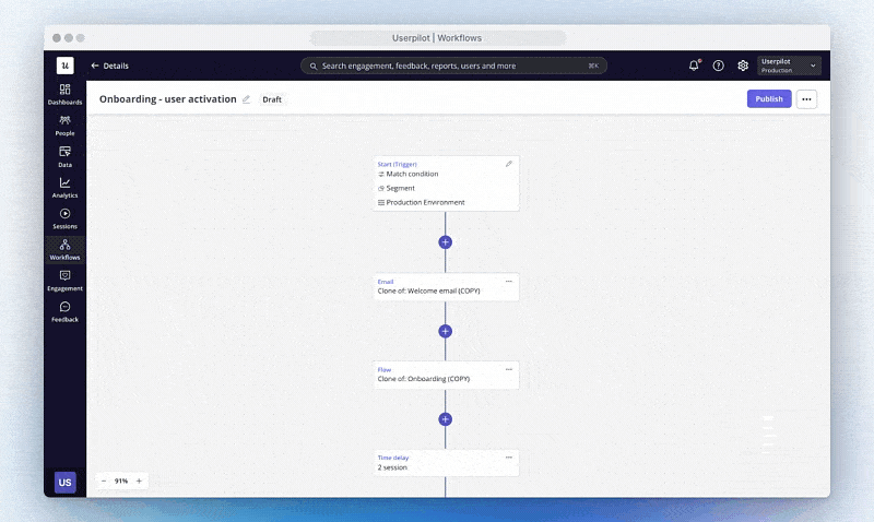
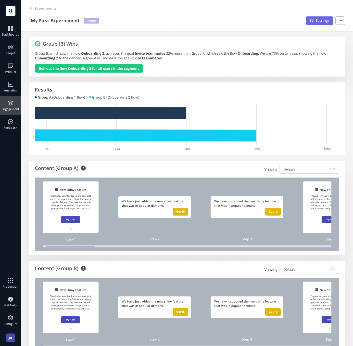
The same canvas is what makes A/B testing the whole flow practical. Run version A against version B, segment by user role or plan, and let activation data decide which ships.
The variables worth testing aren’t just copy or timing. They’re which mechanism wins for your product. Sometimes the checklist version converts better, sometimes the AI agent version does, and you won’t know until you run the test.
Ship onboarding fixes yourself in hours
One last thing about how onboarding improves over time. It’s less about the design and more about cycle time.
When we shipped Userpilot’s email feature earlier this year, the funnel showed a sharp drop at domain verification. The classic move would have been to file an engineering ticket, wait two sprints, and ship a code change in about five weeks.
Instead, I built a targeting tooltip and a small checklist directly inside Userpilot in a few hours. The drop-off closed within days.
The principle behind that fix is bigger than the fix itself. When you can change in-product UI in hours instead of weeks, the cost of trying a variant collapses. That’s the thing that compounds.
The teams I see winning at onboarding aren’t the ones with the cleverest first design. They’re the ones who can ship the next version this afternoon.
Get in-app onboarding right!
The version of all this I’d hand a PM starting from scratch this week is short:
- Pick the one action that signals value to your product.
- Build whichever mechanism gets the user to that action fastest, on both mobile and web.
- Use AI to take the setup work off the user where you can (Airtable’s Omni, Amplitude’s Wizard CLI, Lia in our case).
- Run the whole sequence across channels in one workflow rather than four systems.
- A/B test the variants and let activation data decide.
That’s the substance. The rest is execution, and the teams that ship execution faster tend to be the ones who win.
If you want to see what this looks like inside Userpilot, book a demo, and our team will walk you through how Lia, Workflows, and Analytics fit together for better in-app onboarding.
About the author