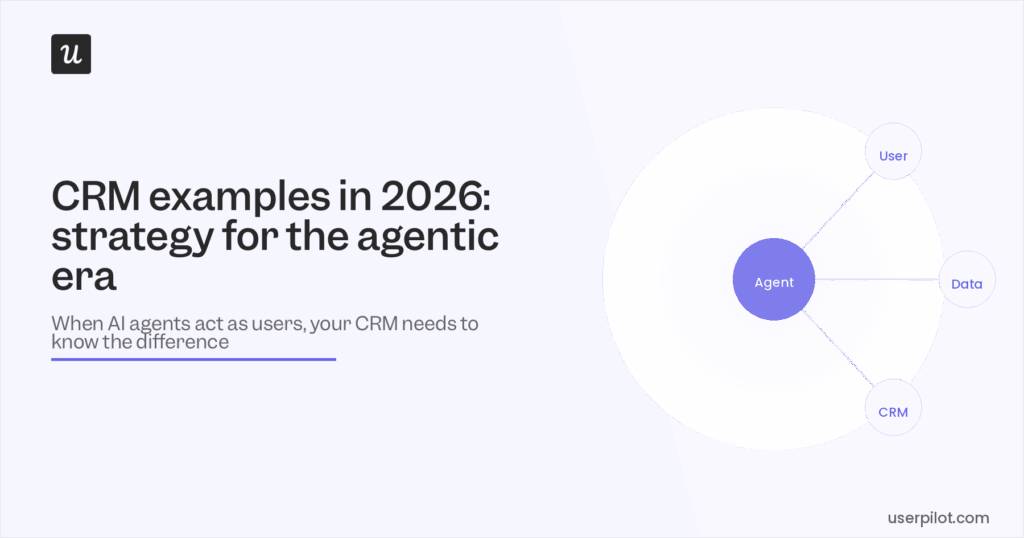
Customer Relationship Management Examples in 2026: Strategy for the Agentic Era


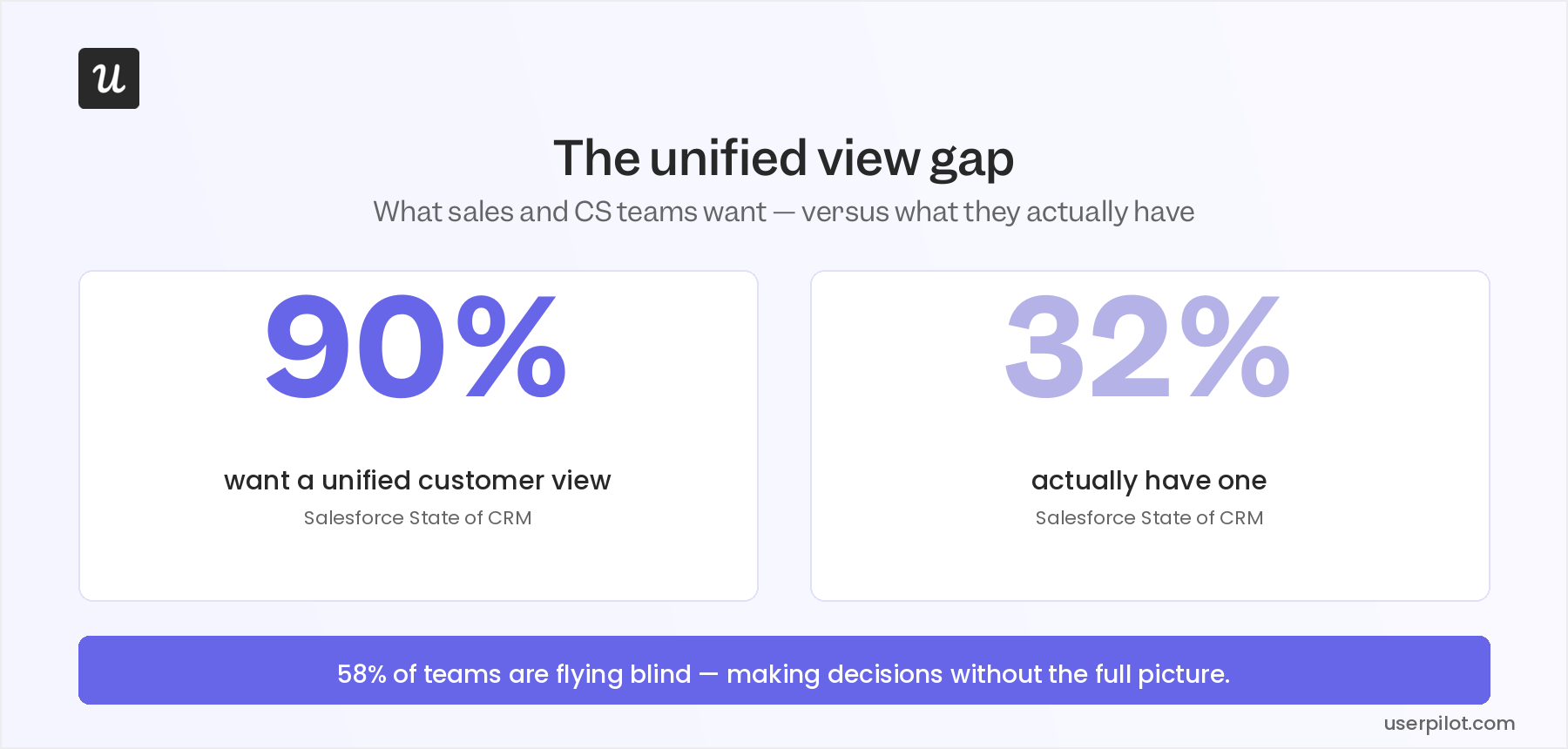
Customer relationship management in 2026 is facing a major challenge that I’ve watched play out across almost every SaaS company that talks to our customer retention team at Userpilot. According to Salesforce’s State of CRM report, 90% of businesses believe a single unified view of their customer data would be valuable, but only 32% have actually built one. In the past, aggregating data from your product, your CRM, your support inbox, and your email platform into one coherent picture used to require more engineering time than most growth-stage SaaS companies could justify spending.
This excuse no longer holds up in 2026 when AI-powered tools can pull behavioral signals, monitor account health data, aggregate survey responses from multiple sources in real time, and then push them into your CRM.
There’s a second shift compounding the first: a growing share of the “users” your product logs in 2026 aren’t humans at all. AI agents accessing your product through MCP-connected workflows don’t respond to check-in emails, won’t show up on QBRs, and can’t trigger the engagement events your health score was built to catch. The customer relationship management playbook most CS teams inherited was written entirely for human customers, which makes it increasingly incomplete as AI adoption continues to grow.
After spending the last 18 months watching teams struggle to reconcile the agentic disruption with their existing CRM strategy, I want to share everything I’ve learned through a few curated and actionable examples.

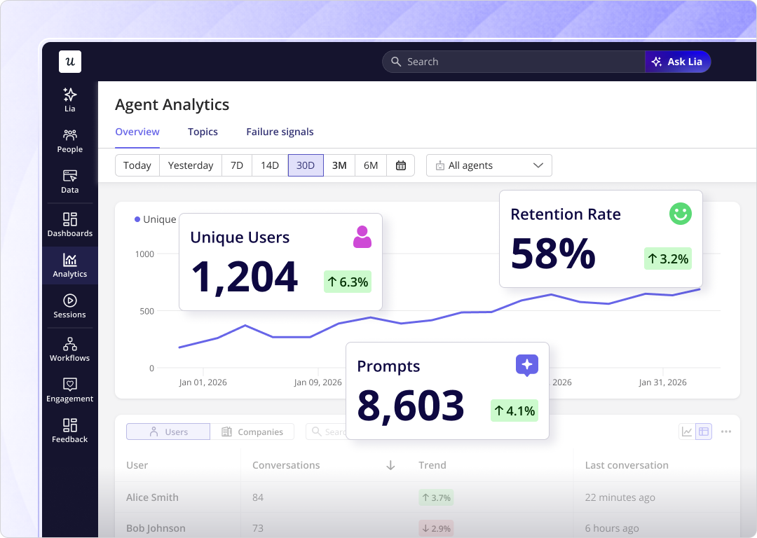
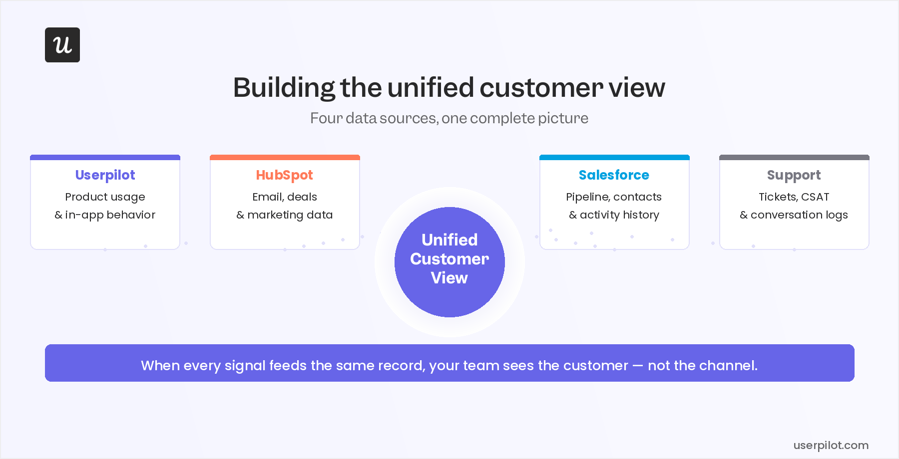
Building the unified customer view
The unified customer view is not a dashboard feature or a CRM module you can buy. It’s what happens when product usage data, support history, CRM properties, and survey responses all resolve to the same customer record, so that the team members responsible for those relationships can see everything in one place.
Most SaaS teams already have every piece of this data, but it’s scattered across multiple tools that don’t communicate with each other.
This is why you end up with your sales team calling previous customers who churned last month because the CRM never received a cancellation signal from the product or CSMs miss expansion opportunities because the power-user behavior occurred inside the product without reaching the account record. I’ve watched both failures happen at companies that described themselves as “data-driven”.
The two examples in this section are the foundation. Get these two right and the personalization, proactive relationship management, or support examples that follow become much more executable.
CRM example 1: Behavioral data capture and CRM sync
Behavioral data is the most underused customer relationship management data source in most SaaS stacks. CS teams spend countless hours on calls asking customers “how’s it going?” but those are conversations they wouldn’t need to have if they could already see what those customers do in the product each week. These feedback surveys also leave out insights from non-human users. Effective CRM strategy in 2026 means managing two distinct data streams: human signals and agent signals. The teams getting this right ensure that their unified views account for both.
Your CRM no longer just tells you what the customer said but shows you what they’re actually doing.
There’s a complication for accounts with substantial agent usage. When an AI agent accesses your product through an MCP workflow, it generates API calls and task completion events rather than clicks and session depth, often bypassing the UI entirely. If a meaningful share of an account’s monthly usage is agent-driven, the click-level behavioral data reaching your CRM reflects only part of the picture, and the instrumentation strategy for those accounts needs to include API-level event capture alongside the standard behavioral layer.
CRM example 2: Automated feedback collection with CRM sync
Behavioral data captures what customers do but not how they feel about it. That’s the gap that NPS, CSAT, and CES surveys deployed in-app are designed to fill, and it’s a gap worth closing: sentiment data that stays in a survey tool does nothing for the CS team making renewal decisions in the CRM.
The standard problem with in-app surveys is that those responses sit in a survey tool while the account history lives in the CRM. A CSM reviewing an account in Salesforce doesn’t see that the same user submitted a 3-out-of-10 NPS score last week. The context exists in one place but the decisions are made in another.
Userpilot’s Salesforce and HubSpot integrations push survey response data to CRM contact and account records automatically. Account health scores (quantitative behavioral signals) and customer sentiment (qualitative NPS or CSAT responses) end up in the same record your CSMs and AEs already work from, without exporting and without manual reconciliation.
Lincoln Murphy, one of the original architects of SaaS customer success practice, has written about this dynamic for years. The teams that close the relationship gap are the ones who act on the signals they collect. By extension, the CRM sync is what makes acting on survey data a standard workflow instead of a separate project.
CRM example 3: Segmented onboarding from CRM properties
When your CRM already has company size, industry, lifecycle stage, and plan tier then the only decision left to make is whether your onboarding flow actually uses any of it. Userpilot’s HubSpot integration pulls CRM properties directly into Userpilot user segments. When a user signs up, their segment membership is determined by data that exists in HubSpot, so that the onboarding checklist, contextual tooltips, and welcome modal can all be differentiated before the user has completed a single in-product action.
CRM example 4: Lifecycle messaging triggered by behavioral signals
The lowest-impact CRM activity most SaaS teams run is the calendar-based email sequence. Day 1, day 7, or day 30 messages that arrive because a schedule says to send them (not because a behavioral signal says the recipient is ready to read them). The customer who activated on day 2 gets the “getting started” email on day 7, and so does the one who never came back after signing up. Behavioral triggers replace the schedule with a signal. An email triggered when a user activates a core feature, or when they haven’t returned in 14 days, or when they’re approaching a plan usage limit, arrives at the moment it’s most likely to land.
The content doesn’t always need to change, but timing determines whether the message ends up being useful or just adding noise.
Userpilot’s HubSpot integration enrolls users in HubSpot marketing automation workflows based on in-product behavioral events. A user completing the core activation milestone gets enrolled in an expansion nurture sequence, whereas one who hasn’t logged in for 14 days triggers a re-engagement workflow. The same automation tooling your marketing team already uses, but fired by product signals instead of a calendar date or other arbitrary schedule.
CRM example 5: Churn risk detection before it becomes visible
The “high logins, zero outcomes” pattern is the churn signal most CS teams miss. The account looks active by every surface metric because sessions are up and product usage is holding steady, but the core outcome that justifies renewal hasn’t been achieved. By the time that becomes visible in a renewal conversation, the case to be made for staying with the product is already lost. Catching this pattern requires watching two signals together: usage volume and value realization.
Userpilot analytics surfaces both at the account level by tracking feature adoption rates, activation milestone completion, and funnel drop-off by user segment.
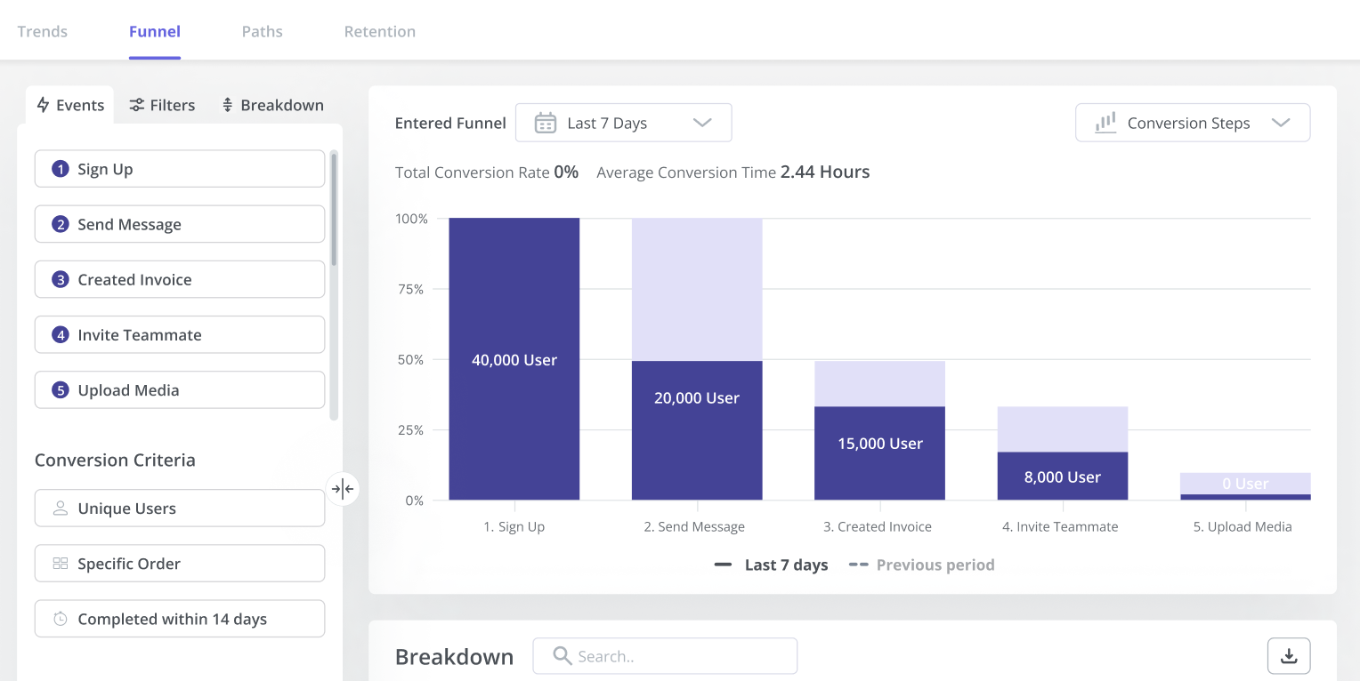
Funnel analysis by account shows where the “high logins, zero outcomes” pattern is hiding because accounts with strong engagement at the top of the funnel but low activation milestone completion are the ones you need to call before the renewal conversation starts.
Lia, Userpilot’s AI, then monitors these signals across the entire user base continuously, flagging accounts that match the risk pattern without requiring a CSM to manually pull a report for each one.
For agent-heavy accounts, the signal set shifts. A customer whose primary usage is an AI agent running automated workflows can show perfectly normal session counts while that agent silently accumulates task failures or rate-limit errors. The health indicators that matter for those accounts are API call consistency, task completion rates, and workflow error frequency, none of which surface in click-level funnel analysis without deliberate instrumentation.
Userpilot’s Salesforce integration pushes health score data to Salesforce account records so your CSMs don’t need to log into a separate tool to find the risk signal. It arrives witin the record they already work from, alongside the contract value, renewal date, and support history.
CRM example 6: Expansion and renewal triggers
The mirror of the churn signal is the expansion signal, and most CS teams are as slow to catch the second as the first. The account approaching plan limits, the feature spreading to a second team, and a usage pattern that looks like a new use case emerging; these are the behaviors that predict upgrade readiness before the customer even thinks to ask. They just need to be visible to the person who can act on them. In-product signals are the earliest expansion indicator you have.
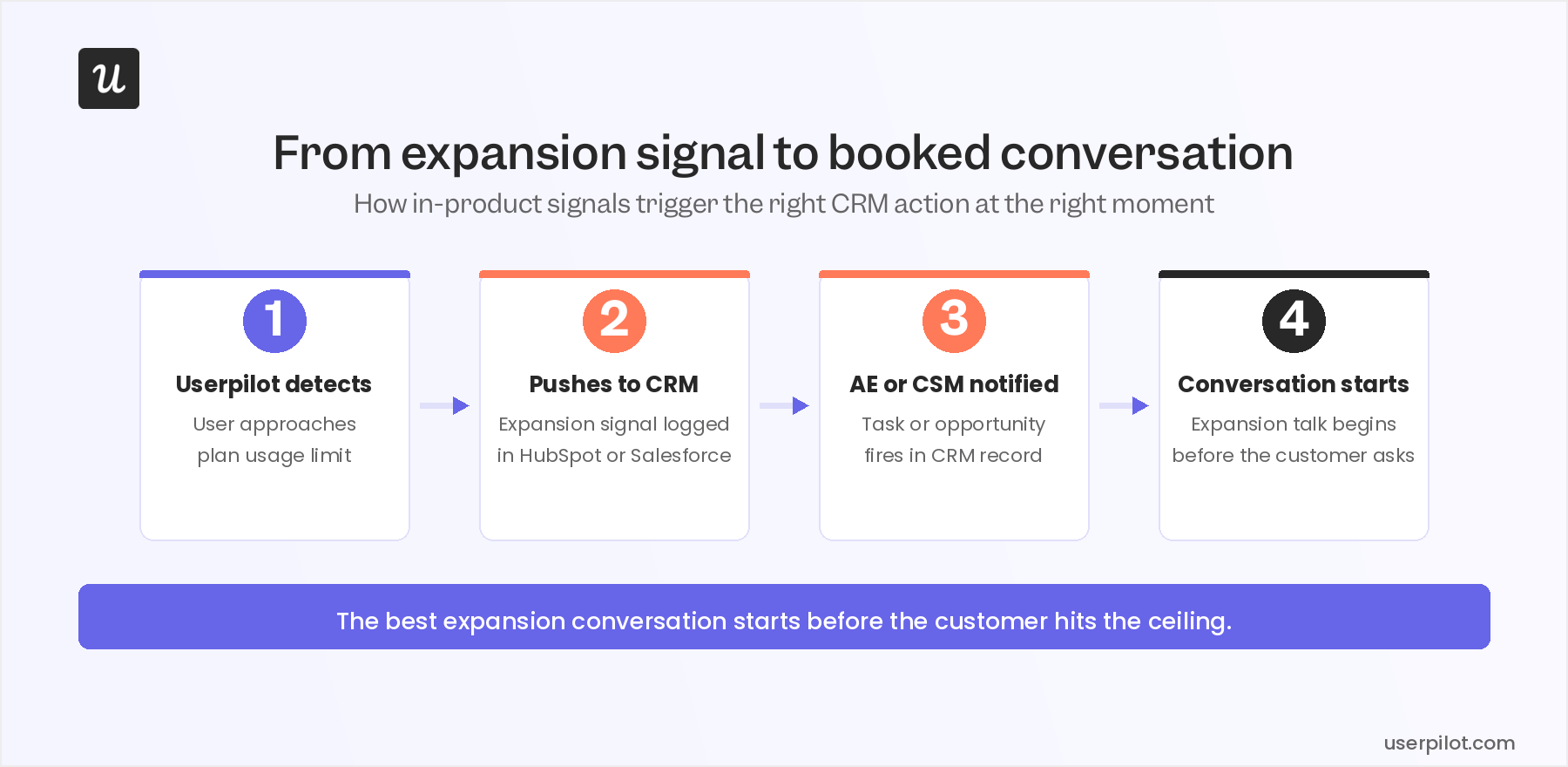
A customer doesn’t think “I should upgrade” until they hit a constraint, but the data shows it coming before they get there.
Usage analytics surface these patterns at the account level so you can monitor plan limit proximity, power-user behavior spreading across seats, and new feature adoption in areas adjacent to the core use case. Userpilot’s Salesforce and HubSpot integrations then push these expansion signals to the relevant CRM opportunity record, triggering a task or notification for your AEs and CSMs. The expansion conversation starts at the moment the signal is strongest, not whenever the CSM happens to review the account or the calendar says to check in.
CRM example 7: Self-service support that keeps customers in the product
Every support ticket is a CRM data point that costs money. High-volume, low-complexity questions (“how do I configure X,” “where is Y setting”) consume CS capacity that should go to the conversations that actually move the relationship. When handled poorly, they don’t just cost your business money but also damage the relationship they were supposed to protect. In-app resource centers with AI-powered search deflect these questions before they become tickets so customers can get the answer inside the product without switching to email or a chat widget.
Userpilot’s resource center is built and customized without engineering involvement: articles, video walkthroughs, and contextual help content that surfaces based on where the user is in the product at that moment.
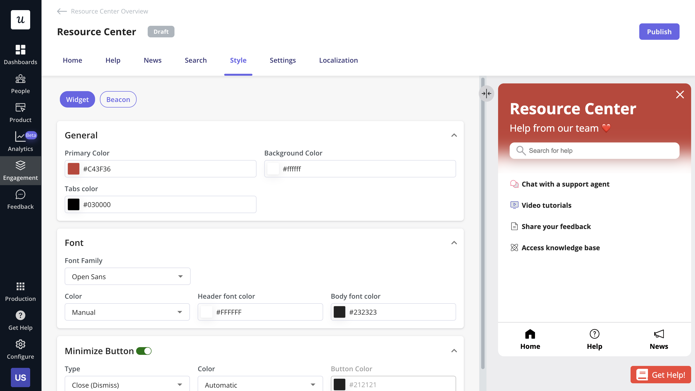
The CRM connection is less obvious but equally important. Support ticket volume by account is an account health signal: a customer who consistently generates support load is telling you something about onboarding quality or product fit. Resource center engagement data (searches, article views, unresolved queries) feeds back into account health alongside behavioral data and survey responses, completing the picture of how the customer is experiencing the product.
Omnichannel CRM (what the integration layer actually enables)
The reason omnichannel customer experience stays aspirational for most SaaS teams isn’t that they lack channels but that the data from those channels doesn’t resolve to the same customer record. A user who emailed support, completed an in-app tour, and opened three product update emails shows up as three separate data points across three separate tools, ensuring no team member has a complete picture. This is the type of compartmentalization you’d see for intelligence operatives rather than team members who are supposed to share insights and respond collaboratively.
When product, support, sales, and marketing data all resolve to the same CRM record, customer relationships benefit from shared context.
IDC’s 2026 report “Rethinking CRM and Embracing Agentic AI” names the agentic dimension specifically. As AI agents account for a growing share of customer touchpoints, the CRM record needs to capture agent activity with the same fidelity it applies to human interactions. An account where agents handle 60% of product usage but those interactions don’t appear in the CRM isn’t omnichannel; it’s a partial view with a blind spot large enough to misread account health entirely.
Userpilot’s HubSpot and Salesforce integrations make in-product behavioral data a first-class CRM data source alongside sales history, marketing engagement, and support tickets. A brief note on CRM types: collaborative CRM platforms (like Microsoft Dynamics 365) are designed around cross-team data sharing; operational CRM systems (like HubSpot or Salesforce) handle the workflows that act on it; analytical CRM systems (like Zoho Analytics) provide the reporting layer. Most SaaS teams use a combination, and whether they achieve their goals usually comes down to whether product data (human and agent alike) is factored in at all.
Agentic expansion signals (how to grow revenue when your account is an AI)
A growing share of SaaS accounts in 2026 are accessed partly or primarily by AI agents running automated workflows through MCP connections. These accounts don’t generate the behavioral signals CS teams were built to interpret. High session counts can mask zero task completions while a health score built around click-stream data will rate an agentic account as perfectly healthy right up until the non-renewal lands. The signals that actually matter for these accounts are different: API call volume, task completion rates, workflow error frequency, and rate-limit proximity to name a few.
Yazan Sehwail, Userpilot’s CEO, has been direct about where the product usage layer fits in this shift:
“We see Userpilot as becoming the infrastructure that powers your product usage data for that sort of system. As teams start deploying their own AI agents, those agents are gonna tap on our existing infrastructure that will be powering all of the usage and all the product data, and that’s extremely powerful.”
The practical CS implication is to extend the unified view rather than build something separate. An account’s AI agents hitting workflow errors is a risk signal that belongs in the same CRM record as NPS scores and renewal dates. Consistent task completion at scale is an expansion signal the same way power-user behavior is, and both need to reach the CSM’s record for anyone to act on them.
Execution is a choice; Monitoring AI agents is a requirement
Ninety percent of SaaS teams know what good customer relationship management looks like. The 32% that have actually built the unified view didn’t get there by being more sophisticated. They picked the right tooling, closed the data silos between their product and their CRM, and built the workflows to act on what they could suddenly see. The examples in this post are all variations on the same underlying move: taking data that already exists in your product and making it visible to the person responsible for the relationship, at the moment when it’s most useful. That’s the customer relationship management execution gap.
Closing this gap is now a willful decision rather than the technology problem it used to be.
The companies doing this well in 2026 are also extending the definition of “product data” to include what their customers’ AI agents are doing. Agent workflow health, task completion rates, API error signals: these are relationship data now. The CS teams building playbooks around both human and agent signals are building a unified view that’s actually complete. If you want to see how Userpilot’s HubSpot and Salesforce integrations work in practice (the behavioral event sync, survey response push, and health score automation covered in this piece), get a personalized demo.
About the author