User Engagement 101: What It Really Means (and How to Do It Right)

The average annual churn rate for SaaS companies sits between 1%-5%, and 4% churn rate is considered a healthy benchmark. Yet, most teams feel their numbers are going above this range without seeing it coming.
It starts weeks earlier when new users sign up, try the product once, and never return. While the average completion rate is 19.2%, the rest churn. The dashboard might look active, but most users leave long before reaching their “aha!” moment.
I’ll share my strategy for improving user engagement by making your product so valuable that users can’t imagine their work without it, turning them from temporary visitors into long-term advocates. Because true user engagement isn’t logins, session duration, or page views. Those are vanity metrics that mislead you into thinking activity equals value.
What does the term “user engagement” mean?
User engagement is defined as existing users actively interacting with your product in ways that indicate real value.
- For Loom, it can be a user recording their first Loom video.
- For Dropbox, it can be a user uploading and sharing that file.
I define true engagement as the extent to which a user derives value from your product through meaningful interaction. It’s when your product becomes an indispensable part of their workflow because it actively solves their problems and helps them achieve their goals.
This value-based perspective on user engagement is crucial across the entire user journey, from their initial ‘aha!’ moment during onboarding to their evolution into a power user. From a conversion perspective, user engagement is the missing link between acquisition and retention.
The actual definition of user engagement varies from role to role. The goals, the KPIs, and the outcomes are different for each of the roles.
- A product manager sees engagement as users completing key actions.
- A growth marketer sees it as users returning after a campaign.
- A customer success manager sees fewer confused tickets.
However, the end goals for any role tracking user engagement are the same: conversions.
User engagement focuses on users while they use your product, especially new users. However, customer engagement is about caring for customers throughout their experience, even when they’re not using your product/service. This could be via email, social media, or calls/meetings.
Furthermore, your board might point to rising Monthly Active Users. I argue that a truly “active” user is one who performs a core, value-creating action. My job is to boost user engagement so effectively that free users can’t imagine not becoming paying customers, transforming a high-level metric into tangible revenue potential.
This is a smart move now that expansion ARR from existing customers rose to a median of 35% of total new ARR. Your existing, engaged users are your most efficient source of new revenue. This also means distinguishing between engaging a non-paying “user” to prove value and managing a paying “customer” relationship.
Their needs and your goals are different. For a free-tier user, the goal is activation and conversion, which calls for a low-touch, automated model. For a paying customer, the goal is retention and expansion, which often uses a more hands-on, high-touch vs. low-touch engagement model, where a customer success manager might be involved to ensure they’re maximizing their ROI.
Why is user engagement important?
Consider how Slack becomes the default starting point for many teams. They use it before any other tool because it trims the overhead of figuring out what to do next.
It tells you if onboarding worked, if users found their “aha! moment”, and if they see enough benefit to keep coming back. Without it, vanity metrics will hide the truth, and teams miss the signals that predict retention and long-term revenue.
However, some metrics give a false sense of progress. Here are two such scenarios where the data you track doesn’t reflect true behavior:
- Users with a role of “Product manager” log in 5 times per week, but it means nothing if you don’t know what they did.
- They also spend a good 30 minutes using your product, but you don’t know for sure if they were actually productive or just lost.
Tracking both scenarios seems good on paper, but from a conversion point of view, it means nothing.
However, if you found out that 3 out of 5 times users logged in have exported reports, and a few users invited their team members and used team-specific features together, that’s why they spent 30 minutes.
Applying this insight, you can show tooltips to guide new users to try out report exporting and an invitation flow to users in segments created to target product managers.
User engagement is a two-way street; if you want user engagement, you must engage to understand user behavior first.
User engagement is your cheapest growth channel
69% of users who fully activate their profile in the first week of signing up have retained even after 3 months. Since engaged users return on their own, you’d spend less on paid ads just to keep your top of the funnel alive. This means you can drive growth based on data-backed product behavior from real users.
To use user engagement as a growth channel, you need to understand what engagement looks like in practice. All your users can be categorized into 4 stages of engagement:
- Point of engagement: When most users discover features and explore.
- Engagement: When users actively and intentionally use features that solve customer workflow problems.
- Disengaged: When users stop using specific features or the whole product.
- Re-engaged users: When users start using your product again.
To continue running your growth channel smoothly, you must identify users based on these stages and create dedicated engagement strategies for each stage.
We talked with Ann Marie McNamara, Beable’s Senior Product Manager, to understand how they increased app engagement. They used Userpilot’s page tagging to track feature engagement/usage. And they were able to drive student participation by 77%.
Furthermore, they were able to track how many users visit the Educator Academy. Since tagging the page in Userpilot, they’ve had 1681 unique visits to that page.
The re-engaged users cost nothing to acquire. All you have to do is nudge them with in-app messaging or email. Encouraging these users for higher engagement increases the chances of word-of-mouth marketing. You can also gather more user feedback from them using surveys or NPS score pop-ups.
User engagement predicts every other business outcome you care about
While you might say that increasing monthly active users is important, I’d say MAUs alone don’t tell the full story of user engagement. Truly active users interact with core functionalities and value-creation actions. User engagement patterns must show if users understand the value of your product.
Here’s what tracking user engagement can help you predict:
- If usage of core actions (not features) slows down, your team can figure out why and can predict the future churn forming before support tickets or complaints appear.
- Feature-level engagement makes expansion revenue predictable because your team can see which accounts are moving deeper into the product. This is extremely helpful, especially when expansion ARR from existing customers has risen to a median of 40% of the total new ARR. Something similar happened with ChargeZoom, where they tripled their expansion revenue and halved churn using Useriplot.
- Steady repeat usage shows which customer groups will upgrade without waiting for sales touchpoints.
Every competitor can ship similar features, but only one thing keeps users from leaving the moment a new option appears – higher customer engagement.
User engagement is the new moat
A moat is the set of advantages that make it hard for others to pull your users away, and user engagement strategies can be used to defend your users from being poached.
High user engagement builds habits, which makes it difficult to switch to competitors with similar features. Since you will analyze user behavior to come up with engagement strategies, you will stand out from others who are only competing on features and pricing.
Cledera’s high-touch onboarding and limited in-app engagement weren’t scalable. They were able to create engagement, but that was too weak. In just one week, they created in-app messages with Userpilot, and those messages significantly outperformed emails in response rates. They also got better control over user experience to increase engagement with NPS surveys.
How do you measure user engagement?
Basic activity matters because it tells you whether users show up at all. But feature adoption and session behavior matter more than basic activity because they show what users actually rely on.
Here’s what I mean:
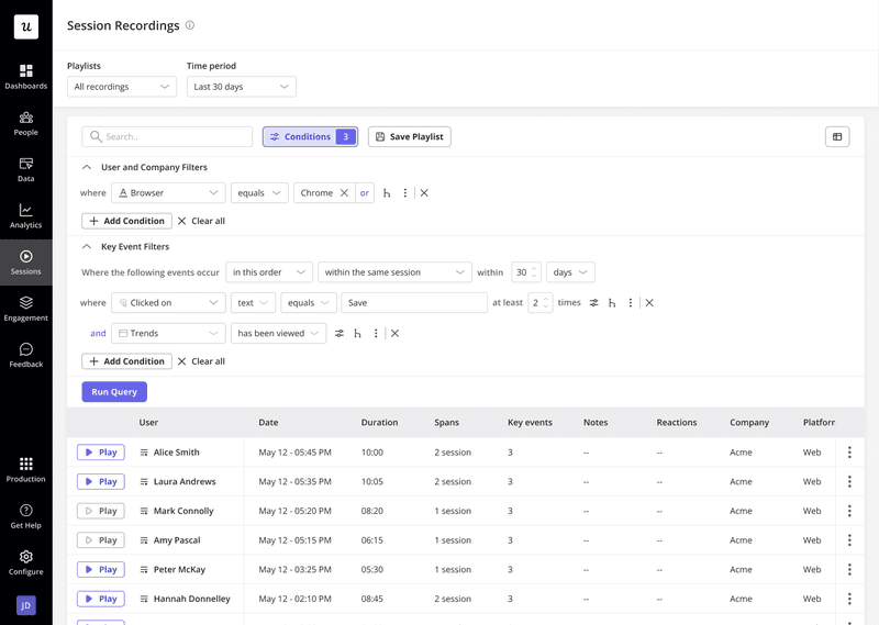
- Session recordings show how users move across your product.
- DAU/MAU metrics show habit strength.
- TTV shows the first win speed.
- Stickiness shows repeat use.
To measure user engagement fruitfully, you must understand what you’re measuring. These key performance indicators (KPIs) give me a true pulse on user health without the analysis paralysis. Here are the four I live by.
1. Define your “active” user
An “active” user performs a core, value-creating action, which signals that they’re getting value from your product. For Slack, it’s sending messages; for Dropbox, it’s uploading a file.
Identify such users by using session recordings, product usage, raw events auto capture, user profiles, and NPS surveys.
Quick checklist to define your core actions performed by “active” user:
- Aligns with value: Does this action align with your product’s core promise? E.g., for a video editing tool, it’s exporting a video, not just creating a project.
- Predicts retention: Do users who perform this action use your product longer than those who don’t? If yes, you’ve found a strong persona.
- Indicates habit formation: Check if the user is repeating this action in a natural cadence (daily, weekly, monthly) as part of their workflow.
2. Measure product stickiness (DAU/MAU)
This metric indicates the percentage of users who return daily and is calculated by dividing the number of daily active users by the number of monthly active users. Analyzing daily vs. monthly active users helps you identify loyal users and create new features and/or marketing campaigns for them.
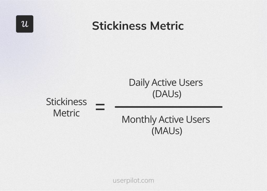
The average DAU/MAU ratio for SaaS products is around 13% and for B2B SaaS, it’s around 40%. This means that SaaS products become a part of the daily workflow for only 13% of B2C and 40% B2B users.
If your product’s DAU/MAU ratio is less than the benchmark, your product likely has unclear “repeatable value moments” and is usually optional. Optional tools are the first that users usually unsubscribe.
Improving stickiness usually begins with diagnosing which core actions correlate with repeat use and not by adding more features, which is also not based on concrete evidence.
3. Track key feature adoption
Adoption patterns make expansion easier to predict since accounts that use the core feature usually grow faster. Key features are the ones that correlate strongly with long-term retention and upgrades. A low in-app marketing adoption rate for a critical feature is a huge red flag indicating poor engagement with high-value functionality. Also, key feature adoption shows which features users actually use a lot, clearly showing which parts of the product matter the most.
For instances where you notice low adoption, dig deeper. The feature you’re tracking might be hidden for the end user, confusing, or was introduced at the wrong moment. For example, a reporting feature placed in a deep menu appears only after a long navigation, so users miss it, get confused when they do find it, and ignore it.
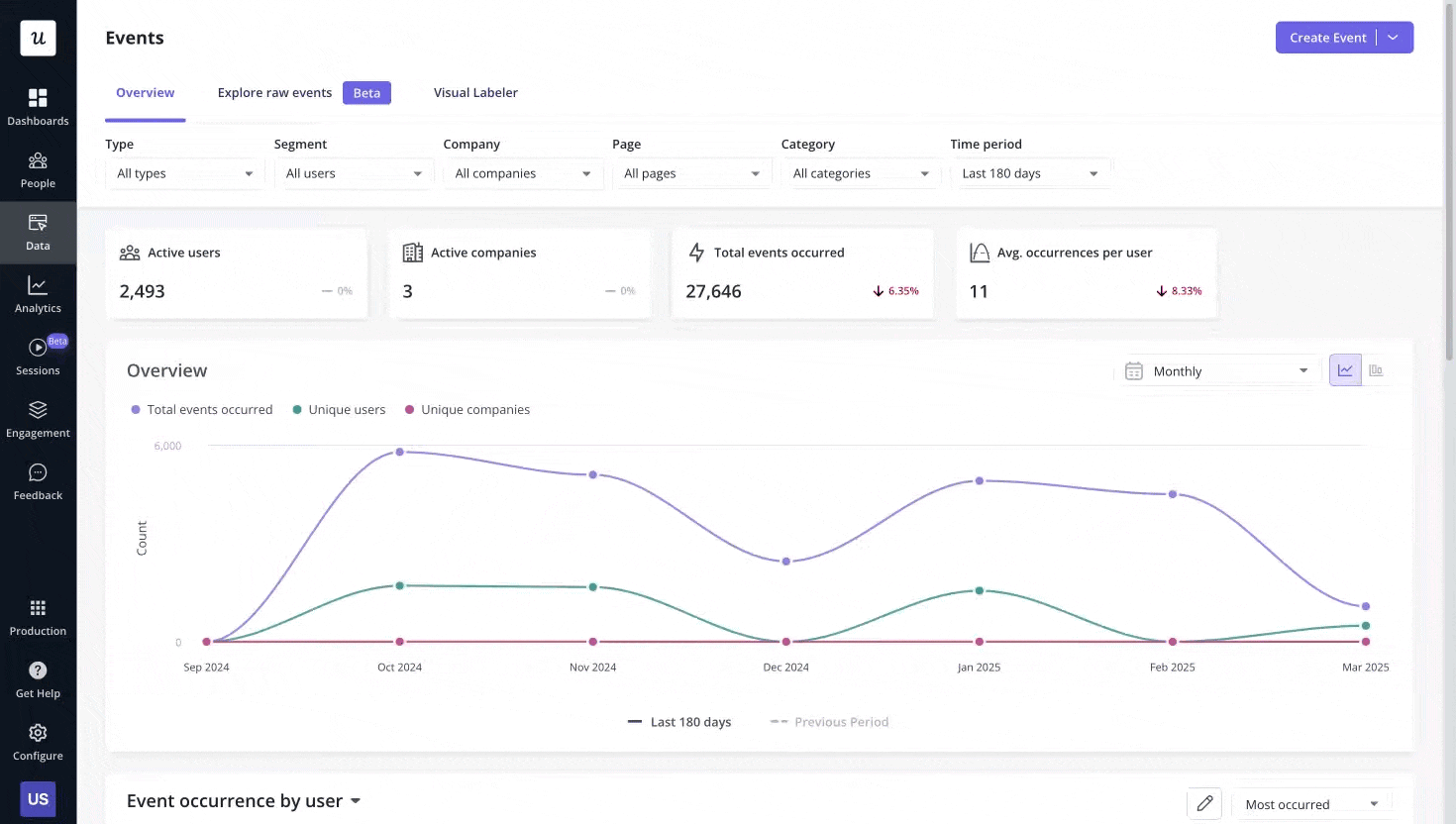
You can visualize this directly in Userpilot by segmenting users based on which core features they’ve adopted, and triggering in-app nudges when they haven’t. Segmenting this way shows which user groups succeed and which group is failing silently.
You can also use:
- Trends report to visualize product data and spot
- Events dashboard to track user behavior in real-time.
- Core feature engagement to analyze usage trends, adoption rates, and metrics.
Feature adoption is a crucial indicator for personalized onboarding of new users. Because you’re taking insights from how users are using your product to get rid of their pain points.
4. Gauge user loyalty with Net Promoter Score (NPS)
Ask users how they feel, not just what they do. Net Promoter Score (NPS) is a simple question: “How likely are you to recommend [Product] to a friend or colleague?”
If your product isn’t keeping users engaged, there’s a hidden friction you need to identify. To figure out where the real value sits, you can trigger NPS surveys while people are using key features.
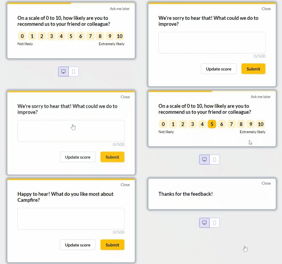
While tracking user engagement, quantitative data can help you make data-driven decisions to improve brand loyalty. That’s why NPS surveys reveal whether users genuinely like your product, as behavior alone is insufficient to gauge user satisfaction.
From an activation point of view, collecting feedback at key moments in the customer journey is where your product fails to make a first impression.
While the average NPS for SaaS companies is between 31 and 36, the score itself is less important than the process you build around it. A good NPS score is a powerful leading indicator of retention and word-of-mouth advocacy that behavioral data alone can’t capture
Lastly, to boost user engagement, pair NPS scores with session data. This way, you can identify what to fix first and which flow people are unhappy with.
How do you increase user engagement?
Every stalled, half-finished flow hides a pattern. Once you know what to look for, you can move users forward with far less effort. The gap between interest and real use is where most products lose it’s users. Start with one or two that address your biggest leaky-bucket problem, then iterate to build a more holistic engagement model.
Below, I’ve shared my playbook to increase user engagement and stop users from just leaving. No warnings and complaints. Just gone.
1. Shorten the time to value (TTV)
The first five minutes in your app are the most critical. Don’t give every user the same generic tour. Instead, use a simple welcome survey to trigger a personalized onboarding path.
Ask two simple questions: “What is your role?” and “What is your main goal today?” Based on their answers, guide them directly to the features most relevant to them.
The easiest way to shorten TTV is to identify core features that will give the users their “aha!” moment and get them there faster. How fast? Around the average TTV in SaaS of 1 day, 12 hours, 23 minutes.
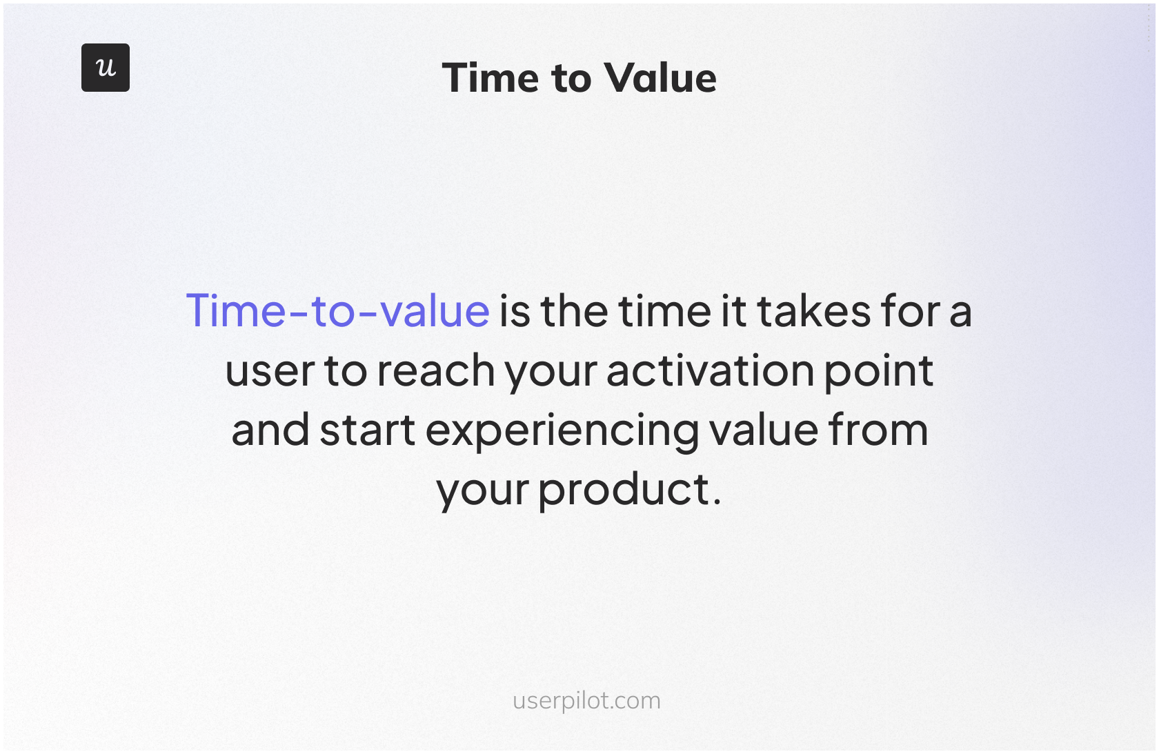
The “Aha!” moment is that point of realization when the user truly grasps the value of your product. To achieve this, the early steps must demonstrate clear value and eliminate guesswork at each stage, enabling them to move forward more efficiently.
You can use Userpilot to build no-code user onboarding flows or modals and set them to show up exactly when a user hesitates. Because small nudges work better than long tours.
Users act more when the next step feels simple.
2. Surface what users are missing
If users don’t touch key features, they’re missing out on the customer experience you have created for them. To see how users flow through your product, use Userpilot’s flow performance dashboard, which will show skipped steps, so you know where to intervene.

To begin fixing user engagement, you can find features that users signed up for but never used, which gives you low-hanging fixes instead of starting from scratch.
When only a small portion of users adopt critical features, it shows your product’s value isn’t obvious and well-known yet, and you might lose all users in that segment.
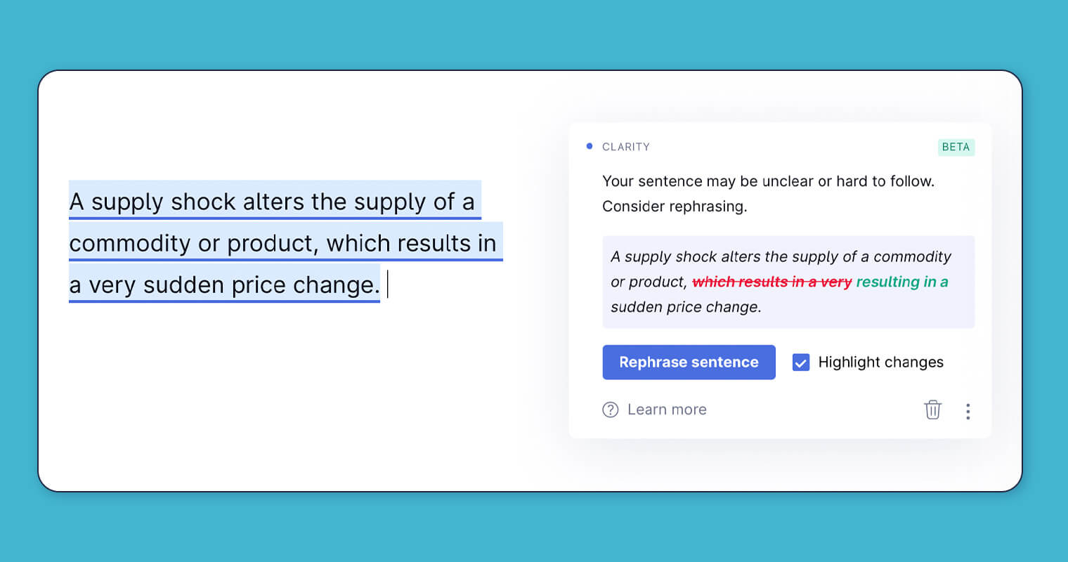
Grammarly is the classic example of this. It shows contextual prompts to users to fix their writing mistakes they’re missing.
3. Design for context, not averages
Even if you have a small user base, don’t treat all users the same. Your product would have power users, new users, and at-risk users. Each type of user would need a different customer experience. With Userpilot, you can optimize success paths for each segment for customer journey, engagement, and growth.

When you’re designing user engagement for context, segmenting based on behavior (e.g., “used this core feature”, “never used it”) gives far more useful insights than just plan type or company size.
Because when you tailor interactions by segment, users feel the product fits their needs, so they engage faster. Also, when you design flows and messages that match the user’s needs contextually, you reduce confusion and friction.
GetCraft couldn’t guide different user types through the right steps because every user saw the same generic onboarding, which slowed activation. Userpilot helped GetCraft build no-code segments and onboarding flows that were personalized to match each user’s needs.
Only 20% of registered users completed their profiles. After creating segments and different onboarding paths with Userpilot, the profile completion doubled and went from 20% to 40%.
More users completed the required steps needed to become a fully active member. The onboarding friction dropped because the users only saw flows relevant to their role and stage.
4. Close the feedback loop
Feedback given inside your product shows issues right away, which makes them easier to fix. Analyze the feedback fast to plan future versions of your product, flow, and in-app messaging that evolve with real user behavior, not just assumptions.
Use in-app NPS surveys to collect contextual feedback. When a user provides a low score and leaves a comment like, “I wish I could integrate with Salesforce,” don’t just let it sit in a spreadsheet. Tag that user with “feedback-salesforce.”
Then, months later, when your team ships the Salesforce integration, create a segment of every user with that tag and send them a personalized in-app message: “Hi [First Name], a while back you asked for a Salesforce integration. It’s here! Click to connect your account.” This shows you listen and makes users feel like partners in building the product. I’ve seen this single tactic rescue at-risk accounts and even convert detractors into case studies.
To help you with omnichannel engagement with your users, Userpilot brings web, mobile, and email into one flow, so users never lose their place when switching devices. Behavior-based triggers let you guide them the moment they pause, while unified analytics show how each channel supports the next. Teams can launch these journeys without code, which speeds up testing and keeps engagement steady.
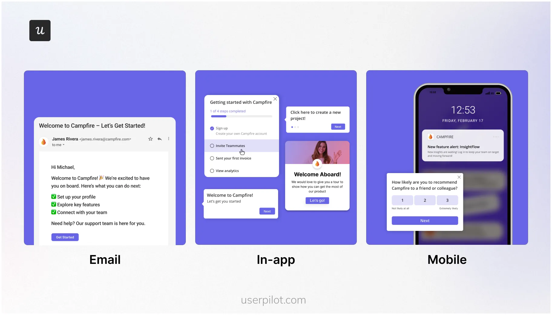
With the omnichannel experience created using Userpilot in place, you can:
- Follow up with users who provide feedback to show you heard them.
- Trigger feedback at key moments (after success, after leaving a feature unused), so your team picks up the pain points while it still affects the activation.
- Fix user engagement issues that analytics tools like Google Analytics might not explain.
When you act on feedback, you close gaps in onboarding and engage customers, which makes business sense. Especially when in-app surveys get a response rate of 10%-30% compared to email surveys of 2%-3%.
5. Re-engage with purpose
The lifetime value to customer acquisition cost ratio is 3:1, meaning that an acquired customer becomes 3 times valuable than the cost at which they were acquired. But if you don’t retain existing users, you can’t reap value from those customers.
Identify triggers, such as unused key features, stalled workflows, and new releases, where users typically drop off. Then reach out to those users by showing modals and in-app messages.
While you’re at it, create a different story for such users. Since their activity is low, they need different messages and offers. Messaging that you use for new or highly engaged users won’t work on them.
Userpilot offers Raw Events, which you can use to capture clicks, form submissions, and text inputs. This behavioral data can be used to pick the right moment to display modals/in-app messages and encourage re-engagement with your product.

Since you’re trying to re-engage customers, craft your message around something they haven’t done before in a way that shows what they’re missing.
6. Reward habits, not logins
We studied 181 companies over the past year and found that the average core feature adoption rate was 24.5% and the median was 16.5%. This means only 24.5% users on average reach the features that create real product habits.
To make your product sticky, you can’t settle for daily logins. Track the repeated use of core actions. To make your users habituated to using your product, reward them for completing tasks. To fix this, you can use Signals within Userpilot to get notified when users complete specified tasks.
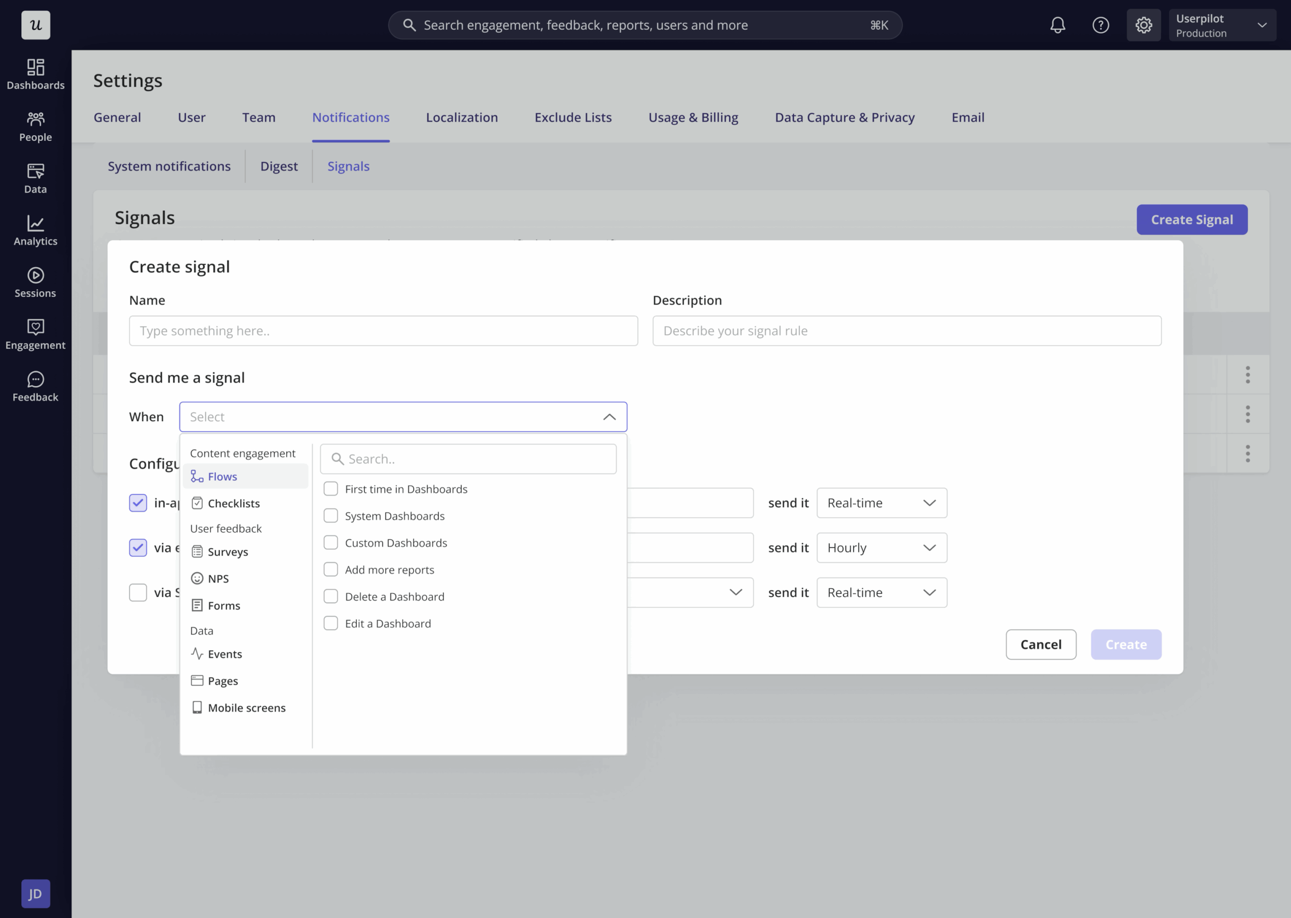
When your team starts tracking cycles of use, they can identify which actions they return to without reminders or nudges. And with that, you can cultivate power users by guiding them through the next steps because this shifts behavior from random exploration to repeated value usage.
The idea is to make your product an integral part of their daily routine, rather than something they check occasionally.
5 User engagement myths SaaS teams still believe
Most product managers and their teams rely on averages that don’t reveal anything substantial.
I’m going to debunk the top myths I have identified to help you come up with marketing strategies that will enable users to achieve their goals using your product.
Myth #1: More activity means more engagement
Since activity is easier to track, it becomes a shortcut or proxy for tracking real progress. But what if users are clicking around because they’re lost? Similarly, long sessions might be because of confusion.
Real engagement occurs when users reach a point where they’re executing steps to achieve outcomes you designed the product for – e.g., exporting a video in a video editing tool.
How to fix this mistake:
- Reduce the number of steps for early users to achieve a win instead of casual wandering.
- Identify users who move a lot but accomplish very little. Check if they’re confused.
- Track if users complete key steps that lead to value, not how long they stay.
Myth #2: Personalization means knowing everything about your users
You don’t need more data to create personalized onboarding and overall user experience. It’s common to think personalization comes from heaps of data, but the strongest results usually come from simple behavioral cues.
Most data won’t be used and adds little to no value to the user experience. What matters the most is what users are doing right now, and not their full profile. User behavior tells you more than their job titles, company size, or what they filled in the sign-up forms.
How to fix this mistake:
- Show the next steps based on their last action, not their background. (at least not always)
- Ignore data that hides valuable insights to create an intuitive user experience.
- Use small signals like skipped steps or paused flows to guide users.
Myth #3: You’ll fix disengagement at renewal time
Most paying customers won’t mind cancelling subscription renewals, especially when your team waits for the renewal dates, assuming they will retain them. Once they decide to cancel, usually the decision is final.
Churn shows months after the first signs of struggle. The flip side is also true – if you identify the first signs of struggle, like skipped features and shrinking visit patterns, you can prevent churn months in advance.
How to fix this mistake:
- Track feature usage drops, since this exposes churn long before the support team hears anything.
- Engage with user-generated content like reviews to fix customer loyalty publicly.
- Look for users who used to return weekly, but now only visit once a month.
Myth #4: Engagement belongs to the product team
User engagement is an implied KPI for all teams, not just the product team, and other teams don’t have to watch from the sidelines. All teams contribute in their own capacity to move users forward.
CS teams catch friction early, support sees recurring issues, and marketing sets out to communicate the positioning.
How to fix this mistake:
- Run monthly engagement reviews so all teams are on the same page and see the same signals.
- Use shared dashboards so each group knows where users fall behind.
- Give clear winners for each stage of the journey, not just features.
Myth #5: You can’t measure engagement until you’re at scale
No product is too small for any metric to mean anything, as long as you’re focusing on the outcome and not the basic action. You can track meaningful actions from day one, even with only a few users. In fact, it’s easy to dig deeper when the user base is smaller.
Early signals reveal which paths create value and which paths slow people down. Also, simple metrics tracked for a smaller user base help shape clear habits before the product grows.
How to fix this mistake:
- Document basic actions like first task done, first value reached, and first return visit.
- Define what an “active” user means before you hit the growth mode.
- Study the early users who succeeded and follow their patterns.
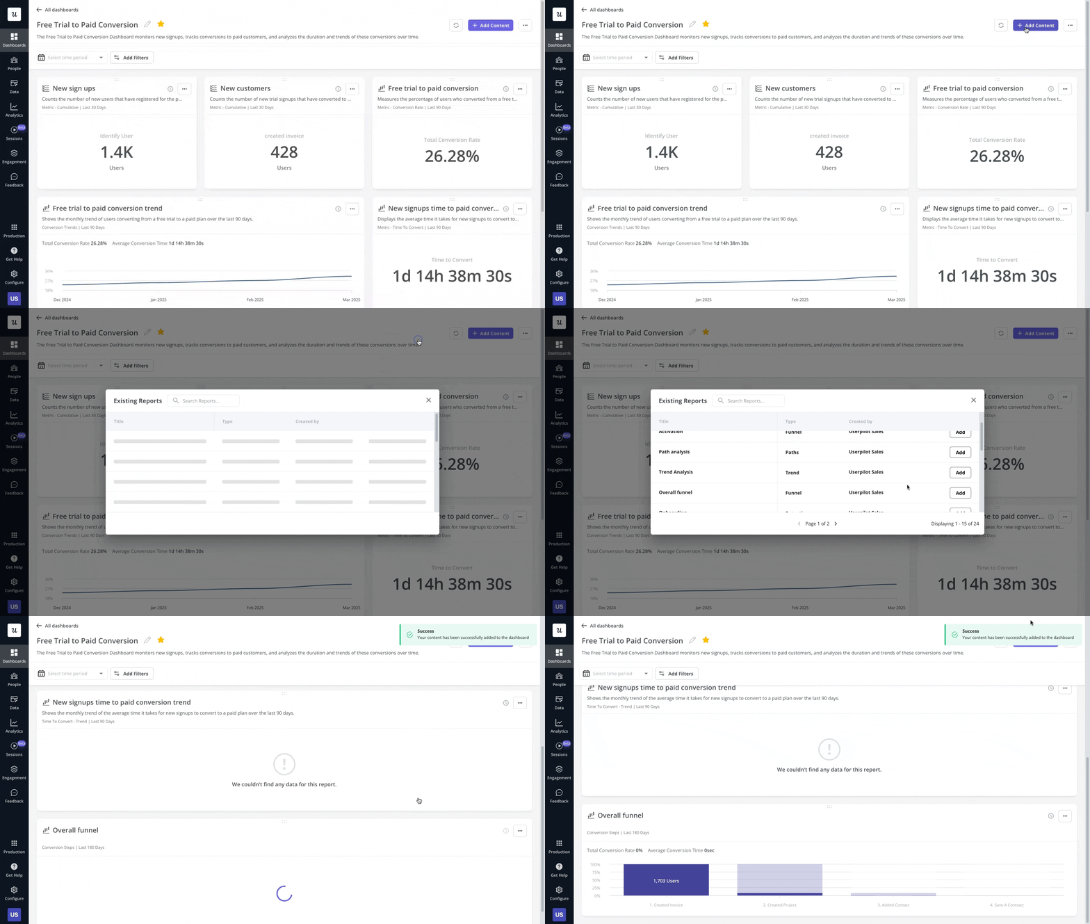
Make user engagement your operating advantage
User engagement isn’t something you do once a quarter; it should be discussed and monitored weekly. That’s because real user behavior guides choices, so teams can stop guessing and focus on what users actually do.
A strong user engagement strategy creates a virtuous cycle: it lowers your Customer Acquisition Cost (CAC) through word-of-mouth and increases Customer Lifetime Value (LTV) through better retention and expansion.
Treat user engagement as a filter for your roadmap decisions, so that you focus only on feature improvements that move users forward. Let user engagement be the north star that guides your new features development, because you’re watching which actions users repeat intentionally.
Take user engagement seriously because each interaction is a chance to help users get one step closer to value.
FAQ
What is user engagement in UX?
User engagement in UX refers to the level of attention and action users exhibit while interacting with a product. It reflects how well they understand the experience and whether they reach outcomes that matter to them.
What is another name for user engagement?
Another term for user engagement is customer engagement, particularly when users have already become paying customers and regularly interact with the product.
What is a user engagement plan?
A user engagement plan outlines the steps a team takes to guide users to value. It defines key actions, touchpoints, and follow-ups that help users stay active, complete tasks, and build steady habits over time.

