How to Write the Perfect Software User Guide

How to Write the Perfect Software User Guide

Even for the most experienced onboarding teams, creating a software user guide is not for the faint of heart.

You’ll need to explain exactly how your software works in simple, accessible language… and then get users to actually take the time to read it!

To some extent, this is a problem with the language you use to write your guide.

But you can also reframe how you think about user manuals to make them more interactive and engaging for your customers.

Let me explain.

TL;DR

  • A user guide is a form of documentation that makes it easier for customers to get value out of your product.
  • By allowing users to solve their own problems self-sufficiently, without bothering your customer support team, user guides reduce churn and cut your SaaS support costs.
  • A good user guide is concise, full of images and videos, and structured in such a way that it’s easy to search through.
  • Even with the best guides, there’s no guarantee that the user will read them, despite the countless hours invested into building them.
  • An interactive walkthrough might be a better option, since it’s more engaging for people to learn by doing (or by play) than it is to read a wall of text. It’s also faster for companies to build a walkthrough than a written manual.
  • Walkthroughs commonly contain elements like tooltips, hotspots, checklists, microsurveys, and modals.
  • Userpilot will let you build all of these elements without needing to code.

What is a user guide and why is it important?

If you’ve ever been through the millennial rite of passage that is building furniture from Ikea, you will have seen a user guide before.

ikea guide
Source: IKEA

Manuals such as these are used in almost every industry to assist users in getting the most out of products. And the SaaS world is no exception to this rule.

User guides can be physical, like the leaflet in the picture above, but in the world of software, they’re much more likely to be digital.

Enter the knowledge base

Many SaaS businesses have started creating knowledge bases on their websites.

A knowledge base is a distinct part of your company’s website (often a subdomain) which houses content showing customers how to use your app.

Userpilot has a knowledge base of its own:

userpilot knowledge base

And we’ve previously written about how you can use a help center widget to embed your knowledge base within your product itself, making it even more accessible to your customers.

Here’s what this looks like:

resource center
Source: Postfity

If you’re thinking “this sounds like a lot of work to put together,” you’d be correct. So…

Why bother?

There are 4 good reasons to spend time and money building online manuals like this for your customers:

Self-sufficiency

Firstly, there is value in allowing users to answer their own questions in a self-sufficient manner.

70% of customers prefer to look up answers on a company’s website than send an email or give customer service a call.

Less tangibly, there’s also the sense of accomplishment you can give your users when they solve their problems for themselves.

Fewer support costs

If more of your users are able to solve their own product issues of their own accord, that means that fewer queries will reach your customer support team.

As a result, you won’t need to employ so many support agents to answer the phone, emails, or online chat.

If all those agents are salaried, that adds up to a lot of savings over time.

Contextual help

If you really know what you’re doing, you can set up your help widget in such a way that it will automatically display the 2-3 knowledge base articles that are most likely to benefit users according to which part of your app they’re on.

From your customer’s perspective, that makes you look like a mind-reading Jedi, able to anticipate their questions even before they themselves can.

Less churn

If you put the previous 3 factors together, the bottom line is that companies that invest in user documentation experience less churn over time.

And you’d be surprised how much of a problem churn is for SaaS businesses, even as early as Day 1.

What you should include in your user manual?

There’s no such thing as a universal manual that will work for all businesses.

But if I had to recommend a list of ingredients to maximize the odds of your manual providing value to the end-user, here’s what I’d include:

Write simply and concisely

Few things are more annoying than verbose technical writers.

bad writer

Remove all the fluff from your manual to make it as user-friendly as possible. Every word should say something of value.

No one wants to read a long, boring description of your product’s features that reads like a college essay, so focus instead on the benefits it provides.

Assume that your customer is a novice to your field and pitch your level of writing accordingly. Avoid industry jargon.

Get the visuals right

The saying “a picture speaks a thousand words” comes to mind here.

You should use images, screenshots, videos, and even gifs to break up the wall of text whenever you can.

If you need to include a screenshot of your product, consider showing a simplified user interface that greys out the less relevant parts of your app, like this:

simplified ui

That way, you make it as easy as possible for the reader to focus on what you’re drawing their attention to.

Any fonts that you use should be consistent with both the rest of your knowledge base and indeed your brand’s overall style sheet.

A logical structure

When you create user guides, you should structure them in such a way that they are as easy to read (and scan) as possible.

A table of contents is essential for each guide or article.

If you have multiple guides, consider segmenting them by topic area, so the reader doesn’t have to scratch around in the “API integrations” guide to figure out how to install your Chrome extension.

On the macro-level, it makes sense to present topics for new customers front and center.

For best results, your user manual should be searchable, as should your knowledge base as a whole.

Go the extra mile

If you follow the above 3 pointers, your user guides will be better than those of 90% of other SaaS companies.

If you want to really “wow” your audience:

  • Include links to further resources (including external resources) to really ramp up your customer education.
  • Ensure that your content is accessible to the deaf or the blind. You could even consider making separate guides for these segments.
  • Test your manuals on real users and incorporate their feedback as your bring out new iterations. That way you understand exactly what support documentation they need.

For a free template to give you some inspiration, feel free to check out Userpilot’s own knowledge base.

Limitations of traditional software guides

But even if you follow the above advice to the letter, your manual still won’t be perfect.

Partly, this is a philosophical point: there is no such thing as 100% perfection, and striving after it is an exercise in futility.

Will users read them?

There is also no guarantee that your users will read your guides, especially if they are not situated inside your product itself.

Even if they do find them, they’re unlikely to really enjoy reading them. I mean, let’s be honest here: can you say that you’ve ever enjoyed reading product guides?

I didn’t think so.

How much time are you willing to invest?

It’s also worth considering that creating technical product documentation like this takes a long time, assuming you’re going to do it properly.

You should factor in:

  • Interviews with software developers so that the technical writer understands your product.
  • Editing and re-editing.
  • Coordinating your writer with your graphic designer.
  • Hours spent testing guides on real customers
  • Edits to the documentation after every new product update.

And after all that, there is still no guarantee that your customer will even find your guide, let alone read it and find it helpful.

That’s a pretty large time and financial expense, not to mention the opportunity cost of everything else that you could be doing instead of writing user documentation.

So is there a better way?

The value of an interactive guide

We’ve previously written on this blog about the merits of an interactive product walkthrough.

To recap, this is:

  • A two-way conversation with the customer which responds to their in-app behavior in real-time.
  • A guide to only the parts of your product that the user finds relevant to their individual use case
  • Something that challenges the customer to take action. By using basic features of your product, they will learn by doing, as opposed to by reading.
  • Based on a short checklist that’s linked to the user’s segment, and will lead the customer to perform tasks that take them towards activation.

Not a linear product tour

For sake of clarity, when I say “interactive product walkthrough,” I don’t mean a linear product tour.

A product tour lists all the features of your product at once, in the same order each time, regardless of the user’s needs. These are universally hated, as the following graphic shows:

product tour hate

Now that we’ve got that out of the way…

Is interactive better?

Here are some compelling reasons to consider creating an interactive guide, as opposed to one that just makes the customer consume content passively:

More engaging

No one enjoys reading a wall of text. Especially in an age where our attention span is shorter than ever before.

Instead of reading, your customer can learn by doing. They can experience the value of your product first-hand, as opposed to just understanding it abstractly.

You can even turn your walkthrough into play by adding gamification elements like points or a leaderboard.

gamification

See this post for more details.

More relevant

The challenge with a traditional user guide is that users have to manually look for the information that will allow them to solve their problems.

Modern automation has reduced this pain a little bit, with searchable knowledge bases, help center widgets, and contextual help.

But it’s an even more elegant solution when your interactive walkthrough literally only shows customers information that’s relevant to them. Everything else is filtered out.

That’s essentialism personified.

Faster to build and iterate

As we discussed earlier, building a knowledge base is an arduous task that involves multiple departments.

By contrast, creating a product walkthrough can be done in a matter of minutes by a product marketer.

You don’t even require code to do this. Solutions like Userpilot will let you build your walkthrough in the browser and visualize the result immediately.

These same time savings apply to any future updates to your user documentation as well.

Get the user to invest in the process

Both the Hook Model and the Ludic Loops models of product engagement require the customer to invest in spending time in your product before they become regular users.

hook model

This stands to reason. Sunk costs psychology also suggests that humans, in general, are more likely to value something after they have invested time and resources in it.

So if your goal is long-term customer retention, you may as well start getting users to engage now.

Elements of an interactive guide

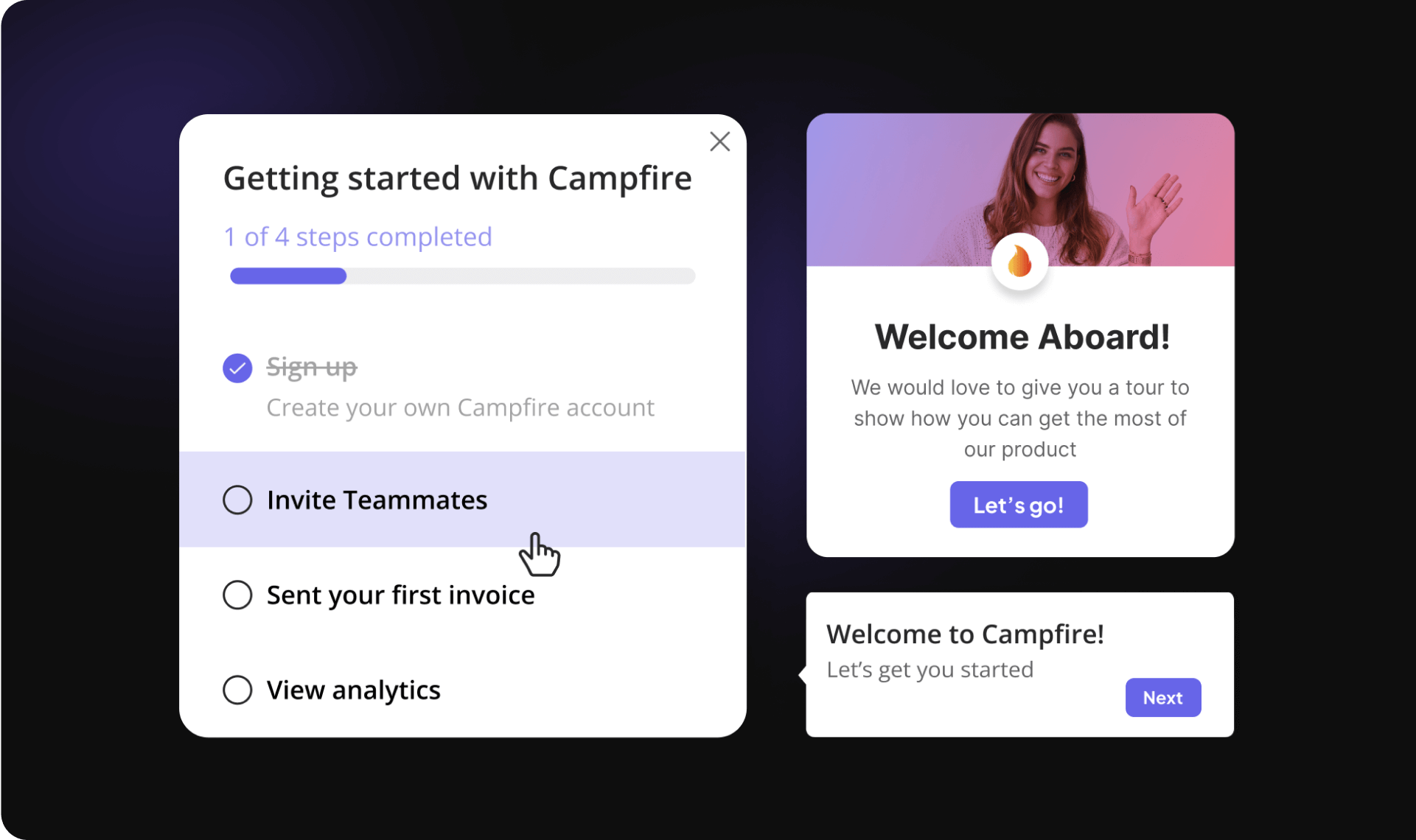
To build an interactive guide, you’ll need to include the following UI patterns.

All of these can be created with Userpilot, for the record.

Checklists

checklist

Checklists are great for setting your customer tasks so that they learn the most important features of your product for their particular use case.

For best results, give the user free credit for completing the first task, so that they experience an immediate sense of accomplishment.

Tooltips

tooltip

Arguably the most used UI pattern, tooltips are great for providing contextual help for one individual element of your product.

The customer just needs to mouse over the element and then the tooltip will appear, as if by magic.

Microsurveys

microsurvey

Are you unsure what your users think of your interactive tour? A microsurvey is a great way to ask them for feedback.

There are quantitative surveys that use metrics like NPS, and also qualitative ones that give you more context about the user’s feedback.

Hotspots

hotspot

These are a great alternative to tooltips when you want to highlight one UX pattern.

Rather than explaining what the pattern does, the hotspot will blink softly to get the user’s attention.

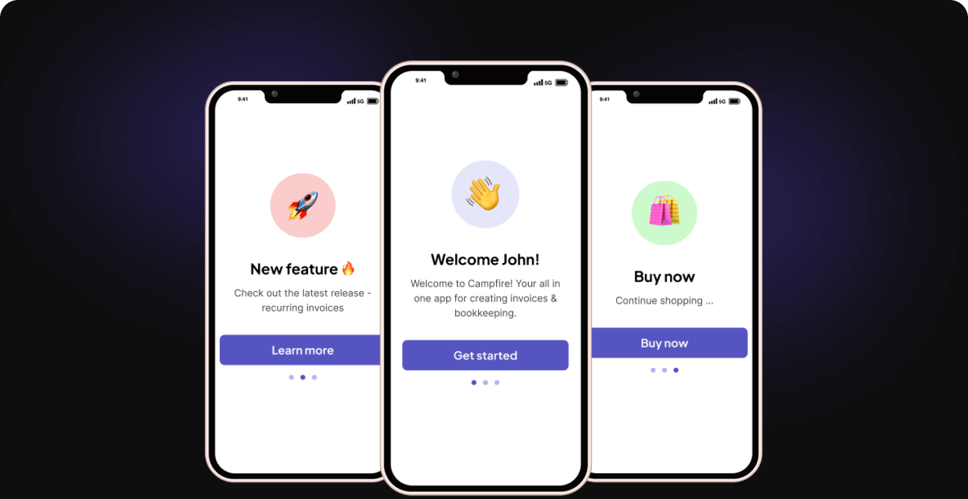
Modals

modal
Source: Asana

This is a versatile pattern that is substantially larger than the others we’ve listed so far.

You see lots of companies using modals to create a welcome screen as the first component of their interactive tour.

Conclusion

Thank you for reading this guide to software manuals! We hope you’ve found it useful.

You should now know:

  • What a user guide is and why they matter
  • What a manual should consist of
  • Why interactive walkthroughs are superior to manuals
  • What elements a walkthrough should include

If you want to build a walkthrough for your company without having to mess around with code, you should give Userpilot a try. It’s free, so you have nothing to lose. Check it out today!

previous post next post

Leave a comment