Why Traditional UX Design Principles Fail in SaaS and What Product Leaders Should Use Instead?


Simplicity, consistency, and ease of use are core principles of user experience (UX) design, and for a reason. They’re the cornerstone of product design, still relevant today.
However, with the fast-shifting standards of product design brought by the AI revolution and rapidly changing interfaces, the way product teams apply these principles needs to change. A product leader’s job is to manage the tradeoff a principle creates and rely on usability testing and user interviews to show which trade-off applies before a redesign ships.
In this guide, we will focus on 7 insights and actionable observations based on the traditional UX design principles that will hold true in 2026 and beyond.
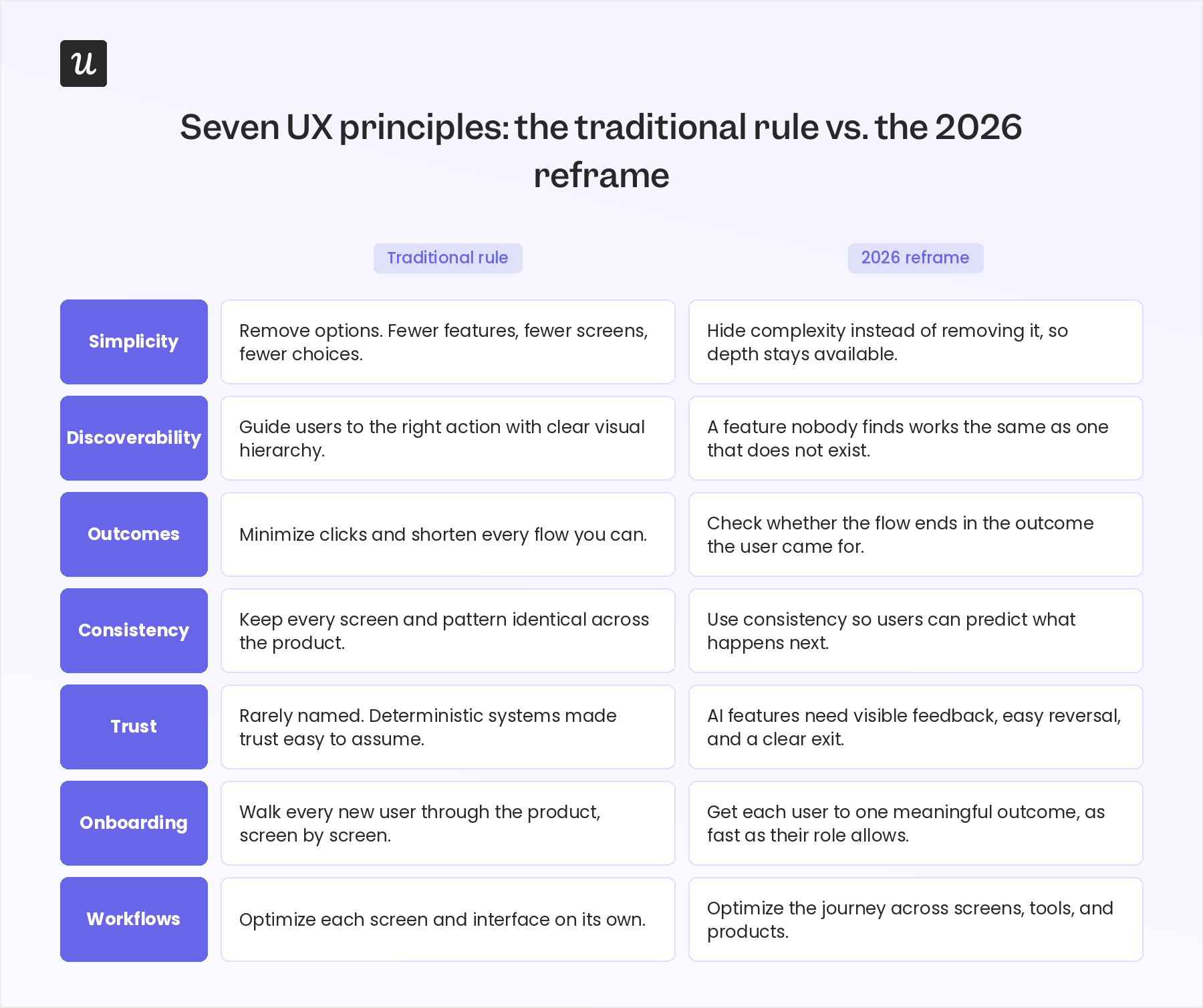
#1 Simplify the effort, keep the control
The traditional version of this principle advises keeping interfaces simple and removing options wherever possible, on the theory that a simpler interface is automatically more user-friendly.
Hick’s Law backs this up. The more choices someone faces, the longer they take to decide, and the higher the cognitive load and mental efforts are required. So the instinct is to strip features, screens, and settings down to a minimum. But removing an option is not the same as removing effort.
The 2026 version of this principle is narrower: Cut the effort a task takes without cutting the control a user needs. Enterprise buyers often expect depth because depth is what they evaluated the product on, even when end users only touch a fraction of it.
This connects to the aesthetic-usability effect, which says people judge a clean, visually appealing interface as easier to use, even when the product underneath hasn’t gotten any less complex. Hiding complexity behind a simpler layer works, but deleting it usually doesn’t.
For example, Salesforce’s interface looks dense on purpose. Enterprise teams configure pipelines, permissions, and automations that a simpler CRM couldn’t support, and removing that depth would remove the reason many of them bought it. Figma applies the same logic to its UI design at a smaller scale. Its toolbar shows only the basics until a designer needs the vector tools underneath it.
This is also Nielsen’s flexibility heuristic at work. An interface can offer shortcuts to people who use it often, without forcing those shortcuts on someone opening it for the first time. A keyboard shortcut, a saved view, or a bulk-action menu can sit one click below the surface, available to daily users and invisible to everyone else.
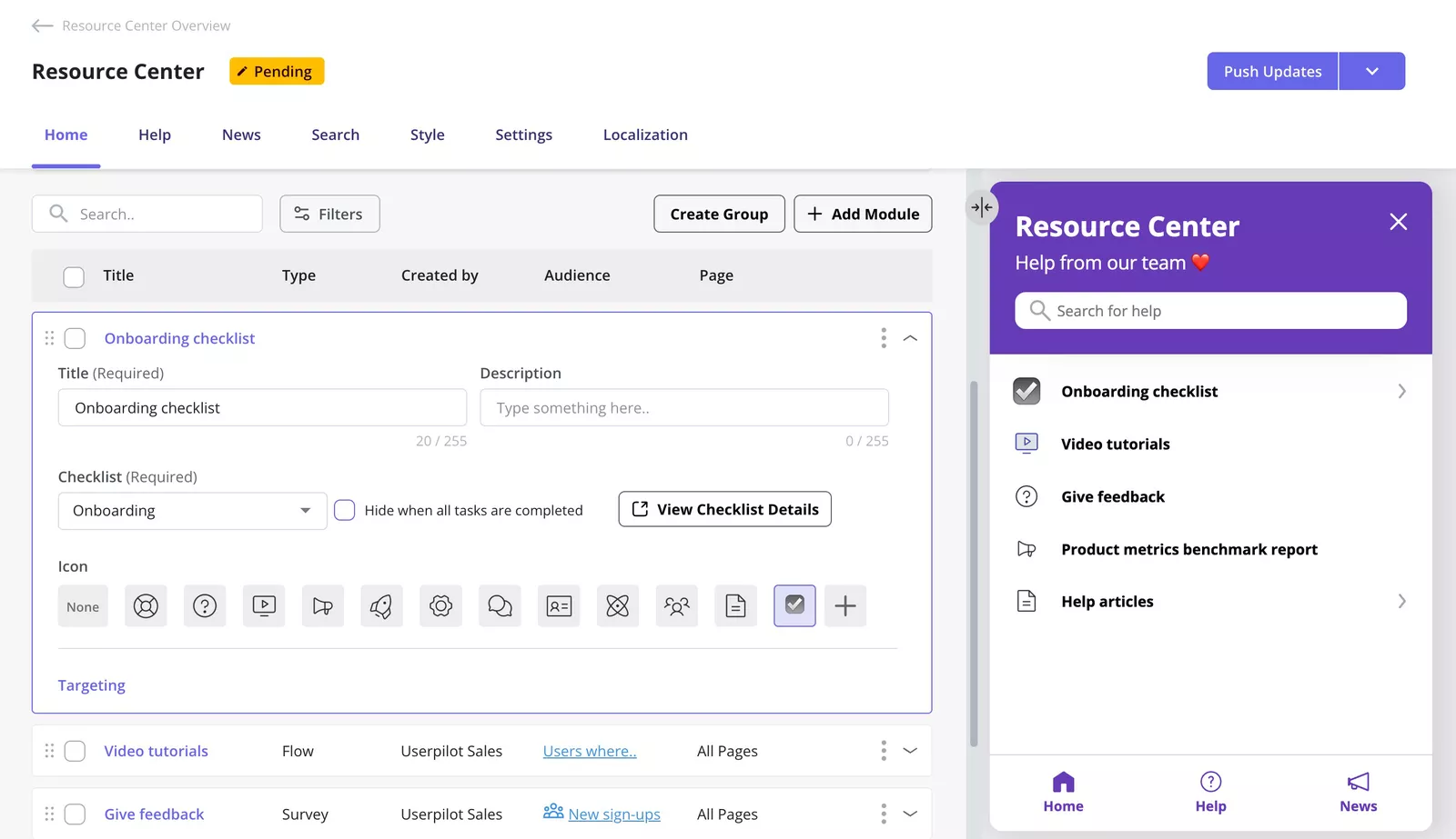
Our own design team ran into this directly while redesigning Analytics 2.0 in Userpilot. The internal assumption was that the event occurrence distribution chart added no value and could be cut from the new layout, but session replay told a different story.
About 10% of users were hovering over the chart to read the data behind it, a small but real group relying on a feature the team had planned to remove.
We made the chart collapsible instead of removing it, so the 10% who used it could still expand it, while everyone else didn’t even realize that it existed because they didn’t use it. Removing the chart would have been the simpler engineering decision, and even easier to implement, but collapsing it kept the option open for the users who needed it.
Accessibility features face a version of the same test, with higher stakes. The European Accessibility Act took effect across the EU in June 2025 and requires many digital products sold there to meet accessibility standards. That makes screen-reader support and keyboard navigation part of a product’s necessary capability, not something to strip out during a redesign for the sake of a cleaner look.
Accessibility means designing for as many people as possible, including users with visual, hearing, or motor impairments, and anyone working around a situational limit like a cracked screen or a noisy room. In practice, that means color contrast that holds up for people with visual impairments, alt text on images, headings that assistive technologies can navigate in order, and descriptive link labels instead of generic text like “click here.” These choices enhance usability for everyone, not just people relying on accessibility features.
Simplifying a product removes effort, but oversimplifying it removes a path some users have no other way to take. Simplicity and accessibility are both key principles here, and one doesn’t excuse skipping the other. This is where design thinking earns its place, by starting from the accessibility need before any visual design begins.
#2 Features only help if people find them
The traditional version of this principle says, make the interface easy to use, and a well-designed screen will guide people to the right action. In 2026, I’d add a condition to that: a feature that nobody finds works the same as a feature that doesn’t exist. Discoverability decides whether the work behind a feature ever reaches a user.
Most SaaS products publish release notes for every update, and most users never open them. A feature can solve a real problem and still sit unused for months, because nothing in the interface points to it at the moment the user needs it.
Sometimes a feature stays hidden because nothing about it gives users a visual cue. A new icon sitting next to ten familiar ones won’t help users quickly notice what’s changed, so it does nothing to eliminate confusion about what’s new.
Contextual helpful recourse centers close part of this gap by surfacing guidance inside the product, at the point where a user is stuck, instead of having to go looking for it in a resource center.
Session replay is one of the most reliable ways to catch the rest of it. Watching how users interact with a flow surfaces usability issues and pain points, like buttons that get hovered, ignored, or missed entirely, in a way that release notes or a one-time product tour never report back.
A feature with strong adoption and a feature nobody touches can ship in the same release. Low usage doesn’t always mean a feature failed. Sometimes it’s just that nobody found it.
#3 When extra steps make a product better
For years, the standard advice here was: Minimize clicks and shorten every flow you can. The 2026 version asks a different question: “Does the flow end in the outcome the user came for”?Completion matters more than speed.
GitHub makes deleting a repository slower on purpose because some user actions can’t be undone. Before the delete button activates, you have to type the repository’s exact name, and for repositories with stars or forks, GitHub adds another warning and suggests transferring ownership instead.
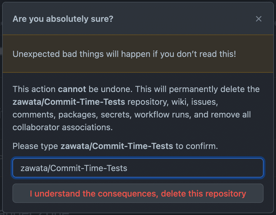
That extra step costs a few seconds, but it prevents a mistake that can’t be undone, which makes the slower flow the better one for this particular action. Good usability sometimes looks like friction, when the friction protects against something irreversible.
Userpilot’s design team tested a similar tradeoff with an approval step for publishing surveys and flows. A contributor would build the flow, and a manager would approve it before it went live, adding a confirmation step meant to catch mistakes early.
Amal Al-Khatib, Product Designer at Userpilot, ran multiple rounds of qualitative usability testing on the approval step and found it would complicate the product and add friction without enough payoff.
The team deprioritized the approval step and shipped a lighter alternative instead. Notifications and alerts to flag risky changes after they go live, rather than blocking them beforehand. That kind of testing is what validates a design decision before it ships broadly, and it matters more as a product adds features and the interface gets more complex.
The same logic applies to onboarding. A flow that takes two extra minutes to explain why a setting matters can produce more confident users than one that skips the explanation to save time, and confident users are more likely to finish the user flow instead of abandoning it and contacting support.
#4 Use consistency to help users predict what’s next
The classic framing treats this as a uniformity rule, keeping everything consistent across every screen and every release. Today, it means UX design consistency exists so users can predict what a button, a label, or a pattern will do before they click it.
This is part of why Jakob’s Law holds true here. Users spend most of their time on all the other sites and apps, and they bring those mental models with them when they arrive at yours. A SaaS app that moves its search bar to an unfamiliar spot, or renames a “delete” action to something else, forces users to relearn something they already knew how to do.
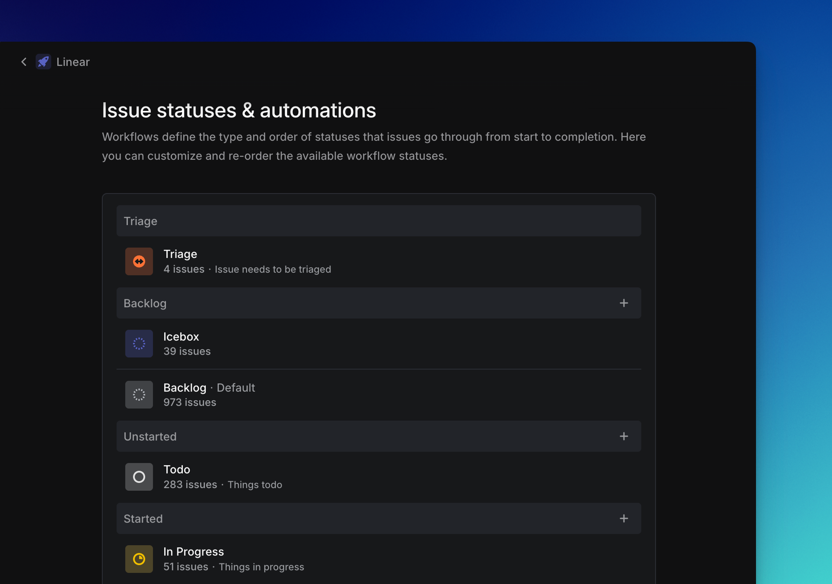
Linear’s design system is built from a shared set of predefined components, including a handful of status colors that stay the same red, gray, or green across every view. Once someone learns how one project view works, every other view behaves the same way, which is what makes consistency useful instead of just tidy. Predictable patterns like this let people focus on their task instead of relearning the interface.
Consistency stops being useful when it locks a product into a pattern that no longer fits how people use it. A redesign is worth the relearning cost it creates only when it changes how the product works, how users use it, but not just how it looks. Examples of this tradeoff show up whenever a SaaS product ships a major visual overhaul without changing the flows underneath it.
#5 Trust has become a UX principle
Most lists of UX principles from a decade ago don’t mention trust directly, because the systems being designed were deterministic. For example, a button always did the same thing, and a report always pulled the same numbers. AI features change that math. A recommendation, a summary, or an automated action can be right most of the time and still wrong often enough that users need to know how much to rely on it.
Jakob Nielsen, co-founder of the Nielsen Norman Group, calls this user control and freedom. Giving users a clear emergency exit to undo or leave an action without fighting through a complicated process. AI features raise the stakes on that heuristic because some of those actions are now taken by a model instead of being typed by a person. Undo, cancel, and exit paths matter just as much when an AI agent makes the change as when a user does.
Gmail’s undo-send button is a small, deterministic example of the same idea. The system did exactly what you told it to do, and undo just buys a few seconds to change your mind before the action becomes permanent.
AI features need a version of this that goes further than undo. Feedback, telling users what’s happening within a reasonable time, is one of the oldest usability principles, and AI recommendations need their own version of it. If Lia, Userpilot’s AI assistant, recommends an in-app flow based on user behavior, showing why it made that recommendation and how confident it is turns a hidden model output into part of the interface itself.
Reversibility matters even more once a system can take action on its own. A user who can undo an AI-made change will trust the system faster than one who has to verify everything it touches beforehand, and that verification step is exactly the kind of friction that the trust in your product is supposed to remove. Reversibility has become a fundamental principle for any AI feature that acts without a person confirming first.
#6 Onboarding should get users to outcomes faster
Most onboarding flows are still built around one idea: show users how the product works, screen by screen, until they’ve seen everything. In 2026, it means getting each user to one meaningful outcome as quickly as their role allows.
A generic product tour is built like an online course. It walks a solo founder and an enterprise admin through the same screens in the same order, regardless of what each already knows. Neither one reaches the outcome they came for. The founder wants to see a result from one core action, while the admin wants to set up permissions for a team that hasn’t logged in yet.
Role-based onboarding splits that single tour into paths that match what each type of user is trying to do. Userpilot’s in-app flows can trigger a different checklist or tour based on a user’s role, their plan, or an action they’ve already completed, so a returning user doesn’t see the same checklist as someone on day one, and each flow is built to guide users toward one outcome instead of showing them everything at once.
A flow tied to a role or a milestone reaches the user at the point where it’s relevant, rather than on day one, regardless of fit.
Users don’t experience a product in isolation. Someone opening it from a mobile notification at 11 pm, stressed and trying to get one thing done, is in a different state than someone on a scheduled onboarding call with their team, and a milestone-based flow can adapt by saving progress and resuming where someone left off, rather than restarting the onboarding from the top. People also move between different devices mid-task, picking up on a phone what they started on a laptop, and a flow that remembers their progress works the same way regardless of device.
Progressive enablement extends the same idea past the first session. Instead of unlocking every feature on day one, the product introduces advanced options once a user has completed the basics, so the path to each new capability appears when it becomes relevant, which is the kind of timing onboarding psychology research focuses on.
#7 Why the best UX design happens between screens
Design teams have typically approached this screen-by-screen by optimizing each interface on its own until every one is clean and usable. But today, I’d recommend optimizing the journey a user takes across screens, tools, and sometimes entire products.
A support issue rarely starts and ends in one tool. A user might hit an error in your product, search the help center, open a chat widget, get escalated to a person, and receive a follow-up email, with each step handled by a different interface.
Each of those tools can be well-designed individually and still add up to a bad experience if the user has to repeat their problem at every level of their way to resolution. Visibility of status, the same idea Slack uses for individual messages, matters just as much across this whole journey. A user should be able to tell where their issue stands without asking again.
This is also where visual hierarchy and information architecture stop being the same thing. A clear, logical visual hierarchy helps users quickly identify key elements on a screen and decide where to go next, with minimal effort. Information architecture is the layer behind it, that is, how content gets grouped and categorized, and how the screens, tools, and pages users navigate connect to each other.
A UX designer can get the visual design and visual hierarchy of every screen right and still ship a product whose information architecture loses people between screens. Both layers matter, and neither one makes up for the other.
Fixing this means treating integrations and handoffs as design problems, not just engineering ones. Because streamlining workflows across tools is part of the user experience too. A clean, intuitive screen doesn’t help much if the step before or after it lives in a different tool with no connection back.
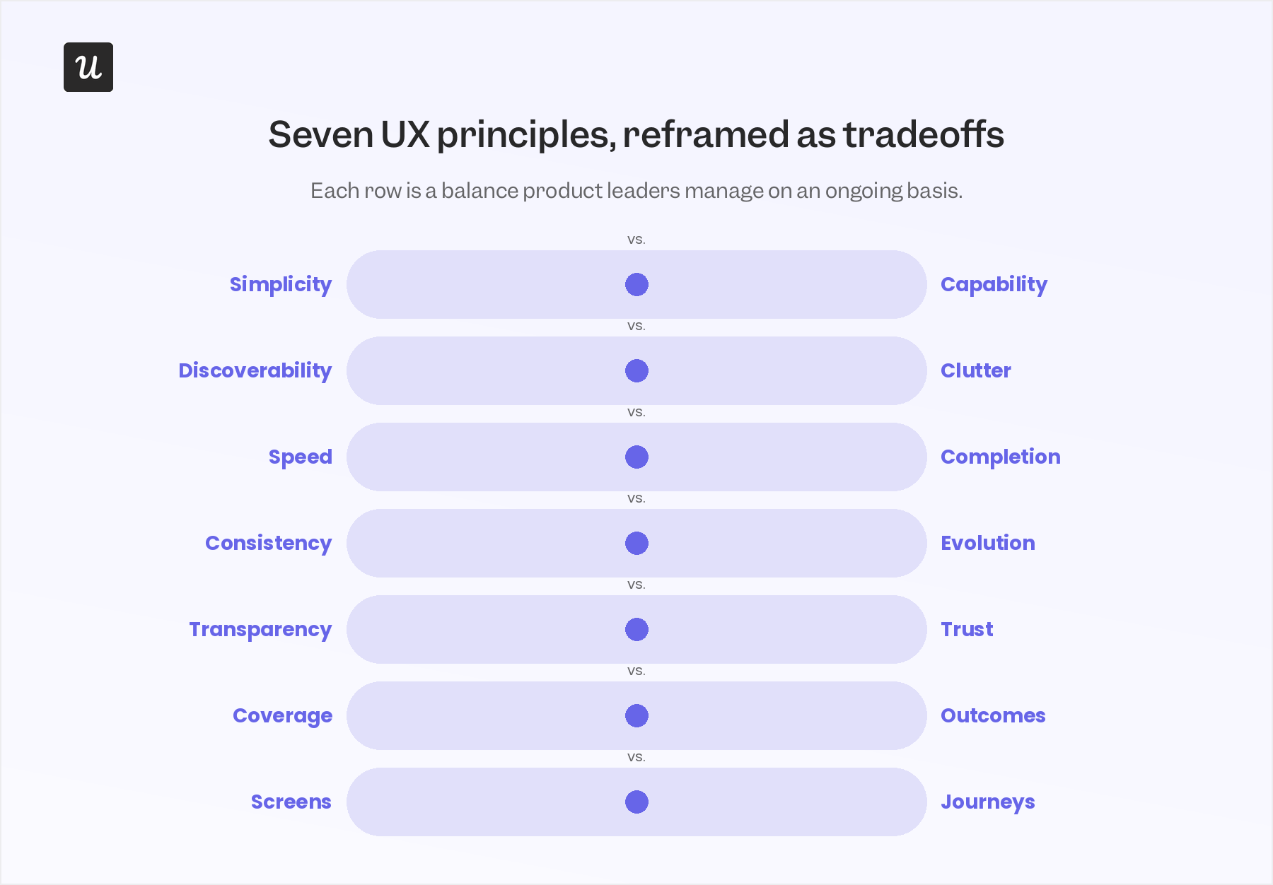
The shift from rules to tradeoffs
Each of the seven principles above still holds up on its own. All seven points back to the same idea of user-centered design, where the test for a decision is what it does for the person using the product, not whether it matches a rule. What changes is how literally a team applies that idea, and in what context.
A rule like “keep it simple” or “stay consistent” doesn’t say what to do when two good outcomes conflict, like a power user’s need for depth against a new user’s need for clarity. Treating the principle itself as the goal, rather than the tradeoff behind it, is where most of these design decisions go wrong. User centricity means holding both needs as legitimate, then deciding which one the product serves in this specific moment.
The strongest product teams don’t measure themselves against a fixed checklist of best practices, because what counts as best practice is constantly evolving as products and user expectations change. Before changing an interface, they ask what problem the principle they’re about to follow is actually solving, and what they’d give up by following it exactly as written. Teams that create products people stick with ask this question early in the UX design process, while a redesign is still an idea on a whiteboard. If you want to answer questions to evaluate the design principles discussed in this post, consider booking a demo to check out how Userpilot can help you with this.
About the author