
Onboarding UX patterns might just be the unsung hero of the SaaS world.
Without in-app experiences guiding the new users through your product such as tooltips, checklists, and welcome screens, it’s unlikely that your users would stay with your product long enough to activate.
But what are the must-have onboarding UX patterns to build an effective interactive walkthrough? And how can you tell whether you’ve designed them properly?
Stay tuned for the answers to these questions.
Onboarding UX pattern categories
Before we get to the individual onboarding UX patterns, it might be helpful to think about a structure to situate them in.
Classically, there are 3 main groups of onboarding UX patterns:
Annotated UX patterns
These are the smallest types of onboarding UX patterns.
The name “annotated” comes from the fact that these UX patterns are literally annotations on top of the user interface.
To show you what I mean by this, the most common examples of annotated UX patterns are:
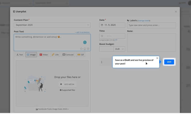
Tooltips:
Hotspots:
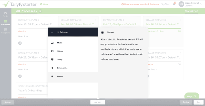
In both cases, these annotations are typically created to draw attention towards one particular action that you want the user to take during onboarding.
Note that I said “one” particular action, not “multiple” actions.
The mistake that most SaaS companies make with annotated UX is highlighting too many actions at once.
This is bad for two reasons:
- When too many options are highlighted, users become confused as to the next action they should take.
- Users get annoyed with all the tooltips and hotspots popping up all over the place, and the risk of them churning rises.
A better approach is to focus on highlighting one key action and then delivering on that promise of value as soon as possible.
In other words, don’t leave 4-5 different screens for the user to click through between your annotation and the thing it is highlighting.
Embedded UX patterns
These are the medium-sized onboarding UX patterns.
Embedded UX patterns are so-called because they are embedded into the customer’s product experience.
Examples include:
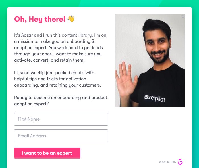
Popups:
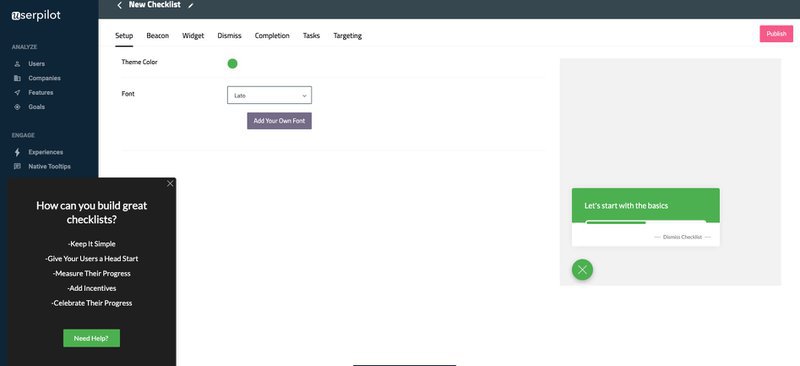
Slideouts:
Checklists:
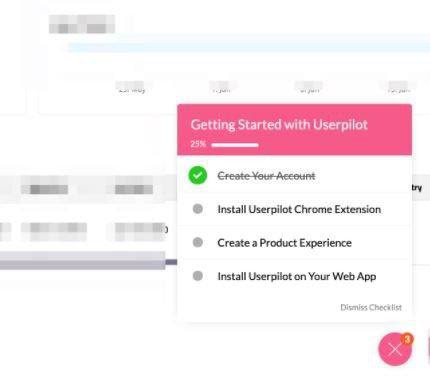
Since they are often larger than annotated UX patterns, embedded UX patterns are commonly used to flag the user and get their attention.
Compared with annotated UX elements, which are best used to draw attention to just one key action, the guidance given by embedded UX is often a bit broader in scope.
For instance:
- Checklists are frequently used to list multiple key actions on the path to activation
- Slideouts might be used to announce a new product feature or a possible plan upgrade
- Popups can be really handy for bringing up a microsurvey that you want the user to fill in during onboarding
Like their annotated cousins, embedded UX patterns tend to be overused by most SaaS teams.
From a user’s perspective, there’s nothing more annoying than multiple slideouts popping up all over the place to try to get your attention when you’re in the middle of doing something.
So don’t overuse your embedded UX patterns.
Instead, highlight the most important actions you want to draw to your customer’s attention and leave it at that.
A good rule of thumb is never to have more than one embedded element pop up at any one moment.
Otherwise, you risk having your users churn.
Dedicated UX patterns
These are the largest UX patterns.
So large, in fact, that the entire screen is dedicated to them — hence the name.
Because of their size, dedicated UX patterns are often used for important data collection, in cases where it’s essential that there’s nothing to distract the user.
Examples of dedicated UX patterns include:
Welcome screens:
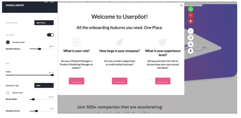
Sign-up forms:
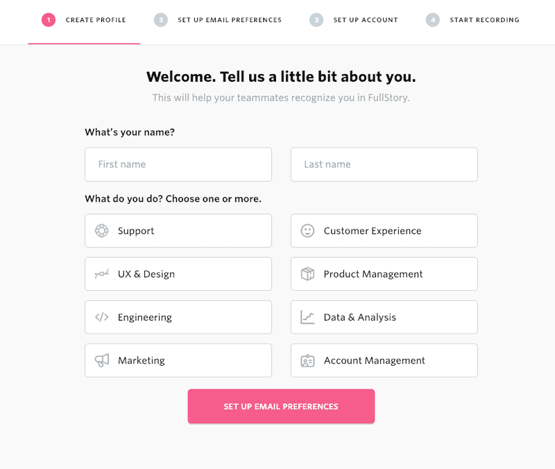
Given their all-encompassing nature, dedicated UX patterns do sometimes require a bit of patience on behalf of users who are chomping at the bit to use your product.
This is especially true if it’s a long welcome screen with a massive onboarding survey or a friction-based sign-up form.
But the upside of using such a large screen is that UX patterns build a sense of anticipation in the user for what comes next.
And in cases where your product requires a lot of data collection before it works properly, dedicated UX is a great choice.
Now that you understand the 3 main types of onboarding UX patterns and what they’re used for, let’s explore the most common individual UX patterns in a bit more detail.
Individual Onboarding UX patterns
There are several main UX patterns that are used during onboarding, with each one playing a unique role in the overall process.
You can use them however you please, but this article will take you through them in the order they appear in most SaaS products:
Sign-up form
A sign-up form is one of the most important UX patterns you will use when onboarding new users.
That’s because it’s the first thing that new users see. As in the offline world, first impressions mean a lot.
To design your sign-up flow correctly, you should first consider whether you want it to be frictionless or friction-based.
Friction in this instance refers to the number of hurdles placed in your customer’s way before they start using your product.
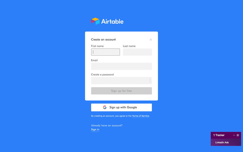
Frictionless sign-up forms are as short, quick, and easy to fill out as possible. They should not get in the way of the customer using your product any longer than is strictly necessary.
Your average frictionless sign-up form will have 2-3 form fields to fill in, something that can be done in a matter of seconds.
Look at Airtable’s sign-up form. It’s about as lean as you could possibly imagine:
Other ways you can reduce friction for your customer during the sign-up phase of onboarding include:
- Reducing password conditions such as requiring a certain number of letters and numbers to a minimum
- Enabling autofill to save customers from manually filling out dates and phone numbers
- Minimizing the number of fields on your sign-up form
- Enabling third party sign-up via platforms like Google or Facebook, as opposed to forcing users to create a brand-new account specifically to use your product
In practice, frictionless sign-up forms are the best choice for most businesses.
But there are occasions where SaaS companies need to collect lots of user data upfront to ensure that their product works as intended.
Other times, digital products will need to gather customer data upfront for security reasons — such as if you’re signing up for a new online bank account, for example.
In such cases, a friction-based sign-up is a better design choice.
An example of a company that uses such a sign-up form in this way is FullStory, which produces session replay software.
FullStory has almost no value as a product without its users first installing the FullStory JS snippet.
The company has therefore decided to extend its sign-up flow, meaning that customers have to install the snippet before they can do anything else.
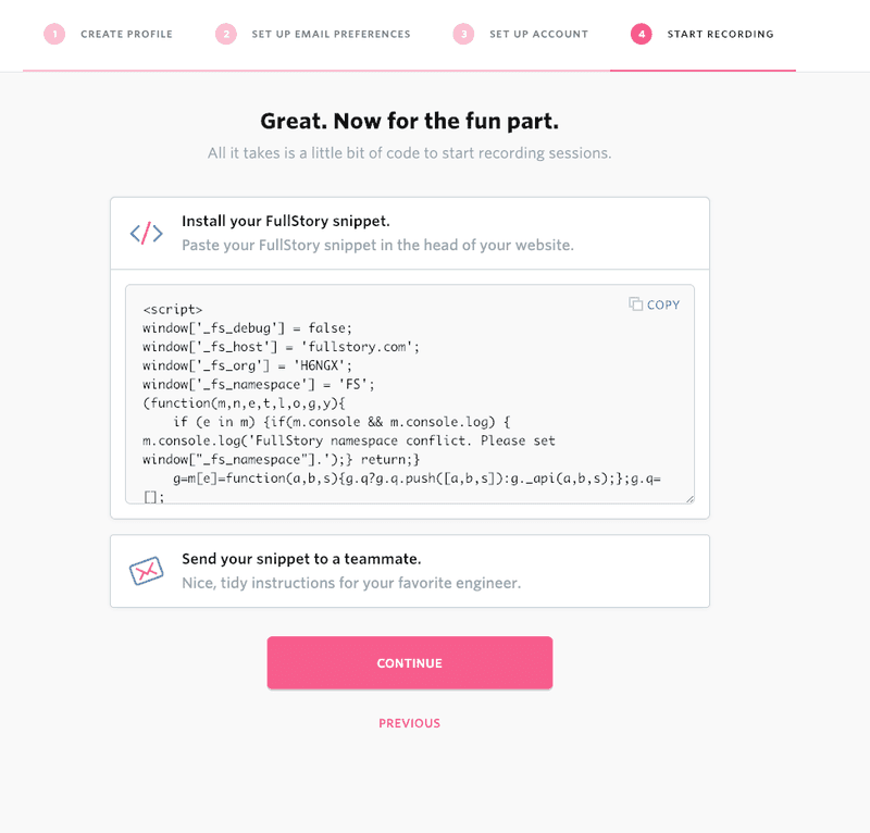
This qualifies as friction, and so reduces the number of people who become users.
But the huge upside is that the users that do sign up get the full value of FullStory’s product.
You can find out more about how to deal with friction in sign-up forms by reading this post.
Welcome screens
Welcome screens are commonly used during onboarding to welcome new users onto your platform.
Typical elements include:
- A smiley photo of one of your team members
- A greeting from your business
- Addressing the customer by their first name
- Briefly referring to any next steps
A number of SaaS companies forget that welcome screens are also a great place to segment your users so that their remaining onboarding experience can be customized to their individual customer needs.
From a UX design perspective, the best way to do this is through a microsurvey.
As the name suggests, this doesn’t have to be long.
Just ask the user a few basic questions so that you have a sense of what value they want to derive from using your product.
During the ensuing product walkthrough, you’ll then want to show them only the product features that their user segment needs in order to activate.
Look at how Kontentino does this:
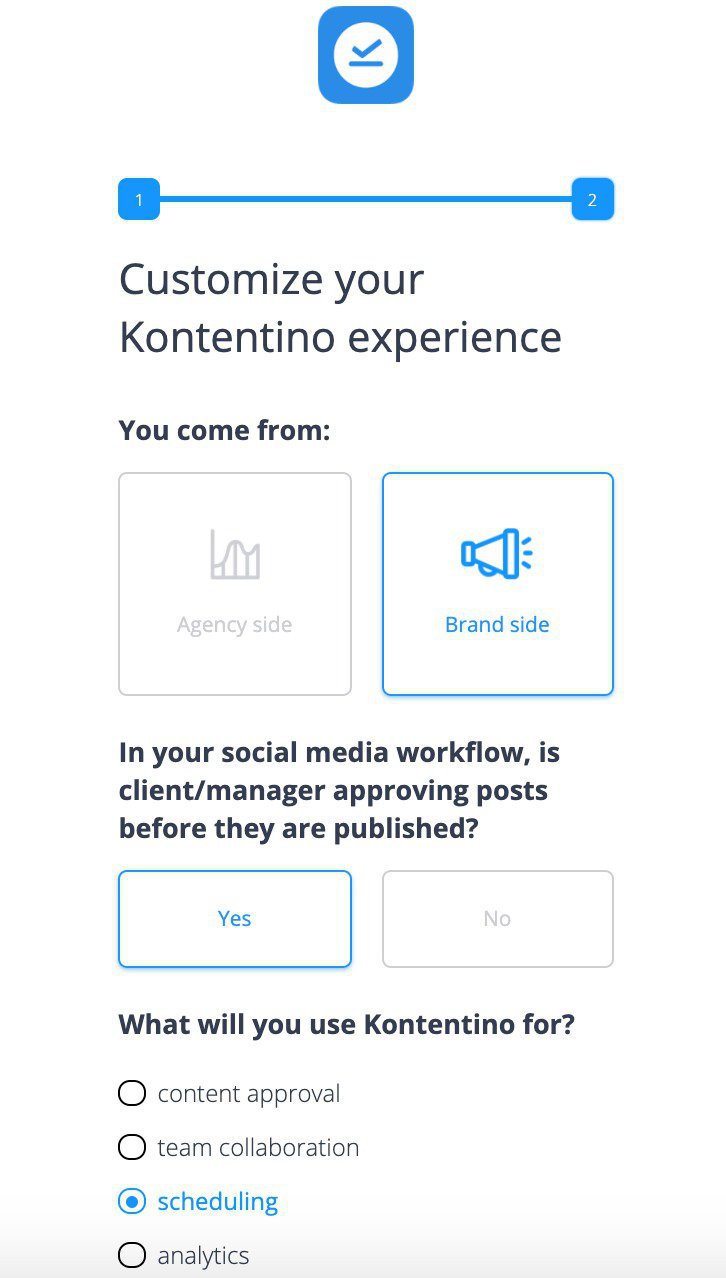
As a social media scheduling company, it’s important for them to know up front whether their users are brands with one set of social accounts, or agencies managing dozens of them on behalf of multiple clients.
So they ask this question on the welcome screen.
Welcome screens are most often built on what’s called a “modal.”
Classically, a modal is a dedicated UX pattern that is so large that it visually separates the customer from the product.
Because it’s so large, a welcome screen can be perceived as disruptive by the customer if it’s in the way of the product experience for too long.
From a designer’s point of view, there are three ways to prevent this disruption from being too frustrating for your users:
- Don’t just be cutesy on your welcome screen. Instead, make sure that you ask the user questions about their background which will facilitate their future product experience.
- Keep the microsurvey on your welcome screen as short as possible. Don’t burden your customer with more bureaucracy than is strictly necessary.
- If you really want to avoid disrupting their product experience, present your welcome screen as a smaller embedded UX pattern instead of a dedicated pattern that takes up the whole screen.
For more about welcome screens, we recommend that you read this post.
Demo content
Demo content is fictitious placeholder data that shows customers how your product could hypothetically be used for their specific use case.
It’s a UX pattern that you often see after the initial welcome sequence is complete, especially for more complex products where it’s not immediately clear to your customer what your product would look like after they’ve populated it with their data.
For this reason, demo content is typically used to fill empty states, so as to prevent your user from becoming overwhelmed by the blank screen in front of them and not knowing how to fill it.
When you design your demo content, make sure that you create different fake content for each user segment.
This might seem like a small detail, but it really means a lot to your users.
If you’re a project manager, you’re not going to be interested in data that’s aimed at hairdressers!
You should also ensure that the data you input is actually fake, rather than compromising your customers’ privacy. These days, it’s easy enough to generate placeholder data from public APIs or open-source databases of fake user profiles.
Here’s an example of dummy data generated by the open source DataFairy database. It’s quite convincing!
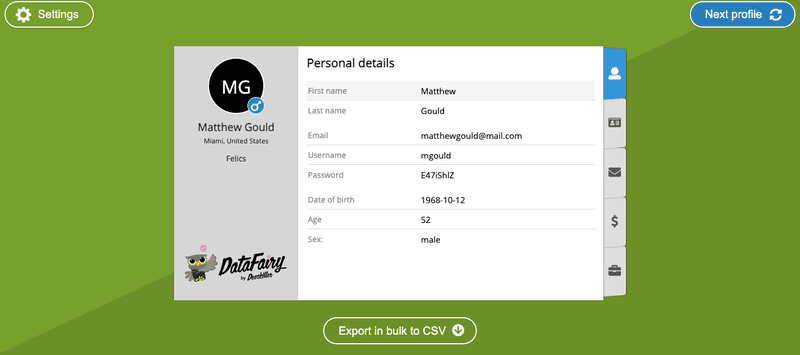
Ideally, you should tell your users directly that this is fake data.
And it should be immediately obvious to the user how to replace the dummy data with their own, real data.
The last thing you want from a UX perspective is dummy data popping up a year into your customer’s product experience!
For more about dummy data, check out this article.
Checklists
During SaaS onboarding, checklists are commonly used as part of the product walkthrough to list the key actions a user needs to take before activating.
One of the embedded UX patterns, checklists, help set the user’s expectations, encouraging them to take action in the direction of activation.
That’s because checklists harness the Zeigarnik effect: the observation that humans are more likely to remember incomplete tasks than completed ones.
By listing tasks on your checklist, you therefore ensure that those tasks stay top of mind for your user.
The most common mistake I’ve seen SaaS companies make when it comes to checklists is to give users too many things to do at once.
Less is more in this instance. Focus only on the 1-3 product features the user needs to learn in order to activate.
Everyone likes the feeling of having checked off an important task, so build into your design that you’ll give your users a sense of having a quick win.
I’ve seen numerous companies give users credit on a checklist for an action they took before the checklist popped up on their screen.
For example, on this checklist from GrowthMentor, you can see the user was given credit for creating an account — which was something they did during the sign-up flow.
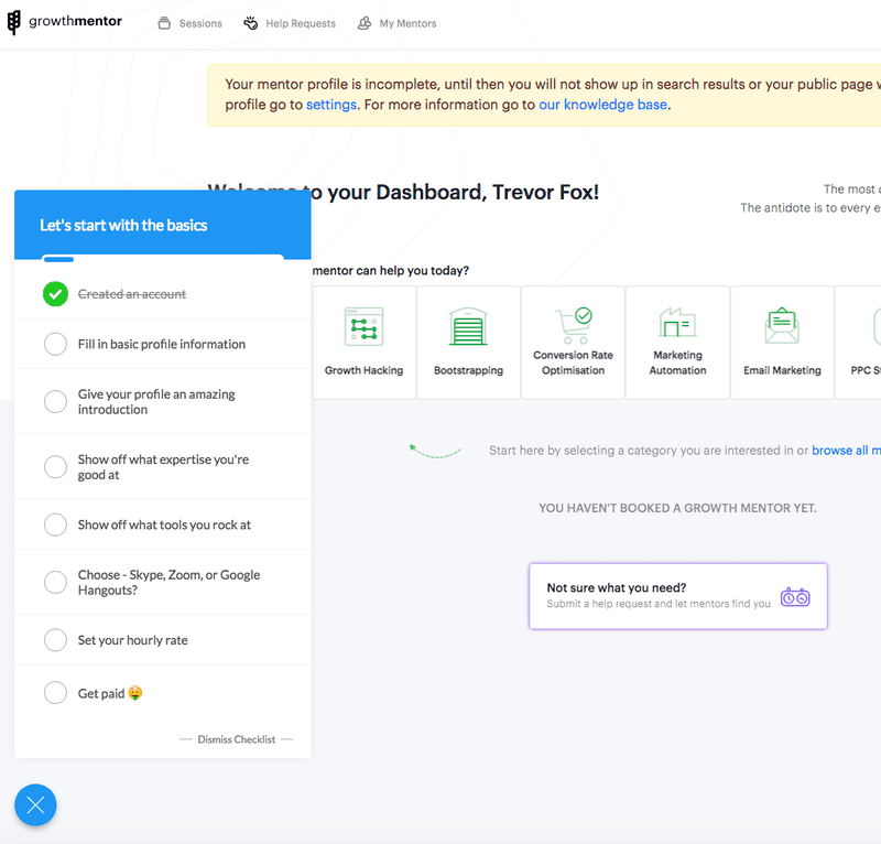
For more guidance on how to make the perfect checklist, have a look at this post.
Tooltips
Tooltips are an annotated UX pattern that is often used during onboarding to draw attention to one specific feature of the user interface.
On desktop, tooltips normally appear when the user hovers over a particular UI feature.
By contrast, on mobile, tooltips normally appear when the user taps and holds the element in question.
Tooltips come in two main varieties:
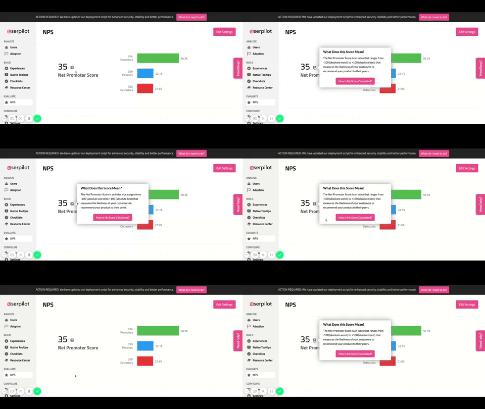
The native tooltip is a standalone pattern that is integrated directly into your product. Native tooltips are often used for pointing out fairly straightforward UI elements.
Here’s an example of a native tooltip:
Alternatively, you can also create tooltips that are part of a larger experience flow.
In this instance, it’s often the case that you can chain multiple tooltips together and have later tooltips only display once the user has completed a certain pre-defined custom event.
Let me show you what I mean.
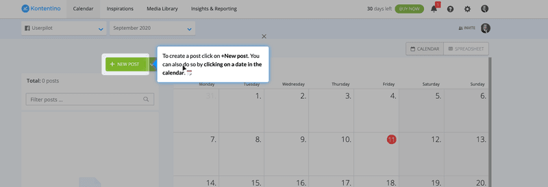
Here’s a tooltip created by Kontentino towards the end of their onboarding flow. It highlights the second of two key actions users need to take in order to activate: namely scheduling a social media post.
But it will only show after the user has completed the first key action: in this case, by connecting their social media account.
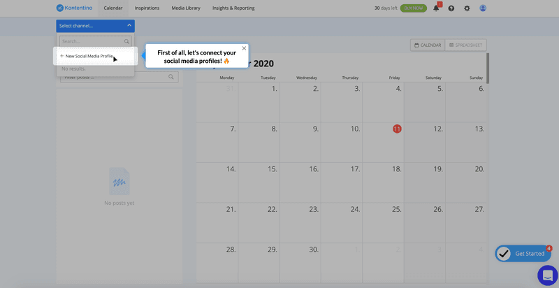
One design technique you can use to make this UX pattern really stand out is to highlight a feature and the tooltip next it, while simultaneously darkening everything else.
This is very disruptive, so I would suggest using it sparingly, but it is very effective at getting the user’s attention.
To learn how to build tooltips, see this post.
Do you require coding knowledge to make Onboarding UX Patterns?
In the past, building even a humble tooltip would have required tons of code.
When I say tons of code, imagine this level of technical wizardry…
<html>
<head>
<title>HTML tooltip</title>
</head>
<style>
.arrowpopup {
position: relative;
display: inline-block;
cursor: pointer;
}
.arrowpopup .tooltiptext {
visibility: hidden;
width: 160px;
background-color: #856;
color: white;
text-align: center;
border-radius: 4px;
padding: 9px ;
position: absolute;
bottom: 150%;
left: 50%;
margin-left: -85px;
}
.arrowpopup .tooltiptext::after {
content: "";
position: absolute;
top: 100%;
left: 50%;
margin-left: -5px;
border-width: 5px;
border-style: solid;
border-color: #856 transparent transparent transparent;
}
.arrowpopup .show {
visibility: visible;
}
</style>
<body style="padding:100px;">
<div class="arrowpopup" onclick="myFunction()">Tooltip Demo Click here!
<span class="tooltiptext" id="tooltipdemo">HTML Tooltip helps you to display extra information of element.</span>
</div>
<script>
function myFunction() {
var tt = document.getElementById("tooltipdemo");
tt.classList.toggle("show");
}
</script>
</body>
</html>
… all to create a tooltip that looks as simple as this:
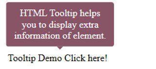
Not very scalable, and not the sort of thing you want your devs to spend a lot of time doing.
Fortunately, there is a workaround.
Onboarding tools enable you to build a vast range of UX patterns directly in your browser, without any knowledge of code whatsoever. All you need to do is install one quick JS snippet. Even the least technical of product marketers will be able to build UX patterns in just a few clicks.
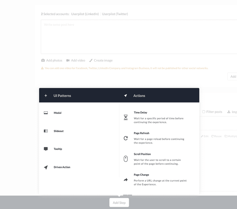
For more information about how to apply an onboarding tool to your business, check out this article.
Conclusion
We hope you enjoyed this guide to onboarding UX patterns!
After reading this article, you should be able to:
- Identify which category the most common UX patterns belong to
- Know how to design a range of UX patterns in a manner that fits the commercial needs of your business
- Remember that you don’t need to code UX patterns from scratch anymore in 2021.
If you’re looking for a great onboarding tool that will help you build UX patterns without using code, we hope you’ll consider Userpilot.
Start your free trial today!


