Wondering whether Chameleon or Walkme is the best option for your SaaS company?
This article is going to dive into the Chameleon vs Walkme debate and try to answer a key question: Which is the better tool for user onboarding, as well as other use cases?
In the post below, we’ve covered all the common use cases and done an in-depth analysis of the key features of Chameleon and Walkme – as well as compared it to an alternative solution that may be better in some situations.
Let’s get into it!
TL;DR
- Let’s explore how Chameleon, and Walkme compare when it comes to user onboarding and other common use cases.
-
- Chameleon is a product adoption platform. It enables SaaS teams to leverage real-time user data to build beautiful on-brand experiences, improve user onboarding, and drive product-led growth.
- WalkMe is a digital adoption platform that can help you create frictionless experiences for your customers. The platform is built keeping the compliance, scalability, and security needs of enterprises in mind.
-
- If you’re looking for a better option for user onboarding, Userpilot exceeds both functionality and value for money compared to other tools on the list.
- Userpilot is a product growth platform that drives user activation, feature adoption, and expansion revenue. It also helps product teams collect user feedback, streamline onboarding, and gather actionable insights from analytics. Get a Userpilot demo for user onboarding and drive your product growth code-free.
What is Chameleon?
Chameleon is a product adoption platform. It enables SaaS teams to leverage real-time user data to build beautiful on-brand experiences, improve user onboarding, and drive product-led growth.
In addition, it empowers product teams to create and manage dynamic in-product experiences. With Chameleon, SaaS teams can now create beautiful product tours that help, guide, and delight their users throughout their journey. All of these are possible without coding!
What is Walkme?
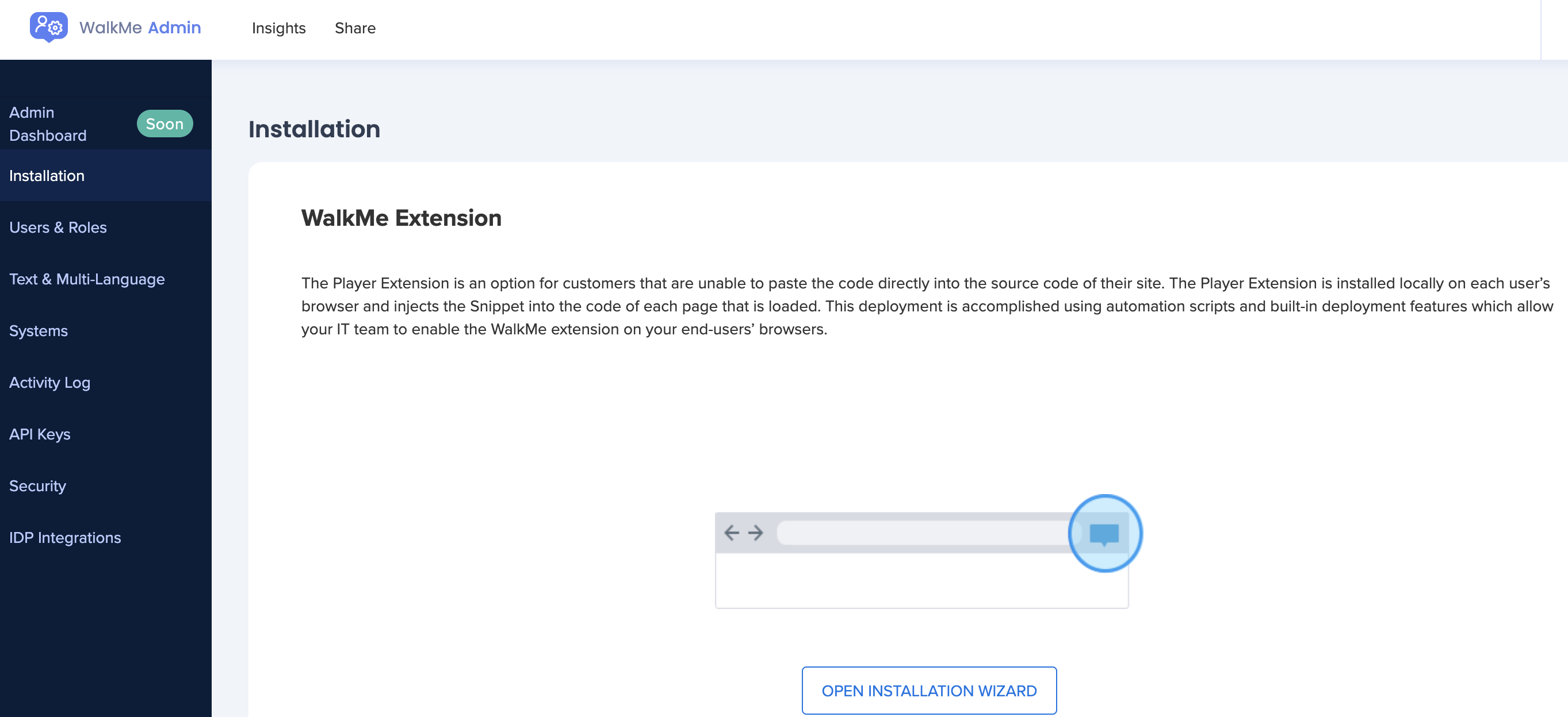
WalkMe is a digital adoption platform that can help you create frictionless experiences for your customers. The platform is built keeping the compliance, scalability, and security needs of enterprises in mind.
Using it, you can onboard customers and keep them engaged throughout their lifetime with your business. With powerful features like workflow automation and analytics, you can use it to grow your enterprise.
Chameleon vs Walkme for user onboarding
In this section of the article, we’re really going to compare Chameleon vs Walkme in terms of user onboarding. That way, we’ll be able to figure out which tool – Chameleon or Walkme – is the best option depending on your use case.
Chameleon for user onboarding
Users expect to be shown the red carpet with a welcome tour for your product. Chameleon helps you create welcome tours that gets users beyond their first “Aha”.
Here are some features of Chameleon for new user onboarding:
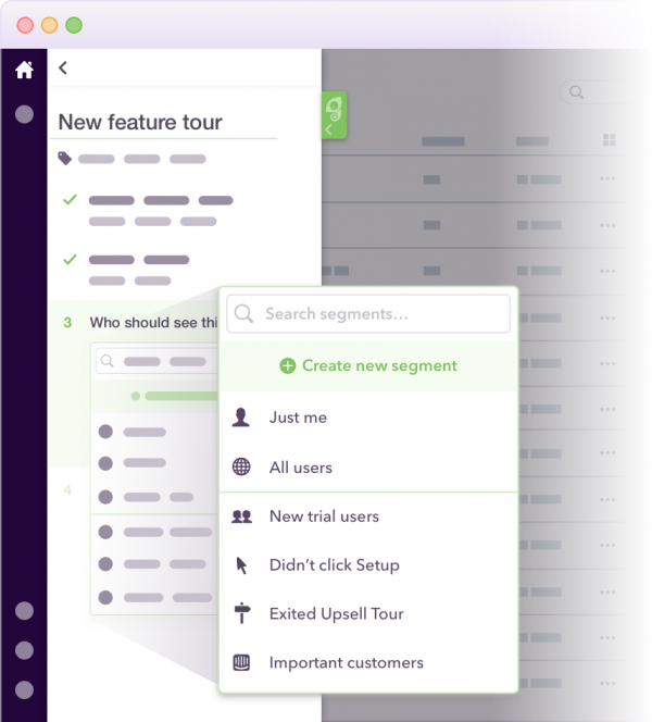
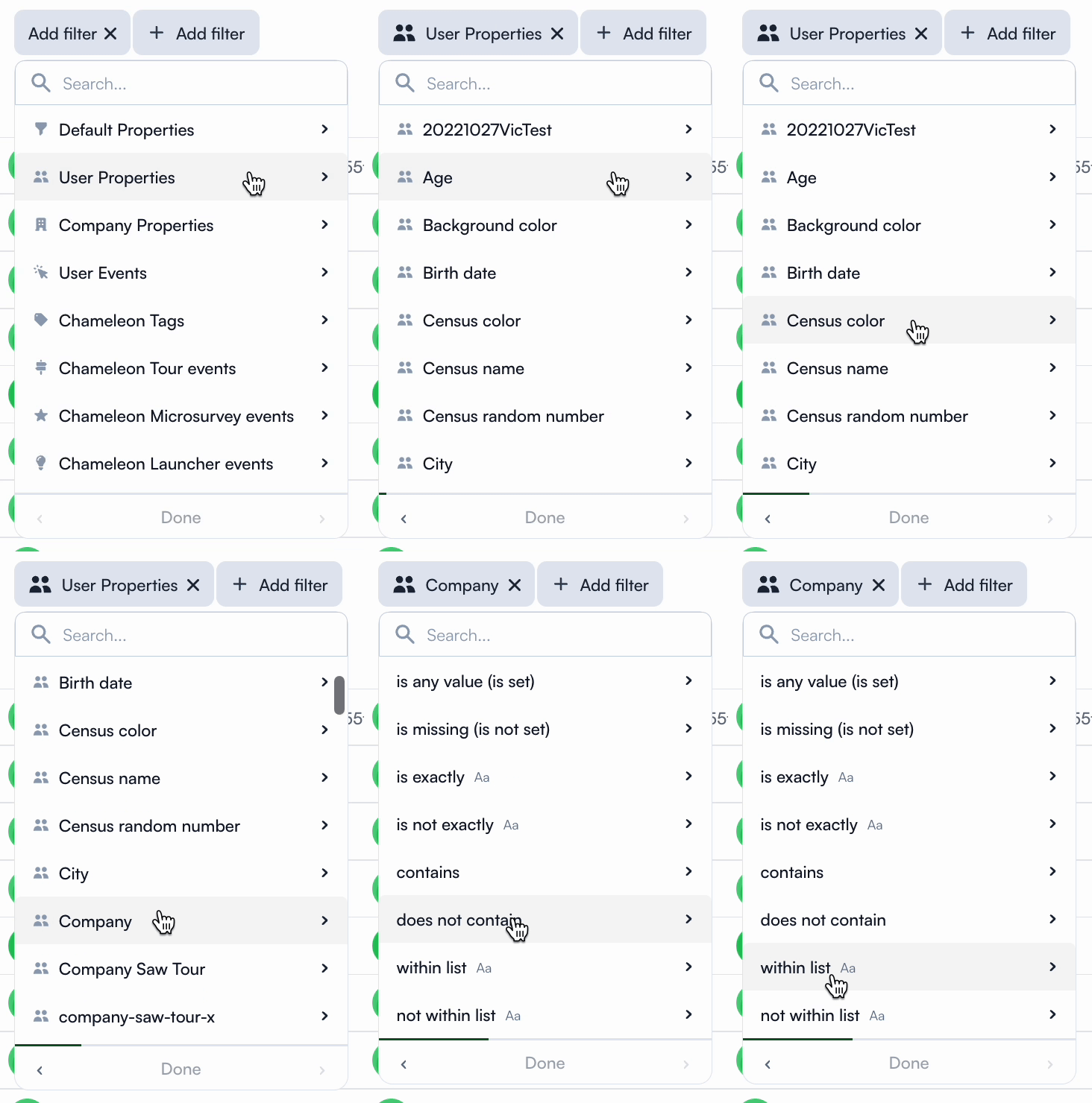
- Segmentation: You can use custom segments to show a sequence of your product tours over time. The hyper-targeted onboarding flows are tailored to your users’ needs. Here’s a short example of what the tour session can look like:
- Clear Analysis: Easily assess and optimize your user onboarding tours with real-time data.
- Launchers: Build onboarding checklists, including items like Loom videos and knowledge base articles to help users unlock more value.
- Customization options: Enjoy fine control over where the onboarding flow appears, choose who sees it, and define how users can interact with it.
Spoiler alert: When you subscribe for the Starter plan, you get access to just one launcher which is very limited for many onboarding use cases. However, you get unlimited access when you pay an extra $971 for the Growth plan.
Walkme for user onboarding
Any digital adoption platform that seeks to gain the attention of businesses needs to have a solid lineup of features for user onboarding. It’s crucial because this is the stage where you can make a first impression on your users. Hand-holding them in this phase can help them get up to speed soon.
WalkMe has a bunch of features for user onboarding:
- You can create an onboarding checklist through the Onboarding Tasks feature on WalkMe. It’s possible to set different goals inside your checklist so users can keep checking them as they complete them. The Onboarding Tasks can include Smart Walk-Thrus, videos, and articles to guide your new users.
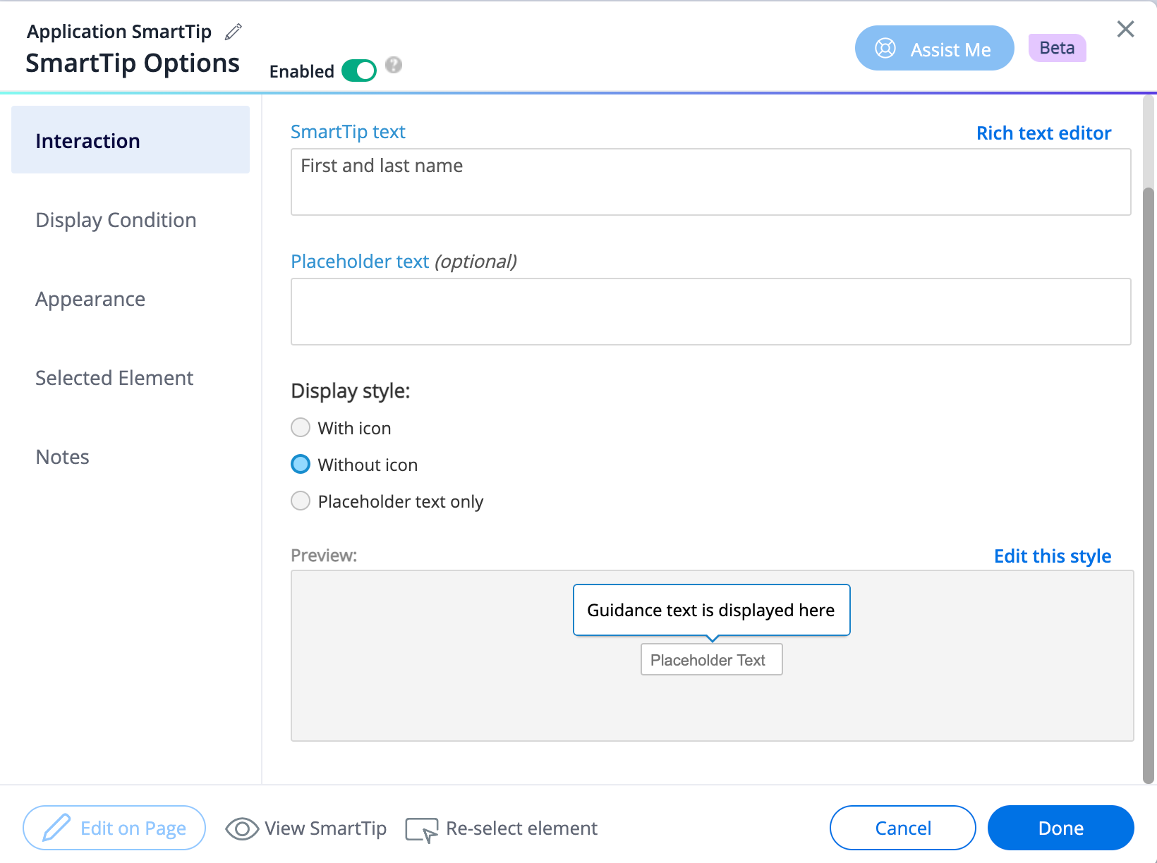
- You can also use WalkMe’s SmartTips feature to guide your users through the app’s UI. These serve as on-screen guidance and help reduce the learning curve for new users. Clicking on a SmartTip opens a pop-up that gives more information on the element.
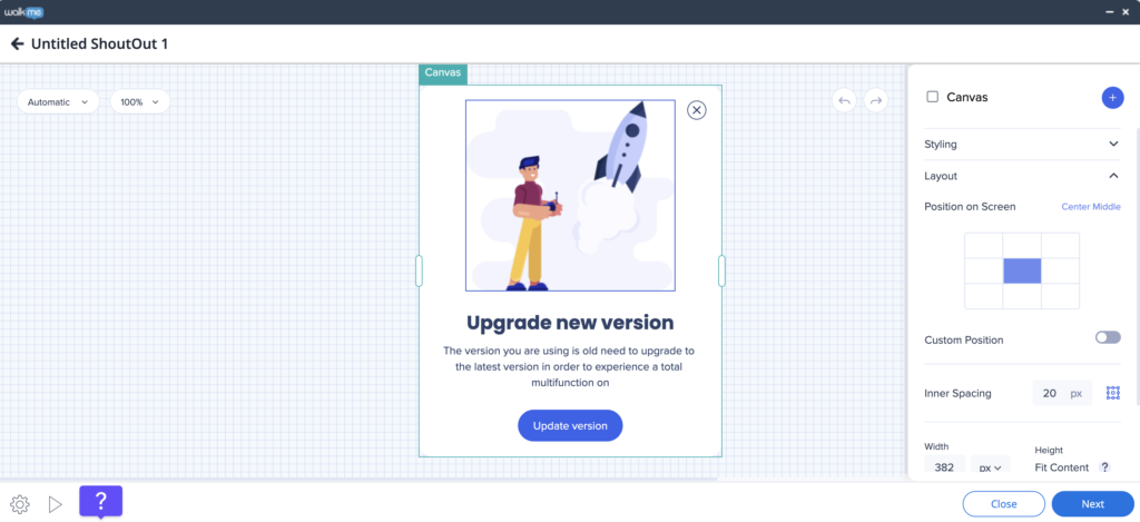
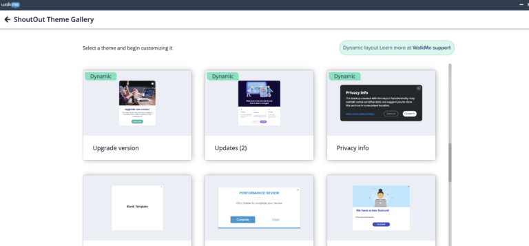
- Likewise, you can use ShoutOuts to draw your new user’s attention to specific announcements. They’re essentially banners that you can use to show users what they need to know when getting started. You can also get them to take action through ShoutOuts.
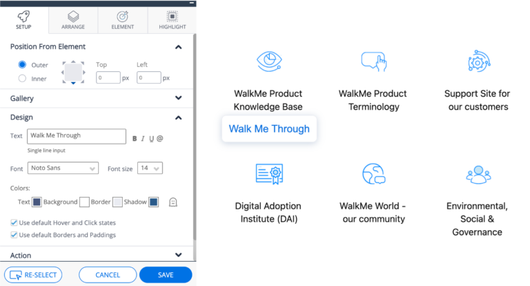
- You could also use Launchers in your onboarding flow for some self-guidance. When users click on Launchers, a new action like a Smart Walk-Thru will get triggered. Users can click on each Launcher you create to learn more about your platform.
Chameleon vs Walkme for product adoption
In this section of the article, we’re really going to compare Chameleon vs Walkme in terms of product adoption. That way, we’ll be able to figure out which tool – Chameleon or Walkme – is the best option depending on your use case.
Chameleon for product adoption
Interacting with users where they’re most engaged – inside your app – is a powerful way to gauge how you can make them stay and love your product. Chameleon is a product adoption platform that helps SaaS teams transform users into advocates by easily creating and implementing in-app messages.
- Step-by-step tours: Guide users through the product with different tours and launchers. This provides an interactive and visually engaging learning process and helps users navigate through the product and increase feature adoption.
- Self-serve launchers: For easy access to resources. By providing quick and easy access to information, you can minimize support tickets and improve customer experience.
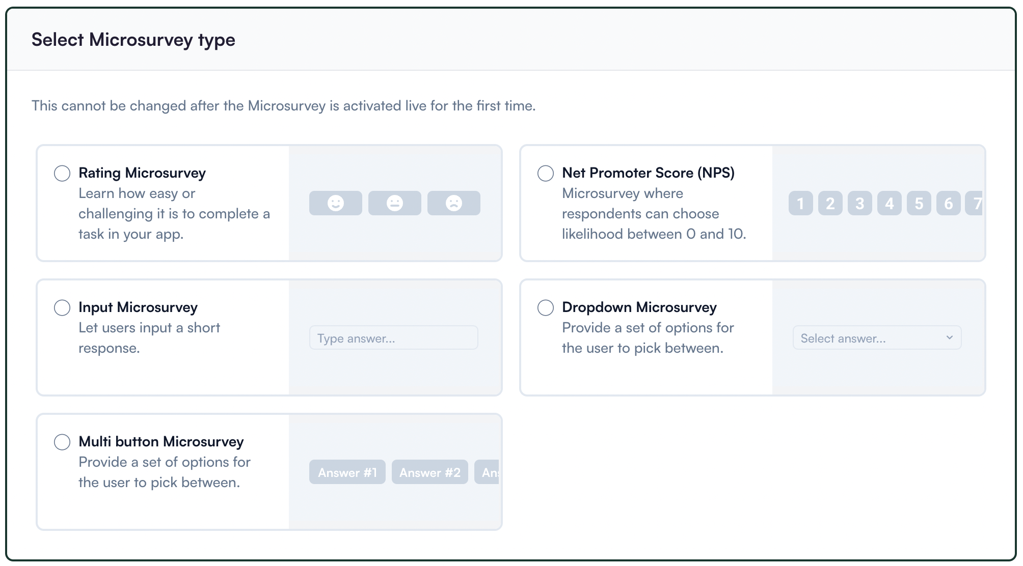
- In-product microsurvey: For gathering contextual feedback. These short surveys help gather contextual insights, understand pain points, and identify key areas for improvement.
- Tooltips: For giving real-time guidance. With tooltips, you can provide support to your users without disrupting their experience, and help them overcome hassles without stress.
- Customization options: It offers highly customizable styling, allowing you to create experiences that will match your branding.
Walkme for product adoption
Any digital adoption platform that seeks to gain the attention of businesses needs to have a solid lineup of features for user onboarding. It’s crucial because this is the stage where you can make a first impression on your users. Hand-holding them in this phase can help them get up to speed soon.
WalkMe has a bunch of features for user onboarding:
- You can create an onboarding checklist through the Onboarding Tasks feature on WalkMe. It’s possible to set different goals inside your checklist so users can keep checking them as they complete them. The Onboarding Tasks can include Smart Walk-Thrus, videos, and articles to guide your new users.
- You can also use WalkMe’s SmartTips feature to guide your users through the app’s UI. These serve as on-screen guidance and help reduce the learning curve for new users. Clicking on a SmartTip opens a pop-up that gives more information on the element.
- Likewise, you can use ShoutOuts to draw your new user’s attention to specific announcements. They’re essentially banners that you can use to show users what they need to know when getting started. You can also get them to take action through ShoutOuts.
- You could also use Launchers in your onboarding flow for some self-guidance. When users click on Launchers, a new action like a Smart Walk-Thru will get triggered. Users can click on each Launcher you create to learn more about your platform.
Chameleon vs Walkme for customer experience
In this section of the article, we’re really going to compare Chameleon vs Walkme in terms of customer experience. That way, we’ll be able to figure out which tool – Chameleon or Walkme – is the best option depending on your use case.
Chameleon for customer experience
Customer experience is the impression your customers have of your brand based on all of the interactions they’ve had with your business.
Chameleon improves the customer experience in product adoption through features like:
- In-app guidance: Utilizing product tours to improve customer experience. Note that you will need to have CSS knowledge to make styling changes in the Chameleon Builder.
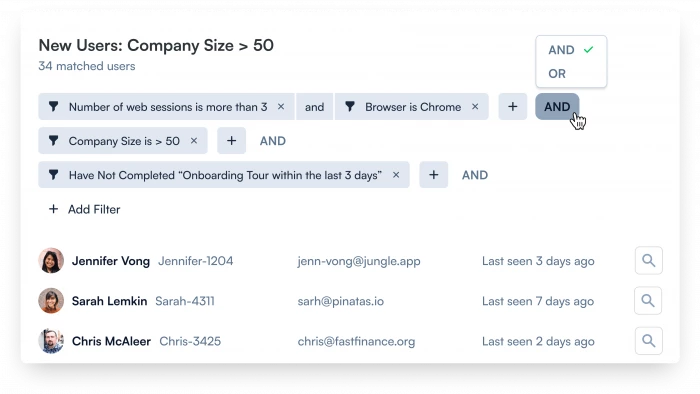
- Personalization through segmentation: Chameleon offers you to personalize user experiences by tailoring product onboarding and in-app experiences for the users most prone to interact and be interested in them. But keep in mind that your segmentation filters are limited compared to other tools like Userpilot.
- User progress tracking: This feature enables you to identify areas where users might be facing difficulties or dropping off due to friction. By tracing user progress, you can scale their experience on your app.
Walkme for customer experience
The clear path to better user retention and low churn is a frictionless customer experience. When users can use your product well to achieve their goals, they’ll likely stick to it. This can boost product adoption and revenue as well.
Here’s what WalkMe has to offer for elevating your customer experience:
- The Onboarding Tasks feature helps you create a smooth onboarding journey for your customers. It enables them to understand how to use it well through a self-service checklist.
- Similarly, you can use SmartTips, ShoutOuts, and Smart Walk-Thrus to help your users discover new features and make it easy for them to start using them. You can also provide targeted guidance to them by creating segments in your audience.
- The ActionBot can be used to direct users to relevant knowledge base articles to help them overcome any roadblocks.
- WalkMe gives you detailed analytics on your users and how they engage with your in-app engagements. You can use them to improve your product and features further to boost customer experience.
Chameleon vs Walkme for user feedback
In this section of the article, we’re really going to compare Chameleon vs Walkme in terms of user feedback. That way, we’ll be able to figure out which tool – Chameleon or Walkme – is the best option depending on your use case.
Chameleon for user feedback
Chameleon is a great product feedback tool for gathering contextual feedback inside your app and building an effective and actionable feedback loop.
With Chameleon, you can:
- Create various types of microsurveys: To measure user sentiment regarding new features, product UX and UI, or other in-app experiences created with Chameleon.
- Trigger feedback surveys: Target different custom segments for higher completion rates.
- You get access to basic completion reports: Most of the additional data will need to be analyzed in your analytics tools that Chameleon integrates with and sends data to.
- Personalize the surveys as you wish: You will need help from a developer or may require CSS skills.
Walkme for user feedback
Like user feedback, it’s important to collect feedback on your product as well. This feedback can play an instrumental role in helping you make informed decisions about your product. Here’s how WalkMe makes product feedback collection possible:
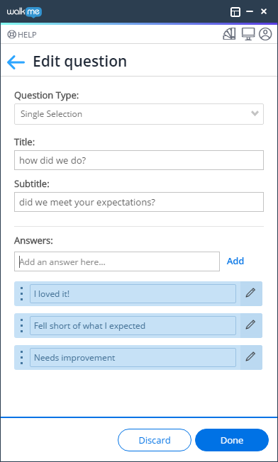
- You can use feedback and NPS surveys to collect product feedback from users. Feedback surveys, in particular, are helpful as they can give you insight into what needs changing.
- WalkMe offers different question types for surveys and you can also set them to play automatically at various frequencies.
- You can track the survey analytics through WalkMe Insights to understand what needs to change to boost product experience.
Chameleon vs Walkme: Which one you should choose?
To further simplify this selection process, let’s break down the strengths and limitations of each tool. Understanding the distinct advantages and potential drawbacks of Chameleon and Walkme will provide you with a detailed roadmap for making a well-informed decision!
Pros and cons of Chameleon
Pros of Chameleon
From a wide array of features to aesthetic UI patterns that can create any flow no matter how customized they need to be, Chameleon is no doubt a powerful tool for scaling product adoption.
It works in a similar way to Userpilot and offers similar features: styling, analytics, templates, goals, A/B testing, and checklists.
Let’s look at the pros of using Chameleon:
- Intuitive no-code builder: Chameleon comes with an easy-to-use Chrome Extension builder.
- Engaging tour guides: Build interactive tours to onboard users, announce features, and create other customer in-product experiences using simple steps.
- Good range of in-app messaging and UI patterns: Easy to create custom modals, slide-outs, tooltips, hotspots, launchers (checklists or resource hub), and more.
- Full two-way and deep analytics integrations: Chameleon fits into your stack, and easily connects with your favorite tools to send data to, and from Chameleon. It offers the deepest integrations, with analytics tools, CRMs, and more.
- Effective segmentation and targeting system: Leverage user data and experiences to structure effective marketing messages and tour guides for a specific target audience.
- Advanced A/B testing: Drive continuous improvement of in-app messages and define the ideal user experience with precise A/B testing.
- Rate limiting: No user wants to be overwhelmed with multiple product tours, in-app messages, and tasks. With rate limiting, you can reduce the number of user experiences — one step at a time, with clarity over speed.
Cons of Chameleon
While Chameleon is a deep production adoption tool with an array of great features, there are still some downsides. Here are the main cons of the tool:
- Not entirely no-code: Early on, we stated that Chameleon can be used without code. True. But it is not a completely no-code tool. You’ll need the help of a technical-savvy employee in your team to sort out some build-up as the learning curve is steeper.
- Hard-to-use interface: The new UI is a bit harder to use (a lot of clicking), and there can be minor bugs here and there.
- Limited experiences: There are some limitations to the user onboarding flows. For instance, you can’t run multiple in-app experiences at the same time, as you can in Userpilot.
- Pricey: The Startup plan is quite expensive (starts at $349/mo for 2500 MAU and includes just one launcher). This means you need to go for the Growth plan, where you pay more but save more at the same time.
Pros and cons of Walkme
Pros of Walkme
WalkMe is among the most popular platforms out there for digital adoption, especially for enterprises. It’s got a range of useful features that businesses can leverage to create in-app engagements, track user behavior, and retain customers, among other things. Here are the pros of using WalkMe:
- Multiple in-app engagements: Offers a bunch of in-app engagement options, including product tours, tooltips, help widgets, onboarding checklists, and more. Using them well can help you engage your customers.
- User-friendliness: The platform is quite user-friendly in terms of creating in-app engagements. And while it does have a moderate learning curve as a whole, it becomes easy to use once you get the hang of it.
- Lots of analytics: WalkMe provides in-depth analytics on a range of things like in-app engagements and forms to help you understand the impact that they’re creating. This helps you optimize your strategies for better results.
- Workflow automation: Workflow automation features like onboarding automation stand out as they enable you to automate a series of steps and processes like clicking buttons to make your customer experience better.
- Community: WalkMe offers a strong community of experts and partners who can help you whenever you get stuck.
Cons of Walkme
While WalkMe has a bunch of good things to offer that make it one of the leading digital adoption platforms out there, it does have a few drawbacks that prevent you from unlocking its full potential. Let’s take a look at some of the cons of this platform:
- Coding knowledge: Even though WalkMe is no-code/low-code for most of its functions, you’ll need to know HTML or CSS to make the most out of the platform.
- Challenging on complex sites: The process of implementing WalkMe on your website depends on the complexity of your site. You might find it challenging to ensure that your content behaves the way it should if you’ve got a complicated website.
- Focused on employees: WalkMe’s primary use case lies in digital adoption for employees, even though it has a specific plan for customers. However, this makes it slightly weaker compared to other platforms that have been dedicatedly built for customers.
Userpilot – A better alternative for your SaaS
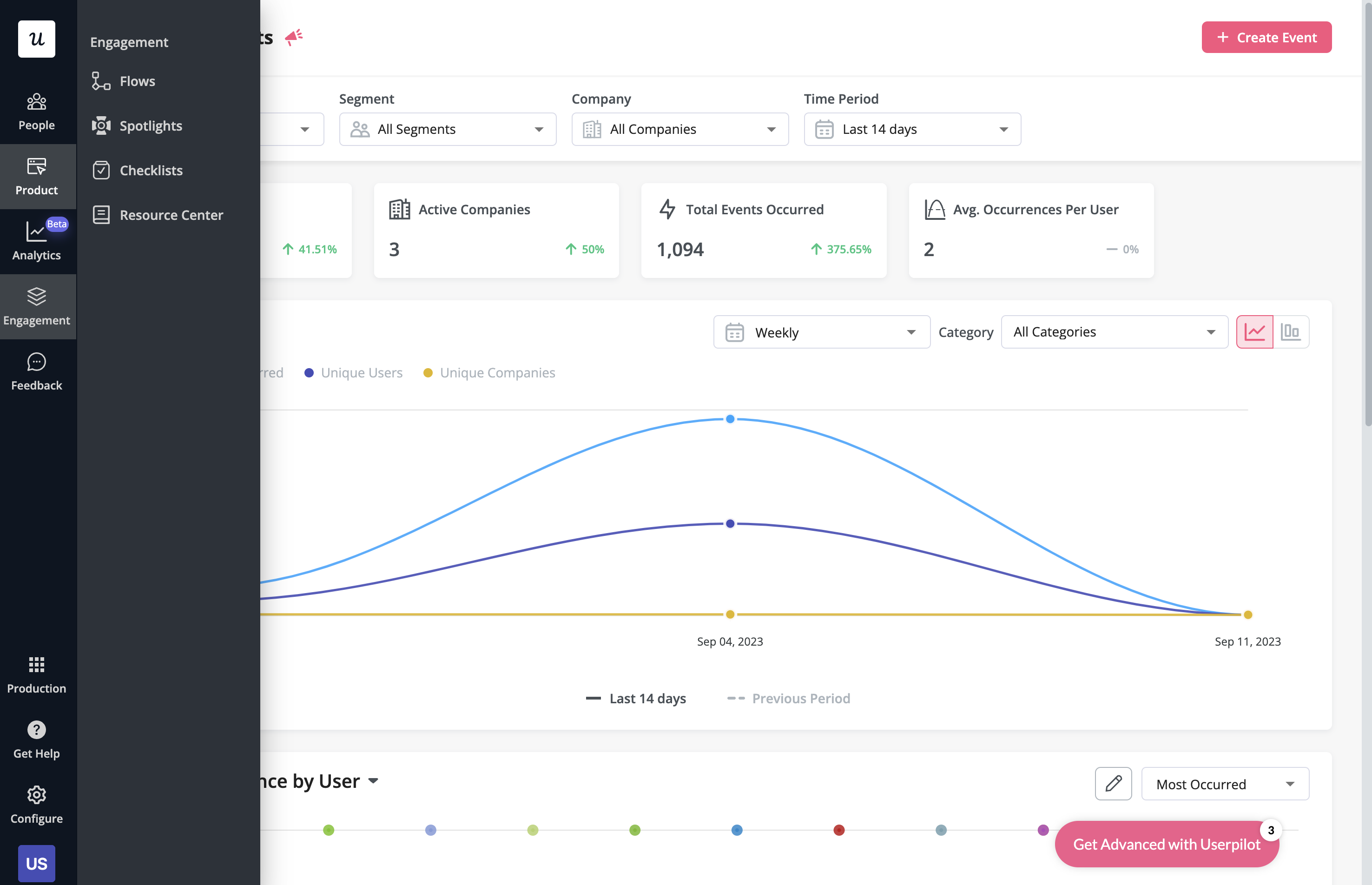
With Userpilot, you’ll be able to track both product usage and user behavior to get a holistic view of how customers use your product — which will guide future development, improve the user experience, and inform your growth efforts.
Pros of Userpilot
As a full-suite digital adoption platform, Userpilot has all the features you need to onboard users, track analytics, and gather feedback from customers without writing a single line of code. Here are a few pros of using Userpilot as your product growth solution:
- No-code builder: Userpilot’s Chrome extension lets you build flows, add UI elements, and tag features without writing a single line of code.
- UI patterns: There are plenty of UI patterns to choose from when using Userpilot, such as hotspots, tooltips, banners, slideouts, modals, and more!
- Startup-friendly: Userpilot’s entry-level plan gives you access to all available UI patterns so you can hit the ground running.
- Walkthroughs and flows: Build engaging interactive walkthroughs and personalized onboarding flows that target specific segments of your user base.
- Self-service support: Build an in-app resource center to help users solve problems, customize its appearance to align it with your brand, and insert various types of content (videos, flows, or chatbots) to keep your customers satisfied.
- A/B testing: Userpilot’s built-in A/B testing capabilities will help you split-test flows, iterate on the best-performing variants, and continually optimize based on user behavior.
- Feedback collection: Userpilot has built-in NPS surveys with its own unified analytics dashboard and response tagging to help you retarget users. There are other survey types to choose from and you can even create your own custom survey.
- Survey templates: There are 14 survey templates to choose from so you can gather feedback on specific features or run customer satisfaction benchmarking surveys like CSAT and CES.
- Advanced analytics: Userpilot lets you analyze product usage data, monitor engagement on all in-app flows, and use the data to create user segments that are based on behaviors instead of demographics.
- Event tracking: Userpilot’s no-code event tracking lets you tag UI interactions (hovers, clicks, or form fills) and group them into a custom event that reflects feature usage.
- Mobile: With Userpilot’s mobile SDK, you can create targeted onboarding flows using slideouts, carousels, and push notifications without writing extra code.
- Third-party integrations: Userpilot has built-in integrations with tools like Amplitude, Mixpanel, Kissmetrics, Segment, Heap, HubSpot, Intercom, Google Analytics, and Google Tag Manager so you can share data between all the solutions in your tech stack.
Cons of Userpilot
Of course, no tool is perfect and there are a few cons to consider before choosing Userpilot as your user onboarding or product growth solution:
- Employee onboarding: Currently, Userpilot only supports in-app customer onboarding.
- Freemium plan: There’s no freemium Userpilot plan so those bootstrapping their startup and need sub-$100 solutions should consider more affordable onboarding platforms like UserGuiding or Product Fruits.
Conclusion
Hopefully, this post helped you decide whether Chameleon or Walkme is more appropriate for your company. As you can see – both have many upsides and downsides.
Undeniably, Userpilot provides a better value for money and is a better choice for a mid-market SaaS, especially when it comes to user onboarding and user feedback.
If you’re interested in finding more, book a demo with our team here!

