Cohort Retention Analysis 101: How to Measure User Retention?


What is cohort retention analysis? And how do you leverage it to surface churn signals, improve user experiences, and boost your overall retention rates?
These are the main questions I will break down in this article. I will also share a few intuitive tools to get the job done.
What is cohort retention analysis?
Cohort retention analysis is the process of tracking user engagement with a product over time. However, instead of looking at the user population as a whole, it looks at specific user groups linked to specific events or timeframes.
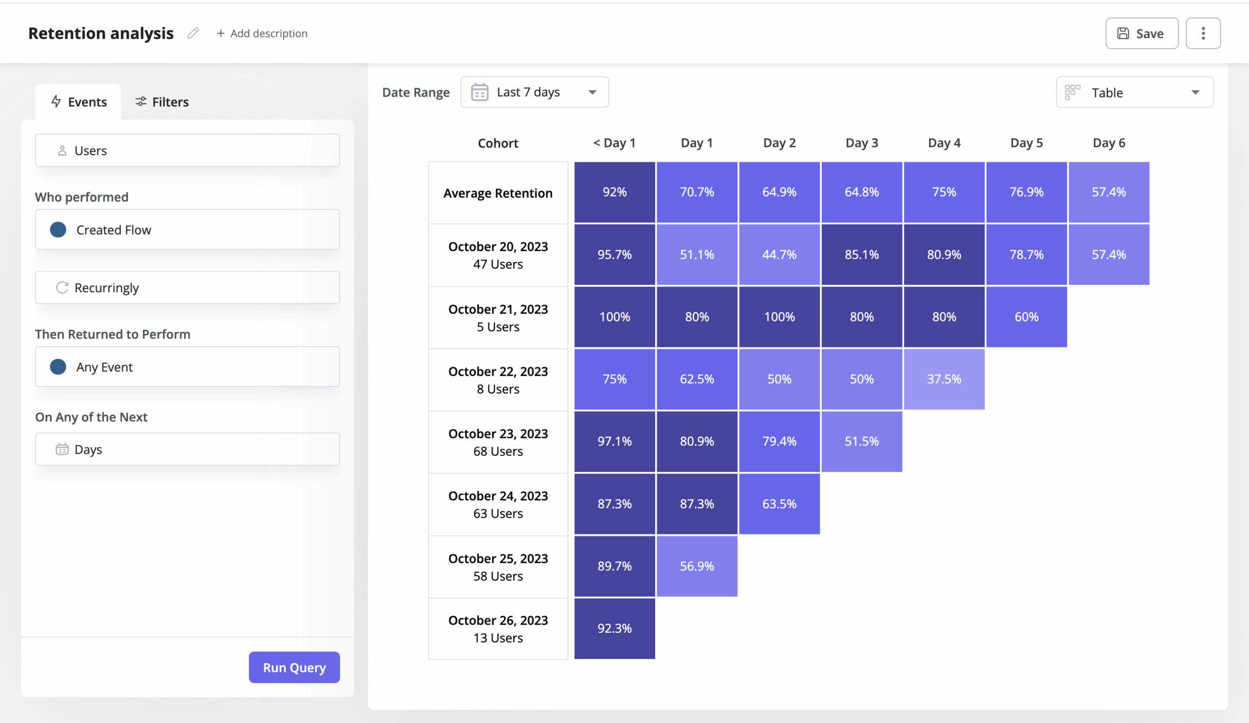
Have a look at the cohort analysis table below.
The users are grouped into daily cohorts, based on when they subscribed to the product.
From the chart, we can easily see that the retention rate for users who subscribed to the product on October 20, 2023 is 51.1% after 2 days, 85.1% after 4 days, and so on.
Why use cohort analysis to measure customer retention?
There are a number of benefits of using cohort analysis to track customer retention. Here are a few key ones:
- By measuring how well different groups are retained, cohort analysis helps you evaluate your retention strategies, identify the most successful ones, and make data-driven decisions to improve your retention efforts.
- Cohort analysis enables teams to track and analyze customer behavior over a specific period and gain insights into long-term behavior trends.
- With cohort analysis, you can compare retention rates for different cohorts and identify behavior patterns or product changes that could be impacting them.
- By analyzing cohort retention rates, SaaS businesses can establish the length of the customer relationship, predict the customer lifetime value, and use these metrics to forecast future revenue.
Different types of customer retention cohort analysis
There are three key types of cohort retention data analysis: acquisition cohort, behavioral cohort, and predictive cohort analysis. Let’s break them down and explore how each one can drive better retention insights.
Acquisition cohorts
Acquisition cohort analysis divides users into cohorts based on acquisition events. Examples of acquisition events include signing up for the product or subscribing to a paid version.
This kind of analysis allows organizations to identify long-term retention patterns for each cohort and compare the effectiveness of various retention strategies over time. It also enables them to evaluate the impact of their acquisition and marketing campaigns.
Behavioral cohorts
Behavioral cohorts are made up of users who have or haven’t completed a specific event within a specific time frame. For example, you could group your users based on whether they completed the onboarding checklists or not.
Behavioral cohorts analysis gives teams more granular insights than user acquisition cohorts because it tells them not only how many users have been retained but also why.
Prediction cohorts
Prediction cohorts are groups of users who are likely to show certain behaviors or patterns in the future. They are built using machine learning algorithms to analyze historical behavior data.
This type of cohort analysis enables teams to predict user behavior and act proactively to change it. For example, they could use them to maximize upsell opportunities by engaging users with contextual in-app messages.
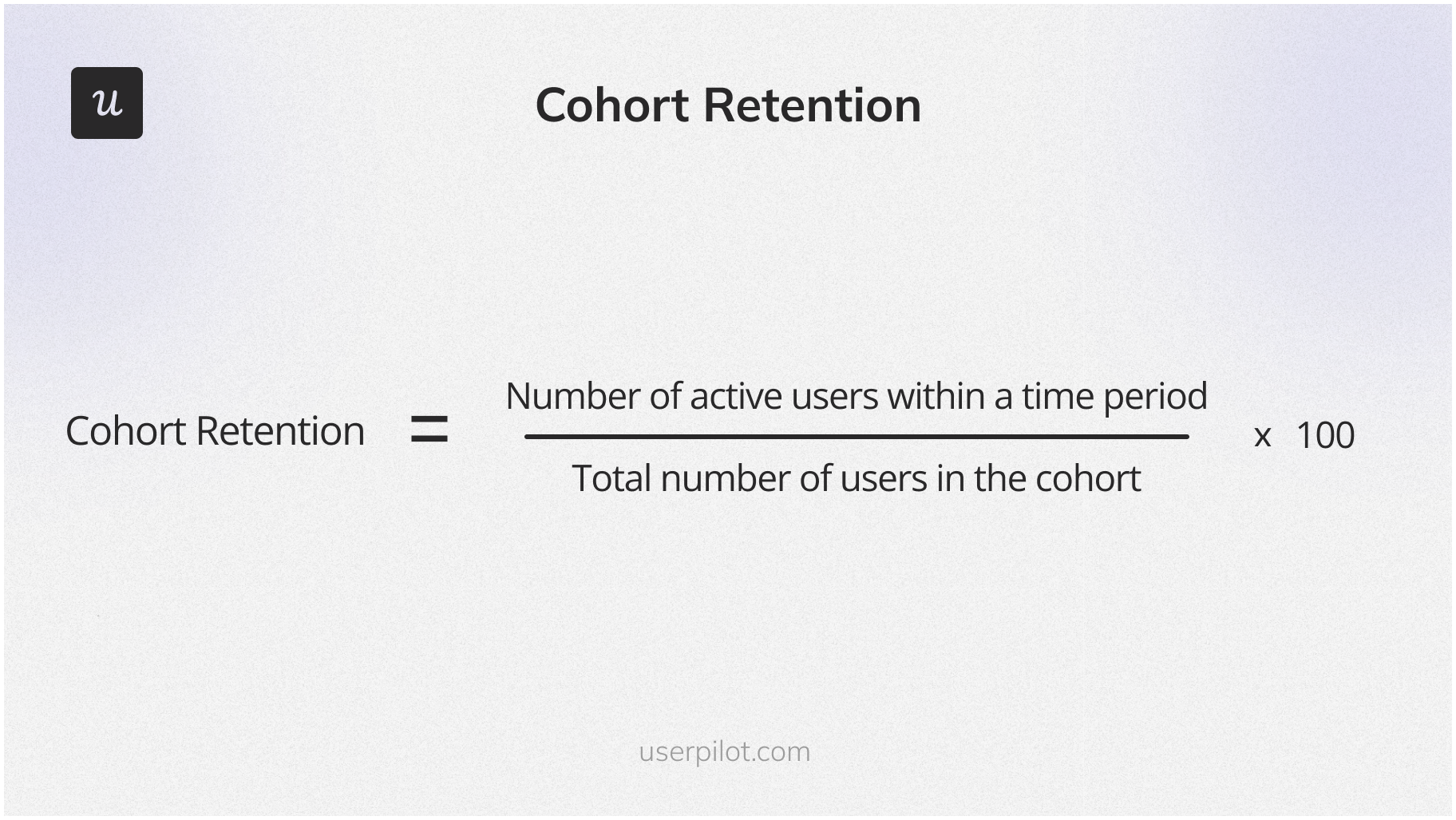
How do you calculate cohort retention?
To calculate the retention rate, you divide the number of active users within a time period by the total number of users in the cohort.
Note: In this context, active users are the users who return to the product and complete a defined retention event during the selected time period.
So if we go back to the retention table above, 47 users subscribed to the product on October 20, 2023. That’s the total cohort size. On Day 1 (2nd day), there were 24 active users. Dividing 24 by 47 gives us a cohort retention rate of 51.1%.
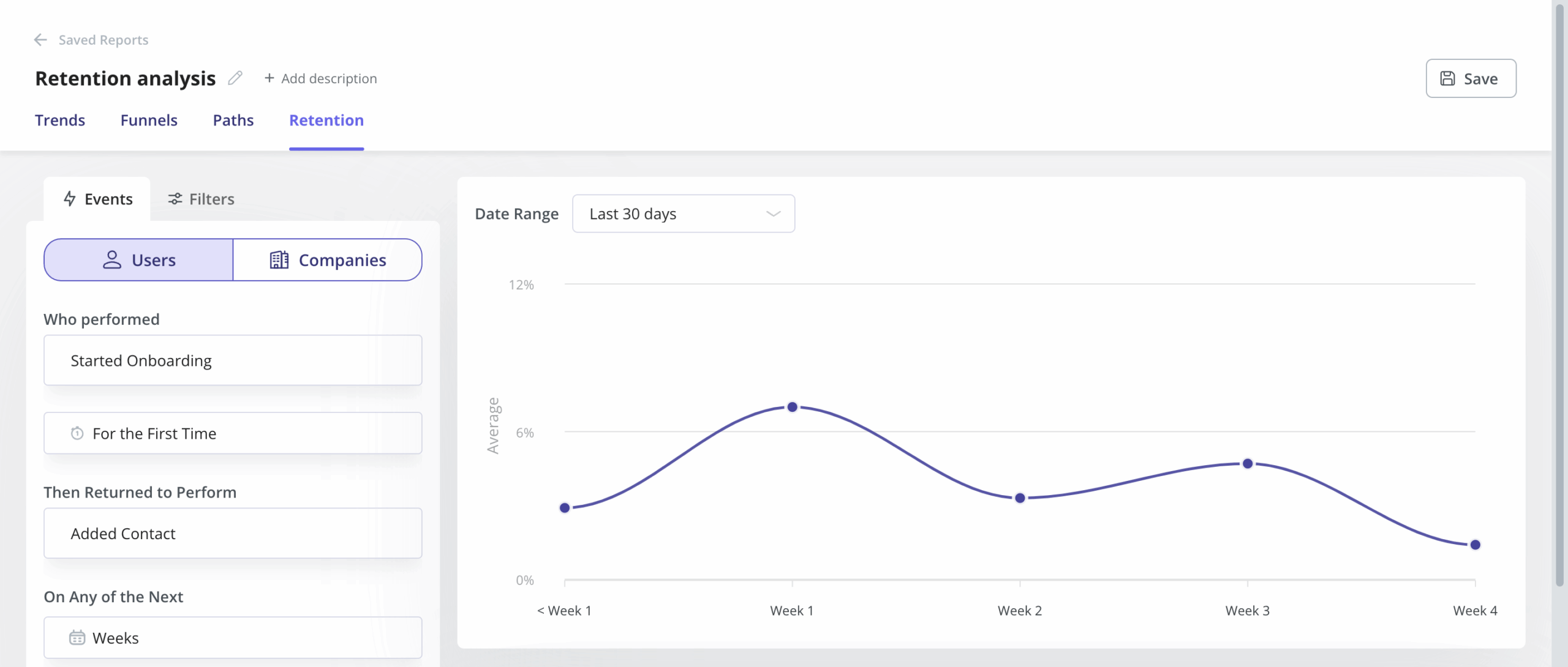
How does Userpilot measure and segment user cohorts?
At a practical level, Userpilot’s retention analysis follows a simple structure:
- You define an initial (cohort) event — i.e. Sign up.
- Then define a retention event — i.e. Used feature X.
- Choose a time interval (daily, weekly, monthly) and date range.
- The tool automatically generates a retention chart showing how users return over time.
From there, segmentation is layered directly into the analysis so you can:
- Track user retention curves and identify drop-off points.
- Compare retention across cohorts grouped by time or behavior.
- Segment cohorts using filters like feature usage, plan, or user attributes.
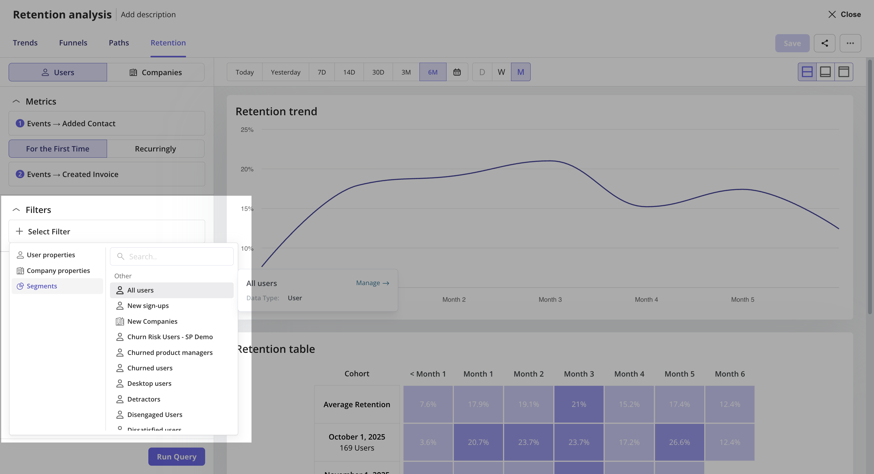
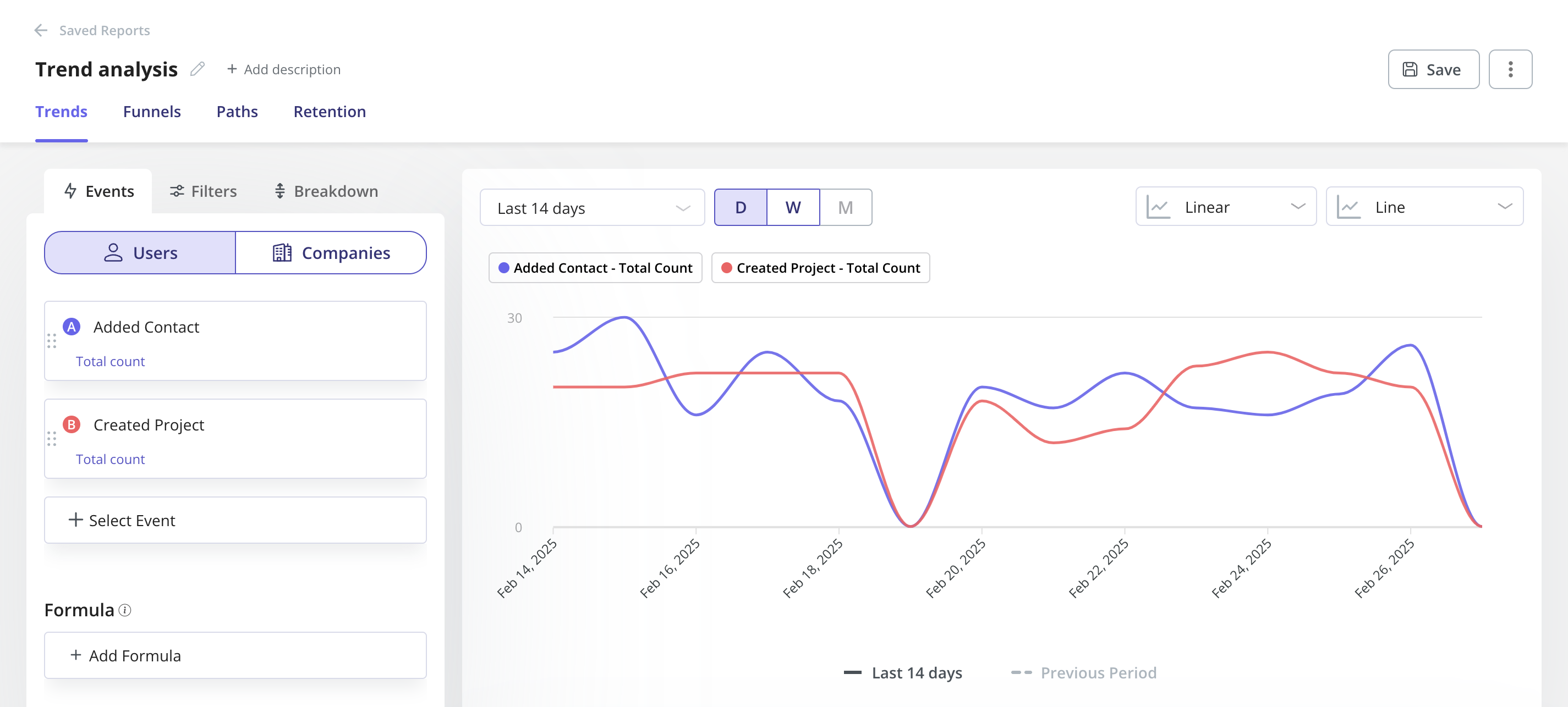
In practice, this means you’re not just grouping users by when they joined but also segmenting them based on what actions they take. This makes it much easier to understand what drives retention versus churn.
What is a retention cohort analysis example?
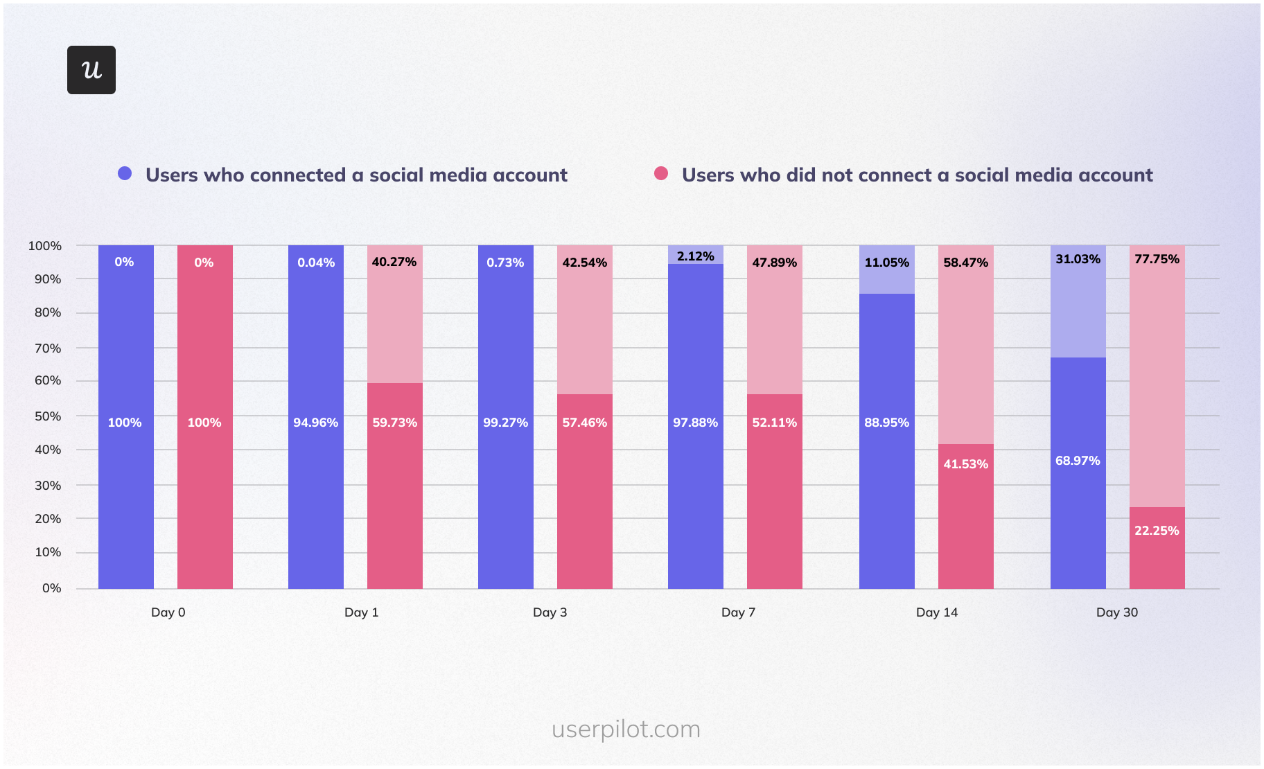
Let’s imagine you’re a product manager or product owner of a social media automation tool, like Hootsuite. You want to identify behaviors that affect retention and customer loyalty.
One of your hypotheses is that users who connect to a social media account have a higher retention rate.
You start the analysis by choosing an acquisition cohort, like the new customers who signed up for the product in January 2023.
Next, you break down the cohort into two behavioral cohorts: those who have connected to a social media account and those who haven’t.
After that, you have to plot the two cohort data over a specific time period and compare them. If there’s a big discrepancy between the two, your hypothesis may be right.
All that is left to do is act on the insights. For example, you could ensure that users add their social accounts by making the task a vital part of your new user onboarding checklist or prompting existing customers with in-app messages.
How to analyze cohorts to improve the customer retention rate?
The example above shows you how cohort analysis can help improve your retention figures. Let’s look at different ways you can leverage your own cohort analysis to streamline your retention strategy and boost customer retention rates.
Measure the effectiveness of new users’ onboarding experience
The quality of user onboarding will have an impact on your retention figures.
So what can you do if you see user engagement drop dramatically within 2 weeks of signing up for the product?
First, choose the acquisition cohorts that clearly show the trend. How are they different from others where the drop is not so significant? Were there any changes introduced to the onboarding process before you started experiencing the drop?
If yes, they could be the culprit.
If not, you may need to look at user engagement with the onboarding assets in more detail.
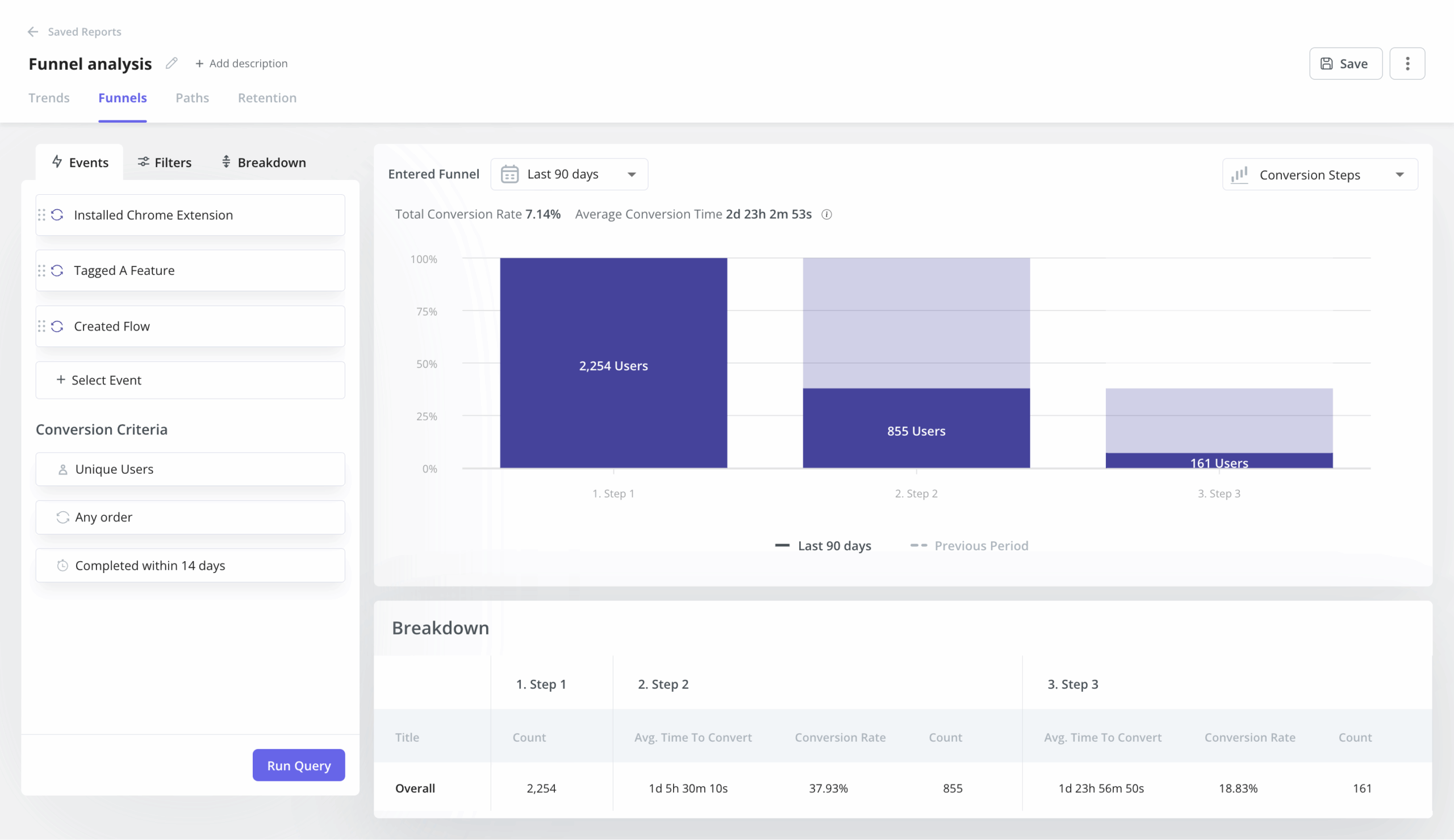
Start by breaking down the acquisition cohorts into two user segments: retained customers and churned ones. Next, use your product analytics to compare their engagement patterns. I recommend using funnel analysis to compare conversion rates between the two segments at each step of the onboarding process.
Pinpoint successful behaviors that increase user engagement and retention
You can use a similar process to identify successful user behaviors that are correlated with higher retention rates.
First, use acquisition cohort analysis to identify the most successful users.
Next, analyze user behavior patterns in detail using your analytics tool. Pay attention to the behaviors that distinguish successful users from the churned ones. To ensure consistency, look at the same period of time for each cohort, for example, the first 2 weeks or a month.
In the same way, you can identify churn warning signals.
Once you’ve identified these specific behaviors, you can create custom events and then visualize their impact on a retention curve to verify your findings.
Identify drop-offs in the user journey
Identifying the drop-off points in the user journey is the first step when tackling declining retention.
To identify such drop-off points, all you have to do is plot the retention curve for a particular acquisition cohort. For example, with the social media automation tool, you could plot their daily engagement.
The curve will show you immediately when the users experience friction. This could be after a day, two, or five. However, it won’t tell you why users drop off.
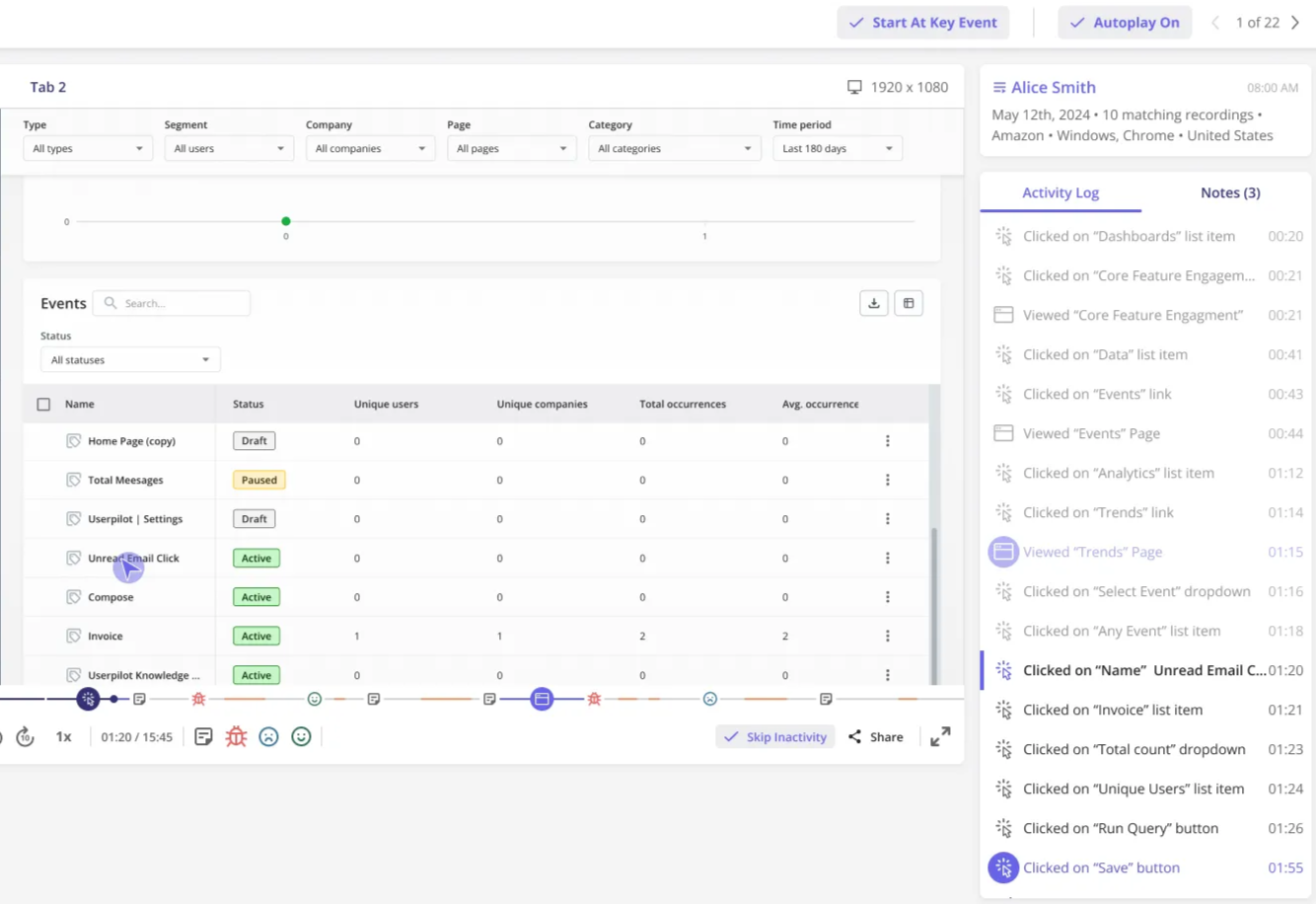
For drop-offs, you will need to look at customer behavior in more detail using session replays to understand if they’re facing friction, rage clicking on a button, or failing to take the next step.
Track how a new feature launch impacted retention rates
Let’s imagine that you’ve launched a new feature in May and hope that this will increase your user retention rate.
Start by looking at acquisition cohorts from May onwards. We can see that the retention rate has indeed started growing since the new feature launch.
Does it mean that the increase can be attributed to the new feature? Not quite.
Correlation is not the same as causality. The retention boost could be a pure coincidence, or there could be other factors that have had an impact.
To test your hypothesis, you need to dig a bit deeper and use product analytics to analyze the engagement with the feature.
If the retained users engaged with the feature, it may be the reason for the improved retention data, assuming there were no other significant changes to the product introduced at the same time.
Run cohort retention analysis with Userpilot!
Cohort retention analysis provides a granular view of your business that aggregate metrics often hide. Done well, it helps you spot churn patterns early, understand what drives long-term value, and make informed product decisions.
Userpilot’s no-code tools make this even easier. They let you track retention in context, pair insights with data from customer feedback, and guide users with targeted in-app experiences across web and mobile.
Ready to see how that works? Book a demo to begin.
FAQ
What is a good GRR and NRR?
A good Gross Revenue Retention (GRR) rate is typically between 85 percent and 95 percent, as it shows you are retaining most of your existing revenue before expansion. A strong Net Revenue Retention (NRR) rate is above 100 percent, indicating that expansion revenue from upgrades or upsells is more than offsetting churn or downgrades.
Is 84% retention rate good?
An 84 percent retention rate is generally considered good, especially for early-stage or mid-market SaaS products. However, what counts as “good” depends on your industry, pricing model, retention metrics, and customer lifecycle, so it should always be compared against your own historical benchmarks and similar companies.
What is the formula for cohort retention?
Cohort retention is calculated by dividing the number of users who remain active during a given time period by the total number of users in the original cohort, then multiplying by 100 to express it as a percentage.
What are the 8 C's of customer retention?
The 8 C’s of customer retention are commonly defined as clarity, convenience, consistency, communication, customization, credibility, care, and community, which together describe the key elements needed to build strong, lasting relationships with customers.
About the author