5 Selected Ways to Leverage AI Customer Feedback Analysis


As a UX researcher, I’ve noticed a growing gap between how much feedback teams collect and how much of it they’re able to analyse.
Every week, I see the same discussions across LinkedIn circles and Reddit threads. Teams are drowning in open-text, valuable feedback, yet only a fraction ever gets turned into actionable insight. And frankly, the volume is outpacing human capacity.
AI is becoming the only realistic way to close that gap.
Not because it replaces research judgment, but because it handles the parts we’re increasingly too overloaded to do manually. You can name them: clustering themes, surfacing anomalies, and uncovering sentiment patterns at scale.
This shift isn’t speculative anymore. For example, Qualtrics reported in 2024 that nearly half of research teams already use AI to analyse qualitative data. Gartner’s 2026 outlook also shows AI-assisted tools becoming standard across enterprise teams.
So, in this article, let me walk you through 5 ways I leverage AI for customer feedback analysis.
What is AI customer feedback analysis?
AI customer feedback analysis uses artificial intelligence to read and assess customer feedback. It turns it into structured tags, topics, and scores you can act on as actionable data and actionable insights. Think of all the surveys, support tickets, and reviews you receive, including app store reviews, pulled into one place and processed for you.
Most tools rely on natural language processing and machine learning. In practice, a good AI feedback analysis workflow will:
- Tag each comment by topic so you can filter by pricing, onboarding, or bugs instead of reading everything line by line.
- Score the tone so you can track customer sentiment for key features, segments, and the overall customer experience over time.
- Extract repeated phrases so you see how often specific pain points or requests appear in your customer feedback.
For example, after a feature launch, I might export 300 open-text survey responses. I upload them to an AI customer feedback analysis tool, choose a set of tags (navigation, speed, clarity, reliability), and let it process the comments.
In a few minutes, I get a view that shows how many users mentioned each theme. I can see where feedback analysis is most negative and which quotes best represent each cluster.
Why AI customer analysis is a better option than manual analysis
Beyond the obvious time sink, manual feedback analysis introduces significant risks to your product strategy.
When humans serve as the primary filter for data, we introduce psychological biases and execute poorly. Currently, the average enterprise has only 6 AI projects deployed at scale versus 26 in pilot stages. Such a number confirms how difficult it is to move from experimental sorting to scalable insights.
1. The scale problem
Manual analysis functions with 100 users. You can read every email and chat log. But as you scale to 1,000 or 10,000 active users, this approach collapses if you want to deliver exceptional service.
Over 82% of B2C brands now regularly track customer sentiment just to manage this explosion of unstructured data across help desks and social media. Those are customer service interactions that customer support teams cannot read end-to-end.
At scale, one of two things happens:
- Data abandonment: You stop reading the feedback because the volume is insurmountable, causing you to miss critical signals of customer dissatisfaction.
- Sampling error: You read a random 5% of tickets, hoping they represent the whole. They rarely do.
2. The bias trap
Our brains naturally prioritize emotional salience over statistical significance. When analyzing feedback manually, I often find myself falling victim to two specific cognitive traps:
- Recency bias: If the last three emails I read were angry complaints about the “Export to PDF” feature, I enter my weekly product meeting convinced that PDF Export is our #1 priority, regardless of the actual data.
- Confirmation bias: If I just shipped a new feature I am proud of, my brain latches onto the positive comments (“Great update!”) and subconsciously discounts the negative ones as “user error.”
3. The opportunity cost
This is the most expensive aspect of manual analysis. Every hour spent tagging CSV rows is an hour not spent on product discovery, interviewing users, or designing solutions.
If your highest-paid product minds are doing data entry, you are burning capital.
The argument for automation is now purely financial: Inference costs for GPT-3.5 level systems dropped over 280-fold from Nov 2022 to Oct 2024, making automated analysis significantly more affordable than your hourly rate.
Therefore, AI customer feedback analysis can help automate the low-value work (sorting) and resolve feedback businesses usually leave buried in spreadsheets, so you can execute high-value work (solving).
5 Ways to leverage AI for customer feedback analysis
Once you stop treating customer feedback analysis like a one-time spreadsheet project, the next question is simple: where can AI actually help?
In practice, you don’t need extra workflow automation tools; you need one consistent first pass on all your customer feedback, so your time goes into decisions, not tagging.
Here are the five ways I use AI-powered workflows to turn messy input into clear, actionable insights and keep our AI feedback analysis efforts consistent:
1. Automate unstructured data tagging
The biggest bottleneck in feedback analysis is the manual categorization of open-ended text. You run a Net Promoter Score (NPS) or other customer surveys to collect feedback, and you get hundreds of responses. Some are about pricing, some are bug reports, and others are feature requests.
In the past, I would export this to a spreadsheet and go row by row, assigning tags like “Pricing,” “UX,” or “Bugs.” It was slow, and I was prone to error after the hundredth row.
AI changes how you handle customer feedback analysis at scale. Large Language Models (LLMs) excel at pattern recognition. You can feed an AI model your raw feedback data and ask it to categorize responses based on a predefined list of tags, or even let it generate themes for you.
This is known as qualitative data analysis, but now automated as an AI customer feedback method. Instead of spending days coding data, you spend minutes reviewing the AI’s work.
The scale at which this operates is also massive. For example, Klarna’s AI assistant handled 2.3 million customer conversations in one month, proving that automated systems can manage volumes equivalent to hundreds of human agents.
Such capability is coming soon to Userpilot with our product growth agent, Lia. Instead of spending hours tagging responses manually, you’ll get instant insights into what’s driving user sentiment.
Our AI agent can even help you build and launch in-app experiences to address the issues it finds.
Want early access? Join the waitlist!

2. Conduct customer sentiment analysis at scale
Knowing what a user is talking about is step one. Knowing their customers’ feelings about it is step two.
Traditional sentiment analysis used to be clumsy. It would look for keywords like “bad” or “hate” and flag them as negative. But language is nuanced. A user might write, “This feature is sick!” depending on the context, that could be a positive review or a complaint about a bug.
Modern AI understands context, and not only that, it can parse sarcasm, slang, and mixed emotions.
For example, a review might say, “I love the new dashboard, but the load times are killing me.” A basic tool might mark this as “Neutral.” AI can identify that the sentiment toward the UI is positive, but there is clear negative sentiment toward performance.
I use customer sentiment analysis to prioritize the roadmap. If I see a dip in sentiment scores after a specific feature release, I know something broke in the customer experience.
This becomes even more powerful when you combine it with customer sentiment scores. By tracking sentiment trends over time, you can see trending customer feedback rapidly. That helps you pinpoint the exact moment your user base starts to shift, anticipate customer sentiment changes, and intervene before churn spikes.
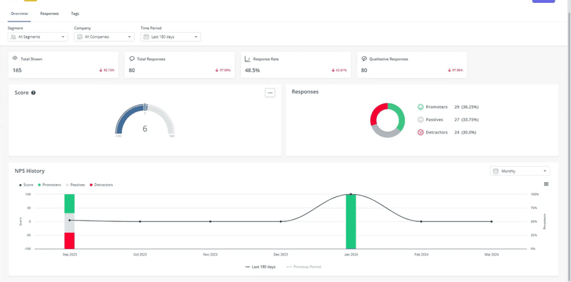
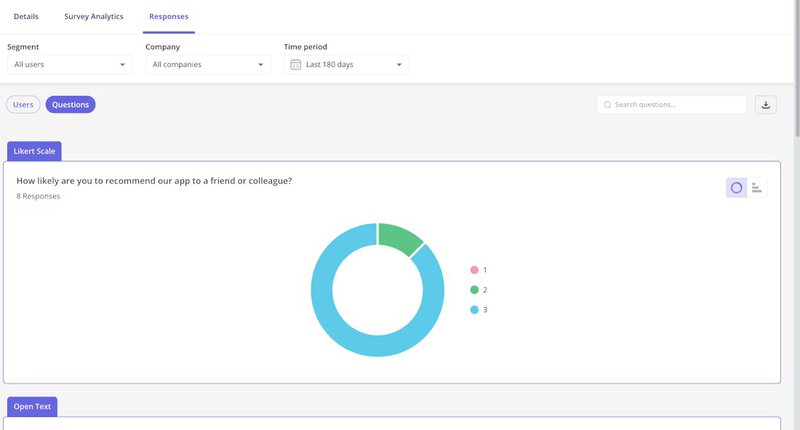
If you are using Userpilot, you can also view sentiment distribution directly in your dashboard through pie or bar charts. This gives you a clear visual breakdown of how users responded and their sentiment levels.
3. Summarize long-form feedback
Sometimes, users write essays. These are often your most valuable users, the ones who care enough to type out 500 words on why your onboarding UX frustrated them.
But when you share findings with stakeholders, you cannot paste a long block of customer feedback into a document and expect it to drive a decision.
This is where AI customer feedback analysis helps in a very practical way. You can feed a long support ticket or survey response into AI tools and ask for a short summary of the core pain points. Then you use that summary to route work faster, without losing the original context.
Here’s how I used to review customer feedback without turning it into a two-hour exercise:
- Ask for a 4-part summary: Goal, Friction, Impact, Suggested fix.
- Require 2 exact quotes pulled from the original text, so the summary stays grounded in verified customer comments.
- Add one “confidence” line: High, medium, or low. If it’s low, I read the full response.
This matters because summaries can drift. One study in Royal Society Open Science found that some AI summaries miss important details because not all AI models handle nuance as well as human readers. That is why I always keep two quotes and do a quick review before sharing.
4. Predict churn before it happens
Churn rarely happens without warning. Users usually tell us they are leaving months before they actually cancel.
They tell us through support tickets, any customer support interaction, low usage, and survey comments that hint at deeper customer dissatisfaction.
The problem is connecting these dots. A human might not notice that a user who gave a “7” on an NPS survey also visited the “Cancel Subscription” page three times last week. AI can.
By feeding feedback data into a churn prediction model, AI can correlate specific phrases in feedback with subsequent cancellation behavior. It learns that when users say “value for money,” they are price-sensitive and at risk.
Here’s how it works in practice. The model is trained using historical data with predefined labels. Think churner or non-churner. You feed it data from thousands of past customers, like their login frequency, feature usage, support ticket data, payment patterns, and their survey responses. Then algorithms like Random Forest or XGBoost analyze such data to find patterns and return predictions.
Let me give you an example.
Netflix discovered that when users stop watching for more than five days, their likelihood of canceling skyrockets. So once their AI detects these early signals, like decreased viewing frequency, they automatically trigger offers to pull users back in, protecting revenue and customer satisfaction.
5. Connect feedback to behavior
Feedback rarely tells the whole story. A user might say, “I can’t find the export button.”
If you just analyze the text, you might think you need to make the button bigger. But maybe the button is big enough, and the user is just looking in the wrong place because of a confusing layout.
This is where AI helps bridge the gap between what users say and what they do.
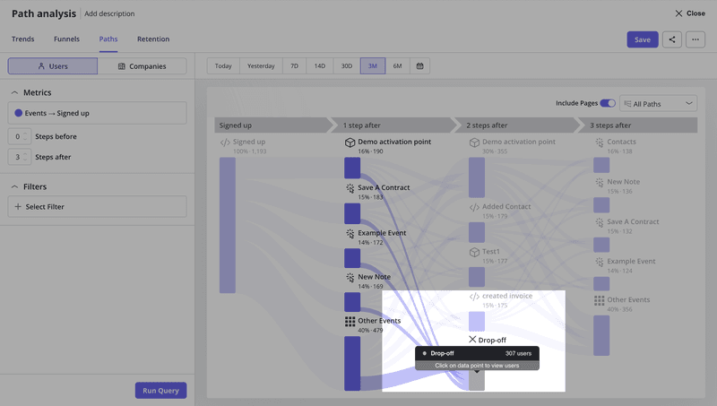
AI can help correlate specific feedback topics with behavioral metrics. For instance, if AI tags a surge of feedback regarding “Login Issues,” you can immediately look at your funnel analysis reports or user path visualization to see if there is a corresponding drop-off at the login screen. That way, you see exactly where the customer journey breaks down.
This kind of connected intelligence is coming soon to Userpilot. It will help you surface insights such as “Enterprise users who mentioned ‘onboarding’ in their feedback have a 40% lower activation rate than those who didn’t”.
You’ll be able to ask follow-up questions like, “Which user segments are converting faster?” or “Is there a correlation between negative feedback about pricing and actual upgrade behavior?”
The AI analyzes your behavioral data alongside feedback responses to reveal patterns you’d miss reviewing spreadsheets manually.
So join our waitlist so you won’t miss out on our release!
Be first to access Userpilot’s AI-powered insights!
As your product grows, trust depends on how quickly you respond to customer feedback. Users expect you to notice patterns, fix friction, and keep the customer experience consistent with rising customer expectations across releases.
A practical way to get these key benefits is:
- Collect customer feedback in-app where issues happen.
- Let AI feedback analysis group themes and surface customer needs.
- Prioritize the work that prevents churn and helps improve customer loyalty.
Over time, this turns scattered comments into a reliable early-warning system and feedback loop between your users and product team.
Userpilot is building AI-powered workflows, leveraging AI to shorten that path from insight to in-app change. Want to know more? Book a demo!
FAQ
Can you use AI for feedback?
The key is keeping a human check in the loop, especially for edge cases and high-impact accounts.
How does AI feedback analysis work?
Most AI feedback analysis uses machine learning models to read text from surveys, tickets, and reviews, then label it by topic and tone. You get structured output you can filter by segment, plan, or timeframe, which helps you evaluate customer interactions alongside what users said.
What is generative AI for customer feedback?
Generative AI is now commonly used for analyzing customer feedback, and it takes a step beyond labeling. It can draft summaries, highlight patterns, and suggest follow-up questions, based on the customer feedback data you already have.
What are the best AI tools for customer feedback?
Good AI-powered tools for customer feedback include:
- Qualtrics XM for large-scale voice-of-customer programs.
- MonkeyLearn for text-based AI feedback analysis and classification.
- Medallia for omnichannel CX programs.
Userpilot fits when you want a product growth solution tied to usage. You can collect customer feedback on web and mobile with in-app surveys and NPS. Then you analyze customer feedback using NPS dashboards, customer feedback analytics, and survey analytics by segment and platform.
Upcoming Userpilot AI-powered features aim to surface patterns faster, suggest next best actions inside your product, and deliver personalized and proactive experiences.
About the author