A Complete Guide to In-App Resource Centers: How To Support Your Users Better
You get your hands on the latest SaaS tool and can’t wait to start using it, but the setup process is complicated. The next logical step? You look for help within the app. However, there are no resources to guide you, so you reach for your phone and connect with customer support.
That’s when you hear the dreaded “All our executives are busy. We’ll connect you to an agent soon.” And then begins the excruciating wait.
As a digitally savvy SaaS user, wouldn’t you rather troubleshoot issues on your own? It’s faster and gives you more autonomy over the experience.
That’s where in-app resource centers step into the picture.
An in-app help center empowers users with self-service support, meaning they can find answers to their queries when they need it without exiting your app.
In this article, we’ll discuss the must-have features of in-app resource centers and tips to build a robust help center for your SaaS.
What is an in-app resource center for SaaS?
An in-app resource center for a SaaS product is a repository of help, support, and educational resources within your application. In-app resource centers usually feature product documentation, knowledge base articles, tutorials, and more to provide users with contextual support as they navigate your product.
The content is designed to address common user queries and pain points and typically comes with a search function to help users locate relevant information easily. In-app resource centers are also called embedded resource centers, in-app knowledge bases, and in-app help centers.
What are the key features of in-app resource centers?
The best in-app resource centers share a few common features, even if the exact content may vary. These include:
What’s the biggest challenge with your current user support?
How are you currently helping users in-app?
What if you could provide instant, contextual help right inside your app?
An effective in-app resource center reduces support load and empowers users to find answers themselves, exactly when they need them.
Ready to build an in-app resource center that delights your users?
Stop frustrating users and start providing proactive, self-service support. See how Userpilot can help you launch a powerful in-app resource center without writing any code.
1. Knowledge base content
Even the most technically adept users can need assistance to understand how different features work. Address their issues with helpful articles, video tutorials, and FAQs right when they’re looking for help. Additionally, include educational resources, such as case studies, e-books, and webinar recordings, so users get maximum value from your product.
2. Search functionality
According to Gartner, only 36% of “very simple” customer issues are resolved in self-service. In a whopping 43% of cases, customers can’t find content relevant to their issues, which can be frustrating. Adding the best content to your resource center isn’t helpful if users have to jump through hoops to find relevant information. It adds friction to the user experience and can cause more churn.
How do you ensure your in-app help center meets user expectations? Integrate search functionalities and make it easy to navigate.
Allow users to find specific resources by typing relevant keywords in a search bar. It’s even better if they can set filters to refine the search results.
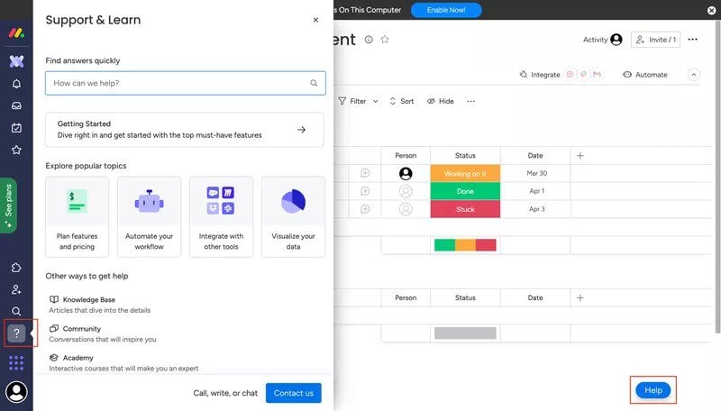
For example, Monday’s help center features a prominent search bar with a “how can we help” prompt, so users know exactly where to find help and how. Multiple options to access the resource center—the left sidebar and the floating button—make the experience even smoother.
3. Interactive guides and walkthroughs
Include step-by-step guides and interactive walkthroughs to delight users with contextual guidance as they navigate your product. They use hotspots, modals, and tooltips to nudge users to perform specific actions and take them closer to the ‘Aha!’ moment.
Including interactive guides and walkthroughs in your in-app resource center makes it easier to access them on-demand.
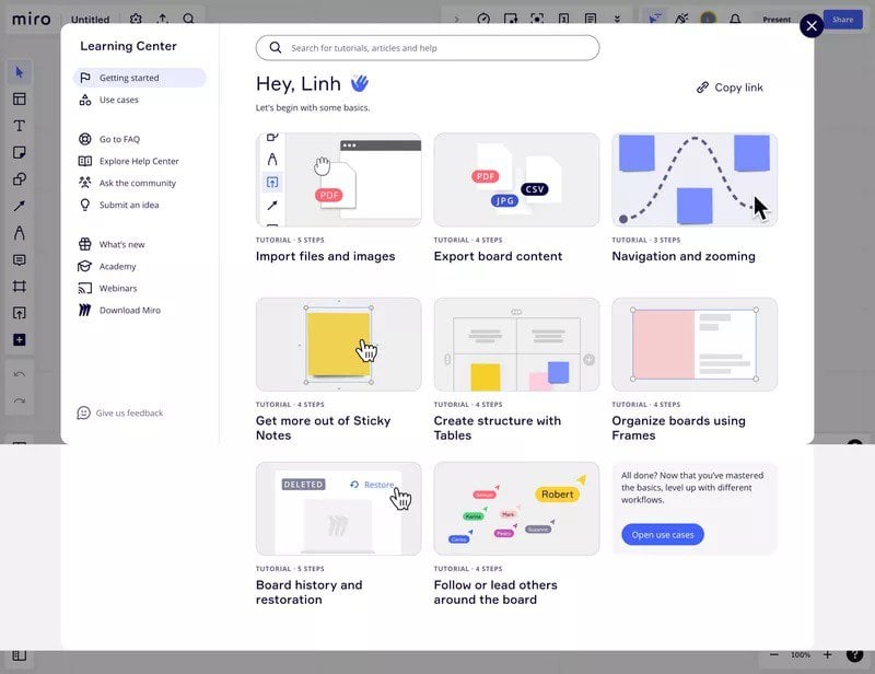
Miro, for instance, features a collection of guides in the ‘Getting started’ section of their learning center to help users get started with using the platform. Each guide addresses a specific feature/use case/task, and clicking on it launches a tutorial.
4. Support channels
Knowledge base articles and interactive walkthroughs are suitable for addressing common user queries. However, complex issues need human intervention, so including multiple customer support channels in your in-app help center is a must.
Use contact forms to allow users to submit their requests. Likewise, add a live chat widget to let them connect with customer support agents and troubleshoot problems in real time. If you offer email and phone support, make sure the contact details are easily accessible.
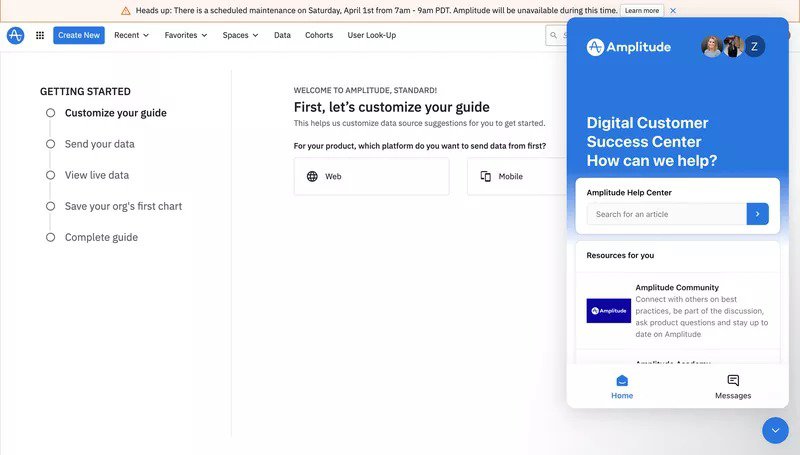
You can also take things up a notch, like Amplitude does, by featuring a community support section. This will create a sense of belonging and boost user engagement by facilitating peer-to-peer support.
5. Personalized content
An in-app help center that tailors resources and recommendations based on user behavior and preferences to create a personalized experience is a must-have. It ensures that users can easily find the information they’re looking for.
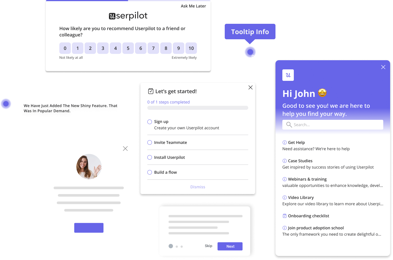
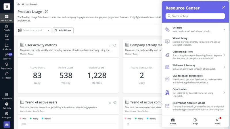
Userpilot, for instance, features an all-in-one resource center with different module types for each user segment. We use various content formats, such as articles and videos, to help cater to diverse user needs. Users can also launch a chat with customer support from within the resource center.
Why are in-app resource centers important?
Self-service functionalities are no longer a novelty. According to a Salesforce report, 67% of users would rather talk to an AI agent than a human. As Millennials and Gen Z take over decision-making roles, particularly in B2B companies, the demand for self-service support will grow further.
A well-designed embedded help center offers several benefits, such as:
- Improved user engagement: With helpful content at their fingertips, users spend more time exploring different features and experiencing your product’s value.
- Reduced churn: A comprehensive in-app resource center provides quick solutions to user problems, minimizing frustration and churn.
- Increased customer satisfaction: The self-serve component of in-app help centers creates a sense of control, allowing users to find the right solutions at the right time. Personalizing the resource center content improves satisfaction levels further.
- Reduced support team costs: An in-app resource center gives users quick and easy access to information, eliminating the need to raise support tickets for simple queries. It allows support agents to focus on complex issues and improves their efficiency, which has a direct impact on the bottom line. In fact, self-service support costs $0.10 per contact versus $8.01 per contact for phone, live chat, or email support.
- Direct access to valuable insights from customers: Engagement analytics for your in-app help center offers a glimpse into user needs and pain points. Use these insights to inform future product development and customer success efforts.
8 best practices to build an in-app resource center to empower users
Knowledge base providers help you set up multiple resource centers with a few clicks.
In the following sections, we’ll discuss a few tips to design an in-app help center that drives results.
1. Create high-quality, on-brand, personalized content
Create content that addresses user needs and pain points at different stages of their journey. To cater to diverse user preferences, incorporate different content formats, such as:
- Articles highlighting specific use cases.
- FAQs for common user queries.
- Interactive tutorials for each feature.
- Downloadable resources like checklists and templates.
- Educational content, including case studies, webinars, and whitepapers.
For a cohesive experience, make sure the resource center matches your brand’s visual identity and voice.
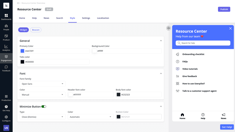
Userpilot lets you build an in-app resource center packed with various content formats, and you can customize the colors, font, and button styles code-free. You can even customize your existing knowledge base in the same manner.
2. Optimize for intuitive navigation and accessibility
Design a clean, clutter-free, and visually appealing interface that grabs and retains user attention. Next, organize your content into logical categories and subcategories for easier navigation. Make sure you use descriptive headings for each asset so users know what to expect before opening it.
For instance, if you’re creating how-to articles for different use cases, you can structure each heading as follows: How to <<name of task>> using <<name of feature>>.
Additionally, provide users with multiple options to access the resource center. Add an icon to the navigation bar and side menu bar or use a floating button. Keep accessibility in mind while designing the content as well. Provide options like font size control, high contrast, and text-to-speech options to make your content more accessible.
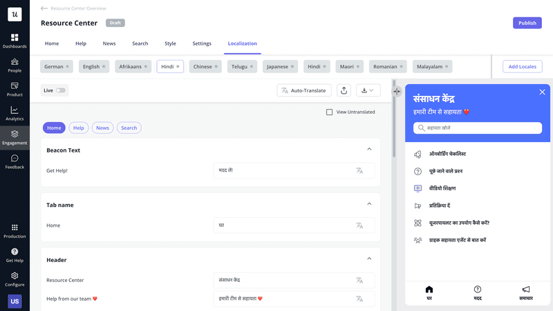
With Userpilot’s localization feature, you can automatically translate the resource center content to a user’s preferred language. In other words, you can create personalized experiences for a global user base—even non-English speakers.
3. Implement a solid search function feature
Help users make the most of your in-app knowledge base by adding robust search capabilities. Integrate a powerful search engine that can interpret complex search queries and generate accurate results.
Also, offer different filter and sort options to let users refine the search results based on their needs. Advanced features like autocomplete suggestions and related search can make it even easier for users to locate relevant content.
4. Segment users to provide contextual support
It’s now time to personalize your in-app resource center. Start by creating user segments based on their in-app behavior, goals, or lifecycle stage. Then, deliver targeted in-app help and guidance that align with a user’s current context and needs.
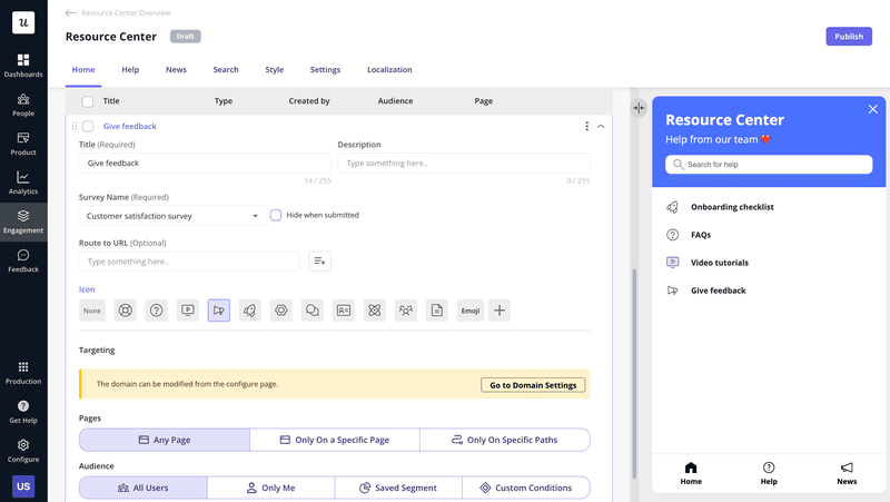
With Userpilot, you can modify the page and audience targeting settings to display and hide specific modules in the resource center. That way, different user segments see content that’s relevant to their goals and pain points, enhancing their experience.
5. Integrate your research center with other support channels
What happens when users face issues beyond what’s covered by resource center content? For a seamless experience, provide them with easy access to different support channels, such as contact forms, in-app messaging, and live chat. If they need help with complex issues, offer the option to contact support agents via email and phone.
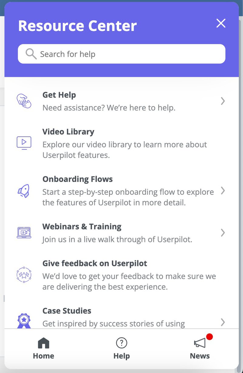
While having multiple support channels is essential, ensuring a smooth transition between self-service and human assistance is just as crucial. For instance, Userpilot’s resource center combines all user support options into a single hub. Besides case studies, onboarding flows, and videos, the resource center also gives users direct access to support agents.
6. Monitor usage data and identify content gaps
Your help center packs a goldmine of insights into user behavior and expectations that help spot content gaps. Monitor resource usage and support ticket deflection rates to measure the effectiveness of your content. Additionally, keep an eye on search queries to understand what information users look for and how well your existing content matches their needs.
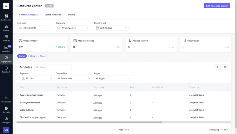
Userpilot’s Resource Analytics dashboard lets you track metrics, such as modules clicked and articles viewed. You can even monitor the number of clicks on a resource and the last time it was clicked to identify and weed out unused content.
7. Gamify the resource center experience
Setting up a new tool, learning to use its features, and troubleshooting issues usually involve a learning curve. Users have to navigate a new interface and how different features and tools fit into their daily work. How do you make them look forward to it? By incorporating gamification elements into your in-app resource center.
Add progress bars to show users how far they’ve moved in their onboarding journey. Reward them with digital badges or incentives when they complete specific actions or hit milestones. You could also let users collect redeemable points by accessing educational content or participating in polls.
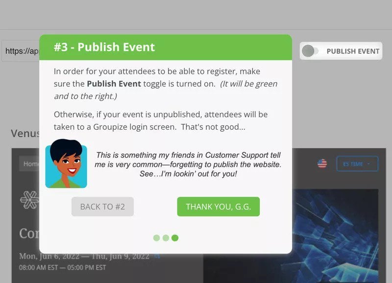
These game-like elements add excitement to otherwise mundane processes and boost user engagement. The strategy did wonders for Groupize. They integrated G.G., their interactive assistant, with their resource center (created with Userpilot) to gamify user experience. Groupize noticed a steep decline in their support tickets as users turned to G.G. for simpler queries.
8. Regularly update content, gather user feedback, and improve on design
A good in-app resource center needs regular maintenance. Update your content with accurate, relevant, and up-to-date information to minimize user frustration. To enhance it further, collect user inputs via surveys and in-app feedback widgets and identify content gaps.
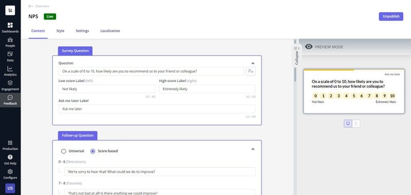
Userpilot’s pre-built survey templates make feedback collection a breeze. You can customize an existing template or create one from scratch to implement different surveys, such as CES, CSAT, and NPS. Surveys can even be triggered based on in-app activity to reach users when they’re most willing to share feedback.
Stop churn in its tracks: The power of in-app support
In-app resource centers aren’t just a convenience. With on-demand, self-serve support, they encourage users to spend more time within your product, potentially improving activation and adoption. You also gain insights into user needs and pain points.
However, building a robust in-app help center takes more than creating top-notch content. From personalized content recommendations and automated translation to search functionalities, a lot goes into creating a resource center that lives up to user expectations.
Userpilot is an all-in-one product adoption platform that lets you design an intuitive, personalized, and user-friendly in-app resource center. Schedule a demo now to see how you can use it to take self-service support to the next level.

