How Marketing Teams Can Use Userpilot to Improve App Engagement
Getting users to download your app is only half the battle. The real challenge lies in keeping them engaged and returning for more. For marketing teams in product-led companies, that challenge goes even deeper: even though they are also responsible for KPIs such as free-to-paid conversion, upsell, and new feature adoption rates, they often don’t have direct access to the in-app touchpoints where these decisions happen. They’re stuck waiting on product or engineering teams to make changes, often slowing down growth experiments and missing key conversion moments.
A product growth platform like Userpilot solves this by putting the power back in marketing’s hands. With it, teams can launch personalized onboarding flows, upsell prompts, and usage-based nudges without depending on engineering teams. In this post, I’ll share just that: how to improve app engagement, retention, and other growth metrics with Userpilot.
9 Ways to improve app engagement with Userpilot features
1. Create personalized onboarding experiences
Personalized onboarding experiences lead to higher engagement because they deliver precisely what each user needs.
The more relevant the flow, the more likely they are to engage, so start with in-app surveys to learn each user’s job. This data also helps you track product stickiness, adoption rate, and retention metrics.
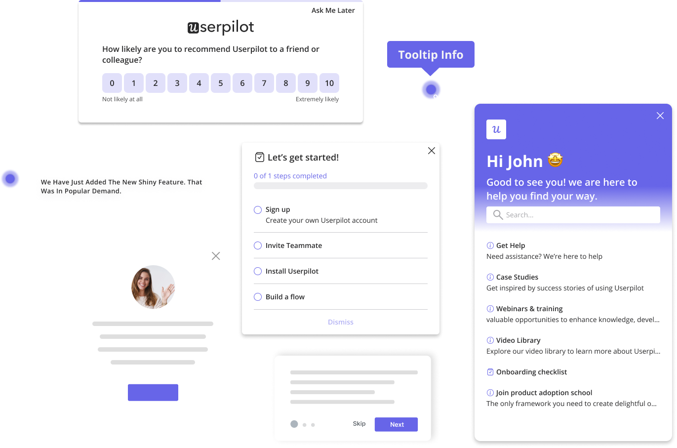
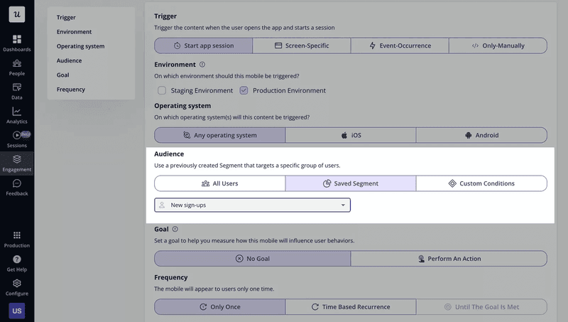
Then, segment them based on that data and trigger tailored onboarding templates. With Userpilot’s advanced user segmentation, map each segment to an in-app flow that appears only when it matters. For example, a new user might see a short checklist after signing in, and a returning user could get a contextual tooltip on an advanced button.
Userpilot’s no-code editor helps you design customizable tours, so you can easily create personalized experiences that keep users engaged.
2. Help users discover and adopt new features
Many users only scratch the surface of what your product can do. By highlighting new features and continually showing the value each one adds, you deepen their connection to the product. The more value they see, the more likely they are to become power users who regularly engage with your app. In other words, the stickier your app becomes.
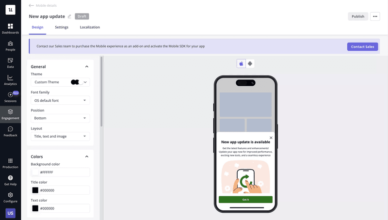
A slideout is a small panel that glides into view over the mobile interface, delivering information without blocking the screen. With Userpilot, you can build targeted slideouts and trigger them based on specific user actions or attributes. For example, when someone reaches a page containing a newly launched feature, it can trigger a slideout that explains how to use the feature or links to a quick walkthrough.
Additionally, you can invite new users to new launches within the app so they never miss out on valuable updates.
3. Use gamification elements to keep users motivated
Gamifying your mobile app turns routine tasks into enjoyable experiences, which drive retention and build loyalty.
Instead of simply pointing users to the next click, set milestones (such as integrating Userpilot with HubSpot) and use Userpilot’s code-free visual editor to trigger a celebratory in-app message when users reach that milestone.
For instance, offer a welcome badge upon sign-up and introduce levels that unlock extra features as users achieve new milestones.
4. Localize in-app experiences for global audiences
What better way to engage users across the web than speaking their language?
Localizing your in-app experiences is a powerful personalization method that boosts engagement by speaking to users in their language.
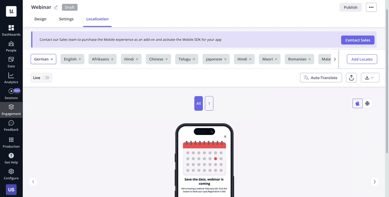
With Userpilot, you can automatically translate your existing app content into 15 languages with a click of a button instead of building new ones from scratch in each language. This covers every element of your product journey map, from NPS surveys to checklists and resource center content.
In this way, removing language barriers and tailoring experiences helps you foster user trust, product adoption, and long-term loyalty.
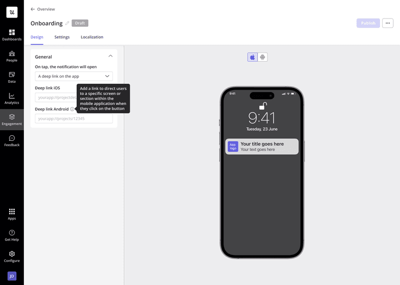
5. Design strategic push notifications to re-engage users
Timely push notifications are a surefire way to encourage inactive users back into your app. Use Userpilot to design timely messages that highlight new features, prompt actions, or remind users why they signed up.
These notifications can be triggered automatically based on user behavior, ensuring your updates land when they’re most likely to spark engagement. By segmenting users according to their app usage patterns, you can tailor each message to address individual pain points, making communication feel more personal and less spammy.
6. Automatically trigger emails based on in-app behavior
Automated emails based on in-app behavior are a strategic way to keep users engaged even when not using your app. With Userpilot’s webhooks, you can instantly send personalized emails whenever certain events happen, like an NPS survey submission, a button click, or a milestone completion.
For instance, if a user discovers a new feature but doesn’t explore its benefits, trigger a follow-up email with a how-to guide. By bridging in-app actions with immediate follow-ups, you create a seamless customer experience that fuels user retention, encourages in-app community, and keeps your product in mind.
7. Analyze user engagement to identify bottlenecks
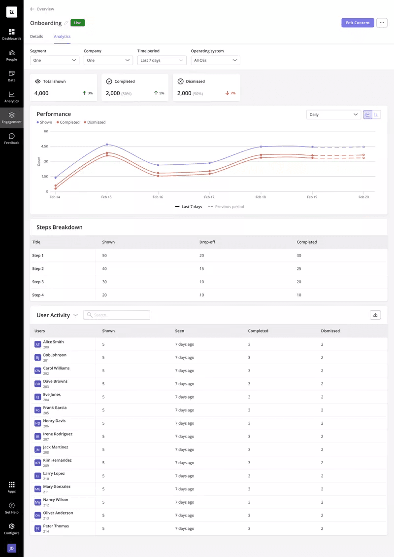
If you don’t know where users struggle, you can’t fix it. With Userpilot’s analytics, you can:
- Track how each user navigates your onboarding flows and where they drop off.
- How many users view certain in-app messages?
- Quickly spot drop-off points.
All these insights appear in one unified dashboard, alongside your web analytics, so your team sees the entire user journey across platforms, including how marketing campaigns influence user behavior.
By monitoring app engagement metrics like activation, adoption, retention, and churn, you’ll uncover where people lose interest, whether due to a confusing step or a missing feature.
8. Collect user feedback to improve your engagement strategy
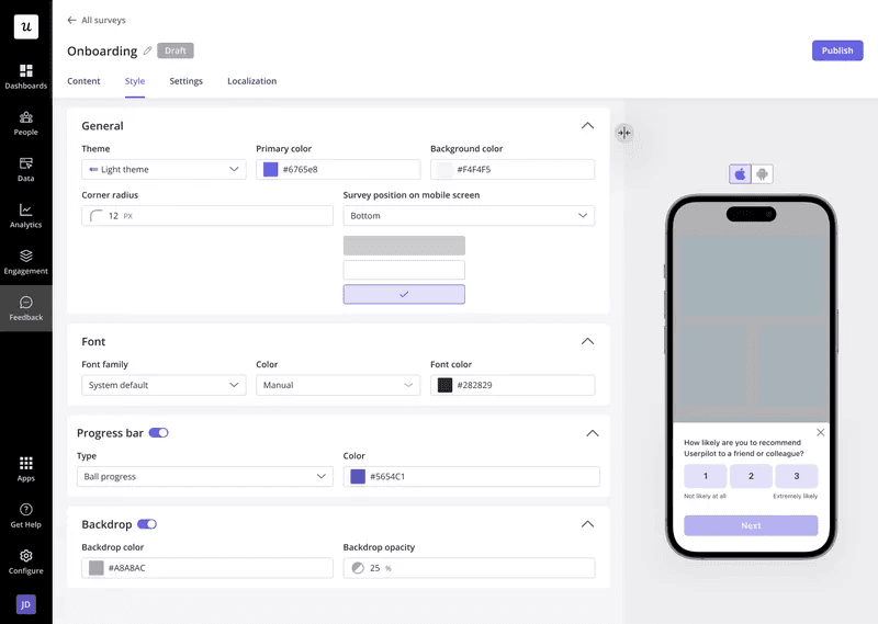
User feedback offers the most transparent window into what keeps users interested, so why not ask them directly?
Userpilot lets you embed in-app microsurveys (like single questions or short sets) so you can gather candid input at the right moment. For example, trigger a survey immediately after someone completes a workflow to capture fresh impressions.
Unlike traditional surveys, you’re not sending users away from your app, which boosts response rates and keeps them engaged within your app. You can also customize question types, like NPS, multiple choice, or open text, to capture the insights you need.
By acting on user feedback in real-time, you’ll improve your mobile app engagement strategy and deliver a more satisfying experience overall.
How much does Userpilot cost?
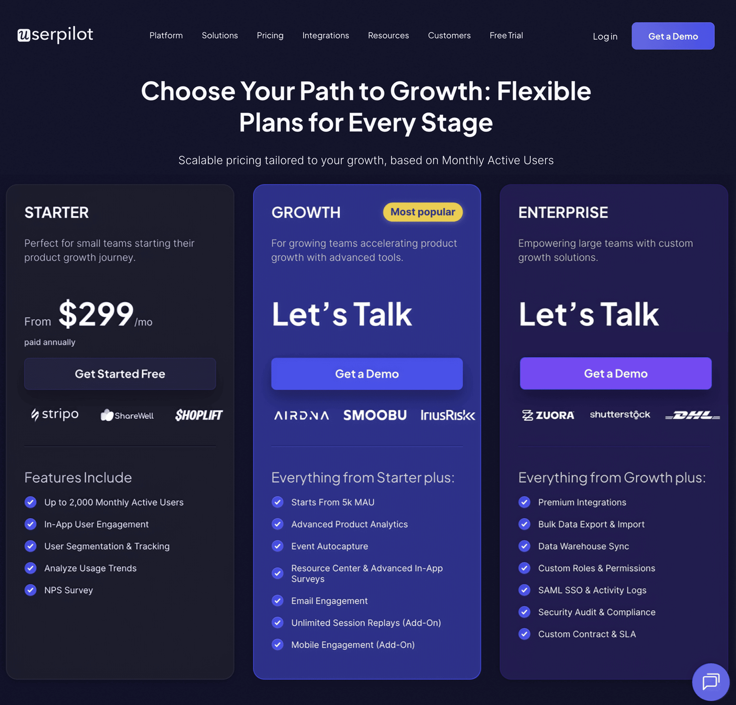
Userpilot’s pricing has three tiers:
- Starter: Userpilot’s entry-level plan is available exclusively as an annual subscription, priced at $299 per month. It gives you access to basic features such as in-app messaging, flow analytics, NPS surveys, and segmentation.
- Growth: Custom priced and includes everything in the Starter plan, adds custom MAUs, advanced product analytics, retroactive events autocapture, session replay (add-on), content localization, in-app surveys, resource centers, and mobile functionality.
- Enterprise: Quote-based and includes everything in Growth plus premium integrations, bulk data exports, data warehouse sync, custom roles, SAML SSO, priority support, and security audits.
Want to see Userpilot’s engagement features in action?
User engagement isn’t just a nice-to-have; it’s the foundation of retention, growth, and long-term success. If users aren’t actively engaging with your product, they’re not realizing its full value, and that puts your business at risk.
Userpilot gives you the tools to change that. With powerful in-app messaging, contextual onboarding, personalized experiences, and real-time analytics, you can guide users toward meaningful actions exactly when it matters most. Don’t let engagement slip through the cracks. Book a demo today and see how Userpilot can help you turn passive users into power users.

