9 Examples of Loading Page Designs That Actually Engage Users


From simple loading spinners to complex loading animations, loading pages have become a work of art today. So, what can we learn from the best loading page examples about user experience, delight, motivation, and engagement?
This article explores ten of the best loading pages we’ve seen and what makes them so good. We also examine the dominant UX design principles behind good loading pages to guide your own creation.
Loading page examples Summary
Some of the most engaging loading page examples we’ve found are:
- Slack incorporates a loading spinner, team quotes, and helpful tips into its loading page.
- TurboTax delays its loading for a few seconds, with a loading animation showing the “complex” process happening in the background.
- Intercom’s loading page contains a loading animation and messages explaining the loading process.
- Productboard uses a skeleton screen for small loading areas and a logo animation with marketing messages for a full page load.
- WeTransfer utilizes its loading screen to advertise its paid Pro service.
- Duolingo uses its cute owl mascot, Duo, to engage users on the loading page. It also shares inspiring messages to drive retention.
- Expedia uses a floating airplane animation on its loading screen as users search for flights.
- Medium uses a skeleton screen to reassure users that the content is loading.
- Customer.io uses an adorable mascot pigeon to replace the traditional loading spinner and create a friendly loading experience.
- Looking to create your loading page? Include a loading animation and other interactive elements to make the page engaging.
- You can also include a progress bar for users to track progress and tailored messages to explain delays in the process.
- Ready to create the best loading page ever? Userpilot can help you conduct A/B tests to determine what works best for your users. Book a demo to learn how.
What is a loading page and why are they important?
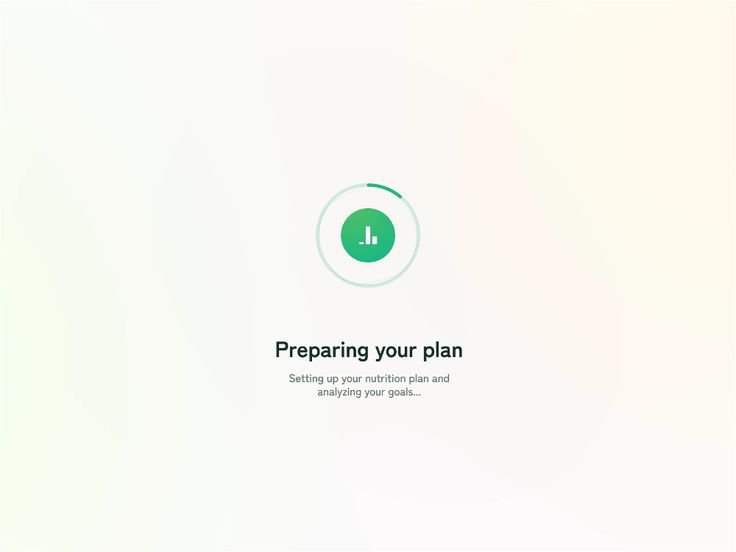
A loading page is a screen that tells your site users that your site is loading. It comes up during the loading process, typically containing loading animations, progress bars, etc.
Loading screens are as old as the internet itself. Whether they’re waiting for some data to load or a page transition, these screens reassure users that the content they seek is coming.
As a result, it makes their wait time more tolerable and less frustrating. When done properly, a loading screen can boost motivation, delight users, and reinforce your website’s brand identity.
Loading page vs. Loading spinner vs. Skeleton screens
A loading page is a full-page display that typically includes some message, loading animation, or progress bar.
It is ideal for when the entire website is loading, or there’s a significant delay in content delivery.
A loading spinner is a small CSS loading animation that rotates or spins to indicate loading activity.
This preloader animation can be placed in various positions to show progress with the loading element or page section.

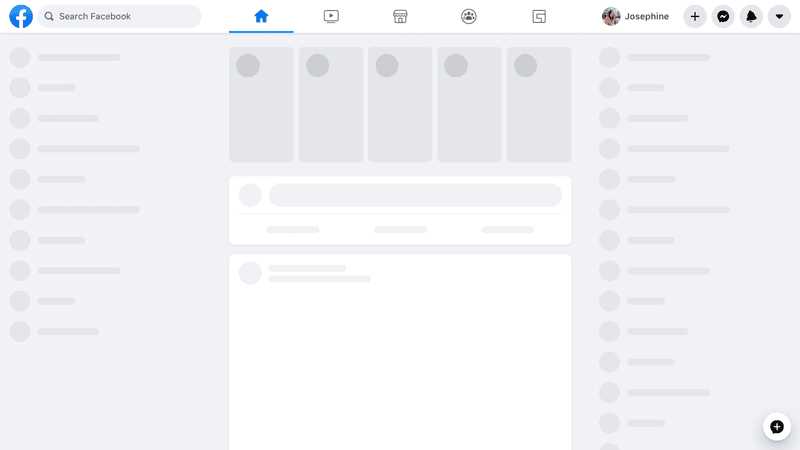
Much like loading pages, skeleton screens are typically full-page displays. They mimic the structure and layout of the final content and often appear as gray or white outlines or shapes.
Skeleton screens provide a visual framework of the loading content to reduce the perceived load time. The visually engaging loading experience they provide makes them ideal for complex page layouts.
Best loading page examples you will love
From loading animations to skeleton screens, SaaS companies use a variety of loading screens to keep users engaged. Let’s now consider some of these loading page examples and what makes them great.
1. Slack
Slack provides one of the best loading page examples for products looking to reinforce their brand identity with the loading page. Their loading page is a combination of different elements.
A skeleton screen and a loading spinner prepare users as the app loads. They also reinforce their collaborative features by enabling users to add quotes that team members can view during wait times.
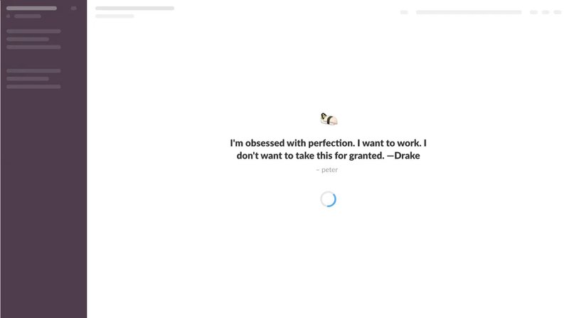
Finally, if there are no quotes from the team, Slack shares helpful tips on the loading screen, providing users with valuable information to help them get the most out of the app.
2. TurboTax
TurboTax helps users calculate and file their taxes. To do that, it has to load and process the user’s data. This process takes about 5-10 seconds, with a loading animation showing the processing happening.
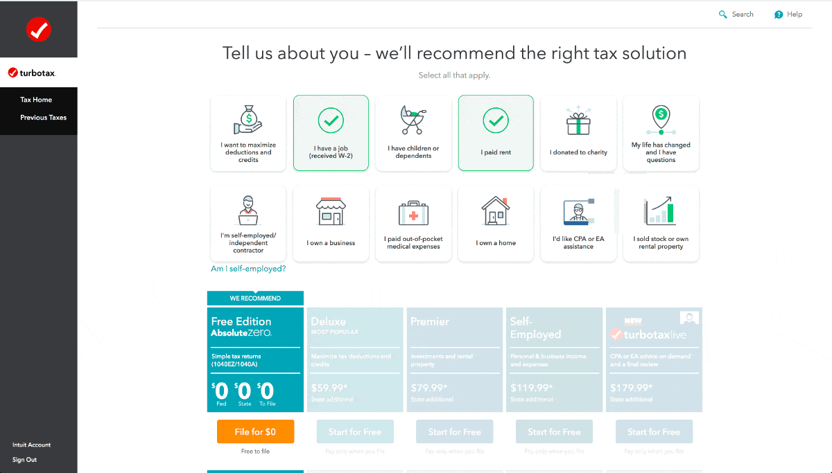
TurboTax provides a perfect example of how the loading page can improve the user experience. They really do not need 10 seconds to load and process user data.
By taking that long, though, they reassure users that their accounts are actually checked and accurately analyzed. The on-screen messages in the animation further foster this idea.
3. Intercom
Catching Intercom’s loading screen is a little tricky if you don’t have a slow internet connection. The customer service platform takes less than a second to fully load.
When you do catch it, though, you’ll notice two key elements. First is a spinner loading animation that “shows” you things are loading. There’s also a message explaining what’s going on in the background (“Getting everything ready…”).

Simple as it is, the spinner plus the message keeps the user engaged with the app loading. This is the perfect example to follow if your app doesn’t typically have long wait times.
4. Productboard
Productboard uses a skeleton screen when small sections of the website are loading. This limited loading screen drives attention to the specific loading area while also setting expectations for what’s coming.
For a fuller app launch, Productboard animates its logo to let users know things are moving forward. They also include marketing messages and other quotes beneath the logo animation to keep users engaged.
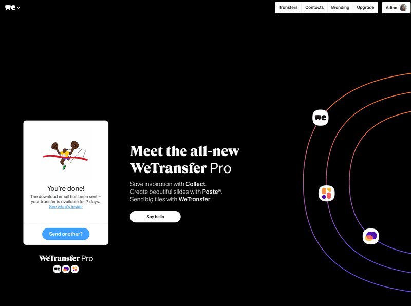
5. WeTransfer
WeTransfer enables you to share files of up to 2 GB for free, without even registering an account. However, they also offer a Pro service for larger file transfers.
While users wait for their files to be transferred, WeTransfer promotes their Pro service on the loading page. We love this technique as it drives account expansion while keeping users engaged.
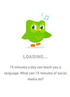
6. Duolingo
The language learning app Duolingo adopts a fun approach to its user interface, and its loading process is no different. Their adorable owl mascot, Duo, occupies the screen as the app loads.
Below this loading animation, Duolingo tries to boost user retention by including facts and reminders to encourage users. A little progress bar also helps users track the loading progress.
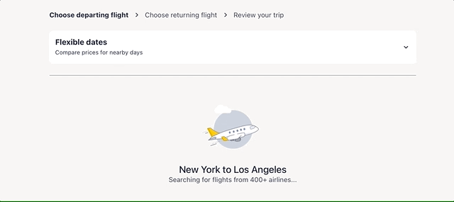
7. Expedia
Expedia’s loading animation is equally captivating – a plane floating past fluffy clouds. This animation fits perfectly as it pops up while users search for a flight on the platform.
It, thus, reinforces the site’s purpose while providing some entertainment to engage users until the flight results are available.
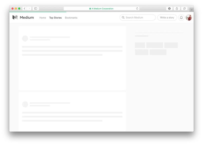
8. Medium
The online publishing platform, Medium, uses a skeleton loading screen to engage and delight users. Designed to facilitate quick content delivery, this loading page design is an essential part of the user experience.
It reassures users that the content is loading, making the wait times more bearable. They also load low-res image previews to reduce the loading time further.
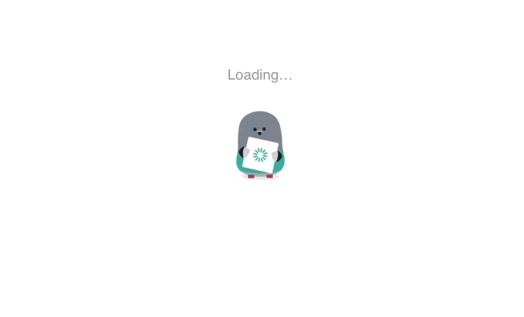
9. Customer.io
Customer.io makes a fun play on the traditional loading spinner using its cute mascot – an animated pigeon named Ami. The mascot is fun and friendly, which makes the wait time more interesting.
Likewise, because Ami is present throughout the product, its presence on the loading screen creates a familiar, consistent brand experience.
How to build engaging loading pages with these UX principles
Despite your best efforts, you may never be able to eliminate loading times. So, how can you create a better loading page that is engaging while limiting user frustration?
Implement a progress bar
Visual cues like circles and loading spinners are excellent. But if your app will take a few seconds to load, loading bars are a no-brainer!
Progress bars help site users track the loading progress, reassuring them that the process is underway. You can make this exciting by animating your progress bar as it fills up.
Then, you can pair them with informative texts that explain the progress or offer a sneak peek of what’s coming.
Make loading more interactive with a loading animation
Delightful animations can transform your loading screen from a dull, lifeless experience into a truly engaging one. Subtle animations draw attention to the loading process, making it more enjoyable.
You can also incorporate small interactive elements like clickable buttons, hover effects, or click animations to make the process even more engaging and enjoyable.
Benefit from empty states to showcase useful information
Empty states are moments in the product experience where there’s nothing to display. These moments can easily come up while the app loads or transitions from one page to another.
During these moments, you can include skeleton screens or placeholder text to give users an idea of what to expect. You can also include icons or illustrations that relate to the content or the loading process.
You can also display tailored messages that fit the user’s context or specific situation to keep the user engaged while waiting.
Clearly communicate the loading reason
Communication is essential if the loading screen will be up for a while. For example, you can include inspiring loading messages or display related content to prepare users for what’s coming.
You can also provide information about the loading process, such as estimated load times or reasons for delay.
For example, if a screen is delayed due to a poor internet connection, you can inform the user of the connectivity issue. This informs the user of the problem while absolving you of blame.
Incorporate robust user testing
As with everything else, you can never be too sure what will resonate best with users. So, test, test, and test again. Get real users to test your loading pages and provide feedback.
Use the feedback to identify areas for improvement and iterate on your design to create a more engaging and effective loading experience.
You can also conduct A/B tests for multiple designs to determine which one best resonates with your users.
Conclusion
By incorporating creativity, interactivity, and informative elements, the loading page examples above are anything but mundane experiences. Instead, they capture user attention and leave a lasting impression.
As you try to determine the ideal loading page design for your audience, Userpilot can help you A/B test your different design concepts. Book a demo today to learn more.
About the author