Mobile App Metrics I Actually Track as a PM (and the Ones I’d Cut From Your Dashboard)


I’m Abrar Abutouq, PM at Userpilot, and I’ve spent enough time staring at post-launch mobile app dashboards to know what it feels like when your mobile app metrics are all moving at once and none of them tell you which one to fix first. That’s the problem this guide is designed to solve.
A bit of context on why the first-session experience deserves most of your attention: roughly 50% of users uninstall within 30 days, and about 25% abandon after just one session. Getting those early moments right is where most mobile apps win or lose the relationship.

The 14 mobile app metrics worth tracking: a quick reference
The order of importance depends on your current lifecycle stage. At early stage, fix activation before anything else. At maturity, revenue metrics become the primary levers. Use this table as a reference, then read the sections below for the prioritization logic.
| # | Category | Metric | Why it matters |
|---|---|---|---|
| 1 | Activation | Time to First Value (TTFV) | The single best predictor of Day 1 retention and the metric most dashboards are missing. |
| 2 | Engagement | DAU/MAU (stickiness) | Tells you how often retained users actually return. |
| 3 | Engagement | Feature adoption rate | Shows which features are delivering value and which need better discovery. |
| 4 | Engagement | Average user session length | Signals engagement depth, with important caveats about when a high number is bad. |
| 5 | Engagement | User retention rate | The central health metric. Tracks whether users find enough value to return. |
| 6 | Engagement | Churn rate | Identifies the user loss you can actually prevent, and the segment where it’s happening. |
| 7 | Acquisition | App downloads | Tracks acquisition channel performance. A vanity metric until activation is working. |
| 8 | Acquisition | Customer acquisition cost (CAC) | Measures marketing efficiency. Only meaningful when paired with LTV. |
| 9 | Revenue | Average revenue per user (ARPU) | Gauges per-user revenue performance and informs pricing and tier decisions. |
| 10 | Revenue | In-app purchase conversion rate | Measures how well your monetization model is working by user segment. |
| 11 | Revenue | User lifetime value (LTV) | Guides acquisition strategy. The denominator in every CAC decision. |
| 12 | Technical health | App crashes | Early warning for retention risk. A spike after launch usually shows up in Day 1 numbers within 48 hours. |
| 13 | Technical health | App launch time and load time | Two metrics I’ve combined because they diagnose the same thing: how fast your app becomes useful. |
| 14 | User sentiment | NPS and user sentiment | The qualitative layer that tells you why the quantitative metrics are moving. |
Why mobile app metrics alone won’t tell you what to do (and the framework that changes that)
Pick up any standard list of mobile app metrics and you’ll find the same structure: a definition, a formula, and a benchmark. If your number is below benchmark, the advice is some variation of “work on improving this.” What’s always missing is the decision layer: which metric to look at first, what a dip most likely points to, and what experiment to run in response.
Metrics don’t carry equal weight across a product’s lifecycle. A team three weeks post-launch shouldn’t be watching ARPU with the same urgency as Day 1 retention. Activation metrics tell you whether users are getting value fast enough to return. Revenue metrics tell you whether you can build a business around that value. Sequential, not parallel — and most dashboards don’t reflect that.
The mental model I use is a triage stack: fix activation before worrying about retention, fix Day 1 before looking at Day 7, and fix retention before acquisition spend becomes meaningful. If users aren’t reaching their first value moment in session one, everything downstream is measuring the consequence of that one problem.
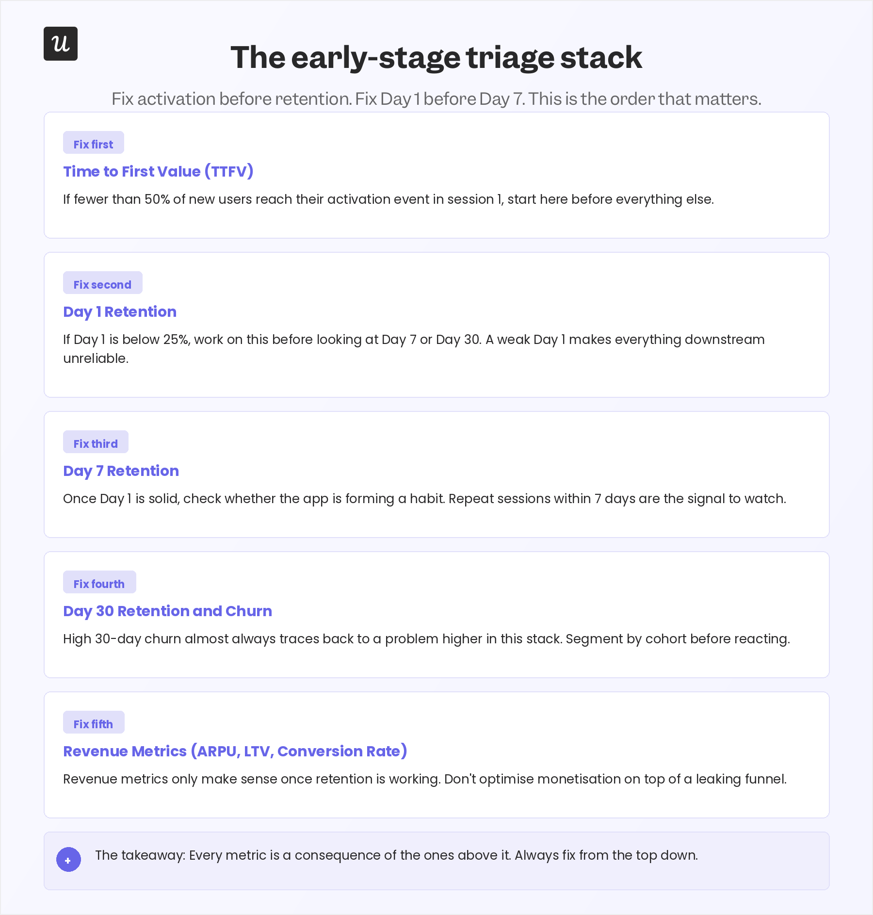
Each section below follows this logic. I’ve organized the 14 metrics into four categories, noted which stage each one is most relevant at, and added a note on what I investigate when each number moves. The full decision framework is in the last section.
Mobile app engagement metrics: The ones that predict everything else
1. Time to First Value (TTFV)
Time to First Value is the one mobile app metric I’d add to every dashboard that standard lists don’t include. It measures the median time it takes a new user to reach the specific action that makes your app useful: not signing up, not completing an onboarding checklist, but actually experiencing the value your app was built to deliver.
To measure TTFV, define the one event that represents genuine value delivered: for a productivity app, creating a first task; for a food delivery app, completing a first order, then track the median time from app open to that event by new-user cohort. Users who reach that event in their first session retain at dramatically higher rates than users who don’t, regardless of category.
There’s no universal benchmark for TTFV because the activation event varies by app. What I look for instead: if fewer than 50% of new users reach the activation event in their first session, the onboarding path has a friction problem that outranks everything else on the list. The fastest fix for this is contextual in-app guidance that surfaces the path to first value directly, rather than relying on users to discover it on their own.
2. Daily active users (DAU) and monthly active users (MAU)
DAU and MAU, taken together as a ratio, tell you how often retained users are actually returning to your app. A DAU/MAU ratio of 20% or higher indicates strong stickiness; above 25% is excellent. The ratio is sometimes called the stickiness ratio, and it’s one of the more honest proxies for whether your app has become a habit.
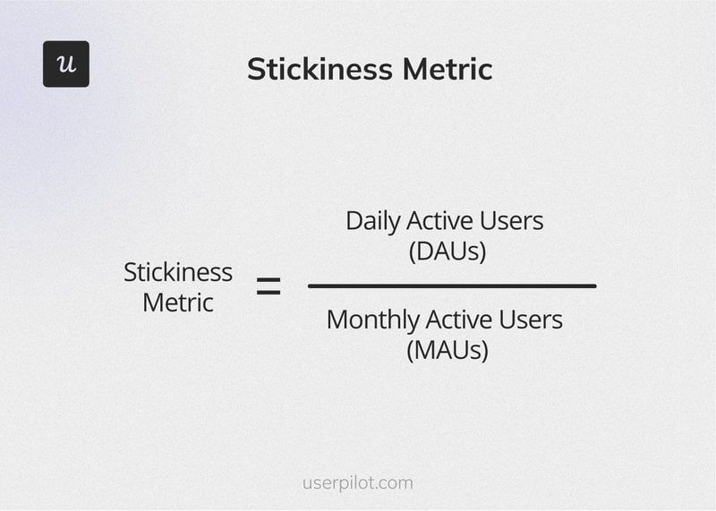
To calculate it: divide DAU by MAU and express as a percentage. Mixpanel’s 2024 benchmark report put the cross-industry average at 37%, though that figure is skewed upward by high-frequency social and messaging apps.
When stickiness drops, I look at the events driving repeat sessions first. If users are opening the app but not completing meaningful actions, the issue is usually feature discoverability or a value proposition that worked at sign-up but isn’t being reinforced in subsequent sessions. If they’re simply not opening at all, that points to a notification strategy or re-engagement problem.
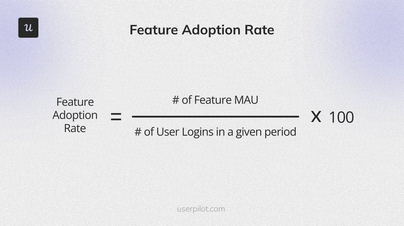
3. Feature adoption rate
Feature adoption rate measures what percentage of active users interact with a specific feature within a defined timeframe: (users engaging with the feature / total active users) x 100. Our own benchmark data across 100+ SaaS companies puts the average core feature adoption rate at 24.5%, though well-designed features with strong discovery paths can reach 40-50% in their first month.
Discovery and engagement are two separate problems. Low adoption because users aren’t finding the feature points to a UI or onboarding flow problem. High discovery but rapid drop-off after the first use points to a value or usability problem, and session replays are usually the fastest way to understand which one it is.
Not a B2B example, but one worth mentioning is Sephora SEA that ran into the discovery problem with their augmented reality Virtual Artist feature. After implementing a targeted in-app messaging strategy using push, content cards, and in-app messages, segmented to users who had viewed a makeup product page but hadn’t used the feature. They saw a 28% increase in AR feature adoption, a 16% uplift in usage per user, and a 48% increase in overall feature traffic. The fix wasn’t in the feature itself. It was in the communication around it.
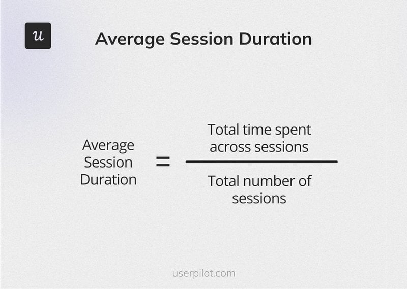
4. Average user session length
Average session length measures how much time users spend in a single visit: total time spent across all sessions divided by total number of sessions. Adjust’s 2024 research found typical session lengths range from 6.55 to 28.62 minutes, with social and entertainment apps on the high end and utility apps considerably lower. Where your app falls in that range matters far less than whether the sessions that are happening are productive ones.
Use this metric as a signal, not a north star. A session length that looks high can mean users love the app, or it can mean they’re stuck and can’t figure out what to do next. Product leader Aakash Gupta experienced this directly: he watched both adoption numbers and session duration climb and assumed the product was healthy, only to discover through support tickets and session replays that users were spending extra time because they couldn’t understand the product.
When session length jumps unexpectedly, the first thing I check is whether the average is being pulled up by users who are looping or backtracking through the same flows, rather than users going deep on features they value. A funnel view showing where users spend time per screen usually answers that question within a few minutes.
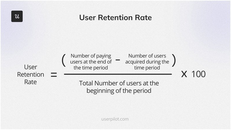
5. User retention rate
User retention rate measures the percentage of users who remain active after their initial install, tracked by cohort: [(users at end of period minus new users acquired) / users at start of period] x 100. Statista reports that the average one-month retention rate for mobile apps varies between 1.2% and 9.9% by industry, which is a sobering range.
The three cohort benchmarks I track are Day 1, Day 7, and Day 30. According to getstream.io’s 2026 retention benchmarks, average Day 1 retention sits around 25-30%, Day 7 around 15-18%, and Day 30 around 5-8%. If your Day 1 number is below 25%, that’s where to focus before you look at anything else. A strong Day 7 built on a weak Day 1 is almost always temporary.
When Day 1 retention dips, the diagnosis is almost always in onboarding. Either the time to first value is too long, the first session doesn’t make a strong enough case for returning, or there’s a technical friction point: a crash, a slow load, or a confusing flow that breaks the experience before value is delivered.
If you want to go deeper on the practical side, I’d recommend reading these app retention strategies once you’ve got your Day 1 baseline established.
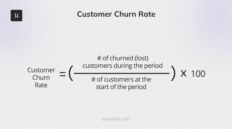
6. Churn rate
Churn rate measures the percentage of users who stop using your app in a given period: (churned users / total users at start of period) x 100. Industry-wide, 30-day churn averages 89.3% to 98.7%, which is an uncomfortable range but one that reflects how competitive mobile attention is and how high the bar is for delivering first-session value.
The first thing I do with churn data is segment it before reacting to the aggregate number. High churn among users from a specific acquisition channel often points to a mismatch between the ad creative and the actual product experience. Users who completed onboarding but still churn are facing a product value problem, not an acquisition problem, and those two root causes need completely different fixes.
Once you’ve identified the segment with the worst churn, a churn survey triggered at the point of uninstall is often the fastest way to find out why. The answer isn’t always what you’d expect.
Acquisition metrics: Useful once you’ve fixed activation
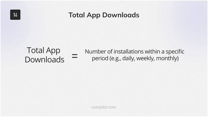
7. App downloads
I track app downloads as a channel-level metric, not a product health metric. Pulled from App Store Connect, Google Play Console, or a third-party analytics platform, downloads tell you which acquisition sources are working and how much volume your campaigns are generating. Where they mislead teams is when high install numbers get treated as proof that the product is working.
Downloads tell you one thing: someone installed. Everything that happens after is entirely separate from that number. Teams that optimize for downloads without fixing their onboarding and activation flow often find themselves on a treadmill, spending on acquisition while users churn before experiencing any real value.
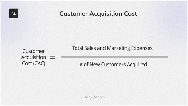
8. Customer acquisition cost (CAC)
Customer Acquisition Cost is your total sales and marketing spend divided by the number of new users acquired in the same period. The average cost to drive an installation is between $3.4 and $4.7, but that climbs fast once you factor in in-app promotions and campaigns aimed at driving purchases, and at that point, CAC can easily exceed $77.
CAC only becomes a decision-driving metric when paired with LTV. Whether $10 CAC is high or efficient depends entirely on what the average user generates in lifetime revenue. The ratio that matters is LTV:CAC, and sustainable mobile businesses typically aim for at least 3:1 before scaling acquisition spend.
App revenue metrics: The floor your monetization model sits on
9. Average revenue per user (ARPU)
ARPU is total revenue for a period divided by total active users in that period. The most useful signal it gives: if your ARPU is consistently higher than your middle pricing tier, that’s evidence users are gravitating toward your premium offering. Appsflyer’s research found that ARPU for non-gaming iOS apps is 5x higher than Android equivalents in the same category ($8.39 vs $1.54), worth knowing if you’re deciding where to invest monetization effort first.
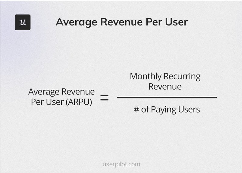
ARPU becomes most actionable when you segment it by user cohort rather than reading the aggregate number. If your most recent install cohorts have lower ARPU than older cohorts, you either changed your acquisition channels or adjusted your onboarding in a way that’s converting fewer users to paid.
When ARPU is higher than your middle-tier plan, that’s usually a signal to lean into the premium experience: make the upgrade path more prominent in onboarding and design flows that drive new users toward the tier where they’ll get more value sooner.
10. In-app purchase conversion rate
In-app purchase conversion rate is the percentage of active users who complete a purchase: (users who made a purchase / total active users) x 100. The average install-to-purchase conversion rate sits between 2.6% and 5.5%, and for freemium apps specifically, the free-to-paying conversion rate typically runs between 2% and 5%. Both numbers look low until you factor in the global volume of mobile users those percentages apply to.
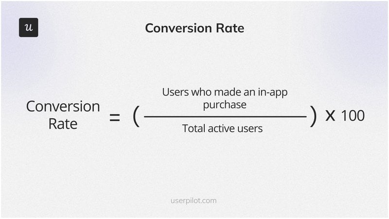
The most useful approach to this metric is comparing conversion rates across user segments: users who completed onboarding versus users who skipped it, and users who arrived from organic search versus paid install campaigns. Those cohorts will convert at meaningfully different rates, and the gaps tell you where to invest next.
When conversion drops, check whether a recent app update changed the purchase flow before adjusting pricing or marketing. Friction in the checkout experience: an extra confirmation screen, a payment method that requires too many steps, a price reveal that feels abrupt. These kill conversion faster than almost any other variable.
11. User lifetime value (LTV)
User Lifetime Value measures how much revenue a single user generates across their full relationship with your app: ARPU multiplied by average customer lifespan. There is no universal LTV target to hit in isolation. What matters is a healthy LTV:CAC ratio where LTV is at least 3x your acquisition cost.
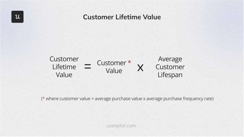
LTV is most useful for making acquisition strategy decisions. If users who subscribe to your higher-tier plan have a notably higher LTV than users on the entry plan, that’s a strong signal to design onboarding flows that drive new users toward that tier earlier. If the LTV difference between tiers is smaller than you expected, that’s worth investigating before increasing acquisition spend.
Technical health metrics: The silent killers
12. App crashes
App crash rate is the percentage of sessions that end in an unexpected termination: (number of crashes / total sessions) x 100. Instabug’s 2024 research found the average crash-free session rate is 99.95% for Android and 99.87% for iOS. Anything below those thresholds typically correlates with lower app store ratings and higher early churn.
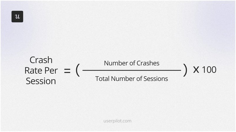
I keep crash rate in my PM dashboard as a leading indicator, not just on the engineering side. A spike after a new feature ships is often the first signal that something broke, and if I don’t catch it quickly, it shows up in Day 1 retention within 48 hours.
I track crash rate by app version and by user segment. New users experience crashes differently than returning users, and crashes on onboarding screens have a disproportionate impact on first-session metrics specifically.
13. App launch time and app load time
These are the two metrics I’ve folded into one section because they’re diagnosing the same underlying issue: how fast your app becomes useful after a user decides to open it. Launch time specifically tracks the time from tapping the app icon to the first responsive screen. Load time covers the duration until content fully renders within an already-open session: page loads, data fetches, and content transitions.
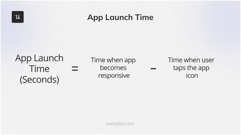
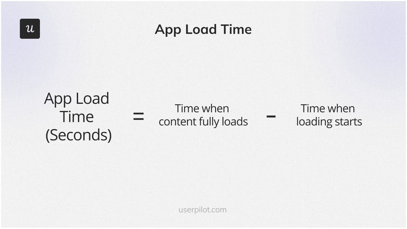
Google recommends a maximum of 5 seconds for cold starts, 2 seconds for warm starts, and 1.5 seconds for hot starts. For load time within an open session, aim for under 2-3 seconds for standard content. When either metric runs long, users interpret it as the app being broken rather than slow, and that interpretation drives uninstalls before a single feature has been evaluated.
A release that pushes launch times past those thresholds usually has the same culprit: something added to the startup sequence that doesn’t need to be there. Deferred loading (initializing non-critical features after the first screen renders) is usually the fastest fix without requiring a full architecture change. I’d check that before touching anything else.
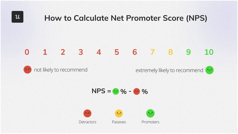
14. NPS and user sentiment
Net Promoter Score measures user loyalty by asking how likely users are to recommend your app to others on a 0-10 scale. Promoters (9-10) minus Detractors (0-6) gives you the NPS. Our benchmark data shows the average NPS across SaaS products is 35.7%. The number matters less than the qualitative follow-up: “Why did you choose that score?” is where the actual signal lives.
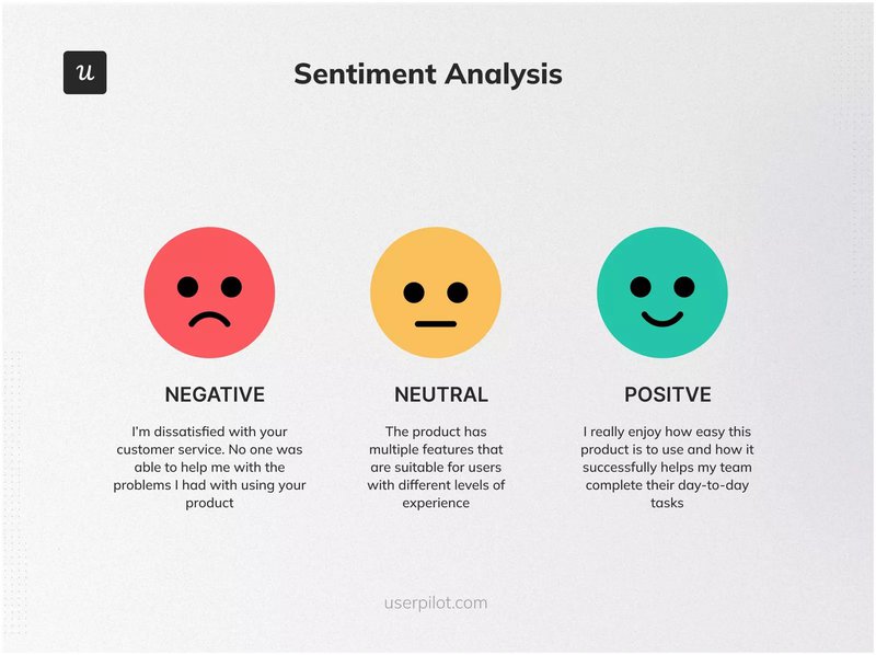
Pair NPS with sentiment analysis across app store reviews, support tickets, and in-app feedback to get a full picture. NPS gives you the aggregate loyalty score. Sentiment analysis across those other channels tells you which themes are driving it up or down, and which features, flows, or support experiences are generating the most friction.
Trigger the NPS survey at a meaningful moment, not on a random timer. After a user completes a key action or reaches a usage milestone, the feedback is more representative of their actual experience. Timing it after a frustrating interaction will tank your score in ways that don’t reflect how most users feel about the product.
For a breakdown of which NPS format to use and when, this guide on NPS survey types covers the options in more detail.
When a metric drops, here’s what I actually do
Every metric in this guide is only useful if it leads to a decision. The most common failure mode I see is treating a metric drop as the problem, rather than as a signal pointing toward the problem. When Day 7 retention drops, the question to ask isn’t “how do we improve Day 7 retention?” It’s “where in the user flow, between Day 1 and Day 7, are users stopping, and why?”
The diagnostic I use starts with the funnel step immediately upstream of the metric that moved. If TTFV drops, I look at the step before the activation event. If Day 1 retention drops, I look at first-session completion rates. If feature adoption drops, I check whether something changed in the discovery path: a UI update, a new onboarding flow, a navigation change that reduced the feature’s visibility.
When we launched Userpilot’s email feature, the funnel showed a sharp drop-off at domain verification. Users were starting setup and abandoning at that one specific step. Within a few hours, I’d built a targeting modal inside Userpilot that highlighted the correct steps in context, without touching the engineering queue. The drop-off closed within days.
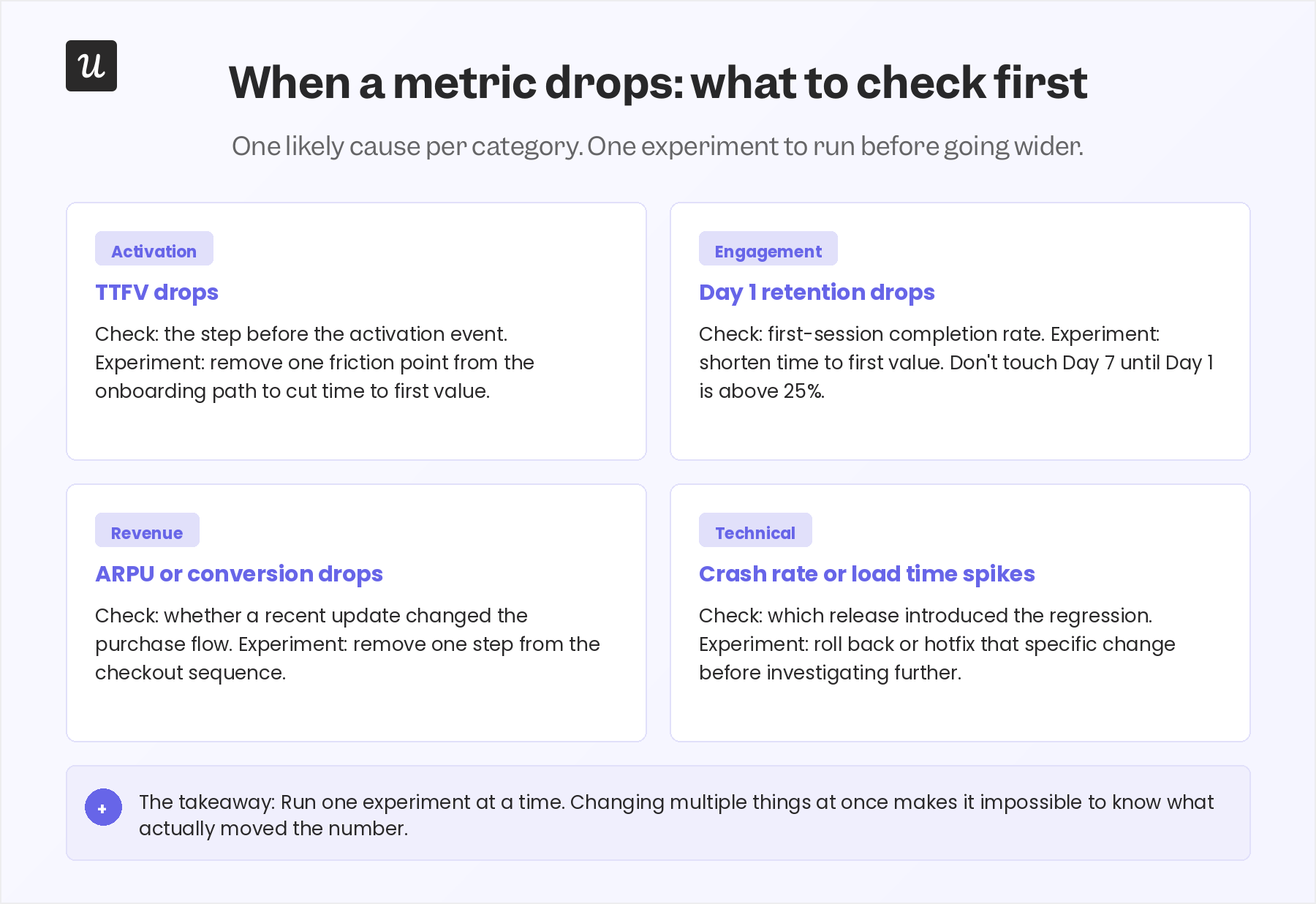
The pattern generalizes: for each major metric category, there’s a short list of likely causes and a first experiment worth running before going wider. Most importantly, run one experiment at a time. The instinct when metrics look bad is to change everything simultaneously. That approach makes it impossible to know what actually moved the number, and it often creates new drop-offs in the flows you didn’t intend to touch.
The diagnostic loop I’ve found most reliable: track the event, find the single funnel step with the highest drop-off rate, form one hypothesis about why users are stopping there, build the smallest intervention that tests it, and watch whether the metric responds. An in-app message, a tooltip, a flow simplification. These are faster to ship and easier to evaluate than a full feature rebuild. If the smallest fix doesn’t move the number, that tells you something important too.
The most important shift is going from “what does this number mean?” to “what would I need to observe to know what’s causing this?” That reframe turns a dashboard from a report into a diagnostic tool. That is the difference between measuring things and actually learning from them.
Use your mobile app metrics to drive decisions, not just dashboards
Tracking 14 metrics means nothing if you don’t know which one to act on when it moves. The frame I keep coming back to: activation first, then retention, then acquisition, then revenue. Each stage has its own relevant metrics and its own levers, and mixing them up is how dashboards become noise.
If you want to connect your mobile app metrics directly to in-app interventions, that’s exactly what I use Userpilot for. Userpilot’s mobile product lets you go from spotting a funnel drop-off to deploying a fix in a few hours, without an engineering ticket. That speed is what closes the gap between measuring and actually improving.
FAQ
What is an app metric?
An app metric is a quantitative measurement used to understand how users are engaging with a mobile application and whether the app is delivering value. Examples include DAU/MAU, retention rate, Time to First Value, and crash rate. The distinction between a useful metric and noise is whether it corresponds to a decision you can actually make.
What is a KPI for apps?
A mobile app KPI (Key Performance Indicator) is the specific metric most directly tied to your current business objective. If your goal is activation, TTFV is your KPI. If your goal is retention, Day 1 or Day 30 retention rate is more relevant. A well-defined set of onboarding KPIs at early stage typically produces better decisions than tracking all 14 metrics at equal weight.
How to analyze mobile app performance?
Start by identifying the two or three metrics that match your current stage and goal. Track them weekly by cohort. When one moves, go one funnel step upstream to find the likely cause before generating hypotheses. The most common mistake is adding more metrics to the dashboard when a number dips, rather than investigating the specific metric that already moved.
What mobile app metrics matter most at early stage?
At early stage, Time to First Value and Day 1 retention are the two that matter most. If users aren’t reaching their activation event in the first session, and aren’t returning after day one, no other metric will explain why. Fix those two before looking at acquisition cost, revenue metrics, or long-term retention curves.
What is a good DAU/MAU ratio for a mobile app?
A DAU/MAU ratio of 20% or higher is generally considered good, indicating strong daily engagement among monthly users. Above 25% is excellent. Apps below 10% are often underdelivering on repeat-use value or struggling with re-engagement. The appropriate benchmark also varies by app category: daily-use apps like social or productivity tools should aim higher than weekly-use apps like planning or scheduling tools.
About the author